
Martin Fowler's Blog, page 32
August 30, 2015


August 27, 2015
Citizen Four

My brief thoughts on watching my newly acquired DVD of
Citizen Four - a film about the whistleblower Edward Snowden.
August 26, 2015
Bliki: PresentationDomainDataLayering
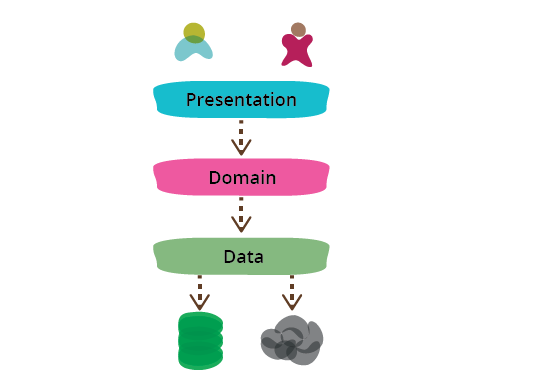
One of the most common ways to modularize an information-rich
program is to separate it into three broad layers: presentation (UI), domain logic
(aka business logic), and data access. So you often see web
applications divided into a web layer that knows about handling http
requests and rendering HTML, a business logic layer that contains
validations and calculations, and a data access layer that
sorts out how to manage persistant data in a database or remote
services.
On the whole I've found this to be an effective form of
modularization for many applications and one that I regularly use
and encourage. It's biggest advantage (for me) is that it allows me
to reduce the scope of my attention by allowing me to think about the
three topics relatively independently. When I'm working on domain
logic code I can mostly ignore the UI and treat any interaction with
data sources as an abstract set of functions that give me the data I
need and update it as I wish. When I'm working on the data access
layer I focus on the details of wrangling the data into the form
required by my interface. When I'm working on the presentation I can
focus on the UI behavior, treating any data to display or update as
magically appearing by function calls. By separating these elements
I narrow the scope of my thinking in each piece, which makes it
easier for me to follow what I need to do.
This narrowing of scope doesn't imply any sequence to programming them - I usually find I need to
iterate between the layers. I might build the data and domain layers
off my initial understanding of the UX, but when refining the UX I
need to change the domain which necessitates a change to the data
layer. But even with that kind of cross-layer iteration, I find it
easier to focus on one layer at a time as I make changes. It's
similar to the switching of thinking modes you get with
refactoring's two hats.
Another reason to modularize is to allow me to substitute
different implementations of modules. This separation
allows me to build multiple presentations on top of the same domain
logic without duplicating it. Multiple presentations could be
separate pages in a web app, having a web app plus mobile native
apps, an API for scripting purposes, or even an old fashioned
command line interface. Modularizing the data source allows me to
cope gracefully with a change in database technology, or to support
services for persistance that may change with little notice. However
I have to mention that while I often hear about data access
substitution being a driver for separating the data source layer, I
rarely hear of someone actually doing it.
Modularity also supports testability, which naturally appeals to
me as a big fan of SelfTestingCode. Module boundaries
expose seams that are good affordance for testing. UI code is
often tricky to test, so it's good to get as much logic as you can
into a domain layer which is easily tested without having to do
gymnastics to access the program through a UI [1]. Data access is often slow and awkward, so using
TestDoubles around the data layer often makes domain logic
testing much easier and responsive.
While substitutability and
testability are certainly benefits of this layering, I must stress that even
without either of these reasons I would still divide into layers
like this. The
reduced scope of attention reason is sufficient on its own.
When talking about this we can either look at it as one pattern
(presentation-domain-data) or split it into two patterns
(presentation-domain, and domain-data). Both points of view are
useful - I think of presentation-domain-data as a composite of
presentation-domain and domain-data.
I consider these layers to be a form of module, which is a
generic word I use for how we clump our software into relatively
independent pieces. Exactly how this corresponds to code depends on
the programming environment we're in. Usually the lowest level is
some form of subroutine or function. An object-oriented language
will have a notion of class that collects functions and data
structure. Most languages have some form of higher level called
packages or namespaces, which often can be formed into a hierarchy.
Modules may correspond to separately deployable units: libraries,
or services, but they don't have to.
Layering can occur at any of these levels. A small program may
just put separate functions for the layers into different files. A
larger system may have layers corresponding to namespaces with many
classes in each.
I've mentioned three layers here, but it's common to see
architectures with more than three layers. A common variation is to
put a service layer between the domain and presentation, or to
split the presentation layer into separate layers with something like
Presentation Model. I don't
find that more layers breaks the essential pattern, since the core
separations still remain.
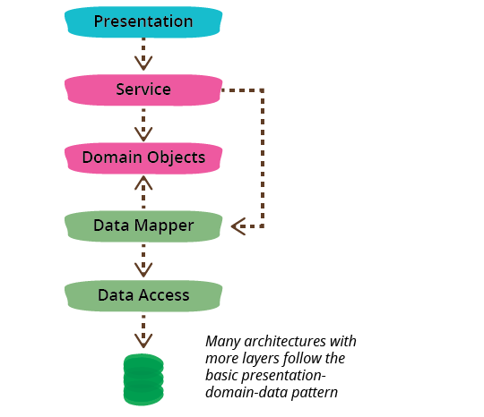
The dependencies generally run from top to bottom through the
layer stack: presentation depends on the domain, which then depends
on the data source. A common variation is to arrange things so that
the domain does not depend on its data sources by introducing a mapper between the domain and
data source layers. This approach is often referred to as a Hexagonal
Architecture.
Although presentation-domain-data separation is a common
approach, it should only be applied at a relatively small granularity.
As an application grows, each layer can get sufficiently complex on
its own that you need to modularize further. When this happens it's
usually not best to use presentation-domain-data as the higher
level of modules. Often frameworks encourage you to have
something like view-model-data as the top level namespaces; that's
ok for smaller systems, but once any of these layers gets too big
you should split your top level into domain oriented modules which
are internally layered.

Developers don't have to be full-stack but teams should be.
One common way I've seen this layering lead organizations astray
is the AntiPattern of separating development teams by
these layers. This looks appealing because front-end and back-end
development require different frameworks (or even languages) making
it easy for developers to specialize in one or the other. Putting
those people with common skills together supports skill
sharing and allows the organization to treat the team as a provider
of a single, well-delineated type
of work. In the same way, putting all the database specialists
together fits in with the common centralization of databases and
schemas.
But the rich interplay between these layers
necessitates frequent swapping between them. This isn't too hard
when you have specialists in the same team who can casually
collaborate, but team boundaries add considerable friction, as well
as reducing an individual's motivation to develop the important cross-layer
understanding of a system.
Worse, separating the layers into teams adds distance between developers and users.
Developers don't have to be full-stack (although that is
laudable) but teams should be.
Further Reading
I've written about this separation from a number of different
angles elsewhere. This layering drives the structure of P of EAA and chapter 1 of that book talks
more about this layering. I didn't make this layering a pattern in
its own right in that book but have toyed with that territory with
Separated
Presentation and PresentationDomainSeparation.
For more on why presentation-domain-data shouldn't be the
highest level modules in a larger system, take a look at the
writing and speaking of Simon Brown. I also
agree with him that software architecture should be embedded in
code.
I had a fascinating
discussion with my colleague Badri Janakiraman about the
nature of hexagonal architectures. The context was mostly around
applications using Ruby on Rails, but much of the thinking applies
to other cases when you may be considering this approach.
Acknowledgements
James Lewis, Jeroen Soeters, Marcos Brizeno, Rouan Wilsenach, and
Sean Newham
discussed drafts of this post with me.
Notes
1:
A PageObject is also an important tool to help
testing around UIs.
Share:


if you found this article useful, please share it. I appreciate the feedback and encouragement
August 25, 2015
Bliki: AntiPattern
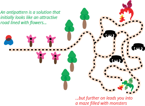
Andrew Koenig first coined the term "antipattern" in an article
in JOOP[1], which is sadly not available on the internet. The essential
idea (as I remember it [2]) was that an antipattern was something that
seems like a good idea when you begin, but leads you into trouble.
Since then the term has often been used just to indicate any bad
idea, but I think the original focus is more useful.
In the paper Koenig said
An antipattern is just like a pattern, except that instead of a
solution it gives something that looks superficially like a
solution but isn't one.
-- Andrew Koenig
This is what makes a good antipattern something separate
to just a bad thing to point and laugh at. The fact that it looks
like a good solution is its essential danger. Since it looks good,
sensible people will be take the path - only once you've put a
lot of effort into it will you know it's bad result.
When writing a description of an antipattern
it's valuable to describe how to get out of trouble if
you've taken the bad path. I see that as useful
but not necessary. If there's no good
way to get out of it, that doesn't reduce the value of the
warning.
It's useful to remember that the same solution can be a good
pattern in some contexts and an antipattern in others. The value
of a solution depends on the context that you use it.
Notes
1:
Journal of Object-Oriented Programming, Vol 8, no. 1.
March/April 1995. It was then reprinted in "The Patterns
Handbook", edited by Linda Rising (Cambridge University Press)
2:
I don't have a copy of the paper, so I'm going primarily off
memory and some old notes.
Share:
if you found this article useful, please share it. I appreciate the feedback and encouragement
August 18, 2015
Bliki: AlignmentMap
Alignment maps are organizational information radiators that help
visualize the alignment of ongoing work with business outcomes. The
work may be regular functionality addition or technical work such as
re-architecting or repaying technical debt or improving the build
and deployment pipeline. Team members use alignment maps to
understand what business outcomes their day-to-day work is meant to
improve. Business and IT sponsors use them to understand how ongoing
work relates to the business outcomes they care about.
Here’s an
example scenario (inspired by real life) that illustrates how these
maps may be useful. A team of developers had inefficiently implemented a
catalog search function as N+1 calls. The first call to the catalog
index returned a set of SKU IDs. For each ID returned, a query was
then made to retrieve product detail. The implementation came to the
attention of an architect when it failed performance tests. He advised
the team to get rid of the N+1 implementation.
“Search-in-one” was the mantra he offered the team as a way to
remember their objective. Given the organizational boundary between
architects and developers and the low frequency of communication
between them, the mantra was taken literally. The team moved heaven
and earth to implement a combined index query and detail query in a single
call. They lost sight of the real objective of improving search
performance and slogged away in an attempt to achieve acceptable
performance in exactly one call. Funding ran out in a few months and
after some heated discussions, the project was cancelled and the team
disbanded.
The above example may seem absurd but sadly, enterprise IT is
no stranger to architecture and business projects that are
cancelled after a while because they lost sight of why they were
funded in the first place. In the terminology of organizational
design, these are problems of alignment.
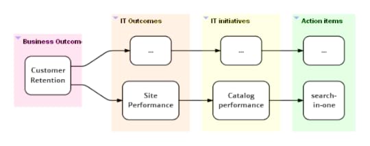
Visualizing Alignment
Broadly, IT strategy has to align with business strategy and
IT outcomes with desired business outcomes. A business outcome
may be supported (in part) by one or more IT outcomes. Each IT
outcome may be realized by one or more initiatives (program of
work—architectural or business). At this point, it may also be
useful to identify an owner for each initiative who then sponsors
work (action items) across multiple teams as part of executing
the initiative. Depending on the initiative the owner may be a
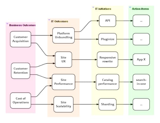
product owner, architect, tech lead or manager. Here's an
alignment map for the “search-in-one” case. Had it been in public
display in the team’s work area, it might have prompted someone
to take a step back and ask what their work was really meant to
achieve.
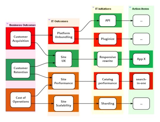
Global Map
A global alignment map for the IT (appdev+ops) organization may
look more like this (although real maps tend to be much
larger).
As with all information radiators, such a map is a
snapshot in time and needs to be updated regularly (say once a
month). Each team displays a big printout of the global map in its
work area.
Big organizations are likely to realize value early in this
exercise by collaborating to come up with a version 1.0 of such a
map that everyone agrees to. The discussions around who owns what
initiatives and what outcomes an initiative contributes to leads
to a fair bit of organizational clarity of what everyone is up to.
Usually, the absence of well-articulated and commonly understood
business and IT strategies come in the way of converging on a set
of business and IT outcomes. Well-facilitated workshops with deep and wide participation
across the relevant parts of the organization can help address this.
Tracing alignment paths
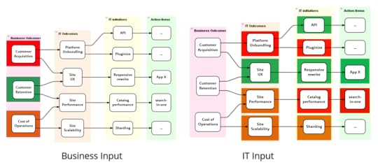
Once a global alignment map is in place, it allows us to trace
alignment from either end. IT and business sponsors can trace what
action items are in play under a given initiative. Development
team members can trace through the map to understand the real
purpose of items they are working on. In addition to in-progress
items, we could also include action items that are planned, done
or blocked.
As illustrated in the map above, each team highlights their section
of the map on their copy of the global map.
Qualitative benefits validation
Once a month (or quarter), IT and business people get together
to validate if all the IT activity has made any difference to
business outcomes. Business people come to the meeting with
red-amber-green (RAG) statues for business outcomes and IT people
may come with RAG statues for their side of the map. Both parties
need to be able to back up their RAG assessments with data and/or
real stories from the trenches (narrative evidence).
These maps can be combined

Sriram's recent book explores how best to design an IT
organization to be agile enough to survive in today's
competitive jungle.
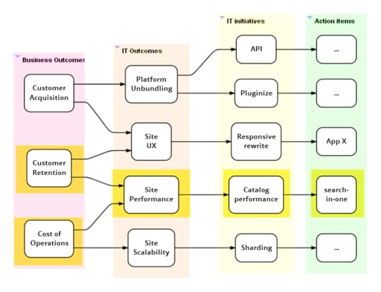
With this the group may realize that:
Some outcomes have turned green as compared to the previous
meeting. Perhaps customer retention turned green after the last
release of the responsive rewrite initiative.
Not all IT activity is making the expected difference to
business outcomes. This provides an opportunity to discuss why
this may be the case. Perhaps because:
It is a little early in the day. Other planned items need to
complete before we can expect a difference. This is probably
why, in the map above, customer acquisition is red even though site
UX is green. Platform unbundling is still incomplete.
The initiatives and action items are sensible but a different
execution approach is needed (this is the reason in case of
“search-in-one”).
A different initiative or set of actions are required and
existing ones are better cancelled. Something outside of IT has to
fall into place before the business can realize value.
A few business outcomes are green even though the related IT
initiatives aren’t. This probably means IT matters less to this
outcome than other non-IT factors. In the map above, this is probably
why customer retention is green even though site performance
isn’t. Perhaps IT means to say that performance isn’t where it
should be although it hasn’t affected retention just yet.
To summarize, alignment maps provide a common organization-wide tool to
discuss the extent to which different IT initiatives are paying off.
They could also improve the ability to make sense of ongoing work and
bring it greater alignment with business objectives.
I haven't used this technique enough yet to claim general
effectiveness, although I do think it shows enough promise.
If you try this out I'd be glad to hear about experiences with
it.
Acknowledgements
Thanks to Jim Gumbley, Kief Morris and Vinod Sankaranarayanan for their inputs.
Special thanks to Martin Fowler for his guidance with the content and help with publishing.
Further Reading
I describe other information radiators
that help the cause of organizational agility in my
book Agile IT Organization
Design. My companion web site at
www.agileorgdesign.com
contains links to further writing and my talks.
Share:
if you found this article useful, please share it. I appreciate the feedback and encouragement
August 9, 2015

August 5, 2015
OSCON Keynote: Making Architecture Matter
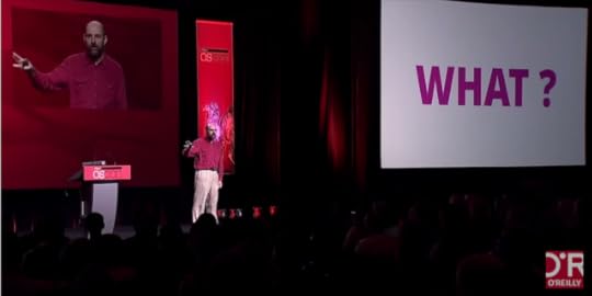
A couple of weeks ago, I gave a keynote at OSCON. They asked
me to talk about the importance of software architecture in
fourteen minutes. I put together a talk focusing on what
software architecture means and why it's important.
July 14, 2015
Fifth and final installment of Refactoring Loops to Collection Pipelines
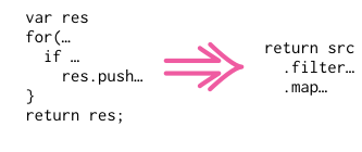
In this final installment of my article on refactoring loops
to collection pipelines, I tackle a loop that's performing two
different validations on the identifiers for a person.
July 11, 2015
photostream 87

Crown Point, Columbia Gorge, OR
July 9, 2015
Martin Fowler's Blog

- Martin Fowler's profile
- 1104 followers

