
Bliki: AlignmentMap
Alignment maps are organizational information radiators that help
visualize the alignment of ongoing work with business outcomes. The
work may be regular functionality addition or technical work such as
re-architecting or repaying technical debt or improving the build
and deployment pipeline. Team members use alignment maps to
understand what business outcomes their day-to-day work is meant to
improve. Business and IT sponsors use them to understand how ongoing
work relates to the business outcomes they care about.
Here’s an
example scenario (inspired by real life) that illustrates how these
maps may be useful. A team of developers had inefficiently implemented a
catalog search function as N+1 calls. The first call to the catalog
index returned a set of SKU IDs. For each ID returned, a query was
then made to retrieve product detail. The implementation came to the
attention of an architect when it failed performance tests. He advised
the team to get rid of the N+1 implementation.
“Search-in-one” was the mantra he offered the team as a way to
remember their objective. Given the organizational boundary between
architects and developers and the low frequency of communication
between them, the mantra was taken literally. The team moved heaven
and earth to implement a combined index query and detail query in a single
call. They lost sight of the real objective of improving search
performance and slogged away in an attempt to achieve acceptable
performance in exactly one call. Funding ran out in a few months and
after some heated discussions, the project was cancelled and the team
disbanded.
The above example may seem absurd but sadly, enterprise IT is
no stranger to architecture and business projects that are
cancelled after a while because they lost sight of why they were
funded in the first place. In the terminology of organizational
design, these are problems of alignment.
Visualizing Alignment
Broadly, IT strategy has to align with business strategy and
IT outcomes with desired business outcomes. A business outcome
may be supported (in part) by one or more IT outcomes. Each IT
outcome may be realized by one or more initiatives (program of
work—architectural or business). At this point, it may also be
useful to identify an owner for each initiative who then sponsors
work (action items) across multiple teams as part of executing
the initiative. Depending on the initiative the owner may be a
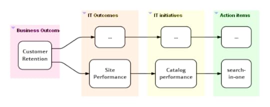
product owner, architect, tech lead or manager. Here's an
alignment map for the “search-in-one” case. Had it been in public
display in the team’s work area, it might have prompted someone
to take a step back and ask what their work was really meant to
achieve.
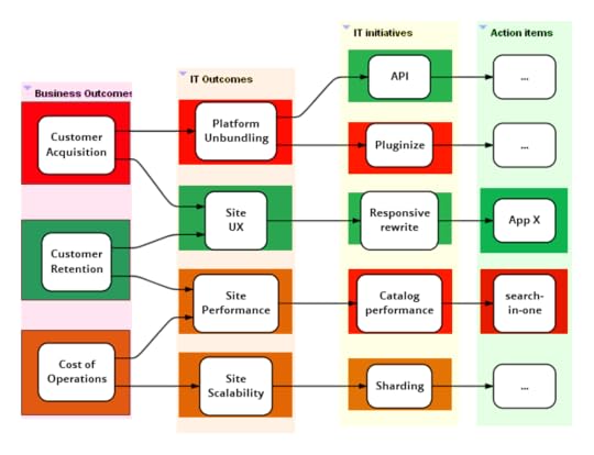
Global Map
A global alignment map for the IT (appdev+ops) organization may
look more like this (although real maps tend to be much
larger).
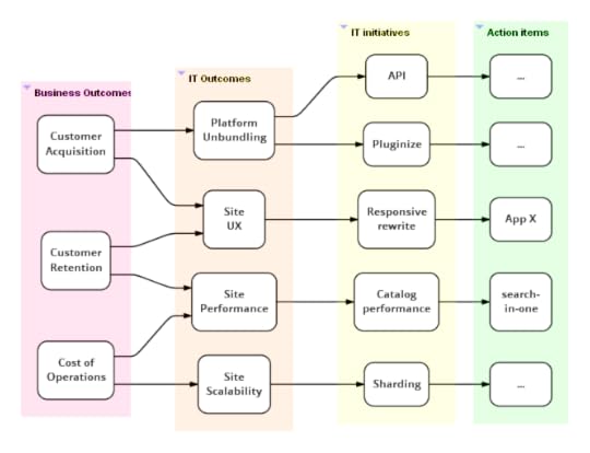
As with all information radiators, such a map is a
snapshot in time and needs to be updated regularly (say once a
month). Each team displays a big printout of the global map in its
work area.
Big organizations are likely to realize value early in this
exercise by collaborating to come up with a version 1.0 of such a
map that everyone agrees to. The discussions around who owns what
initiatives and what outcomes an initiative contributes to leads
to a fair bit of organizational clarity of what everyone is up to.
Usually, the absence of well-articulated and commonly understood
business and IT strategies come in the way of converging on a set
of business and IT outcomes. Well-facilitated workshops with deep and wide participation
across the relevant parts of the organization can help address this.
Tracing alignment paths
Once a global alignment map is in place, it allows us to trace
alignment from either end. IT and business sponsors can trace what
action items are in play under a given initiative. Development
team members can trace through the map to understand the real
purpose of items they are working on. In addition to in-progress
items, we could also include action items that are planned, done
or blocked.
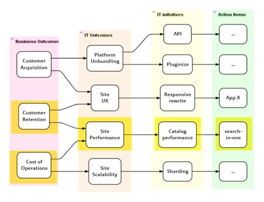
As illustrated in the map above, each team highlights their section
of the map on their copy of the global map.
Qualitative benefits validation
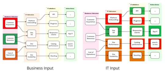
Once a month (or quarter), IT and business people get together
to validate if all the IT activity has made any difference to
business outcomes. Business people come to the meeting with
red-amber-green (RAG) statues for business outcomes and IT people
may come with RAG statues for their side of the map. Both parties
need to be able to back up their RAG assessments with data and/or
real stories from the trenches (narrative evidence).
These maps can be combined

Sriram's recent book explores how best to design an IT
organization to be agile enough to survive in today's
competitive jungle.
With this the group may realize that:
Some outcomes have turned green as compared to the previous
meeting. Perhaps customer retention turned green after the last
release of the responsive rewrite initiative.
Not all IT activity is making the expected difference to
business outcomes. This provides an opportunity to discuss why
this may be the case. Perhaps because:
It is a little early in the day. Other planned items need to
complete before we can expect a difference. This is probably
why, in the map above, customer acquisition is red even though site
UX is green. Platform unbundling is still incomplete.
The initiatives and action items are sensible but a different
execution approach is needed (this is the reason in case of
“search-in-one”).
A different initiative or set of actions are required and
existing ones are better cancelled. Something outside of IT has to
fall into place before the business can realize value.
A few business outcomes are green even though the related IT
initiatives aren’t. This probably means IT matters less to this
outcome than other non-IT factors. In the map above, this is probably
why customer retention is green even though site performance
isn’t. Perhaps IT means to say that performance isn’t where it
should be although it hasn’t affected retention just yet.
To summarize, alignment maps provide a common organization-wide tool to
discuss the extent to which different IT initiatives are paying off.
They could also improve the ability to make sense of ongoing work and
bring it greater alignment with business objectives.
I haven't used this technique enough yet to claim general
effectiveness, although I do think it shows enough promise.
If you try this out I'd be glad to hear about experiences with
it.
Acknowledgements
Thanks to Jim Gumbley, Kief Morris and Vinod Sankaranarayanan for their inputs.
Special thanks to Martin Fowler for his guidance with the content and help with publishing.
Further Reading
I describe other information radiators
that help the cause of organizational agility in my
book Agile IT Organization
Design. My companion web site at
www.agileorgdesign.com
contains links to further writing and my talks.
Share:


if you found this article useful, please share it. I appreciate the feedback and encouragement


Martin Fowler's Blog

- Martin Fowler's profile
- 1104 followers

