Stephen Clapham's Blog, page 6
October 2, 2023
China Tech’s Dual Personality
Back in 2020, an institutional client asked us to review five of the biggest Chinese tech stocks. The client wanted us to look at Alibaba, Tencent, JD.com, Meituan and Baidu, and give an assessment of the quality of their accounting.
One of our key observations was the amount of investment these companies were undertaking.
This wasn’t capital expenditure, as you might expect. Because these companies weren’t investing massively in warehouses, cloud servers and hard assets like their US counterparts. Instead, these five big Chinese tech companies were investing in start-ups.
In five years, this group of companies essentially invested five Vision Funds in the Chinese tech eco-system. True, it wasn’t quite $500bn and it wasn’t 100% invested in China. For example, Tencent made a notable investment in Tesla.
But we thought this level of investment was exceptional. We also thought it was almost certain to result in misallocation of capital. Roll forward two years and I thought it would be interesting to see how those numbers look today.
The Big Five, Two Years LaterThe obvious thing to mention is that some (but not all) of this group have drastically underperformed since 2021.
Chinese Tech Stocks’ Performance Source: Behind the Balance Sheet from Sentieo data
But we’re going to focus on fundamentals rather than share prices.
The group’s net income, which had been uninspiring to say the least, has improved significantly. In the past two years, it was 40% higher than the previous five years. This was mainly driven by lower losses at Meituan and JD.com moving into profit.
Where it gets really interesting is the cash generation of the group and how these cash flows have been deployed. Let’s start with how they’re using the cash.
Chinese Big Tech Sources and Uses of Cash –Seven Years Source: Behind the Balance Sheet from Sentieo dataThe (Huge) Investments Continued
Between them, the five companies have invested a total of $0.75 trillion in acquisitions and non-controlling investments over the past seven years, we estimate. That’s quite a staggering number. Even Masayoshi Son of SoftBank would be impressed.
This would be frightening if the companies hadn’t taken in $0.5 trillion from business disposals. Some of these will certainly be flotations; some will be sales to acquirers; and some may be sales to other VCs and private equity funds.
This means the net investment is a more modest $200bn, funded by operating cash flow.
Capex amounted to less than $100bn over seven years – relatively small change. To put that into context, Amazon alone spent more than this in the past two years. Albeit on a revenue base which is 25- 30% larger than the Chinese sector.
These five big Chinese tech stocks are still using their cash in a very different way to their American peers – the increasing asset intensity of some of the US tech stocks is an important and overlooked subject which I shall return to in a later article. But this wasn’t the most striking thing about the Chinese group’s cash flow.
Where Has The Cash Conversion Gone?The most interesting data point was the drop in operating cash flow relative to net income.
I explained the improvement in net income was mainly loss reversal, but cash flow conversion for this group of companies was significantly weaker. Operating cash flow is down 16% on the previous five years total, compared with net income that is 40% higher!
Chinese Tech Cash Generation Source: Behind the Balance Sheet from Sentieo data
Part of the reason may be profits on disposals of investments.
If this is the case, shareholders should probably wish they had done more. For some of these companies, it looks like shareholders’ fortunes rest on the valuation and success of what is in effect a VC fund. Maybe even more than the success of the operational business.
This shows that thinking something is a good business at a fair price might not be enough. You also need to understand the real drivers of a company’s share price.
The post China Tech’s Dual Personality appeared first on Behind The Balance Sheet.


September 29, 2023
September 26, 2023
The Future of Quality Investing
I began a series on quality investing, which has been at the fore in the past decade. In our previous article, we looked at a report by Amundi Asset Management, Revisiting Quality Investing, which showed that:
quality was persistent;it outperforms in the long term; and(equally important) an absence of quality underperforms.
Amundi demonstrated that high quality stocks significantly outperformed lower quality stocks with an 8%-a year performance gap between the highest and lowest quintiles. They used four different variables to define quality, as shown below. Each of these behaves differently, and a combination of all four delivered the best results.
Amundi’s Quality Factors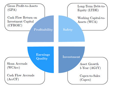
Source: Amundi Asset Management
One reason why quality outperforms is that it does well in times of turbulence and particularly in the event of turmoil in markets. But it often underperforms in bull markets, especially in the early stages of recovery from a bear market – all this we know and it makes sense. But given that we live in bull markets for most of the time, the benefit from quality in adverse markets must be larger than the drag in bull markets.
Excess Return by Factor – Global Universe
Source: Amundi Asset Management
Unfortunately, the period of the Amundi study, 2003-2020, does not include a traditional bear market, although it does include two crises, the global financial crisis (GFC) and the pandemic. The 2003-2007 period was a fairly traditional bull market, with the quality factors overall underperforming, and the most powerful factor returns, faring worst. The latter part of the period saw returns in positive territory, albeit at a lower annual rate than when it was underperforming; but by virtue of a longer period, it comes out positive overall.
Returns for Combined Factors – by Geography
Source: Amundi Asset Management
The US shows above average scores in both directions as does the EMU, suggesting this is not a tech stock phenomenon. There are significant regional differences in the performance of quality overall (ie, using a combination of the four factors), which suggests there may be something specific about certain regions or that the quality factor is not as consistent as might be hoped. This is also true for the profitability factor which is returns -based, as can be seen in the next table.
Returns for Profitability Factor – by Geography
Source: Amundi Asset Management
The pattern here is more consistent with only the Pacific ex-Japan region showing a different trend in 2003-2007, and this could be a specific driver – for example, growth derived from China after its accession to the World Trade Organisation (WTO) in 2001. The other regions show a consistent pattern.
The Amundi study was not as detailed on the time periods as I had hoped when I was writing the last articleIn the meantime, I therefore looked at a number of other studies on quality.
Goldmans Sachs Asset Management suggests that high quality outperforms in drawdowns by 2.9% in the US and by 1.3% internationally, and that it has outperformed 80% of the time in the last decade – the chart shows underperformance only in 2013 and 2016.
High Quality Stocks Have Outperformed in the Last Decade
Source: Goldman Sachs Asset Management
In the same article, it suggests that quality is not as persistent as I concluded last time, with only 54% of companies described as high quality five years previously retaining that description – unfortunately, there is limited explanation in the article.
The Schroders QEP team [1] defines quality as having three characteristics:
Profitability, as defined by return on equity, cash generation and marginsStability, principally of sales, earnings and cash flowsFinancial strength, modest leverage and ability to service debt
Quality companies deliver a consistent operational performance for the following two years and continue to deliver good news as shown in the chart.
Quality Companies Deliver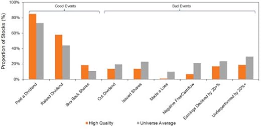
Source: Schroders, MSCI 1988-June 2014
Their definition gives a significant long-short performance differential for high vs low quality companies.
Returns by Quality Cohort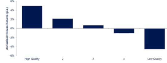
Source: Schroders, MSCI 1988-June 2014
Like Amundi, Schroders shows a better performance for the combination of quality measures than for the individual components – profitability, stability and financial strength. They actually monitor more than 60 individual inputs before making a final assessment of the underlying quality of a company.
An MSCI paper discusses the quality factor as defined by its Quality Index, which employs three fundamental variables to capture quality:
Return on equityDebt to equityEarnings variability
They show that the quality factor is defensive, historically having outperformed during declining market conditions, as illustrated in the chart. Note the significant underperformance in sharp upticks, which might simply be the worst performers having a bounce in bear market rallies.
Quality Performs in Downturns, Lags in Sharp Rallies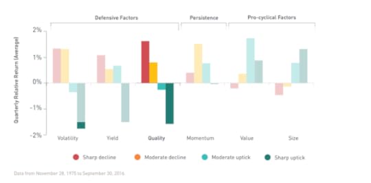
Source: MSCI
They also show this chart where quality was the worst factor coming out of an economic downturn, having outperformed on the way down, again consistent with expectations. The conclusions are consistent with the thesis that quality outperforms in a bear market and then gets left behind, but does well overall.
Performance of Quality vs Other Factors by Year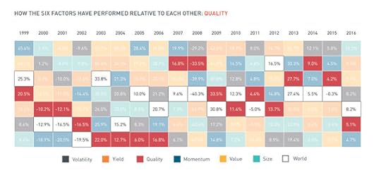
Source: MSCIConclusions
The conclusion from all these studies is that quality is worth pursuing – some conclude that quality underperforms in bull markets, but more than make up for it in bear markets, some conclude that more recently quality outperforms most years.
I wonder if it will be that simple in this cycle. The crucial questions are
1. The degree to which quality persists –my last article suggested that it was quite persistent, but Goldmans are less positive.
2. The definition of quality – many of these studies (and I have omitted an AQR study which is incredibly detailed) rely on very sophisticated quantitative screening which is beyond the reach of the ordinary investor. I wonder how these filters will perform in the rather different economic and stockmarket environment I foresee in the next decade.
3. In one or two of these studies, quality worked better in the US than elsewhere. This is an important concern. The likes of Apple and Microsoft are large and have been massive outperformers and could conceivably skew results. I don’t know this, but it could be a risk.
The post The Future of Quality Investing appeared first on Behind The Balance Sheet.
September 18, 2023
Twitter’s $2.9bn black hole
In a recent article I explained that tech investors were likely to see further dilution of their investments because after significant share price falls, many companies are likely to issue new stock options to employees. My original piece, entitled Stock Based Compensation – the Disappearing Expense, explained that stock based compensation (SBC) presents a problem for investment analysts in several ways:
1 Almost every company adds back SBC in its calculation of adjusted earnings. Earnings are therefore overstated, as payroll costs would have had to be (much?) higher without this issue of stock to employees.
2 Because the SBC expense is a non-cash item, it is added back in the calculation of operating cash flows. Cash flow multiples are therefore understated. Although buybacks are often deployed to offset the dilution from the issue of shares to employees, this cost is not reflected in Free Cash Flow (FCF) multiples. I explained a solution in that earlier article.
3 Valuations should at least factor in the impact of the options outstanding on market cap, but analysts often forget to make this adjustment. Some analysts include it in the number of shares used to calculate earnings per share (EPS), but there is no consistency.
I then explained that accounting standards in respect of stock based comp leave a lot to be desired. Their intention is to give a measure of the opportunity cost at the time of grant – hence if there is a cost in year one of an option vesting over three years, the International Financial Reporting Standards (IFRS) say that the cost is spread over the three years. US GAAP (generally accepted accounting principles) is similar, as the two standards were introduced at the same time and the two standards setters were actually talking to each other.
The original charge is not varied if the share price quadruples in yeartwo, which is obviously a problem, as the cost to shareholders has increased significantly. Similarly, if the share price goes up, the real cost of the pool increases, but this is not reflected in the P&L.
This would be less of a problem if there was adequate disclosure and analysts could calculate the effective opportunity cost each year, which is what shareholders should be concerned about. Spoiler alert – the disclosure falls short.
So we have a number in the accounts which doesn’t reflect the economic reality. That’s not ideal but not that unusual. (IFRS 16 being a good example.) We can get round this. Last time, I explained how to adjust the cash flow and the FCF yield calculation. The other trick I use is to inflate the future share count by the historical growth in the number of shares in issue – I look at this before share buybacks so that I can estimate what level of dilution is likely in future. Of course, dilution may be higher or lower in subsequent years.
Real-life Examples of SBCI originally illustrated the difference between the stock option expense and the real cost to shareholders by looking at the difference between:
– The P&L charge for the option expense over a period
– The number of shares issued each year to employees times the average share price in the year. This is only a rough estimate of the real cost to shareholders of issuing stock to employees, but it’s all we can do with the information we have.
I concluded that for some companies, the option expense in the P&L significantly understated the actual cost to shareholders.
Let’s look at some examples; For most of the group in the table, SBC is the principal adjustment to EBITDA (earnings before interest, taxes, depreciation and amortization. Less so for Netflix because Sentieo adjusts the adjusted EBITDA, which I shall explain in my next post on the company.
Stock Based Compensation Source: Behind the Balance Sheet from Sentieo data
On SBC to revenue, Netflix is not as prodigious a user of stock based comp. The main users here are Twitter, Salesforce and Meta Platforms. For Twitter, the options expense exceeds its reported EBITDA and it’s almost as large as Salesforce’s reported EBITDA. And for IHS Markit and for Meta it’s significant at nearly 20% of reported EBITDA.
Quantifying the IssueIn my original article on this subject, I pretended that at the start of 2014, you, dear reader, were a successful venture capitalist and you owned 5% of Twitter and 5% of Facebook/Meta (OK, a very successful VC). You would have owned the following:
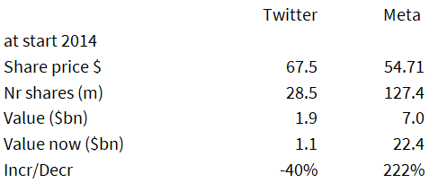 Source: Behind the Balance Sheet from Sentieo data
You would have done much better with your Meta stock, as we know, which would have trebled (previously, it had nearly quintupled) as opposed to Twitter which actually declined, and that’s after the Musk bid! But let’s look at what happened in the eight years from 2014 to 2021 in stock based compensation (all data from Sentieo):
Twitter’s charges for SBC in those eight years amounted to $4.2bn; for Meta Platforms the total was $36.4bn. Large numbers and equivalent to 11% of the opening market capitalization of Twitter and 26% for Meta Platforms. Had you known this at the start of 2014, that might have coloured your view of the shares, but let’s consider the relative significance of SBC for the two companies.
The conventional way of assessing this might be to compare these charges with the respective P&L statements which is quite easy to do, as illustrated in the above table. More important, and more difficult, is to assess the economic impact of the issue of this stock to employees.
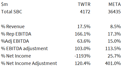 Source: Behind the Balance Sheet from Sentieo data
The table shows the SBC expense from the accounts which for Twitter over the eight years amounted to 18% of revenues, 63% of adjusted EBITDA, and the company reported a cumulative net loss. For Meta Platforms, the same ratios are 9% of revenues, 15% of adjusted EBITDA and 4 times net income.
To understand the real economic effect, however, we have to leave aside the accountants’ notional value of the options, and look at the number of shares against which options were issued, how much cash was received (not much usually) and what the company would have needed to spend on buybacks in order to offset the dilution; this last measure is a fair economic representation of the true cost to shareholders at the time.
In the case of Twitter, Sentieo’s standardised cash flow helpfully gives you the cash received from the exercise of options – just $75m in eight years. By analysing the Consolidated Statements of Stockholders Equity, we can assess the number of shares issued each year on the exercise of stock options and in relation to the vesting of Restricted Stock Units.
There is a difference here in that I am calculating the stock actually issued, rather than the options granted, which forms the input to the SBC expense line. But in practice, the real economic cost to the business is the stock actually issued – this is what actually dilutes shareholders, not the notional options charge in the P&L.
Over the eight years, 230m shares were issued by Twitter to its employees and with an average calendar year share price which fluctuated between $16 and $54, we estimate the value of the stock issued was $7.2bn or $7.1bn after taking cash receipts into account.
 Source: Behind the Balance Sheet from Sentieo data
The SBC expense in Twitter’s P&L totalled $4.2bn, versus the actual economic cost of $7.1bn net – a huge difference. This suggests that using the actual stock issued in the year at the average share price looks likely to be a better indicator of the true cost to shareholders.
Doing the same comparison for Meta Platforms, we get 352m shares issued in the period and a total value (at average prices in each year) of $60bn, which compares with $36bn of SBC in the same period. For Twitter, our estimate is 72% higher than the total reported in the accounts and for Meta Platforms our estimate is 67% higher – these are significant differences for two tech stocks pulled at random.
US companies are incentivised by the tax legislation to use share options because the options are a deductible for tax purposes. For some companies, the use of stock options is likely more significant than the examples portrayed here. But in all cases, the current practice of in effect ignoring the cost and taking the benefit of the expense in a reduced tax rate, is sloppy analysis. This is a double whammy benefit to the companies’ apparent valuations.
The post Twitter’s $2.9bn black hole appeared first on Behind The Balance Sheet.
#26 – The Pragmatist

Alec Cutler is a value investor who manages a highly successful low risk balanced fund, based in Bermuda. He has forthright views on markets.
SUMMARYAlec Cutler runs one of the best performing low risk global funds and has a pragmatic investing approach. In this interview, we discuss inflation and markets and what this means for stock selection. Alec explains his views on what makes for a successful investment team. And he explains the principles of investing he learned as a child from his grandmother, which still guide his investing framework today.
Getting into InvestingAlec wanted to be an investor since the age of 8. He was introduced to investing by his grandmother (similar to Beth Lilly in Ep 24). His grandfather had a seat on the New York Stock Exchange. HIOs wife inherited the seat when he dies and refused to sell it to her husband’s partners. She leased the seat as women in those days were not allowed to have seats on the NYSE but she didn’t like the offered price.
She learned about investing at cocktail parties in spite of an education well below her intelligence and became a highly successful investor. She would meet public company executives at these parties and learned about their stocks. She was a much better investor than her late husband and taught Alec some of the basic principles of investing:
the importance of cash earningsgood steward managementsthe importance of investing in products that matter and have staying powerand the gains that come from paying less than something is worth.


Alec has a very strong and extremely interesting view of the world. He highlights that institutional memory and anchoring are significant in investing. The first blip in a regime change is often ignored or is overcome by “buy the dip” which admittedly has worked pretty effectively to date.
Underlying this, however, is a tremendous amount of liquidity and stimulus which Alec believes has become an addiction. He believes that when we look back, the Fed encouraging the Government to spend money in the Covid pandemic was equivalent to going off the gold standard in 1971. Liquidity of $7tn was injected in just a few months and the Inflation Reduction Act will deliver another $2-3tn of liquidity. Alec says the economy is addicted to money and the market is addicted to money.
The last bubble created a massive misallocation of capital and the result is inflation. Alec thinks the biggest risk is if the Fed believes they can really get to 2% inflation, as he thinks the natural rate of inflation for the next few years could be 5%.
He believes the market is telling him to own TIPs and high free cash flow quality stocks. And as long as he is clipping good dividends, Alec feels he is being paid to wait.
Alec’s Investment ApproachAlec believes in having a diverse team. 40% are women, a deliberate strategy. (This must be harder to achieve than it sounds – we have been trying to boost the number of women listening to this podcast which is far lower than we would like – suggestions welcome).
Not everyone thinks the same and he classifies team members as storytellers or numbers people. Typically one of each group will review a potential investment. The team travels a lot and Bermuda is very accessible. Interestingly, in contrast to say Chris Pavese who sees his remote base in the Blue Mountains, away from the noise of New York, as a big advantage, Alec didn’t stress that as an attraction of Bermuda which was a personal choice for him.
Having a diverse team has enhanced their process significantly.
The Successful Investor
We joked about the CFA – you can be a highly ethical person but still fail their ethics exam. The qualification tells you where everyone’s baseline is. It weeds out a few, but it’s more knowing what everyone else knows.
There are three levels of investor in Alec’s judgment.
At the bottom level, having a passion, the maths, the spreadsheet ability and the accounting knowledge are all taken for granted.
At the next level, can you learn from your mistakes?
At the top level are the few special people with an innate ability to recognise patterns, no fear of being wrong and an uncanny ability to overweight their future winners. And it takes a long time to prove that you are any good.
ABOUT Alec Cutler
Following a spell in the Navy, Alec joined Brandywine, now a $66bn firm, working directly with founder Tony Hitschler, then one of the top value investors. One piece of advice he gave was after periods of acute success, he would come into Alec’s office and say “Great job! This too shall pass”.
Alec stayed with Brandywine until Tony retired then moved to Orbis in Bermuda. In 2012, he started a moderate risk global fund. He was attracted to balanced funds and there was a gap in the Orbis portfolio and the fund has performed extremely well.

Alec recommended two books. He likes Stocks for the Long Run by Jeremy Siegel as a primer on the history of markets and believes that you need to be a historian as an investor. His other choice is a biography of Leonardo DaVinci which focuses on how peculiar he as and how he thought out of the box.by
Buy on amazon.com Buy on amazon.co.UK
How to Think like Da Vinci by Michael Gelb
 Buy on amazon.com Buy on amazon.co.UK HOW STEVE KNOWS THE GUEST
Steve met Dan Brocklebank of Orbis at a conference and Dan introduced them. Steve and Alec share very similar views on the long term outlook so immediately got on, and Alec kindly agreed to come on the podcast on his next London visit.
Full disclosure: Orbis is a client of Behind the Balance Sheet.
PrevDecoding the Quality Factor Twitter’s $2.9bn black holeNextThe post #26 – The Pragmatist appeared first on Behind The Balance Sheet.
September 11, 2023
Decoding the Quality Factor
Does Quality Work?
I wanted to share a couple of studies looking at quality stocks. The first is Amundi Asset Management’s Revisiting Quality Investing, a 100-page paper from last year. The second is a public but unpublished study by Invesco which their chief investment officer (CIO) recently discussed at a conference.
The Amundi paper (or book) set out the best way to define quality as a factor. Stocks were grouped into quintiles according to various quality criteria and their performance following the global financial crisis analysed, from 2007-2020. There was a striking difference between the lowest and highest quality stocks:
Annualised Excess Returns Source: Amundi AM from MSCI, S&P Compustat, S&P Capital IQ
The authors divided the quality baskets into different factors:
 Source: Amundi AM
By using two metrics to define each factor, there is less chance of misclassification. (Whether these are the best bases to look at is a subject for another article.) The results in performance terms for each are shown in the chart, again breaking each factor into quintiles.
Annualised Excess Returns by Factor Source: Amundi AM from MSCI, S&P Compustat, S&P Capital IQ
The profitability metric, which is really a returns-based metric, shows the most significant performance variation between best and worst quintiles, and it’s here where we should focus. The authors suggest that the risk-adjusted return will improve by using all the factors together as shown in the multi-dimensional scores in the table, but while multi-dimensional might be more effective for quants funds, it’s obviously of less use to private investors.
The table highlights a small improvement overall in returns and a lower volatility, but it’s not consistent across geographies and I just don’t think many serious investors care as much about volatility as the academics (and perhaps some wealth managers).
Long/Short Performance Statistics Source: Amundi AM from MSCI, S&P Compustat, S&P Capital IQ
Globally, profitability is the best factor by far, but combining it with the others does improve results slightly (by 0.5% as highlighted, which is significant) and lower volatility (1% as shown in the line below the highlights). Let’s just focus on the advantage of the multi-dimensional vs returns alone:
Long/Short Performance Statistics Source: Behind the Balance Sheet from Amundi AM plus MSCI, S&P Compustat, S&P Capital IQ
For simplicity, I show the performance improvement and reduction in volatility by looking at the arithmetical differences and the risk returns using a geometric calculation. It’s interesting that in two regions out of five, it’s better to use the returns or profitability metric alone. I don’t know why this should be, but it strongly suggests that returns are a safer filter. And that’s consistent with what we would have expected.
Interestingly, when the profitability metric is analysed between its two components, it’s gross profitability which is much superior.
Annualised Excess Returns Source: Amundi AM from MSCI, S&P Compustat, S&P Capital IQ
If the authors had stopped there, it would have been a great study and would have confirmed my prior beliefs. But they introduced a further refinement which was breaking the performance down into time buckets. But before covering that, which I intend to do in my next article, I wanted to drill down further into the returns and look at the persistence of returns.
Persistence of ReturnsInvesco have produced some interesting research about persistence of returns and how this affects stock market relative performance. Its UK CIO, Stephanie Butcher, presented a chart at a recent public conference, but Invesco’s compliance department refused me permission to reproduce it. Instead, I have shown the results as published in the table below.
My table is less attractive but simpler than their graphic. The way to think about this is that they divide the MSCI EMU Index (currently 233 stocks in the universe, weighted to France, Germany and the Netherlands), and divide them into 16 buckets. The starting Return on Invested Capital or ROIC is divided into quartiles and they then look at where each stock lies in the ROIC quartile five years later to get the 16 buckets.
So if you start in the top quartile and end in the top quartile, you are in the Q1 starting bucket and Q1 ending bucket, which occurs for 56% of the Q1 stocks as shown in the table. They then show Q1 stocks which end in Q2, Q3 and Q4. The last column shows the relative performance over a five-year period. This was done starting in July 2010 and ending in July 2015, then repeated monthly until September 2021.
Invesco Quality Persistence Study Source: Behind the Balance Sheet from Invesco data
One important point to note is that 233 stocks won’t fall evenly into 16 buckets of 14-15 stocks. The sample size is in my view too small to be conclusive, but it’s interesting that it corresponds closely to my hypothesis.
The most important point to note is that the most frequent bucket pairs are Q1/Q1 and Q4/Q4. Good companies tend to stay good and bad companies tend to stay bad. And you get well rewarded for buying the first and avoiding the second, 5% relative in each case – this is a sensible strategy to follow.
I was quite surprised that buying a bad company which improved significantly didn’t get rewarded more highly – buying a Q4 company which improved to Q1 only beat a company which started in Q1 and ended in Q1 by 3%. Buying a Q3 company which ended in Q1 was slightly better. This profit improvement strategy is the one I followed when I was at the hedge funds and that delivered hugely better relative performance.
Another way of looking at the data is to segment it by the ending quality bucket, again with Q1 being a good company and Q4 being a bad company.
Invesco Quality Persistence Study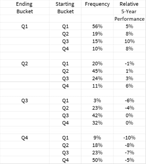
If you end making high returns you will make good money, and if you end making poor returns you will lose money vs the benchmark. Stocks which stay in the middle perform like the average and if they slip, performance is significantly weaker.
As I say, the sample size is small and I don’t place too much emphasis on it, but I would like to look for some wider studies, and I am sure there will be a number. I shall return to the subject of how such quality strategies perform in different time periods as that is really significant at this juncture. But buying quality has worked and good companies tend to stay good companies which sustains the relative performance.
The post Decoding the Quality Factor appeared first on Behind The Balance Sheet.
September 4, 2023
Big Tech’s Invisible Threat
Sometimes, having decades of experience in the stock market feels uncomfortable – it can make you too fearful. If you haven’t read The Money Game (amazon.com or amazon.co.uk) by Adam Smith (real name George Goodman), then read Chapter 12, where he explains the phenomenon far better than I ever could. It’s about history. Those of us who lived through it have vivid memories of the dotcom crash and as a consequence were far too conservative in the Covid tech bubble. Now, it’s all unwinding, much like last time, but faster, and in greater size, as the stocks are bigger.
Here is Bill Gurley, one of the best tech investors in the world, on the subject:
https://twitter.com/bgurley/status/15...Gurley is spot on. The believers will anchor on the 12-month price high, a dangerous strategy. Twitter’s board sent a clear message about that approach when they accepted Elon Musk’s bid. That should, but probably won’t, discourage those who follow Cathie Wood of Ark Invest.
I have been chuckling recently as the value investors have started to sniff around tech – a big-name investor and someone I respect emailed me last week to ask which tech stocks I would buy on a five-year view. Schroders value team put out a blog “Is misfiring Netflix now a value stock?”
Nick Kirrage, co-head of the Schroders Global Value team (a former client of mine and a smart investor), said: “Areas of the market that have the biggest chance of falling in value are those that are the most expensive . . . There are some phenomenal tech businesses out there, and the time will come when value investors like me will have the chance to buy them. It’s just a matter of being patient.”
Given the pace of some of the declines, he may not need to be too patient. David Sacks highlighted some of the falls using data from tech-focused investment fund Altimeter Capital. The de-rating of the internet index vs its long-term average, let alone the fall from the eye-watering peak, is enough to arouse interest.
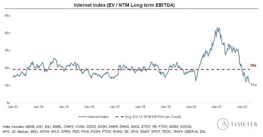
Source: Altimeter Capital
EV:sales is one of my favourite valuation parameters and has become the fashion for loss-making tech stocks. I shall return to this in a future article. The SaaS Index has now dipped below its pre-Covid median EV: Sales, having seen a 50%+ decline from the peak. It’s still not exactly a bargain at 7.1x forward sales:
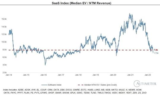
Source: Altimeter Capital
In the dotcom bust, “value” buyers would sniff around a stock that had been cut in half only to see it fall in half again. And then again.
Definition of a stock that’s down 90%? One that fell by 80%, then halved.
And you don’t need me to remind you that 40x Ebitda and 16x revenues are daft valuations. There are of course companies which justify that – one in 100 tech stocks. If you buy stocks at those sorts of prices, the odds are you will lose money. At 8x revenues for a software stock, the odds were in your favour for the past few years, but that was an unusual time. It’s conceivable that it’s repeatable, but it’s far from a low-risk strategy. The fall from an overpriced top is never a useful guide to where value lies.
There is one factor which Nick Kirrage, and you, should bear in mind. And that’s stock options. I have written in the past about stock-based compensation and the pitfalls for investors and I am now writing a three-part series for this Substack (interspersed among normal service, as not every investor is an accounting geek). I start by looking at the reaction of companies to the fall in their share prices.
What now, after the fall?Everyone in the tech companies loved stock options when the stocks were going up – employees got free options, the stock price was going to the moon, and they became rich. Management loved them because they got LOTS of options; and staff were happy because they were being paid often a ridiculous amount for their efforts. Shareholders couldn’t really complain much because the stocks were doing well – who cared about the 5% dilution when you had a 100% capital gain in a year or less?

Source: Lamborghini
Fast forward 12 months and the picture doesn’t look quite as attractive to tech employees. That Lamborghini you bought on the back of a week’s gain in the stock price may have to be paid for in real dollars. Your options are so under water that there is no chance that they will make you any money. Employees can then become so unhappy that they look for another job with stock options which are actually worth something – because if you start at a new company, they will offer you options based on today’s stock price.
So you certainly should not be surprised – and you should perhaps show a little understanding – when management reprice employee options. In reality, they have little option (sorry) if they are to retain staff. This is probably already happening. Here is Coinbase, the crypto platform, which reported Q1 results recently and its stock-based compensation charge had gone from $105m in Q1 last year to $352m; it was $263m in Q4.
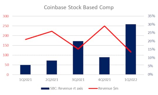
Source: Behind the Balance Sheet from Sentieo data
Meantime, its revenues are falling and the stock price has collapsed:
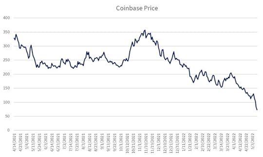
Source: Behind the Balance Sheet from Sentieo data
So the market cap has shrunk 80-odd per cent, while the stock based compensation charge has gone up more than 3x. One reason might be more staff. This will not be true for all tech stocks. Many of them will be laying people off instead. Investing app Robinhood has one of the highest ratios of stock-based comp to revenue (87% last year in our screen!) but has apparently laid off about 9% of its employees.
More common, I suspect, will be that companies issue additional options – if the share price is falling fast enough, employees may be spooked and management may feel the need to issue even more options to retain them.
Where options are repriced, the accounting treatment is to value the new options and amortise the difference vs the original over the remaining vesting period. So we may well see a pickup in stock-based comp, but as every company seems to add it back to adjusted earnings, and analysts seem to ignore it, I am not sure there will be the share price reaction that would result if companies switched from issuing shares to paying in cash. Although that will likely also be a trend.
Therefore, this is a pattern which is unlikely to be unique to Coinbase. If we look at options struck at Alphabet and Meta, to pick two random examples:
Meta Restricted Stock Units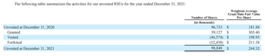
Source: Meta 2021 10-K
The Meta stock price when I wrote this piece in mid-May 2022 was $190. It was $336 at December 31. The average options are worthless and need a 30% hike in the share price to be worth anything. Expect Meta to reprice those units, representing 3.6% of shares in issue. It’s not the biggest issue for Meta right now, of course, but I would factor in 5% dilution into my valuation calculation and I would do some more work to calculate the annual dilution, although 5% is probably a safe number.
ConclusionBob Farrell’s 10th rule:
Hopefully, the correction (or dose of reality) in the tech sector will mean a greater differentiation between strong businesses and fads going forward. The fads will fade away and there will be a lot of zeroes – among them will be outright frauds and some simply over-hyped situations where there was no intention of theft. For many companies, impoverished shareholders will see further declines in the value of their holdings as stock options are used to retain talent.
For the stronger companies that are left, there will be cutbacks – I was surprised that at its Q1 results, there was little mention of cost-cutting at Netflix, for example, as that is one obvious way of addressing their profitability issues; subsequently, they cut Harry and Meghan while 150 employees have been laid off (more on Netflix coming here soon). But the norm will likely be the repricing of stock options across the sector. This will make shareholders even poorer, but managements have few choices.
Paying subscribers get a screen of the main stock option offenders in the US and Europe. There are even some quoted stocks whose stock-based comp is greater than revenue! The list includes a well-known household name with a market cap in the tens of billions which looks at risk here, but I flag more than a dozen names whose stock prices are down 70% or more where SBC looks to be a significant risk.a
The post Big Tech’s Invisible Threat appeared first on Behind The Balance Sheet.
August 28, 2023
A Multi Decade Inflection Point
By definition, a multi-decade inflection point doesn’t happen very often. We have had 40 years of falling interest rates, a fabulous tailwind for most assets and for the use of leverage. Interest rates cannot rise that much because of huge government indebtedness, hence the case for financial repression where rates are kept low and government debt is inflated away. Even if you don’t believe in the financial repression argument, it’s arithmetically impossible to have another 40-year tailwind from falling rates. (Unless you believe that rates can go to -5%; I would have thought that impossible at one time, but I am more imaginative now, having seen too many impossible things happen in markets over the past decade).
Inflation is here to stayOf course, I don’t know this for sure. There are three main reasons why inflation will be a theme for at least the next decade:
Globalisation has been a key driver of disinflation for probably the past 30-odd years. Even if relations with China were not strained and Covid had not opened our eyes to the supply chain risks, there would be a limit to how much disinflation further outsourcing to Bangladesh or Vietnam would bring. But the onshoring drive to make supply chains less vulnerable and to reduce our reliance on China will clearly be inflationary.The demographics are unfavourable – the baby boomers are retiring and the dependency ratio (effectively the ratio of retired people to people of working age) will rise in many Western countries. There will be fewer workers and although increasing numbers of robots will alleviate the worker shortage, this looks likely to be an inflationary pressure (although it hasn’t created inflation in Japan).Measures to combat climate change will be expensive – we could end up with electricity that is very cheap to produce and will bring us some relief from inflationary pressures, but that appears over a decade away. In the meantime, additional capacity will be built, often duplicating existing plant, and this greener capacity is likely to be a burden on consumers. Why this is central to investment strategiesInflation is a wealth tax. It hits the poorest in society most but it also hits the rich, if they have not invested to defend their capital. Bonds are a disaster in an inflationary environment. In the 1970s, the last period in which we had persistently high inflation, equity indices did not always keep pace and only select groups of stocks managed to deliver a real return.
Most importantly, I doubt that there are many professional fund managers around today who were investing in that period and who have hands-on experience of coping with the impact of inflation on their portfolios. . This is likely to be a very different environment from the ones we have become used to, particularly recently. The terminal value for a growth stock in 20 years might look quite different from today in an inflationary environment, unless it has inflation-linked revenues. We shall need to change our thinking.
David Einhorn’s approach to inflationI recently talked to hedge fund manager David Einhorn, the founder of Greenlight Capital, whose portfolio is heavy on inflation protection. I am not sure if it was assembled with that objective in mind, rather these stocks are more likely to be ones he liked and where there is an inflation-protection overlay.
The first type of inflation protection is fee-based revenues. Brokerages come in different forms, but the commonality between a stockbroker and an insurance broker (or even a travel agent – remember them?) is that their revenues are a percentage of the clients’ transactions. So as prices go up, their fees are linked, and there should be a good element of inflation protection. They are people-intensive businesses, so they are inflation-protected rather than inflation-proof. David Einhorn has a position in a payments processor which, similarly, has percentage fee-based revenues.
The second type of inflation protection is sunk costs. Those readers who are old enough to remember the 1970s and sad enough to have an interest in accounting may recall something called CCA – Current Cost Accounting. Yes, even back then the accountants were dreaming up ever more marvellous ways of reporting, mainly it seems to give themselves more work and more fees. Under CCA, if you were in manufacturing, as most of the economy was then, you had two sets of accounts – the historical cost accounts were drawn up on the same basis as they are today. The current cost accounts purported to show what your profits would be if you had bought your fixed assets in today’s money.
It was more complicated, but the basics were something like this. There was a massive book of indices where you could find out what inflation had done to the cost of your assets. Say you had a press which cost you £10,000 15 years ago and had a life of 30 years. Today, because of inflation it would cost, say, £30,000.
The historic cost accounts had the asset sitting at cost £10,000, depreciation £5,000 and net book value of £5,000. The current cost accounts would have the asset at cost £30,000, depreciation £15,000 and net book value of £15,000. You get the picture – the asset used to produce your widgets had gone up massively in value. This confers an important advantage on you, as a new entrant wanting to compete with you using a similar press would have an entry cost of £30,000 and would have to charge prices commensurate with making a return on that investment. Your returns on a £10,000 cost are going to look pretty special in that environment.
Einhorn has two types of asset that seek to exploit such a situation. One is a housebuilder with an extra long land bank. This is exactly the type of situation to look for. Land is scarce in the UK and has been subject to inflation for many years, so smart investors have always looked to own builders with longer land banks. The valuation differential between builders with short and long land banks is only going to increase in the UK and it will also become more significant in the US. But this applies to any type of sunk cost.
This has a profound implication – for the past 40 years we have favoured capital-light businesses that enjoy high returns. Low-return businesses have been less attractive. The reason is that high-return businesses have delivered long-term returns to shareholders that have been close to their returns on capital; they have therefore been more attractive than their ugly low-return cousins. This relationship may not exactly be broken – a high-return business with pricing power will still be a good asset to own in an inflationary environment. But there will likely also be jewels among those ugly low-return businesses, which requires quite a change in thinking.
The second type of asset that Greenlight owns to exploit this situation is one where there has been a historic lack of investment, preferably with a long construction lead time – mining is the classic example. Again, there is a sunk-cost element which will play out with inflation, but here the capital cycle is also at work.
Those of you who have read Edward Chancellor’s books Capital Account or Capital Returns will be familiar with the concept – it’s usually very profitable to buy stocks in industries where capital is exiting. When the industry starts to ration capital and to be more disciplined in adding supply, or where it is closing capacity, returns usually improve significantly. This is true today of many mining and energy investments, and again this strategy is an effective hedge against inflation.
I shall return to the subject of inflation many times in this Substack and will explore the Capital Cycle in an Age of Financial Repression soon. I talk about the capital cycle in chapter 4 of my course How To Pick Winning Stocks.
The post A Multi Decade Inflection Point appeared first on Behind The Balance Sheet.