
Emily Henderson's Blog, page 82
August 4, 2023
The Farmhouse Kids’ Bathroom Deep Dive – The 8 Fabrics I Considered For The Bathtub Nook Curtains

The bathroom reveal is coming on Monday, but not without me needing to try out eight different fabric options for our totally unnecessary but so cute tub niche. I can say, almost unequivocally that I love fabric more than most design elements. There are endless patterns and colors and for the most part, it’s super non-committal and flexible (besides upholstering your sofa, for instance). I started my career styling exclusively for magazines and for whatever reason I found myself in the fabric district in New York every week (shout to Mood and M & J, if they are still around). So my fabric collection is LARGE and for interiors, I absolutely don’t just stick to “decorator” or “home” fabrics (I would for upholstery, obviously, but not for virtually anything else). Often the fashion fabrics are more interesting and fun. So between what I already had and a trip to a few local fabric stores I found no less than EIGHT options that I thought could work.


As you can see the tub stayed in the place that it was originally but we designed and framed it out this little niche mostly to put this curtain idea. I guess I just thought it would be fun and playful and an opportunity to add color and pattern (again in a non-permanent way – so I could have more fun with it). Those shots are before we painted the white to match the white of the tile 🙂

At first, I tried just white, and it was sweet, but definitely low impact. It felt like I was missing an opportunity to be more fun – especially for a kids’ bath.


Almost all of these were real contenders. There wasn’t ANY that we were like “bad, no, take it away”. They all did something totally different to the room. Let’s dissect…
Option #1: Large-Scale Green Damask
Iphone shots coming at you. I liked this one SO MUCH. It instantly made the bathroom more interesting and it certainly worked color-wise. The scale of the damask looked so good with the tile – contrasting without being too competing. But we didn’t stop there…


I love a ball fringe or tassel fringe a lot so I grabbed a few samples (quarter yards) to play with. Admittedly, I wasn’t very impressed with the local selection (New York and LA both have stores full of one million trim options and it’s incredibly fun and inspiring…but Portland was definitely lacking or maybe I just don’t know where to go yet). Some of these fabrics wanted fringe, some didn’t. The more decorative/patterned fabrics looked cute with them but it sure did go old-world-fancy really fast (so less Scandi farmhouse, which is totally fine, but you have to know you are taking it in a different direction).
Option #2: White, But Make It Special
I really liked the white in here – calming and simple, and had it been our bathroom I might have continued to work with this vibe (washed linen, tassel fringe, etc) but it did kinda bore me for a kids’ bath.


The gold tassel fringe looked the best, though, and really pulled in the faucet brass.

It could be pulled back with a tie, creating a cute fun shape, too. These were just two white linen tablecloths that I had (they didn’t match which you couldn’t tell).
Option #3: White, But Make It Special (With A Texture Pattern)

I also loved this Swiss dot fabric, which was so sweet in person (and whimsical) but again, pretty darn low impact. It was also so thin that it would need to be professionally sewn to ensure that it didn’t look messy and haphazard.
Option #4: Bold Pink And Green Floral
Well, that really changed the vibe, didn’t it? Birdie LOVED this one and honestly so did we!! But I don’t think the bathroom was big enough (nor was the niche) to handle this much fabric in such a large scale.
Option #5: Plaid + #6: Gold Stripe

Both of these were real contenders at first. The green plaid felt appropriate (I think it was just shirting material), but a little on the safe side. Then the gold and white was so exciting but very “GO DUCKS” next to the green tile.
Option #7: Sweet Floral With Green And Butterflies
This one was a last-minute add in the fabric store. I didn’t LOVE LOVE the fabric on its own – a little too basic/sweet for me (but I could be biased because it was a cheap fabric so maybe if I had found it vintage I would like it a lot more?). But it actually worked really well! The green looked good and it’s hard to see but there are also gold butterflies.


If we had gone with this one I would def add the ball fringe or tassel fringe – it needed more style to make it cool enough (IMHO). Birdie also LOVED this fabric and wants to sew pillows out of it (their sewing hobby is still in full swing, BTW – y’all we have SO MANY KID-SEWN PILLOWS).
Option #8: Large Scale Teal Gingham
When we put this one up Gretchen and I both loved it. It felt like the right vibe (Scandi farmhouse) but still whimsical and certainly not boring.

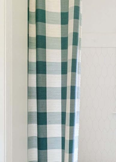
It was a “home” fabric and on the more expensive side than the rest of the fabrics (but still coming in at $15/yard and we needed six yards).
Down To Two…
We knew that this fabric would change the rest of the styling of the space – and while these aren’t crazy different they certainly change the mood/vibe. When you see the full reveal you’ll see what we chose on Monday! So if you love curtain porn and want to see this whole space styled out, set your calendars/alarm 🙂
*Pretty Photos by Kaitlin Green
The post The Farmhouse Kids’ Bathroom Deep Dive – The 8 Fabrics I Considered For The Bathtub Nook Curtains appeared first on Emily Henderson.


August 3, 2023
The Farmhouse Kids’ Bath Deep Dive – Our Vintage Dresser Turned Custom Vanity

One of my favorite (best?) moves is to bring vintage into every room (obviously), but it’s harder to do in bathrooms aside from styling. I’m not sure if this idea was born out of desperation (I don’t have a vanity but I have this dresser, ok!) or if I had planned this from the beginning but I know this much – I intentionally didn’t get a readymade vanity in the hope of using something vintage. I love this English pine antique dresser so much (the keyholes) so when I was asked what our plan was for the vanity I thought, “Uh, would this work?” and we went for it.
 photo by sara ligorria-tramp | from: mountain house: the kids’ room reveal!!
We originally shot this dresser for the kids’ room reveal at the mountain house (four years ago?? and I’ve been hoarding it ever since (I intentionally moved it from there knowing that it would work so well in this house somewhere). But Jamie (ARCIFORM) had to do some magic on it to turn it into a vanity.

Now, very often when someone takes a vintage piece and turns it into a vanity they use a vessel sink on top – I think it’s just an easier application. I did this in my kids’/guest bath at our Glendale house:
 photo by tessa neustadt | from: guest bathroom reveal
This totally worked for this bathroom (more midcentury and graphic) but I not what I was going for in this farmhouse kids’ bath (also pretty darn sure that there wasn’t enough room between the vanity and the toilet per code – but we didn’t use permits on that old bathroom soooooo…).

Jamie had to measure and cut the hole for the sink, then I believe that he reinforced the underside with some wood to make sure it could handle the heavy sink. He secured it from the underside as well.

Of course, he would need to cut a hole in the back for the plumbing, like so…


Jamie did such an expert job at this – although I’m sure it could be DIY’d if you have some carpentry skills.
Wait, So Can You Still Put Storage In The Drawers?
You betcha! You lose all storage on the top drawer – it’s just a dummy drawer that houses the sink. The bottom drawer fully functions with lots of space. But the trick became the middle drawer.

Jamie hacked out space for the plumbing and built a frame into the drawer – thus preserving the storage space on each side.

It actually holds a lot now. The drawers are tall enough to put in more vertical things upright (like shampoo, conditioner, etc.). There’s even a decent amount of space in front of the cutout.

And then the bottom drawer fully functions, like it did before.
The Countertop

Now this dresser was on the narrower side. We knew for sure that we had to do a wall-mount faucet because we wouldn’t have the space for a deck mount. The first wall-mount faucet we chose came out much farther than this one – technically the water made it into the bowl, but it looked dumb. So I had an extra one of these (long story) and we changed them out which isn’t always as easy as it sounds, but worked in this case…thankfully!!

We drew out the backsplash to be this pretty shape and I just LOVE how it turned out.

There she is. Another vintage dresser turned vanity piece in the books and we LOVE IT. I’m sure we should seal the wood now that it’s in a bathroom which we haven’t done yet, but I also may never 🙂 Come back tomorrow for some bathroom styling (the tub niche curtains) then the full reveal on Monday! xx
*Pretty Photos by Kaitlin Green
The post The Farmhouse Kids’ Bath Deep Dive – Our Vintage Dresser Turned Custom Vanity appeared first on Emily Henderson.
August 2, 2023
Want Em’s Eclectic Living Room Look? We’ve Got 5 Great Tips And CUTE Shoppable Picks!

When someone refers to a home with a “modern farmhouse” style the immediate visuals are LOTS of whites, woods, hits of black, and very clean lines. An NY Times article that recently came out about the style said, “Love it or hate it, the modern farmhouse is the millennial answer to the baby boomer McMansion.” Honestly, that statement feels very true to me…as a millennial:) And while that version of “modern farmhouse” isn’t my particular style, there is nothing wrong with it for those whose style it is. However, in a world that is also increasingly obsessed with cool vintage and a more “granny” aesthetic, I think many of us want to move into uniqueness, color, and warmth. So when I saw Em’s “modern” farmhouse living room, I thought, “YES! That’s the kind of farmhouse I would want to live in.” If you also had a similar reaction to this room reveal and would like to recreate the key elements, then you are in the right place my friends. I do want to say that I think that it’s important to note that the overarching way to nail this “modern” version is individuality. You need to bring yourself into it – your heirlooms, your treasures, your own beloved color palette. Yes, Em had the advantage of years of thrifting and a healthy budget but I promise with time and patience, your home will look just as special.
But since we love to teach and send you in the right direction, I am going to break down the elements that all together, really make this room sing. Ok, class is in session.
LIGHTING
Oo baby, do we love to mix and match lighting styles and we learned from the master, Emily Henderson. It’s such a user-friendly way to make a home feel collected and unique. Think about all of Em’s homes…she’s been doing it forever. But for the farmhouse, Emily used her three favorite types – modern traditional, sculptural, and of course, vintage/iconic. Take the photo above for example. She started with those wonderful modern traditional double sconces from Rejuvenation as the “base,” since they are “more permanent” lights. She wanted them to match the style of the farmhouse’s architecture. Great, layer one complete! Then to add in some visual tension (in this particular shot) she decided to bring in this incredible and iconic Noguchi floor lamp she’s wanted for basically a decade. Both are technically modern, but they’re of two totally different styles and eras. The colors are also all neutral which helps them to play nicely together:)
Inspired? Well, I’ve picked out nine pretty affordable “modern” options to help you get the look…
Modern Lighting
1. Andre Wall Sconce | 2. Gold Ambient Lamp | 3. Crissey Sconce | 4. Walnut Plinth Floor Lamp | 5. 3-Head Floor Lamp | 6. Burnished Brass Pendant Light | 7. Black/Gold Ceiling Fixture | 8. Ceramic Lamp with Tapered Shade | 9. Antique Brass Gallery Sconce
The lighting market is so good right now because look at these options! It’s hard to choose favorites but for a sconce, I love the new Rejuvenation sconce (#3). It’s similar to the one Em used but is just a little less detailed which is just my personal preference. Both are beautiful! For a floor lamp, that World Market cutie (#4) is one I could even put in my current apartment! So versatile, but works great for an eclectic modern farmhouse with that warm wood base and simple drum shade. Then lastly for a table lamp, the white Target x Studio McGee (#8) is so good. The shape is simple but special (DRINK) and it has a mix of materials – ceramic base and fabric shade. I told you it was good!
Sculptural/Handmade-Looking LampsIs it an Emily Henderson room without a sculptural or handmade-looking lamp? Not often. They act as both a piece of art and a source of light. Win-win! This is also where the “eclectic” part of “modern eclectic farmhouse” starts to come into play.

1. Naomi Table Lamp | 2. Ceramic Geometric Lamp | 3. Ivory Table Lamp | 4. Ruins Ceramic Sculptural Lamp | 5. Tournage Oak Wood Lamp | 6. Square Table Lamp with Tapered Shade | 7. Blonde Sculptural Lamp | 8. Ceramic Lamp with Tapered Shade | 9. Cassandra Table Lamp
The good news is the market is FULL of them! Why? Well, they look good with almost any style, bringing in shape and texture. Take #5 and #7 for instance. Both have a modern, interesting shape in an organic material but are offered at two different price points. Something for everyone! Also, if you only want to dip your toe into this style then #2, #6, and #9 are still awesome but on the simpler side. But if you want to go for some more drama then #1 and #4 are truly excellent.
Vintage And Vintage-Inspired LightingVintage lighting has a special place in our hearts and will without a doubt always bring soul and uniqueness to your farmhouse style (or any other style for that matter).
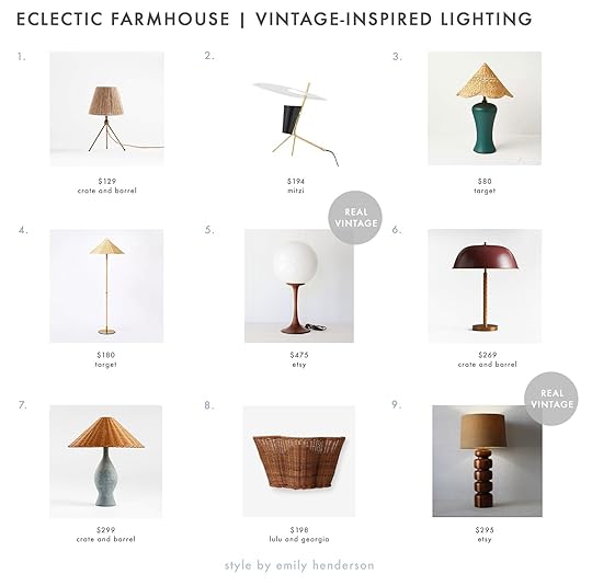
1. Ellery Tripod Lamp | 2. Kenly Table Lamp | 3. Ceramic Lamp with Tapered Shade | 4. Floor Lamp with Tapered Rattan Shade | 5. Mid-Century Round Orb Lamp | 6. Brown Suede and Metal Dome Lamp | 7. Green Ceramic Lamp with Rattan Shade | 8. Kalani Sconce | 9. Mid-Century Turned Wood Lamp
Clearly, most of these are of the “inspired” variety but can’t you see how much life they would bring to an eclectic farmhouse space (especially paired with some modern fixtures:))? The natural fibers of #1, #3, #4, and #7 give off an instant warmth and softness. I really love that #8 is a sconce! How pretty would that look? Then for a more modern feel that still leans vintage, look at #2 and #6. I’ve actually considered buying both of those for my house too. But there really is something special about the real thing like #5 and #9.
COLOR AND PATTERN

Ok now that we’ve got lighting VERY dialed in, color and pattern are 10000% the most important element. Why? Well, what sets this farmhouse style apart from the very neutral “millennial modern farmhouse” is ummm…color and bold pattern. FYI, this is not a “we hate neutral modern farmhouses”! They are great and again, if that’s your style we absolutely support you. But yes, going eclectic means deciding on a color palette and infusing your home with it. For Em, it was greens, blues, rusts, blacks, and whites, but you can choose whatever you love.
Fun PillowsFirst let’s play with pillows, ya? They are a perfect noncommital cozy decor piece that adds color and texture. What a dream!

1. Tensira Porter Bolster | 2. Modern Throw Pillow | 3. Velvet + Wool Circle Pillow | 4. Round Leather Throw Pillow | 5. Grid Stitch Pillow | 6. Brown Leather Bolster Pillow | 7. Buffalo Check Pillow Cover | 8. Corduroy Throw Pillow | 9. Woven Alpaca Wool-Blend Pillow
Mixing patterns and solids will help balance the overall look of the room so it feels fun but not overwhelming (unless that’s what you want). Then make sure you mix bold colors with more neutral tones for the same reason. This is also a great opportunity to add a little “luxe” into your room with material like velvet, corduroy ( #2, #3, and #8), or leather (like #4 and #6). For patterns, you also want to make sure if you are using more than one to vary the scale of each pattern. Oh, and lastly make sure to vary those pillow shapes. That was a lot in one little paragraph!
Boldly Patterned Throw Blankets

Of course, throw blankets are a must and the same pattern rules apply! As you can see Emily mixed new and vintage but varied the pattern scales and kept the color palette consistent. She also gave you a few examples of how to display your beautiful throw blanket:) Shall we just jump right into the shoppable options?

1. Blue And Green Plaid Throw | 2. Ezcaray Matisse Throw | 3. Ivory Windowpane Throw | 4. Handmade Kantha-Stitched Throw | 5. Ikat Striped Throw | 6. Young River Knit Blanket | 7. Ivory and Terracotta Checkered Throw | 8. Eleanor Pritchard Dovetail Throw | 9. Pantelho Throw
Emily is more of a geometric gal when it comes to patterned blankets (but plush solids are a close second)! #1 and #8 remind me the most of the one that Em used in her shoot but #5 and #9 are also so good. If you really “went for it” in the color department for your pillows, then I love the idea of using #3 and #6 for their neutral colors but large-scale pattern. You really can’t go wrong with any of these.
ART
Ahh now comes time to talk about art. Buying art can feel sooo intimidating but we promise if you take it slow, it doesn’t have to be. Emily, of course, has been collecting for years but I’ve found some pretty great options that are affordable (for the most part) and very much fit the vibe of Emily’s specific living room. But if you want more guidance, Ryann wrote an awesome post about buying art when you’re feeling paralyzed. For this type of electicism, try to be really restricted with your color palette. If you look at Em’s art, it’s an array of blues, greens, whites, and blacks. Like that’s it. This allows for the art to have a ton of movement and dimension without making the room feel too visually intense. This art both excites you and puts you at ease. Did I just describe my perfect man?

1. Abstract Framed Canvas (36″x36″) | 2. Tide IV | 3. Neutral Abstract Framed Canvas (24″x30″) | 4. Landscape Collage 101 | 5. Set of 2 Watercolor Abstract Prints | 6. 1985 Antoni Llena Poster | 7. Abstract Framed Print | 8. Moment of Night (41″x41″) | 9. Split Lines 2
I can’t tell you how impressed I am with Target’s art selection. I mean look at #1, #3, #5, and #7! They are all so pretty and come in a range of sizes (#1 is 36″x36″!). Minted is also a classic trusted affordable source that supports artists all over. I really love #2. But if originals are something you are able to invest in we love places like Uprise Art. I have a couple of pieces from them and was so impressed with their beauty and quality. I’ve had my eye on #4 and other pieces from Jordan Sullivan for years. But also never forget Etsy or Chairish! I love that poster (#6) and those are great sites to find lots of similar options. I do want to say that the bigger box stores like Crate & Barrel and West Elm have really wonderful large-scale art selections too. I know #8 is expensive but if you have the budget, 41″x41″ is HUGE!
INTERESTING OBJECTS

Ready to get into the small details? Cool. So the final touch to nailing this style is pulling out or hunting for some fun/interesting/weird objects. Bonus points if they look handmade. These can range from sculptures, vases, bowls, candelabras, etc. As with art and lighting, Em has been collecting them for YEARS but they really aren’t that hard to find as you’ll see below. Of course, flea markets and thrift shops are really fun places to hunt. But if you don’t have access to places or events like that, the internet is your friend. Let me show you.
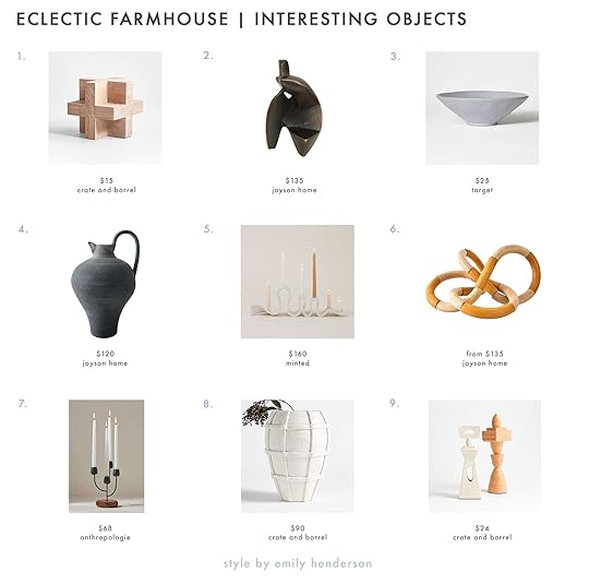
1. Wood Block Sculpture | 2. Lore Sculpture | 3. Ceramic Slate Bowl | 4. Norfolk Jug | 5. SIN Ceramics Candelabra | 6. Gordie Knots | 7. Nordic Candelabra | 8. Villa Ceramic Vase | 9. Terracotta Sculptures
Like Em’s wooden sculptures on her mantel, #1 and #6 are great affordable alternatives. Do they serve a purpose other than looking cool? No. But to us, that is purpose enough:) For the extra “organic” looking vibe, #5, #8, and #9 are so awesome. Emily actually recently bought #5! Then for some darker color contrast, #2 and #4 are both extremely beautiful and come from one of our favorite places to shop for accessories, Jayson Home. And lastly, don’t forget about places like Target (how cute is that bowl? #3) and Anthropologie. They are always coming out with cool interesting things to add just the right amount of eclecticism to your farmhouse (or any other kind of house:))
MIX AND MATCH DESIGN STYLES

We made it to the last tip! This one is less about products (even though you will need products to achieve this) and instead more of an idea since there are truly endless possibilities. What I’m talking about is mixing design styles. Few people do this better than Emily and it’s why her homes look soulful and textured yet fresh. As shown above, don’t be afraid to mix a classic mid-century modern chair with a rustic antique cabinet. Em’s rule is that you can mix any style you want as long as they share similar tones and/or materials. So for the chair and cabinet, both have gray neutral undertones and the warm wood on the chair’s legs talk to the distressed, unpainted parts of the cabinet. It’s also kind of a gut check at the end of the day to decide what looks good together but those guidelines can help:) The more you do it the better you get. Happy styling!!
Hope this is fun and helpful. Collecting pieces you love to decorate a home can take a long time so don’t put pressure on yourself. It’s a process that’s hopefully a really enjoyable one. These are just tips to guide you along the way.
Love you, mean it.
*Design by Emily Henderson and ARCIFORM
*Photos by Kaitlin Green
The post Want Em’s Eclectic Living Room Look? We’ve Got 5 Great Tips And CUTE Shoppable Picks! appeared first on Emily Henderson.
August 1, 2023
The Farmhouse Kids’ Bath Deep Dive – All Things Tile, Grout, And Playing With Simple Shapes!

I feel like I was a different person three years ago when I was initially designing this bathroom, and yet thank GOODNESS current Emily loves how it turned out. I remember sitting on the floor of the mountain house with buckets of samples from Pratt + Larson and so many pieces of paper that I had cut out into shapes, trying to come up with unique ways to use simple tile shapes. I had so much time (it was during lockdown) and had a real “bee in my bonnet” about the kids’ bath having this fun tile floor/wall border.
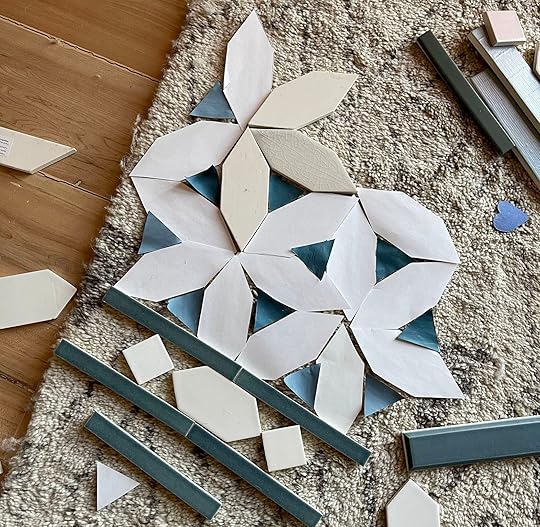
So first we chose this picket shape feeling like it could go from green to white in a way that created a cool shape. It was really inspired by this photo:
View this post on InstagramA post shared by gamble + design (@gambleplusdesign)
I played around and around and ultimately simplified it. I find that this is a pattern of mine (not sure if it’s a good one) – where the initial idea is complicated and busy, then it gets pared back and ultimately becomes the simplest version of the initial design. I guess my hope is always that styling and other more flexible and less permanent elements will help the designs come to life. I think for the most part it has worked, but in some cases, I wish I had gone a bit riskier.
At first, we wanted this whole room tiled – floor to ceiling but decided that maybe we didn’t need to do that and instead having it go up to a peg rail height would be enough impact. And in fact, maybe that would be a better look and highlight the tile more.
 Wait, Are Those Custom Windows?????
YES MA’AM. A quick note regarding the fancy windows here – you might see these more custom windows in the renders which we obviously wanted to do, but couldn’t for budget reasons. They were quoted at $5k each, for those of you still learning math that is $10k FOR OUR KIDS GD BATHROOM WINDOWS. Soooooooo…listen…we love our kids, but not “$10k for windows” much. We kept the same basic wood ’90s windows that were totally fine. And sure, there are many times (especially from the outside) where I wish they had the vintage diamond pattern had it been free (or even $2k), but there was simply no way we would spend that in this room. We felt confident that we could make this bathroom beautiful enough through styling (we were right and don’t regret that for one second).

Back to the tile. For the most part, I really liked how it looked in the renders. It was the first bathroom we designed and it barely changed in the two years of the design process which is pretty impressive/rare. I felt that it was simple but special (DRINK!) and again, that with styling it would come alive.
But that’s jumping ahead. Back to choosing the different tile shapes:


For this house, I went with less pattern contrast and instead did more texture contrast with big colors, simply executed. This is just the method I chose for this house (which I REALLY like). So we have the same green handmade tile from Pratt + Larson in a small 1″x3″ herringbone on the floor, 1″ hex on the shower floor, and green and white picket tiles on the walls.
Then The Install…

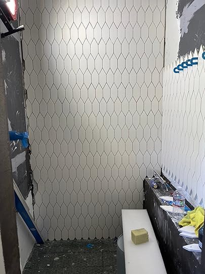
The floor tile went down pretty seamlessly. But once we got onto the walls we had some figuring out to do. At this point, we weren’t hiring ARCIFORM for their time (mostly because I was in Portland and could do it, and they were so busy with other jobs that locking down their time was hard. Plus they charged hourly which could add up quickly so I tried to make decisions by myself – for better or worse). The decision in question was how many green picket tiles do we install for the border before changing to white?


I hadn’t remembered what was in the plan (nor did we have a hard copy of the tile plan to give the tile installer). Of course, I could have tried harder to find the plan but no one is less digitally organized than this girl (I see the irony). This is endlessly frustrating when you spend hours of designer’s time making decisions and cementing them into plans, just to go rogue when asked on the fly what to do with a tile. Was it half a picket up the wall, one full one (which is really one and a half), or two (two and a half)?

The answer came pretty quickly when we realized we didn’t have enough green tiles to do more than one and a half tile border around the bottom. I love when the means/facts inform the decision, not the other way around. NO CHOICE!!! We spent hours on site trying to figure it out just to be told that we had no choice. Honestly, it was a relief.
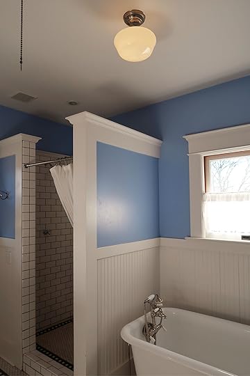
But Where Do You Stop The Tile?We decided early on that we wouldn’t go to the ceiling once a reader told me that a fully tiled room would be too echoey (and I have auditory issues). Not sure if reducing it to 60″ high really avoids that problem but in my mind it made me start questioning the floor-to-ceiling of it all.

We ended it at 74″, butting it into flat trim that would eventually house a peg rail.
The Grout Color – The Most Stressful Decision Of Them All??I think “THE POWER OF GROUT” should be a separate course in design school (maybe it is, I wouldn’t know). For the floor we knew that we didn’t want white – despite how “cleanable” it is, I KNOW that it’s not and that white grout will eventually look disgusting unless you are not messy or are a daily cleaner (not me). And yet we wanted white grout for the white wall tile. So we asked our tile installer (shout out to Level Plane) to mock up a few boards with extra tile to help guide our thoughts and feel confident about the decision.


We had him do one dark, one medium, and one lighter.
We even went to NE Portland to visit a site of his where he had just installed similar green tile to see the green grout that he had custom-made. In our opinion, it looked brown so we decided not to wait the extra two weeks nor spend the extra $200 to have a color-matched grout for our tile.
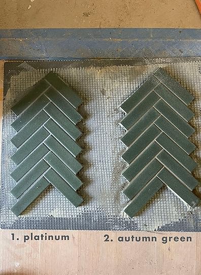
We also didn’t want to go super dark because once we saw that, it looked really harsh and too masculine. So it came down to platinum and Autumn green. We chose platinum and it’s great, but there are times I wish I had done a lighter grout.

For the shower, I’m honestly not sure why they started the white picket where they did (with just a little diamond tiny piece at the bottom). It doesn’t totally bum me out, but I feel like that was a specific layout choice. We did hex on the floor as you can see, with a square drain.
Tile Reveal!


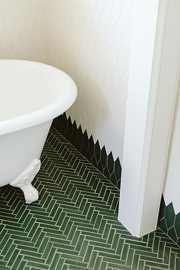
It turned out sooo pretty and the floor grout has of course lightened up so you can see the pattern even more (which we are happy about). Let me know any questions! I don’t have a $$ amount for installation because it was tied in with the whole house, but these tiles are def a lot more than large-scale subway tiles to install (just more intricacies and cuts). Hit me up with your questions in the comments.
A huge thanks to Pratt + Larson, a local handmade tile company, for partnering with me on this tile. They are always so wonderful to work with and their product has endless options (as you have seen throughout our whole house).
*Pretty Photos by Kaitlin Green
The post The Farmhouse Kids’ Bath Deep Dive – All Things Tile, Grout, And Playing With Simple Shapes! appeared first on Emily Henderson.
July 31, 2023
The Farmhouse Kids’ Shared Bathroom Is Coming VERY Soon!! Let’s Recap (And See Our New White Paint)

This week we’ll be documenting the full process of our kids’ shared bath (with a full, styled-out reveal and another YouTube video coming within DAYS – watch the first video if you haven’t yet HERE). BTW this is one of those rooms that looks straightforward, not moving any plumbing or changing the layout from the original room – easy peasy, right? But y’all NOTHING IN LIFE IS STRAIGHTFORWARD, especially when remodeling, creativity, and the internet are involved. There is just so much to break down and I have a lot to say (surprise, surprise), with a compulsion to share everything I learned. You really shouldn’t pay to go design school (once you learn renderings), future designers should just follow me around all day during a renovation year – you’ll learn so much!! It’s truly endless what you can learn (and if any designers say it’s not, don’t trust them). The creative process is a beast – so let’s hope it turns into a beauty this time, shall we??
Where Is This Bathroom In The House?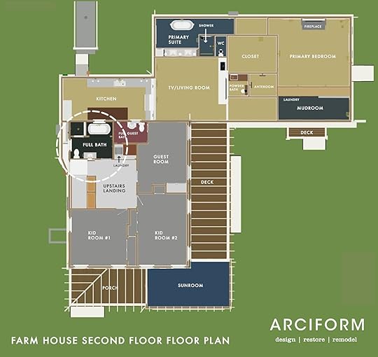
Today we are upstairs, off the landing where the two kids’ bedrooms and our guest bedroom are located. It’s a decent-sized bathroom and was the only room in the entire house that we seriously considered for months not doing much to (just paint, really). See for yourself…

See? Pretty cute! So how dare I tear this all out? Good question. Well, first off for you purists, it wasn’t original (done in the ’90s), but done with classic finishes in a totally tasteful way. Had we not been redoing the electrical and plumbing of the entire house (which we had to do, she was OLD and it wasn’t pretty) we likely would have not opened up these walls. But we still considered leaving it be until ARCIFORM did a bit of fortune-telling and reminded us that the whole house is going to be freshly, and perfectly renovated – do we really want one room to feel like it’s in a different house? Would we end up upgrading it to match the vibe of the rest later on? And if so, we should just do it now. You might have opinions about that, which I fully get. But I did picture the whole house done and leaving only this room mostly untouched started to not make sense.

But the location of everything was great (and how adorable is that vintage toilet that broke upon us trying to salvage??). ARCIFORM also pointed out a lot of tile imperfections – not the tile itself but the install, which I didn’t notice but once they pointed them out I sure did.

I want to say kudos to the former homeowners who remodeled this in the 90s – besides the paint color and maybe the light fixtures, this bathroom is totally timeless and classic.


We kept that train rack which I JUST found in the garage and have the perfect place for it. Everything else was donated to the Rebuilding Center and sold quickly.
So we set out to redesign it in an updated way that felt more “me” with a Scandi-farmhouse bent. Here were the renders that ARCIFORM did based on my design. Stephyn and Anne were so incredible at helping us see the vision with these renders (they use Chief Architect which is so much faster and more intuitive than others and can do 3D, plan view, and elevations at the same time – when you make a change it changes it across the board).
Tomorrow I’m going deep into the tile choice and why we did what we did, how we chose this design and any lessons learned for all of you design enthusiasts (hi! me!).


But you don’t go from renderings to all done without some hard work. When you have to redo the plumbing and electrical it’s really your chance to fix all the things inside the walls and make it a solid new house again (spoiler – this is also where your budget will explode, so if you don’t need to open up the walls, simply DON’T).

ARCIFORM did all the stuff that I honestly don’t even know about – Jamie (our project manager) becomes more of a national treasure every time I see old photos like this. SO MUCH HAPPENS without you even knowing it. Reinforcing stuff, adding insulation, a billion things to problem solve (our new pantry is right below so a lot of engineering need to happen). Everything. Is. A. Thing. (that might need to be a new EHD drinking game phrase along with “simple but special”). The point is, you can (almost) never make a big decision without it creating a domino effect (and sometimes those dominos are BIG!). I feel incredibly grateful that our house is basically brand new from the inside out now because ARCIFORM did such a high-quality job – no shortcuts – renovation.


When you aren’t making major changes it seems so funny to go from walls to no walls back to walls as if seven subcontractors weren’t involved. But it’s freshly done and going to last FOREVER.
Plumbing (rough-in), electrical (J-boxes), then drywall went up (you can say “hang rock” if you want to speak contractor language, although I doubt they’d appreciate it if you are a lady which is just so cool…). Then tile, trim, and paint. SO EASY. 🙂
Tile Install Progress
 Then… My Paint Fail
So last August we moved in, and the bathroom looked like this. It’s pretty incredible EXCEPT for my dumb paint color choice. I wrote about it more here, but essentially, while the tile was covered with plastic I made a blanket paint color choice for the whole house, which has worked well in some rooms, but not so much in others. The white I chose was too white and once the plastic was off the tile, I was super bummed/nauseous to see that the once white tile now looked very, very beige and it was all my fault. And y’all, I can handle ivory, cream, and taupe but this new beige-looking tile was a real problem for me (it was even worse in person, trust me).
I was SO MAD at myself and of course, had to tell anyone who stepped foot into this bathroom how much I had effed it up. It felt like such a rookie mistake. Fixable, sure, but again (sorry for being a broken record but there are always new faces here), we had JUST paid tens of thousands of dollars and it took three weeks to paint the entire house. So to have to pay to repaint and disrupt my family again because I didn’t obsess enough about the white color just felt so dumb. Plus my confidence was in question and so much self-doubt had seeped in that I didn’t even feel like I could make the right white choice on my own. Turns out decision and renovation exhaustion can affect your judgment, PLEASE BEWARE.
But we kept moving along even while I was awaiting the right paint color to magically reveal itself in my brain.

We went round and round (ha) about mirrors. Playing with a lot of vintage ones (none of which were chosen) because drilling into tile isn’t for the faint of heart.
Ultimately everything came together and y’all, this bathroom is FUN. What you’ll see this week is all things tile choice/design, how we retrofitted this dresser into a vanity, designed a new antique vintage light over the bath, and styled it out with a bold patterned fabric bathtub niche curtain. Adding color and pattern on a quiet foundation is my favorite game to play. I hope you think we won 🙂
And good news! The bathroom got repainted with a white that matched the tile, and…THE TILE LOOKS WHITE AGAIN. You might think you know what this bathroom looks like but styling goes a long way so please come back and watch it come ALIVE.
*The Pretty Photos by Kaitlin Green
The post The Farmhouse Kids’ Shared Bathroom Is Coming VERY Soon!! Let’s Recap (And See Our New White Paint) appeared first on Emily Henderson.
July 30, 2023
The Link Up: The $45 Overnight Bag Em Bought, Arlyn’s #1 Blush Rec, And THE Dorm Room Essential

Happy Sunday, everyone! Did y’all like our surprise kitchen reveal week?? It was truly such a special project and made even more special (and extremely cool) that we got to partner with Crate & Barrel! In case you missed it, here is the intro post that goes over things like budget, here is the post about ice blasting the ceiling (and a cautionary tale), and here is the REVEAL! So before we get into a very special “bathroom week” let’s talk about these links…
This week’s house tour was designed by a designer/architect, husband-wife team (ummmm the dream??) who 13 years ago moved from Mexico City to Los Angeles. The home they ended up renovating for themselves was a gorgeous 1940s Spanish-style home in Santa Monica. So not only did they restore and tastefully modernize this home but made sure to let Mexican influences be seen in the overall design, colors, furniture, art, and accessories. It’s so so good. Go check it out here!


Duffle Bag | Brian’s Outfit: T-shirt | Shorts (similar) | Sneakers | Sunglasses + Em’s Outfit: Denim Blazer | Blouse | White Shorts | Sandals | Sunglasses (similar) | Purse (similar) | Pearl Necklace (similar) | Gold Chain Necklace (similar) | Gold Bead Bracelet (similar)
From Emily: Y’all I got this new cute new affordable weekend/overnight bag that I’m very much enjoying (and even trained it up to Seattle for the T Swift concert). I bought it for Brian because he didn’t have one and he genuinely doesn’t like it when I spend real money on stuff for him, but he was using reusable grocery bags for when he just needed to throw in a few things in the car. I personally think it looks way more high-end than it is, has a cute black and white stripe strap that could be a really great gym bag or a quick overnight bag. Oh, and while I love the idea of real leather more, I find it to be way too heavy for a shoulder bag. The faux leather makes it super lightweight.
From Arlyn: I’m not wearing much makeup these days because A: it’s so hot, everything just melts off of my face anyway, and B: My toddler isn’t impressed much by my mascara. I’ll put some on before a Zoom meeting or if I’m going out and want to feel good about myself. Especially in this heat, I’ve been finding that my powder blush just sits on my skin, making it feel a bit cakey. My cream blush doesn’t really sink in and wears away quickly. So I set out to try a new blush I had been eyeing for a while and I LOVE IT. The Soft Pinch Liquid Blush by Rare Beauty (Selena Gomez’s makeup brand) lives up to its 4.5-star rating across over 6,000 reviews. It blends in beautifully, you only need a tiny bit since it’s very pigmented (which means it’ll last a long time) and the color offerings are just right. I found a new holy grail, I think.
From Mallory: These are the only hair ties I use because they don’t damage your hair and they leave noticeably less crimps in your hair when you take it out of a ponytail!! Personally, I’m a fan of them for workouts because they’re strong enough to hold your hair together even in the highest-intensity workout classes. Highly recommend if you’re in the market!!
From Jess: Last time I was at Target I spotted this extremely cute thin gold picture frame and decided to snag it (I got the square one). Did I have a plan for it?? Not exactly but I knew I’d regret it if I passed on it. I’m planning on getting a solid mat to float mount an old picture of my mom or a cute Polaroid. Then when we were up at the farmhouse last week, Em had a few which only made me feel validated in my purchase:)
We wanted to let y’all know that J. Crew is having a pretty great sale right now (and if our numbers are right, J. Crew is very popular around these parts:)) So if you are in need of an affordable flowy dress or a “not bank account breaking” breezy top then go get 30% off wear-now styles, plus extra 50% off select sale styles. Just use code: SHOPNOW. Enjoy!
From Caitlin: OMG. If you’re about to send a kid to a dorm (or if you’re a 31-year-old woman who spends hours schlepping pounds and pounds of clothes, towels, and bedding to the laundromat every week), I HAVE FOUND A GENIUS INVENTION. It’s a laundry backpack!!! I grabbed one on a whim earlier this month because my laundry was overflowing, the strap on the laundry bag I’ve been using since 2009 broke (RIP), and I wanted a hands-free option (way easier to carry). I expected to like it…but y’all, I freakin’ love it. It fits two full collapsible hampers worth of stuff (is that a helpful measuring system? Several loads if that’s easier to gauge) and there are pockets on the outside for your laundry essentials! It’s only $17 and it’s SUCH A GOOD PRODUCT. Like, gang, I’ve been carrying laundry around for 14 years. This is the best bag. Seriously – from here on out, this is going to be my go-to gift for any person moving to a place without in-unit (or in-building) washers and dryers. 5 stars is not enough!!! (The other reviews seem to match my passion, just for the record!)
Ok, that’s it for today! Enjoy the rest of your Sunday and see y’all tomorrow, xx
Opening Image Credits: Design by Emily Henderson and Sarah Weldon | Styled by Emily Henderson and Emily Bowser | Photos by Steven Mcdonald | From: The Prettiest Green And Pink Kitchen Remodel That We Completed In 7 WEEKS
The post The Link Up: The $45 Overnight Bag Em Bought, Arlyn’s #1 Blush Rec, And THE Dorm Room Essential appeared first on Emily Henderson.
July 29, 2023
20 Affordable VERY CUTE Lightweight And Airy Summer Blouses We Love (Most Are Under $80!)

Ok, so two weeks ago we talked about 16 pretty wonderful affordable dresses that were all summer heat-approved. You all really seemed to love it so we thought that this week we would chat about our second favorite summer clothing item…The Breezy Blouse TM! A lot of you might know that this is a topic that we care A LOT about, especially Emily. She has been The Breezy Blouse queen for literal years (proof here and here and basically every fashion post ever). These blouses are meant to be billowy (no sticking to your sweaty body), regular bra-approved (VERY IMPORTANT), and yet super stylish. None of us want to look like a disheveled, sweaty mess in this 95-degree weather that both LA and Portland are having. Is everyone else ok?? I hope so.
 imagine all of these tops with shorts:) but these photos do prove that these blouses can be worn year-round!
In one of our previous blouse posts, Emily even created a “scientific formula” to decipher if a blouse was cute and comfortable which I’ve laid out for you below:)

She, of course, has been branching out to other styles (like the oversized button-up) but we all love her stunning Ulla Johnson and The Great tops, right? But most of the time they are out of our budget and so that’s how this post was born! About 75% of these tops are under $100 and 50% are under $50 which I am pretty excited about. I categorized them in terms of pattern starting off with florals and shapes. Let’s get into it, shall we?
Puff-Sleeve Striped Smocked Embroidered Poet Blouse – $28 (On Sale)
Let me tell you that Old Navy has a GREAT selection for these kinds of tops at truly wonderful prices! But what I loved about this one was that it followed all of Em’s previously stated rules (hello tassels), the neutral colors are so pretty, and it goes up to 4X (well the 4X is currently sold out but maybe it will come back?)!
Ruffled Puff Sleeve Shirt – $60

For a slightly more tailored look, how cute is this ruffle puff sleeve number?! The sleeves give you a sweet drama and the buttons give you the option of how much (or not much) you want to show the girls off. This also comes in white and looks the most “romantic” of the three colors IMHO. The size goes up to XXL.
Floral Puff Sleeve Tie Neck Top – $45 (On Sale)

Similar style to the first option but I really love this beautiful blue print! It’s been a minute since I’ve shopped at the Loft (like maybe high school??) but I was also very impressed by their selection of cute tops. Definitely worth checking out!
Smocked Shoulder Tie Neck Top – $45 (On Sale)
Can you tell we love this particular style?? I just really loved this one too for the fun print that would beautifully transition into fall. This is included in the Nordstrom Anniversary sale so to get that price I would grab it sooner rather than later:)
Livvy Top – $148

Ok, so $148 isn’t necessarily what I would consider “affordable”. However, when I saw this top I LOVED it. The print, the way it drapes, and it’s from a sustainable brand. So if you are someone with a budget that is more robust then this could be a great option for you! It does only go up to an XL and for some stupid reason is not offered in their extended sizes.
Frances Blouse – $128

This brand, Emerson Fry, was just introduced to me by (you guessed it) Emily when she revealed her entry with this top and living room with this one! I reeeeealllyy loved those tops so I poked around and naturally found more (this is only one of them). Again, over $100 for a top doesn’t scream affordable but they are also a sustainable brand that uses natural fibers and has a serious goal of creating zero waste! Check out their “about EF” here to get all the info. So with an incredible mission and beautiful pieces, if you have the budget this feels like a VERY good brand to buy from. Plus, The Breezy Blouse queen herself is a massive fan:)
Ruffle-Trimmed Cotton Blouse – $30

Y’all this little ruffle, eyelet number is CUTE!!! It’s easy, breezy, will make you look very put together and the sizing goes up to XXL. I love the contrast of the sweet top with those raw-edge shorts too. Plus for $30 I just don’t think you can beat it.
The Linen Puff Sleeve Shirt – $78

Can you tell we’re in the striped section now? A pattern that is near and dear to our EHD hearts…especially light blue stripes:) I love that this is a button-up with a twist! The mock collar is super chic and those puff sleeves make it perfect for summer.
Oversized Poplin Boyfriend Shirt – $40

But for something more classic, Old Navy has this awesome oversized button-up that goes up to 4X! But to give you a little styling inspo, here are two ways Em likes to wear her button-downs in the summer…

 from: emily’s easy, throw on and go summer outfits that still make her feel put together
Ok, so it’s really just one flap out or no flaps out but notice that she sizes up in her jean shorts to make them a little slouchy and that this look could either be a little dressed up with clogs (or low heels) or a casual sandal! If you are wondering where the blue striped shirt is from here you go🙂 The pink one is no longer available:(
Mille Talia Puff-Sleeve Blouse – $198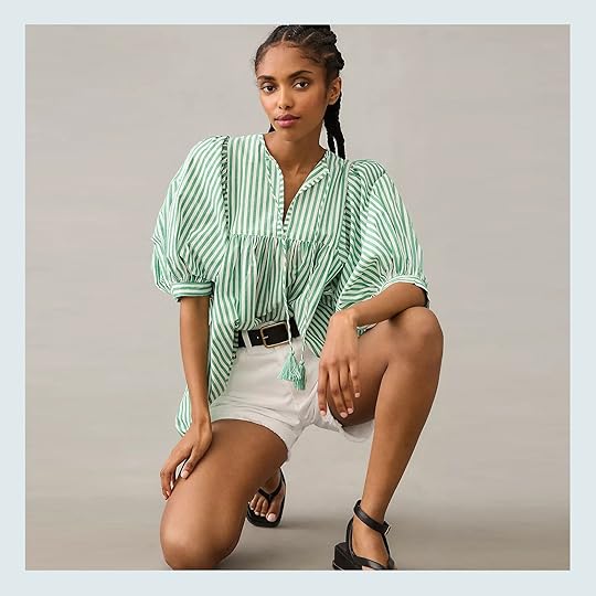
I promise this is THE ONLY top at this price point! I just couldn’t resist because this green-striped beauty screams “easy breezy summer top”. A true “throw on and go” piece if you will. Actually, Em tried on the dress version a few weeks ago too!

 photo by kaitlin green | from: i went to the mall and here is what i bought or loved (in search of cute comfortable summer clothes)
This was her exact quote about it: “I couldn’t put this dress in my basket fast enough. I’m going to wear this all summer long. The sleeves are so fun, it has pockets, and the green/white stripe is a hell yes. It’s lined and feels high quality (it should be, it wasn’t cheap). This is my dress of the summer.”
The dress comes in a few other really cute prints in case the stripes aren’t your thing but there’s a white eyelet version that’s on sale so…
Pilcro Long-Sleeve Popover Top – $118

The stripes continue but the blues are mostly gone. Ha. I really love how classic yet unique this one is. The colors are a little unexpected and the collar and front detail are super cool. This has effortless “cool gal” written all over it.
Linen Button-Up Camp Shirt – $75
See a little more blue but this time with purple! I love this color combo and the oversized short sleeves. It’s another one that feels effortless but for those who still like some structure (Jess quietly raises her hand:)) Madewell KNOWS how to do a boxy button-up!
Adeline Top – $148
I had to throw in one checkered option, right?! The shoulder and sleeve detail/overall cut had me swooning. It’s simple and sweet yet chic and also comes in FIVE other patterns and colors. 10/10.
Pleated Eyelet-Trim Shirt – $118
If you’re an eyelet lover then this is a super special option (this is the last one over $100 I promise)! The color is great and summer-y and I love that the oversized detailing goes along the trim. Also, THE PLEATING! Great for the office, brunch, etc. It also comes in black and white.
Short Sleeve V-Neck Woven Eyelet Top – $30

Just, yes. For $30 you can get this great and versatile top with just enough detailing to make it look extra special. It also comes in three other bright colors and goes up to a 4X (which is currently in stock)!
Broderie Anglaise Blouse – $40
I know this one might be a little tricky with a bra but it’s SO CUTE! I love the tiny ruffles and the eyelet pattern so much. Causal Romanticism<3 Oh, and it goes up to a 4XL!
Short Sleeve Top – $28
I am a big orange fan and always have been. So I really love this color for a summer top! It’s fun with just the right amount of detailing if you are someone who shies away from that sort of thing. Sadly, this top is on clearance and only has up to size XXL but if that works for you then I am fully in support of this purchase:)
Oversized Blouse – $25
Look at that drape! Chic, chic, chic, and I love that the front has both buttons and a tie. I just think this is a very elegant option that I might be buying for myself. It also comes in black and mint and goes up to XXL.
Textured Gauze Square Neck Top With Volume Sleeves – $37
This one is also calling my name. I love a gauze-y fabric because that really says “it’s summertime” to me. Plus those sleeves are cute and I don’t need to worry about cleavage which is always a plus for me personally:)
Clip Ruffle Button Blouse – $53 (On Sale)

Ah, we’ve come to our final pick! When I saw this one it immediately reminded me of Em. The color, the subtle pattern, the sleeve ruffles, and the neckline. I also think this is a great year-round top so no need to put it away when that fall breeze hits! 10/10
Any thoughts? Any suggestions? Of course, some of these will work in better climates than others but hopefully, if you were on an affordable summer blouse hunt you found at least one option that you loved:)
Love you mean it.
Opening Image Credits: Left – Photo by Kaitlin Green + From: The Farmhouse Entry Reveal | Middle: Photo by Veronica Crawford + From: My “Casual, Comfortable, Cool” Spring Weekend Wardrobe | Right – Photo by Kaitlin Green + From: The HIGHLY Anticipated…Farmhouse Living Room Reveal
The post 20 Affordable VERY CUTE Lightweight And Airy Summer Blouses We Love (Most Are Under $80!) appeared first on Emily Henderson.
July 28, 2023
The Unexpected Curtain Trend We Didn’t See Coming, But Everyone Is Doing (Including Emily)
Remember when I moved from my beloved, charming 1920s Mediterranean apartment into a more contemporary stark-white walled townhouse, and then wrote an article about how nothing I already owned felt right in there?
Well, if you don’t remember, you can find that here. And if you do, I’m back with more. While I will say that my “it’s all a disaster!” mania has cooled off and things are starting to feel a bit more like home—the product of taking a deep breath and hanging some art—there are areas I know need work. My cool-toned blue sofa, for one, would be so much better in a warm tone like ochre, for instance. But pish-posh, that’s a different fish to fry for another day.
 i considered going for a bold, patterned curtain in this room but between the ceiling slope, the intense plaster texture on the walls and the view of the city out the large picture window (which you can’t really see here), i opted for the simple route and was so happy with the result. | photo by sara ligorria-tramp
Today’s design discussion-slash-challenge happens to be what’s beyond my sofa: the curtains. The white, IKEA curtains that felt so pristine in my last home are suddenly as boring as a sack of all-purpose flour in their new spot. They framed my old second-floor picture window beautifully and added just the right amount of necessary softness to my plaster walls and White Dove walls (the perfect warm white, in my opinion). But these walls aren’t a glorious milky hue but rather a completely generic landlord-favorite Swiss Coffee. Suddenly, these curtains look tired. Perhaps they’ve also been waking at 3 am every morning to replace a baby’s pacifier. Such hard-working curtains, they are. And while that’s one totally plausible hypothesis, another is that…this room just needs something else.
If you were to take one tiny scroll through my saved folder of room images on Instagram or even Pinterest, you’d be correct to assume that I live for pattern and color. Except when you look at the first floor of my house, NOTHING IS PATTERNED and apart from my blue sofa, THERE IS NO COLOR. How did I get here?
In my hunt for a panacea or, at the very least, a design palette cleanse, I unearthed a bit of a trend I wanted to share that just might save my living room in its current state: the patterned curtain. I’m sure I don’t have to explain to you the absolute death grip the neutral window covering has had on the design world over the last decade (or…always?). Heck, most of the projects you see revealed around here play it safe with the ubiquitous white or flax linen panel and Roman shade.
There are, of course, a few reasons for this: they add just enough texture in a functional form (read: privacy) without fighting against or adding too much visual weight to a room’s design; they’re very easy to find at numerous price points; they’re classic; and, as mentioned, they’re a very safe choice for a usually very pricey item. Who wants to spend hundreds or even thousands on draperies in a floral pattern you might tire of before the spend seems worth it? I won’t even dignify that question with a response (no one, okay, that’s the answer).
But back to the “trend.” Interior design, in general, has really spread its wings in recent years on a mainstream level. People are wallpapering ceilings and painting everything in sight…I LOVE IT, so it’s no wonder I’ve been noticing far more designers and design content creators sidestep the white curtain for something in a rich solid hue, or, even better yet, a bold pattern.
The patterned window covering is everywhere right now, whether via just a subtle windowpane grid or a full-blown sprawling floral moment. And I can use several hundred words to tell you what that detail adds to a room scheme, but instead, let me show you.
First Up: The Solid Color CurtainI know this is a post about patterned window textiles, but I kind of want to build up to it. Because, you know, drama and all. First, let’s start with some EHD baddies:
 from: the reveal we’ve all been waiting for! caitlin’s mostly thrifted, postmodern regency deco living room | photo by sara ligorria tramp
In Caitlin’s (long awaited) living room, the grass green panels are a key part of her color palette. Without them, the room would have been predominantly blushy peach and neutrals. Plus, they draw the eye to and from all her amazing vintage finds so perfectly.
 from: moto reveal! how jess made her wfh office/living room totally multifunctional (with big help from the world’s most beautiful smart monitor) | photo by sara ligorria-tramp
Isn’t this just so pretty?? I hope you all remember Jess’ office spruce up in her beautiful Old World apartment. The blush linen just glows against the turret window, a feat likely not able to be accomplished if she had gone for the subtly of white.
 design by martha mulholland | photo by laure joliet
Moving on from our in-house friends is this vignette from Martha Mulholland. That whole home, actually, is so lovely and a testament to bold drapery. I personally think had she gone with beige or white panels in this room, it would have stolen the warmth of the window casing and woodwork. The rust makes them pop a bit more and leans into the character of the architecture.
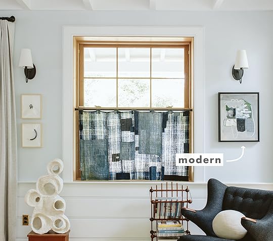
Let’s Get Charmed By Some Prints design by rose beltran | photo by sara ligorria-tramp
Behold, the photo I’ve had saved on my desktop for months that is possibly the most direct inspiration for what I want to do in my own living room. Shot for Emily’s second book, Rose Beltran’s block print curtains hit that perfect harmony between sweet, chic, interesting, and not overdone. I tried to hunt down this fabric but haven’t had much luck. Does anyone by chance know what it is?
 design by rose beltran | photo by sara ligorria-tramp
Here’s another room in that same home. Both have a modern yet cottage-y vibe, but I just think the plaid Romans here bring the fun and youthful design of the space up to balance everything else that’s low-slung (or the ceilings are really high, and even so, the point still stands). The patterned window covering is not just a design choice but also a tool.
 design and photo by ashley goldman/the gold hive
Many years ago, when I was a full-time EHD staffer, I ran a house tour of Ashley Goldman’s lovely craftsman in San Diego, and since then, I’ve enjoyed watching her update spaces like the kitchen while keeping to and respecting the era of the home. And man I love these little café curtains she did here. I like to play a game where I cover them up with my fingers and then reveal them back to myself to drive home my crush on all things print right now. The peppering of blue in the fabric is a great counterbalance to the oxblood in the rug, wallpaper, and cookware.
 design and photo by jenni yolo/i spy diy
Hello striped bamboo shade! You see, not all pattern has to be like PATTERN!!! Even something like what Jenni Yolo picked for her dining nook with a simple black and white stripe is enough to add that touch of whimsy and cool.
It took me this many words to decide that the best way to describe going for a print on your curtains is like ordering the hot fudge sundae that comes with whipped cream, nuts, and a cherry, and then asking for the add-on of rainbow sprinkles, even though they’re not on the menu. The “rainbow sprinkle” is figurative here, of course, because only an animal would alter the perfect creation that is the HFS, but the attitude behind my analogy is what’s important.
 design by dee murphy | photo by zeke ruelas
Rainbow. Freaking. Sprinkles. Dee Murphy could have easily gone the route of simple, neutral curtains. In fact, had I designed this room with all the same pieces, it’s probably what I would have done. Maaaybe I would have been bold enough to go for a tone-on-tone solid drapery but I would have never thought to pair that floral print with the vintage rug, but it works and it’s kind of a little design surprise. Some of my favorite rooms always have a moment of an unexpected choice. Something that doesn’t *super* match but works unexpectedly, and I think that’s what’s happening with these window treatments.
 design by heidi caillier | photo by haris kenjar
One of my favorite ways to introduce pattern in your curtains without it feeling scary is to stick to a very tight color palette like Heidi Caillier did in this bedroom. The gorgeous Zak+Fox fabric on the panels lives in the neutral, warm neutrals space as the bedding, wallpaper, and even furniture. That way, it’s pattern, but it’s more visual texture than a full-blown eye-catching graphic.
 before cafe curtains from: our custom farmhouse dining nook reveal (and what makes it so incredibly durable…and pretty:)) | after cafe curtains from: the dining nook restyled – an accidental style move back to being eclectic | photos by kaitlin green
Now, let’s study Emily’s dining nook before and after she brought in her vintage Japanese Boro fabric cafe curtain. It’s obviously so lovely, but it takes on a whole new life with the magic of the textile, in my opinion. And yes, I know the “before” photo didn’t have any covering on the window, but I still think it’s a fair comparison for the point I’m writing about: pattern adds zest, life, and charm. Not every room or vignette calls for that, of course, but in the instance of what I’m working with in my space, it certainly does.
Some Quick & Dirty AdviceI can’t possibly guess the statistics of how many of you reading right now are all like “Yeah, duh, pattern is where it’s at” and how many are more “Sorry, you’re just not going to convince me and I’ll die with my white curtains,” but just in case there is a middle ground between those two stances, I wanted to offer some sure-fire ways to make printed window coverings work in your home if you’re interested in trying out the look.
First, go for timeless: Things like checks, plaid, stripes, smaller-scale block prints, and even certain florals are likely never going to be “out of style.” They’re classics for a reason and have an enduring quality to them stylistically, even in more daring colors.
Don’t spend a fortune: As much as I love to tell people to invest in quality when and where they can, there are a lot of great ready-made options available for pretty decent price points (when compared to custom drapery). Another tip is not to forget to dig around second-hand markets for printed curtains. I’ve seen some of the people I follow find absolute gems for almost nothing. Take the money you save and get them laundered and hemmed to the size you need.
Test things out if you’re nervous: Want to know a fun little trick? Flat sheets or even large tablecloths can double as window panels depending on the size. Now, I’m not saying hang your sheets forever, but if you happen to have a patterned sheet you like, clip it up to your curtain rod and live with it for a few weeks and then see how you feel.
Time For A Little DIY PlanningNow that I’ve helped you, it’s time to help myself. Being that I already have 10 of these IKEA panels and would rather not have to buy all new draperies, I had the idea of dying and block printing them myself, because I have excess time on my hands as a new mother, and what else would I do with that then spend hours hand stamping flowers? In all honestly, I love a mindless, repetitive project, and I think I’d feel pretty dang proud of my work once complete every time I looked up from the sofa.

Here is a snapshot of my living room as it stands. A few things you can go ahead and ignore: the fact that my drapes are all clearly different lengths…I washed them and then only ironed half of them (the long ones) before it got dark and I had to put them all up, and then I just never got back to it. Oh, and the unkept patio behind the sliding glass doors. That’s a project for the future (stay tuned…maybe!). And of course the diaper box and unhung art in the right corner.
Do you see how the curtains feel limp, boring, and like they have the potential to be so much more? If they were the lead in a teen romcom circa 2002, they’d be on the precipice of removing their unsightly glasses, getting a chic bob haircut, and putting on a slinky red dress to inevitably win the guy and become prom queen. But for now, they’re the frumpy sad sack nerd who can’t be bothered to wear mascara.
As I mentioned, my loose inspiration is the curtains in Rose Beltran’s living room I showed above and I think that would be “easy” enough to accomplish. And by “easy,” I mean at least somewhat possible.
Take a gander at some quick Photoshop work to give you an idea of how things can look:

After digging around the RIT Dye website to find a combination of dyes that will turn the creamy white I have into a buttery tea-stained beige (a formulation they call Aged Ivory), I hunted down Rose Quartz and Lemon Yellow from my local art stores and started the search for a block print stamp and paint. My intention is to first dye all the panels in my washing machine (they actually suggest this, don’t be scared like Charles was when I talked him through the plan), get them all steamed and wrinkle-free, and then map out a grid for the flower print I bought.
You’ll have to imagine that the pattern isn’t straight on like that obviously, but rather folded into the curtains. I haven’t quite decided on the colors yet as I have some thinking to do with regards to an updated palette but I have ALWAYS loved a block print marigold or Scottish thistle. I mean, for well over a decade, so I just know that these will feel more me once finished. I think once I swap out some of my other soft goods like the pillows to better match the style, I’ll bring down the modern vibes to something more welcoming and charming.
If you’re wondering whether I’ve ever done this or not, the answer is a firm no, but I did one paint Kelly green chevrons on some curtains back in the chevron heyday and that turned out okay, so I think I’ve got it in me to do.
Thoughts? Prayers?
Shop the TrendBefore signing off so I can get to work rehabbing my existing curtains, I window-shopped a little for myself in case this plan goes south and I need to indeed buy new panels. Here are some of the ones I’d maybe consider, as well as a few I’ll dream about but likely won’t invest in.
 Amber Lewis for Anthropologie Rowena Curtain 50″x96″ | 2. Arnica Bhotah Floral Curtain 50″x96″ | 3. Abeille Curtain 50″x96″ | 4. Holli Zollinger Kalami Floral 1pc Blackout Window Curtain Panel 50″x96″ | 5. Red + Blue Poppy Flower Hand Block Printed Cotton Curtains 46″x98″ | 6. Penelope Moss Custom Curtain 50″x96″
1. Pieced Stripe Curtain 50″x96″ | 2. Blue Buffalo Check Cotton Blackout Window Curtain Panel 44″x96″ | 3. | 4. | 5. Dash – Block Print Boho Curtain Panel by littlearrowdecor 50″x96″ | 6. Tatum Ivory Curtain Panel 50″x96″
Stay tuned EHD friends for how this all turns out. These curtains are phase 1 of a living room refresh that mostly involves new textiles and styling, but I’ll be sure to keep you posted.
Until next time…
The post The Unexpected Curtain Trend We Didn’t See Coming, But Everyone Is Doing (Including Emily) appeared first on Emily Henderson.
July 27, 2023
The Prettiest Green And Pink Kitchen Remodel That We Completed In 7 WEEKS

Happy reveal day! I can’t express how exciting and downright fun this kitchen makeover has been to execute and see come to life. After doing my own three-year renovation-to-reveal process on our farmhouse, it has been incredibly satisfying to turn around a kitchen makeover in less than two months (!!). If you are just landing here today and this is all new to you, you’re going to want to head to this post to see all the before photos and read about the budget, timeline, and needs and wants of the homeowner. Then come back studied up and take in this beauty fully.
To help them launch their new line of renovation products, I collaborated with Crate & Barrel to give a new life to this kitchen. In just a bit, you’ll see the stunning kitchen island from the collection but know that there is so much more: a few kitchen island options, bathroom vanities, hardware, and, of course, lighting and accessories. Our reader/homeowner, Julie, submitted her kitchen for the makeover and we felt like it was the perfect space that checked all our boxes—timeline, budget, style, and the right space to show off the island. Then, we got to work. I hired a familiar team to me including my former PDX assistant, Sarah Weldon, to project manage and do all the renderings needed, as well as my brother Ken to be the contractor and manage all the subs. I have to say it went SO WELL, with a few normal problem-solving opportunities that we honestly sailed through together.
And before we get into the pictures and details here’s a fun video about the transformation! (just wait for the ad to play:))
Before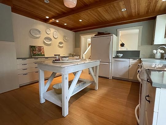
As a reminder, the kitchen before had a ton of potential and was ripe for a surface-level glow-up as it didn’t need any new electrical or plumbing, no walls moved, and no engineering—all cosmetic. Here was our to-do list again:
Install new panel-ready appliances + functioning range Remove uppers and replace with open shelving and a new hoodRefinish ceiling (check yesterday’s post for what we did)Add new hardware, faucet, and lightingPaint and wallpaper
We’d keep the following:
Existing layoutAll the lower cabinets (and bank of drawers), as well as the sink FlooringPaneling (it would just need to be patched and painted) Countertops, cutting where needed (they are pretty good and replacing them is a real thing)The whole project took almost two months, seven sub-contractors, and a lot of hard work by my team to get her done. While this is a faster and more budget-friendly kitchen remodel as compared to most, we wanted to be real about the amount of time and effort that went into it because it’s still a lot. My hope is that you can glean ideas and information from this makeover that you could implement in your own remodel.
The Kitchen Now!!!
Cabinetry Paint Color | Wallpaper | Backsplash Paint Color | Ceiling Light | Island | Stools | Knobs | Pulls | Applicance Pulls
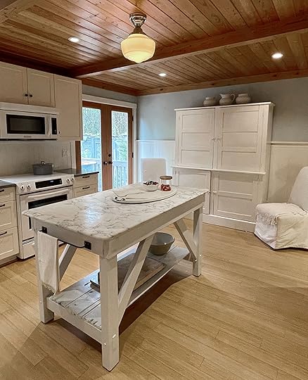
It’s hard for me not to scream HOW GOOD IS THIS but I guess I just did. We love it so very much, can you blame me? This kitchen now has so much personality, a real point of view, and a lot of whimsical touches rendered in a really fresh way. The colors all work so well together to give it depth and a real sense of space, while the island complements it all and adds so much function. Note how well the tones of the veining on the stone work with the green cabinetry. ::chef’s kiss::

Sconce | Vase | Footed Bowl | Mug
The floral wallpaper is by Kelly Ventura and was the real jumping-off point for the room’s color palette. We pulled the green (Rosemary by Sherwin-Williams) and the light blue/green of the backsplash (Conservative Gray by Sherwin-Williams) from the pattern and, frankly, I was ecstatic to do a pink and green kitchen. We weren’t able to see the stone in person for the island so we were very pleased to see so much green in the veining. Integrating the appliances went a long way to making the kitchen feel more streamlined and modern. It wasn’t a ton of cabinetry to begin with so eliminating the visual stop of an appliance front like, say, the dishwasher, goes a long way to streamline the design. If you’re curious to learn more about how to integrate your appliances without replacing all of your cabinetry, stay tuned because we’re working on that post. For this space, it was still a $4,000 investment, but far cheaper than gutting it all.

For the new hood, we bought a hood insert and integrated it into a simple boxed cabinet that we trimmed out with a little detail on the bottom. It’s painted the same color as the beadboard since there was enough going on between the green and the floral wallpaper. While I did mention we were keeping the existing beadboard, we ended up needing to replace what was behind the range since we extended it higher than it was prior when it met the upper cabinets that were removed. That was one of our unforeseen hiccups, but it was affordable and readymade so my brother was able to source the matching profile and get it up.
The Island
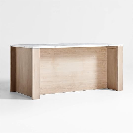
Now for the reason for the season. This whole kitchen partnership with Crate & Barrel was to feature this island which is one of the four that they just launched. Before we had even selected the kitchen we were going to makeover, I chose the Terra 78″ Marble Top and Natural Oak Wood Kitchen Island with Storage because I responded quickly to it, stylistically, and I knew it could work with so many different styles. In addition to this one, they have others that are more contemporary or more traditional. The Terra is so simple and high quality, the white oak and marble are timeless and classic, and it’s extremely functional in both prep, storage, and seating. It is priced really well for what you get and comes totally built with white glove service (extremely plug-and-play).

Mixing Bowls | Baking Dishing | Measuring Cups | Dish Towel
On top, you have three great drawers for flatware, utensils, and placemats. On the left side, you have really deep pull-out drawers which I’d use for trash and recycling. In the middle section, you have two deep drawers for larger items like mixing bowls, big pots/pans, and baking dishes. Then on the right is another pull-out drawer for a stand mixer or stock pot, as well as a shelf option should you want to put other larger pots or bowls. It’s HIGHLY functional and well thought out. Bonus points? The drawers soft close like a dream.
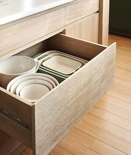
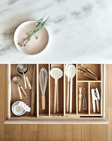
Left: Large Ceramic Batter Bowl | Right: Wood Plate | Drawer Organizer | Wood-Handled Measuring Cups | Rolling Pin | Whisk | Slotted Spoon | Wood Solid Turner | White and Wood Spoon | White Spoon | Measuring Spoons | Coffee Grinder Brush | Vegetable Peeler | Can Opener
On the back side, you have a 14.5-inch overhang which is ample for sitting and with the opening being 68 inches, you can fit three large-sized stools perfectly.

Pot Rack | Cast Iron Oven | Ceramic Olive Oil Cruet
The marble top is a honed solid stone with a lot of subtle veining for forgiveness. We were so impressed with this particular stone; it had so many soft golden and green tones and the Crate & Barrel team pulled no stops in its quality. It absolutely does not look readymade. Something to note for anyone with a sink or cooktop/range in their existing island is that you’ll have to relocate those. This island is perfect for a kitchen like this that had a freestanding furniture piece that could be replaced with a more functional island. That, or a kitchen with no island at all that has the walk-around clearance for one.
The Plate Wall
Wall Plates (vintage) | Candlestick Holders | Vase | Plates | Napkins | Flatware | Table Lamp
Our homeowner Julie (who understandably didn’t want to be on camera) is an antiques dealer and she had this incredible collection of ironstone platters. We happily leaned into this and, after arranging them outside on the floor of the deck (ha!), displayed them all on the wall. Julie assisted us and glued plate hangers to the back of each one and then we just went for it. I couldn’t love it more. You can see a lot of the age and different designs of the rims. This collection comes from years of scouring the markets and I’m so grateful that we got to display them for her (and us).
Hardware
In case you don’t remember the “before,” this bank of drawers had so much hardware with handles upon handles that made it look really busy. Sarah did a fantastic job of reconfiguring the new hardware in a way that was more modern and subdued. We combined one simple brass micro-knob on the tiny drawers and one pull on the larger ones which gives them more power and more presence, with less. This hardware is gorgeous with round backs and a sweet little round detail on the handle, too.

Bowl | Wooden Mortar and Pestle
I can’t stress enough the importance of mixing knobs and handles to make something feel truly custom and well-designed. They just complement each other so well and are scaled proportionally to the size of the drawers. We also loved that the island didn’t need hardware (it has finger pulls cut into the top of the drawers) so that it could be more of a standalone piece (think like the one in the farmhouse where we did the bank of cabinets in one color/hardware, but let the island be its own thing that still worked so well).
Lighting

We needed to replace the lighting over the island to have more presence and be scaled better for the large island. We found this linear pendant with two shades that worked perfectly in our design plan. The white and warm brass was exactly what this needed to not be too distracting with the lower ceilings. This fixture also comes with drop options for the length and can be much higher if you have higher ceilings (the rods can screw together in certain increments to give you more length options). Because Julie has two sons that are really tall, we wanted to go above their eye-line and not be right in their face, so we dropped this pendant a foot down (plus the shades).
Open Shelving
Top Shelf: Pitcher | Berry Colander Mug | Wood Board (similar) | Pink Planter (unavailable) | Serving Bowl
Bottom Shelf: Mugs | Wooden Plates | Ceramic Bottles (vintage) | Small Bowls | Large Bowls | Mortar and Pestle
Counter: Cutting Board | Canisters | Facuet | Wooden Lazy Susan | Garlic Bowl (similar) | Pepper Grinder
I get goosebumps every time I see this shot. The colors are so magical and you don’t even notice the simple stone that she already had because it works so well with the two green tones. One of our unpredicted costs was to get a stone cutter on site to take down the old backsplash that was there, drill an extra hole for our new faucet and remove part of the stone behind the range so we could slide it in further. We mixed both Julie’s pieces with a lot from Crate for the styling, keeping it warm, whimsical, and modern. Her two boys are grown (but still live with her at times) so her storage needs were far less than when they were little and she was excited to get the uppers gone and still be able to look at some pretty things. We offered to put all of her original plates and bowls up here when we left, but she didn’t want us to touch the styling so we left everything as-is (including the garlic). Julie, you were A DREAM to work with. I’ve never done a makeover with someone that was so legitimately helpful and so generous. She even gave me three of my favorite seascapes! Thank you, Julie!
Before And AftersAnd now for some dopamine-inducing before and afters in the ever-gratifying side-by-side format to see what was accomplished. I wish I could give you all an in-person tour because once you are in this kitchen, it just SINGS. The Crate & Barrel team took some video content and a lot of social so be sure to check them out on mine and Crate’s accounts so you can get a full circuit of the space (including the island).


What an incredibly fun and satisfying job this was. Crate & Barrel was so wonderful to work with, Julie was so lovely, my team killed it, and I get to stand here and give the glow of some serious collective hard work and pride. This project was such a great reminder that when you push things a bit with color and pattern, it all pays off in the end. Being in this kitchen is such a joy.

The whole room turned out just so dreamy, fresh, modern, and sweet, and with the help of the new Crate & Barrel kitchen island, also highly functional. A huge thanks to my team, Sarah Weldon for co-designing and project managing, Ken Starke as the general contractor, Emily M. and Gretchen on my team for social and production help. Crate even had Emily Bowser come up and help style to camera while I was in front of it on the day of the shoot. They all know that my favorite line is, “Many hands make light work” and in this case, I couldn’t have asked for better and more fun hands. 🙂
Thank you SO much to Crate & Barrel for sponsoring this project and post! These are the best kind of partnerships and getting to work with such a great team and brand makes it that much better.
This post was sponsored by Crate & Barrel but all words and opinions are all mine. 🙂
*Design by Emily Henderson and Sarah Weldon
**Styled by Emily Henderson and Emily Bowser
***Photos by Steven Mcdonald
The post The Prettiest Green And Pink Kitchen Remodel That We Completed In 7 WEEKS appeared first on Emily Henderson.
July 26, 2023
Reviving A Shiny, Orange Wood-Paneled Ceiling With Dry-Ice Blasting: Was It Worth It?

It’s no secret that I’m a fan of good, natural wood paneling. In fact, I talk so much about my love of natural-toned wood, I’m fairly certain Google just automatically redirects any search inquiries about it straight to my site (I wish). Before diving into the nitty-gritty of the ceilings in this home, let me remind you of how we transformed the mountain house ceiling. Does walnut blasting ring any bells? If you don’t recall or weren’t a reader during those days, we learned so much from that process, including just how many different media types could be used to “blast” the wood down to its natural grain. We ended up going the walnut route (which looked weird TBH, so we redid the tongue and groove), but there’s silica sand, corn cob, ice and baking soda, each with its own intensity.

In case you missed yesterday’s post, I introduced a very fun seven-week, no-reno kitchen remodel we did for a reader here in Portland. The space was great but needed some refreshing…the ceiling being one of the big ticket items. As it’s been about five years since we shot walnut shells at the mountain house ceiling, a new blasting technique popped up on my radar and I was eager to try to give it a go. The ceilings here reminded me of one of my less successful spraytans – orange, shiny and not natural at all. They were much, MUCH shinier in person TBH. These wood ceilings needed a 2023 revamp to find to their natural, nicely tanned, non-orange state. We were going for a happy, sweet vintage-inspired kitchen, and those shiny planks needed to go.
As you may remember, a small part of me was disappointed in the texture we were left with at the mountain house after walnut blasting (it looked both pink and orange). My hope was that with a different technique, the blasting process would leave less evidence behind (aka too much texture). Ideally, the look we were going for here was pretty similar to my original vision for the mountain house–a softer, lighter-toned raw wood that felt updated yet timeless.
 the mountain house ceiling
The goal for this kitchen ceiling was to remove the lacquer finish and with it (hopefully) the orange tone of the wood. As I said, the ceiling had great bones, with tongue-and-groove paneling and some solid beams, but in order for it to mesh well with our new design direction and color palette, the gloss just HAD to go.


From my research, dry-ice blasting seemed like it would fit the bill. It’s non-toxic and *claims* to be nonabrasive (more on that later) or at least gentler than most of the options out there. It leaves virtually no mess either, which is always something to consider when working in someone else’s home. The machine is definitely loud like it was with walnut blasting and despite it not leaving much of a trace in terms of debris, the area still had to be taped off and covered in plastic for protection. In general, dry-ice blasting is mostly used for pressurized cleaning, but almost all of the companies we reached out to assured us it would be a great choice to remove the finish on this wood ceiling. This was not me just guessing, the pros suggested this.

So I had my team contact a few companies to gather some quotes and a better understanding of the process. Costs were pretty similar across the board for this roughly 300-square-foot room, all coming in at around $4,000. The process requires a lot of equipment and securing the right amount of dry ice or liquid CO2 depending on the machine. Thankfully this amount was doable within the project budget, but it’s definitely a little spendy for a room this size.
The crew we hired was confident in their process yet still opted to do a test spot before diving all the way in. And let’s just say, there was some major troubleshooting. The first pass of dry ice had no problem removing the gloss, but it also removed chunks of wood that ended up looking like termites had a woody brunch with bottomless mimosas, and then bolted. We were left with tiny holes and an uneven surface that, while no longer shiny, gave us a brand new problem to deal with. Was dry ice even the right choice for this?! What happened to NONabrasive?? We wanted a smooth, matte, even finish. Not this.


After the guys assured us it was a matter of gauging the right amount of pressure and nozzle configuration, they came back the next day with a new approach. It looked better, but not great. While the blasting could successfully get into the grooves, it was all feeling uneven, and was weirdly hard to tell where they had blasted and where they hadn’t. Maybe it was the lighting or the residue, but whatever it was, it was kind of a bummer. Plus, with too much blasting, we’d have the same problem as before—a too-rough surface, or worse, no surface to work with at all if it was worn down too much. We needed to finish the job with something gentler that would even everything out.

Though they weren’t too happy about it, we agreed that the best way forward was to have them manually go over it all again with a pole sander. Think of a Swiffer with a sandpaper attachment instead of a dust catcher. Let’s just say I didn’t make any friends here since this is definitely rough on the body and super time-consuming to go at a ceiling this way. But had we just done this from the jump, the process likely would’ve been much faster (this all took about 3-4 days) and would’ve given us a much smoother finish. But dry-ice just was suggested by the pros and sounded COOL (pun intended) and we had to see how it worked in case it would be a good option for future, similar projects.
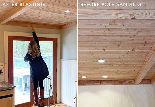

So…would I recommend it?
Honestly, probably not. What we realized pretty quickly is that the job should’ve been done the old-fashioned way from the start. Not even sandblasting, just sanding. The lacquer was thin enough to come off with a little back and forth (we know this because the homeowner, Julie, got up there between dry-ice sessions and sanded it herself, achieving the look we were going for from the start). I will say the blasting was great at getting into the grooves, sure. But, overall I think it just caused more trouble than it was worth.

We’re not mad at the results though (Thank goodness). And we learned a lot as we usually do around these EHD parts. Ultimately we were left with a look pretty close to what we had hoped for. The new, raw wood ended up pulling a little more pink, which at first felt like an issue but actually paired really nicely with the wallpaper and paint colors we chose (that you’ll see tomorrow). So I’m happy to report the ceiling is gloss-free and so much prettier. No more light glare or orange tones. Mission accomplished, with some to be expected bumps in the road (like most design risks we take).
We can’t wait for you to see the reveal as we’re pretty darn proud of it. COME BACK TOMORROW!!!!!
The post Reviving A Shiny, Orange Wood-Paneled Ceiling With Dry-Ice Blasting: Was It Worth It? appeared first on Emily Henderson.
Emily Henderson's Blog

- Emily Henderson's profile
- 10 followers

