
Emily Henderson's Blog, page 170
May 13, 2021
The Most Versatile Piece Of Clothing We Are All Shopping For This Summer
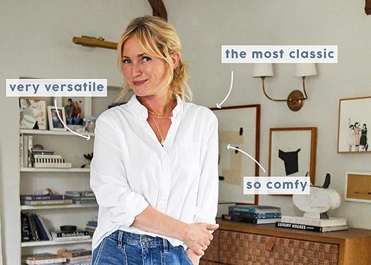
Summer is so close I can almost feel a perpetual sunburn coming on and with the world beginning to open up again, we might have a somewhat normal summer after all. Now that there are some safe ways to travel and go on vacation, us gals at EHD have been brainstorming A LOT about what we will be wearing this summer. One thing we all agreed on was a single garment that is on all of our summer wish lists. I know what you are thinking but no, it’s not denim shorts. It’s simple, timeless, and the easiest thing to style and wear all summer. It’s the oversized button-up shirt.
As Emily discussed last week, a summer uniform is really effective because it makes getting dressed so easy and since us adults are sort of required to wear clothes most of the time, it’s best to have a few go-to summer staples. In my experience, the oversized button-up is one of those magical pieces of clothing that is low maintenance and cute and can go from day to night effortlessly making it the perfect piece for summer. Let’s just say that if you are going to pack one thing for a summer vacation, this should be it. Allow me to demonstrate:
Pair With Shorts And Sandals (Or Mules) For A Casual Day Look

Button Up (similar) | Shorts | Clogs
Picture this: It’s the peak of summer and you are going to the beach for the first time in over A YEAR and you are planning on soaking up the sun all day long. The oversized button-up is the perfect companion as you can just drape it over a bathing suit unbuttoned or buttoned with shorts, and it’s even acceptable to wear to a casual lunch or dinner. So versatile.

Button-Up Cover-Up Shirtdress | Shorts
See? Even Em is on the button up kick and had this to say about hers: The cover-up I’m opting for this summer is the oversized thin men’s style drapey button-up. I feel pretty cute in this and it’s so easy to wear with enough transparency to still feel cute and fun.
Wear As A Swimsuit Cover Up
Okay, now you are at the beach (or by the pool) but let’s say you don’t want to don your bathing suit all day but you aren’t quite ready to go back to normal clothes yet. The button up is easily transformed into a swimsuit coverup so you can be ready for a dip and not feel too exposed.
Pair With Dark Jeans Or Pants And A Heeled Sandal (Or Clog) For An Evening Look

Button Up (similar) | Jeans | Heels
Now, it’s the evening and you have dinner plans. Your skin is sun-kissed but not sunburnt, the weather is a perfect 73 degrees, and you are about to splurge on a good meal. So you pair your button-up with dark-washed denim jeans, heels, some jewelry, and voila! You’ve got yourself a cool, summer evening look.
Okay, I may have gotten lost in my perfect summer day but you get the point. The button-up is the perfect summer staple IMHO. If you are in the market, there are soo many good ones available online right now but I also advise paying a trip to your local Goodwill and checking out the button-up shirt inventory in the men’s section. You won’t be disappointed. In the meantime, here are some picks we love:

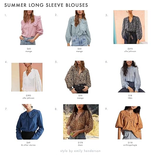
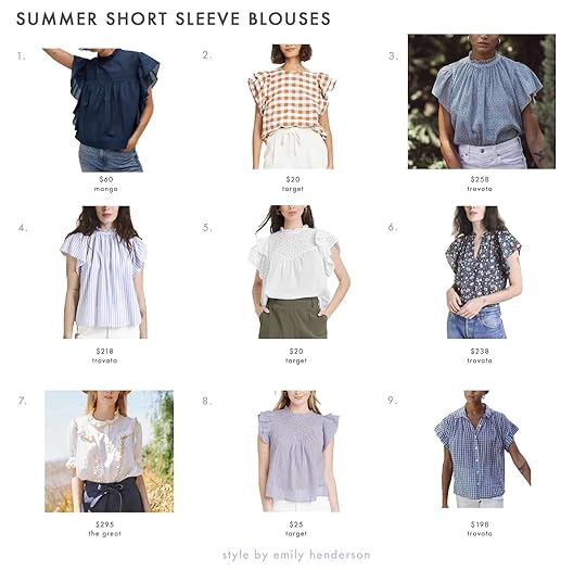
1. Big Shirt | 2. Oversized Pocket Linen Shirt | 3. Linen Shirt | 4. Airy Lyocell Blend Shirt | 5. Oversize Poplin Shirt | 6. Oversized Cotton Shirt | 7. White Oversized Cotton Shirt | 8. Boyfriend Shirt | 9. Relaxed Fit Shirt | 10. The Silky Cotton Oversized Shirt | 11. Kelali Men’s Shirt | 12. The Hero Button Up | 13. Lucia Top | 14. The Stripe Hero Button Up | 15. Oversized Boyfriend NK Shirt | 16. Button Up Wrap Top | 17. Oniru Shirt | 18. Ace Button Up
Muted greens, blues, and yellows are great for summer but you can never go wrong with the classic white number. I love #13 (it has a really special ruffle detail, too) and #5 because it is more long and oversized and could act as a dress too. Something like #9 is more fitted and would be great pair with jeans or a sexy skirt for a summer date night look.
What’s your summer staple? And do you have any safe summer vacation plans? Tell me everything. xx
Opener Image Credit: Photo by Veronica Crawford | From: 18 Pairs of Fall Boots: A Review of the Good, the GREAT (and the So-So)
The post The Most Versatile Piece Of Clothing We Are All Shopping For This Summer appeared first on Emily Henderson.


How This DIY Tambour Paneling Project CHANGED The Way Anita’s Family Used Their Home (Plus A Step By Step)
We have a rather nondescript room in our home that we rarely use. It’s an extra-long, extra-dark living room/dining room, and I’ve tried so many ways to make it special using furniture. Inevitably, we default to our kitchen or family room, and don’t end up using this space except for formal sit-down dinners.
Especially since renovating our kitchen early this year, we all end up crowding around the island to eat together. We just love being in the new space so much! It’s so bright and beautiful, and has become the center of our home. Which made me realize… in order to create that same excitement around our dining room, we needed to elevate that space, too.
 our kitchen!
At the end of the day, this drab, cookie-cuter space just needs a little architectural refinement to inspire more intentional use of this room. In order to get us out of our kitchen and into the dining room, this needs to be a corner we love to live in! So, we decided to add tambour wall paneling to our dining nook to create a sense of arrival and purpose.
Our Choice of Tambour PanelingOver the years, I’ve played so much with this wall! It’s hosted a greenwall of ferns in hanging pots, a bookshelf, oversized art. I remember with fondness the huge macrame art piece I hung one winter. Nothing has lasted—or invited more intentional use of the room. Which is why I’m determined to bring intention into the very walls!
Paneling is the perfect choice because it creates depth and infuses a room with importance. Nothing about paneling a room feels like an afterthought: this detail is PERMANENT. It’s not like you’re just slapping something onto a wall! You’re building an actual custom structure, which helps a space to feel more deliberate and refined.
[image error]
There are many different types of paneling to choose from, depending on the vibe you’re trying to achieve. We’ve already added a few paneling DIYs to our home, including a board & batten on our bedroom wall and (more recently) this funky triangular wainscoting, both in this green! Each type of paneling brings its own special flavor to a space, but this detail always makes a room feel bespoke. This time, we’re going with a rounded tambour to add texture and dimension.
The paneling we chose for this space is really special, with a curvy, welcoming detail that makes you feel like you’re in the hotel! Tambour is trendy for a reason—it’s sleek, while building visual interest that still manages to feel playful and friendly thanks to its round shape. Bringing this classic look into our home upgraded our dining room instantly.
Always Start With WHY!My background as a licensed therapist guides all of my interior design choices. After all, we’re creating space for the experiences we most want to have! In this case, I chose this look specifically for our dining area, because our family uses the dining room as a neutral place to communicate. So many amazing conversations can be had in a room where everyone feels open and at-ease!
This has worked wonders for our family. There was a moment just last year when my daughter was set to start her first week of high school, but couldn’t go on campus during Covid. Her class schedule was all mixed up, but we couldn’t find a real person to talk about it with, and stress was running high. As a family, we were able to use our quiet dining space to empathize and work out the problem together.
Often, in order to get to common ground, the environment where we share these moments needs to hold that frequency of loving acceptance. All of us just want to feel safe and secure. It’s human nature! Maybe you’ve heard of Maslow’s Hierarchy of Needs? It goes something like this:
When our basic needs for food and shelter are met, we can start to feel safe. And once we feel safe, we can find belonging in our communities. With a clear role and sense of connection, we’re able to build confidence—which, in turn, brings success! Conquering our own goals makes us more likely to help others, as we finally become self-actualized individuals.
This whole pyramid is built upon those basic human needs for shelter and food. And we fulfill those first needs at our very own dining room tables! By decorating and styling a dining room that also fosters safety and connection, we can build esteem and self-actualization right in our own homes. Form and function go hand-in-hand.
So for us, this is more than just a paneling project! We’re cultivating an intentional space where empathy is grown and invited—a little enclosure where no one can be judged. Over time, the brain starts associating that space with those feelings. So when you feel sad, you know that’s where you can go.
How To Determine The Number Of Panels You’ll Need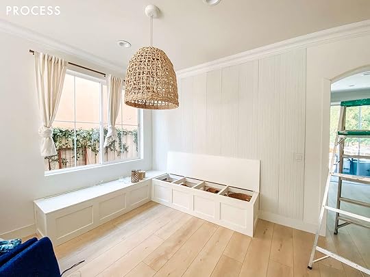
Building this little dining room sanctuary is actually a LOT easier than you would think! Paneling is a wonderful DIY for beginners, because you’re just using a nail gun and wood glue. Depending on how much wall area you’re covering, you may need to cut a few holes for electrical switches and outlets, but Home Depot can even do that for you if you have the right measurements, or rent you the equipment to cut the material yourself.
Otherwise, you’ll just need the panels themselves. To figure out how many panels we would need for our dining area, we started with a sketch of the wall, including our existing shaker-style bench and arched doorway. Travis then measured the open areas of the wall, minus the bench and door, and marked the measurements on the sketch. I often call Travis “Mr. Meticulous,” and with this project, he was in his element!
Panels come in 12” widths, and we planned to place them vertically along the wall. (I always recommend vertical lines—they draw the eye upward and make your ceilings feel taller!) Travis used our to-scale sketch to plot out the 12” increments. We determined we’d have a few different lengths to accommodate, and tallied up all the total number of panels we’d need:
3 full panels between the bench and the doorway 10 shorter panels between the bench to the ceiling 2 panels cut to various smaller sizes for the space above the arch, above the window, and between the window & bench.The archway would be the toughest detail we needed to account for, and we planned to outline this feature with moulding. Because our archway is wider than average, we had the trim custom-made by a moulding shop. To figure out the measurements for the moulding, we took a piece of cardboard and traced the arch to make a template when ordering the trim. This worked out great to get the right-sized curve!
The Tools Of The TradeWith all the ingredients prepped ready, it’s time to get into the installation! We used:
5 total panels from Surfacing SolutionPre-fabricated moulding from Advanced Moulding Tape measure Multi-tool oscillating blade (to cut baseboard) Miter Saw (to cut panels) Jig Saw (for archway and detailed cuts) Wood glue Brad nail gun Wood putty and sandThe panels come in a raw, wood state, and we decided to paint them a bright white. When it comes to impact, one of the biggest game-changers in any space is paint! Color sets such an important first-impression and informs the mood of the whole room.
In my heart of hearts, I wanted to paint the paneling a fun color—but after 12 years experimenting in this low-light space, I know better. For a room this dark, we need to use white for its high LRV (light reflectance value) in order to help amplify what little light we have. We chose Sherwin Williams Pure White to help illuminate the space. Since we’re in the dining room, I used a satin finish: you always want to be able to wipe it down!
Step-By-Step Installation
1. We started with the hardest part: the archway. To prep for the archway moulding, Travis first had to remove the baseboards where the moulding will need to fit. Using a multi-tool oscillating blade, he made a vertical cut to the baseboards at the moulding’s edge. He then scored the excess baseboard where it met the wall and pried it off.
2. The arch we ordered was accurate, but longer than necessary, since we had to order a 6’ minimum at the moulding shop. Travis re-measured and cut the arch and side mouldings using a miter saw, so they are able to join together as seamlessly as possible.
3. We painted the moulding before installation, and added the sides first, using glue and a brad nail gun. The moulding arch will go on last, since we’ll need it to help measure the panels above the archway. Travis cut these more precise panels with a jigsaw.
[image error]4. Compared to the archway, the other panels were a piece of cake! Travis measured out each panel and cut the lengths with the miter saw. Since walls, ceilings, and floors can be uneven, he measured the length of each panel again just before cutting.
5. We painted the panels first, then installed with glue and the brad nail gun. It might help to note that these particular panels have been harder to nail because of the grooves. Some panels weren’t exactly flush, because they were a little warped. It’s almost impossible to tell, but of course Mr. Meticulous wasn’t that happy about it;)
6. Finally, Travis used wood putty and sand to fill in the nail holes and seams between each panel, and we did a final touch-up with paint.
The Final Reveal
Table | Chairs | Woven Bowl | Trays | Happy & Calm Stoneware Mugs (set of 2) | Lemon Stoneware Salad Plates (set of 4) | Paint Daubs Linen/Cotton Napkins (set of 4) | Spiral Cork Placemats (set of 4) | Pendant Light

We LOVE this result! Of all the techniques I’ve tried to spice up this space, nothing has worked quite like this wall treatment! The success of our paneling project goes back to my conclusion about cookie-cutter homes: the solution to a room that’s dark and difficult is to elevate the space. When there’s only so much light, you have to invest a little more than just furniture.
By putting a personal stamp on the very walls themselves, we make the room feel more like our own, and less like a template we have to fit into. When you’ve tried every type of art-and-furniture variation, and it still doesn’t work? That’s your clue that some next-level detailing is needed. Otherwise, you’re spinning your wheels and wasting time and money swapping out objects that have little impact on the space itself.
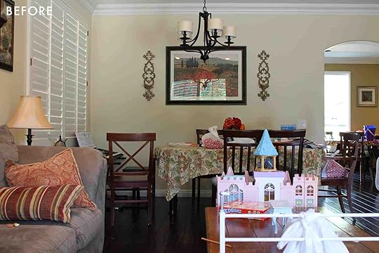
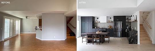
For a real fun showstopper moment, here’s the BEFORE before:
And our beautiful after:
[image error]So while paneling can feel very cost-prohibitive because cabinetry and woodworking are so expensive (!) ultimately, this wall treatment is a long-term investment in our home, and we went in with our eyes open. But if you don’t want to use Tambour, beadboard is a less expensive option that can achieve the same results: a more streamlined, sophisticated space. Actually, Em did a post a while back that has lots of good info. Go for it!
*Design and Photos by Anita Yokota
The post How This DIY Tambour Paneling Project CHANGED The Way Anita’s Family Used Their Home (Plus A Step By Step) appeared first on Emily Henderson.
May 12, 2021
The Two Month (YES TWO) Kitchen Reno That’s Sporting An Unexpected Trend
If you are renovating or following any designer on Instagram you know lead times are truly OUT OF THIS WORLD right now. I’m talking 20 weeks for even a piece of furniture (ok that’s a long one but not as rare as you’d think). So when our friend Anne Sage emailed us about this stunning kitchen and told us it was completed in two months…during covid (cut to everyone doing a spit take) we needed to know HOW! Plus I mean, look at this beauty. Like we weren’t going to show you regardless?? It’s perfectly modern and sleek while still being warm and inviting. NOT an easy combo but one that was very important to her clients as they have, let’s just say… opposing styles.
So for the first WOW moment, take a look at this before…
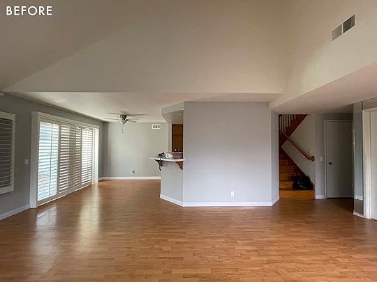
I KNOW. So let’s get to Anne and see how she made this possible in such a short amount of time.
How did you get this beautiful kitchen done in two months…during covid?? Any tips and tricks?
It definitely feels pretty miraculous that we turned it around as quickly as we did! A few reflections on how we managed to do it:
1. We jumped on a last-minute opening in our contractor’s schedule and ran with it! We met with him for the first time at the house on a Wednesday, and by Friday we were in demo mode. We didn’t even have designs for the kitchen yet! While I of course don’t suggest making hasty decisions, but I do recommend keeping your eyes open for the signs and opportunities telling you it’s go-time.
2. We chose materials based on when we could get them (i.e. ASAP!) and worked our design around that. If something couldn’t ship out in time for our install, we didn’t even consider it. (BOXI by Semihandmade played a huge role here, since their cabinets ship in 2-3 weeks from the date you order them!)
3. Incorporating vintage elements into the space also helped us stay on track. There are already so many great reasons to shop vintage—it’s environmentally responsible, it’s one-of-a-kind—but in these COVID times, it has the added benefit of no manufacturing delays since it already exists! Plus if you purchase your vintage items locally, you can have them THAT DAY. Incredible, haha!
If you can share what was your client’s budget? Did you have to pay extra to rush anything?
We started with a budget of $60k, but that included also redoing the floors throughout the entire house and painting every room in the house. We ended up spending more like $80k, after deciding to do some additional work like giving the fireplace in the living room a facelift and replacing all the baseboards. It’s a bit tricky to separate out what the kitchen itself cost, since it was all folded into the work on the house as a whole. But if I had to guess, I’d say $40k? And while we didn’t have to pay extra to rush anything materials-wise, my project manager and I definitely put in a ton of extra hours visiting the house (usually twice daily, morning and evening!) to make sure the tradesmen were staying on track. Which I guess is paying extra, in a way.

Did you have to deal with any structural issues when demoing?
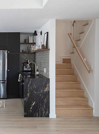
We took the main floor of the space from three small, cramped rooms (kitchen, dining, living) into one large open concept! It required opening out big chunks of the ceiling, taking down the dividing walls, and shoring things up with some new structural support beams in the ceiling. There were also several different levels of ceiling (thank you, 1980s architecture) and we made them all one height for a greater sense of continuity. All that work represented a pretty significant chunk of our budget and timeline—but it also gave us a bit of breathing room in the schedule for the kitchen materials to arrive.
What did your client ask for in terms of style, materials, and function?
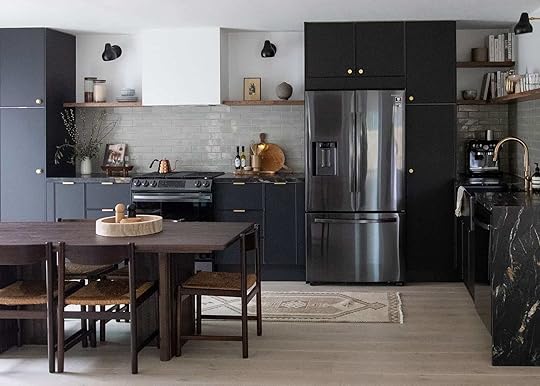
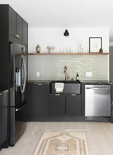
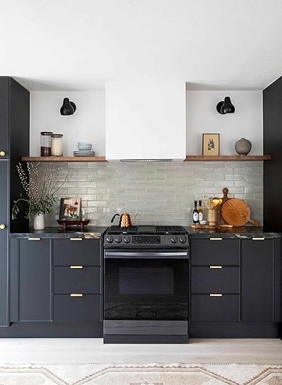
The client was a husband/wife pair and the project was a balancing act between her boho inclinations and his more modern taste. There were a few style requests they both agreed on from the beginning: They both wanted black cabinets, liked the earthy look of concrete, and didn’t want the space to feel too delicate or fussy. They’re both quite tall, so appreciate finishes and furnishings that have a certain weightiness to them.
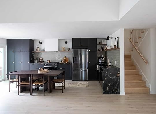
Height also played a role in some of the functional decisions we made—specifically, raising the countertops from the standard 36” to a custom height of 38”. Since our BOXI cabinets and all our appliances were off-the-shelf in terms of standard sizing, our contractor built a platform beneath everything. Rather than use the 4” toe kick that came with the cabinetry, he then painted a 1×8 board to match the matte back cabinets and used that as our toe kick. We got the clients the extra height they wanted but still managed to stay on schedule without any time-consuming customizations!
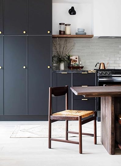
Another functional request from the client was a place to store cookbooks. It ended up being the perfect way to use that corner area to the left of the sink! Corners are SO tricky in kitchens and often end up being dead space, but I really love our little solution of continuing the open shelf into the corner and then adding a second shelf above. It looks intentional and streamlined, and makes use of every inch in the kitchen!

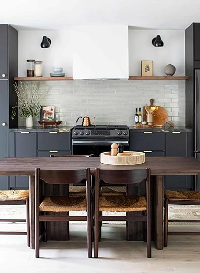
Table | Chairs (vintage) | Rug (vintage)
Was there a discussion of island vs dining table?
There sure was! We explored multiple layouts before arriving at this one. Because we were opening out the kitchen walls and extending the kitchen space into what had been the original dining area, it meant there was no longer a designated dining room. We played around with layouts that had only a kitchen island, but ultimately decided that for daily family life, it wasn’t ideal to have only a counter-height spot to eat. Then, we tried layouts that featured a small island and small dining table, but that would have felt cramped in a space whose entire purpose was to cultivate an open and airy feel. So I rounded up several photos of kitchens in which a long table sits where an island would, creating a hybrid island/dining vibe. We all agreed that it was our best solution!

Range | Refridgerator | Dishwasher
I love how the appliances really blend into the kitchen so perfectly! But was there a discussion of integrated appliances? If so, what was the determining factor to forgo them?
Appliances are amongst the most back-ordered materials on the market right now, so we were lucky to get these in time! As mentioned before, we limited our selection pool to what was most readily available, and these appliances were the first available in a darker colorway. Integrated appliances would have meant waiting weeks more.
However, we did base our cabinet layout on the idea of making the three tall pantry cabinets on the left to be the exact dimensions of the fridge and single tall cabinet on the right. That is to say, three 18” cabinets on the left are the mirror of the 18” double fridge doors and one 18” cabinet. So there’s the streamlined feeling of integration without having to wait or pay extra for actual integrated appliances. As well, the gorgeous waterfall edge surrounding the dishwasher also adds to that streamlined, quasi-integrated effect!
So I don’t think I’ve ever loved an espresso-like toned wood tone so much! What was the inspo to go darker in a world of light/medium wood tones?
The choice of wood was informed by a couple of things! Firstly, I mentioned the client’s boho inclinations; bringing some earthy raw walnut into the space was a way of adding an organic touch to soften the modern matte black finish of the cabinets.
Secondly, since we were doing white oak floors throughout, I didn’t want to use light woods in the open shelving, table, and chairs. It felt like I needed to incorporate materials that provided a half-step between the light floors and dark black of the kitchen cabinets; the espresso-toned woods tie the light and dark elements together by acting as a bridge.
Jess Note: Ok I think “espresso” or very dark woods like walnut are going to hit big this year. And while this wood table and chairs are, of course, the most beautiful form, we are pretty into it. Is this year that light, blonde wood will be knocked out of first place???
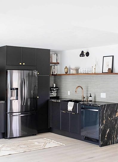
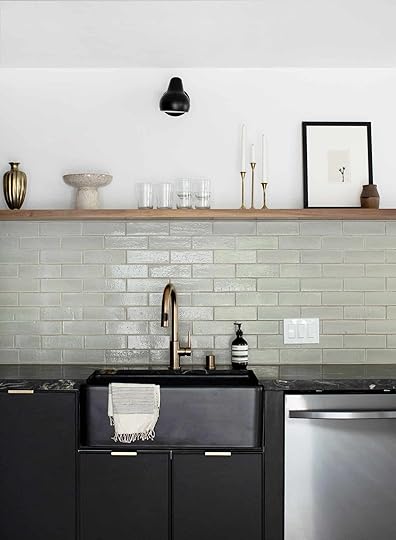
The subway tile is both simple but so special because of the color you chose. What is that tile and what grout color did you use?
Isn’t that tile a showstopper? Fireclay Tile is my go-to, and this is their Glazed Thin Brick in the color “Elk”. Fireclay offers several of their colors in a quick-ship option (ships out in 5 days or less!) and I ordered samples of all of them to show to the client. Elk was not in fact a quick ship, but I threw it into the mix because I knew with the initial structural work we were doing, we had that room for a bit of a longer lead time on the tile. (Tile has the benefit of being one of the last things to go in!)
Jess Note: Not all subway tile needs to be the classic white. You can still have that classic look while stepping a little outside the box with varying tiles and grout color combos.
Faucet | Air Gap Cover | Sconce
We tried a few different tile colorways in our renderings and the Elk won by a landslide. It felt cool and modern—and evoked the feel of concrete, which the client had listed as style inspiration—but also brought warmth and organicism, since each tile is handmade and unique.
In terms of the install, we considered a grid layout but opted for a traditional offset subway pattern (with a ⅜” thickness), again for that feeling of warmth (a grid was farther down the path of contemporary than we wanted to go).
I chose the Polyblend Oyster Gray grout because it was the closest tone-on-tone warm grey to the color of the tile. I briefly toyed with the idea of a dark charcoal-colored tile—it would have been a very cool effect to be sure—but ultimately really wanted the tile itself to be the star. A monochromatic grout lets that Fireclay Brick really shine!
Tell me about the stairs? What was that process like to get them to look like that?
OH BOY, those stairs! What a journey! So as I mentioned previously, our initial scope of work included redoing the floors throughout the house. Downstairs, it was a simple swap of replacing the old vinyl floors with new engineered hardwood in a 7” white European oak. Upstairs, however, had hardwood floors already—so the client opted to sand and stain them to match the finish of the new floors downstairs. To replace the floors entirely would have blown out our budget, so sanding and refinishing them with the same stain used upstairs was the route we chose. They’re not an exact match with the new floors used downstairs, but they’re pretty darn close!

Cabinets in “Edge” (a slim Shaker style) in Peppercorn (a matte black finish) | Knobs | Pulls
Have you ever worked with IKEA boxes before and Semihandmade fronts? If so, how was using BOXI different?
I’ve done two IKEA/Semihandmade kitchen installs before, including one in my own home! I’ve always loved the result from a Semihandmade kitchen, both in terms of function as well as finished aesthetics.
And now, working with the BOXI cabinets was a total dream beyond even the Semihandmade. For starters, my contractor was thrilled to learn that he didn’t have to assemble anything from IKEA, ha! It was really easy to design the kitchen using the BOXI components—there was enough variety in the offerings that I could get exactly the look and function that I wanted, but not so many options that I got overwhelmed. Then cabinets arrived ready to install just two weeks after we placed our order, the ultimate in cabinetry plug-and-play. They look so luxe, too. It really feels like a custom kitchen with none of the waiting time, cost, or additional work!
How did you and your client go about planning out the cabinets/storage needs to best fit their lives?
My client is a family of four with two young children, so we knew that maximizing storage would be essential. Floor-to-ceiling pantry cabinets are a great way to do that, and BOXI offers a pull-out drawer option in those tall cabinets, which I love for easy access to food and dishwares. Around the stove, we opted for a mix of deep drawers for pots and pans, and then hinged cabinet doors that hide additional pull-out drawers for utensils. (Can you tell I love drawers?!) Then right next to the sink is BOXI’s pull-out trash receptacle cabinet, which hides both trash and recycling bins!
What are some tips you can give people who want a dark kitchen but still make it feel warm and inviting like this one?
1. Work with a contrasting mix of finishes: We paired earthy, grained walnut wood with our modern matte black cabinets, chose a black countertop material that still had plenty of warm, chocolate-y veining in it, and added touches of brushed brass to bounce light around the space.

2. Leave some white space: We opted to do tile only beneath the open shelving. This of course helped keep our budget and timeline in check, but mostly we did it because we wanted to leave some negative space and provide the eye with relief from all the surface finishes. I like to think of the white walls above our open shelving as visual palate cleansers, a break for your eyes in between admiring those black cabinets, grey tiles, and dreamy black counter slab!
3. Go light on the floors: I definitely would have approached this kitchen totally differently if the client hadn’t opted for those European white oak floors! They lay such a bright and breezy foundation, we could afford to go moodier with cabinets, counter, and backsplash.
Glass and Walnut Food Containers | Copper Tea Kettle
4. Don’t skip a rug: A rug in a kitchen is a great way to warm things up no matter what your color palette. This vintage runner from Bente Vintage was an absolute perfect fit, both in terms of size and vibe. It adds that boho flair the client likes, but also feels very graphic and crisp!
5. Incorporate playful shapes!: I’ve been dying to use Louis Poulsen’s VL38 sconces in a kitchen for ages, so I was thrilled when the client was into them. They’ve got this pudgy, squatty silhouette that reminds me of a cute little gnome—yet they manage to be utterly sophisticated at the same time. They bring a jovial energy to the space!
It’s Jess again! I told you it was good. Hopefully, if you are renovating or planning to start a reno that you got some great tips because there were so many. Thank you Anne for sharing this wonderful kitchen and your wisdom with us:)
Did you think I’d end this without a before and after side by side?! NEVER.
And actually, I’m not done yet because I want to talk covid renos! How have you been dealing with the lead times? Do you have any other tips and tricks you’d like to share with the class? Any cautionary tales? Do you think dark woods are going to be a trend this year? See you in the comments!
Love you, mean it.
*Design by Anne Sage
**After Photos by Elizabeth Messina
The post The Two Month (YES TWO) Kitchen Reno That’s Sporting An Unexpected Trend appeared first on Emily Henderson.
May 11, 2021
7 Attainable Tips To Make Your Bedroom Feel Like Your Favorite Hotel
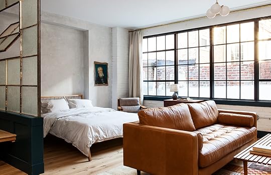
There’s a certain feeling you get when you check into a cool hotel and walk into your room for the first time. It’s that “run-and-jump-on-the-bed” sensation that makes you feel like a kid again. Like relaxation and excitement all at the same time. That something about hotel rooms evokes this weirdly awesome emotion out of people, so it’s not surprising that so many people would want to capture the same feeling in their own boudoirs. I can’t tell you the amount of folks that have asked me for advice on decorating their bedroom and when I ask how they want it to feel, 9/10 they’ll say “I want it to feel like a nice hotel.” Well, guess what? I TOO, would like my space to feel like a luxury hotel and I want to feel the urge to run and jump on my bed every time I walk through the door. So today we’re going to explore how to take your bedroom from lackluster to hotel status (yes, even if it’s a rental).
You may remember my studio apartment: a cool 500 square feet that truly mimics a hotel in layout, but there’s one MAJOR difference between my apartment (and many rentals in general) and hotel rooms: rental apartments and some newer homes can easily feel like a stark, white box. Once you have a case of the white box it’s hard to get rid of it..and I caught a bad case of the white box pox.
The Problem: The White Box RentalHere’s what we’ve been working with for reference (and if you want more photos of the space “before” click here).
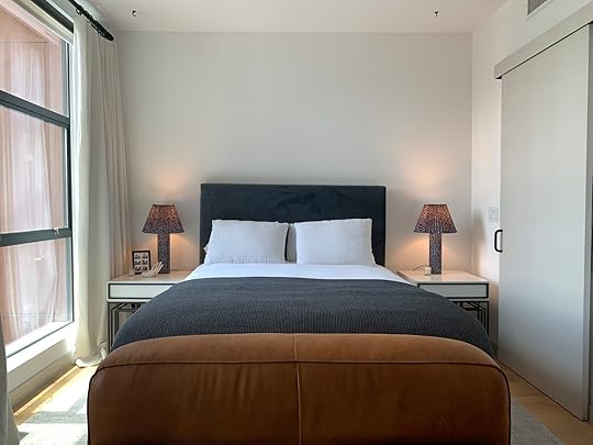
Curtains | Rug | Bed (similar) | Bedding | Nightstands | Lamps | Loveseat
My goal is to get out of this white box feeling, but HOW? How are these hotels doing this magic luxury trick?? Sure art above the bed would help, but it wouldn’t change the boxy white vibe. Paint is another great option but I have a real fear about going dark (or even too colorful) on the walls because I want to keep it light and bright and I don’t want to make the space feel ANY smaller. So how do we make it less stark and more homey without having to paint or wallpaper the whole space??? I asked Emily what we should do to make it feel more comfortable and hotel-like and less white box rental-like and we came up with a big list of things that make hotels so special (and some of them are VERY EASY to add to your bedroom/studio apartment). Let’s begin this case study.
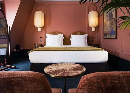
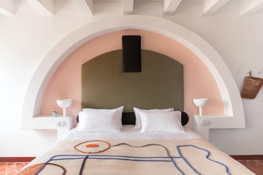
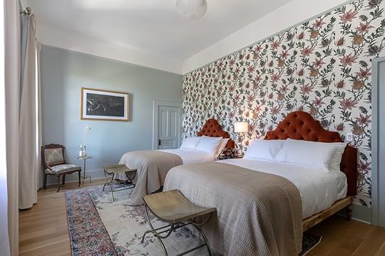
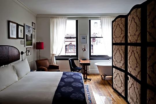
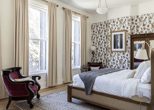
Add a Statement Bed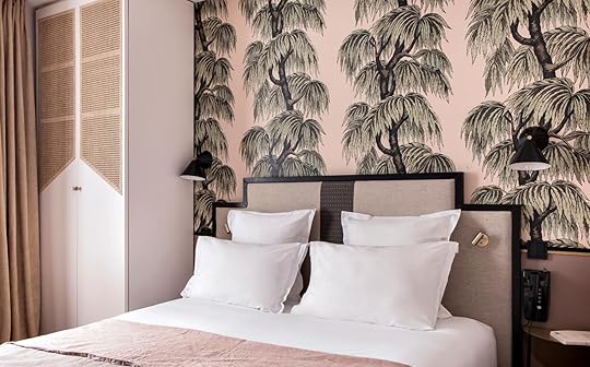 design by br design interieur| photo by hervé goluza | via hotel doisy
The NUMBER ONE thing we noticed that hotels have that regular bedrooms often don’t are statement beds. They INSTANTLY give your eye somewhere to go and help the room feel less boxy. Having a shape other than a square helps so much when you’re trying to make your nightstand, bedside lighting, and headboard all work together and not be boring. They add a flow and a “designed” element that most standard bedrooms often skip over (which is important when you have nothing but a small, white and boxy space to work with). It also makes perfect sense to have your bed be the main focus of the room because it’s the biggest piece that will always take up the most space.
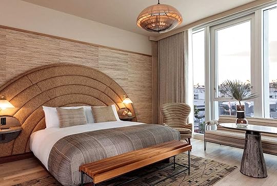
 design by chzon | photo by karel balas| via il palazzo experimental
How good is this statement bed from one of our favorite design firms Chzon???? Every hotel they touch turns to gold. No joke. Now if you don’t believe me about the statement bed, let’s show you some more…shall we??
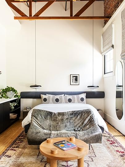 design by sally breer | photo by laure joliet | via firehouse hotel
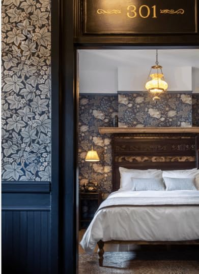
Okay confirmed, lots of hotels have statement beds, but a lot of them ALSO have statement walls in addition. So step one: have an interesting bed (here is a post we did on shoppable options), then step two (which is optional) add a cool feature wall that draws your eye to the bed wall for even more high impact. Here’s an example:
 design by nina freudenberger | photo by jessica alexander | via white water
We love a wood slat wall over here (who doesn’t?!) and white water cambria does it WELL. It works perfectly with their scandi-minimalist vibe and overall gives your eye somewhere to go without adding too much contrast. A lot of hotels also use wallpaper to achieve the statement wall look, but you have to be careful that it doesn’t have TOO much contrast from the rest of the walls if you’re choosing to only wallpaper one wall. Let me show you what I mean:
 design by designellipsis, fools gold daughter, & doug washington design | photo by kat alves | via national exchange hotel
See how this hotel above only wallpapered one wall but used a dark complementary color on the other walls so the transition was visually smooth? This is also a great hack if you want a wallpaper that’s more expensive so financially you can only swing one wall.
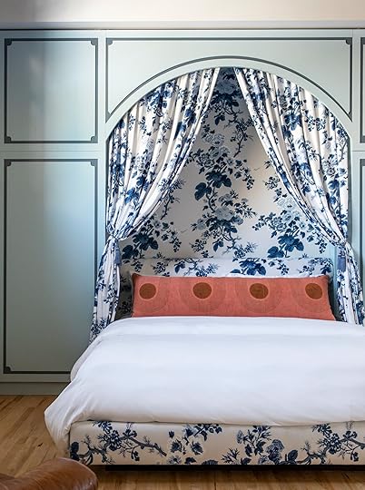
 design by roman and williams buildings and interiors | via high line hotel
Then for this hotel, they have a beautiful bed against a trimmed-out wallpaper wall moment. So cool and honestly extremely DIYable.
 design by chzon | photo by bruno comtesse | via menorca experimental
So many hotels make the bed wall the main focus by adding in a texture, an architectural moment, or wallpaper. Accent walls are HARD to nail but I love how all of these hotels achieved theirs. The key is having some contrast, but not too much contrast to the room doesn’t feel smaller.
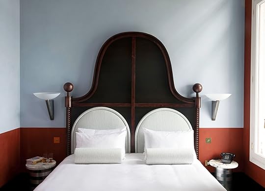
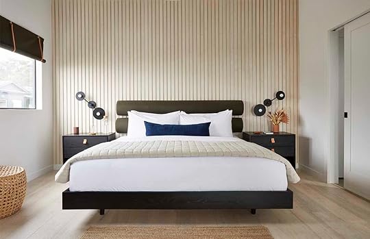
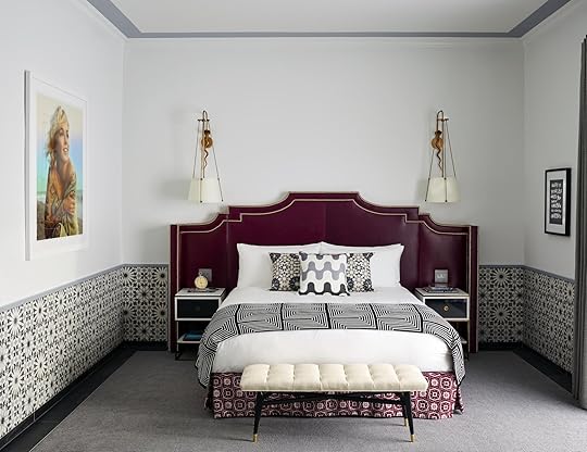
Symmetry Is KeyAnother tip in hotel room design is that hotels keep the symmetry in the nightstands and lighting. It’s pleasing to the eye and the design lends itself to being comfortable because there are fewer visual surprises (but that doesn’t mean it’s boring!). Not to mention, it keeps the vibe feeling super high-end. Now let’s look at some photos that are nice to look at that prove my point:
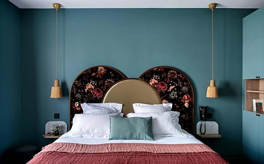 design by br design interieur| photography by hervé goluza | via leopold hotel
That’s a VERY good, symmetrical room if I do say so myself. Also that’s House of Hackney fabric! See what I mean about not being boring. This room is colorful and textured, yet because of the clear symmetry of the bed, nightstands, and lamps, it’s not overwhelming to look at. Your eyes know what to expect.
 design by commune design | via ace hotel palm springs
The Ace hotel does such a good job at feeling lived in and cozy. Plus, look at this headboard that wraps around into a bench. Commune Design, guys….insane.
Design For ComfortWhile the thought of wall-to-wall carpet might send shivers down your spine, I couldn’t write a post about hotel design without mentioning SO MANY OF THEM HAVE IT. It’s just proof that carpet can be done and can be done WELL. If you don’t have carpet (like me!) or if you don’t want carpet in your bedroom (totally understandable), then I’d HIGHLY recommend adding in a comfy rug under your bed to get that cozy hotel vibe and feel. Also, consider getting a bold or patterned rug because this will add pattern without being in your eye-line so it won’t feel overwhelming (this is Emily’s rule for the Farm House btw).
 design by chzon |photo by karel balas | via hotel panache
It’s important to make the space COMFORTABLE and here are the three things you should splurge on if you’re looking for the hotel feel. 1. bedding and SHEETS (mine are from Annie Selke and I could not recommend them enough) 2. Have comfortable, upholstered seating around that people will enjoy sitting in 3. A GOOD MATTRESS. I don’t know about you but if you’ve ever experienced a great mattress at a hotel it’s like you’ve been transported into another heavenly dimension. So if it’s time for you to get a new mattress, it will likely change the way you feel about your room and SLEEP. We are big fans of Tuft & Needle if you need somewhere to start.
 design by designellipsis, fools gold daughter, & doug washington design | photo by kat alves | via national exchange hotelHave More Than One Window Treatment
Hotels almost always have options for their window treatments. Either they’ll have two sets of curtains (one sheer and one blackout) or they’ll have one set of shades and blackout curtains. It gives you multiple options for letting light in but also having privacy. Also, the importance of blackout curtains for sleeping CANNOT be understated. I have a very large and awkwardly sized window for curtains and I was always confused and scared on how to get custom curtains until I found Wovn Home, which makes the process SO EASY. If you’re looking for awesome window treatments that ship directly to you (without having someone come to your house) check out Wovn Home. We LOVE ours so much.
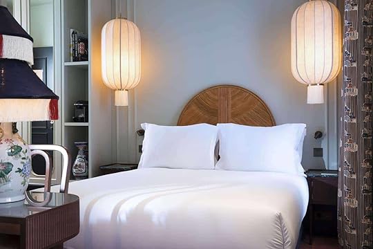
 design by kelly wearstler | photo by natasha lee| via santa monica properThere’s No Such Thing As Too Many Lighting Options
Hotels are known for having multiple lamps, sconces, and overhead lighting. It’s not uncommon to have BOTH a lamp and a reading light by your bed…and this is something I want to incorporate in my space FOR SURE. We don’t have recessed lighting in our apartment (and most hotels don’t either), so finding lots of different lighting options around the space are critical for everyday life and comfort.
 design by pauline d’hoop, michel delloye, and delphine sauvaget | photo by eve campestrini | via hotel monte cristo
Also, the lighting that’s used in hotels is usually statement lighting, like a double-armed sconce or something that’s sculptural and gives off a warm, soft glow. Don’t forget how important it is to find interesting lighting that you like in order to make a room really stand out and feel designed. It’s a great place to add personality especially when you’re working with a small space.
 design by lind & almond | hotel sanders
When it comes to having multiple lighting sources (especially when you have no recessed lighting) it helps to think about lighting sources by zones. For example if you live in a studio, you could have a reading light and lamps on your nightstands in your bed zone, then have a floor lamp by a chair/seating area, an overhead pendant near a dining area, and a sconce or desk lamp on your desk or work area. Go by zone, and no, it won’t feel like too much.
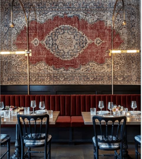
 design by jacques garcia| via nomad hotelDon’t Shy Away From Pattern
Pattern is a hard thing to nail, but having some pattern in a small space is critical in order to make it feel cozy and interesting. The San Francisco Proper hotel (below) is one of the BEST examples of this:

 photos by sara ligorria-tramp | from our visit to the san francisco proper hotel
 So good, right? Kelly Wearstler always kills it. The reason this works so well is because the patterns vary significantly in style and scale, while all staying within a very simple black, white and great color palette. The white box completely disappears with the walls covered in multiple wallpapers, so this is a great tip if you’re looking to make the space feel more homey AND very designed.
 design by martyn lawrence bullard | via hotel californian
I love the way Martyn Lawrence Bullard uses pattern. His style is heavily inspired by Moroccan tile and patterns, and he brings that in perfectly in the hotels he’s designed. The above photo is his design at the Hotel Californian in Santa Barbara and the photo below is his work at the Sands Hotel in Palm Springs (one of my favorites). In these designs, Bullard uses just a touch of pattern in the main furniture pieces, on the walls and in the window treatments, while still leaving the majority of the space light, bright and airy (and I’m all ears).
 design by martyn lawrence bullard | via sands hotel and spaAdd a Small Seating Area
Hotel designers know that guests are fully LIVING in these hotels for a few days at a time, and will need somewhere to sit to put on shoes, or if the guests have a guest over, there needs to be a place for them to sit so they can all comfortably have a conversation (to the best of their ability in a small amount of space of course). Having a seating moment is highly important in a bedroom, don’t skip this  Plus it’s another opportunity or pattern and/or texture.
 design by jersey ice cream co | photo by heidi’s bridge
 So there you have it –– the 7 things you should consider when you’re trying to give your space that real classy, high-end hotel feel. I hope this was helpful and that we can all achieve that jump-on-the-bed feeling in your own space. Thanks for reading and best of luck!! Xx
Opening Image Credit: Design by Pauline d’Hoop, Michel Delloye, and Delphine Sauvaget | Photo by Eve Campestrini | via Hotel Monte Cristo
The post 7 Attainable Tips To Make Your Bedroom Feel Like Your Favorite Hotel appeared first on Emily Henderson.
May 10, 2021
Ryann Asks Emily How To Frame Her Art (And Basically Gets A Master Class In Gallery Wall Execution & Framing)
I have lost track of how many decisions I’ve made since I began my MOTO (makeover takeover) process last year. I’ve nailed down paint color, window treatments, pillows, throws, rug, and furniture options and yet the decisions keep on coming. Right now, I am staring at my unfinished gallery wall wishing it would magically become self-aware and figure itself out. Even though I have a vision of what I want it to be, the execution is easier said than done. Namely, the amount of frame options out there makes my head spin and I kinda just want someone to tell me “this is what you should do and it will look awesome”. Well, fortunately for me I work for a pretty famous interior designer! What luck! So last week, I sheepishly asked Em if she could help me figure out the right frames for my gallery wall because frankly, I am all out of decision-making energy in this area. She graciously agreed so now my gallery wall is in much better hands. But first, let me give you a sense of what I am going for…
Inspiration photo by natalie jeffcott | via apartment therapy
 As a refresher, or for those just tuning in to my MOTO process, my style is a bit 70s-cowgirl-meets-eclectic-old-world-Italian-grandma or as I’ve recently liked to put it, Bridgerton meets The Godfather meets Thelma and Louise with a hint of Breakfast at Tiffany’s.
Now, the location and feel of my gallery wall is specifically inspired by some of my and my fiancé’s favorite Italian restaurants. Shortly after the pandemic hit and we were quarantined, we both felt we hit a roadblock with the design of our living and dining area. I was feeling super uninspired and wanted more color and life in the space but didn’t know what direction to go necessarily. Then, one day my fiancé was making one of his famous Italian dishes and it suddenly hit me. I looked at him and said, “what if we made our home feel as welcoming and eclectic as an old Italian restaurant, with a bunch of photos and art surrounding our dining table??” Of course he loved the idea and it’s been our vision ever since.
 design by rita konig | via coco kelley
Since then, the creation of our gallery wall has been highly influenced by how we want the space to feel. We want it to feel lived in but not cluttered, definitely eclectic, and very heavily inspired by both of our interests. Easier said than done…
 left: design by annie sloan, photo by jesse wild | right: photo by jenna cooper la, via sfgirlbybay
As I looked through my pinboard for inspiration for this post, I noticed all the gallery walls I am attracted to have a mix of styles of both frames and art but with a mostly old-world feel which is possibly why this aspect of my MOTO has been so tough. I just needed a true professional for help.
Enter The Emily Henderson:
General Framing Questions:1. Do you have any golden rules when it comes to framing?
I always share the advice “frame for the piece, not for your space”. While I don’t ALWAYS stick to it, it’s a pretty great rule of thumb – the frame should complement the art first, think about your space after (and usually the simpler the better IMHO).
2. Are there frames you would only use for certain types of art?
I like a visually lighter/thinner frame, in general, unless it’s a big piece of art and can handle a thick frame. The bulkiness of the frame shouldn’t overpower the piece of art – it should bring your eye to the art (you know, frame it, ha) but then let the art shine.
3. When it comes to gallery walls do you prefer uniform frames or mixing and matching?
All can look GREAT, but you aren’t wrong by being frustrated. It’s HARD. I know that this is really annoying advice, but a gallery wall is only as good as the art in it. I think it’s much easier to execute one large piece of art than try to quickly collect a bunch and force them to work together. There are some frames I don’t love (like over-the-top baroque, needlessly chunky, or too shiny brass), but that’s just a personal preference.
4. If you use matted frames should they all be matted or is it okay to have some matted and some not?
You can definitely mix matted and not matted. I love float mounted with a mat far better than the more traditional bevel cut mat and if I had to choose between full bleed and matted I suppose I prefer full bleed (where the art goes straight to the frame) but there are some pieces that really need the negative space between the art and the frame – some breathing room to help it feel more important and special and give your eye a break.
5. What are some of your favorite places to source frames?
If you want to make your life easier and you have a budget then we love Framebridge and Simply Framed, but they are on the more expensive side. I generally only do those for pieces that are not standard sizes or where you want a special treatment (like float mount). I honestly love frames from Ikea, CB2, Room and Board and West Elm as well.
6. Are there rules for mixing vintage ornate frames and new frames?
Not really, I think that modern art looks better in simpler frames and not in ornate frames. So I generally only use ornate frames if they are original to the older painting or feels really fitting. I’ve found that if I’m intentionally framing something that I opt for simpler as I feel it’s more timeless.
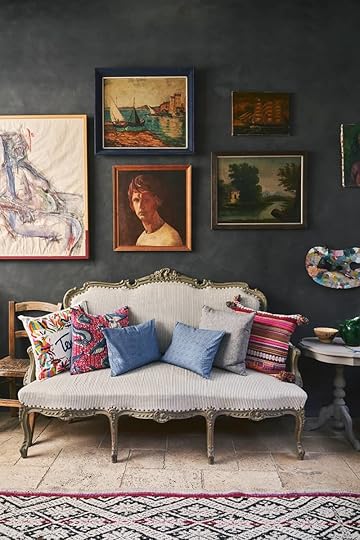
Ryann here again. Now, we are going to move on to my actual gallery wall and I feel nauseous thinking about revealing it to you because A) it is not final and B) art is hard to curate and so so personal so there is a big chance many of you will not love anything I have up. Even though a handful of the pieces are straight from Emily’s prop closet, arranging them correctly and presenting them in the best way is no easy feat. But for the sake of research, I am setting aside my pride because all I really want is a fabulous gallery wall that reflects my personality and style. Here she is (for now):
 my gallery wall as is — not final
 From Em: At first glance it does feel off and it’s hard to know why. After staring at it for a while I think there are few things you could think about: 1. I think you have too many small pieces, specifically vertical. 2. you need a bigger piece to help anchor everything and 3. I’m still not convinced it’s the right wall for a gallery wall. I usually put gallery walls either over a piece of furniture – sofa, credenza, built-in, or where I would put an accent wall (like a niche or a hallway/powder room). I fear that in this location you need an anchor of some sort. However, ANYTHING can be done. But it is making this corner feel cluttered, busy, and small. For those of you at home, Ryann has a tricky corner because needs a dining table, desk, and a piece of storage so it’s pretty tight over there. I kinda want to take a stab at rearranging and put the dining table in the corner where the desk is instead of floating in the pass-through space.
I also think that I would play with the rivers being closer together – less spacing in between the pieces. I kinda want your table to be against the wall – as a rectangle, not floating so that it can help ground that gallery and also allow for more pass-through space. Then you could integrate an articulating sconce into the gallery to hang over the table which would look cool. Then maybe you find a cool folding screen to delineate between the “dining area” and your “office” or move your desk somewhere altogether (by entry?). It’s SO HARD!!!!
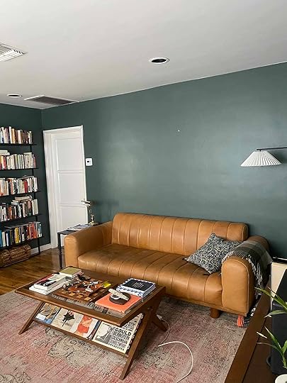 the space above my sofa for reference Emily’s Framing Advice
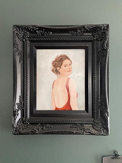
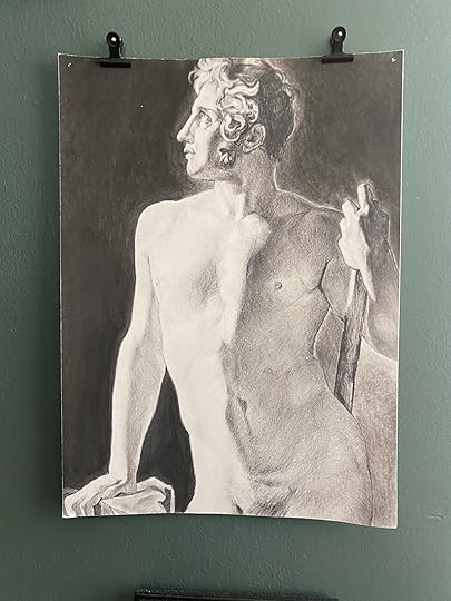
 painting of me by my grandmother | vintage print
Left: This frame feels a bit heavy and ornate for the piece. It could totally work but it feels like a lot.
Right: I think as-is this is fine. I feel like on the dark wall all I see is the white mat, but I would leave it for now and try to work with it.

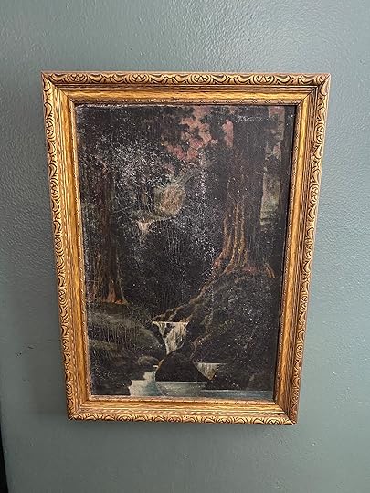
 thrifted jesus print | landscape print
 Left: I would put this in a much bigger frame with a matte. Maybe a mid-tone wood and make it look more like contemporary art. this piece can go really “thrift store” and “cheesy” but I think elevating it into a much bigger modern wood frame would give it the presence it needs.
Right: I think this frame is great as is!
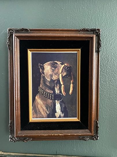
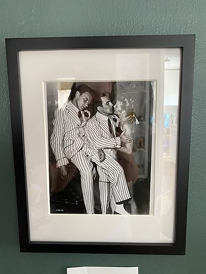
 dog with sausage print | vintage copacabana menu from the 60s
Left: This guy is hilarious. Keep the frame for now. It could go in a modern frame to give it more of a contemporary art feel – thin wood frame, float mount over a mat.
Right: This piece is all about personal preference. I’m assuming it has sentimental meaning but the colors and vibe are different than the other pieces, which can be totally fine but just makes it more challenging.
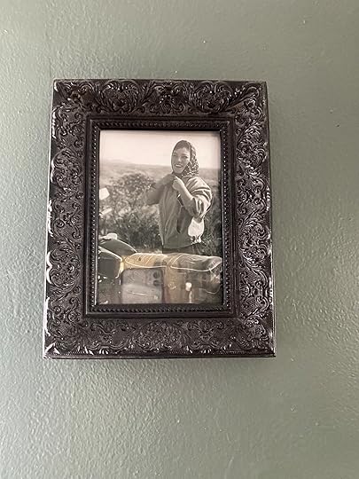
 photo of my fiancé’s grandma | thrifted piece from Em
 Left: I love this little old frame, it’s cute!
Right: I found this etching piece at a thrift store and while I like the frame I don’t love the matting – I wish it were less dingy (but that’s just a personal preference). But I also fear that a bright white frame on the wall would be really jarring.
 thrifted print from em
 I would float mount this with a wood frame – you want to see the edges and that it’s old, not behind a mat. I’ve hoarded this for so long and I’m so excited to see it get some play!
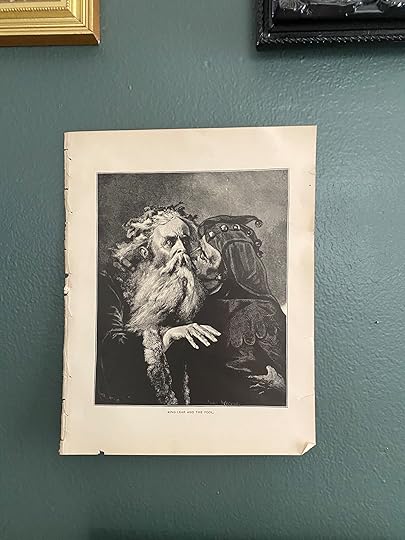
 vintage shakespeare print | drawing by stephanie kurth
Left: You could float mount this in a larger wood frame to help it have more presence, to see the ripped edges, and add some warmth.
Right: I love this piece – definitely a dark frame, maybe a black fabric mat to help give it some presence?
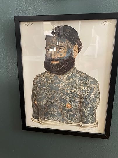 thrifted piece from em| tattoo man print
 Left: Leave for now! I got this piece at the flea market I think and loved it as-is.
Right: I love this piece and I think mixed with the old world art it still totally works and the color palette feels spot on.
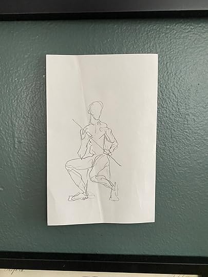 drawing by stephanie kurth
OOh I like this little guy. You could float mount it with a dark thin frame that echos the thin lines of the piece.
Also from Em: Listen, again I want to say “there are no rules” with gallery walls because I’ve seen all the rules broken and have broken them myself many times, and they can all work. HOWEVER, it’s just easier to make a gallery wall look really good when there is a theme or some sort of consistent color palette within the variety of shapes and colors. I would lean into the “old world” vibe of the paintings, etchings, and the figure work that all feel more neutral and naturally work together really well. I would take them all down and divide them into two categories – old world and neutral and more modern and colorful. You might find that sticking in one world makes it so much easier to look good.
Ryann here again. I honestly feel like I just got a Masterclass in framing which is awesome. It’s like everything I was feeling that was off about my gallery wall has finally been put into words. I am PUMPED but also slightly nervous thinking about letting Em and all of you down because I am so emotionally attached to many of these pieces. That said, I feel hopeful and excited and on the right track.
Now, I’d love your guys’ input if you’d be so kind. Namely, do you think the gallery wall is in the wrong place or can I make it work? Should I move it over the sofa so it’s more grounded or do you like the idea of it staying in the dining area as I originally was inspired to do? I know it’s tough having not seen the whole space (I must leave some things for the reveal after all) but your two cents is very valuable and welcomed. xx
Opener Image Credit: Design by Velinda Hellen Design | Photo by Sara Ligorria-Tramp | From: Velinda’s First Freelance Client Reveal: Molding The ‘Builder-Grade Budget’ + Where They Saved & Splurged
The post Ryann Asks Emily How To Frame Her Art (And Basically Gets A Master Class In Gallery Wall Execution & Framing) appeared first on Emily Henderson.
May 9, 2021
The Link Up: Where Emily is Staying For A Mothers Day Retreat, Ryann’s New Salad Dressing, Mallory’s Water Bottle Investment
Hi all and happy Sunday. But more importantly, Happy Mother’s Day to all of the amazing mamas! The mere fact you are still here after what this last year served you should grant you all the pampering this world has to offer. But however you choose to spend your day, know that we see you, think you are doing a kick ass job, and are sending all of our love. Now let’s link up!
This week’s home tour is a domino feature that SCREAMS cozy Farm vibes (ohhhh how we love a farmhouse!!). But seriously, if you like gingham, you’ll LOVE this. Textile and home goods designer, Heather Taylor took her Laurel Canyon home from mid-century to cozy and eclectic, and boy do we love it. The warmth! The wicker! The GINGHAM! This is just proving to us that this pattern is not just for swimsuits, guys.
From Emily: For Mother’s Day Brian is taking me back to the Auberge in Napa for a Mother’s Day retreat (we went a few years ago and LOVED I – it was the first time we had a trip where nothing was planned, we didn’t leave the resort grounds and barely talked to another soul because it’s so peaceful and spread out). It’s no kids, all relaxing with these super spacious rooms that you can spend all day in. We are going to feel it out but we’ve been fully vaccinated for a month and my shoulders are literally aching for a massage and their spa is incredible. The rooms feel like individual homes, there is a ton of outdoor dining and walking and feels really comfortable (if not luxurious) for our first hotel stay in a year. Napa here we come
 the national exchange hotel in nevada city
As we were looking around though I found two new design-forward hotels in smaller historic gold mining towns an hour away from Sacramento that looked SO GOOD. While we haven’t stayed there yet (we will in November) for those of you in the area check out The Holbrooke and The National Exchange Hotel for a getaway (and some design inspiration).
From Ryann: My fiancé and I have this tradition where we have Italian Sunday dinners every Sunday and it’s always the highlight of my week. He is an incredible cook and makes everything from chicken cutlets to baked rigatoni to eggplant parm and it’s all FANTASTIC. Up until recently, my sole job was to drink wine and be his cheerleader in the kitchen, that is until I found this italian dressing recipe that I now make every Sunday to pair with an artichoke and roma tomato salad. The dressing is dairy-free but somehow so creamy (it must be the dijon mustard) and I can’t get enough of it. I am usually subpar in the kitchen, but now my salad game is F I R E all thanks to this recipe.
From Jess: I bought this cream bronzer/highlighter combo a few years ago and LOVED it. I was clearly heavy on the highlighter because it ran out faster than the bronzer. So once that side ran out I put it away… until a couple of weeks ago! I forgot how truly magical that creamy bronze color looked on my skin and that it makes me feel so glowy and happy. I have the Tropic Equinox which is described as a warm neutral prismatic bronze. That description my friends is exactly right. So if you are looking for a clean and vegan bronzer/highlighter combo, I give this one a million thumbs up. But also maybe take a second look at the makeup you already have because you might find something equally magical:)
From Mallory: I’m YEARS late to this party, but I officially bought my first Hydroflask and I finally understand the hype. I was really hesitant about them for so many years because I thought they were just too heavy and like $50 for a water bottle feels absurd. Also, I hated the clanking sound they made if someone would drop them. BUT I’ve been converted. I finally bought one, on a total whim at the Nordstrom ebar (lol) and BOY do I understand now. You can put ice in this bad boy and head down to the pool in 100-degree weather and this thing will not let it melt. It’s amazing. I also highly recommend getting this sippy lid because for some reason this lid makes me drink 1000x more water than I would without it. It’s like an adult sippy cup that keeps your drink cold or hot for days hahaha.
From Caitlin: By the time this post goes live, I anticipate that I will have watched all of season 3 of Shrill. Does anyone else love it as much as I do? Aidy Bryant is a joy, the rest of the cast is SO fun, and everyone is so well dressed all the time. I also feel like it reminds me a lot of my own friend group, which I love. Did anyone else binge it this weekend???
Also From Caitlin: Heads up that Anthro Day ends today! If you’ve been eyeing anything on the site, check and see if you can get a deal on it! (I, an overall addict, was super excited to scoop these long, lightweight lilac ones and I can’t wait to get them in the mail!)
Thanks so much everyone for taking a little bit of time out of their day to spend with us. We love you all and again HAPPY MOTHER’S DAY!!
Opening Image Credits: Photo by Kat Alves | Wallpaper by PHD Wallpapering | Design by dEsignEllipsis | Fools Gold Daughter, & Doug Washington Design | via National Exchange Hotel
The post The Link Up: Where Emily is Staying For A Mothers Day Retreat, Ryann’s New Salad Dressing, Mallory’s Water Bottle Investment appeared first on Emily Henderson.
May 8, 2021
My Summer Uniform: The 3-5 Pieces I Love Wearing That Makes Getting Dressed SO Easy


When I was an assistant prop stylist in New York as a 23-year-old, a pretty well-known photographer, Sang An, who I shot with a lot wore the same thing every day. He had a uniform – two actually, one for summer and one for winter, and he wore the exact same thing five days a week (he had 5 sets of the same outfit). He did it so he “didn’t have to think”. When you are a 23-year-old stylist during the day and a bartender at night living in New York, such adulting seemed so odd. Isn’t getting dressed supposed to be fun? A part of creative expression? A way to take low-risk creative risks?
Whenever I heard “capsule collection,” I thought it was what boring rich old people did. It just felt so grown up, full of zero “fun”, but also for most of my 20s I wore wacky thrift store clothes that included vintage teenage mutant ninja turtle teeshirts and “cotton bell-bottom chaps” – decidedly not two ingredients that are a part of anyone’s capsule collection. But like anything, the older you get the more you don’t need to try on as many types of partners/careers/styles because you get closer to what makes you happy and feels the most right for YOU. Truly a very adult thing. Or maybe I’ve just gotten boring stylistically, and that’s ok, too. I can shake it up for big “nights in the city” (spoken like a true country cliche mom) and splurge on a fancy dress here and there for special occasions. Or maybe it’s just a phase, a only-barely-post-pandemic-lifestyle? Or a seasonal thing when you live by a lake and don’t take any meetings from the chest down?
I know exactly what I “opt” to wear all summer. So while it wasn’t intentional I, too, have created a loose uniform of sorts. More like a formula that allows for change in colors, patterns, and styles. But the shape, fit and general vibe are consistent. This is based on years of trying other things only to be kinda uncomfortable in one way or another and always opting back to my formula.
The Formula
The formula is simple: short jean shorts (with varying amounts of holes and lengths), a blousey blouse (with varying amounts of pattern and color), and nude sandals or mules (with varying amounts of heel and traction). Maybe a T-shirt here and there but I’m so picky with t-shirts that I’m much more of a blouse lady.
Want proof? Here are 6 outfits I’ll be rotating all summer long:
Outfit #1: Long Sleeve Blouse + Jean Shorts + Sandals

This formula was scientifically produced in a lab where the first question is – if it’s hot out, what body part wants to be exposed? The answer for me is always my legs (but might be different for you). So my shorts are short and no I’m not falling for the Bermuda short thing as I think it cuts off my legs and honestly makes me cringe – a decidedly uncomfortable emotional reaction that deems itself scientifically out of the running. I love a loose cotton or silk top that has a peephole or some sort of ruffle sleeve (but you’ll see I also love a white men’s button-up). These sandals are my newest ones that are SO CUTE, while being extremely transitional.
Outfit #2: Long Sleeve Blouse + Ripped Jean Shorts + Sandals

With a more conservative top (a menswear-inspired white button-up) I bring out the even shorter ripped shorts. These are all different varieties of 501 Levis, but I’m sure other brands have good options. I like a little slouch in them. And the button-up acts as my swimsuit coverup, too.
Outfit #3: Short Sleeve Blouse + Shorts + Sandals

Blouse (similar)| Shorts | Sandals
To shake it up I often opt for white cut offs, with another blousey top. I rarely wear jewelry up here, but likely will start layering gold necklaces if I were to go in public.
Outfit #4: T-Shirt + Long Jean Shorts + Sandals

T-Shirt (similar) | Shorts | Sandals
This isn’t QUITE as typical, but this year I did get some slightly longer shorts with less holes, mostly so my FIL would stop making fun of how many holes I have in my pants. The t-shirt is from Lost and Found in LA and it’s super thin and comfy, which is great for layering on top.
Outfit #5: Short Sleeve Blouse + Jean Shorts + Heeled Clogs

I suppose this is me getting fancier with heeled clogs and a patterned button-up. I’m very curious if/when I’ll go back to wearing shoes that have 3″ of wood on the heel – it now feels ABSURD to me, but admittedly I do feel good in them visually. I might wear them for Mother’s Day brunch and see how long I can handle a heel (these are super comfortable but after a year with no heels it just feels absurd that they even exist).
Outfit #6: Short Sleeve Blouse + Jean Shorts + Heeled Clogs

Blouse (similar) | Shorts | Clogs
A lot of the same – I know – thus the “formula”. But these shorts are my “not too short, not too long” option that I probably wear the most. And another cotton blouse that feels fun, comfy, and forgiving. I didn’t buy anything new for this post except the sandals, because I needed them, but wanted to round up some of my favorites out there in shorts, blouses, and shoes. But first, I have some guidelines for buying that have helped me purchase clothes I will wear again and again.
SOME TIPS:For Jean Shorts:I like to size up to wear with swimsuits, but I like it to be more fitted when I wear with blouses, so I often have two sizes of the same short. They do stretch out a bit but not a ton (as Levi’s are 100% cotton).
For Blouses:I like anything that doesn’t need to be ironed, has some sweet detailing (like ruffle or necktie), and usually a pattern. This allows me to be a mom and run around with kids without worrying about ruining or staining a shirt. I also wrote a more in-depth post last year about my blouse formula. Man, I am VERY scientific about my clothes.
For Shoes (And Other Accessories):I like them to look/feel more utilitarian with no fussy heel or shine. Just leather, straps, and full function. I also wear Havaianas and Tkees for flip-flops and love a basic straw gardening hat with a tie for the beach (I’m done trying to find a floppy hat that doesn’t lose its shape in a few weeks). This year I bought this and this. Lastly, for sunglasses I’m big on the classic Rayban Wayfarer and aviators (or knock-off versions that are way less expensive) and most of you know I love this tanning lotion (forever, like I’ve tried everyone and it is my favorite) and for light makeup I love this easy lipstick and this sunscreen/foundation combo.
I have to say having a sort of uniform DOES make it so you don’t have to think as much. So if you like this look and want to create your own, here are some picks to get started:
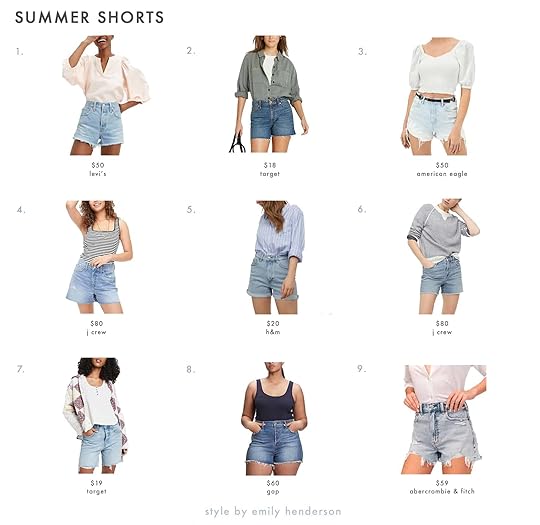
1. 501 Original Women’s Shorts | 2. High-Rise Denim Shorts | 3. Denim Mom Short | 4. Slouchy Boyfriend Short | 5. Mom Ultra High Shorts | 6. High-Rise Denim Short | 7. High-Rise Bermuda Jean Short | 8. 3″ Sky High Rise Shorts | 9. High-Rise Mom Shorts
1. Babydoll Collar Cotton Shirt | 2. Babydoll Collar Blouse | 3. Jeanne Blouse | 4. Maeve Blouse | 5. Printed Flowy Shirt | 6. Wide-Cut Blouse | 7. Ruffled Collar Cotton Denim Shirt | 8. Ariste Top | 9. Harmony Lace Peasant Blouse
1. Ruffled Cotton Top | 2. Ruffle Short Sleeve Linen Top | 3. Carla Highneck Shirt | 4. Carla Highneck Shirt | 5. Flutter Short Sleeve Eyelet Top | 6. Brett S/S Bohemian Blouse | 7. The Scallop Cedar Top | 8. Ruffle Sleeveless Eyelet Blouse | 9. Marianne B Ruffle Sleeve Shirt

1. The Organic Cotton Box-Cut Tee | 2. Vintage Tee | 3. Whisper Cotton Rib-Crewneck Tee | 4. The Crop Tee | 5. Short Sleeve Shrunken Boxy T-Shirt | 6. The Crop Tee Embroidered

1. Marlo Clogs | 2. Heeled Clogs | 3. Dagny Clogs | 4. Ayanna Clog |5. Cognac Clog | 6. Old School Heel Clogs

1. Agile Blush | 2. Martie Sandals | 3. Colorblock Sandal | 4. Gia Platform Sandals | 5. 2-Strap Sandals | 6. Robin Platform Sandal
I feel like a summer uniform or “formula” is easier than a fall, winter, or spring uniform mostly because the kids are out and I’m with them so much. It’s like play clothes that I feel kinda cute in and make me feel stylish enough, while being incredibly comfortable and casual. But that’s just me. So, I am curious, do you have a summer uniform and if so, what’s your criteria? xx
Opener Image Credit: Photos by Veronica Crawford | From: My “Casual, Comfortable, Cool” Spring Weekend Wardrobe
The post My Summer Uniform: The 3-5 Pieces I Love Wearing That Makes Getting Dressed SO Easy appeared first on Emily Henderson.
May 7, 2021
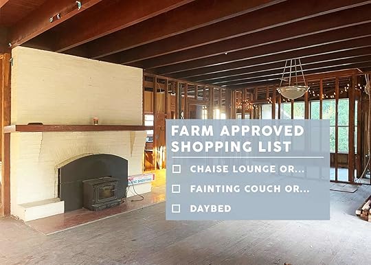
My Farmhouse “Ok To Shop” List – Chaise Lounge, Fainting Couch, Daybed Or A Visually Open-Backed Sofa… I DOVE DEEP
The decorating part of the farmhouse is certainly not a priority and yet I’ve started shopping. A lot of you asked about timing and while of course we don’t know anything firm, our plan is to move up in August to acclimate the kids to the new school/neighborhood and live in a rental house til it’s ready. We are hoping early 2022 to move in an as of a few days ago we have a magazine shoot scheduled for late April (for August reveal). We have demo’d and have applied for permits while we order all tile, appliances, plumbing fixtures, flooring, etc. I know that rushing it will only stress me out greatly (which is bad for the whole family), plus I’ll make more mistakes and nobody really wins that way. Of course, I say that now while living in this nice house enjoying my summer down here in relative renovation denial. I’m sure once we get into a furnished rental I might be like, “OKEEDOKEY LETS MOVE THIS TRAIN ALONG”.
When we renovated the mountain house I told my contractor that I wanted “fast and good” but would forego “cheap, “and we ended up getting “slow, good, and expensive”. I’m starting to think that a renovation of this scale can never be rushed and it will always be expensive if you want “good,” which we do. He agreed to the “fast, good, and expensive” route but ultimately it came down to subs and him wanting to only hire people he trusted (BORING). So it was just slow with so many days just sitting empty, waiting for subs. And guess what? the good subs are expensive. So my expectations this time around are more realistic. It will take a while. It will not be cheap. In exchange for that, we will get a fantastic high-quality result (RIGHT??). So that’s the timeline update… Hoping to shoot in a year, making the whole process about a year and a half from purchase, and 16 months from demo.
But on Saturday mornings I can’t help but to shop. Part of it is the addiction, the thrill I get going down vintage rabbit holes, even without purchasing (no need, the dopamine hits my brain just by looking). So I’ve put some rules in place for myself though – I’m only allowed to actually shop for and purchase anything that A. takes my breath away and B. I can see its place in our home (aka we need it). You know when you see something and you suck your breath in real fast and your heart stops for a second? This is likely either because it’s A. unbelievably good, or B. unbelievably cheap. A caveat: I may not and will not pass up a vintage or thrifted “steal” even if I don’t “need it” – because if it’s GREAT and cheap then I know I can find a place for it and it’s just bad business to not snag and hoard it. But in regards to my actual “list” I know for sure (HA is anything for sure at this point?) that the living room layout would benefit from a visually low/light backed sofa that still has weight and can help ground the conversation area while staying visually open to the big scenic doors that lead to the back yard.
This is VERY specific, I realize. The living room layout is HARD because there are so many walkways, entries and exits, and focal points. I’ll show you more later (we played with a bunch of stand-in furniture last time we were up there) but what we decided would be ideal is to have a sofa, a fainting couch, and two club chairs. Why a fainting couch? Because the big scenic doors to the backyard are behind it so we want it to visually feel open to them, but still have a place for leaning against it (not just a bench or flat daybed). So I was on a MISSION to find one and last weekend I did!!!!
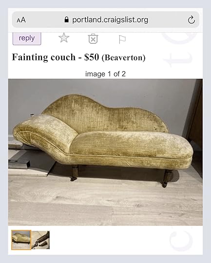
FIFTY BUCKS!!! Now I was pretty open to what it could look like, I just needed to LOVE IT. So this one has this amazing deco feel, but it’s still SIMPLE, with not a lot of ornate details. It looked comfortable, had a nice open back giving view to the backyard, and yet in a new fabric I could see it just being simple and classic. I text Ken immediately, at like 7 am, and begged him to go get it before it got taken. I had no idea how it was on Craigslist for 2 weeks at that insane price ($50!!!). He agreed, probably annoyed but he didn’t show it and left his family on a Saturday morning to do my craigslist errand bidding. Then he sent me this photo…

IT’S FOR A CAT. We don’t have a cat. We couldn’t stop laughing, like the whole family – even the kids. I appreciated that he held it in his arms for scale because apparently I don’t read dimensions and need a large brother to stand next to something in order for me to understand sizing. After we stopped laughing I got sad because had it been human-sized it would have been the BEST steal. Then I went back to the listing, sure that they hadn’t put dimension but it said it right there!!! “miniature fainting couch, 18″ x 48”. I was so emotional about it that I didn’t even read the not-so-fine print!!! The level of stupid I felt was high, and just thank god it was only $50. OBVIOUSLY, we are keeping it and going to upholster it in something FABULOUS and then start shopping for a cat. Charlie wants it for his “reading nook” but I think it’s even too small for him. The ultimate hand-in-face emoji.
So with that box totally unchecked, on Saturdays I have been searching around for something that would work there (mostly because it’s fun). Now let me be clear that I don’t even know if we really NEED this piece of furniture because now that we’ve changed the layout to include a dining nook in the corner (not floating), we have WAY more flexibility with the furniture layout. But I spent hours searching nonetheless.
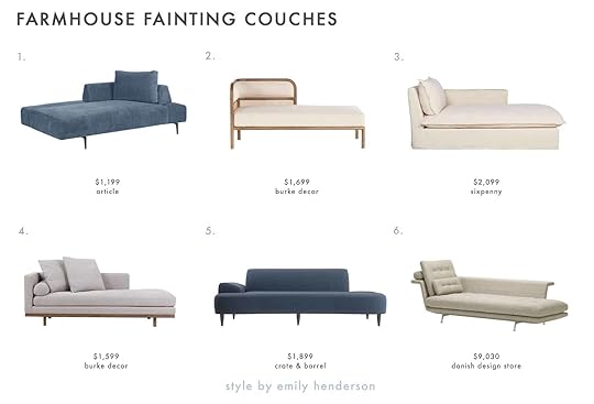
1. Divan | 2. Tremaine Chaise | 3. Neva Daybed | 4. Brady Chaise | 5. Bella Curved Chaise | 6. Grand Sofa Chaise Lounge
I love a half back of the chaise because it can “face” forward and to the right whereas a typical chaise can only face left or right if that makes any sense. So this is like 1/2 sofa, 1/2 chaise. It keeps your eye moving past it (towards the view out the big scenic doors) and yet is substantial enough to be balanced near an actual sofa. I have a couple of favorites from up there that you’ll see at the end.
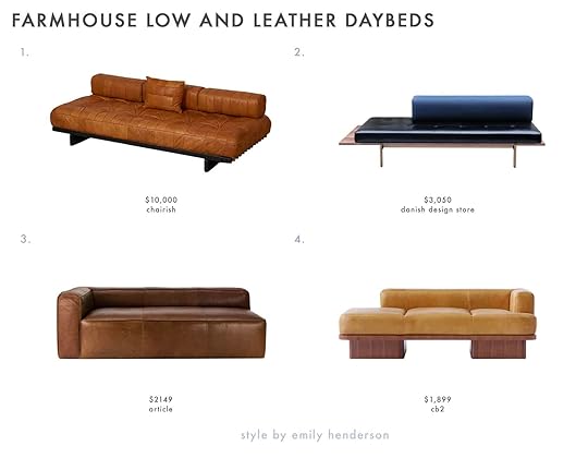
1. De Sede Ds 80 Patchwork Leather Daybed | 2. Discipline Sofa | 3. Mello | 4. Serafin Leather Daybed
All of these are low enough (but still substantial) to be able to see past them, not stopping the eye. I like all of these a lot – they are cool, although perhaps not quite classic enough (and that de Sede vintage one is awesome but $$$$ and Brian hated it :))
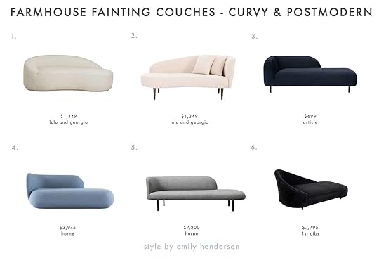
1. Diego Sofa | 2. Jody Chaise | 3. Lupra | 4. Rico Divan Sofa | 5. Continuous Chaise Sofa | 6. Adrian Pearsall Mid Century Cloud Chaise Lounge Chair
All of these would be contenders, that simple unfussy curvy shape could work with most other sofas and they feel modern and cool in a way that this farm might need. And no, we aren’t sticking to any sort of “modern farmhouse” vibe inside. I’m really just doing whatever I want to with the furniture and accessories. Sure I have some more primitive and utilitarian pieces that I think will look awesome here, but I’m not limiting the styles because it’s a farmhouse (I’m more careful to reference the style with the permanent finishes – flooring, lighting, tile, etc).
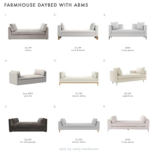
1. Pavo Daybed | 2. Pacific Daybed with Wood Legs | 3. Brooklyn White Daybed | 4. Shelter Daybed | 5. Jasper | 6. Hunter Lounge | 7. Elvi Chaise | 8. Asher Daybed | 9. Loft II Cream Daybed
Now the totally flat day beds won’t work here because, well, I prize comfort over most things and most people don’t want to sit on a bench for a long time without leaning on something. But these above have substantial enough arms that they can be leaned against on both sides. I love the idea of reading here where I can see out the back and still feel in the living room.

1. Vivi Tete-A-Tete Chaise | 2. Custom Tete-a-Tete Sofa Bench in Grey Velvet with Walnut Base by Adesso Imports | 3.
What about a tete-a-tete? Are we still doing these? I reaally like these modern ones, but the antique victorian ones remind me of Bridgerton where the men/women shant sit next to each other in case their bodies doth touch. I don’t think we’ll end up doing one of these but again it doesn’t shut off the room to the backyard and yet is still a part of the conversation area (but there is something the feels highly impractical about them and like you are shunning the person that is facing outside).
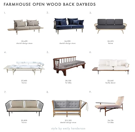
1. 2-Seater Sofa w/ Side Tables | 2. 2-Seater Sofa | 3. Originals Studio Couch | 4. St. Charles Daybed | 5. Oiled Walnut Spindle Back with Brass Accents Bone Chaise by Casey McCafferty | 6. Distrikt Sofa | 7. Mollis Sofa | 8. Mogensen Spokeback Sofa | 9. Tateishi Shoiji Oak and Walnut Chaise Longue
Now these you have to picture without most of the back sofas, exposing the woodwork. Picture throw pillows but allowing enough of the line of site open through the wood. These also mix really well with more substantial upholstered sofas. #9 is SICK – it’s vintage and was only designed to face that way (and we want it to face the other way) but that is an insanely beautiful piece of minimalist furniture.).
MY FAVORITES!!
1. Oiled Walnut Spindle Back with Brass Accents Bone Chaise by Casey McCafferty | 2. Brady Tete A Tete Chaise | 3. Lupra | 4. Bella Curved Chaise | 5. Continuous Chaise Sofa | 6. Adrian Pearsall Mid Century Cloud Chaise Lounge Chair | 7. Elvi Chaise | 8. Serafin Leather Daybed | 9. Originals Studio Couch
Seriously all of those up there are AWESOME. #1 is my #1 and I might commission that to be made or if the designer Casey McCafferty can’t (he’s focusing more on sculptures which are crazy good) then perhaps Fernweh – a local Oregon furniture maker – can design a windsor backed version of a daybed. So good. The pricing is all over the place with the Article one being SO good and affordable and the Horne one being very expensive, but those lines are gorgeous. The Lulu and Georgia one is soooooo cozy looking and the Crate and Barrel one is postmodern and perhaps trendy, but the lines of it are so simple that I think it’s timeless enough. And of course, I’ve loved everything Adrian Pearsall (#6) and always lean towards vintage (I SCOURED 1st Dibs and Chairish and found very few that would work).
But essentially unless I found #1 at a flea market or on Craigslist I’m not pulling any triggers yet. I will “come up with a plan” and even “take time to design the space” because none of our sofas will work in this living room so I should probably not box myself into a piece of furniture that is new and can be purchased in 6 months from now. But I feel very well versed now in what’s on the market so if I don’t find that random vintage steal or design something custom with a local maker then I have some pretty awesome options that I know will work well with a lot.
Most importantly I learned the benefits of reading the fine print, designing for scale, and making sure that I’m buying human-sized furniture. So glad that 20 years into my career that I’m still buying dollhouse or cat-sized furniture online thinking I found a score. If it happens again please expect a #brotherforscale hashtag to start because apparently my brother near the piece is the only way I can confirm sizing. Have a lovely weekend, folks.
The post My Farmhouse “Ok To Shop” List – Chaise Lounge, Fainting Couch, Daybed Or A Visually Open-Backed Sofa… I DOVE DEEP appeared first on Emily Henderson.
May 6, 2021
Caitlin Has A Secret Trend Spotting Hack And Here’s What’s Coming Up Next – BOLD ANTIQUE REVIVAL
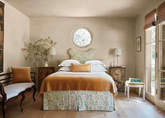
SOMETHING IS HAPPENING. A TREND IS AFOOT. It’s very early, but I can feel it in my bones (and I can see it in the IG feeds of some of my favorite trendy vintage dealers, who have all somehow mysteriously and simultaneously begun to pivot away from their postmodern). Buckle up, folks, because I’m here to talk about the rise of the bold antique revival. Today, I’m highlighting rooms filled with colors, pattern, wallpaper, and most exciting of all: the return of precious, detailed, darker antique furniture. (There is nary a blonde wood, mid-century piece, or sparse room to be seen in this post!) 4 years ago, I jumped on the postmodern train and scored an apartment’s worth of (now-) very-trendy 80s furniture for free…so hopefully, if this post inspires you, you’ll be able to hop on board early and grab some vintage pieces for next to nothing.
But before we get too in the weeds, I need to clarify that I’m not heralding the rise of eclectic or collected or classic maximalist style – today’s deep-dive on a very specific intentional, tapered, measured, and bright iteration of traditional. We’re not talking about “grandma’s cool house packed to rafters with years of treasure from her worldly travels” here. This upcoming trend, to me, feels more precise and thoughtful and almost palatial – kind of like if Marie Antoinette lived in a 2021. Imagine a mix of French and Grecian Revival pieces paired with a splash of Hollywood Regency, a pinch of 1930s Art Deco, a dash of Chinoiserie, blended in a 21st-century shaker and served with a sprig of like…South Carolina prep. It’s formal, polished, finished, and statement-making, but your surfaces will not cluttered, you won’t have to spend all weekend dusting knickknacks, and you’re giving all your pieces room to shine in their own right. OKAY, ENOUGH YAPPING FROM ME. Let me show you what I’m talking about!!!
Antique Casegoods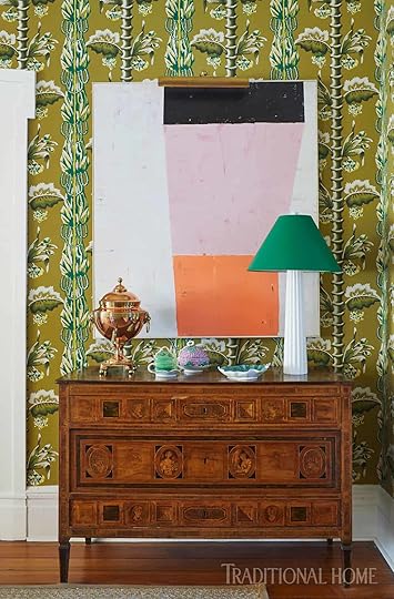 design by brockschmidt and coleman | photo by jean allsopp | via better home and gardens
I had to lead with my favorite photo in the post, because it sums up what we’ll be dissecting today. This room, my friends, is a masterclass in balancing the intersection of formal and playful. The marquetry cabinet is an absolute high-end showstopper that’s so well-balanced by the bold wallpaper, modern art, geometric lamp, sparkling copper & brass urn, and whimsical dishes. Styled in a different setting, this vintage piece totally could have read as fussy but in this room, it comes off as warm and welcoming. ARE YOU CATCHING MY DRIFT?
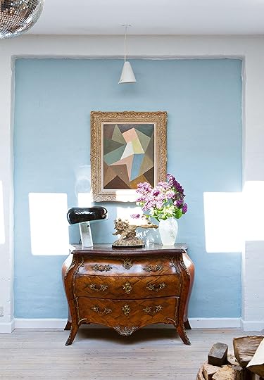
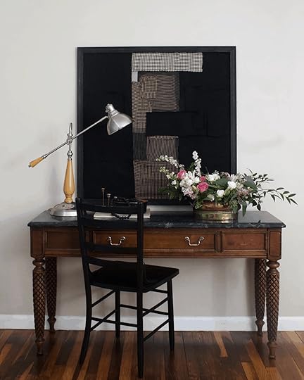 left: design by anja alfieri, photo by mikkel strange, via bo bedre | right: design and photo by tanieka harris
But okay, maybe you want an example with a little less color and pattern…that’s cool. Here’s some rooms for you, too! I think my favorite thing about this style is that it takes the pieces that formerly existed in my grandma’s sitting room (you know, the one where no one was allowed to sit or touch anything) and it turns them into functional, everyday staples. It almost feels a little self-indulgent and self-care-y to let yourself enjoy the most formal pieces in your most informal spaces. (Basically what I’m trying to say is that this trend is the furniture equivalent of using your wedding china every day. Treat yourself! You deserve it!)
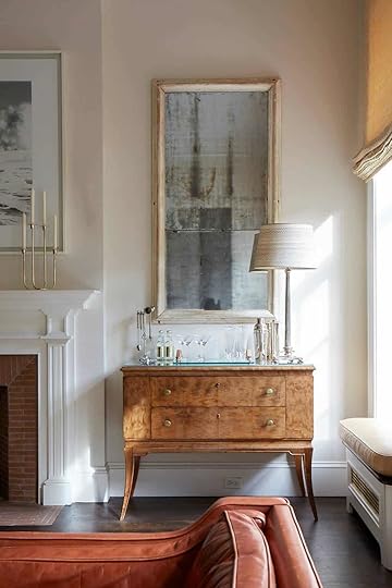 design by rita konig | photo by paul massey | via house and garden uk
Ah, YES. Using a bar cart here could have felt simple or small or played-out – but if you have a dresser or cabinet you love, why not throw some glass on top and use it as a serving area? Additional pro: I have it on good authority from the folks at Wertz Brothers (an enormous LA warehouse with very good IG stories of their inventory; worth a follow even if you’re not in the area if you love vintage furniture!) that true antiques are super-well priced right now as most folks scramble for a very limited inventory of ’70s and ’80s pieces. Like, guys, you can save money AND be an early adopter. WIN/WIN.
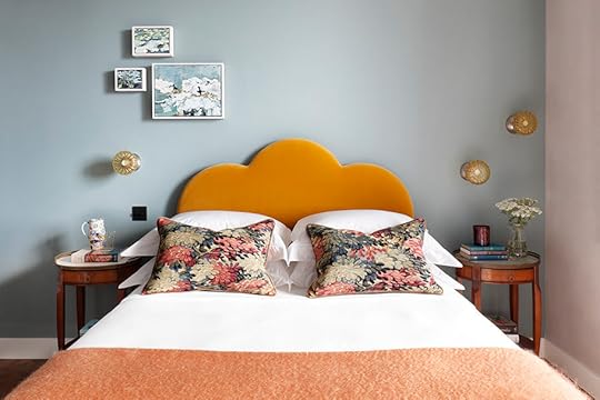
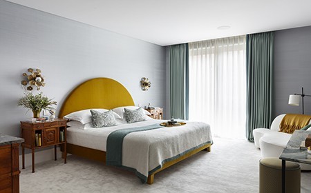 left: design by studio ashby, photo by alexander james, via vouge uk | right: design by studio ashby, photo by phil durrant
When Jess DMed me the room on the right, I gasped. Studio Ashby is incredible at mixing old and new. I’m not saying you need to go full-on Bridgerton in your home, but even adding a few classic wooden vintage pieces – even in tiny doses, like as nightstands – bring a ton of heart and soul to your room. Plus, HOW GOOD ARE THOSE NEEDLEPOINT PILLOWS on the left?!?
Saturated Color Palettes design by jeffrey bilhuber | via architectural digest
Oh my gosh, have you ever seen primary colors look THIS sophisticated? Like, if someone told me in passing that they were considering a blue wallpaper with yellow curtains (and valances) with a coral chair I woulda been like, “uh, pal, are you planning for Peewee’s Playhouse? Maybe don’t do that?” but this room…this is well done. It’s bright without being blinding and happy without coming off like a McDonalds Playplace. 100000/10. Bonus: peek at that canopy through the tinted mirror!
 design by luke edward hall | photo by benoi linero
Full disclosure: I am really struggling not to straight-up steal this color scheme (including the striped bed frame, honestly) for my own bedroom. But look a little deeper – those are vintage nightstands, a curtain with valances, and a sconce with a very traditional shape, yet they all feel very fresh and new. Playing with paint – yes, you can do your walls, paint, and trim in 3 different colors – and being bold with your decor color choices can really pay off!
Cabana Stripes design by beata heuman
SWOON. This speaks to my minimalist maximalist roots. (I guess that the end of the day, not much has changed aside from my preferred finishes and eras.) We have a lot of classic elements here, like the fringed sofa and the Jenny Lind legs, but everything is really brightened up by the bold red-and-white stripe that echoes the color of the built-in arch. (Side note: You remember Jenny Lind from the Greatest Showman? Well, uh, Jenny Lind was actually a really famous opera singer and she’s the namesake of all these circle-shaped wood-turning furniture pieces! If you ever see a kids’ Jenny Lind bed, you owe it to the real Jenny Lind!)
 design by pierce & ward | photo by skye parrott | via the nordroom
The magic of stripes: they’re classic and timeless without being too much. It’s a bold and fun statement that will continue to work with a ton of furniture and decor styles. You can take it from me, a chronically indecisive person who has held onto a vintage black-and-white striped couch like the holy grail despite switching every other item in my apartment endlessly. If you’re pattern shy, this is the best way to test the waters!
Large-Scale Wallpapers
 left: design by jared hughes design, photo by jean allsopp | via better home and gardens | right: design by redd kaihoi
HELLO MARIE ANTOINETTE. Your palace awaits, girl!!! These are not the bitsy, floral print floral papers of yore, y’all – these wallpapers are here to make big, bold, and occasionally mural-esque statements. But let’s break it down a bit more: while being very traditional, the hall on the left and the console table on the right are anything but stuffy. On the left, the blue painted ceiling brightens up the space and the wallpaper adds a ton of whimsy (can you guys imagining Swiffer-ing in there? How FUN would cleaning be?) while the bar set up on the right makes a very traditional console table feel a little less precious.
 photo by simon brown | via romantic irish interiors
SO COZY. The brass canopy and vanity could read super punctilious, but they’re made warm and cozy by contrasting patterns, a homemade quilt, and a tablecloth. I’m a huge fan of this idea: is there anything in your home that feels a little too precious that you could tone down with a table runner? Give it a whirl, friend!!
 left: design by pierce & ward | right: design by kit kemp, photo by simon upton, via the nordroom
We hit the jackpot on the left, pals! SO many vintage pieces – everything from that entry table to the chair in the back to the gilded mirror and frames up the stairs – anchored by a huge wallpaper, timeless rug, fun stair runner, and bold chandelier. Let this be a lesson to you in the art of pattern patching – intent and confidence are everything! If a chair reupholstered in neon pink can work with two different red rugs, you can play with color in your own home, too! I also had to include something for our future parents (yes, that’s a Jenny Lind crib!) – get a load of this bold wallpaper along with that aged end table in the corner.
High-Impact Lighting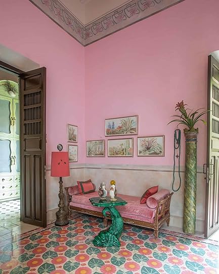
 left: design by marjorie skouras, photo by john ellis, via architectural digest | right: design by luke edward hall, photo by benoi linero
How special are both of these?! That one-of-a-kind floor lamp is jaw-dropping (this shot was pulled from a primary bedroom tour, but the whole home is worth a look!) when paired with this luxurious setup. I know it seems like a lot, but guys, that’s only TWO PIECES OF FURNITURE WITH A LAMP. The rest is just wall art, color, and pattern. When it comes to the new bold traditional style, little things are doing a lot of heavy lifting! And somehow, the gilded, marble-topped table on the right is toned down by the saturated wall color, statement mirror, and bright lamps. Lesson: both these vignettes have very high impact despite being pretty sparse. Budget-conscious pals, use these kinds of details to your advantage!
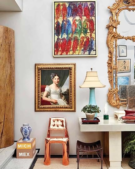 design by redd kaihoi | photo by trevor tondro | via 1st dibs
Another find from our very own Jess!!! I swear, y’all, the true highlight of working at EHD is finding a bunch of gals I can DM about interior design photos Being said, how bold and confident is this design? I love how this lamp really bridges eras – it speaks to the ginger jar and the finial echoes the mirror and framing, so it’s really the key piece that’s holding this space together. Plus, that pitched shade holds its own and gives some gorgeous textural contrast to that tubular copper chair!
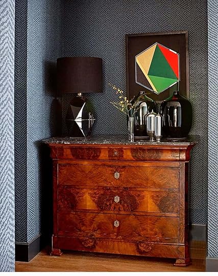 source unknown
Not to call too far back to the beginning of the post, but we actually started out by looking at a lot of vintage casegoods topped with very modern lamps…so let’s go back there for a second. This shot is almost a more masculine or neutral version of the first shot we broke down – we still have the bold wallpaper, modern art, metallic vessels, and standout geometric lamp. The overall look is VERY different, but the formula is the same. We can get this look at home, too!
Tailored Curtains with Valances design by beata heuman
Well, first, uh, HEY, CABANA STRIPE. Nice to see you deep in the post! But what a game-changer these stunning, uber-tailored curtains are (anyone else feel relieved when they see a drape fall at exactly the right length?). I know that you’re oogling the shape of the valance and pleating, but please take a peek at the tiny, appropriate version on the right – while we at EHD are traditionally evangelists of the floor-length drape in all situations, this room proves that rules can be broken. You know, especially when you’re taking a ton of exciting design risks. ARE YOU SOLD YET?
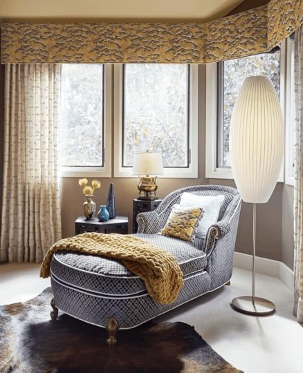 design by laura zender design | styled by sarah finnane | photo by werner straube
This one and the next one were other Jess finds – I had asked if she had any great sculptural valance inspiration and MY GAL DELIVERED. These are PRECISE. I’m a huge fan of this room because it comes off as pretty 20th century – beige walls, beige carpet, simple trim, etc. – but MY GOSH, isn’t it elevated by these window treatments? They change the whole tone of the space! Valances are coming back, pals, and you can take that to the bank!!!
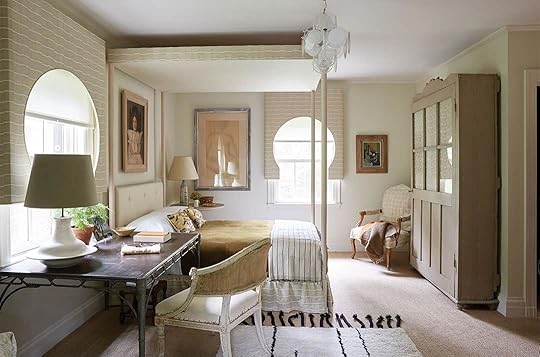 design by david kaihoi | photo by francesco lagnese | via schumacher
First off, how lucky are would you be to find an interior designer willing to help you make such gorgeous custom-shaped drapery? And second off, WOW. Similarly, I love this because it highlights that you can turn a fairly normal, neutral, carpeted room into an oasis – you don’t need vintage architecture when you can design special features yourself! Bespoke items mixed with vintage touches make this feel like a TOTALLY fresh, special, one-of-a-kind space.
Statement Beds design by beata heuman
Ah, a quick resting place for my minimalists who have been shocked and jarred by the amount of color and pattern in the post! This is another absolute favorite of mine – we have a mix of antique nightstands, a grounding and saturated solid rug, and a casual stripe with a special shape. This is one of those “WHO, ME? I woke up like this” rooms that feels effortless and calm but looks like a gosh darn knockout.
 design by suzanne rheinstein | photo by laura resen | via architectural digest
Another quick resting place for those who need one – we’re fully vintage in this room and it’s clean, manageable, and elevated without feeling too fuddy-duddy. If you’re looking for a sign to splurge on a special bed, this is it (plus, I recently just somehow learned that we spend FOUR WHOLE MONTHS per year IN OUR BEDS). Basically, it’s time to make your home a relaxing, warm, soulful, inviting retreat
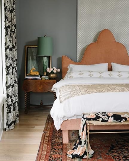
 left: design by pierce & ward | right: by design by rita konig, photo by paul massey, via house and garden uk
But we can go a teensy bit more muted if you absolutely need to. I love the formula that’s starting to brew: special bed, cool walls, floral print, demilune table, white bedding, vintage rug, tiny floral arrangement. You can do this at home! I promise!
 design by leanne ford | styled by kate berry | photo by nicole franzen | via domino
Another Jess find, serving as proof that dark ornate vintage wood can work in ANY type of space. Look how these two beds glow against the rough texture of the walls and beams! The shining frames are balanced out by some calm, textured bedding. Sure, these would look stunning all done up with some wallpaper and window treatments, but they look just as lovely when they take the starring role in a more sparse space. Leanne Ford is VERY talented and we should all take a page out of her book
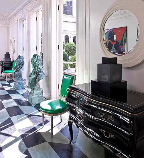 design by kelly wearstler
A GAL’S GOTTA HAVE HER GLAM. I get it. If antique natural-toned wood isn’t your thing, you’re in luck! Lacquer up one of those vintage babies and go to town! Kelly Wearstler did it TWICE in this shot so you know I’m not leading you astray!
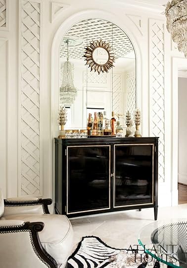
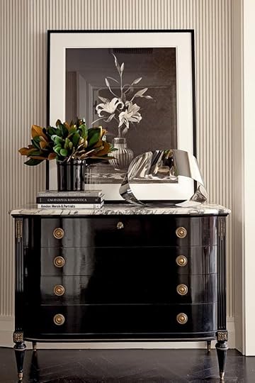 left: via coco kelley | right: source unknown
As always, I don’t want to lose my lovers of neutral, so I wanted to bring you some bold black and white inspiration, too. Lacquer brings a whole new level of sophistication to these pieces – can you imagine them in a blonde wood, Scandi-inspired instead? No thank you! I know you probably don’t want your home to feel like the Caesar’s Palace in Vegas (and for what it’s worth, I also don’t want your home to feel like the Caesar’s Palace in Vegas) but a few hits of shine can really take a room to the next level.
 design and photo by gwen of the makerista
Huge fan of this iteration because it feels really achievable – if you have a neutral bed frame at home and you stumble upon the opportunity to add a lacquered vintage chest in place of a nightstand, bring it home and try it out! This adds a ton of soul and personality (not to mention shelf space!) to a room that could easily swing boho or mid-century with a simple switch of nightstand and decor.
Classic Regency Touches (That Are Super Achievable) design and photo by jessica of domicile37
If you’ve been reading this and you’re like “hey girl, I like this but I don’t think I can pull it off in my home, this would be a very drastic shift,” I’d love to present the above photo to you by the extremely talented, Jessica of Domicile37. Buds, there’s not that much going on here – just a bold color, bold wallpaper, a sofa, and a cabana-striped chair with some classic regency lucite & leopard mixed in! My inner maximalist and my inner minimalist are at peace knowing that I’ve found a style that does SO MUCH without requiring SO MANY unachievable things. (PS. EHD Jess told me that leopard wasn’t a thing with this trend and after sending this, she reneged and was like “you’re right leopard is totally a thing, MY BAD!”)
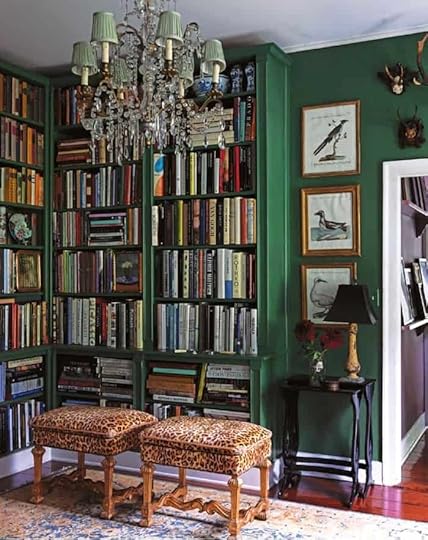 left: design by jared seligman, photo by fran parent, via architectural digest | right: via french accents by erin swift
And of course, we couldn’t forget about our classic finishing touches!!! Take a quick peek at those roped-tassels on the left and the leopard print on the right – when it comes to the bold new traditional style, BOTH ARE WELCOME. Classic Hollywood called and they want to talk to you and your new space because it is FUN AND TIMELESS.
At the end of the day, I think that actually sums it up – sure, this may be a lot of color or pattern for some folks, but it’s survived the test of time. At this point, no one will ever look at a vintage Bombay chest and think “oh my gosh, that shape is DONE” (she wrote, while staring with disdain at her butter-yellow, wavy, 1980s sideboard). The thing I love most about the new bold traditional is that it really truly IS timeless – when it comes to these antiques, you’ll have total freedom to style and play around them in a way that I don’t think I really appreciated until now.
At first, I thought that my transition away from my Toontown-aesthetic was driven solely by familiarity and mass adoption (e.g. “I’ve had these vintage pieces for 4 years, time to swap” and “wow, postmodern pieces are available everywhere, time to move on,” but after so much pinning and planning and thinking, I have a newfound appreciation for the longevity and flexibility of true antiques). I’m so excited to see my favorite IG furniture dealers starting to dip their toes into this space – because, you know, even I have to admit that a marquetry cabinet is of definitively higher quality than my laminate counterparts – and I’m really excited and hopeful to see what this next iteration of interior design brings forward.
In any case, I’M SO CURIOUS ABOUT YOUR THOUGHTS. Is this too dated for you? Are you excited that your pieces are coming back en-vogue? In case you’re not familiar, vintage furniture is kind of like MY ONLY PASSION and I want to talk about it all day, every day, so let’s battle it out!!! The new bold traditional: HOT OR NOT?
Opening Image Credits: Design by Suzanne Rheinstein | Photo by Laura Resen | via Architectural Digest
The post Caitlin Has A Secret Trend Spotting Hack And Here’s What’s Coming Up Next – BOLD ANTIQUE REVIVAL appeared first on Emily Henderson.
May 5, 2021
What You Bought In April… Once Again We Were Shocked (But Delighted) By #1
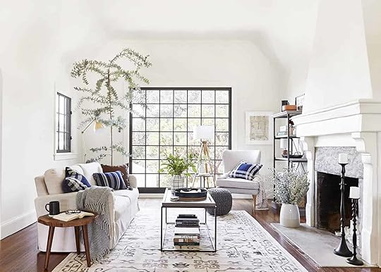
Oh May gosh, can you believe April is already over??? Sorry for forcing you through that dumb pun, I just saw an opportunity and had to take it. Anymay, (MALLORY, STOP) we linked a stupid amount of great products in April and there were 10 specifically that you guys seemed to love the most! Why is it so fun to see what people are buying? Is it to know what people actually liked or is it just because it’s one of the least creepy ways of spying on everyone?? Either way, we’re gonna share the top 10 best sellers for last month, so let’s go.
10. Jess’s Clogs
First up to bat, we’ve got Jess’s clogs from our shoe post!! These little beauties are from Madewell and are A GREAT summer shoe. Here’s what Jess had to say about them “I had been eyeing these clogs since Em got them! Then when she so generously let us raid her garage, there they were and are now mine. They are SO cute on, the perfect amount of height and are “a statement” without being a statement. They are still available at Madewell so if you have been wavering, waver no more”
9. Em’s “Mrs. Doubtfire” Dress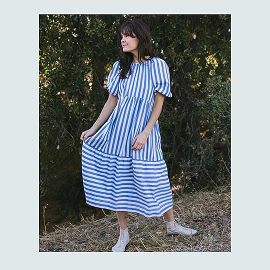
Mrs. Doubtfire Dress (noun): A dress that is flowy enough and comfortable enough to slide over your pajamas, workout clothes, or any other “at home/quarantine outfit,” and works perfectly to disguise what you’re actually wearing during Zoom calls. Doesn’t everyone have one of these by now?? It’s the ole Zoom call outfit hack and it’s the best way to dupe clients or coworkers into thinking you’re wearing a real outfit. Plus this particular dress is extremely cute and well made which is why Em loves it so much:)
8. Indoor/Outdoor Rug
This rug hails from the awesome laguna beach house tour we featured last month. You can find it in their very cute kid’s room!! Wow, it’s styled so well. This rug is such a cute color & has a fun, casual feel AND it’s an indoor/outdoor rug so it can handle a bit more wear and tear. I totally get why this was a top seller! It’s highly snaggable.
7. Jess’s Facial Sculpting Wand
Jess is obsessed with Shani Darden’s products, so when she saw that her face sculpting wand was finally back in stock, she knew it was something she wanted to save up for and invest in. Her glowing review includes: “Not only do I just feel more toned after I use it, it’s also a relaxing massage for my face and neck. I like that I’m forced to slow down a little and enjoy the process.” So if you’re looking for a splurgy self-care gift for you (or mom for mother’s day maybe??) check this bad boy out!
6. Emily’s Necklace
Emily’s had this necklace for YEARS and it’s only getting better with age. It’s one of those little pieces that can instantly edge up an outfit but also make it personal, plus it makes a great gift. We are so happy it’s still available xx
5. Emily’s Blouse
Not too surprised to see this lil beaut on here. Em wore this for our latest Target shoot and the minute I saw it I was like, “WOW THAT’S CUTE AND IT’S ONLY $24???” so of course, everyone felt the same!!! It also comes in a brown and white gingham that I HIGHLY recommend checking out.
4. Mallory’s Summer Heels
I AM SO EXCITED TO HAVE AN EXCUSE TO TALK ABOUT THESE AGAIN! My favorite shoes. Ever. I could not NOT welcome summer without these babies on my feet. I like wicker in my furniture, so why not on my feet. They’re pretty tall and make me feel like a wicker giant, but aren’t uncomfortable because of that thick platform. They also come in 2 other more neutral colors. 10/10 to these babies.
3. Jess’s Summer Jeans
These jeans are the best!! Jess linked them in the link up a while back and I totally get why these made the top 3 because she even sold me on these (and I’m obsessed). You know how everyone says skinny jeans aren’t in anymore? Well these to me are the perfect transition pants if you’re not quite ready to let go but you still wanna seem “in with the trends.” Plus the wash is the best kind of denim wash to me. 10/10 to these!
2. Emily’s Boyfriend Jeans
Emily wore this cute pair of denim with that cute shirt that took home 5th place and they are a STEAL. At $24 for a pair of jeans, OF COURSE these would make it to second place. Their awesome boyfriend cut is totally in and I love the rips in them. All in all, these jeans could not be better for the price.
And in first place we have…
1. Ryann’s Sweatpants
The wildly cute, wildly affordable TARGET SWEATPANTS! These pants are perfect in every way. Especially because they’re stylish enough to wear out but they’re still sweatpants…win-win! Plus they come in so many different colors for there’s really a pair for everyone. WAY TO GO RYANN FOR RECOMMENDING THESE! You made lives better with this rec
Thanks everyone for tuning in! Take care of yourself today. We love you xx
Opening Image Credits: Photo by Sara Ligorria-Tramp | From: How Target’s Fall Threshold Collection Nails the “Updated Classic” Trend
The post What You Bought In April… Once Again We Were Shocked (But Delighted) By #1 appeared first on Emily Henderson.
Emily Henderson's Blog

- Emily Henderson's profile
- 10 followers

