
Emily Henderson's Blog, page 167
June 8, 2021
Are You Ready To Entertain In Your Outdoor Space??Check Here To Make Sure You’ve Got What You Need
It finally happened. I have two friends that now have POOLS! In every other city I’ve ever lived (outside of the one I grew up in), knowing someone with a pool was a fantastical dream that was completely out of reach. I mean if you know someone in NYC that has a private pool please give them my number because I will do what it takes to be their friend. I can provide witty banter and wine (mid self as I do not have a pool). So ya, from the majority of my post-college life it’s been public pools or hotel pools when friends would visit. But now that I’m a. old enough to have friends that own homes and b. live in a city with a little more space so I plan to be floating my summer away.
Now my childhood best friend is throwing a little, all vaxxed housewarming little pool party and was picking my brain for outdoor dinnerware recs because she’s never had a real backyard (and pool) before as an adult. This clearly had me thinking. Soooo many people moved this last year (me included) to spaces with a little more room which a lot of the time included outdoor space which was sometimes the point. Some guidance in the 2021 outdoor tabletop arena might be helpful to you all too!
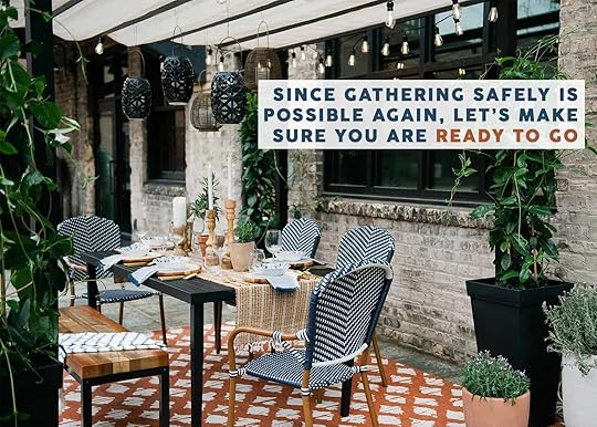
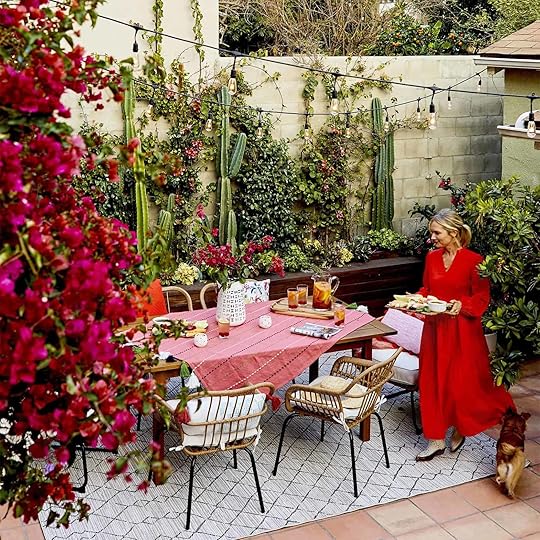 photo by sara ligorria-tramp | from: how to style out your outdoor space so you’ll actually use it
When I talked it over with the team, there were some opinions since having a second set of dinnerware can be easily wasteful. Emily is happy just using their everyday dishes outside since their kitchen is so close to their deck, Caitlin loves having melamine dishes, which are typically used for outdoors, as her everyday dinnerware, and I fall somewhere in between. I am big on having shatter-free glassware outside because well… I can be clumsy. Plus it’s really unsafe to have broken glass with people and animals running around barefoot. I don’t think anyone would argue with that:) Also, I love love my heavy ceramic dishware inside but really HATE when I have to lug it outside for a little happy hour/snack hang with my friend neighbor. That last one is not that important but sadly not untrue. So when you are shopping assess what your actual needs are and go from there.
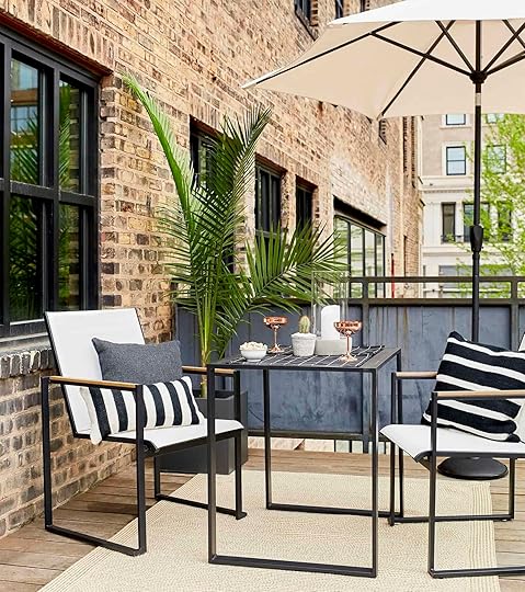 photo by melissa oholendt | from: a foolproof way to create an outdoor room with target
Also as a design and product lover, I feel as though it’s my duty to show you the current awesome products on the market to maybe fill in the gaps of your outdoor entertaining setup if you are in need (for furniture head here:)).
But before we get into the roundups, per Caitlin’s request, I’m going to do some EHD old school combos to maybe spark some outdoor tabletop dreams…
Editor’s Note: All of these products and combos are for outdoor spaces big and small. No pool required. Just make it work for you:)

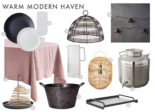
1. Modern Melamine Dinnerware Set | 2. Fluted Acrylic Highball | 3. Woven Straw Food Covers (set of 2) | 4. Incandescent Mini Faux Wicker String Lights | 5. Cotton Plaid Tablecloth | 6. Carrie Portable LED Lamp | 7. Black Metal Tiered Stand | 8. Gold Oval Beverage Tub | 9. Plastic Serving Bowl with Lid | 10. Citronella Ancona Ceramic Candle | 11. Glass Natural Wrap Pitcher
I had to start with a punch of color because well it’s summertime folks! Don’t be afraid to pick some bold moments like this cobalt dinnerware and colorful tablecloth. The trick is to then bring in smaller pieces to complement them in the same color scheme like with the cup, string lights, and bug repellant candle. Then to bring in some softness, texture is always the way to go (and feels very summer-y) so I picked that adorable pitcher and food cover. Notice those also speak to the woven string lights:) Next, to give it a hit of modern and ground the combo together I threw in that portable LED lantern for more mood lighting and the tiered metal stand. Lastly, I wanted to add a little unexpectedness (that’s a word, right?), so that brass beverage tub for endless Spiked Spindrifts and a green bowl because stepping outside of your color palette with one piece is fun in my humble option;)
Let’s go a little softer, eh?
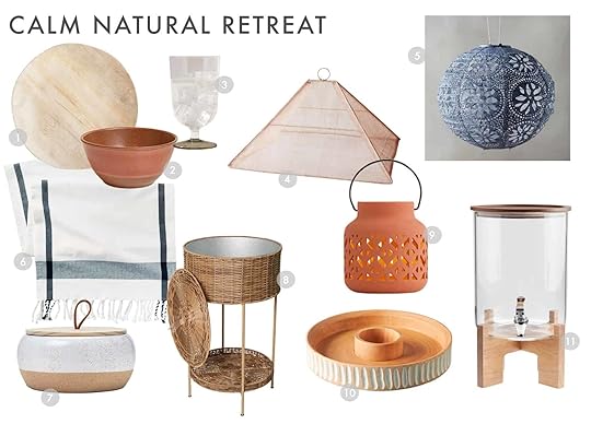
1. Faux Bois Melamine Dinnerware | 2. Melamine and Bamboo Cereal Bowl | 3. Footed Acrylic Glass | 4. Handmade Collapsible Woven Food Tent | 5. Floral Lace Solar Lantern | 6. Cotton Plaid Table Runner | 7. 15oz Large Round Ceramic Citronella Candle | 8. Woven Ice Bucket | 9. Rust Geometric Ceramic Lantern | 10. Marin Chip & Dip | 11. Glass And Acacia Wood Drink Dispenser With Stand
You might not be the super colorful type and that’s totally fine. Our outdoor spaces are meant to make US feel good. So here is my neutral combo and while I’m partial, I really love it. First off, can you believe that the “wood” dinner plate is melamine?? I know I was shocked at first too. I am HIGHLY considering buying a set for when I want to sit on my patio or just don’t want to deal with my heavy ceramic plates. But back to the anatomy of this combo. It’s all about mixing up natural textures. Here we have wood in the plates, the lid of the candle, the chip & dip holder, and the top and back of the beverage dispenser. Then you have ceramics in the candle base, bowl (it’s faux but gives the effect), and solar table lantern. Lastly, you have the soft and woven bits (table runner, blue hanging lantern, and, food cover). It’s all pretty balanced. What I always make sure to do in even the most neutral space is to add a liiitle color. The blues and the green on the glass really help to bring it all to life.
Last but not least, we are going modern monochrome…almost:)
1. Pebble Matte Black Melamine Dinner Plates | 2. Bamboo Melamine Stripes Salad Plate | 3. Plastic Frenchie Jumbo Glass | 4. Round Black Stripe Mesh Food Dome | 5. LED Pendant Light Strand | 6. Linen Tablecloth | 7. Glass Pitcher | 8. Bori Natural Lantern | 9. Stainless Steel Fustis Beverage Dispenser | 10. Citronella Coil | 11. Citronella Coil Holder | 12. Galvanized Metal Beverage Tub | 13. Lanai Serving Tray
If pink isn’t your thing you could easily swap out the table cloth for a more monochrome one. I was obviously inspired by Malcolm’s bedroom with this one because I think it’s just the move to “liven up the party” if you will. This combo is about the metals while adding in little natural textures because you’re literally in nature, they are a must. I love the play on scale with the striped salad plated, ribbed drinking glass, and the food cover. It gives some visual interest without needing colors. Then mixing all of the different metals (string lights, beverage tub, tray, and drink dispenser) helps to let your eye bounce around without it needing to work too hard since they aren’t too different. Now I don’t know about you but I’ve wanted one of those burning citronella coils for a minute and this just might be the year. This one will burn for 36 hours but there are bigger ones that last longer. I would love for the mosquitos and I to live harmoniously in 2021. Fingers crossed? So not only is it useful it also brings in a lighter tone, along with the woven lantern to help contrast all of the dark colors. Modern, chic, but still warm. Always the goal.
Oooook! Hopefully, you are now refreshed on your outdoor entertaining comboing skills. But these are just the tip of the iceberg. You might have a totally different style you want so fear not because it’s time to really get into some product. Buckle your seatbelts because we are going into a 2021 outdoor entertaining deep dive:)
Dinnerware You Won’t Believe Is For OutsideAs I said in the intro this one is a little controversial. Hopefully, just like everything else we are all purchasing with thoughts for the long term and not just “o shoot, I new need plates for our BBQ so I’ll just pick something I’m fine with”. We ALL fall into this trap from time to time. But a lot of these options are SO cute and if you are looking, I think you will be very happy:)
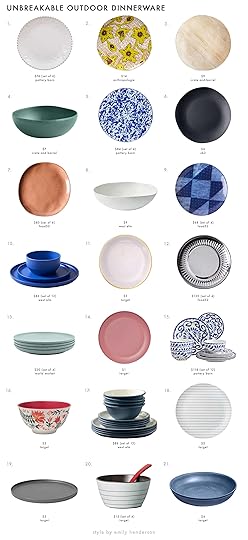
1. Beaded Pearl Melamine Dinner Plates | 2. Macaria Desert Plate | 3. Faux Bois Melamine Dinnerware | 4. Teal Bamboo and Melamine Dinnerware | 5. Swirl Enamel Dinner Plates | 6. Pebble Matte Black Melamine Dinner Plates | 7. Sandia Melamine Dinnerware | 8. Melamine Stone Dinnerware | 9. Prairie Melamine Plates | 10. Modern Melamine Dinnerware Set | 11. Pink Melamine Dinner Plate | 12. Stainless Steel Paper Plates & Cups | 13. Bamboo Fiber & Recycled Coffee Ground Plates | 14. 10.5″ Plastic Dinner Plate | 15. Melamine 12-Piece Dinnerware Set | 16. Bamboo Melamine Dinner Bowl | 17. Flared Pop-Tone Melamine Dinnerware Set | 18. Bamboo Melamine Stripes Salad Plate | 19. Gray Bamboo Dinner Plate | 20. Bamboo Melamine Stripes Dessert Bowl & Spoon Set | 21. Melamine and Bamboo Dinner Bowl
If you are like Caitlin (and maybe soon to be me) and are looking for melamine plates for inside and outside I love #1, #3, #6, #7, and #17. Also, #15 is also really doing it for me. But if a bolder look is what you want for your outside summer look then #2, #5, #10 (which comes in a bunch of colors), #14 or #16 are great picks. Just always remember that mixing and matching fun patterns and solids will make for a cool and thoughtful tablescape.
Truly Unbreakable DrinkwareMy love for drinkware is not contained to the great indoors. Outdoor cups can be just as beautiful and if put in my hand last… years longer. This brings me to the very exciting news that none of these cups are glass, so your feet will be totally safe if something spills:)
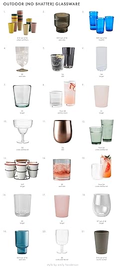
1. Bamboo Cup Set | 2. Fluted Acrylic Double Old Fashioned | 3. Veranda Outdoor Tumblers | 4. Footed Acrylic Glass | 5. Chill Acrylic Double Old Fashioned Glass | 6. Plastic Frenchie Jumbo Glass | 7. Plastic Short Tumbler | 8. Stripe Rim Acrylic Drinking Glass | 9. Plastic Translucent Tumbler | 10. Stacking Acrylic Margarita Glass | 11. Doris Bronze Aluminum Stemless Wine Glass | 12. Emmeline Acrylic Glasses | 13. 7pc Drink Caddy Set | 14. Gold Rimmed Acrylic Whiskey Glass | 15. Liv Acrylic Glass | 16. Ribbon Texture Drinkware | 17. Plastic Translucent Tumbler | 18. Plastic Wine Glasses | 19. Fluted Acrylic Double Highball | 20. Stacking Acrylic Clear Wine Glass | 21. Bamboo Fiber And Recycled Coffee Ground Cups
I think that glassware is really where you can play with texture and shapes. #3 very much reminds me of Emily’s tumblers from her LA house patio reveal that I have lusted for ever since. I am also very here for #4, #7, #15, and #20. But also how can you not love that drink caddy?!
 photo by sara ligorria-tramp | from: how to style out your outdoor space so you’ll actually use itCute Pitchers and Dispensers
Ok so some of these are glass but I think that when it comes to pitchers and drink dispensers, they using don’t get tossed around too much. I mean if you choose to have your margarita glass pitcher poolside then you are braver than I and pass me a sweet sweet marg:)
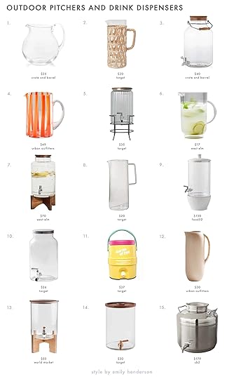
1. Sora Acrylic Pitcher | 2. Glass Natural Wrap Pitcher | 3. Acrylic Drink Dispenser | 4. Nadia Striped Glass Pitcher | 5. Drink Dispenser with Stand | 6. Fluted Acrylic Pitcher | 7. Pure Drink Dispenser | 8. Glass Pitcher | 9. Ceramic & Glass Drink Dispenser | 10. Vintage Glass Beverage Dispenser | 11. Igloo Barrel of Fun Retro Portable Beverage Server | 12. Dylan Tall Pitcher | 13. Glass And Acacia Wood Drink Dispenser With Stand | 14. Glass Modern Beverage Dispenser | 15. Stainless Steel Fustis Beverage Dispenser
I have number #14 and it works great. The only thing is that you need to be able to have it near an edge of a surface or find a stand. This is why #5, #7, #9, and #13 are really great options. But the playfulness of #4 and #11 are so fun! I also just love the natural look of #2 and #12. I think you just need to think about how much you plan to use either type and if you have the storage. Thankfully my dispenser fits beautifully in my new place… not so much in my old little studio. Just some food for thought… or ice-cold beverage for thought…
Tables Linens That Pack A Design Punch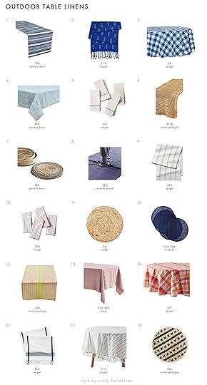
1. Azul Striped Handwoven Recycled Table Runner | 2. Cotton Clipped Table Runner Blue | 3. Polyester Printed Tablecover | 4. Roxy Ocean Wave Tablecloth | 5. 4pc Single Border Stripe Napkin Set Teal | 6. Iazid Raffia Table Runner | 7. Woven Seagrass Placemats with Holder – Set of 6 | 8. Navy Chambray Umbrella Table Runner | 9. Oversized Texture Rib Stripe Table Runner Black/Sour Cream | 10. 4pc Stitched Border Thin Stripes Napkin Set Red/White | 11. Water Hyacinth Charger Placemat | 12. Lightweight Summer Placemats (Set of 4) | 13. Posie Gingham Table Runner |14. Linen Tablecloth | 15. Cotton Plaid Tablecloth Pink | 16. Cotton Plaid Table Runner Cream | 17. Cotton Woven Tablecloth Blue/White | 18. Woven Bamboo Placemats, Set of 4
NO Bugs Allowed With These CoversThese are definitely not a necessity but boy would they be nice to have. Especially with the good on the serving dishes. LA isn’t a particularly bug-filled place aside from mosquitos (we’ll get to the citronella candles) but there are plenty of areas that are. Hope these help if you do:
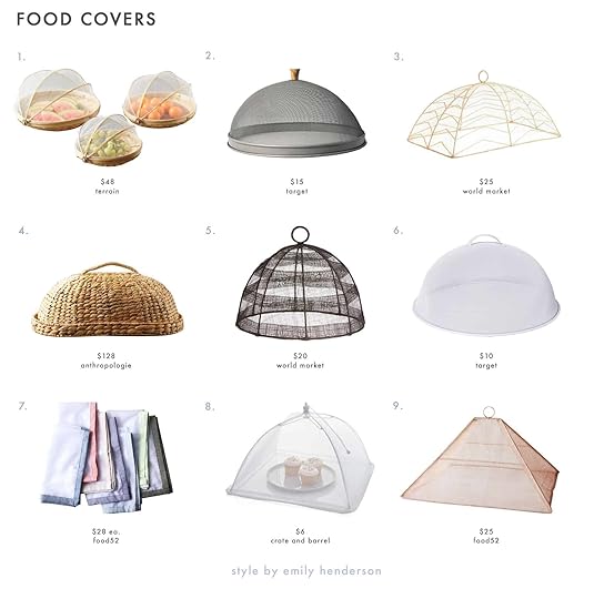
1. Mesh + Bamboo Food Covers (set of 3) | 2. Mesh & Wood Food Dome | 3. Rectangular Natural Chevron Mesh Food Dome | 4. Woven Straw Food Covers (set of 2) | 5. Round Black Stripe Mesh Food Dome | 6. Steel Food Dome | 7. Outdoor Net Food Cover | 8. Food Tent | 9. Handmade Collapsible Woven Food Tent
I am very into #1 and #4 because I’m a suck for natural woven pieces. But #7 is SO cool. Sure is it a fancier napkin? But likely more sanitary. Also, #8 and #9 are totally collapsable which is great for storage. Do you people with bug problems are these a must? Let me know.
 photo by tessa neustadt | from: how to decorate your outdoor space with targetBeverage Tubs To Keep Things Cool
I am an ice person because I like my drinks COLD. And step one of having the ultimate cold drink experience is having them cold in the first place. This all means that if your outdoor space is not super close to your fridge you NEED a beverage tub to keep those drinks cool. Ok no, you don’t need it but it will make your and your guest’s beverage time much more enjoyable I promise.
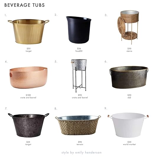
1. Gold Oval Beverage Tub | 2. Recycled Bamboo Wine Bucket | 3. Woven Ice Bucket | 4. Bash Copper Beverage Tub | 5. Galvanized Beverage Tub with Black Stand | 6. Spangle Metal Beverage Tub | 7. Galvanized Metal Beverage Tub | 8. Galvanized Iron + Woven Rattan Beverage Tub | 9. Round White Galvanized Metal Party Tub
Again, I like them all but #3 is pretty great because not only is it pretty and woven, but it’s tired with that little extra storage shelf on the bottom. Speaking of woven, #8 is a beaut too! But if your outdoor decor is in need of a hint of glam to brighten it up you can’t go wrong with #1 and #4.
Ready for some mood lighting??
Outdoor Mood LightingEmily will be the first to tell you the importance of outdoor lighting and I will be the second. It can make or break the mood, people! We’ve all been in those backyards where the only light source is a crazy bright overhead light that makes it impossible to create a relaxed mood… or at least that’s how it feels to me. So let’s avoid/fix that issue, ya?
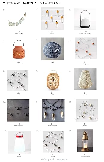
1. Blue Tie Dye Fabric Orb Solar String Lights | 2. 10ct Elongated Tube LED Outdoor String Lights | 3. Carrie Portable LED Lamp | 4. Rust Geometric Ceramic Lantern | 5. Floral Lace Lantern | 6. Incandescent Mini Faux Wicker String Lights | 7. LED Cage String Lights | 8. Bori Natural Lantern | 9. Mosaic Petal Lantern | 10. LED Pendant Light Strand | 11. Commercial LED Light Strand | 12. String Lights Bronze Hood | 13. Sun Squad Lantern | 14. Incandescent Faux Wicker Globe String Lights Brown | 15. Revere Steel Lantern
Let’s first talk string lights. These are (IMHO) the biggest asset you can bring into your outdoor space and there are seriously SO MANY options. If you like modern, go with #2, #7, or #11. Or are you more boho? Then #1, #6 or, #14 is all you. And for those in-between then you absolutely can’t go wrong with #10 or #12. Hang those puppies up and you will have instant ambiance. But adding in another light source (aside from candles…don’t worry we are almost there), we love a lantern. #3 has been on my list for a couple of years and I think despite its sleek lines it’s super versatile. However, #5 and #9 also have been on the ole Pinterest board for AWHILE. Truthfully they are all slam dunks so you can’t go wrong.
Seriously NO BUGS With These Candles and IncenseLast but absolutely not least are these BEAUTIFUL bug repellant candles. I am a mosquito magnet so these are an essential part of my outdoor setup. Maaaybe this is also a housewarming gift for my friend?? Plus with all of these super cute options, why not create ambiance AND get those darn bugs out of your life (or most of them out of your life).
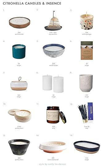
1. Gold Cement 5 Wick Citronella Candle |2. Citronella Coil + Citronella Coil Holder | 3. Citronella Ancona Ceramic Candle | 4. Decorative Ceramic Citronella Candle | 5. Blue Frosted Glass 5 Wick Citronella Candle | 6. 12pk Citronella Tea Light Candles | 7. 15oz Large Round Ceramic Citronella Candle | 8. 2pk Pillar Candle Citronella | 9. Citronella Cement Candle | 10. Citronella Wood Candle | 11. Not Citronella – Real Insect Repellent Candle | 12. Mosquito Repellent Incense Sticks | 13. Citronella Lava Candle | 14. Centoa Citronella Centerpiece Candle | 15. Long Ceramic Citronella Candle
So you have candle or and incense options. I’ve never tried the incense but it seems like they would be very effective. And if they are also pretty…HI! If you want to try like me, #2 and #12 are my picks. Now, these candles are pretty beautiful. I mean look at #5, #7, #10, and #14?! But if you already have nice holders then going with #6 or #8 is great.
Well, that’s it for today. You made it! I hope that you too either can find a friend with a pool or get one yourself (blowup ones count!). We all deserve some luxury and relaxation this summer. So let’s talk products, what you like to use, what kind of space you are designing for. See you in the comments. xx
Love you, mean it.
Opening Image Credits: Photo by Melissa Oholendt | From: A Foolproof Way to Create an Outdoor Room with Target
The post Are You Ready To Entertain In Your Outdoor Space??Check Here To Make Sure You’ve Got What You Need appeared first on Emily Henderson.


June 7, 2021
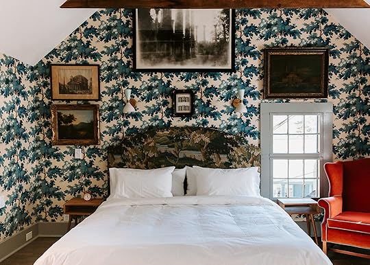
New Project Alert! Em And Key Are Designing The Main Bedroom Suite in The 2021 Real Simple Home

Hi guys! I know it’s been a while since you’ve heard from me, but guess what? I’m still here! The EHD team asked me to stay around a bit longer (yay!) and even hired me as the EHD Insider Community Design Consultant/Liaison (whoop whoop!). I’ve only been in my new role for a couple of weeks, but it’s been so fun consulting, connecting, and chatting all things design with you guys!
P.S. if you’re not a part of the EHD Insider Community, you should be! (you can sign-up here)
But I’m not here to talk about my new role, but rather a TOP SECRET project I’ve been working on behind the scenes with Emily.
Ready to hear what it is? Drumroll please…
 illustration via real simple
Em & I are co-designing a room in the 2021 Real Simple Home! For those who don’t know, the Real Simple Home is a showhouse created by Real Simple magazine. They collaborate with a team of pro interior designers and organizers to decorate each room and feature the home in an upcoming issue of their magazine. Each room is filled with clever ideas and products that their readers can shop and implement in their own homes. This is the magazine’s fourth showhouse, but this year’s house is a little different. Instead of just decorating a move-in ready penthouse in NYC as they did in previous years, they are doing a full-gut renovation on a 1910, 3-story dutch-colonial, located in Westfield, N.J.
 original graphic via real simple (edited by ehd)
Top Row (Left to Right): Em! | Me! | Ryia Jose | Second Row (Left to Right): Delia Kenza | Katie Holdefehr | Eduardo Rodriguez | Third Row (Left to Right): Raili Clasen | Natalie Papier | Nikki Boyd | Leslie Corona
With the help of New Jersey build team Gialluisi Custom Homes, Emily and I, along with extremely talented designers like Raili Clasen, Natalie Papier, and Ryia Jose just to name a few, are each designing a room in the house. Can you imagine how swoon-worthy this home is going to be once complete? At the end, the home will be put on the market for sale! I’m currently trying to convince my husband that we should move to NJ (although I doubt we could afford it). Maybe I should try to convince one of you guys to buy it and then let me move in… any EHD readers currently looking to buy in New Jersey? 
 photo by jennifer lomeli | via real simple
Emily and I have been keeping this secret from you all since January (sorry), so before I get into the design details, let me backtrack and tell you how all of this came to be. Back in January, Real Simple approached Emily to be one of the showhouse designers, and of course, she said, yes! But, designing a room (across the country) in the midst of moving to Portland, renovating the farmhouse, and building a river house… oh and let’s not forget WRITING A BOOK…plus pandemic…is A LOT. Sheesh! Just reading that makes me exhausted. So she asked if I would help, and also of course, I said, yes!
 via real simple
 via real simple
It was such an honor to be brought on board for this project, but I’d be lying if I said I wasn’t a little bit nervous about the whole thing. This would be my first time working/collaborating with another designer, and as we learned in Max’s post, every designer’s process is different. So co-designing (as fun as it is), often means compromise.
Thankfully, Emily and I actually have very similar design processes (ie. it starts on Pinterest), and are drawn to similar aesthetics (ie. cottage-y, old-world meets new). But, I think the main difference between us is that Em is way faster at making decisions than me. I’m the type that wants to scour through ALLLLL the options before I pull the trigger on something, while Em is more of the “I see it, I like it, I want it, I got it” type. ::Alexa, play Ariana Grande::
I’m sure having hundreds of design projects under her belt and being in the thick of two major renovations has contributed to her ability to make quick selections (which was so necessary because we didn’t have much time to pull the design together to begin with), but from a mentee POV, it’s been such a great learning experience seeing how quickly and confidently she operates…with the exception of those two times she accidentally purchased miniature furniture.
 design by cameron ruppert | photo by stacy zarin goldberg
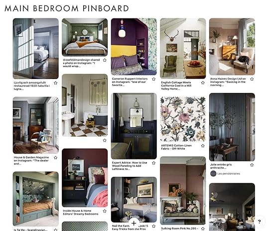
Although this is technically an EHD project (that I’m assisting on), Emily expressed that she truly wanted this to be a collaborative experience and for us to work hand in hand to come up with a design direction (which I thought was so considerate of her). So before we discussed our individual wants/desires/design ideas for the space, we decided to start a shared Pinterest board and pin, pin, pin to our hearts content to come up with a design avatar.
 design by sean anderson | photo by alyssa rosenheck
 It wasn’t long before we realized we were both pinning similar inspo pics: rooms that had statement wallpaper, or moody color paneling, mixed multiple patterned furniture pieces, and florals. Lots of florals. All of which are key identifiers of Emily’s infamous love for the “Eccentric English Grandma” (EEG) aesthetic.
 design by anna haines | photo by andrew steel
Now, that’s what I call Synergy! …or maybe I’ve just been severely influenced by EHD? In either case, we were both on the same page. And then, Emily found this wallpaper from House of Hackney and all the stars aligned– the universe, or perhaps a little divine intervention from Aunt Flossy (Emily’s late aunt who EEG is inspired by) had given us the perfect jumping-off point for the design.

House of Hackney Artemis Wallpaper
 design and photo by paige cartledge
If you’re a faithful EHD reader then you’re no stranger to the “Eccentric English Grandma” aesthetic (perhaps you may even be sick of us referencing it). This style concept was first mentioned on this blog circa 2020 (here).
::Sidebar: I like prefacing 2020 with the word “circa” because it makes it sound like it was a long time ago, and boy do I want that year to be a distant memory.::
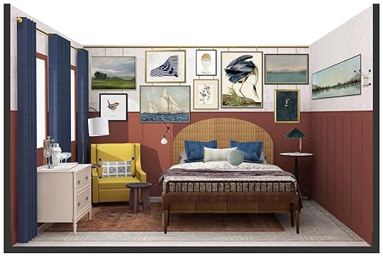
As Emily describes it (EEG), “it’s full of moody rich colors, dark wood tones, granny-inspired patterns, wicker accents, and a heavy dose of “weird”. Think of the coolest old English grandma you’ve ever met, whose home tells a story you want to know all about.”
But since then, EEG has been more of an EHD buzzword than a proven design concept. You see, although in theory it seems like it would translate into a really cool space, EHD has never actually implemented that aesthetic IRL.
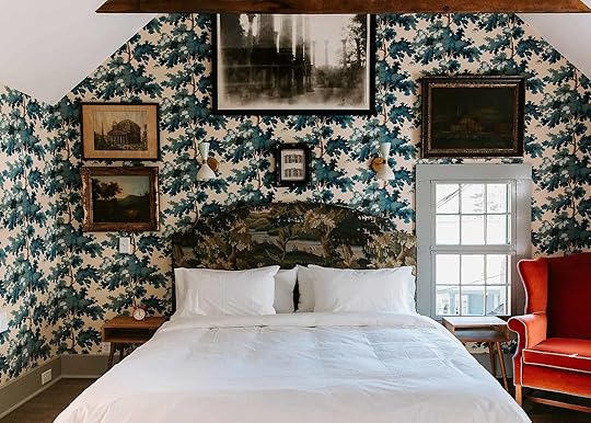
 photo by sara ligorria-tramp | from: living room update – again – our new sofa, my dream floral chaise and the pop of red I always wanted in my life
The closest we got was Em’s latest (and final…I can’t believe she’s moving) living room iteration which she described as “Almost Off her Rocker But Like Not Really Eclectic Grandma”. And although Julie did design an “Eclectic English” bedroom for Apartment Therapy’s small/cool event last year circa 2020, it was a virtual room. If only we could have all enjoyed it in person! So again, up to this point, we’ve had no real-life examples of this aesthetic that EHD wholeheartedly endorses.
 design and rendering by julie rose | from: the design we’ll never get to see in person
 Not to sound dramatic, but this is a PARAMOUNT moment for EHD, because for the first time EVER we will actually get to see if Eccentric English Grandma is as cool of a space in real life as it seems on paper, or if EHD has been misguiding readers this whole time. DUN DUN DUNNN….
Drama and expectations aside, we had the most gorgeous House of Hackery wallpaper and Aunt Flossy’s blessing, so it was time to start designing. 3000 miles away. With only a floor plan to refer to. FUN!
Being that Emily’s in LA/Portland, I live in Maryland, and the showhouse is in New Jersey, we’ve had to design everything virtually, without ever stepping foot in the space. Definitely not ideal, but common given the times we’re living in.
The Real Simple Home has 5 bedrooms, and we are tackling the primary suite. From an architectural standpoint, there were two main concerns for us. First, this renovation would be a complete gut, so although the home was built in 1910 it would essentially look/feel like a new construction once complete. This may sound like a plus for some, but not when you are trying to design a space that looks/feels like an awesome grandma’s house. We knew we would need to find ways to add the charm and character (that was probably demo’d out) back in.
 our personal floorplan
Second, after reviewing the floorplan, Emily noticed that because of the placement of the windows we wouldn’t be able to center the bed on the wall without it covering one of the windows. And positioning the bed off-center would just look/feel weird.
So we began to brainstorm ideas on how we could add some architectural interest to the space as well as solve the off-centered bed dilemma. Adding wall paneling and intricate mouldings, vaulting the ceiling, exposing the beams, adding a fireplace, and relocating the windows (so the bed could be centered) were some of the ideas Emily presented to the builder. All of which were denied, with the exception of the wall paneling. Hey, that’s better than nothing!
So we decided to do T&G paneling on the bottom half of the wall, and then the HOH wallpaper on top. The bed will still have to be off-centered, but hopefully people will be so captivated by the wall treatment they won’t notice. Ha!
 design by jason reeves| photo by maggie braucher | via remodelista
Unfortunately, we can’t share the design plans with you quite yet, but I will say there were a few caveats when it came to furniture selections. You guys know that Em (and myself) love all things vintage, and a BIG part of the EEG aesthetic is for it to look/feel like it’s been curated over a long period of time, which typically means incorporating vintage pieces. However, the main goal of the RS home is for readers to be able shop what they see, so all the major furnishings had to be sourced from online retailers. Although this somewhat limited us in our selections, it was actually a really exciting challenge to find “new” pieces that felt unique and timeless and could invoke a vintage feel.
 design by tenley masson of zoe feldman design | photo by stacy zarin goldberg
I know some of these inspo photos will not be everyone’s cup of tea. Eclectic design is not for everyone. But as Emily says, “perfection is boring, let’s get weird”, and EEG is all about embracing all things eccentric and, well, kinda weird. But don’t worry we will be “taming” some of those (weirdo) vibes a bit for “commercial” reasons. Again, the whole point of the Real Simple house is for it to be filled with design ideas that can appeal to a wide range of readers. So going full-fledged EEG may be a bit much for some most people. For example, I originally wanted to do a custom headboard in the same floral print as the wallpaper and then have the wallpaper and headboard aligned in a way that it looks like one cohesive print. Gratefully, Em reeled me in a bit on that idea. Instead, we are just going to let the floral wallpaper be the statement (and a STATEMENT she will definitely be), but then incorporate more print and pattern with rugs and textiles, which should be much more palatable for the general public. The below inspo pic is that “balance” we are going for — unexpected and interesting, but not too “weird”.
 design by rita konig | photo by eric piasecki
 So technically, this room may not have alllll the EEG vibes (I think we’ll have to wait for the second (victorian) farmhouse reveal for that). BUT, it’s going to be a VERY pretty room, that stylistically feels unique and fresh while still being approachable and attainable for Real Simple and EHD readers, alike.
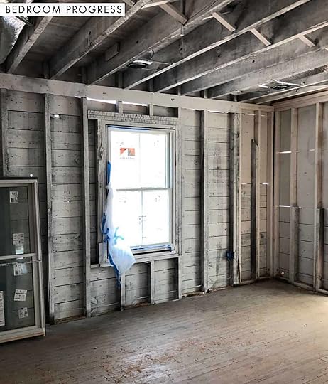
This is the latest pics we have of the space. Big shout out to Ryia Jose for snapping these for us when she was there the other week (she’s designing the home office. Can’t wait to see her space!).
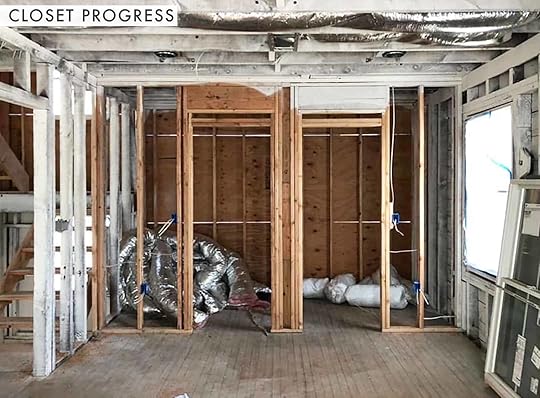 progress pic of walk-in closet
As of today, Emily & I still haven’t seen the space or any of the furnishings in person…please send up a prayer that everything actually looks good together and is the right size/scale for the room. As you can see, the house is still in the construction phase due to covid-delays, so we won’t physically be in the space until it’s time for install, which is currently scheduled for mid-July (pending covid delays). Again, please send up a prayer that everything actually looks good together and is the right size/scale for the room. And then, the home will be photographed and debuted in the October 2021 issue of Real Simple mag. So exciting!
Unfortunately, we won’t be able to share the final reveal with you guys until after it’s published. BUT, for my EHD Insider crew out there (hollaaa!!), I’ll try to share a few sneak peeks with you guys when I’m there for install. Again, if you’re not signed up, ya should be so we can chat all the time!
Needless to say, we are absolutely thrilled to be a part of this year’s show house! Huge thanks to Real Simple magazine! And Thank you Emily for bringing me on board! So let’s chat! Do you think this (modified) Eccentric English Grandma aesthetic will live up to its hype, IRL?
Xx
Key
Opening Image Credits: Design by Tenley Masson of Zoe Feldman Design | Photo by Stacy Zarin Goldberg
The post New Project Alert! Em And Key Are Designing The Main Bedroom Suite in The 2021 Real Simple Home appeared first on Emily Henderson.
June 6, 2021
The Link Up: Mallory’s Pool-Ready Summer Sandals, Jess’s Butter-Soft Bike Shorts, and The Best Bra Bundle On The Web
Hi all and happy JUNE! Now that Memorial Day weekend has come and gone, we’re calling it summer over here and boy are we ready for a bag of cherries and some pool action. As things are heating up, so is our lil link up so we won’t waste another second. Let’s dig right in:
From Emily: Last week at our epic garage sale weekend where we live, the kids brought around their piggy banks and made very questionable purchases (charlie bought a weird wallet with studs all over it and Birdie a glass golf trophy – both for $1). But meanwhile, we found an old card game of ‘would you rather’ that Brian bought for a buck and we’ve played it every meal since. It’s all fun/weird stuff so the kids LOVE it and we normally make one of our kids in charge of the question so like if the options are “drink a milkshake out of dog saliva” then you can ask them questions like “can i put chocolate chips in it, etc” and it gives them this sense of authority being able to say yes or no to our requests. It was SO FUN. I’m sure it will get old (and you can TOTALLY write it yourself just on paper) but if you are in need of some fun dinner conversation with younger kids, we are having a blast with this game.
This week’s home tour is one you can actually STAY IN brought to you by Remodelista. It’s the Highlander Mountain House in North Carolina. The vibe is NC meets English Countryside and is packed with some amazing House of Hackney textiles and William Morris wallpapers that we just cannot get enough of. We’re using one of these photos for inspo in an exciting announcement post coming up tomorrow, so stay tuned!
From Mallory: I’m currently on the market for a pool/beach/lake flip flop for the summer because I am personally getting tired of my $3 target flip flops that are now on the verge of breaking at any moment. I had this conversation with a friend earlier this week: are there no cute (but still waterproof/durable ish) flip flops that exist??? Like what is the shoe that I love to wear but don’t care if it gets soaking wet??? Let me share with you my findings: 1. People will not shut up about how comfortable and durable these slides are but do they check off the cute category??? I mean, they’re technically trendy but my big size 9 foot is probably not looking the cutest with this giant thing on. But also did I just buy them in yellow?? Absolutely 2. I also bought these Havianas to bring to the lake with me last weekend because they’re super classic and I love the rose gold color but all in all it’s still a rubbery flip flop (which I AGREE is kinda just what you need sometimes and I know I’ll get a lot of use out of them) BUT are they the perfect cute pool shoe??? Here’s the last option that’s more ‘fashionable’ 3. J. Crew is giving me some good pool vibes with these cute tortoise shell flip flips and also these cushy strap sandals but Madewell might be my favorite with these boardwalk sandals (that are $39 instead of $59 right now btw). Anyway, those are all the shoes I bought/am looking to buy but I’d personally love to know what kind of shoe is best. Does anyone have a one-size-fits-all-summer-occasions solution?? I’d love to know in the comments PLEASE AND THANK YOU.
From Jess: I’ve you been wanting to dapple into bike shorts like me, I found SUCH a good pair (per Ryann and Mal telling us the Abercrombie & Fitch is actually cool again). These puppies are soft like butter, not at all see-through, and not crazy expensive. Highly highly recommend!
Also From Jess: My cousin and I watched Bo Burnham’s new Netflix special, Inside, and we were kinda blown away. We were very unsure of it for the first 20 mins but then were completely taken in. If you don’t know, Bo made this piece during quarantine, filmed it all in one room, and did literally everything himself. I think that it’s impossible not to connect with him due to the vulnerability in how he was processing the total emotional and mental madness of quarantine. We were all him at some point if not in lockstep. This special funny, sad, visceral, and just a freaking trip. As one headline stated, “‘Bo Burnham: Inside’ is a brilliant, upsetting portrait of everyone'”. I know that may not sound like the “post-vax life” we wanna be living but I promise you will be moved.
From Ryann: A recently told a friend “if you don’t start watching @megsstalter’s videos I don’t know if we can be friends anymore” because that is how passionate I am about her and her comedy. She is the funniest woman alive, I love her videos so much (this and this make me laugh out loud every time) AND now she is on the new HBO show called Hacks. Have you guys seen it??? I am not only obsessed with her character but the show itself is so so good. It is definitely the best show on tv right now IMHO and Meg Stalter is an absolute treasure.
From Albie: In the past, I’ve always just bought a bra, see if it worked, and if it worked, I’d buy it in a bunch of colors till my next bra overhaul. This time I decided to haul four diff brands & one of the four that I’ve been loving this past week is Harper Wilde. I invested in their essentials bundle, with four bras, so that alone, let me test a bunch of bras at once
From Caitlin: I flew out to the east coast last week to spend the holiday with my childhood best friend (hooray!) but forgot to pack PJs (oh no!). I ended up running to H&M to grab some sweats and HOLY MOLY, I stumbled upon the best tank top of all time!!! I have never been super self-conscious about my arms but I have been pretty conscious of my like, armpit boobs (or at least that’s what I call them, please let me know if there’s a real name) and I was SHOCKED to find that this style cut in perfectly and hid my aforementioned armpit boobs so I didn’t have to do a whole “you need to get over yourself” self-love talk in the mirror. In any case, this tank is $7.99 and makes me feel like a DIME and the cut is actually just REALLY GOOD so if you’ve ever seen these and been like “oh no, I don’t think that style of top could work for me,” GIVE IT A WHIRL, BABY!!
Also From Caitlin: I know we’ve been talking a lot about our ~ bodies ~ here on the blog for a while (…see above, too, I guess) but OH MY GOSH PLEASE READ BODY TALK. I am obsessed with Katie Sturino, the founder of Megababe and maker of my all-time favorite underwear reviews (the team will confirm that I talk about her at least once a day, if not more) and this is truly just essential reading for anyone who is kinda fed up with feeling a little weird in their own skin. You can support a local bookstore by grabbing it here buuuuuut it’s also a little cheaper on a certain major retailer’s website so make your choice and READ IT. A BILLION STARS FROM ME!!!
That’s all for this week! Thanks for tuning in and we’ll see you tomorrow 
Opening Image Credit: Design by Jason Reeves of Highlander Mountain House | Photography by Maggie Braucher| via Remodelista
The post The Link Up: Mallory’s Pool-Ready Summer Sandals, Jess’s Butter-Soft Bike Shorts, and The Best Bra Bundle On The Web appeared first on Emily Henderson.
June 5, 2021
The Fun, Easy To Wear And BOLD Dresses I am Opting For This Summer

It seemed time to shop for fun summer clothes, and it wasn’t just me. Everyone in the office was shopping for, nay, craving bold summer dresses – think pool parties, outdoor brunches, date nights, and even some “resort looks”. Is the year of dressing boring coming to an end? Am I ready to wear fitted clothes? I DON’T KNOW, but the colorful dresses that I am showing here are very easy to wear, forgiving, low-maintenance, and FUN. I tried on way more that were either too “much” or too tight. These were just right and totally wearable. So if you are in the market for some cute, bold colorful summer dresses here are some I can recommend. And a huge thanks to my friends Annie And Derik who own the Reckless Unicorn for letting me shoot in their epic backyard.

ALEXIS Short Sleeve Shirtdress | Clogs (similar)
Target sent me this when they launched their collab with ALEXIS and while it’s more “office” than “resort” the color is SO GOOD, the little princess sleeves are adorable and the best part – pockets with a big hoop skirt that twirls fully horizontal.


The skirt is so full and fun. I could definitely wear this to business meetings this summer and feel like “me”, and like I “tried”.

Blue Palms Midi Dress | Hat (similar) | Sandals
When I first saw his I thought it was a lot, but when I put it on it was A. so lightweight and comfortable and B. so fun – like I really tried. So with just one piece of fabric I look like I spent time pulling together a lewk. It has huge sleeves and it is a LOT of fabric, but I loved it.


Swimsuit | Selamawit Wrap Skirt | Sandals
Yes, that is a swimsuit with ruffled sleeves. It’s a little over the top (and you can’t even put a coverup over it), but with the wrap skirt from Lem Lem It might be my new favorite pool party outfit this summer.


This is DEFINITELY bold, but the cut is so cute and wearable. The ruffles are fun and play with proportions a lot, making it feel really flattering and fun.

And it has POCKETS! The shoes are vintage that I’ve had forever, and gave to Jess recently but borrowed back for this shoot.


Dress | Hat (similar) | Sandals
I know. I have this in blue, too. The Great sent me the blue one first, and I loved it SO MUCH that I knew I would get equal wear for years out of this one. Imagine at Christmas with cute boots?! This dress drapes so well, the broken stripe is so playful and fun, and sleeves are big and puffy and I frankly just always feel good in it.


And that is my favorite hat this summer – always a big fan of summer hats that don’t blow off in the wind.

Mixed Hudson Floral Maxi Skirt | Cuffed Sleeve Shirt | Sandals | Hat (similar)
Birdie LOVES this skirt and so do I! I put it on sometimes just to make dinner with a T-shirt because I get sick of wearing athleisure all day and this feels at least a little special even just for a family BBQ.

The shirt is from Madewell and those are my favorite summer sandals that have the perfect about of heel and are extremely comfortable.


The skirt also didn’t cut in (only a TINY bit) – I sized up as I usually do with skirts because no ONE makes them to actually fit your size without cutting in. I think this is a medium.

Bahiri Peasant Dress | Hat (similar)
Another big fun maxi that is so easy to wear, light-weight, has pockets, and is just a “hell yes” if you need it. It’s also by Lem Lem which is a black-owned female business and while a lot of my favorite pieces were sold out, they have more GREAT stuff. And this one felt super high quality.


One Piece Swim Suit | Mixed Prints Multi Layered Midi Skirt | Hat (similar)
Ok this one was where I got caught up a bit in being bold, but likely wouldn’t wear it unless I was going to a tropical island this summer (which we are not). So I returned it, but boy if you have a beach vacation in your future this is SO FUN.

This skirt was really tailored and fit nice (with a zipper). I think it might be best for body types where you are more petite on top, making this the star.

Lastly, another short fun dress with some MORE ruffles. Now, this dress isn’t necessarily for my body type (I don’t really do backless) and it’s VERY plunge-y but for those with a straighter figure, this might be a fun way to add volume.

I had fun wearing the dress (because it was super voluminous), but ended up returning it because ultimately I loved some of the other looks so much more and I didn’t need them all.

There were SO MANY more that I wanted to try, but didn’t. So instead I rounded them up for you all.

1. Puff Short Sleeve Dress | 2. Puff Sleeve Tie Waist Volume Dress | 3. Wrap Neckline Dress | 4. Maxi Ruffles Dress | 5. Bright Forest Midi Dress | 6. Tie Front Full Skirted Maxi Dress | 7. Mazaa Cascade Dress | 8. Suelta Dress | 9. Painted Toucans Midi Dress | 10. Printed Cotton Dress | 11. Halima Flutter Sleeve Dress | 12. Vent Cotton Dress | 13. Wild Hearts Layered Midi Dress | 14. Sleeveless Ruffle Shift Dress | 15. Phoebe Flounced Maxi Dress | 16. Yellow Open Waist Midi Dress | 17. Crochet Midi Dress | 18. Frill Cotton Dress | 19. Bella Dress | 20. Puff Elbow Sleeve Open Back Dress | 21. Zebra Print V-Neck Short Sleeve Dress
So are you like us and are ready for some BOLDNESS? What is everyone wanting to wear this summer? xx
*Photos by Veronica Crawford
The post The Fun, Easy To Wear And BOLD Dresses I am Opting For This Summer appeared first on Emily Henderson.
June 4, 2021
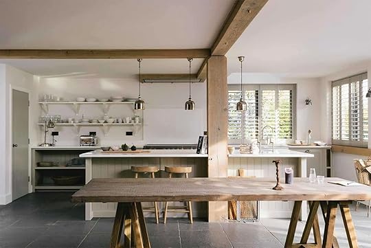
Farmhouse Update: How to Design A kitchen With a Load Bearing Post And Beam In The Middle + 4 Unique Options

Here’s a challenge that came up again that I feel is worth discussing. How do you design with a random load-bearing post in the middle of a room, specifically the kitchen? It is HARD. One of the reasons we didn’t originally put the kitchen in the corners was because of the load-bearing post, and so ARCIFORM integrated it into this walk-through cabinet pantry, thus hiding it. Great. Done.
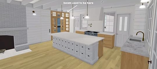
When we were first considering moving the kitchen into the corner (upon your suggestion) we were chastized that “the house will fall down” without the post. “Structural engineers” can be such buzzkills. So I started researching how to make that work – how to integrate a post with an island, as well as how to make a horizontal beam over the island work (with two different ceiling heights – we are vaulting part of the kitchen, but can’t vault the other side because the second story is above it). Here is the rendering of the post in the island before we “designed it”.
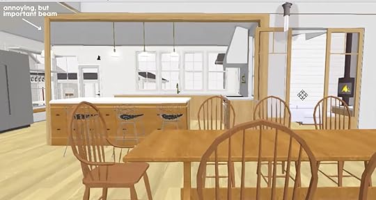
While we could have made it work, it was a bummer and a challenge. Since we had a structural engineer already doing the whole house, and since we had to add a beam anyway, we upgraded to a stronger header that could span the entire width, eliminating the post. This is likely a 3-5K dollar change for us (nobody really knows), but that felt worth the sacrifice to get a completely open – non-post interrupted – kitchen. But what if you aren’t already re-engineering your house? What if you HAVE to have that post? Here is what we came up with …
Keep It Looking Architecturally Accurate
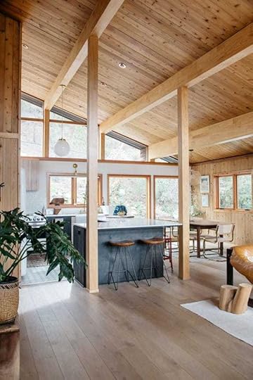 design by aaron and erin bruno | photos by lily glass | via sfgirlbybay
This house in Malibu that we also shot for the book did a great job of letting the ceiling lead the way in where and how they placed their posts. It looks totally intentional and original. As you can see the beams (horizontal) run into the posts (vertical). It cuts into the island just slightly but it totally works.
Heft It Up – Make It Bigger And Create A Feature Out Of It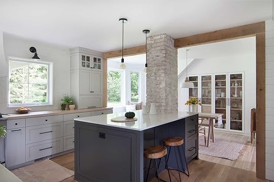 design by garrison foundry | photo by beatrice pediconi
Now this solution works because that brick is really pretty and it feels substantial – like there is no way that it couldn’t be there. It’s almost like you dared to put your kitchen here, so you had to work with what the house originally intended. And it works! Not sure this brick would have worked in our farmhouse, but it def works here.
Give It Purpose – Add Storage/Display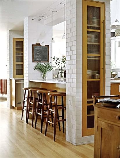 source unknown
If you do want to chunk it up, you then have an opportunity to add storage in it or instead of it. Now I saw a few versions of this that were of varying success, but you can see how it could work.
 design by doherty design studio | photo by derek swalwell | via est living
Take this one. Cleary way too modern for the farmhouse (and also not technically load-bearing) but with the right materials would be such a functional and beautiful way to create “a beam”.
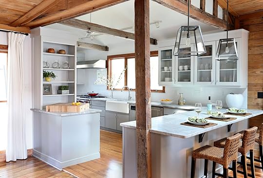
Make It Part Of The Kitchen Island Transition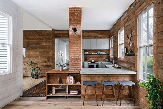 design by low design office | photo by chase daniel
I know that a lot of old houses have this problem – the kitchen was built small and closed off and when opening it up you likely have a load-bearing post to contend with. Now if you are already re-engineering your house there is almost always a way to get rid of it, but yes it can cause you to spend a lot of money, have to spend more on engineering (and larger beams, headers or footings – sometimes upgrading to steel) and of course, delay permitting. If you aren’t already needing a permit and just doing cosmetic upgrades, then consider working with it to save likely thousands. These examples TOTALLY made them work.
 via devol
I mean I love basically every deVOL kitchen ever and this wood beam is good. Pick a really beautiful piece of wood with not only add texture to your kitchen but also a heck of a lot of soul.
 design by amy trowman design | photo by margaret wright
This one is a little smaller and more rustic but still totally looks awesome. Plus the wood helps to balance the white kitchen with an otherwise wood-filled home. Win-win.
Ok now for our ideal solution for the farmhouse…
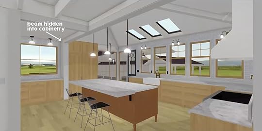
As you can see now we have a more open kitchen, with the beam meeting the new load-bearing post hidden in the cabinetry by the fridges. Nothing here is designed but you get the idea. We are trying our best to keep it out of our immediate sightlines. Of course, we haven’t got the OK from the city yet, so stay tuned on that…
The post Farmhouse Update: How to Design A kitchen With a Load Bearing Post And Beam In The Middle + 4 Unique Options appeared first on Emily Henderson.
Is It Worth Moving The Load-Bearing Beam From The Middle Of The Farmhouse Kitchen + 4 Unique Options If We Can’t
Here’s a challenge that came up again that I feel is worth discussing. How do you design with a random load-bearing post in the middle of a room, specifically the kitchen? It is HARD. One of the reasons we didn’t originally put the kitchen in the corners was because of the load-bearing post, and so ARCIFORM integrated it into this walk-through cabinet pantry, thus hiding it. Great. Done.
When we were first considering moving the kitchen into the corner (upon your suggestion) we were chastized that “the house will fall down” without the post. “Structural engineers” can be such buzzkills. So I started researching how to make that work – how to integrate a post with an island, as well as how to make a horizontal beam over the island work (with two different ceiling heights – we are vaulting part of the kitchen, but can’t vault the other side because the second story is above it). Here is the rendering of the post in the island before we “designed it”.
While we could have made it work, it was a bummer and a challenge. Since we had a structural engineer already doing the whole house, and since we had to add a beam anyway, we upgraded to a stronger header that could span the entire width, eliminating the post. This is likely a 3-5K dollar change for us (nobody really knows), but that felt worth the sacrifice to get a completely open – non-post interrupted – kitchen. But what if you aren’t already re-engineering your house? What if you HAVE to have that post? Here is what we came up with …
Keep It Looking Architecturally Accuratedesign by aaron and erin bruno | photos by lily glass | via sfgirlbybayThis house in Malibu that we also shot for the book did a great job of letting the ceiling lead the way in where and how they placed their posts. It looks totally intentional and original. As you can see the beams (horizontal) run into the posts (vertical). It cuts into the island just slightly but it totally works.
Heft It Up – Make It Bigger And Create A Feature Out Of Itdesign by garrison foundry | photo by beatrice pediconiNow this solution works because that brick is really pretty and it feels substantial – like there is no way that it couldn’t be there. It’s almost like you dared to put your kitchen here, so you had to work with what the house originally intended. And it works! Not sure this brick would have worked in our farmhouse, but it def works here.
Give It Purpose – Add Storage/Displaysource unknownIf you do want to chunk it up, you then have an opportunity to add storage in it or instead of it. Now I saw a few versions of this that were of varying success, but you can see how it could work.
design by doherty design studio | photo by derek swalwell | via est livingTake this one. Cleary way too modern for the farmhouse (and also not technically load-bearing) but with the right materials would be such a functional and beautiful way to create “a beam”.
Make It Part Of The Kitchen Island Transitiondesign by low design office | photo by chase danielI know that a lot of old houses have this problem – the kitchen was built small and closed off and when opening it up you likely have a load-bearing post to contend with. Now if you are already re-engineering your house there is almost always a way to get rid of it, but yes it can cause you to spend a lot of money, have to spend more on engineering (and larger beams, headers or footings – sometimes upgrading to steel) and of course, delay permitting. If you aren’t already needing a permit and just doing cosmetic upgrades, then consider working with it to save likely thousands. These examples TOTALLY made them work.
via devolI mean I love basically every deVOL kitchen ever and this wood beam is good. Pick a really beautiful piece of wood with not only add texture to your kitchen but also a heck of a lot of soul.
design by amy trowman design | photo by margaret wrightThis one is a little smaller and more rustic but still totally looks awesome. Plus the wood helps to balance the white kitchen with an otherwise wood-filled home. Win-win.
Ok now for our ideal solution for the farmhouse…
As you can see now we have a more open kitchen, with the beam meeting the new load-bearing post hidden in the cabinetry by the fridges. Nothing here is designed but you get the idea. We are trying our best to keep it out of our immediate sightlines. Of course, we haven’t got the OK from the city yet, so stay tuned on that…
The post Is It Worth Moving The Load-Bearing Beam From The Middle Of The Farmhouse Kitchen + 4 Unique Options If We Can’t appeared first on Emily Henderson.
June 3, 2021
More Renovation Regrets And Cautionary Tales As Told By Our Readers: Bathroom Edition
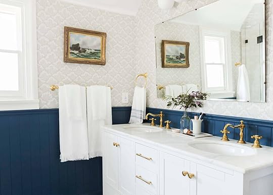
Hello friends and welcome back to another renovation regrets saga. If you are just catching up, this series started when Emily posed the question “what do you wish someone had told you before renovating?” and the answers we received were pure gold. Thanks to you, our talented readers, we have received hundreds of renovation stories and cautionary tales and we knew we couldn’t keep all that juicy information to ourselves. Last week, we tackled the kitchen and unsurprisingly, you all delivered EVEN MORE tips and tales. Today bathrooms are on the docket and I trust that anyone with a bathroom reno on their radar will want to heed every single word. Let’s get to it, shall we?
On Tile design by nate berkus | photo by christopher dibble
From Rusty: I tiled on top of the original broken mosaics in the bathroom, to save time and money. The tiler roughed up the old tiles first so they’d grip the adhesive, etc. So, I have a little bit of a raised floor, maybe 1cm? It’s no biggie and I’d definitely do this again.
From Elina: [I wish someone would have told me] Not to buy tile too early. We needed to order more tile when we were finally ready to install and the color didn’t match because it came from different lots.
From Kathleen: Be sure to install porcelain tiles, not ceramic. They chip and look terrible. Also, small tiles in the shower creates lots of grout lines and are a real pain to keep clean. Big tiles in the shower a better way to go. Reduce the grout.
From anon: My current rental bathroom has “orange peel tiles” which means I can’t use anything with suction cups in the shower. (If I owned this place I would rip out these tiles! And raise the showerhead to adult height instead of 52 inches, and install an adult length tub, and rip out the hideous sliding shower doors and put in a curved shower curtain rod.)
On Showers & Bathtubs design by elspeth benoit and arterberry cooke | photo by alex zarour of virtually here studios | from: a master class in using color in your home without it feeling like a colorful home
 From Whitney: Rain shower heads are really lovely in spa theory, but I’m convinced were designed by people who washed their hair daily. As a woman of color, every house I’ve looked at/Airbnb that I’ve stayed in that has a “luxury” master bath has a rain shower head. I wash my hair every 10 days. There is no way to avoid getting your hair wet and even a shower cap can’t save that. I just need them to go away.
Editor’s Note: Emily also dislikes rain showers. Do people really want water constantly in their face??
From Nina: I once stayed in a BnB with a fancy “open” double shower and I can confirm it’s way colder than a regular shower cabin. You know that feeling of dread when you have to walk out of your warm shower into the cold bathroom? Yeah, now you are spending your entire shower in that cold bathroom, brrr!
From Tracy: This is also true with those showers that are “half glass”’ – no door, just glass by the showerhead. I stayed at a place in VT with one of those – rough choice for the climate!
From Ally: [I am] the owner of a very large (5’×10′) multi-headed steam shower that we added on and have regretted for 22 years. To accommodate the steam feature (which we’ve almost never used!) the shower is fully enclosed and tiled floor to ceiling with a gap-less shower door. Talk about a constant horrible mildew mess! By code, the door must open outward so we can’t even leave it open post-shower or it blocks a sink and drips onto the floor. And yes we had an architect on this project that didn’t function well from day one! I’m hoping for a lottery win so I can one day rip it out and start over!
From Virginia: In our old house in a not-warm climate, we had a double master shower that wasn’t *too* cold, but the spray would get split between the showerheads in a way that made both ineffectively weak. I talked to a plumber about it and apparently this was actually just the prior owner having chosen shitty hardware which he had warned her about, as he happened to be the same plumber who had done the renovation (!). You apparently have to get special hardware that properly diverts the full pressure stream to make both showerheads comfortable to use at the same time, and it’s slightly more expensive.
From Misty: We bought a house with a huge shower – way more room than needed for even two people and my 6’5” hubs was ecstatic about having a shower that “fit him”. I hated it. We only used one shower head and the tile was cold. Even with running it with the doors closed to create heat before getting in, was a waste of time and water.
From Maddy: If you’re planning a soaking tub, keep a close eye on the gallons it holds in the tub specs, and another close eye on the size of your water heater, unless you’re going to have an on-demand heater for your bathroom water supply. Deep+wide tubs, like jacuzzis, can hold 80+ gallons and your water supply is going to struggle to give you a nice hot soak that you can really submerge yourself in. Narrower tubs with deep depth-to-overflow (14-15″) and plenty of length to stretch out typically hold around 50 gallons, which is a size at which you can comfortably submerge yourself and have plenty of hot water to bask in even if you have a 50-60-gallon tank. (You’re not going to use every drop in your 50-gallon tank to fill a 50-gallon tub, because you displace a lot of water yourself and you won’t be using straight, unmixed hot water. But you could easily use every drop in your tank filling a bigger tub.)
From Amanda: Our main bathroom is a wet room – meaning all the walls are tiled and it has a bathtub and an open shower with no doors. This was our only way to fit in both a shower and a tub. However, I learned after the fact that the ordinary slope for the drain in the shower tends to leave a lot of water on the floor. If I could do it over again, I would increase the slope to ensure that the water would all go down.
From Kathleen: When we remodeled our master bath we put in an open shower, so no way to access the shower handle without getting sprayed with cold water, not a fun way to start every day. I suppose if you are into Wim Hof this would be no problem. Should have plumbed the handle to be accessible outside of the shower. Ugh.
From Bobbi: We put in a large two-person, two wall-mounted shower heads with no door, and I love it! We live in North Carolina so winters are short, but we have not noticed a difference AT ALL in terms of shower warmth and I tend to run cold. We did put a heated floor in the non-shower portion of the bathroom and it’s lovely. Big disagree on that one, we’ve had this layout for about four years and it makes me happy every day.
From Clare: Never do an open shower if you live in a climate that gets below 50 degrees unless you’re A) a sadist or B) keep the heat in your house on 80 degrees. Pretty rough to shave your legs when they’re goosebumped!
On Toilet Placement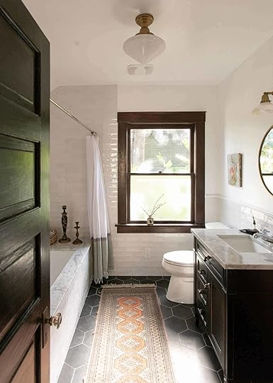 design by kirsten blazek | photo by alex zarour of virtually here studios
From JJ: We have a large master bathroom but we thought it would be a great idea to place the toilet in a small room in the bathroom so multiple people could be using the bathroom and you would have your privacy while on the toilet. Here’s the kicker; I am an Orthopedic Nurse Practitioner and SO many falls occur in the bathroom. If someone falls in that tiny toilet closet areas, EMS has to drag you out of the area to get you on a stretcher. I wish we were more mindful of this so we can feel good about growing old in this home.
From Katie: Wall-mounted toilets are great solutions for cramped bathrooms. They are pricy but can add so much space.
From Lisa: My friend convinced me to put electrical outlets behind all of the toilets while we’re redoing the bathrooms, even though we don’t want to install bidets right now. And after I mentioned it to my architect, she said that they’re doing more and more bidets in recent projects. It’s so cheap to add an extra outlet while doing major work (especially in our case where the full baths are being built from scratch including drywall), just do it.
On Heated Flooring photo by sara ligorria-tramp | from: the final mountain house reveal (for now): all the details of my master bathroom
From Renee: We put heated floors in our en suite bathroom and LOVE them. We feel that the heated floors were the best part of our new bathroom! Just make sure that you have a good electrician install the wires and then everybody stay out of there until the tile installer can get there. Coordinating the schedule with your electrician and tile setter is a must!
From Jeffree: Some heating flooring pads can be installed via your crawlspace/basement between the joists rather than directly on top of your subflooring and under the tile. This makes repair or replacement far easier.
From Renee: It’s easy to put a heated floor in your bathroom but put it in your shower too! To avoid cold feet!
On Accessibility & Layout design by shaun crha| photo by sara ligorria-tramp | from: home tour: how this designer built a a beautiful modern traditional guest home for his dad to age in place
From Virginia: The main issue is that things like hand towel racks, toilet paper holders, and showerheads are placed *just off* from what would actually be the most user-friendly. Like the hand towel hanger makes it so that the edges of a standard size hand towel have to hang kind of tucked between the sink and the wall, so it doesn’t dry well. It’s annoying to make it sit right after every use so it doesn’t hang into the sink basin and get wet/be in the way. The showerhead in one bathroom is perfectly centered in the smallish enclosed shower, which means there’s no way to slightly stick your head or body out of the spray while, say, shaving legs or letting conditioner soak in. In both cases, if these things were shifted by just a couple inches they’d be perfectly placed, but having them slightly off from user-friendly is surprisingly annoying. And there are things like that all over but these two are the most noticeable.
From Leila: Bathroom showpeople will tell you that you have to buy the whole suite from one place or the whites won’t match – this is bollocks. But the Ikea sink you got for £40 will scratch drastically in a way you never realised porcelain was capable of.
From Sheila: Consider accessibility options, even if you don’t need them now. There may be a time when you’d like to host an elderly family member or when you or a family member faces mobility options during an extended recuperation. Having a bathroom, including a walk-in shower with space for a bench and a hand-held shower head that can be reached and controlled by someone seated on that bench, on the main living floor is highly desirable as is a means of entry from the car parking area into the house with a minimum of stairs. Depending on the area, light switch/doorknob heights may be set by code to be at wheelchair-accessible heights. If not, it should be considered anyway.
From Faith: Master bathrooms need a linen closet (either in the bathroom or right outside).
From Kim: Tell your cabinet maker what kind of sink you are putting in your bathrooms. We had a cabinet replaced in our powder room/half bath and didn’t tell him it was a vessel sink. It’s way too high for kids even with a pull-out step built into the toe kick of the cabinet.
From Maddy: Include access panels for bathtub/shower plumbing if at all possible, so if something goes wrong in the wall you can hopefully avoid having to bash through your lovely and expensive tile work to get at the plumbing. If you can plan for your “wet wall” to back onto a closet, hallway, or utility space, you can put an access panel there without it intruding on the design of a main room.
From Amanda: We also did wall-mounted faucets in both of our bathrooms. It seems that some plumbers aren’t used to doing them and both times I noticed that they installed the rough-in plumbing at the wrong height. I think this is just good to know for something to double-check before any walls are closed up.
From Emily B: Consider counter heights in the bathroom for how tall you are. We have a tall family and did a really beautiful custom vanity that is on the short side of standard especially since we are tall people.
From Justin: Don’t expect the plumber to know how far the tub should be from the wall, or how high the slide bar should go. Do your research and be ready for everything so that you’re not making 8 am decisions on the fly.
On Choosing The Right Materials: photo by sara ligorria-tramp | from: mountain house reveal: the riskiest bathroom I designed—with a “how i’m feeling now” update
From Kate: We moved into a new build in March with flat matte paint, as well as a two and five-year-old… and it’s a DISASTER! The powder room is destroyed by water splashes, soap sprays, and little handprints anywhere they put a dirty hand or a wet clean hand. Also, you can see brown patches in the paint where their little bodies rub next to the sink in the spot by their stool where they typically stand when washing.
From Allison: Pick out all your materials. I mean everything, from the water barrier on the outside, to the windows, cabinets, etc. many contractors will use the cheapest and pocket the difference.
From Andrea: I would go back and tell myself to not put beadboard in my bathroom. It gets grimy and is impossible to clean well. At least wainscoting has less grooves to try to keep clean, but really I would stick with flat panels.
From Emily B: Also, never do barn doors on any room you want to be able to be private (bathrooms or bedrooms). They just don’t seal out sound and light the same way a door jam does. We put one on my daughter’s room and it has affected her sleep with the light and sound.
From Jennifer: When I put in a shower in a former half bath, I got several tile estimates. Every one of them included schluter, those metal edges on the end of tile (Blech). I didn’t want metal edges. Finally, one creative installer said, “no you don’t have to have schluter. I can cut fresh pieces of tile to finish the edges, I’ve put clear nail polish on tile edges before to give them a glossy, finished look, there’s tons of creative ways to get the look you want.” Don’t just take what installers say as gospel until you talk to a few people. All those previous unimaginative, old-fashioned installers knew how to do was schluter when design, trends, and options change endlessly.
From Verana: Light-colored grout in your shower floor will discolor. We had picked cream grout to match the color of the tiles (which looks stunning), but maintaining the color takes weekly cleanings. I understand much better now why hotel showers typically have dark gray grout… much easier to maintain.
Alright my friends, do you have any more tips or renovation regrets to add? Should we keep this series going? If so, what room would you like us to tackle next? Drop your suggestions below! xx
Opener Image Credit: Photo by Tessa Neustadt | From: Our Classic Modern Master Bathroom Reveal
The post More Renovation Regrets And Cautionary Tales As Told By Our Readers: Bathroom Edition appeared first on Emily Henderson.
June 2, 2021
Did You Think We’d Skip The Nordstrom Half-Yearly Sale? The 3 Things We Each Really Want

Hello, pals! Welcome to a lil’ midweek afternoon light read. (But if this is your first stop of the day, catch up on Em’s reveal from this AM because there are two dog photos in there that are so cute that they make me weep!) Today’s topic: Nordstrom’s Half-Yearly Sale, an event with which I am deeply obsessed (you gotta love a store that cuts prices on new merchandise twice a year!). The only con? THERE’S SO MANY DISCOUNTED ITEMS. It’s like the Cheesecake Factory menu – too many choices! Too much to look at! How’s a gal supposed to decide what to get?!
Which is why I, as always, enlisted the help of Team EHD. We all sorted through the Nordstrom site, pulled our favorite picks, and I have henceforth assembled them all here for your viewing pleasure. I’ve been on such a shopping kick lately and it was fun for me to live vicariously through the carts of my coworkers – hopefully, it’ll be quick fun for you, too (PS. All this is not sponsored, but like…Nordstrom, you have my number!!)
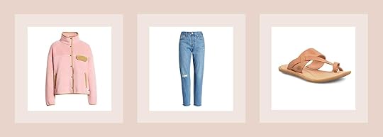
Cragmont Fleece Jacket | Wedgie Icon Fit High Waist Nonstretch Straight Leg Jeans | Veda Flip Flop
I have this fleece in navy and it’s my go-to most winters. Feels weird to buy it now but it’s also great for chilly summer nights around a fire (and it layers very easily over clothes). It has pockets, snaps easily, and just for whatever reason is the one I always grab.
I JUST got these via Rent the Runway and here they are so much more affordable than if I were to buy them off off the rental site. While it’s hard to say that these are “super comfortable while sitting down”, as Levi’s are a stiff brand, I love the cut (boyfriend) and they are super flattering in the butt (Levi’s knows how to do this). Also where they hit the ankles makes them super easy to wear with sneakers or higher heeled clogs.
These Bjorn sandals look so cute, simple, and utilitarian for casual days this summer. An upgrade from the flip flop, but still super casual.
Jess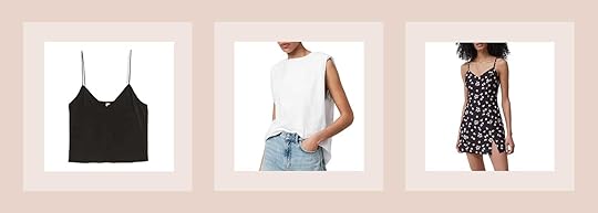
Silk Camisole | Structured Tank top | Printed Dress
Apparently, I don’t own a single tank top that I could potentially wear out on say a date. They are all boxy/baggy and just aren’t the look I want to be going for. So I need to remedy that asap. I’ve been covered up for too long and need to stop hiding. I love how this top is cropped so it will look great with high-waisted pants or a skirt, is super versatile but the satin dresses it up a bit. Not sure about the bra situation yet but I’m sure there’s some solution I’ll be happy with. Plus for $11 how can I not try it out?!
Remember when I just said I wanted to not cover up?? Ha. I can’t just change overnight and this top is awesome. I started following Trinny Woodall on Instagram who has been inspiring the heck out of me to mix up my clothes. She has a similar shirt and I’ve been wanting it since the moment I saw it. Hopefully, it looks good!
Ok, back to flirty. I really don’t know how this dress is going to look on but I love the cut, little slit, and print. I’m thinking it could be a really cute date dress;) I mean add a jean jacket, sandals, and a fun crossbody bag? So fun. O and I really love this necklace and this signet ring as bonus items!
Ryann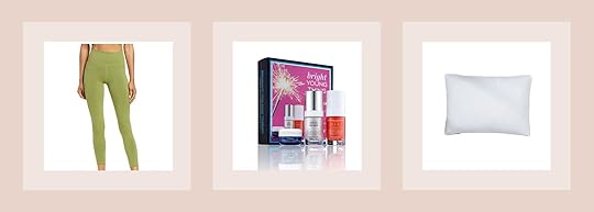
Leggings | Bright Young Thing Set | The Original Pillow
Admittedly I don’t have the sexiest or most exciting picks but these are all things I want but wouldn’t buy full price. I don’t exercise a ton but I do try to walk every day and I realized I need more leggings because wearing the same ones over and over is kind of gross. I am very attracted to these leggings and although the color is probably not everyone’s favorite, I recently discovered my colorstrology indicated that my color is bright chartreuse which sort of explains why I have been drawn to bright lime greens lately. Apparently wearing this color and surrounding myself with it is great for my mood so I am hoping the leggings will help me enjoy exercising a bit more
I have such a love/hate relationship with skincare. I feel like I try a lot of different brands and I am not completely in love with anything I have yet and I am still unsure what my skin really needs. I am someone that really does need a “starter kit” type set up and this seems beginner-friendly enough. I will report back if I love it!
This is a necessary purchase as my dog ripped one of our down pillows when I left him home alone for like 2 hours (he is so dramatic). We are due for new pillows though and I have heard great things about Casper mattresses so I am hoping their pillows are just as good!
Mallory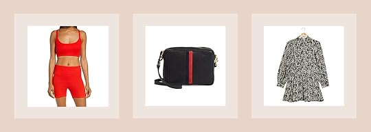
Sleep Bralette + Rib Sleep Shorts | Midi Sac Perforated Leather Crossbody Bag | Pintuck Mock Neck Long Sleeve Minidress
This girl at my gym was wearing a red biker short/sports bra set and I’ve been wanting to get one ever since. I snagged these because they’re a very VERY good deal (like more than 50% off right now so it’s $40 for the whole set instead of $100 which is SO GOOD). I have a hard time justifying spending $50 for a sports bra and then ANOTHER $50 on the shorts or leggings that match (which is usually the price if not more for good quality workout stuff) so this was a great deal. It also just seems like a good comfy lounging WFH outfit because it literally has “sleep” in the title which will definitely be a plus.
I’ve been a HUGE fan of Clare V ever since Emily first introduced me to them via this fanny pack and I knew I wanted to eventually own a bag of my own one day. I saved up and bought this bag, only for it to go on sale 4 months later. FOR $140 OFF. Don’t make the same mistake I did, take this sale and buy this quick if you’ve been waiting like I did.
Another item I bought that I should have waited for the sale for is this Topshop dress that I literally LIVE IN. You guys. I’ve linked this dress like 3 times already and now of course it’s $50 instead of the full price ($75) I stupidly paid. Another deal to take advantage of (quickly).
Caitlin
Julie Long Sleeve Print Minidress | Fayola Drape Midi Dress | Street Seen Fit & Flare Midi Shirtdress
DATE CAITLIN HAS ENTERED THE CHAT. I don’t know about anyone else out there, but I’m dating up a GOSH DARN STORM over here (hooray vaccines!) and figuring out what to wear is harder than ever before!!! Enter my newly rekindled love of the fit & flare dress, which makes getting ready SO EASY (and it also looks really good, too). This Ulla Johnson one really speaks to me because (a.) I’ve seen Em look super cute in a similar red version and (b.) I have a bunch of arm tattoos that I’m SO TIRED of making awkward small talk about, so it’s nice to just wear sleeves sometimes.
Similarly, a huge fan of this little (but also NOT little) red number! I’m addicted to my platform clogs but they can seem like they’re too much when paired with a short dress or skirt. The length on this red dress is a treat – it’ll look so good with a heel – and the color is ideal for spicy dates!
Last but not least: I’m throwing my best friend a tea party bridal shower in her backyard next month and the cut of this dress just feels tea party appropriate. Plus, the print is just really sweet and fun BRB learning how to play croquet.
Now that we’re done – did you grab anything over the weekend? Are there any super good Nordstrom steals that everyone should know about? Has your brain also been feeling smooth as an egg this week? (Mine has, which is why I was like “all I want to read is shopping posts with pictures, please let me write that, thank you!”) I love chatting with you, let me know!!!
Opening Image Credits: Photo by Veronica Crawford | From: 51 Affordable Spring Dresses (& 1 Awesome Jumper I Couldn’t Resist)
The post Did You Think We’d Skip The Nordstrom Half-Yearly Sale? The 3 Things We Each Really Want appeared first on Emily Henderson.
After Three Years We Can Actually Use Our Upper Deck (Because We Finally Have The Right Outdoor Furniture…And Fabric)

The upper deck has sat empty for 3 years. Yet every time I went up there, surrounded by the trees, with the sound of the “stream” I would whisper “this is such a missed opportunity, what do you, upper deck, want to BE ??” It is right off our bedroom, above the dining area overlooking the yard – surely we could give it a purpose. So with the help of Sunbrella on some PERFECT-for-us Blu Dot furniture, it now has a purpose – a truly gorgeous, chill, grownup hangout area. In fact, I’m writing this from here, and feel like the luckiest person on the planet.
But let’s revisit it empty – so you can see how it was BEFORE any reno. I almost forgot how much we did, it’s wild.
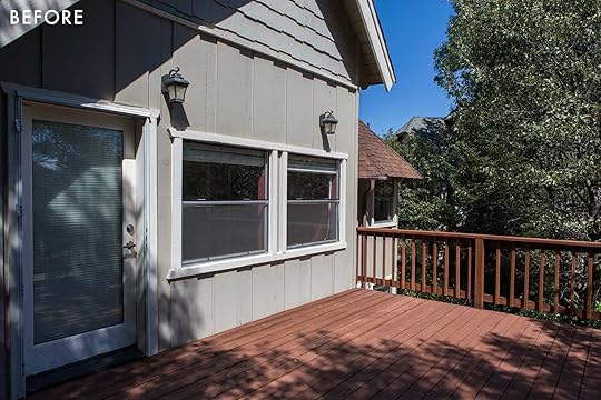
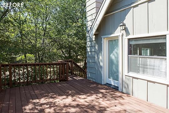
I didn’t know what the purpose of this space would be or what we really needed until recently. I had a girl’s weekend up here and while 8 children played down below safely we were desperate to hang somewhere within earshot but with a little bit of privacy (outside). So creating an outdoor living room started to make sense. So these are the wants and the challenges:
We need ALL-weather furniture. Brian and I aren’t “furniture cover” people so I really wanted something that could last through the snow in the winter and heat in the summer. Sure, I can put cushions away for the big storms in winter, but we know our limitations as people. So we needed really weather-resistant (not even teak) that we knew could withstand the elements. This area gets blasted by the sun in the middle of the day – so we need shade if we want to use it during the day. Due to said sun blasting, we need fade-resistant fabric (thus the Sunbrella partnership which was so perfect)We wanted it to be mostly dark and tonal so it didn’t pop off the house so much. There is something odd about having a dark house in the woods then seeing a big white umbrella – just feels off. We believe in comfort – I’ve found that we don’t use the rooms or furniture that aren’t a joy to sit on.So the goal is VERY comfortable, monochromatic, durable, with a warm modern vibe. Nothing too cold or stark – still with depth and texture.
Enter Sunbrella into the equation, by way of that dope Blu Dot furniture.
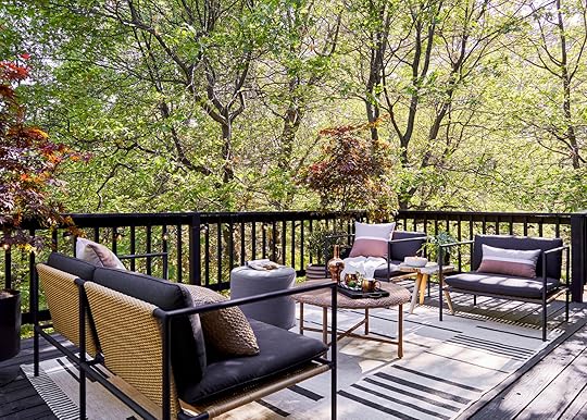
Sofa | Club Chairs | Rug | Coffee Table | Ottoman
That sofa and those club chairs from Blu Dot literally couldn’t be more perfect for this space and the vibe and function that we wanted. They are dark and modern with their slim arms and legs, but the added all-weather wicker on the backs and seats makes them so cool and warm. The proportions are so generous and the Sunbrella wrapped cushions make them unbelievably comfortable. We grounded the area with a rug, found a strangely good matching round coffee table from Target.

Natural Woven Pillow | Abstract Lumbar | Circle Pillow | Coffee Table | Tray | Cocktail Shaker | Mugs | Stump Table | Umbrella | Rug | Pup (sorry, taken:))
We kept the layout super simple with the sofa facing the chairs, threw in a couple of side tables, and then layered on Sunbrella pillows to add warmth. Add a dog for personality.
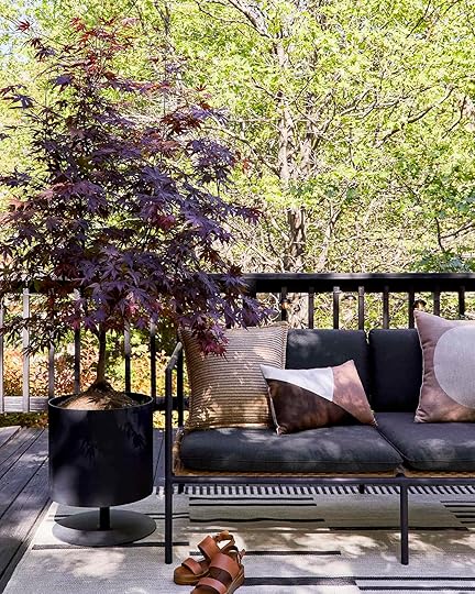
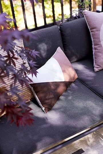
While you can purchase Sunbrella fabrics by the yard, (for interior or exterior upholstery projects) there are a ton of readymade furniture pieces from a lot of our favorite retailers, like Blu Dot to choose from already in Sunbrella. I simply put in “Sunbrella” in the search bar and up came all the different items that come already in the fabric, including the pillows, pouf, and umbrella.
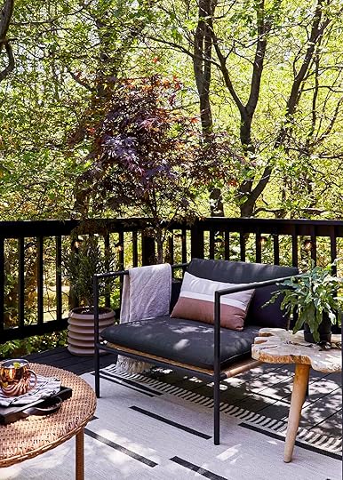
Planter | Throw (similar) | Pillow | Chair | Side Table (similar)
We warmed up the black and green color palette with this terracotta and rust tones, as well as the wood and “wicker” (resin) to keep it feeling balanced. And of course, I needed some dark burgundy Japanese maples to pull it all together.

I planted the trees in that amazing Blu Dot pot (and did it by myself which pulled my back out, whoops) and while I might have to move them below if the sun blasts them too much they add a ton of life and texture up here.
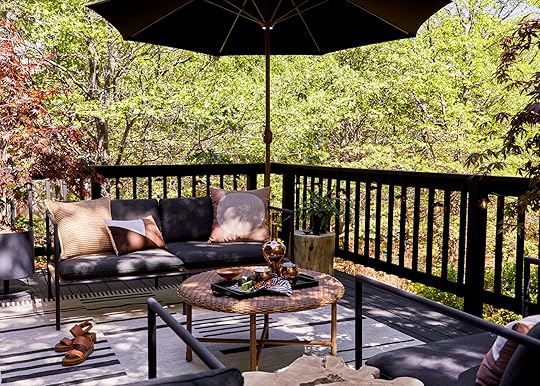
The stump side table and round coffee table are both from Target. The tray is Skagerak and the copper cocktail shaker is from Tom Dixon that I’ve had forever (and has graced the photos in the blog like 200 times – so good).
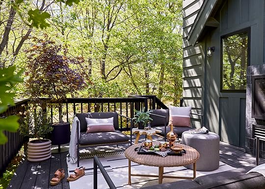

The smaller pot on the ground as well as the one on the side table are both from Hilton Carter’s collection at Target, and they pull in more of that warm tone that we needed to offset the harshness of the dark tones. It’s hard to see in these photos but we strung string lights around the perimeter. It makes it so pretty to be out there at night. Dare I even say romantic:)
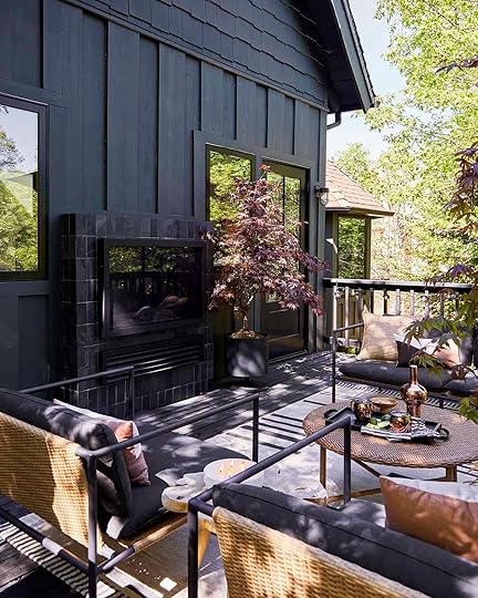
This is seriously one of the easiest and most successful spaces I’ve designed. I suppose it’s because buying a “set” checks a lot of boxes as you know they “work” together (and these clearly do). The clear color palette of rusts, copper tones against the black of the deck and the dark green of the house make it look so pulled together in just a few accessories. Designing a space doesn’t have to be hard, just intentional. A decided color palette will ALWAYS do that (and mixing up the textures:))
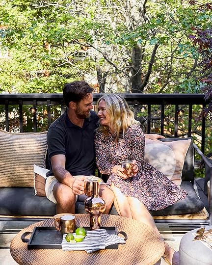
Brian and I now have “date nights” up here while the kids play below or watch a movie. And you bet I’ve been using this as my afternoon office on days when I wasn’t able to go on a walk or get any exercise – just being outside is helpful.
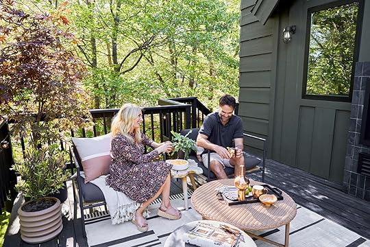
It’s just so wonderful to know that A. another space I neglected, is totally complete and B. I don’t need to worry about this performance fabric and furniture. While nothing is indestructible, I’ve been using Sunbrella for YEARS outside (remember my old Glendale deck?) and literally nothing stained it – not even the sap from our trees. It seemed impermeable to moisture and resistant to muddy paws. After being sent so many of the fabric books, I’ll be using some inside of the farm to keep those muddy pup paws from ruining our furniture. But just know that there are a lot of readymade pieces out there you can purchase if going custom isn’t your thing – and if you can’t tell I highly recommend this Blu Dot line.
O and remember my obsession with hammocks???
It’s truly one of our most cherished spots in the yard. It’s hard to not feel at total peace when you are in a hammock (or at least for me). It’s also our family cuddle/reading spot which is clearly enjoyed but ALL of our family members…

Buttercup is obsessed with the hammock which is, you guessed it, also made with Sunbrella. So neither the sun nor muddy paws can mess with this treasured Henderson piece.
Thanks to Sunbrella for partnering on this makeover. It will get so much use this summer as we start to invite our friends safely up here for one last hurrah (and having this all decked out will certainly help to rent the house out). Another box checked. Here’s a quick get the look for all you interested!

1. Planter | 2. Sofa | 3. Natural Woven Pillow | 4. Abstract Lumbar | 5. Circle Pillow | 6. Umbrella | 7. Stump Table | 8. Rug | 9. Coffee Table | 10. Indoor/Outdoor Cast Pouf | 11. Cocktail Shaker | 12. Mugs | 13. Tray | 14. Stripe Napkins | 15. Chair | 16. Square Pillow | 17. Side Table (similar) | 18. Lumbar Pillow | 19. Planter | 20. String Lights | 21. Hammock | 22. Accent Table
*Design by Emily Henderson
**Styled by Emily Henderson and Emily Bowser
***Photos by Sara Ligorria-Tramp
The post After Three Years We Can Actually Use Our Upper Deck (Because We Finally Have The Right Outdoor Furniture…And Fabric) appeared first on Emily Henderson.
June 1, 2021
A Father’s Day Gift Guide Straight From An Actual “Older” Father (Jess’ Dad Decided To Take Gifting Matters Into His Own Hands)

A few weeks ago my dad called me up and told me (emphasis on “told” as in saying “no” wasn’t really on option), “Hey, I’m gonna write a Father’s Day blog” to which I said, “You mean a Father’s Day post? Ok, write it and we’ll see.” You don’t get to write on Style by Emily Henderson without knowing it’s called A POST, dad. So after a few edits of what he considered every time to be his “final draft,” I sent it to Emily because I was clearly too close to really make a truly objective call. I love my dad’s writing because it’s just so him. I hear his accent, his pacing, his laugh and it all makes me happy. When my mom first got sick 12 years ago, instead of having to individually answer and ultimately console every well-intentioned call, he started a weekly email called Julia’s Update. They are to this day some of the most beautiful pieces of writing I have yet to read. It wasn’t just about her cancer or her sometimes up, sometimes down condition, but the story of a man who loved his wife heart and soul (that’s how they would sign their cards to each other, H&S). This of course is not that but hopefully helps to paint a deeper picture as you read.
He really is the kinda man that’s impossible to put in a box. Just when you write him off as a tough guy from Chicago with a million insane stories that can build almost anything, he starts talking about starting a flower shop business out of the back of his vintage Ford truck because “the flowers in his town suck”. And my apologies to anyone who has sat next to him on an airplane while watching “The Greatest Showman” and potentially heard his mumblings of how he was cheated out of having a good voice. He just can’t overcome the urge to dance in his seat with every song (or around the living room where seatbelts aren’t an issue). This is all to say that he is the absolute most incredible person I have ever met. I owe so much of my ambition, humor, carpentry skills (ok, all of my carpentry skills), and more to him. So getting to share him with you today is pretty special. Plus he has some really great gift ideas that maybe I’ll be using in the near and far future:) What a relief!
Now, if I call him a boomer he might actually shoot me. So all I will say is there’s a 40-year difference which shocks most people (he would want me to add that) and many of you might have an equally “badass dad who has zero time for bullsh* but likes nice and/or useful things”. SO without further ado, Lester take it away…

 some things never change.
Every year around this time, my daughter Jess asks me for Father’s Day gift suggestions. Because EHD’s team is mostly women. A dad’s opinion seems to be in order. Many of my suggestions are not used because they are expensive (my tastes have definitely gotten more expensive with no kids to support). Jess doesn’t want to offend any readers or cost you a lot of money. Good for her. However, I guarantee you the father recipients would not be upset or offended with a Tom Ford custom suit. Ha! We all think we deserve it (and we probably do). So, If we get away from expensive, then the gift needs to be useful. I cannot tell you how many of my Father’s Day gifts have gone into “The Drawer” along with the peace sign tie, the Harley Davidson bottle opener, the glow in the dark pen, the pressure point wristbands for motion sickness, the miniature Swiss army knife, the switchblade, and golf green repair tool. The list goes on and on. Yikes! In defense of my kids, they have gotten better with age but every once in a while I’ll get a “Drawer” candidate. So let’s get down to some basics.
Father’s Day gifts should be used or worn more than just when the kids visit. And that should be voluntary not out of guilt. They should be something that fits our character and habits (why do our children want to change us?). I like working with my hands so tools are a good bet. An artist’s easel with paint and brushes didn’t quite work for me (sorry, Jess). But I did give it a shot. Succeeded in embarrassing myself. Most dads wear some kind of aftershave or cologne. Ok, Old Spice is not Creed Aventus but it’s what I like. A fancy wood-burning pizza oven was way too much work. By the time I got the wood going, I could’ve cooked a half dozen pizzas in my conventional oven in 12 minutes. I like easy. I think most dads prefer easy too. So, here are some suggestions:

A Type S 12v Jump Starter. It is a portable power bank for jump-starting your vehicle. No more jumper cables. No need to get another vehicle involved. And it is small. Fits easily under your seat. It will charge any cell phone or computer and is rechargeable. It’s real handy. Any auto parts store has them. Also on Amazon, you can filter them by type of car so that you make sure you get one that’s gonna work.
Something else automotive could be a mobile detailing gift certificate or an oil change gift certificate works also. Sooner or later we have to get it done. The gift doesn’t always need to be something you can hold in your hand. Services are good and appreciated.

So I bought this trail camera to monitor my chicken coop at night. The chicken feed was being consumed at an extraordinary rate. My girls (chickens) just couldn’t eat that much. Lo and behold I saw the entire neighborhood having dinner. In the early evening, the squirrels would dine along with an assortment of birds. In the late-night hours gophers and rats would be feasting. I also found their entry points. I even spotted a deer grazing just outside the coop. It was all I needed to see to solve the issues. After seeing its capabilities I have all sorts of ideas on how to put this camera to good use since I’ve turned into kinda an outdoorsy guy during the pandemic. It comes in a camo color which is Dad-friendly and has wifi so I can monitor from anywhere. It’s perfect.

1. Men’s Denim Trucker Jacket | 2. Levi’s Trucker Denim Jacket | 3. Denim Jacket
If your dad is about clothes, a jean jacket never doesn’t satisfy. We wear them often. We can beat them up. They are washable (though that doesn’t happen often around here). Just make sure it has pockets. We need pockets. We’ve been stashing stuff in our pockets since kindergarten (frogs, marbles, matches, etc.)


The Greatest Showman Shirt (Given by Jess) | The Princess Bride Shirt (Given by Morgan, My Son)
Most men have dozens of t-shirts but we only wear maybe 6 of them constantly. (I cannot figure out why we hold on to the others ). T-shirts are harder than you think. First of all, you must know if your dad likes the artwork on the front or on the back. We all have a preference. I prefer the front (not afraid to make a statement). This is probably the first my kids have heard that (they’ve just guessed right all these years). Then finding the perfect shirt is brutal. One year my son bought me a “Princess Bride” t-shirt. I love it and never go a day without at least one compliment when I am wearing it. I’m gonna guess my son and I watched that movie at least fifty times when he was much younger. He would lay on my chest and we wouldn’t budge for two hours. Jess and I did the same for “The Little Mermaid”. Though she didn’t get me that shirt, she did get me one from one of my personal favorite movies, “The Greatest Showman” (I’ve always been a song and dance guy. What can I say?) I get compliments galore on that one also. My best memories are of those two on my chest. My late wife lying on my chest was pretty awesome too. Man, do I miss those days. Where was I? Oh yeah, Father’s Day.


1. RYOBI Multi-Tool (with Battery) | 2. Milwaukee Multi-Tool (with Battery)
If your dad is a handyman type like me, a tool might work. The most versatile cordless tool I have is a multi-tool. All manufacturers make them. Look for a sale. Sometimes the Lowes and Home Depots of the world have a set of cordless tools on sale with a multi-tool included. It is a good way to complement his tool collection and give your dad the multi-tool. Win, Win! Though I use other tools more often, the multi-tool has saved the day more than any other.
Editor’s Note: Les prefers the Milwaukee but both are good. Also, if your dad already has cordless power tools then keep the brands the same so the batteries are interchangeable (also make sure if you buy a multi-tool make sure it has a battery:)
1. 20-Ton Bottle Jack | 2. 50-Ton Bottle Jack
Another tool that most people don’t have lying around is a bottle jack. A small or medium size is fine. The only caveat is that your dad won’t truly appreciate it until he needs it. On that day, you’re a star.

Undersink repairs are common and hard to get at. A telescoping basin wrench makes life much easier for us old guys. Again, won’t be appreciated until he needs it.
2021 Callaway Warbird Golf Balls
If your dad is a golfer, a dozen balls and a round of golf (for at least two) is perfect. Free balls and free golf… that’s what we see. Yay!

Yaxell Gou SG2 8-inch Chef’s Knife
If your dad likes to cook like I do, one sharp quality knife is all I need (they are worth the do-re-me).
 wrigley field…GO CUBBIES.
It’s not hard if you keep it simple. Activities are good too. A professional baseball game with my kids was always a great day. I taught both of them how to keep score. I would test them during the game. It was great. I know the pandemic has put the maliooks (read: a stop) on this idea to some extent but they do have limited safe seating and if everyone is vaccinated, why not?
I would guess a picnic in the park is safe enough these days. Personally, I’d like a picnic in Central Park. It’s the greatest park in the world in the greatest city in the world. Yep, I would like that. I think every dad has a favorite place like that.
A gift certificate to a fancy restaurant is not even close to a gift certificate to In-N-Out Burger or White Castle or a Chicago hot dog stand. I’m from Chicago if you haven’t gotten that yet.
Editor’s Note: For my brother’s birthday, my dad ordered a few “kits” from The Taste of Chicago and it was awesome. We were in heaven. Deep dish pizzas and a Chicago Dog kit (yes, even the poppy seed buns and celery salt).
 jess as a baby… i liked her better then. juuuuust kidding.
We have enough socks, we have enough baseball caps, we have enough ties, we have enough gadgets (unless you come across a really cool one). We don’t need anything with “World’s Best Dad!” on it. We already know that. On a more personal level, you could do something with pictures of you and your Dad. Hint: we really liked you as babies.
I am certainly not opposed to a bouquet of flowers. I have a twin sister and my feminine side is strong (thank god) Hint: Not a fan of grocery store flowers.
 back in the day teaching my kids to build a shed.
Just keep it simple and keep it real. Spend time on the card. Funny is better than mushy. We’ll get mushy anyway. Our greatest joy is our kid’s happiness. So be happy! It’s a good gift believe me. When my kids thank me for something that I have taught them (either literally or by example) it just lights me up. So speak up. That’s a good gift too.
 the best, period.
Let me end with this. As a young man I always wondered what my purpose in life was. From the day I was born until October 5th, 1987 I didn’t have any idea why I existed. At 1:23 pm on that day my purpose was discovered. Jessica Bunge was born. It was as easy as 1,2,3. Who knew? A couple of years later Morgan Bunge joined the club. Fatherhood was and is as natural to me as anything I have ever done. It is why I am here. The sight of how my kids have turned out takes my breath away. Just like the sight of their mother used to. Have a happy Father’s Day everyone!
P.S. Most of my “Drawer Gifts” were given to me by my son. Also, I may have mentioned in passing at some moment I would like to try painting (don’t want to piss my editor off).
Jess again. The first time I read this I both laughed to myself and, of course, cried at the end. Then again I’m a real sap, but a sap that was pretty excited to share a little bit of ole Les Bunge with you all. I mean he’s the man that built THE BENCH. I hope that there was at least one idea for those of you shopping for your dads, grandfathers, stepfathers, and/or father figures in your life. And we have a few weeks! So don’t be like I’ve been nearly every single year and stress out, wanting to somehow show this crazy great man how grateful I am for him. I guess I should have always just kept it simple:)
Love you, mean it. (This phrase was actually on a card he got me years ago and I love that it’s both hilarious and heartfelt. That’s why I end every post with it.)
The post A Father’s Day Gift Guide Straight From An Actual “Older” Father (Jess’ Dad Decided To Take Gifting Matters Into His Own Hands) appeared first on Emily Henderson.
Emily Henderson's Blog

- Emily Henderson's profile
- 10 followers

