
Emily Henderson's Blog, page 166
June 17, 2021
9 Affordable (Budget) Powder Room Designs (But LOTS Of Inspo And Products For Full Bath Renos)
We keep saying that “so many people are renovating” right now but IT’S TRUE. We feel that most of the focus has been on kitchens which we totally get. But bathrooms are second on the list. So because of this, we thought we would update a really awesome post that we did a few years about. Why? Well, well who doesn’t love a pre-designed, EHD approved, AFFORDABLE bathroom combo. So I updated all of the products and even add a couple of fresh ones:) Now, these are for powder rooms but they could easily be translated for full bathroom renos. Enjoy!
The powder room AKA half bathroom – although typically the smallest of all the rooms in your house, can be an opportunity to make a big statement for you and your guests. Because these bathrooms are small and often not a room that you spend a lot of time in, you have a huge opportunity to do something unique and fun in there, but it’s not a room in which I splurge for obvious reasons. So we’ve taken on the task and designed 9 budget-friendly powder rooms for you. All of these below lean more on the affordable side and everything in them is off the shelf and ready to order or pick up in-store. Let’s get into it:
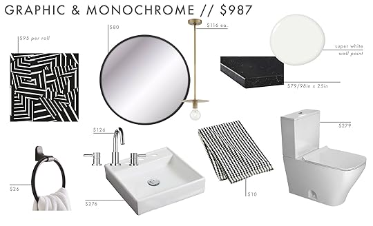
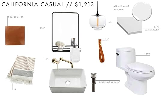
Wallpaper | Towel Ring | Mirror | Pendant | Faucet | Sink | Paint | Counter | Hand Towel | Toilet
Graphic and Monochrome: A black and white color palette does not equal boring. Especially when you start with a REALLY cool wallpaper like this one from Bobby Berk. The key to keeping things graphic is to go for simple and clean shapes. Also balancing straight lines like in the wallpaper, sink, and toilet with round shapes like the mirror, pendant, and towel ring will make it feel interesting instead of one-note.
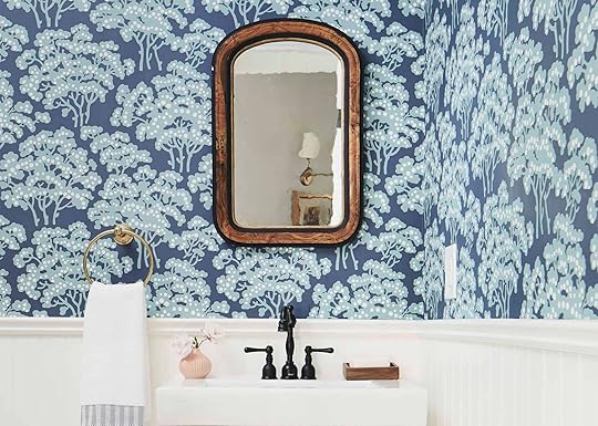
 photo by sara ligorria-tramp | from: silver lake hills master bath reveal
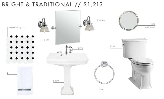
Tile | Hand Towel | Mirror | Faucet | Sink | Sconce | Paint | Toilet | Towel Ring
Bright and Traditional: At just over 1k for all the bathroom materials this one pretty impressively affordable for a traditional setup. The tile and traditional details are something that will always be in style but the light blue paint color helps it from feeling too boring and predictable.
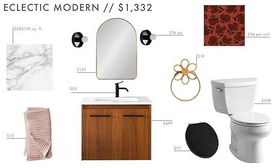
Tile | Bath Towel | Mirror | Faucet | Vanity | Sconce | Wallpaper | Towel Ring | Toilet | Toliet Seat
Modern Eclectic: This is a new one! With our on-goings about EGG, ee thought why not go a little wild in this combo. The quirky wallpaper and towel ring make a really fun statement and contrast perfectly with the more modern mirror, scones, and vanity. Then for a pop of color why not have a blush hand towel?? The toilet is a nice balance of traditional and modern but with a black seat, it gives it a little more of that old-world vibe we want for this bathroom.
Tile | Hand Towel | Mirror | Faucet | Sink and Drain | Pendant | Hook | Paint | Counter | Toilet
California Casual: Because what we dubbed “california casual” became one of the most popular series on the blog we decided to pull together a bathroom inspired by that vibe. It has some industrial-inspired elements in it like the edison bulb light and shelf mirror but the textural tones and that spanish tile floor sound very inviting.
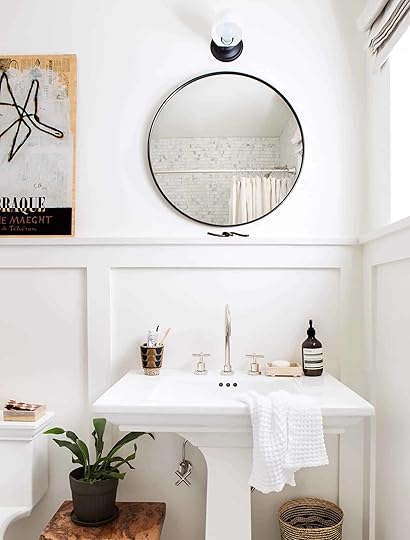 photo by sara ligorria-tramp | from: scott’s bathroom makeover with parachute
Tile | Hook | Mirror | Vanity + Sink | Faucet + Drain | Pendant | Hand Towel | Paint | Toilet
Geometric Spanish: In case you missed our post on what splurge worth tile or wallpaper can do for a room, click through here. But this tile is doing all the talking in this bathroom and is saying all the right things. To make it a little more playful and colorful, we added that green vanity (that comes with the sink and a different faucet but we like that brass one) and the really sweet pendant! Then to play off the circular nature of the pendant we chose a hand towel to complement it. And if you notice even the toilet as a geometric thing happening:)
Tile | Hook | Mirror | Faucet | Vanity + Sink | Sconces | Hand Towels | Paint | Toilet
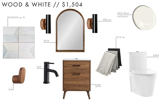
Wood and White: For those of you that like less of everything – including color in your powder room then this one is for you. It is minimal yet still warm what with those hits of wood in the vanity, hook, lighting, and the mirror. And that floor tile looks textural and graphic without introducing something busy and fussy into a small bathroom.

Wallpaper | Tile | Mirror | Faucet | Vanity | Towel Ring | Towel | Sconce | Toilet | Tank | Seat & Cover
Modern Tropical: Another newbie! We wanted to lean into a “sophisticated vacation vibe” and I think we did it. That Jungalow wallpaper is so good and paired with that dark blue subway tile it just makes it chic. But to warm it up (and add some glam) brass was necessary. Both the light and towel ring have this cool asymmetrical thing going on that’s really cool and interesting. So for the rest, we kept it simple with hits of black to ground the whole look.
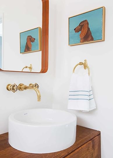 photo by tessa neustadt | from: guest bathroom reveal
Tile | Towel Ring | Stripe Towel | Sconce | Mirror | Sink | Vanity | Faucet | Paint | Counter | Toilet
Woodsy and Warm: This one speaks a bit to Em’s Pacific Northwest roots, and we can see this particular bathroom in a modern yet warm cabin in the woods. If green walls aren’t for you then you could keep the walls white and you still have a really pretty powder room for your guests to enjoy.

Wallpaper | Tile | Hand Towel | Towel Ring | Mirror | Faucet | Sink | Sink Stopper | Flush Mount Light | Counter | Toilet
Sweet and Textured: This is a pretty darling powder room that we think would be so cute in a modern farmhouse:) Texture is key and is shown in the tile, wood mirror, woven light, and towel. But also the pattern of the wallpaper and countertop also add a ton of visual interest. However, that towel ring is SO GOOD!
Last but not least, a few things to keep in mind before you tackle your powder room remodel. These prices are obviously not including any labor which will differ depending on where you live, and for all of them we either included a vanity or a countertop and sink combo that could be used to replace your current setup, so if you decide to do something custom under the countertops then your price will go up a bit from this as well. Let us know if you have any questions on any of these and which one is your favorite of the bunch?
And what do you want us to do next? We are thinking kitchen:) But whatever you want we’ll start working on them. We just may as well do the ones that you want us to do. These are typically more renovation-based budget posts (not the living room/bedroom/dining room 3 ways) but let us know what you want and we’ll tackle. xx
Opening Image Credits: Photo by Tessa Neustadt | From: My Powder Room Reveal
The post 9 Affordable (Budget) Powder Room Designs (But LOTS Of Inspo And Products For Full Bath Renos) appeared first on Emily Henderson.


June 16, 2021
Need A Big Planter?? Here Are The 18 Large and EXTRA Large Ones We Love
Our wonderful Insider Community that Key has been wonderful handling, has asked for large outdoor planter recs and I figured that they might not be alone. Heck if I had a space wider than my almost 3′ x 20′ balcony I would be on the hunt too! But you know what takes time? Searching and looking up annoying dimensions. I think everyone on the team (not just Emily and her cat lounge) has once or twice thought they “knew what the size was by just looking at it online” and FOR SURE regretted it. If you are a gambler that can be very exciting, buuuuut I am personally not a big gambling gal and hate having to return things. Plus it’s bad for the earth. Lose, lose in my opinion. So I did a bit of research and held myself as back as possible to bring you 9 awesome large planters and none 9 dope EXTRA large planters. If you want to see “Jess Unleashed: Outdoor Entertaining Products Edition,” head here. It’s hard not to suggest EVERYTHING I think is cool. But who has the time??
Now before we start, I thought I would give you a little planter sizing info I got from The Sill:
“When choosing a pot, choose a pot that is 1-2” larger than the current size if the plant is currently in a 10” pot or smaller. If your current pot size is >10”, choose a pot that is 2-3” larger in diameter.”
So since we are dealing with those over 10″ pots (and likely even larger plants), make sure those babies have some room to grow… 2″-3″ to be exact.
Large Planters
 left: home of erin hiemstra, design by growsgreen design, photo by seth smoot, styled by kendra smoot, via domino | right: design by william hunter collective, photo by sara ligorria-tramp, styled by velinda hellen and erik staalberg, from: 5 outdoor ideas & hacks that’ll instantly add style (& save you money)
Now when I say “large”, I’m talking between 13.75″ to 16″ diameter which means your plants should be 10″ to 13″ depending. Shall we just hop right in?

1. Self Watering Planter | 2. Pidestall Planter | 3. Totem Indoor/Outdoor Planter | 4.
Graysen Pot Planter | 5. Kauai Cement Pot Planter | 6. Composite Planter | 7. IKEA PS FEJÖ | 8. Brice Planter | 9. White Metal Planter with Black Stand
I think I should start with the two that will make your life the easiest… #1 and #7. Y’all they are self-watering AND under $20. How can you beat it? But if you are good at, or like to be attentive to your plants, as well as love cool shapes then #3, #5, and #8 are for you. Caitlin is actually eyeing #8 for her balcony:) Now if you want a classic look for a really great price then #6 is it. I really love that one.
Sometimes you need to create levels with planter groupings and that’s what awesome about #2 and #9. They are visually both substantial yet light because of their elevated nature. And last but not least, #4 is also on a stand but brings in that classic playfulness with its pattern! Stripes go with almost anything.
Ready to go bigger??
Extra Large Planters design by marie flanigan interiors | photo by julie soefer | styled by jessica brinkert holtam | via architectural digest
These planters range from 17.5″ to 35″ meaning your plants should be 14.5″ to 32″…again depending on the planter. Those are some big plants! The great thing about an extra-large planter like this is that you will likely only need one (which is good for the wallet) and will last you maybe forever. Of course, if you have a huge backyard well then you might need more. But I think the key, especially with the extra-large planters, is to keep them pretty timeless with clean lines. I did throw a color option in there for fun but when you are spending the big bucks on a piece like this it’s important to know that you are still going to love it in 10 years, right? So let’s look at what we got:

1. Flatform Planter | 2. Ring Handle Iron Taper Planter | 3. Bound Black Planter | 4. Barnacle Round Shoulder Jar | 5. Royse Ceramic Pot Planter | 6. Fiber Concrete Flare Urn | 7. Cecilia Indoor/Outdoor Planter | 8. White Belly XXL Planter | 9. Pacifica Planter
My modern heart is LOVING #1 a lot. And honestly, for the size the price isn’t bad. But if it’s texture you want, #3 and #7, and #9 are great. Not too busy but add enough interest to make you (and your future guests) take a second look. I had to add #5 because despite my odd hesitation with pink, how fun is a large pink planter!! However, I am very partial to a traditional aged planter like #2, #4, #6, and #8. They are just so elegant and will truly never go out of style.
Ok, there you have it. Large and extra-large planters that I can 100% get behind. Obviously the new and large planters are $$$ so don’t forget to check garage sales, Craigslist, or your favorite online selling app. Deals are out there if you have the patience;) Hope this was helpful.
Love you, meant it.
Opening Image Credits: Design and Photo by Shavonda Gardner
The post Need A Big Planter?? Here Are The 18 Large and EXTRA Large Ones We Love appeared first on Emily Henderson.
Are Indoor Cabana Stripes Still Cool In 2021? 5 Ways To Incorporate Them In Your Home In A Sophisticated & Non Cheesy Way

Cabana stripes are not a new trend and in fact, some quick research informed me their roots precede the nautical origins that we typically think of. In Medieval times, stripes were only worn by lower class people and criminals and it wasn’t until Queen Victoria donned her four-year-old son in a stripe sailor suit did stripes start to become accepted and adored by the general public. So, stripes have a rich, if not infamous history so maybe that is why they can be so polarizing. Here’s where I stand: cabana stripes are timeless and cool, if done right. Perhaps because of their popularity and mainstream presence in design and fashion throughout the decades, these thick bold lines are sometimes a tough pattern to nail down and can easily become cheesy and cheap if used haphazardly. We tend to think of them in relation with beaches and poolsides (or sometimes clowns), but when brought indoors they can be both elegant and playful and bring in a lot an unexpected excitement to a lackluster space. This pattern, though wonderfully simple, packs a huge design punch. Do you need convincing? Allow me to demonstrate.
1. Create A Bold Accent Wall Or Ceiling design by romanek design studio |photo by reid rolls interiors
A safe and DIY-friendly way to incorporate cabana stripes indoors is by painting them on accent wall or ceiling. Brigette Romanek used this method in the above project and she expertly mixes in sophisticated and sculptural furniture to juxtapose the young and playfulness of the stripes. The room is bold and elegant because it is intentional but not at all boring.
 design by estee stanley | photo by tim hirschmann | via domino
Similarly, the bathroom is less risky place to play with these stripes and it makes a small space seem bigger by drawing the eyes up. Another great thing about this is it is so DIY-able and you can choose just about any color to complement your style.
Now let’s travel even further up to the ceiling and see what these stripes can really do.
 design by crystal sinclair designs | photo by nick glemenakis. | via vogue living
 This dark, moody and modern room by Crystal Sinclair Designs proves that cabana stripes are more versatile than perhaps they are given credit for. The breaks in the stripes create even more dimension making the pattern feel less “Vegas poolside” and more modern European. It’s so cool.
 design by studio giancarlo valle | photo by stephen johnson |via architectural digest
This hallway ceiling moment gets an A+ and 5 stars from me. I love how the stripes do not stop at the ceiling and travel down the wall to create a kind of border to the top of the doors. And did you notice the vent? Probably not because the stripes camouflage it just enough. It is such a fun and unique way to hide an ugly vent (and so renter-friendly!). Plus that richness of the color really brings depth to an otherwise very white space.
2. Go Big With Fabric & Upholstery design by gavin houghton | via apartment therapy
This photo has circled around the internet and all my feeds so many times and for good reason. It is stripes galore but works incredibly well. The ceiling pattern draws the eye up while the matching upholstery grounds the space and allows for even more stripes to be added in the mix. It’s so simple but also so exciting!
 photo by sara ligorria-tramp | from: our boy/girl shared kids room
Who could forget the whimsical canopy that Emily installed in the kid’s room in their LA home? This room may have been divisive but I think we can all agree the canopy is SO good and perfect for a playful kids’ room. Paired with the wicker headboard and pom pom dotted bedding, the stripes are less nautical and more old world chic. Truly works with any style when used in the right way.
 design by tamsin johnson | photo by sean fennessy |via vogue living
 This dining room designed by Tamsin Johnson is one I can’t get out of my head. The stripes and patterned chairs remind me that a good mixing of bold patterns can go a long way. If you remove one or the other, this room could be boring or too minimal, but with both it creates an exciting design moment without doing “too much”.
3. Make A Statement With Striped Furniture design by flack studio | photo by anson smart
The pillow chair by Ash NYC is so good and unexpected when used indoors. There’s no question that its shape and pattern remind one of a beachside “cabana” (duh) but its whimsical shape and bold stripe look exciting and unexpected amongst the rest of the furniture and decor here. Actually, Urban Outfitters has a pretty awesome outdoor chair that is a more utilitarian version of this one! Don’t worry it’s still that happy yellow and would look great both in or outside.
 design by flack studio | photo by anson smart
Here’s the chair doing its magic again (also designed by Flack Studio). The navy and white stripes are obviously beachy which complements the location and style of the home.
 image source | design by vuokko nurmesniemi
This photo has been on my mood board for so long and it fills my brain with serotonin every time I stare at it. I just love it. I love the white and black striped chairs, that awesome green sofa, and the piles of striped pillows. It’s pure eye-candy but does not go overboard with color or pattern. It’s modern but gives me the vintage charm I crave, too.

 image source
When Jess sent me this link my heart exploded and then sank because I want this cabinet so very badly. This might be the one thing I would choose to buy if money was no object (we talk about this all the time in the virtual office–should we make it a blog post?). The price is not listed but I assume it’s $$$ because it is incredible and dare I say, perfect.
 design by lonika chande | photo by paul massey | via house and garden
There’s nothing beach-y going on here but wow is this room playful what with the striped headboard and the circus tent-like canopy. I am a huge fan of mixing patterns and this one nails it.
 design by three birds renovations
But look how amazing they look in a modern, neutral style. Just enough visual excitement without being too bold to rest your head:)
4. Have Fun With It Using Decor design by emmanuel de bayser | photo by kasia gatkowska
Here’s where we get to have some fun and can you imagine how simple it would be to DIY a cabana stripe piece of art?? Some painter’s tape, paint, and a slab of wood, and we are in business.
 image source
Blankets and coverlets are a low-risk and high reward way to bring in this bold pattern. I LOVE a red and white cabana stripe combo and I think it pairs so well with the neutrals and the vintage painting shown here.
 design by three birds renovations
Or taking two types of bedding in two colors and orienting them opposite is a VERY cool and easy way to do “cabana” in a really fresh way like the ladies of Three Birds Renovations did here.

 design by lucinda chambers | photo by paul masey | via house and garden
Did you really think I would forget about curtains? I could never because A) I think they are a great way to incorporate this pattern and B) I am quite obsessed with how the curtains are implemented in the home above. Can curtains be hung pretty much over any opening for some added flair and pattern?? This home is making me think yes.
 design by ash nyc | photo by christian harder | via architectural digest
This piece is so interesting to me. It’s a 3D piece of art that brings in a jolt of color and playfulness in a very elegant New York apartment. This proves that the cabana stripe is extremely versatile and again can work in almost any style of home.
 design by lorenzo castillo
Of course, a roman shade and cabana stripe are a 10/10 match. I love how the nautical theme is introduced with the cabana stripes and emphasized with the navy comforter and matching navy room divider and yet there is still so much vintage charm happening here. It is very sophisticated yet playful.

 design by parker thompson and brian alden anderson | photo by belle morizio | styled by julia stevens | via domino
And then there’s this heaven. Bold, fun and so perfect.
5. Bring The Stripe To Your Floors
 design by studio strato | via remodelista
In this home, the floors were painted bold blue and grey in the living room and throughout the hallways with the intention of embracing a “European summer” aesthetic. The floors really make this colorful home feel like a vacation while maintaining a sophisticated and timeless feel.
 photo by robert riegar | via marc costa
I like to consider rugs as large pieces of art and they are a perfect way to bring in pattern. In this minimal postmodern home, the striped rug layers in a ton of character an charm. It is minimal and fresh put packs a punch especially paired with sculptural furniture and colorful art on the walls.
So, what do you think?? Are you over these stripes or do you think they are perpetually cool like I do? Meet me in the comments and tell me your thoughts. xx
Opener Image Credit: Design by Flack Studio | Photo by Anson Smart
The post Are Indoor Cabana Stripes Still Cool In 2021? 5 Ways To Incorporate Them In Your Home In A Sophisticated & Non Cheesy Way appeared first on Emily Henderson.
June 15, 2021
An Old World Design Element I’m Obsessed With And Tried HARD To Bring Into The Farmhouse (Hint: Interior Shutters)

When I was first pinning for the farm I was looking for ideas on how to make it feel interesting architecturally but in a classic/casual way. It’s a lot harder than you think. While we are gut-renovating this baby and yes many things will technically be new, we don’t want it to feel “new” by any stretch of the means. We need design elements that will give it the quirk and charm it honestly lacked in the first place. I found some photos of interior shutters and fell in LOVE with the idea. They bring in so much warmth and interest in a way that feels really solid, grounded totally classic, and yet unexpected. See for yourself.
 design by nick gavin, katrin thormann and workstead | photo by matthew williams | via remodelista
 design by nick gavin, katrin thormann and workstead | photo by matthew williams | via remodelista
 via shutterly fabulous
 via lonny
You would think that a flat panel would be boring, but when they are hinged like that (and again, fit the window) with exposed hinges – I think they can look so simple and pretty.
 design by anna cayzer | via flickr
There is certainly a romance to them – perhaps because it feels more like a European design element.
 via shutterly fabulous
 design by fredendall building company
I LOVE this green one, especially for the deeper jamb which we considered but realized that it would obscure the view/light even more so we opted out. I also love how that one is asymmetrical with two small panels on the right and just one on the left.
 design by karen bertelsen
I’ve also considered doing it just on the bottom panes of the windows in our main bathroom – not to the top. The one above I’m assuming is folded back on itself or it wouldn’t close all the way which is a huge NO NO.
 via deVOL kitchens
They don’t have to be too fussy – I love the simpler vertical grooves of the above photo.
 design by isabel lopez quesada | via habitually chic
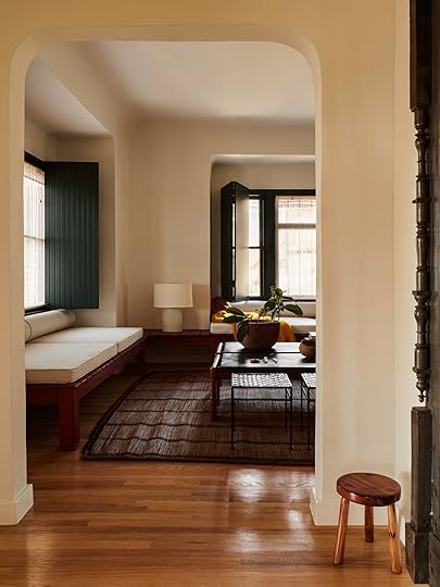
 design patrick bernatz ward | photos by john daniel powers | via yellowtrace
I LOVE how modern and fresh the above shutters feel – it’s not just for older homes. Also how great is the vertical paneling on vertical paneling?? It’s so simple but looks so chic. The contrasting colors don’t hurt either:)
 via shutterly fabulous
I think what most people think of interiors shutters it might conjure up ’80s interiors, not dissimilar to the one above, but if it’s high quality and they are installed to actually fit the windows then I just think they are awesome. But I might love that shot more for the styling and generally prefer non-slatted.
 via nomadic decorator
SO good. That fabric would still let some light through and it certainly adds a lot of texture and softness. So cozy.
 design by natascha persoone
I wouldn’t have thought to put them on doors, and definitely not on arched doors – but it really works and actually is a great window treatment solution for arched windows. The simple warm wood is stunning and likely where we would lean. The options seem kinda endless.
So in February when we were up there I was so happy to find 8 matching antique shutters at Aurora Mills. We thought they would be perfect for our bedroom.
Boom. Done. Or so we thought. They were 16″ wide by 60″. We plugged them into the rendering to see if they would work.


We weren’t sold (also the room has totally changed from this rendering, FYI). Now I know that these renderings don’t show texture/age but it wasn’t feeling nearly as good to us.
Then we did a deep dive on interior shutters to better understand how to use them – what are the rules and things to think about?
 via ingredients ldnShutters need to, HAVE TO, fit the windows when they are closed even if you never close them. Too small shutters on large windows is a thing and it’s not a good thing. You can slightly cheat it so you visually can’t tell that the size is off, but not too much. So it meant that if we used those shutters our windows would be fairly narrow – not the worst thing ever, but we had to ask ourselves if having shutters was worth having smaller windows than we wanted. Often they are installed inside the jamb (see photo above). That means that you might need a deeper jamb. They do block ALL of the light, but there will be a light leak at top/bottom. So this made us think we’d want shades or curtains in ADDITION to the shutters. Harsh light leaks affect sleep more than filtered ambient light through fabric. They aren’t exactly super easy to open and close – so they might be best for the rooms that you can leave open. I worried that it would become this cumbersome job (to be fair we are now very used to motorized shades on a remote that all go up and down at the push of a button). Having shades in addition to the shutters I think would take away from the charm and might look a little dumb. The shutters that we found I think were more exterior shutters – In all the photos above, the shutters folded back on themselves, doubled up when open – I think I prefer that look if we were to do any. If you don’t do them inside the deeper jamb you can outside mount them but it does affect your window casing – it can totally work but it’s something to consider with the architectural style of your home. Custom/new shutters aren’t cheap to fabricate. However, looking at some of these that are simpler I’m thinking that if you are into them you can certainly DIY them.
 Right now we are not doing these particular shutters because we didn’t want the shutters to dictate the size and location of the windows. As you know, natural light is annoyingly important to us and we found that these shutters were making our windows smaller than we wanted and we couldn’t have as many as we wanted because when they were open they would hit each other.
 design by solenne de la fouchardière and simon lee | photo by yuki sugiura | via remodelista
Now we still MIGHT try to bring in some custom shutters somewhere (maybe just on the exterior?) but designing the room with those particular shutters was feeling like we were being held hostage by this design element that maybe wasn’t THAT appropriate for a farmhouse anyway. But when I look at these inspiration images I want them SO BAD. We might be able to bring them into the upstairs bedrooms where the windows aren’t too close, or maybe have them on one side of a window downstairs, but ultimately I think that we chose bigger and more windows over those shutters.
How do you feel about interior shutters? I’m sad that it might not happen, but I promised myself that I will SOMEWHERE, someday  Just might not be this farmhouse.
Opening Image Credits: Design by Special Umbria | Photo by Kristian Septimius Krogh
The post An Old World Design Element I’m Obsessed With And Tried HARD To Bring Into The Farmhouse (Hint: Interior Shutters) appeared first on Emily Henderson.
June 14, 2021
Race to 7/20: Jess and Caitlin Are Racing To Decorate Their, Let’s Say, Challenging Balconies… Here are The Plans
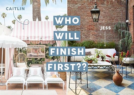
Last Tuesday, Caitlin and I were still feeling kinda meh and not very inspired (or at least I wasn’t). It was a big “WHAT DO WE CARE ABOUT/WANT TO TALK ABOUT? WHAT DO THE READERS CARE ABOUT? DO WE CARE ABOUT ANYTHING ANYMORE???” So after throwing a bunch of ideas out we both decided we wanted to tackle our “unique” balconies. Now I know some these intro posts have ended up being a bunch of empty promises (rip my tiled medicine cabinet cover). BUT this time is different. We have set a deadline, or more so a finish line. The plan is for us to see how fast we can turn these babies out with the absolute latest day being 7/20. This means our reveals will be designed, shot, and ready to publish by that date. It’s a cutthroat race but also a very supportive one:)
So why July 20th? Well, it gives us a little over a month (even though I am placing a big bet on myself to finish much sooner. Watch out Higgins!) and I thought it was a funny play on Armchair Expert’s “Race to 270” where two of Dax’s best friends raced to get to 270 lbs. Caitlin has never listened to a single episode of any Armchair series (I KNOW!!) so she had to take my word for it. They didn’t have a timeline and we don’t have any potentially dicey moral issues (Monica and I were very aligned in our concerns). Oh, and there may only be one update because that’s how fast this is going! Otherwise, it’s practically the same thing. And hopefully just as entertaining! Ok, I’m now going to pass the mic to Miss Caitlin to describe in all her hilarity what determined women we became that fatal Tuesday evening…

HI, IT’S CAITLIN. Jess is right – I’ve been feeling really uninspired to take on projects in my own home right now. Exactly two weeks after getting my second Pfizer shot in April, my internal monologue switched from “I deserve a home that feels like me” to “why work on my apartment when I could work on going to beer gardens and sitting in the park and going on boats and seeing my friends again???”
The next thing you need to know: over the past year, I have grown to be like, uh, a little codependent on Jess. (TBH it’s healthy, but we are just very close!!! It’s very cute!!!) I think we talk for at least 20 hours a week – not even about EHD business, just friend stuff (outside of business hours, of course!) – and so when she called me after work on Tuesday and told me about her plans to do her challenging balcony, I said, “OH, ME TOO. My balcony is also tough! I will design mine and we will do it together,” because what are friends for if not glomming on to your ideas and forcing themselves into your projects?
But it turns out that it’s just what these two indecisive Libras needed, because by Wednesday morning, we both had mood boards and guys, WE STARTED PLACING ORDERS FOR THINGS. Money is leaving our accounts (and in my case, I’ve already gotten some things delivered!). This is happening. Side note: In a true non-competitive competition, we placed these orders while FaceTiming each other and we cheered when the email confirmations came through – it is very nice to have a friend to hold me accountable That said, BUNGO IS GOING DOWN BECAUSE I’M GONNA BE DONE THIS BALCONY ASAP. Let me show you what I’m working with…
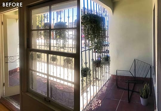
This space has been my problem child for a full year (or uh, two years, I guess. Woops!). It has okay dimensions (10′ x 4′), which would normally be great *if* there wasn’t a door that opened straight into the space – those with sliding glass doors, you are very lucky – but beyond that, it feels like a full-on UFC cage match in here. I really oscillate between thinking the bars are a charming architectural feature and thinking that the bars are the bane of my existence, but I guess that both things can be true. My original plan was to get planters and to grow some vines up the bars to increase the privacy factor, but getting the right size planters to sustain healthy plants would kill the amount of floor space and make ~comfy~ seating arrangements untenable, so I just kinda ignored the problem and figured that I’d deal with it one day when I felt smarter and more capable. But finally, the stars have aligned and the day has come!
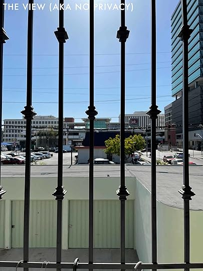
Before I jump into the inspo and plans, though, GET A LOAD OF THAT VIEW. That’s what folks move to LA for!!! It’s beautiful and the bars definitely add a little something extra. This is exactly what I had always dreamed of when watching old sitcoms based in Beverly Hills – just true glamor here, guys. The other day when I was measuring in my PJs, I was catcalled by someone in the drive-thru. So like, SOS, I NEED PRIVACY RIGHT NOW. On to the inspiration…
 design and photo by gray malin
TBH, even *I* am shocked that this is where I ended up, but I’ll walk you through the catalyst a little bit when we get to the moodboard. Doing a whole Beverly Hills Hotel-inspired apartment would be a little too much for me, but in 40 square feet? I LOVE IT. I’m not traditionally into cane or rattan or wicker but I love how functional and light and fun it is for an outdoor space, especially when paired with some cabana stripes.
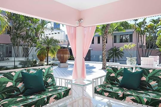 image source
Ah yes, we’re clocking in on a definite theme here. Gimme some banana palm printed cushions, gimme some outdoor curtains with fun tiebacks, and gimme some fun hits of pink and stripes! I’M READY. I’m ready to share my early plan (with notice that things will probably change or shift a little, since finished is better than perfect!).
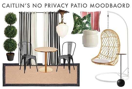
Boxwood | Striped Outdoor Curtains | Chairs | Bistro Table | Runner | Semi-Flush Mount | Leaf Pillow | Pink Pillow | Planter | Hanging Chair | Drink Table
My jumping-off point here was the cabana stripe curtains – they’re made of Sunbrella which means they’ll be really easy to maintain, which is key for me since I live off a major road and everything is constantly covered with a layer of black soot – and I love that I’ll be able to manage the amount of privacy on the balcony. My apartment gets REALLY hot and it takes a long time for it to cool down in the evenings, so I love sitting out on the balcony at night – I can’t wait to draw these shut, flip on the light, and lounge on an egg chair in a sports bra with my book and my $11 Sauv Blanc from Walgreens without a million folks seeing me.
Everything else fell into place pretty organically after that – like, if you’re doing a cabana stripe, you may as well lean into the rattan…and the brass…and the fun prints. I HAD TO. For what it’s worth, I had never been a big bistro table set fan and would have never thought of putting one out here buuuuut a few weeks ago, a gentleman caller came over to make me dinner and he wanted to sit outside (because again, hot apartment) and I was MORTIFIED, so that table and those chairs have already been acquired. #iboughtthis #problemsolver #fasterthanJess
I know that once the “big” pieces are installed, I’ll pepper in a ton of pink & green accessories in terms of pillows, dinnerware, candles, flowers, etc. TBH I would have loved to go for a true Beverly Hills hotel vibe (a little bit of a lighter palate – white chairs, a white drink table, a baby pink rug) but I’m trying to balance out the imposing prison bars while picking pieces that won’t look disgusting after a week of soot exposure. And while my middle door placement drives me crazy, I am pretty excited about the natural separation it makes between a “lil spicy date night” side and a “relaxing like a fetus in my sweatpants” side. In any case, I’m VERY EXCITED to have a new and usable space that I won’t scream about in case a boy ever comes to my house again. Passing it back to Jess, but I’m excited to hear any feedback from you!!! See ya!!

 very intense shopping faces
Hi again! Our codependent relationship has become one of my most treasured gifts of 2020 and I am 100% that horrible coworker/friend that facetimes without asking permission but she graciously answers almost always (I have gotten A LOT better about asking before I call even though she’s never complained). And she is also correct that our Libra indecisiveness makes it near impossible to make a quick decision so last week was an exciting but anxiety-inducing roller coaster. Normally, I spend weeks making sure I am making the “most perfect” decision I can for a room. Hence why my projects take…a minute. But not this time! Exhibit A: I searched for maybe two hours and decided to buy a 10950s vintage lounge chair without the “but what if there’s something better” thoughts taking over. I didn’t even sleep on it! Well, I kinda did because it was off of Craigslist and I couldn’t get it for 2 days but you get the point.
HOT DESIGN TIP: Create a friendly design race with a friend to hold your overthinking butt accountable so you both can enjoy each other’s spaces in the actual near future!
And being held accountable is what I needed (well, we both needed). Remember in my “I Moved” post where I talked about my long list of what I had to have in my next apartment (talking about this one)? An outdoor space was probably #2 on the list of importance. #1 being it had to be bigger:) But the embarrassing truth is I’ve never used it. Sure, I’ve used the building’s community patio with my neighbor friend for some drinks but that’s it. Honestly, it’s un-freaking-acceptable. Walk the walk, Bunge.
Ok, I’m walking here (!), let’s talk about my little slice (literally) of heaven.

Here is maybe the longest and skinniest balcony in the Los Angeles Area. But I don’t care because she is all mine… as I mentioned, there’s a larger communal patio for the building to use when I have more than just Caitlin over for some alfresco drinks and snacks. Can you believe that that statement is a reality?!?! Having more than one person in my apartment feels like rave-level excitement. Not that I’ve actually been to a rave but you get the point.
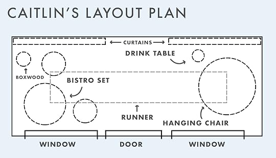
As you can see from these photos the layout is my number one issue but I have a plan that I think is going to work great for me and having those four doors is crucial.

This puppy’s usable dimensions are 30″ x 20′ and below is my current layout that likely can’t change if I want all of the elements I have planned. Essentially the two inner doors will always stay closed because they all swing out towards the balcony. I can then access each chair and side with the two outer doors. It’s for sure going to be tight but totally doable. Then my awesome new lounge chair, which you will see in a minute, can be off to the side so I can more comfortably read, bask in the sun, or drink some wine with my legs up. Oh and I really want a small tomato plant because after eating fresh tomatoes from my dad’s garden last summer, I’m forever changed (and they are apparently very easy to grow which is necessary for my skill level).

Ok, let’s take design. You are probably not surprised that I am going for a vintage European/Parisian look. Predictable, yes. But I love what I love and it’s the right vibe for the exterior of my building.
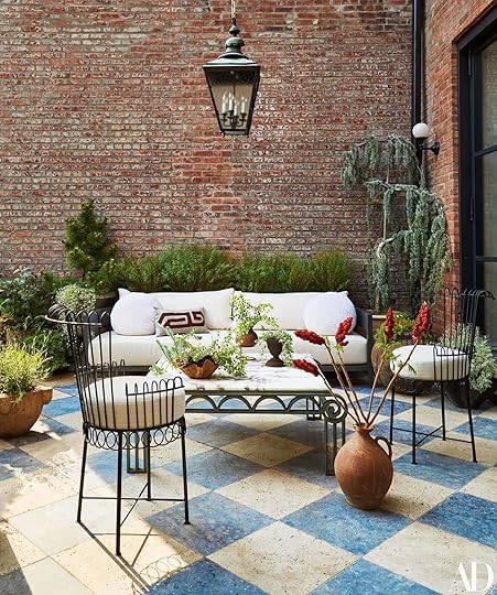 design by athena calderone | styled by colin king | photo by gieves anderson | via architectural digest
My main inspiration is Athena Calderone‘s Brooklyn terrace. I have been drooling over this patio the moment I first saw it a few years ago and knew that if I ever had an outdoor space this would be one of the top inspirations. The blue and off-white tiles, the unique iron furniture, the pop of colorful greenery. All a total Jessica dream.
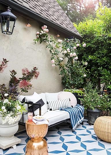
 photo by tessa neustadt | from: the finished patio (with the tile!)
And so is Emily’s old patio! Beautiful, bold patterns, colorful, and fresh yet soulful. Also I just I really love special metal outdoor furniture.
Another issue is going to be greenery. I want to have a good amount but also know my limitations in my plant care abilities. I really want to get better though!
 left: design and photo by anita yokota | right: design by seamus dinnigan, via homes to love
I sadly can’t do vines up the walls like Anita’s wonderful side yard or Seamus’s stunning outdoor dining nook. But do you see those plant stands in the back of Anita’s space? Well, I was pursuing World Market I grabbed myself something similar! Not sure if I will use it for a plant or a lantern holder but love that it’s going to giving me some levels. Since having a vintage look is paramount, I found a DIY how to quickly age (aka rust) metal quickly which I think would give it that feel I want.
Now let’s see my full plan before I go into more specifics…
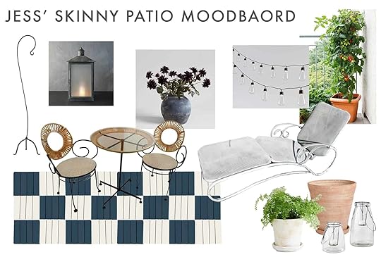
Floor Lantern Hook | Lantern | Faux Flowers | Solar String Lights | Vintage Outdoor Bistro Set | Floor Tiles (going paint blue and white) | Vintage Lounge Chair | White Planter | Terracotta Planter | Clear Glass Lanterns
Do you see the vision?? The floor tiles are going to be the biggest transformation and the biggest project. I’M SO PUMPED. So they are actually the IKEA outdoor click-together tiles that I am planning to spray paint to make that blue and off-white checkered pattern. I was thinking of trying to create a diamond pattern but it’s really going to be sooooooo much harder and the check is going to be great. I’ve already consulted with DIY expert Rashida about the painting process so fingers crossed it lasts. I should mention that they have been purchased and are awaiting paint and some cutting! I told you we are MOVING QUICK.
That bistro set was about to be in my cart from Chairish until I realized it needed to be shipped from across the country and made it way too expensive (I really thought I had clicked the “local” feature!). I was bummed. But then my spirits were lifted when I found that INCREDIBLE lounge chair on Craigslist for $125 which was a lot more affordable than most of the new stuff on the market. It’s a special piece I plan on keeping and loving for a long time. Plus the extra great part is that it’s only 22″ wide which is perfect for the very narrow space. I could maybe get a drink table y’all! Pillows and a throw will be added for extra comfort, color, and style:)
So the hunt for the bistro set continues which might be the one thing threatening my victory because I really want something vintage. I probably will also want something a little less curvy than what is on the moodboard since the lounge chair has that detail handled. But aside from that, the solar lights and clear glass lanterns have been purchased as well. So now I just need to fill in the decor. Oh and get on those DIYS because I want to WIN!!!
So that’s the deal! Are you ready to take bets? Should there be a prize like “the loser” cooks dinner for the winner that they can enjoy on the winner’s patio together?? Hopefully, you are as excited as we are!!
Opening Image Credits: Left From: Design and Photo by Gray Malin | Right From: Design by Athena Calderone | Styled by Colin King | Photo by Gieves Anderson | via Architectural Digest
The post Race to 7/20: Jess and Caitlin Are Racing To Decorate Their, Let’s Say, Challenging Balconies… Here are The Plans appeared first on Emily Henderson.
June 13, 2021
The Link Up: The Sun Hat Emily Will Wear All Summer, Mallory’s Awesome Sports Bra, And All the Summer Dresses We Bought This Week

Hello and welcome to….*drum roll please* THE LINK UP! We just wanted to build a little extra suspense today with that virtual “drum roll” to shake it up, we hope you enjoyed. This week we’ve got lots to talk about because we’ve been buying products left and right in preparation for an (almost) post-pandemic summer…it’s so close we can taste it. So here’s what’s going on this week:
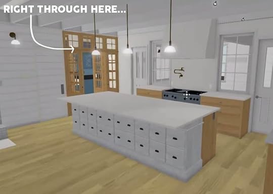
This week’s home tour was sent to us by one of our awesome readers, Jessica Davis. Jessica is an interior designer who recently renovated her mid-century modern in Atlanta and transformed it into an epic spot for her and her family. The home is dripping with personality and amazing hardware (from her hardware company Nest Studio). Scroll through to see some really inspiring rooms & a very fun secret passageway moment.
From Emily: It feels like summer has officially hit up here in the mountains, so I thought it was fitting to share my favorite sun hat and what I look for in a sunhat in general. In the summer we boat around the lake a lot, so I am a HUGE supporter of hats with chin ties because I never have to worry about them flying off. Also, when you want to take the hat off, it makes it easy (and looks cool) when you can just wear them like a backwards necklace. It also needs to be wide enough to ENSURE I won’t get a face sunburn (which can easily happen with my skin). These say they’re 50 SPF and while I’m not totally sure how a hat can have an SPF, these sure do the trick. Last thing… they’re pretty affordable –– only $35 and they’ve gotten me through 2 summers now. I’m a big fan.
From Caitlin: I’m here once again to sing the praises of J. Crew Factory, AKA the dream destination if you miss Jenna Lyons-era J. Crew (not sure if anyone else was really obsessed with the scalloped skirts – I was – but they still exist here!) or want to get current Madewell styles at way cheaper prices. I stopped by their brick & mortar location when I was in Delaware (pro tip: J. Crew outlets = Factory storefronts) and my mom treated me to the CUTEST $50 DRESSES that I now need share! First up, I grabbed this simple white midi with bright rickrack trim which fit way better than I had anticipated – thought it’d be pretty shapeless on the rack but it was awesome on! The waist is a little more form-fitting and the top truly comes to my shoulders, so no armpit creases are visible – and the trim just makes it so happy and fun. And I also grabbed this lightweight slightly-above-the-knee dress with really pretty longer sleeves, which is the perfect comfy choice weight for outdoor summer events where I don’t want to answer a million questions about my tattoos. (FWIW this one runs a little large – I, a person who can’t remember the last time I got a medium and exists in the L/XL spectrum, got a large and considered sizing down from that!)
From Jess: I really love this new dress I got! It’s so cute on and I feel kinda powerful in it. Plus Veronica just got the same one which in my opinion is the ultimate stamp of cool approval. I got a large but the button on the belly area just fits. So if you are cuspy I would maybe size up. As a side note, I’ve decided that I’m going to lean into alterations this year because every body is different and it’s impossible for every piece of clothing to fit perfectly on each one. Had this one been a bit tighter I would have sized up and gotten it taken a little in. I want to control my clothes, not the other way around!
From Albie: We’ve had a lot of big projects that require big fixes but also a lot of small projects that call for small fixes, especially when it comes it comes to finishing touches. DIY isn’t our forte, so the end result may need some finessing. This little kit has come in quite handy when it comes to ensuring a polished finish or just covering up amateur mistakes.
Also from Jess: After 8 years (?) I FINALLY went to the dermatologist and within a minute of my doctor checking me out, she promptly told me a mole on my leg needed to go right now. So with two sets of stitches, my already scheduled first vaxxed pool party will be far less “pool” and much more “dry shade” (ooooooof course). But I’m VERY grateful to have caught a potentially dangerous mole. Everyone go get checked out! All of this is to say, my doctor told me I needed to get compression socks so I ordered these and these. From everything I’ve heard, compression socks are the jam for good blood circulation, swelling, and achy legs. Just make sure you measure your calf so you get the right size
From Mallory: This sports bra literally deserves its own blog post it’s that good. I’ve been a Lululemon fan for a while now, pretty much ever since they made workout clothes cool again. The reason why I love this sports bra so much is because it’s super simple, but has an AWESOME detail on the back so it feels really cute and special. I work out better when I feel good in what I’m wearing, so it’s no surprise that I literally try to grab this every time I workout (which sounds gross, I know, so if you’re curious I also wear this sports bra a lot too). Also as a little easter egg I found this in the sale section of lululemon and think it’s really cute if you want to snag it for yourself since there are only a few left
From Ryann: Welcome to another episode of “Tik Tok made me buy it”. This week I was scrolling innocently when a woman with very similar body shape as me recommended this bralette that is seamless and has zero padding yet looks so supportive. I hate bras with underwire but with size 36 DD boobs bralettes can be hit or miss for me. This one sold me and I want wear it every day, sometimes just with leggings or shorts as it is not too revealing and looks very much like a sports bra (and the green color is so cute!).
Thanks for reading and have a very very happy Sunday!
Opening Image Credits: Design by Jess Davis of Atelier Davis | Hardware by Nest Studio | Photo by Emily Followill | via Atlanta Magazine
The post The Link Up: The Sun Hat Emily Will Wear All Summer, Mallory’s Awesome Sports Bra, And All the Summer Dresses We Bought This Week appeared first on Emily Henderson.
June 12, 2021
Are We Wearing Jeans Again? An Honest Denim Review At Both High And Low Price Points

I’m not sure if we are ready for this but here goes. A couple weeks ago as we were shooting the bold dress roundup I realized that I had a lot of denim with me that I was showing Mal and Veronica. At the time I was doing a partnership with Rent the Runway and Madewell (both just for social not for here), and then my friend Annie (whose house we shot at) also had some jeans, too. So as I was giving a personal review session for Annie, Mal and Veronica, we were like – oh we should at least shoot this and post about it. I only bought one pair of jeans during quarantine and was looking for a new more modern profile but I can NOT do the baggy mom jean thing (???) So here are the ones that I had on hand that I like and wanted to share.

These were my first foray into the straight “mom” jean and are actually affordable (originally $79 but now on sale at $55). I really like how they hugged the thigh/butt but then loosened, rather than being baggy the whole way down. They are very non-stretchy so there isn’t a lot of give in them (similar to Levi’s) so they are better out and about pants than sitting at your desk pants. Brian thought that the ripped hole was a bit extreme but Mal and Veronica liked it. I liked these with heels but they are a bit long so I’d have to restyle them for non heels.


Relaxed Jeans in Springtide Wash, $128
These are your more straight jeans that are loose and stretchy. I would size down (always size down with Madewell). These were super comfy and decent cut but I love the front more than the back.


High-Rise Distressed Straight Cropped Jeans, $30
These are the Target jeans that I’ve written about a few times and they are just GOOD. I find myself opting for them all the time out of comfort and ease. I can dress them up and down (flip flops, sandals, and boots). I’ve also washed them a lot and they wear really well.


Baggy Tapered Jeans in Markwood Wash, $98
These are another straight cut that are super comfortable, but not particularly curve hugging or flattering. But I don’t think mom jeans are supposed to be flattering, right?

Relaxed Denim Shorts in Berriman Wash, $70
Now THESE. You know my love of Levi’s cut offs so when Madewell sent these I was like “sure but I don’t need more” until I put them on and they sit so nicely on the hips and flair out so they are so casual and easy to wear in an oversized way.


Relaxed Denim Shorts in Homecrest Wash: Ripped Edition, $75
These are the same denim shorts in a darker wash and I loved them just as much. I believe these are a size 27 and they are pretty big (and that’s my usual size) so if you want tighter just size down, but I like this size (but haven’t tried the 26 so maybe it would be better).

Denim Pleated Mini Skirt in Upton Wash, $80
How cute is this skirt?? I thought I was kinda not into denim skirts, but once I tried this on it felt modern and classic, but dressed down also very “now”. I put it with a blouse and it was a bit too “sweet” what with the pleats and all but dressed down with a T-shirt I love it.

Colette High Waist Raw Hem Crop Flare Jeans, $219
These boot cuts are the most “going out” pants that I’ve worn in a while and I’m pretty into them. The little flair reminds me certainly of college (anyone else?) but they are a strong pair that I can wear when I want to look a little more pulled together (I rented these from RTR).

Another rented pair from RTR that I fell in love with. These are Levis and the cut feels more fresh, with no holes (my father-in-law will be so happy). They are still Levi’s so they are not terribly stretchy so way better for days that aren’t super hot or for those that don’t mind being more constricted in the name of flattery.
So there you go. I’m still only entering the jean phase post quarantine and you may not be ready to do them again, but if and when you are ready to these are some that I do love and have found to be the right vibe for summer and fall.
*Photos by Veronica Crawford
The post Are We Wearing Jeans Again? An Honest Denim Review At Both High And Low Price Points appeared first on Emily Henderson.
June 11, 2021
Frequently Asked Life Questions That I Figured It Was Time To Share

We are making a massive life change this summer by moving to Oregon and the closer we get to it the harder it is. We’ve talked about moving to Portland for 12 years and we found what we hope is the great property in the great location to raise our kids, grow our family, and groom our fantasy alpacas. But there is still a “are we doing the right thing feeling”, frequently and honestly I don’t think it’s going to go away for a while. And I think that’s ok. Maybe this isn’t the right move, and if so we’ll cross that rainy bridge when we get to it. Every time we go up to visit we feel like it’s the solid RIGHT decision and we are SO excited. The property is just magical, but our family is extremely content living in Lake Arrowhead and there are just so many unknowns about the move back to Oregon, back to a city. So every time I have doubts I try to remind myself of why we are doing this and then I look at the photos of the farm and conjure up how we feel there. I remind myself of the school, our community, my lifelong friends and siblings, and not to mention the amazing food, incredible thrift and vintage shopping, and trees – OH THE TREES. I want all of these things for my family, my husband but mostly my kids. But moving to another state – and even more – moving HOME is harder than I thought it would be. So here are all the questions I get from friends and family and figured that those of you who are following closely likely are wondering the same things. Here goes.
When Are You Moving To Oregon?We are moving mid August, as school starts September 1st. We have rented a house near the farm and school and in a few weeks, we are going up to move in so that when we arrive in August we can settle in and have a couple weeks of acclimating to the neighborhood. We’ll set up playdates in the neighborhood with kids of similar ages, and play a lot on the school playground so they feel familiar with it.
 photo by sara ligorria-tramp | from: how to design a quiet, neural yet exciting living roomAre You Selling The Mountain House?
Heck no. We won’t sell here until we have to – you’ll have to pry it from my dead hands. We plan on coming back for Christmas and summers, which keeps us connected to this magical place as well as our friends in LA that I’m going to miss SO VERY MUCH. Of course anything can happen, but as of now, we have zero plans to sell and intend on making many more years of memories here. Besides… this is our backup plan.
Are You Going To Rent Out The Mountain House To Others?Oh, this has been quite the debate. Obviously, neither of us love the idea of strangers trashing our beautiful, happy place and doing weird things in our bed. But I also love the idea of it being enjoyed and not sit empty! The short-term rental market up here is pretty crazy and we know that we could rent it out for a decent amount when it would be sitting empty for months. As of now, the plan is to have it privately managed, extremely vetted, by a neighbor and renting out for commercial and photo shoots. It won’t be on Airbnb (for now) and can hopefully be a great family retreat for multiple families when we aren’t here. Stay tuned on how to book. Also at any point, if it doesn’t work then we can pivot. There are no definites here
 first post vaxxed team happy hour!What Will Happen With The Business?
Everything will run as-is. I have this awesome team that is all LA-based (for now) so I’m sure there will be some navigating some shoots and schedules and I’m not naive enough to think that there won’t be challenges. But we have been working remotely for a year so we know that the business can do that, I just also want to make sure everyone thrives in this work lifestyle without me. I will likely fly down every 6 weeks to touch base with my team and we’ll likely have more team retreats for brainstorming, bonding/morale and to stay connected. Right now I come to LA every other week for shoots or Mal/Veronica or Sara will come up here. So there will be some navigating of production for the smaller partnerships. Obviously, all the farm stuff has to be taken up there, so as of now Brian will produce social (then sending to Mal to edit and post) and we’ll hire freelance photographers when needed. I hope to have more team lunches and just want to make sure that everyone is still happy and having fun. More team lunches and happy hours please!!! Remember that I’m an enneagram 7 so my goal isn’t to build the business to be big, but to make sure that everyone is having fun, thriving, living their best life. Me too.
I’m worried about my boundaries. Living in the country has been a firm boundary that has slowed me down DRAMATICALLY and despite the year being what it was (terrifying, devastating, full of fear and anger), I’m a far better version of myself up here. I’m a better mom, a better wife, far more present and healthier. So yah, I’m nervous about going back to old patterns, over-scheduling myself, feeling the pull of social obligations and work events. Emily Bowser, who has worked with me for 7 years told me once in exacerbated confidence that she thinks I’m an introvert that extroverts very well. She is also an enneagram expert and highly in tune with personality types. the fact that I don’t leave my house more than twice a month (besides nature of course) does tell me that maybe I’m not the extrovert that I thought I was. But is this just my pandemic personality? What will I be like up there? I’m more self-aware of my patterns now and I have new tools so I think it will be different. Also, Portland is just a different speed than LA. As many of you know living in a large city like LA there is this innate drive and ambition and need to be busy that I don’t think is present in more mid-size cities. I’m excited for a slower speed of life (but fine maybe a bit faster than mountain speed). But we’ll see.

 Are The Kids Excited To Move??
You bet. They are still in the ages that if WE are happy, excited, and together they are so excited. This year has been so bonding for us, but I also know that they are VERY excited for friends again. We’ve been playing outside with more neighborhood kids and they CRAVE it, you can sense the desperation. We already have them enrolled in soccer to meet more kids and families and they are so excited to be with all their cousins (both family and my best friend’s kids). I actually don’t worry about them at all. Of course, we’ve been homeschooling so I’m curious if they will need to do a bit of catching up academically, but I’m sure it will be fine.
Why Is It Hard To Move Home?Moving “home” is hard. Much harder than I thought it would be. There is a lot of familiarity but also a lot of fears. Fear of all the expectations (of life and others of me), of triggering memories, of not being the version of me that I was 25 years ago and how people will react to that. Fear of having to deal with some emotional stuff I’ve successfully avoided for two decades. Fear of losing boundaries, giving away too much access, and not staying focused on my priorities. It’s like Reese Witherspoon in Sweet Home Alabama, only I will CERTAINLY not be romanced by my small town abusive high school boyfriend, don’t worry. I think it’s mostly about my own issues – rectifying past me and figuring out who “future me” is. I could go on and on, but you get it. For those of us who purposefully left where they were raised to live in larger cities and pursue our careers/relationships/families, there is this feeling of going “back” that is fraught, while being so grateful that we even have this opportunity and flexibility in life.
But When Do You Think You’ll Be Done With The Renovation??We have a GREAT opportunity at a big print feature in a magazine that will shoot next May, for an August 2022 reveal. So we are hoping to be in the house by March in time to decorate for the reveals. If it were up to us (Anne, Brian, and I) we could do it, but as you all know between permitting, booking subs, and shipping delays there is a lot not in my control. So we are scrambling to ensure that we are ready on the design side when things are needed.
 What Stage Of The Renovation Process Are You In Now?
We have demo’d and are currently in a holding pattern. We have all our “plans” done – meaning, engineering, structural, plumbing, electrical, foundation, etc. ARCIFORM is EXTREMELY on it, professional, and organized. It’s been as stress-free as it possibly can be when doing a renovation of this size. I feel so supported and just so grateful. We submitted for permits a few weeks ago and are now just waiting for the green light. The house has been demo’d as you’ve seen and as soon as we get approved we will blast into framing, rough plumbing, electrical, HVAC, and all the stuff inside the walls. So it’s our job to make sure we have everything on-site when the walls can finally get closed and everything can be put on top – i.e. cabinets, tile, flooring, light fixtures, etc. We are working on elevations for every room, tile selections, and just the details that will make it special. We are this close to finishing our window package (we have some custom windows I’m VERY excited about all via Sierra Pacific) and we are also almost done with our entire lighting and plumbing orders – I can’t WAIT to show you. My head still hurts sometimes but so much less because of having Anne, Stephyn, Adam, Jamie, and Marty working behind the scenes to execute and support. Also when I do get stressed I remind myself that while what I do is intellectually stressful, renovating is an absolute privilege.
It’s all super exciting, with so much to look forward to and I feel so lucky to be in the position. The unknowns of this move will all work themselves out or not. And everything will be ok, or maybe it won’t for a while because maybe we have a lot to learn and the Universe wants to challenge us in new ways. WHO KNOWS. It’s another chapter of life and I’m personally very, VERY excited to see what happens in these next pages….. Hopefully it will be a super boring novel about friendship and community and family, with a heavy action scene of thrifting. So much drama in the years of thrifting yet to come. xx
The post Frequently Asked Life Questions That I Figured It Was Time To Share appeared first on Emily Henderson.
June 10, 2021
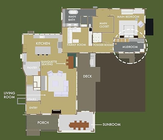
The Fully Designed Mudroom That Will Never Be – Kinda, And How We Got Our Mudroom Back!
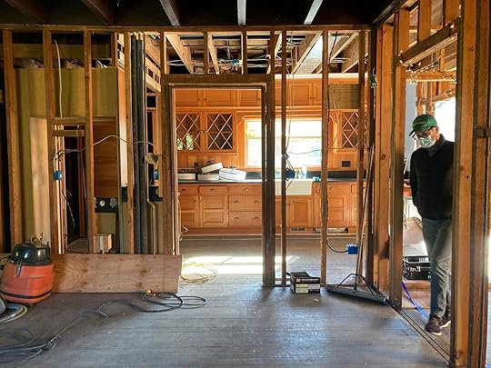
A few months ago I got rather trigger happy with doing the fun stuff of a renovation design. We didn’t even have the layout locked down and I was asking ARCIFORM (Anne and Stephyn) to plug in tile colors, lighting fixtures, and even laundry baskets (???). Then once the floorplan changed, whole rooms got scrapped. SCRAPPED! I would say all that time was for nothing, but it’s not because it’s part of the creative process and besides I can use it for blog posts like this. So today you’ll see the very first room that we actually finished designing, that will never exist.
Our Original Plan: The Butler’s Pantry/MudroomOur first “final” floor plan with the mudroom and butler’s pantry. We were going to add an additional kitchen door that would be connected to a carport.
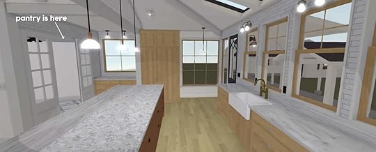
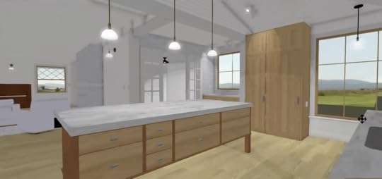
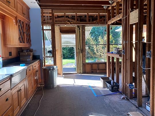
Here’s the original kitchen so you can see the cabinetry we originally wanted to keep…
We were going to keep the original kitchen cabinetry and turn that into a big epic butler’s pantry and mudroom situation. We were all SO EXCITED ABOUT IT. Turns out that the best corner of the house deserved to be the actual kitchen but here is what we had come up with.
Here’s what it looked like:
We were going to paint the original cabinetry and beadboard blue (not quite as bright as this – darker and more moody), and we had this awesome herringbone tile picked out for the flooring. If you think it’s weird to have the floor and cabinets a similar color I get that, but we thought it would look very cool (we hadn’t chosen paint colors or anything). We had some inspiration images that showed this tonal look that felt like it really modernized the space. We would keep the original soapstone (are still hoping to repurpose some of it) and keep the sink as a utility sink.
Then we got a little carried away with the dog washing station. It ended up being 3′ wide and blocking all the natural light that we wanted in the living room! Poor Anne and Stephyn spent hours making that thing make sense, even adding a hook where you’d attach the leash so the pup couldn’t move.
We were also going to add an unnecessary rolling ladder that Anne and I were screaming about, while Brian was squeezing his temples in confusion as to WHY we needed it. Hot tip Brian – library ladders are SO FUN.
We had a pretty interior window into the nook, we had designed this walk-through apothecary shelving that would be this amazing experience to walk through to get to the living room. We even chose all the lighting and plumbing!!
Switched Kitchen Location = Now Where Does The Mudroom Go?When we first ripped apart the floorplan we were devastated to get rid of the mudroom and the breakfast nook. But we realized (thanks to many of you) that we were sacrificing the natural light and the living room to have those two spaces in the best corner of the house.
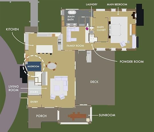
So we kept the door and a little mudroom drop zone. No dog washing station. No library ladder in a pantry. But big enough
Our original mudroom/Butler’s Pantry became kitchen cabinets & then we needed to find a space for the pantry (which meant we had to sacrifice the mudroom entirely…we thought)
So now we have a pantry through these hopefully vintage doors to the left.
 Our New Plan: Laundry/Mudroom
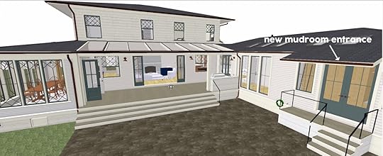
Once we flew up to Portland and walked into our main bedroom we realized how incredibly wide it was. Anne had been saying this for a while but Brian and I were strangely convinced that we wanted to face our bed west. But that all switched once we were there and we took the advice of a few readers and put the mudroom by the backyard. It isn’t the school drop zone, but it is where so much of the in and out traffic to the yard is. The sports court is right there as is the big patch of grass.
 the new location!
The only drawback to this (beyond not being the door that our kids go in and out of for school) is that the washer and dryer are on the backside of our bed wall, so we are trying to figure out sound issues with that.

Here’s where we are now. NONE of this has been fully designed – like the cabinetry, flooring, tile, etc are all still up for grabs. But it gives you a good idea what is happening.
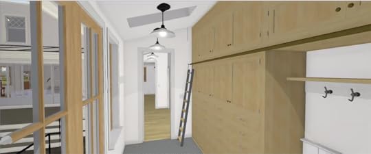
Additionally, we’ll have a pocket door so this is perfect for the pups to dry off when they come in from the backyard – containing them in here instead of them running around like crazy pups throughout the house.
We are still tackling all the design but the layout is finalized (I SWEAR) and you can see below that the mudroom/laundry room is its own entrance out back and where we’ll train the kids and pups to exit and enter.
Meanwhile, the house is just sitting there all ready for work. But we got the best corner full of light back being the kitchen and hopefully flooding that light into the dark living room.
Right now we are tackling all the bathroom designs first because the rough plumbing has to go in there before the kitchen faucets, but I can’t WAIT to design this kitchen properly – with pretty cabinetry details and special stone.
Long story short, it’s so easy to get ahead of yourself and start designing before you are done with your layout, but it’s actually super important to go through all these exercises. Most of our ideas for the original mudroom can be transferred into the new mudroom. And while a lot of you might still wish we had a mudroom near the kitchen door for the drop zone, you can’t have a mudroom at every entrance/exit. You have to choose one and we all agree that the back door will get far more use and wear/tear than the kitchen door. And besides, we will design a good drop zone there (bench with hooks and shoe trays). As Anne says all the time “anything can be pretty when designed well” so we’ll make that work and look beautiful. But WE GOT OUR MUDROOM AND OUR LAUNDRY ROOM BACK!!!! Thanks, readers
The post The Fully Designed Mudroom That Will Never Be – Kinda, And How We Got Our Mudroom Back! appeared first on Emily Henderson.
June 9, 2021
Where To Put Your TV And Fireplace: 4 Winning Formulas That Actually Look Good + What Not To Do

I am deep in “fireplace wall” research mode on both the river house and the farm. Both houses have the same problem which made me realize that this a bigger problem. Where do you put the fireplace and TV so that you can enjoy looking at both? I have found this is a challenge because both TV and fireplaces are important focal points in a room, likely will dictate the orientation of your sofa, and if you are renovating you have the opportunity to do it right so that you can enjoy looking at both at the same time without craning your neck. Now if you aren’t renovating we have options and tips for you to, but if you are I have NEWS FOR YOU. I finally figured out the formulas and I so wish I had known earlier or I probably wouldn’t have put the TV above the fireplace in our family room. Allow me to demonstrate:
Option #1: TV Over Fireplace – But Make Sure It Is Low And Wide design by eric olsen design
Pros: It’s a shared singular focal point and it makes designing and laying out your room really easy. You can have symmetry with either windows or say bookshelves on either side. You know exactly where to look to get the benefits of both, so it really simplifies your design.
Cons: Unless you have a really low more linear fireplace your TV might be too high to watch comfortably. A lot of fireplaces need at least 12″ above them to be safe, and some require more. And if you want to add a mantel you are going even higher – be careful. We have a deep sofa so its OK, but if I’m honest with myself I do wish our TV was lower. We could have avoided this by choosing a lower/linear fireplace (even this one can be great but I wish it had a faux wood option) or doing option 3 (what I wish we would have done). I actually really like how we designed this, with the TV set back versus flush with the fireplace front but I now realize its a bit high.
 design by eric olsen design | photo by karyn millet
Here are more tips for this one:
1. Don’t choose a huge fireplace to avoid it being too high (but you don’t want it looking dinky either). Take into account the clearance of the fireplace before you choose this option to see how close you can hang it to the floor and the TV.
2. So yes, opt for a linear fireplace if it works stylistically in your home. I like these because then it breaks up the box shapes and scales a bit and of course, allows you to hang it lower (but better in a more contemporary home, IMHO)
3. Skip the large mantel and just do it on sheetrock, plaster, brick, or tile. I prefer this look even in more traditional houses I’ve decided. You can add a subtle mantle or surround (like a slab), but just be careful not to keep adding and adding making your TV higher and higher.
 photo by sara ligorria-tramp | from: how we designed our super kid-friendly family room
4. Add a built-in bench on both sides so its not just box over box – a bench flanking it adds even another shape (I love ours) and you can put pillows on it which softens all the squares.
5. My biggest advice is to use the Frame TV if you can. It looks like art and because it isn’t a big black box that screams “watch me” it is less distracting to kids.
Option #2: Fireplace In Corner, TV On Wall In Front On Sofa photo by sara ligorria-tramp | from: how to design a quiet, neural yet exciting living room
So this is a GREAT option in theory, but corner fireplaces have historically been, well not aesthetically our favorite (I’m not alone in this, Orlando is actually taking his out). Now I actually love mine in our living room and it allows us to see the fire from both the kitchen and living room. I don’t think I would design this fireplace now though if I were putting in one that doesn’t already exist. Instead, I would have a hanging corner fireplace. I’m obsessed with the idea of these:
 design by o’connor and houle architecture | photo by derek swalell | via homes to love
  image source
Pros: They look VERY COOl and because they are round they feel appropriate hanging in the corner, off to the side. You can still see and enjoy them and they anchor the corner, while being able to place a TV directly in front of you. ALSO, you can put them in front of windows so you also have the “fireplace, TV, view” problem (which is definitely a good problem to have). A hanging fireplace actually looks very cool in front of windows.
Cons: I haven’t found a ton on the market that aren’t bioethanol, or sold in America.
Option #3: Stove Style Fireplace Off To The Side, TV In The Center design by ha architecture | photo by y dave kulesza | via the local project
Having the TV and fireplace oriented side by side is also an option and can look really cool and modern too. This is the one I sorta wish we would have done for our family room. Ideally, you want to have the TV centered with the sofa and at eye level and vary the size and height of the TV and fireplace so they don’t mirror each other.
Pros: You can avoid having a fireplace in the corner which is less aesthetically pleasing and you can have the TV eye level instead of having it above a too tall fireplace. To add even more architectural interest an exposed chimney will help draw the eye up and it also looks SO COOL.
Cons: You need enough wall space for it to make sense to have the two be side by side. If the room is too small having them next to one another can make the room feel stuffy and crowded.
Option #4: If You Are Not Renovating And The Fireplace Is Too High, Place Your TV On A Credenza design by arlyn hernandez for ehd | photo by sara ligorria-tramp | from: a light, bright & luxe living room makeover
If you are a renter or not renovating and your fireplace is taking center stage, you can put your TV to the side over a credenza. In Arlyn’s rental, she had a fireplace in her living room and the fireplace was too high and too close to the sofa for a TV to be installed over the mantel. She opted to place a credenza to the side and mount her TV over the credenza. The solution for the whole TV-off-center situation is an articulating, pivoting wall mount which allows her to pull it outwards and angle the TV towards the sofa to avoid craning necks.
Pros: You can avoid renovating and still have your fireplace be the focal point. Especially in older homes, fireplaces can provide architectural interest and charm and this formula preserves the fireplace as the focal point.
Cons: Depending on the size and layout of the room it can be tricky to fit a credenza and a fireplace on the same wall.
So there you have it. Which formula would you opt for if you were renovating? Do you also struggle with the fireplace/TV conundrum? Tell me your thoughts below!
Opener Image Credit: Photo by Sara Ligorria-Tramp | From: How To Design A Quiet, Neural Yet Exciting Living Room
The post Where To Put Your TV And Fireplace: 4 Winning Formulas That Actually Look Good + What Not To Do appeared first on Emily Henderson.
Emily Henderson's Blog

- Emily Henderson's profile
- 10 followers

