
Lois McMaster Bujold's Blog, page 51
November 23, 2015
more Vorkosiart
May be seen here.
http://www.amazon.com/GURPS-Vorkosiga...
This was the most diligent effort ever at trying to portray the characters as described. For reasons not all having to do with the project itself, it took years longer than planned. Three artists were shot out from under me in the charge.
But for people who want "realistic portrayals", well, this is what you get.

and the back...

Pretty good interior illos of Miles, Aral, Piotr, the Professor, and Ekaterin, missed the mark by a mile with Cordelia, the others falling on a range in between.
If you people think this should be so easy, you try it...
:-), L.
http://www.amazon.com/GURPS-Vorkosiga...
This was the most diligent effort ever at trying to portray the characters as described. For reasons not all having to do with the project itself, it took years longer than planned. Three artists were shot out from under me in the charge.
But for people who want "realistic portrayals", well, this is what you get.
and the back...
Pretty good interior illos of Miles, Aral, Piotr, the Professor, and Ekaterin, missed the mark by a mile with Cordelia, the others falling on a range in between.
If you people think this should be so easy, you try it...
:-), L.


November 14, 2015
The VK Art Poster at last.
As a gift when we'd finalized this whole project, at my request Ron made me a poster displaying all the e-covers, that I could hang on my office wall. He has very kindly also made it available as a print-on-demand art poster, here:
https://society6.com/product/the-vork...
Note the sizing-pricing button to the left for all five options.
Later: Ron also writes,
"In addition to the Society 6 site, I have created a Cafe Press shop. While the quality of the prints is not quite as high as those available from Society 6 (which is specially slanted toward artists and collectors), they are still pretty decent and might be a little more affordable for some people.
http://www.cafepress.com/vorkosigan/1...
R"
Mine is a custom 2' x 3', and now hangs here:

In the course of things for the e-books, Ron also threw in nice professional title pages that, these being e-books, very few people will ever notice. But we know they are there.
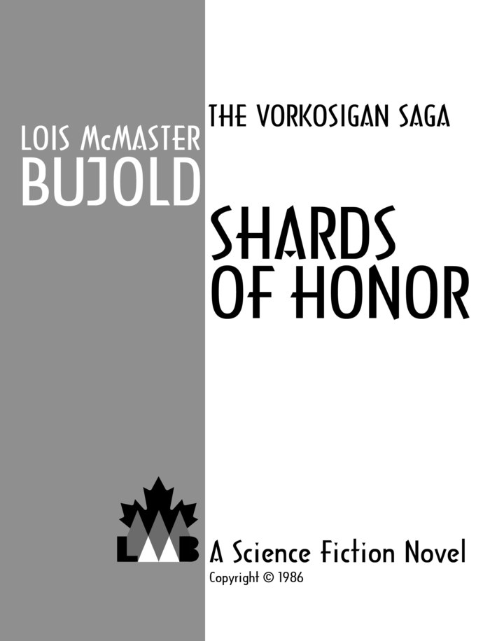
Complete with my very own colophon -- recycling that lost maple leaf, I note. But since "McMaster" is a very Canadian name, I suppose it does double duty.

Ta, L.
https://society6.com/product/the-vork...
Note the sizing-pricing button to the left for all five options.
Later: Ron also writes,
"In addition to the Society 6 site, I have created a Cafe Press shop. While the quality of the prints is not quite as high as those available from Society 6 (which is specially slanted toward artists and collectors), they are still pretty decent and might be a little more affordable for some people.
http://www.cafepress.com/vorkosigan/1...
R"
Mine is a custom 2' x 3', and now hangs here:
In the course of things for the e-books, Ron also threw in nice professional title pages that, these being e-books, very few people will ever notice. But we know they are there.
Complete with my very own colophon -- recycling that lost maple leaf, I note. But since "McMaster" is a very Canadian name, I suppose it does double duty.
Ta, L.
Cover reveal! CryoBurn and GJ&RQ, UK-and-World
These last two aren't up yet but should be soon. Again, note that these covers are for my direct-placement e-books only in the UK and World markets, for which I retain rights. Baen's editions prevail in North America.
This version of the CryoBurn cover was a late offering of Ron's; I'd been about to settle for the first version, below. But I thought this was much cooler (if not chillier) and way more thematic.

The earlier draft was of this lady soon to be out of the refrigerator -- illustrative of a plot element, to be sure, but neither as unique nor as in-line with the iconic style as the final.

And, finally, the cover for the upcoming Gentleman Jole and the Red Queen. This was done in one pass, possibly not only for fatigue on both our parts, but because Ron had already done the cover for Baen, so we'd had a lot of discussion about it earlier.

Next, the poster that puts them all together, because one can't very well stick an e-book cover on one's wall.
Ta, L.
This version of the CryoBurn cover was a late offering of Ron's; I'd been about to settle for the first version, below. But I thought this was much cooler (if not chillier) and way more thematic.
The earlier draft was of this lady soon to be out of the refrigerator -- illustrative of a plot element, to be sure, but neither as unique nor as in-line with the iconic style as the final.
And, finally, the cover for the upcoming Gentleman Jole and the Red Queen. This was done in one pass, possibly not only for fatigue on both our parts, but because Ron had already done the cover for Baen, so we'd had a lot of discussion about it earlier.
Next, the poster that puts them all together, because one can't very well stick an e-book cover on one's wall.
Ta, L.
deeper on the cutting room floor
Here are the first drafts of some of the prior style concepts, before Ron and I finally found our way to the 4th and last.
Be it noted, these are concept sketches, not in any way intended to be finished products, but assembled quickly out of handy prefab elements to ask, and answer, the question, "Is this sort of what you had in mind?" So don't bother nit-picking the details except for sport.
I will only post samples of each array here; more may be seen toward the end of my Goodreads photo file, here: https://www.goodreads.com/photo/autho...
This was the first; Ron thought the slanted style and the color-on-black-and-white would be eye-catching. Not wrong...

Here's another in that run:

At my less than enthusiastic response, Ron offered another more four-square direction, apparently thinking I was objecting to the "slanted" not the "not iconic enough".

At my, "No, wrong way! Turn around...!", and some focus-group work with my chat list, Ron gave a try to a series using the Vorkosigan maple leaf as a unifying element.

In the course of which we inadvertently stumbled on this thread toward the final:

It was at this point observed that to most new readers (the target audience, remember), big red maple leaves were going to say "Canadian" not "Vorkosigan". Hm.
My "And I'm not crazy about the font, either," led to Ron offering me a select menu of 20 varied fonts to pick some I liked, of which I gave him back 3 to play with. Ron also gave me a link to some assorted other book covers, during which we were finally able to work out what I meant by "iconic." When I next saw the results, they were at last in the style I'd been pushing for, and which you have seen (or may see) in the prior "Cover reveal" blog post series.
Art director. More to the job than I ever imagined.
Next up: the last of the series of 17 finals, and the poster!
Ta, L.
Be it noted, these are concept sketches, not in any way intended to be finished products, but assembled quickly out of handy prefab elements to ask, and answer, the question, "Is this sort of what you had in mind?" So don't bother nit-picking the details except for sport.
I will only post samples of each array here; more may be seen toward the end of my Goodreads photo file, here: https://www.goodreads.com/photo/autho...
This was the first; Ron thought the slanted style and the color-on-black-and-white would be eye-catching. Not wrong...
Here's another in that run:
At my less than enthusiastic response, Ron offered another more four-square direction, apparently thinking I was objecting to the "slanted" not the "not iconic enough".
At my, "No, wrong way! Turn around...!", and some focus-group work with my chat list, Ron gave a try to a series using the Vorkosigan maple leaf as a unifying element.
In the course of which we inadvertently stumbled on this thread toward the final:
It was at this point observed that to most new readers (the target audience, remember), big red maple leaves were going to say "Canadian" not "Vorkosigan". Hm.
My "And I'm not crazy about the font, either," led to Ron offering me a select menu of 20 varied fonts to pick some I liked, of which I gave him back 3 to play with. Ron also gave me a link to some assorted other book covers, during which we were finally able to work out what I meant by "iconic." When I next saw the results, they were at last in the style I'd been pushing for, and which you have seen (or may see) in the prior "Cover reveal" blog post series.
Art director. More to the job than I ever imagined.
Next up: the last of the series of 17 finals, and the poster!
Ta, L.
the cutting room floor
Here are a few more of Ron's cover sketches (though, really, they don't look in the least sketchy) that were edged out by their competitors.

Not bad, but I thought the one we choose was more unique.

An earlier draft of the cover, in a slightly less graphic mode.

I suspect Ron really liked this one. I thought it looked a bit horror, plus, while it references an important incident in the book, I don't think it captured the essence the way the marionettes one did.
I had also grabbed off several of the concept-sketches for earlier designs, which I will put in a separate post, to give some idea of how we arrived where we did.
Ta, L.
Not bad, but I thought the one we choose was more unique.
An earlier draft of the cover, in a slightly less graphic mode.
I suspect Ron really liked this one. I thought it looked a bit horror, plus, while it references an important incident in the book, I don't think it captured the essence the way the marionettes one did.
I had also grabbed off several of the concept-sketches for earlier designs, which I will put in a separate post, to give some idea of how we arrived where we did.
Ta, L.
November 13, 2015
Just in from Japan
Aha --
Today's present is an advance copy of the new Japanese edition of Captain Vorpatril's Alliance, sent to me by my long-time translator Ms. Ayako Ogiso. As is common, they have divided the book into two small paperbacks but, as is also common, have coordinated the covers.

Ta, L.
Today's present is an advance copy of the new Japanese edition of Captain Vorpatril's Alliance, sent to me by my long-time translator Ms. Ayako Ogiso. As is common, they have divided the book into two small paperbacks but, as is also common, have coordinated the covers.
Ta, L.
November 12, 2015
November 9, 2015
Cover reveal! Captain Vorpatril's Alliance -- UK and World
This should be up in a couple of days -- but only for our UK and World direct e-placements. Baen retains the e-license for North America, so their edition will continue to be marketed here.
The artists always seem to want to paint the blue girl...

Ron had an earlier version which was even prettier, but its more realistic style, like the wineglass-with-butterbug, did not blend as well with the style of the cover series as it had become established. I'll give you all a peek, but I warn you I am not, at this late stage, soliciting votes.

Almost finished with this task! CryoBurn just went into the final-assembly queue, and all corrections for Gentleman Jole and the Red Queen are finalized for its February UK-and-World e-publication in tandem with the Baen hardcover release.
17 books re-edited and proofed since August. Whew!
Ta, L.
The artists always seem to want to paint the blue girl...
Ron had an earlier version which was even prettier, but its more realistic style, like the wineglass-with-butterbug, did not blend as well with the style of the cover series as it had become established. I'll give you all a peek, but I warn you I am not, at this late stage, soliciting votes.
Almost finished with this task! CryoBurn just went into the final-assembly queue, and all corrections for Gentleman Jole and the Red Queen are finalized for its February UK-and-World e-publication in tandem with the Baen hardcover release.
17 books re-edited and proofed since August. Whew!
Ta, L.
November 6, 2015
pbs.org
So, since I have no cable, I've been learning how to get my nonfiction-TV fixes online. Pbs.org has proven the most fruitful and easily accessed source of science geekery so far. This week's find (now that I have time again to look):
http://video.pbs.org/program/brain-da...
Not everything remains up all the time. I was also fond of this:
http://video.pbs.org/program/inside-n...
and this:
http://video.pbs.org/video/2365559270/
and also "How We Got To Now", but it seems to have aged off. (But my library proved to have it on DVD.)
Anybody else got any recs, or good sources, for this sort of thing?
Ta, L.
November 3, 2015
Cover reveal! A Civil Campaign
There were three tries at this one -- the one chosen was actually the first, which makes me feel a bit guilty. Note the maple leaf on the back of the butterbug.

This was one of the other trials. It amused me deeply, but the realistic style of the wineglass didn't match well with the rest of the set, I thought.

A third entry showed a strand of DNA and two little silhouette figures, one male and one female, chasing each other up/down its ladder, but we already had DNA on two other covers. It was a cool idea that deserves to be recycled someday, though.
A Civil Campaign is a hard book to cover.
Just three more of these to go... I had originally timed it out for the series to finish up just about when I expected the new eARC to go live in mid-November, but then the eARC dropped three weeks sooner. About which I have no objections whatsoever, so.
Ta, L.
Later: Aha, I found where I'd tucked away the other sketch after all.

This was one of the other trials. It amused me deeply, but the realistic style of the wineglass didn't match well with the rest of the set, I thought.
A third entry showed a strand of DNA and two little silhouette figures, one male and one female, chasing each other up/down its ladder, but we already had DNA on two other covers. It was a cool idea that deserves to be recycled someday, though.
A Civil Campaign is a hard book to cover.
Just three more of these to go... I had originally timed it out for the series to finish up just about when I expected the new eARC to go live in mid-November, but then the eARC dropped three weeks sooner. About which I have no objections whatsoever, so.
Ta, L.
Later: Aha, I found where I'd tucked away the other sketch after all.


