
Jeffrey Zeldman's Blog, page 75
April 21, 2011
The Big Web Show No. 46: Get Your Web Type on with FontDeck co-founder Richard Rutter
RICHARD RUTTER, designer, technologist, information architect, writer, and co-founder of Fontdeck and Clearleft, joins Dan Benjamin and me to discuss the technical, aesthetic, and business aspects of putting real type on the web in Big Web Show Episode No. 44, now at 5by5.tv and iTunes for your listening pleasure.

[image error] [image error] [image error] [image error] [image error] [image error] [image error] [image error] [image error]


April 19, 2011
A List Apart No. 326: Orbital content is the next big thing; empowering audiences via the backchannel
In Issue No. 326 of A List Apart for people who make websites: liberate your content to get ahead of the curve in 21st century publishing, and empower live audiences with backchannel wizardry.
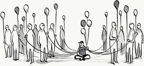
Orbital Content
by CAMERON KOCZON
Bookmarklet apps like Instapaper and Readability point to a future where content is no longer stuck in websites, but floats in orbit around users. And we're halfway there. Content shifting lets a user take content from one context (e.g. your website) to another (e.g. Instapaper). Before content can be shifted, it must be correctly identified, uprooted from its source, and tied to a user. But content shifting, as powerful as it is, is only the beginning. Discover what's possible when content is liberated.
Conversation is the New Attention
by CHRISTOPHER FAHEY, TIMOTHY MEANEY
Baby's got backchannel! If everybody at the conference is staring at their Twitter stream instead of at the person who's doing the speaking, maybe the speaker should meet them halfway. Migrating speaker presentations to the backchannel can empower the audience while enabling the speaker to listen carefully to their responses. The broadcast model of presentations is dead! Long live the conversation model.

[image error] [image error] [image error] [image error] [image error] [image error] [image error] [image error] [image error]
April 15, 2011

Mobile v Small Screen, Edible City beta, HTML5 Reset, Science Blogs, Monkey Do
BABY GOT FRONT-END! Tim Murtaugh, Dan Benjamin and I discuss "mobile" versus "small screen," HTML5 and HTML5 Reset, Science Blogs, the Edible City beta, and more. The Big Web Show #45: Tim Murtaugh.

[image error] [image error] [image error] [image error] [image error] [image error] [image error] [image error] [image error]
April 14, 2011
The Politics of DOCTYPEs
Are Doctypes the New Lunch Tables? – Cognition: The blog of web design & development firm Happy Cog.

[image error][image error][image error][image error][image error][image error][image error][image error][image error]

April 13, 2011
How to work with a designer who is new to the web and wants to control everything
Q. Working with print designer who is just getting into web and they want to control everything. Any advice on how to deal with them? – @FossilDesigns

A. I ASSUME YOU'RE CODING what your colleague designs. Gently explain how pixel-perfect design falls apart on the web, using visual examples. Start with a design that looks great in the environment it was designed for. Your colleague will smile. "Yes, it does look nice here," you will agree. Then move on to three or four common environments where that same design breaks or is unpleasant to use. As long as you are not being a jerk about your superior knowledge, your calm, friendly expertise together with a few examples should make your colleague amenable to learning more. At that point, there are dozens of resources in print and on the web. Start with gentle, introductory books and articles. (I wouldn't plunge your friend into Mobile Boilerplate.) I leave it as an exercise to readers of this page to list articles and books that can help.
If your colleague remains adamant about pixel-perfect design, you're working with the wrong designer. Relationships only work when respect flows both ways. If your partner will not listen, you need a new partner. If this is a freelance gig, find one. If it's a job, and you simply can't get through to your new colleague, involve your boss. Be firm but not threatening. You're not trying to get your colleague fired, you're simply trying to resolve a dispute in which only one of you has expertise. If you're afraid to involve your boss, you're in the wrong job, and your non-web-savvy colleague is merely a symptom of a larger organizational problem. Get out! You can do better.

[image error] [image error] [image error] [image error] [image error] [image error] [image error] [image error] [image error]
April 12, 2011
Complete Audio: Jeffrey Zeldman's Awesome Internet Design Panel from SXSW Interactive 2011
Mandy Brown, Roger Black, Daniel Mall and I discuss the state of web design and publishing at SXSW Interactive, Sunday March 13, 2011.
Photos courtesy Adactio. Audio element courtesy HTML5. Sorry, no transcript is available at this time.

[image error][image error][image error][image error][image error][image error][image error][image error][image error]
320 and up—a device agnostic stylesheet for responsible responsive design
"320 and Up prevents mobile devices from downloading desktop assets by using a tiny screen's stylesheet as its starting point. … Inspired by Using Media Queries in the Real World by Peter Gasston, '320 and Up' is a device agnostic, one web boilerplate."
—320 and up by Malarkey

[image error][image error][image error][image error][image error][image error][image error][image error][image error]
The Big Web Show Episode No. 45: Tim Murtaugh of HTML5 Reset and MonkeyDo

HTML5 RESET DEVELOPER TIM MURTAUGH (@murtaugh, timmurtaugh.com) is our guest on The Big Web Show Episode 45, to be recorded in front of a live internet audience on Thursday, April 14, at 3:00 PM Eastern via 5by5.tv/live.
Tim is the creator of the open-source HTML5 Reset, a set of baseline HTML and CSS templates to get your new web project off on the right foot, and the co-founder of MonkeyDo, a two-person web design and development shop in New York City.
Tim has been building websites since 1997 and specializes in creating standards-based HTML/CSS templates. His eye for design and serious affinity for clean code allow him to painlessly integrate his templates into larger systems without sacrificing user experience or aesthetics.
Recent work includes templates and an Expression Engine installation for Seed Magazine, and a Movable Type-driven network of blogs for ScienceBlogs.com. He is also the developer/curator for the online art gallery Cloud King, which won an award for Best CSS-Based Website at the South by Southwest Interactive Festival.
The Big Web Show ("Everything Web That Matters") records live every Thursday at 3:00 PM Eastern. Edited episodes can be watched afterwards, often within hours of recording, via iTunes (audio feed | video feed) and the web. Subscribe and enjoy!

[image error][image error][image error][image error][image error][image error][image error][image error][image error]


