
Jeffrey Zeldman's Blog, page 74
May 2, 2011
Whitney Hess: Design Principles — The Philosophy of UX
The second speaker at this mornings An Event Apart in Boston is Whitney Hess. Here goes with the liveblogging…
Whitney's talk is about design principles. As a consultant, she spends a lot of time talking about UX and inevitably, the talk turns to deliverables and process but really we should be establishing a philosophy about how to treat people, in the same way that visual design is about establishing a philosophy about how make an impact. Visual design has principles to achieve that: contrast, emphasis, balance, proportion, rhythm, movement, texture, harmony and unity.
Why have these principles? It's about establishing a basis for your design decisions, leading to consistency. It's about having a shared vision and they allow for an objective evaluation of the outcome.
But good design doesn't necessarily equate to a good experience. The Apple G4 Cube was beautifully designed but it was limited in where and how it could be used.
Good design can equal good experience. That's why Whitney does what she does. But she needs our help. She's going to propose a set of design principles that she feels are universally applicable….
Adactio: Journal—Whitney Hess: Design Principles — The Philosophy of UX.

[image error][image error][image error][image error][image error][image error][image error][image error][image error]


Jeffrey Zeldman: What Every Web Designer Should Know — A Better You At What You Do
I'm at An Event Apart in Boston where Jeffrey Zeldman is about to kick things off. I figured I'd try my hand at a little bit of good ol' fashioned liveblogging…
Jeffrey's talk is called What Every Web Designer Should Know—A Better You At What You Do. He asks "what does it mean to be a designer when everyone is calling themselves a designer?" 15 years ago, Jeffrey thought everyone would learn HTML and be a web designer. That didn't happen but what did happen is social media, which is democratising online publishing. His 6-year old daughter uses an iPad like a natural, figuring out the interfaces of drawing tools.
The rules are changing. You may not be in control of the user's visual experience. (those are direct quotes from his slides—he's delivering pre-formatted tweets for the audience's benefit)
Here's the website of Roger Ebert. He's a great guy and his website is full of links but it really isn't set up well for reading. But that's okay. Jeffrey uses Readability (and there's also Instapaper) to format the content.
Adactio: Journal—Jeffrey Zeldman: What Every Web Designer Should Know — A Better You At What You Do.

[image error][image error][image error][image error][image error][image error][image error][image error][image error]
May 1, 2011
Good morning, Boston!

Aerial view of Boston's Back Bay and Prudential area from 36th floor of the Marriott.
Good morning, Boston! | Flickr – Photo Sharing!

[image error][image error][image error][image error][image error][image error][image error][image error][image error]
April 28, 2011
Nominations open for the 2011 .net Awards
SUGGEST YOUR FAVORITE sites, apps and people and celebrate the best of the web.
Nominations for the 13th .net Awards are now open at www.thenetawards.com. We want you to help us find 2011′s best of the web and there are 16 categories to choose from. This year there's a renewed focus on emerging talent with new Awards including the Young Designer, Young Developer and Brilliant Newcomer Awards – presented in association with Happy Cog.
Last year the Awards clocked up more than 95,000 votes, and winners included Ravelry (beating Facebook and Twitter as Best Community Site!), Modernizr (Open Source App of the Year) and Typekit (Web Application of the Year). The mighty Jeffrey Zeldman, meanwhile, scored a hat-trick, bagging awards as Standards Champion and for Design Agency of the Year and Video Podcast of the Year (for The Big Web Show, co-hosted with Dan Benjamin).
netmagazine.com/news/nominations-open-2011-net-awards

[image error][image error][image error][image error][image error][image error][image error][image error][image error]
April 27, 2011
Big Web Show Episode No. 47: Foodspotting Founder Alexa Andrzejewski

FOODSPOTTING FOUNDER ALEXA ANDRZEJEWSKI (@ladylexy) is our guest in Episode No. 47 of The Big Web Show, to be recorded in front of a live internet audience on Thursday, April 28, at 3:00 PM Eastern via 5by5.tv/live.
Foodspotting, a visual local guide that makes finding and sharing food recommendations as easy as snapping a photo, has received attention from Techcrunch, Mashable, The Wall Street Journal, and CNN blogs, and was named one of Time Magazine's 50 Best Websites of 2010.
Before launching Foodspotting in January 2010, Alexa was a user experience designer for Adaptive Path, where she helped both startups and established companies create great experiences that improve people's lives. From redesigning MySpace to conducting the research that underlies the Palm Pre, Alexa has helped clients reimagine products from the ground up.
Through speaking, writing and teaching, Alexa strives to advance experience-minded thinking and methods to all who will listen. Recent appearances include An Event Apart Seattle, WebVisions, Big Omaha, SXSWi, the Web 2.0 Expo in San Francisco and New York, UX Week, and LIFT in South Korea.
The Big Web Show ("Everything Web That Matters") records live every Thursday at 3:00 PM Eastern. Edited episodes can be watched afterwards, often within hours of recording, via iTunes (audio feed | video feed) and the web. Subscribe and enjoy!

[image error][image error][image error][image error][image error][image error][image error][image error][image error]
"Mobile" versus "Small Screen"
As we try to become more responsive with our designs, a lot of attention has been focused on providing "mobile" styles. We've all been adding viewport meta tags to our templates and @media screen and (max-device-width: 480px) to our stylesheets.
It's very tempting (and scope-friendly) to tell a client that we can adjust their site for mobile users, when much of the time what we're actually doing is simply adjusting a design for small screens.
…Simply adjusting a design for a smaller screen and calling it "mobile" does a disservice to both mobile users and developers. Making link targets bigger and image sizes smaller does help the mobile user, but it only addresses the surface issues of usability and readability. It doesn't address their need to do things easily and quickly.
via It's the Little Things – "Mobile" versus "Small Screen".

[image error][image error][image error][image error][image error][image error][image error][image error][image error]
Adactio: Journal—Content First
There's a general agreement that the "mobile" user is not to be trifled with; give them the content they want as quickly as possible 'cause they're in a hurry. But the corollary does not hold true. Why do we think that the "desktop" user is more willing to put up with having unnecessary crap thrown at them?
Unnecessary page cruft is being interpreted as damage and routed around with tools like the Readability bookmarklet, Safari's Reader functionality, and Instapaper. These services exist partly to free up content from having a single endpoint but they also serve to break content free from the shackles of stifling overwrought containers. This isn't anything new, of course; we've been here before with RSS. But the existence of these new reader-empowering tools should be taken as a warning …and a challenge—how can we design for our content in such a way that the reader won't need or want to reach for Readability or Instapaper?
via Adactio: Journal—Content First.

[image error][image error][image error][image error][image error][image error][image error][image error][image error]
April 23, 2011

April 22, 2011
How to carve a 3 x 4 grid
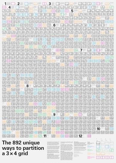
THIS POSTER illustrates a change in design practice. Computation-based design—that is, the use of algorithms to compute options—is becoming more practical and more common. Design tools are becoming more computation-based; designers are working more closely with programmers; and designers are taking up programming."
Designed by Thomas Gaskin. Creative direction by Hugh Dubberly. Algorithms by Patrick Kessler. Patent belongs to William Drenttel + Jessica Helfand.
The 892 unique ways to partition a 3 x 4 grid

[image error] [image error] [image error] [image error] [image error] [image error] [image error] [image error] [image error]


