
Jeffrey Zeldman's Blog, page 76
April 10, 2011
Edward Hopper, Soir Bleu
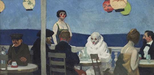
Edward Hopper 1882-1967, Soir Bleu, 1914. Oil on canvas, Overall: 36 × 72in. (91.4 × 182.9cm). Whitney Museum of American Art, New York; Josephine N. Hopper Bequest 70.1208. © Heirs of Josephine N. Hopper, licensed by the Whitney Museum of American Art. Photograph by Sheldan C. Collins
Whitney Museum of American Art | whitney.org
View at whitney.org
View in Readability

[image error] [image error] [image error] [image error] [image error] [image error] [image error] [image error] [image error]


Our Jobs In Cyberspace: Craft Vocabulary vs. Storytelling

AFTER ALL THESE YEARS designing websites and applications, I still don't think in words like "affordance." And when my colleagues use a word like that, my mental process still clatters to a halt while I seek its meaning in a dusty corner of my brain. (When someone says "affordance," there's always a blank where thought stops, and then I see a mental image of a finger pushing a button or stroking a surface. Somehow that one image stands in for everything I know about what "affordance" means, and I'm able to jump back into the discussion and catch up with everyone else.)
Should you ask B.B. King if the lick he just played was in Lydian Mode, he could probably answer you after stopping to think about it. But after all these years playing blues guitar, B.B. King doesn't say to himself, "I'm going to switch to a Lydian scale here," he just plays blues. Scales and vocabulary are necessary when we are learning the craft behind our art. But the longer we practice, the more intuitive our work becomes. And as it becomes more intuitive, it disconnects further and further from language and constructs.
This is why young practitioners often argue passionately about theory while older practitioners tell stories and draw pictures.
Of course any practitioner, green or experienced, can create a word to describe the work we are inventing together, just as anyone, young or old, can have the next great idea. And it is most often the young who come up with exciting new ideas in UX and design and on the internet—possibly because they are still exploring theories and trying on identities, while those who work more intuitively may shut themselves off from the noise of new ideas, the better to perfect a long-term vision.
But the nice thing about the experience arc I'm proposing is that it allows younger practitioners to use words like "affordance" when working together to create a website or application (and soon we will stop distinguishing between those two things), while the older, storyteller practitioners use simpler, down-to-earth language to sell the work to clients, investors, or users.
We need both kinds of practitioners—theorists and those for whom everything has become intuitive second nature—just as we need both kinds of communication (craft vocabulary and storytelling) to do Our Jobs in Cyberspace.™ Don't you think?
Where are you on this arc? Are you the kind of designer who gets fired up from reading a new theory? Or do you sketch and stumble in the dark, guided only by some Tinker Bell twinge in the belly that tells you no, no, no, no, hmm, maybe?

[image error] [image error] [image error] [image error] [image error] [image error] [image error] [image error] [image error]
April 9, 2011
Webvanta Video: Jeffrey Zeldman on the State of Web Design
From the floor of An Event Apart Seattle 2011:
"Mobile is huge. The iPhone, iPad, and Android are huge. On the one hand, they are standards-facing, because they all support HTML5 and CSS3, so you can create great mobile experiences using web standards. You can create apps using web standards. On the other hand, there is also the temptation to go a proprietary route. In a strange way, although the browsers are much more standards compliant, it seems like we are redoing the browser war. Only now, it's not the browser wars, it's platform wars."
Video interview, plus transcript: Interview with Jeffrey Zeldman on the State of Web Design. Thank you, Michael Slater.

[image error][image error][image error][image error][image error][image error][image error][image error][image error]
April 7, 2011
The Big Web Show Episode No. 44: Designer Sarah Parmenter

SARAH PARMENTER (@sazzy, sazzy.co.uk) is our guest on The Big Web Show Episode 44, recording today, April 7, before a live internet audience on 5by5.tv/live at 3:00 PM Eastern.
Sarah owns You Know Who, a small design studio based in Leigh-on-Sea, specializing in the User Interface Design of websites, iPhone, and iPad applications.
The Big Web Show ("Everything Web That Matters") records live every Thursday at 3:00 PM Eastern. Edited episodes can be watched afterwards, often within hours of recording, via iTunes (audio feed | video feed) and the web. Subscribe and enjoy!

[image error][image error][image error][image error][image error][image error][image error][image error][image error]
March 30, 2011
Nearest subway (meta)
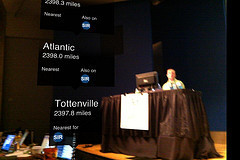
Luke Wroblewski discusses mobile design live in Seattle. Viewed through augmented reality app that points to the nearest London Tube stations.

[image error][image error][image error][image error][image error][image error][image error][image error][image error]
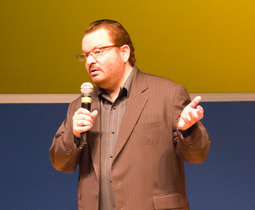
A Day Apart: Live Notes on Mobile Web Design with Luke Wroblewski

A FEW QUICK NOTES from the first hour of A Day Apart: Mobile Web Design, an all-day learning session led by Luke Wroblewski (aka Day III of An Event Apart Seattle), Bell Harbor Conference Center, Seattle, WA:
Audience questions for Luke
How to take a website for desktop to mobile?
Do we need to care about non-Webkit?
Trade-offs between native and web
How to navigate differences between different versions of Webkit?
Mobile e-commerce: best practices
Challenges with different cultures/languages
Media queries
If no budget, what can focus on web to make mobile ok?
How to take a website for desktop to mobile?
Mobile e-commerce best practices
Multiple screen sizes and pixel densities
Time for one project: go mobile or tablet (in e-commerce)
CMSes and mobile—sigh
Best practices for page load
WHY MOBILE? Convincing clients/bosses to care
Of the 50% of total mobile commerce in the US, 70% of it is coming from one iPhone application (eBay).
eBay: global mobile sales $2 billion in 2010, $600 million in 2009. Real commercial opportunities emerging on mobile.
Best Buy: mobile web users doubling every year: 30M (2010), 17M (2009), 6M (2008).
PayPal: mobile transactions increased six-fold in 2009: $25M to $141M.
SOCIAL
Double-digit (28%) rise in social networking on mobile web.
Twitter: 40% of tweets sent via mobile, 16% of new users start on mobile.
Facebook: 200 million active mobile users.
Instagram: iPhone only app took three months to hit one million users. Six weeks later they hit two million users.
Mixi (Japan): 85% of page views on mobile vs. 14% 4.5 years ago.
PRODUCTIVITY AND MEDIA
Google: mobile searches grew 130% in Q3 2010
Pandora: 50% of total user base subscribes to the service on mobile
Email: 70% of smartphone users have accessed email on mobile device
"I don't want to be the record executive clinging to CD sales."
ADDITIONAL USAGE
Yelp: every other second a consumer calls a local business and generates driving directions from a Yelp mobile app.]]27% of all Yelp searches come from their iPhone application, which had 1.4 million unique users in May 2010.
Zillow.com: Viewing active listings 45% more often from mobile devices (audience is primarily active buyers, on location or scoping out neighborhoods)
Facebook: People who use Facebook on their mobile devices (200M active) are twice as active on Facebook as non-mobile users.
Shift in Usage
Let's look at Gmail:
Visitors to web-based emails sites declined 7%.
Visitors accessing email on mobile devices increased 36%.
But what about mobile web usage?
Twitter Usage
40% of tweets sent via mobile.
16% of new users start on mobile.
Mobile web usage
Mobile phones will overtake PCs as the most common web access devices worldwide by 2013.
600% growth in traffic to mobile websites in 2010.
Facebook and Twitter access via mobile browser grows by triple digits in 2010.
Average smartphone user visits up to 24 websites per day.
Top 50 websites constitute only 40% of mobile visits.
Opera Mini traffic up 200% year/year.
For more…
Follow the live tweets at afeedapart.com.

[image error] [image error] [image error] [image error] [image error] [image error] [image error] [image error] [image error]
March 29, 2011
LukeW | An Event Apart: Web 2.1 The Medium Comes of Age

"In his opening keynote at An Event Apart in Seattle, WA 2011 Jeffrey Zeldman provided a historic perspective on the development of the Internet, Web, and Web standards culminating in today's exciting opportunities for Web designers and developers."
LukeW | An Event Apart: Web 2.1 The Medium Comes of Age.

[image error][image error][image error][image error][image error][image error][image error][image error][image error]
March 28, 2011
An Event Apart Seattle 2011
I'm enjoying An Event Apart Seattle 2011 and you're not. Despair not, help is available:
For real-time Twitter aggragation, watch afeedapart.com.
Enjoy AEA Seattle photos in our Flickr group.
Nod along to the interstitial audio playlist.

[image error] [image error] [image error] [image error] [image error] [image error] [image error] [image error] [image error]
March 24, 2011
Big Web Show 43: Krista Stevens of Automattic & A List Apart
KRISTA STEVENS (@kristastevens) is our guest on The Big Web Show Episode 43, recording today, March 24, before a live internet audience on 5by5.tv/live at 3:00 PM Eastern. (New time!)
Krista is an Automattician. A reader, writer, editor. Geek. Four-eyed bookworm. Hopeless introvert. True believer.
The Big Web Show ("Everything Web That Matters") records live every Thursday at 3:00 PM Eastern. Edited episodes can be watched afterwards, often within hours of recording, via iTunes (audio feed | video feed) and the web. Subscribe and enjoy!

[image error][image error][image error][image error][image error][image error][image error][image error][image error]
March 21, 2011
Adactio on Responsive Design as a "Sea Change"
I WISH I had written Adactio: Journal—Sea change. I advise every web designer who hasn't yet done so to read it.

[image error] [image error] [image error] [image error] [image error] [image error] [image error] [image error] [image error]


