Chris Gavaler's Blog, page 5
January 20, 2025
Trump’s “Landslide” Didn’t Happen. Trump’s “Mandate” Doesn’t Exist.

President-elect Trump calls his 2024 win a “landslide” and the “Greatest Election in the History of our Country.” While it’s not clear what exactly “Greatest” might mean, the answer should be mathematical. Rank all the presidential elections by the winner’s vote percentage, and Trump’s “Greatest” should be at the top.
It’s not.
That honor goes to George Washington, who, running unopposed twice, received 100% in both 1788 and 1792.
Since “the History of our Country” is long and electorally convoluted, let’s focus on just the past sixty years. Is Trump on top of that list?
No.
That’s Johnson in 1964. He won 61.1%, with a margin of 16 million votes.
And Nixon, not Trump, comes in for a close second in 1972, winning 60.7%. (Because turnout was higher, Nixon won by more votes, 18 million, but a smaller percentage than Johnson.)
Most presidential wins fall in the 50s. Is Trump’s “Greatest” at the top of that list?
No.
That honor goes to Reagan in 1984. He won by 58.8%. Again, because turnout varies, his margin of 17 million votes is above Johnson’s, establishing a clear top three.
The next seven fall in the 50-54% range. Surely Trump’s “Greatest Election” leads that list?
No.
Trump isn’t even on the list:
1988, Bush: 53.4%, +7M
2008, Obama: 52.9%, +9.5M
2020, Biden: 51.3%, +7M
2012, Obama: 51.1%, +5M
2004, Bush: 50.7%, +3M
*1980, Reagan: 50.7%, +7.5M
1976, Carter: 50.1%, +1.7M
Reagan’s first election earns an asterisk because third-party candidate Anderson received 5.7 million votes. Combine that with Carter’s count, and Reagan barely beats Carter’s 1976 win. Carter’s 50.1% is the lowest percentage of any president who still won more than half of the vote.
And who tops the below 50% list?
Donald Trump.
For his “Greatest Election,” Trump won 49.9%, with a margin of 2.3 million votes. Even if you triple that count, Trump’s win falls behind Biden’s and both of Obama’s.
Continuing down the list, Trump did beat Clinton:
*1996, Clinton: 49.2%, +8.2M
Clinton’s second election earns an asterisk though because his vote count advantage drops to .2 million if Dole and the third-party candidate (Perot earned 8 million votes) are combined, leaving Clinton the smallest winning majority count of the last sixty years.
But the next two presidents need double asterisks as non-majority-winners in races with no (significant) third-party candidates. That’s because they both lost the popular vote:
**2000, Bush: 47.9%, -.5M
**2016, Trump: 46.1%, -2.9M
And the bottom two are plurality (rather than majority) winners due to the two historically strongest third-party candidates:
*1968, Nixon: 43.4%, +5M
*1992, Clinton: 43%, +5.8M
If former-Democrat but pro-segregation Wallace hadn’t run in 1968, it’s unclear where his 9.9 million votes would have fallen. 1992 is also hard to analyze since the majority of Perot’s 19.7 million votes could have gone to either Clinton or Bush.
So where does that leave Trump’s “Greatest Election”?
It’s number 11 out 16, the very bottom of the non-asterisk elections. Trump is the smallest majority winner of two-candidate races in the last 60 years. Focus on just the past 7 presidential races of the 21st century, and he beat only his own and Bush’s popular-vote-losing victories.
2024 marks no significant electoral shift. Trump’s margin of victory is historically infinitesimal.
While that’s better than losing the popular vote by 2.9 million, Trump is also looking at much thinner Republican majorities in Congress. When he entered the White House in 2016, Republicans held 54 of the 100 Senate seats, with a 59-seat majority in the House. As Trump enters the White House this week, Republicans hold 53 Senate seats, with a 5-seat majority in the House. That’s an even smaller House majority than after the 2022 midterm elections, which had been the smallest since the 1930s. Since three Republicans are leaving for appointments in the White House, the majority shrinks to two until special elections.
Republicans should expect a range of Congressional dysfunction mixed in with several very tight legislative victories, ending in 24 months since midterm elections tend to favor the minority party. Democrats lost 63 House seats under Obama in 2010, and Republicans lost 40 under Trump in 2018. Biden lost only 9 seats in 2022, but even that would be enough to flip the House.
Republicans are likely to keep control of the Senate in 2026, though that’s not guaranteed either. They will be defending 20 Senate seats, while Democrats defend 13.
Meanwhile, the GOP has a two-year window with a historically thin House majority and the smallest majority-winning president in a quarter century.
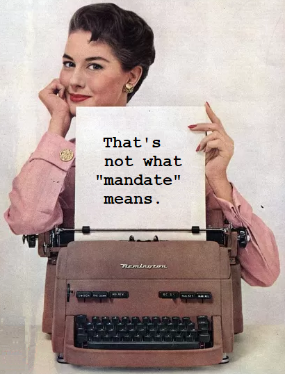
That’s what Trump called “an unprecedented and powerful mandate” on election night and what his new press secretary continues to call “winning the election with a resounding mandate.”
January 13, 2025
Black Characters Colored Green

One of my all-time favorite essays, Zoe Smith’s “4 Colorism,” starts with a page from Gold Key Comics’ Brothers of the Spear #11 (December 1974) where “black people” appear “thoroughly and intensely green.”
Why?
Because, Smith concludes, “print methods adopted by the comics industry early in its history didn’t have any way to consistently reproduce the color brown” (2019).
That’s certainly true, but because the rest of Smith’s excellent essay is about printing accidents and then later trends in four-plate coloring, it never occurred to me that Gold Key Comics could have selected green intentionally.
Then Neal Adams experts Paul Michael Moon Rogers and Lee Hester shared a page from the Washington Star newspaper’s 1969 The Story of the Washington Star, a giveaway comic book drawn but not colored by Adams. It also features a green Black character.

When Smith first saw the green-skinned characters in Brothers of the Spear, she wondered: “Are they Skrulls or something?”
One of the commenters on the Neal Adams thread tried to identify the comic with a similar assumption: “Boy is green like Beast Boy so I’ll guess Teen Titans.”
Because the green is consistent across panels, I’m now thinking that, rather than a result of printing error, the green in both cases was selected with the intention of representing Black skin.
That sounds crazy (because it is crazy), but the historical context is even more complicated.
Until around 1968, Marvel and DC used taupe (AKA gray-brown) for all Black people, like Gabe Jones in Marvel’s Sgt. Fury and his Howling Commandos #1 (May 1963). I find the effect is even more jarring in digital recreations, what Smith calls “straight up gray.”
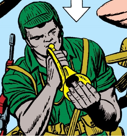
Like green, taupe is not a human color. Using an inhuman color to represent Black people is disturbing. Given that racist baseline, I’m trying to understand why these specific colors were repeated.
I’m guessing taupe was selected because it contained some brown but printed more consistently than brown or non-brown gray. When Marvel first published the Hulk in The Incredible Hulk #1 (May 1962), Stan Lee insisted on gray skin. Colorist Stan Goldberg: “I told him why it wouldn’t work, and it didn’t work, because we couldn’t keep the color consistent throughout the book. Sometimes The Hulk was different shades of gray, and even green in one panel” (Alter Ego #18, 16-17). Beginning with The Incredible Hulk #2 (July 1962), his skin was intentionally green.

Smith notes a similar problem in Hero for Hire #5 (1972): “In my copy, black skin is inconsistent from panel to panel … Luke Cage’s skin is almost the same shade of army green as the pants of the white man he’s fighting.”

Hulk’s 1962 skin was intended to be gray and accidentally turned green. Cage’s 1972 skin was intended to be brown and accidentally turned green. Assuming the colorists at the Washington Star in 1969 and Gold Key Comics in 1974 were aware of the difficulties of printing brown and gray, did they actually consider green to be a plausible alternative?
My short answer: yes.
My long answer is the chapter “Coloring Theory” I drafted for my book-in-progress, “The Color of Paper: Representing Race in the Comics Medium.”
Here’s a medium-length answer:
Neither colorist believed that green resembles the color of any person. But their goal wasn’t about resemblance. The racial logic of four-plate coloring requires members of different races to be represented by different colors. It’s an extension of the racial logic of a black/white color dichotomy. It doesn’t matter that the actual skin colors of white and Black people are overlapping ranges, and that most if not all of the colors in the combined range are some shade of brown. Four-plate coloring was used to fulfill the racial fantasy of absolute and visually determined racial differences. That requirement trumped any concern for resemblance. The beige of white skin was comparatively easy to produce on off-white paper, but since browns were generally avoided due to printing inconsistencies, colorists selected some other color to represent the color of Black skin.
Most comics companies used taupe before switching to a more human but less predictable brown in the late 1960s. Since Gold Key had only been around since 1962 (I think?), and the Washington Star wasn’t in the comics industry, their colorists may not have been as familiar with the taupe norm and went with green instead. Neither color has anything to do with resemblance. Both are used to communicate a racial category while paradoxically revealing nothing about the skin of the individual characters represented. For reasons I won’t go into here, I call that “linguistic color.”
But returning to Zoe Smith’s essay, the intent to use green as a linguistic color doesn’t preclude a range of other printing errors.
Look at that Neal Adams page again:

Whose left hand is drawn in the bottom right of the panel? The Washington Star colorist apparently thought it belonged to the second kid, but that’s anatomically impossible. It’s the foregrounded character’s hand, so (using the colorist’s deranged choice of green) the panel should look like this:

Or possibly this:

Which highlights the second printing error. The character’s face consists of two shades of green arbitrarily dividing his face:
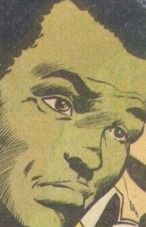
I don’t know enough about what exactly happens with color plates during the printing process, but the green in the left half of the image looks browner to me, close to what Smith called “army green” when describing that Luke Cage panel:
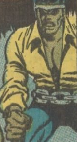
The Brothers of the Spear page is inconsistent too. Setting aside the fact that the ground in the four panels changes from green to purple to orange and then back to green (that’s only slightly different from the green of the foregrounded characters), the green fluctuates within characters too.

I had assumed that was a mechanical printing error, but now I find myself wondering: did the colorist or a printer technician select slightly different greens?
I’m also wondering how many more green-colored Black characters appear in late 60s and early 70s comics.
January 6, 2025
“What Horror Has Magneto Wrought?”: Coloring Marvel’s Racial Fantasies

I’ll be in New Orleans soon, presenting on the MLA panel “Envisioning Racial Futures: Race, Ethnicity, and Speculative Comics.” The Comics Forum organizers asked:
“How have science fiction, fantasy, and speculative graphic narratives imagined racial identity, ethnic conflict, social justice, and the future?”
My abstract answered:
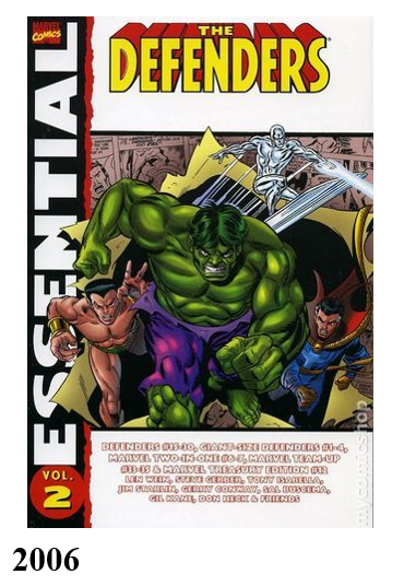
Superhero fiction is an amalgam of science fiction and fantasy that reflects the real-world circumstances of its publications. With notable exceptions, superhero comics have applied speculative genre norms formulaically, while reinforcing racial thinking of white creators, viewers, and publishers. Rather than treating such a comic as the unified product of its multiple authors, I divide The Defenders #16 (October 1974) by its semi-independent contributions. Len Wein’s script features the supervillain Magneto’s plight to end “the vicious persecution” of mutants by using ancient alien technology to create “Alpha, the Ultimate Mutant,” who in his “Neolithic” stage penciler Sal Buscema renders as a racist caricature of a Black man but whom colorist Glynis Oliver assigns the color printing code for white skin. As Alpha evolves, Buscema draws white facial features and then alien ones, while Oliver maintains white skin. While it’s unclear who made the initial choices – Is Buscema’s caricature based on Wein’s descriptions? Did Oliver prefer white or did her editor require it? – the black-and-white reprint in Essential Defenders Vol. 2 (2006) alters them by requiring viewers to project Alpha’s skin color onto the diegetically meaningless gray-white paper. I have conducted a quantitative study to measure viewers’ racial impressions of the evolving character in both the color and black-and-white appearances, while also subdividing study participants according to their reported ethnoracial identities. While the science-fictional fantasies of Defenders #16 extend Marvel’s implicit criticism of the early 70s Black Power movement, they also reveal the incoherence of its racial thinking produced by its multi-author approach and larger historical context.
The previous issue, #15, is the first comic I ever read, and I first blogged about the story arc two and a half years ago. That post has since evolved into a chapter subsection in The Color of Paper: Representing Race in the Comics Medium, which is out for external review at a press right now.
To avoid reading aloud, I try to design slides that are almost sufficient if viewed silently. They’re never quite, but I think you can follow most of the argument:


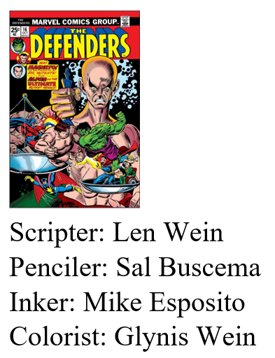


I think that last slide leaves out the most, so here’s the accompanying conclusion:
No character in the issue is assigned Black-denoting skin color, and Alpha’s evolved features no longer evoke caricatural Blackness after the fourth page. Mutantkind then appears to be exclusively White. By preventing an understanding of Alpha as a mutant Black man, however racistly drawn, Oliver’s color art defines Homo Superior as non-Black across its evolutionary stages.
If Essential Defenders viewers instead understand Alpha to have Black skin in one or more of those stages, mutantkind is not exclusively White and so is not a racial category.
Oliver’s colors both obscure anti-Black imagery and literalize White supremacy.
December 30, 2024
A Farewell to Vinyl

I recently offered to drive my father’s vinyl collection to Goodwill for him. He declined. I don’t think he has a way to play them anymore, but that’s beside the point. He’s not ready to part ways.
I gave most of my collection to a friend in my department. That was a little over a year ago, and I haven’t played a single album from the third I kept since, but that’s fine too. He just got the row from the back of the bedroom closet, none of which had been played in the twenty-first century. Mostly for good reason. It’s a semi-eclectic mix of the pretty good, the quite bad, and the shockingly awful. My teenage self is (mostly) to blame.
As a relative newcomer to Spotify, I am still discovering the joys and horrors of a nearly bottomless online library. During one drive up to see my dad in Pittsburgh, I spun over five consecutive hours of Queen, way way past the recommended dose. My one-sentence rave: “an off-broadway musical soundtrack, but due to an obscure labor dispute, the orchestra was replaced at the last minute with a speed-metal guitarist.” Trying and failing to listen to Rush’s Hemispheres was one the most nostalgia-shattering experiences of my life. Aerosmith was, alas, in the dull middle of those extremes.
The existence of Spotify still bewilders me. Set aside the digital surface, and it’s a return of the 19th-century lending library. I don’t own anything, I just listen to it for a monthly fee? Of course texting bewilders me too: the wireless pocket telegraph replaced the wireless pocket telephone?
I decided to give away the bottom two-thirds of my vinyl when I saw that my much younger colleague had been spinning a remaindered copy of Blue Oyster Cult’s 1972 debut. That is NOT a good album, and I’m a guy who saw them twice in concert (they kept opening for Black Sabbath). He didn’t seem to really care WHAT vinyl he played. It was about the experience of listening to VINYL. In my philosophical / literary-critical terminology, that’s privileging discourse over diegesis. Or maybe medium over message? Either is hard to get my head around.
I started buying albums in the very very late 70s, and didn’t stop till the very very early 90s, after I belatedly accepted that CDs weren’t just some 8-track fad — though now apparently they were? In order to get over my own fatherly farewell reluctance, I staged a photoshoot on my dining room table before driving the stack to their adoptive parent. Most date back to my early 80s high school days, so it’s like bumping into my 17-year-old self, someone I’m not on very good talking terms with. I mean, Molly Hatchet? Seriously, kid? And yet there are a few accidental gems scattered in the batch.
I also owe a personal apology to Neil Young: we had a hell of run, old man. And I deeply respect your Spotify boycott — though I’m looking forward to it eventually ending and the marathon car trip that will follow. (Instant wish-fulfillment: just discovered Neil returned earlier this year! I just made a Playlist of my favorite oddities. I’ll go wider on my next Pittsburgh drive.)
Next dilemma: what do I do with my bookshelves of CDs?


December 23, 2024
Tarot Comics!
December 16, 2024
Anachronistic “Comics”
“Anachronistic rhetoric,” argues comics philosopher Aaron Meskin, “is unnecessary.”
For example: “Nothing could have counted as jazz in the seventeenth century, and any theory that implied that there was an instance of jazz 350 years ago or more would be anachronistic.”
More importantly for comics scholarship: “spatially juxtaposed pictorial narratives existed well before the birth of comics in the nineteenth century and any definition that characterizes these as comics is guilty of artistic anachronism.”
I disagree. Or, more precisely, I agree but think artistic anachronism is a common convention and possibly a defining trait of terminology generally.
Caravaggio, the exemplar of chiaroscuro painting, died in 1610, over seven decades before the term “chiaroscuro” was coined in 1686. “Science fiction” was coined in 1929, making H. G. Wells’ 1897 The War of the Worlds not science fiction. Far more significantly, “genocide” was termed in 1944, making the 1915 Armenian genocide, in which the Turkish government killed a million Armenian civilians, not a genocide. Terms are coined in response to something that necessarily pre-exists the term, making them all anachronistic and retroactively applicable.
The term “comics” is typically understood to originate in the 1890s, making any pre-1890 use anachronistic. I have no problem with that. When I find artworks that are sequenced images (AKA, what I consider the comics form) but also include multiple conventions common to the later comics medium, calling them anything other than “comics” seems false.
Frank Leslie’s Illustrated Newspaper is filled with them. Last summer, I explored weekly issues from 1891 (and blogged enthusiastically about them here, here, here, here, and here), all of which fall roughly within the term’s historical timeframe, but I’m now two decades earlier and so fully in the anachronistic zone.
Unless I’m not.
The “Platinum Age” was coined to group comics or proto-comics published before the mid-1930s, but I’ve not seen a start year earlier than 1882. I’ve also seen the “Victorian Age” refer to works published from 1840 to 1897, due mostly to the existence of Rodolphe Töpffer and Punch magazine. Accepting that terminology, I’m just exploring “Victorian Age comics.”
Whatever you prefer to call them, here’s one of my favorites from 1872:

It’s titled, “The Grand Duke Alexis on the Plains — The Buffalo as it Really Was.”
I was especially taken by how the (unnamed) artist draws the panels overlapping, a technique I thought emerged decades later (for example, by George Herriman in the late 1910s and early 20s). If you’re a fan of Neil Cohn’s Visual Narrative Grammer (which isn’t a kind of grammar, but that’s a whole other argument), you’ll notice that all but the penultimate image tell a clear visual story without the need for words. The few captioned words that are included fall within the norms of a standard third-person narrator. The page sequence is even “comic” in the humor sense, the origin of the U.S. misnomer (it’s a shame “comic strips” wasn’t abbreviated “strips” instead).
Here’s another from the same year.

Though this page also features overlapping panels arranged in a sequenced narrative, the text is more essential for understanding the events because each panel is a stand-alone segment of “The Adventures of the Japanese Ambassador in Utah.” Unlike later works in the comics medium, the text is placed in footnotes at the bottom of the page, but, like later works, each panel is numbered. Also, the style of drawing is cartoon (simplified and exaggerated), another later norm, and the intent is comic (and probably racist, though I’m not sure if the features of the Utah characters are more exaggerated than the Japanese ones).
Again, not calling this a “comic” seems false.
To be clear though, these are exceptions. Of the 52 issues published in 1872, each usually 16 pages, these are the only two individual pages that closely resemble later 20th-century Sunday comics: a visually unified one-page narrative.
Of course “narrative” is a tricky term too. Some sequences achieve a different kind of diegetic coherence.
Here’s an example from 1870:

The black line across the center is from the newspaper spine; this is a two-page spread held sideways. It’s titled: “The Promise of the Declaration of Independence Fulfilled: An Allegorical Picture Commemorative of the Passage of the Fifteenth Amendment of the Federal Constitution.” The amendment, establishing the right to vote for Black men, was ratified the month before. Rather than a time sequence, the six images occur simultaneously, with any combination producing what Scott McCloud would term an aspect-to-aspect transition. It’s also an unusual example of a layout drawn with multiple overlap and framebreak effects, as well as two circular insets, all techniques I thought originated over seventy years later.
Here’s another stand-out from 1871:

The work is atypical, because it was not drawn for Frank Leslie’s Illustrated Newspaper but included instead because the paper considered the German artist, Paul Konewka, noteworthy:
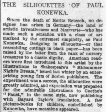
Unlike Konewka’s Midsummer Night’s Dream illustrations (which include one image per page), “The Prussian Soldier” is a one-page multi-image narrative.

I’m especially intrigued by this description: “A scroll-work of thorns and thistles supports, decorates and apportions the subdivisions of this touching story.” That’s an excellent definition of a comics gutter.
It also prefigures Theirry Groensteen’s 1999 analysis of a comics panel:
“There are six important functions of the frame, which I call the function of closure, the separative function, the rhythmic function, the structural function, the expressive function, and the readerly function. All of these functions exert their effects on the contents of the panel (a voluntarily general expression, by which I mean the totality of the figurative elements within the frame) and, especially, on the perceptive and cognitive processes of the reader. Most of the functions also open up a range of formal possibilities, allowing the frame to fully participate in the specific rhetoric of each author.”
While Frank Leslie’s “comics” are rare in the four-year 1868-1872 period I searched, I found one more self-contained one-page coherent humorous narrative in 1868:

Like “The Adventures of the Japanese Ambassador in Utah” published four years later, “A Fight for the Championship” is drawn in a cartoon style (humorous exaggerations), this time caricaturing members of President Grant’s cabinet. Like “The Grand Duke Alexis on the Plains,” the eight unframed panels are not numbered, because each instead includes its own caption. Oddly, the page also includes segments of newspaper text between two of the rows — which have nothing to do with the images but are the continuation of the previous page’s article; perhaps more oddly, the words flow as columns rather than rows, producing two unrelated and contradictory reading paths.
Finally, Frank Leslie’s also includes what could be described as a “comics page,” in the sense later used to name the pages in a newspaper that includes humorous comics, AKA “the funnies page.” In Leslie’s the page typically has only one one-panel comic (or “cartoon” as the term is sometimes used) on a back page of mostly ads.
Here are four from 1872. They all include captions typed below the image, though this first one also includes what would later be termed a speech balloon (emanating from the birdcage) and handwritten text:

The next includes two speech balloons (though I understand from better-researched comics historians that the device did not convey an impression of sound as it would after 1900) and four distinct images combined into one undivided panel (what I call embedded juxtaposition):

Here’s another speech balloon (or speech label) and also a clearly divided panel inset:

Finally, a three-panel sequence with vertical gutters:

I refer to all of these drawings by the appropriately anachronistic term “comics.”
December 9, 2024
Born in the Bronze Age?
I was born in 1966. The first comic book I remember reading was published in 1974. Somewhere during that eight-year span, U.S. comic books outgrew the Silver Age and matured into the Bronze. A sharper edge for that transition and what it might have caused it are less clear.
There is little critical agreement about the so-called Ages of comics. Richard A. Lupoff is most often credited for coining “Golden Age” in his article “Re-Birth” in fanzine Comics Art #1 (Spring 1961). Though the perspective of a later period is necessary to define any former Golden Age, “Silver Age” was probably not coined until a fan letter printed in Justice League of America in 1966 (Casey 2009: 79). When Overstreet Comic Book Price Guide was first published in 1970, it distinguished between only Golden and Silver Ages.

My 2001 edition includes Top 10 lists for four: Golden, Silver, Bronze, and Platinum—a then new term for comics published before Action Comics #1 (June 1938). Terry O’Neil explained in the Bronze Age section of his market report: “As these books are now in the 20-30 year old range, I myself as well as other dealers of my age group must acknowledge that they are truly established as collectibles” (57). Tony Starks, who identified the Bronze Age as his “specialty” and declared it “HOT!,” used the term synonymously with “the 70s” (63), but many fans and scholars place its endpoint in the mid-80s, when I graduated high school. I bought the original monthly issues of the maxi-series Watchmen as a college sophomore.
So why “Bronze”? The sequence of metallurgical periods in world pre-history begins with the Stone Age and is followed by Bronze and then Iron. Placing Silver after Gold instead evokes the Olympics, which established the third-place Bronze medal in 1904. When I ran track in early high school, I finished every race in fourth, so categorizing the period of my childhood as third-place is a comparative win.
The ambiguous Silver-Bronze shift corresponds with a range of events within the U.S. comics industry.

Steve Ditko left Marvel in 1966. The artist had co-created Spider-Man with Stan Lee for Amazing Fantasy #15 (August 1962) and continued penciling, inking, and—in the typically uncredited Lee-dubbed “Marvel Method” sense—co-writing every issue of Amazing Spider-Man that followed. Ditko’s last issue was #38, cover-dated July 1966, and so probably on stands during my June birthday. John Romita drew #39. Ditko worked briefly at DC afterwards, but kept mainly to Charlton where page rates were lower but artistic freedom apparently higher.

Jack Kirby left Marvel in 1970. The industry veteran had worked at Marvel in its earlier incarnations, Timely in the 40s and Atlas in the 50s, and his and Stan Lee’s collaboration on Fantastic Four #1 (November 1961) launched the renamed company. Kirby’s final issue as penciler, #102 (September 1970), ended the longest continuous writer-artist collaboration on a single title in comics history. John Romita drew #103. Kirby signed a three-year renewable contract with DC where he had last freelanced in the late 50s.
Kirby had come to define the Marvel house style, which new artists learned and imitated as inkers of his pencils. After co-penciling and inking two issues with Kirby, Joe Steranko took over Strange Tales #154 (March 1967), penciling, inking, and writing Nick Fury, Agent of S.H.E.I.L.D., which soon received its own title. Kirby built Marvel’s layout norms on a 3×2 grid and punctuated it with an occasional 2×2. Steranko introduced a radical irregularity with no base pattern, which would in turn become the layout norm of 70s comics generally. Artist Neil Adams, who debuted at DC in Our Army At War (July 1967), proved even more influential, innovating his own layouts while also adding a level of comparative realism that defined the next decade.

Though Stan Lee didn’t leave Marvel, he left the role of editor-in-chief to become publisher in 1972, simultaneously ending his career as a writer. His final writing credit was Fantastic Four #125 (August 1972). He wrote one of his last stories for Spider-Man about the dangers of drug abuse at the request of the U.S. Department of Health, Education and Welfare. Because it depicts criminal drug use, the three-issue story arc of Amazing Spider-Man #96-98 (May-July 1971) are the first mainstream comic books published in the U.S. without Comics Code Authority approval since the self-censoring industry organization was established in 1954. When CCA revised its guidelines in response, it was the second revision within one year.

In Superhero Comics, I suggested a different era system established by the Comics Code: the pre-Code era ends in 1954 with the creation of the CCA, marking the start of the Code era which spans to 2011, when the last publishers discontinued its use, marking the start of the post-Code era. Because the Code was revised multiple times, each major revision marks an additional Code era. The second Code era begins in January 1971. The primary change was the acceptance of horror-themed comics, producing an influx of new titles and deadlier characters, including Swamp Thing (1971), Man-Thing (1971), Werewolf (1972) Blade (1973), Deathlok (1974), Punisher (1974), and the spike-fisted Wolverine (1974).

Under the leadership of new editor-in-chief Roy Thomas, Marvel decided the best way to relieve Spider-Man from the plot confines of a happy relationship was to kill his girlfriend. Amazing Spider-Man #122 (July 1973) featured not only Gwen Stacy’s death, but his failure to save her after she’s pushed from a bridge. Gill Kane penciled a “SNAP!” next to her neck when Spider-Man’s webs halt her descent too abruptly, a simultaneous shift in the laws of physics and narrative morality for comics.

The creation of Black superheroes increased exponentially during the transition period too: Black Panther (1966), Falcon (1969), the Butterfly (1971), Blade (1971), John Stewart Green Lantern (1971), Luke Cage (1972), Brother Voodoo (1973).

Denny O’Neil’s and Neil Adam’s first issue together on Green Lantern Co-Staring Green Arrow #76 (April 1970) brought race explicitly into focus when a Black man criticizes Green Lantern for protecting an abusive White landlord: “I been readin’ about you … how you work for the Blue skins … and how on a planet someplace you helped out the Orange skins … and you done considerable for the Orange skins! Only there’s skins you never bothered with–! …the Black skins! I want to know … how come?!”

More female superhero characters and titles premiered in the early 70s too: Black Widow (1970), Valkyrie (1972), The Cat (1972), Shanna (1972), Satana (1973), Tigra (1974).

The shifts were responses to a range of real-world events: the Black Power movement, blaxploitation films, the Women’s Liberation movement, Vietnam War protests, the Mai Lai massacre, Watergate. Scripter Steve Englehart’s Secret Empire run in Captain America and the Falcon culminated in #175 (July 1974) and the revelation that the secret supervillain was the President of the United States. In the next issue, cover-dated the month Nixon resigned, Steve Rogers renounces his Captain America identity.

I want to say that the shift in comics parallels a similar if coincidental shift in rock music: the 1969 supergroups of Led Zeppelin and Crosby, Stills and Nash forming from the breakup of the Yardbirds, the Byrds, the Hollies, and Buffalo Springfield; the death of Rolling Stones guitarist Brian Jones in 1969; the Beatles and Simon & Garfunkle break-ups in 1970; the deaths of Jimi Hendrix and Janis Joplin in 1970; and the death of the Doors’ vocalist Jim Morrison in 1971. On the flip-side: the first albums of the 70s-defining bands Black Sabbath and Emerson, Lake and Palmer in 1970; ZZ Top in 1971; Eagles in 1972; Aerosmith, Lynyrd Skynyrd, Queen, and Journey in 1973; and Kiss, Rush, and Bad Company in 1974.
I recognize though that most eight-year spans could net a similar Bermuda Triangle of idiosyncratic significance.
Oh, and my parents divorced in 1973.
Comics for me start mid-70s, well into superheroes’ gratuitously titled third act.
December 2, 2024
All-New All-Different Medusa?

Dear Marvel Comics,
Please develop a new title featuring a Black woman as a new superhero named Medusa.
Here’s why.
First, some history. Medusa means guardian or female protector. The mythological character was raped by Neptune in Athena’s temple, and then Athena punished her by transforming her hair into snakes and her gaze with the power to turn men into stone. After giving Perseus a mirrored shield so he could kill her, Athena mounted Medusa’s head on her own shield.

French literary critic Hélène Cixous transformed the character into a feminist icon in her 1975 essay “The Laugh of the Medusa.” Here’s an excerpt: “Censor the body and you censor breath and speech at the same time. Write your self. Your body must be heard.”
As far as Marvel mythology, Lee and Kirby introduced their Medusa in 1965. They later retconned Inhuman royalty to fill-in the amnesia induced by the Wizard, but initially she was a supervillain, one of the Frightful Four in Fantastic Four #36.
Maybe it was a product of her villainy, but her powers — her impossibly long, animate, and super-strong hair — distinguished her from Lee and Kirby’s typical women. Look at her first cover appearance:

The male villains extend their bodies, the Sandman most obviously, but the Trapster projects a force field, and the Wizard’s helmet is elongated, which Kirby further foreshortens by placing him in the foreground. Medusa’s hair, which extends beyond to top page, expands her physicality too.
Lee and Kirby tended to shrink women — literally with the Wasp, the lone female member of the original 1963 Avengers. Invisible Girl vanishes, allowing backgrounds to appear within the dotted outline of her body. Marvel Girl sometimes projected thin emanata lines, but usually from a background position. Look at their first covers:

Like the members of the Frightful Four, the male members of the Fantastic Four expand their bodies: the Thing is a living block, Mr. Fantastic stretches, and the Human Torch is a column of fire extending off the page like Medusa’s hair. The male X-Men are the same: Angel’s wings, Cyclops’ eye projection, Iceman’s ice projectiles, and the Beast’s body extends from some sort of swing, while each of his foreshortened feet is larger than other characters’ heads.
Invisible Girl, already taking up less page space than her teammates, literally fades in half, and Marvel Girl, despite the empty negative space around her arms, takes up half the space of each of her teammates.
Compare them to Medusa:

The page area of Medusa’s body roughly triples theirs. Or, as Cixous put it: “I, too, overflow.”
But, like Marvel Girl, Invisible Girl, and Wasp, the original red-haired Medusa is white.
The first Black female superhero, the Butterfly, appeared briefly in 1970 from Skywald Publications. Her wings, which project Dazzler-like light, extend her body too:

Marvel wouldn’t introduce a Black woman as a superhero until 1975. Storm’s cape expanded her body too:
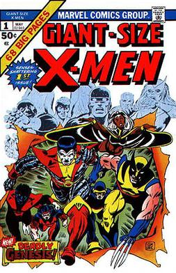
The notion of a Black Medusa (meaning a Black character named Medusa) seems obvious given how real-world hair extensions expand bodies:

Like Medusa’s hair, they also come in red:

I can even recommend a writer.

I paired Nnedi Okorafor’s Shuri: The Search for Black Panther with her 2015 novella Binti in my first-year writing seminar.
Though Shuri’s braids look animate on the cover, Binti’s hair is actually animate at the end of the novel when she transforms into part-Meduse. That’s the name of a jellyfish-like alien species with “long tentacles spilling down to the floor.” Binti was already Medusa-like at the start of the novel, the way she would palm her “plaits smooth like the bodies of snakes.” After her transformation, she realizes, “My hair was no longer hair.” The braids were becoming tentacles: “a soft transparent blue with darker blue dots at their tips. They grew out of my head as if they’d been doing that all my life, so natural looking that I couldn’t say they were ugly. They were just a little longer than my hair had been, hanging just past my backside, and they were thick as sizeable snakes. … I pinched one and felt the pressure.”
But if Okorafor is booked with other projects, Eve L. Ewing is an equally excellent choice.

I pair Ironheart: Those With Courage and her 2017 poetry collection Electric Arches in the same writing seminar. Riri Williams has shorter hair than Shuri:

But hair is central throughout Electric Arches, including in “at the salon,” the poem that gives the collection its title: “I am in the universe and it is my hair, / each strand arched electric …”.
And “why you cannot touch my hair” sounds like it’s straight out of Binti: “my hair is a technology from the future and will singe your fingertips, be careful.”
(Hey, what if Riri’s next Ironheart suit design featured mechanical hair extensions?)
While “Shea Butter Manifesto” and “Ode to Luster’s Pink Oil” extend the theme even further, those poems make me think of another equally excellent choice of author.

I’ve taught Ebony Flowers’ 2019 Hot Comb in my comics course. Unlike Okorafor and Ewing, Flowers is also an artist. Her Lynda Barry-influenced style is nothing like Marvel, but imagine how fun her drawings would be as childhood flashback scenes.
But if all three are busy, I have yet one more equally excellent suggestion.

That’s the final full-page panel from C. Spike Trotman’s Yes, Roya. Though a Black Wonder Woman is wonderful (DC introduced Nubia in 1973), Trotman would have to reign in the sexual explicitness and return BDSM to the subtext — though Medusa’s rope-like hair seems ideal either way.
Trotman, AKA Iron Spike, also has a brilliant social media essay on Black hair:

Would the new Medusa’s braids be born-that-way tentacles? Mechanical extensions riveted to her skull? Something supernatural?
I’d leave those details to Okorafor, Ewing, Flowers, Trotman, and anyone else ready to join Team Medusa.
Of course, Marvel doesn’t own the name “Medusa” or the concept of a hair-themed superhero, especially a Black woman with braids, so if you pass, I’m guessing other comics companies might be happy to step up.

PS. I’ve since had a conversation with a fellow comics scholar who, in addition to kindly giving me time and attention, critiqued relating Black women’s hair to a snake-haired monster — regardless of how Cixous, Binti, or Marvel comics have evolved the mythological allusion. It’s an important critique, and so if someone were to pursue the above suggestions, a new name could be key.
November 25, 2024
Drawing Tarot Cards

Lesley Wheeler’s “Rhapsodomancy” appears in her forthcoming poetry collection Mycocosmic. The title is an invented word that riffs on bibliomancy, randomly opening a book and stabbing a passage with your finger to tell the future. The 22-line poem (published online at the ASP Bulletin) also riffs on the tarot deck, one line for each card of the Major Arcana. But for me, the poem is a comics script. I’ve been searching for a project to apply my “hazardous cut-outs” technique, an oddball Word Paint hack that pops out some random results. That’s right, a divinatory deck that exploits the randomness of card order drawn in a style that exploits the randomness of computer-produced black-and-white shapes. Form, meet function.
The 22-page “Rhapsodomantic” (we’re changing the title a smidge) is still a work-in-progress, but I’ve sketched most of the cast.
Death:

The Devil:

Strength:

The Sun:

The Hanged Man:

The Magician:

The Emperor:

The Hermit:

The Lovers:

The High Priestess:

The Star:

Justice:

The Fool:

Judgement:

The Empress:

Wheel of Fortune:

The Chariot:

But I don’t need a tarot deck to tell this future: Mycocosmic is on shelves March 1, 2025. Pre-orders start now.

November 18, 2024
How I Make Non-Crappy Art in MS Word Paint

I made this drawing in Paint. I’m guessing it took about four hours spread over three days. If I were a more experienced artist I assume it would take less time, but maybe not radically less? I’m also auditing my Creating Comics co-author Leigh Ann Beaver’s Drawing 1 class every Monday and Wednesday morning this semester, which has noticeably upped my game.
Let’s call that Step One: Practice drawing.
Don’t think of a computer as a shortcut around drawing. Think of it as just a drawing tool not fundamentally different from pencil and paper. I use Word Paint because I’m too lazy to learn anything more sophisticated. I also really really like the lack of sophistication because the more I explore it the more weirdness I discover. Better still, it’s infinitely forgiving. If only there were a back-arrow key for the other parts of my day.
I use seven other keys too.
Step Two: Find the keys.

“Color 1” determines the color of the digital pencils, inks, fills, and brushes. Ignore all of that.
All you need is “Color 2,” which determines the color conceptually “underneath” the surface of the screen. I toggle between black and white.
Under the “Home” tab, find the “Select” button, and from the pull-down menu find “free-form selection” and “Transparent selection.” Keep both as default settings.
Most importantly, find “Cut” on the “Home” tab. The little scissors icon next to it is helpful because that’s all you’re doing: cutting out shapes.
That means making a “line” requires drawing two lines: an initial line and a second line loosely retracing it in the opposite direction. Then you click “Cut.” I’ve started using a small Wacom pad and stylus, but I made this pattern (and gobs of other drawings) using the touchpad on my PC:

I start with “Color 1” on the black square, but the white square will be essential later.
Step Three: Choose a picture.
If you want to draw a realistic image, you’ll need a real-world source, and photographs are easier than live models because they don’t move and they’re already flat.
For the above image, I clicked through Facebook photos of myself (because getting someone else’s face wrong feels wronger to me than getting my own face wrong), until I found one with good lighting contrasts. I also ended up going back a decade and picking one that didn’t make me cringe (downside of self-portraits: your self-idealization button is on constant display).
Step Four: Cut-out a sketch.
I described my “hazardous cut-outs” process in a previous post.
This time I started with a “pencil” sketch in Color 1 red (adding the one-time use of two additional buttons to my above instructions, but this step is optional). I copied, pasted, expanded, and cropped my head, then sketched a very very loose contour drawing beside it.
I switched to “free-form selection” and Color 2 black, made another two-minute sketch, and hit “Cut,” which produces semi-random black and white shapes.

To get rid of the red lines still visible in the white areas, select the entire image, delete it, check “Transparent selection,” switch Color 2 to red, and hit paste:

To be clear, it PAINS me how badly I drew the mouth. But that’s the point: it doesn’t matter because these shapes will be part of the final image.
Step Five: Start scribbling.
I mean hatching. I started with the face. If an area was black, I scissored out white marks; if the area was white, I scissored out black marks. I did that multiple times in each area, before reversing the process: scissoring out white marks into areas that were now predominately black, and black marks into areas predominately white.

Step Five: Hatch a background.
Free-floating heads are less interesting than heads in some kind of context. The context I created was completely fictional: it has nothing to do with the source photo. I also scissored out the black areas of hair, cutting a particularly tight pattern of white shapes all at once.

Step Six: Start refining.
It’s the same white-cuts-on-black or black-cuts-on-white hatching as above, but now my areas of attention tightened. So did my hatching. I also discovered a paradox of the digital approach: a unit of small tight hatches cuts out less than a unit of large loose hatches. Less is literally more. And, more importantly at this stage, more is less.
Oh, and one macro change: I have a tendency to draw overly long noses (can’t imagine why) which produces equally elongated cheeks. To correct that, I turned off “Transparent selection,” switched to “Rectangular selection,” selected the top half of the entire image starting mid-nose, and then dragged the whole thing down incrementally, until the nose and cheeks appeared more proportional.

Step Seven: Keep refining.
This is also the final step, but how long you go at it is up to you. I kept the original photo next to my drawing so I was constantly comparing. As Leigh Ann tells her class again and again: CLOSE ONE EYE AND SQUINT. It blurs everything and so clarifies the shading relationships, which is what you’re drawing. The image is not a set of distinct lines but a set of many many lighter and darker hatching areas.

Step Seven: Keep refining.
Like I said, there’s no definite endpoint. But the longer I worked, isolating one increasingly smaller area at a time, the more I actually SAW both the original photograph and the drawing. I also noticed that my mental concepts of “face” and “eye” and “mouth” were interfering with my ability to see and reproduce actual facial qualities. It took me the longest to overcome what I apparently think lips look like.

Also when I showed it to Leigh Ann, she told me to clean out the highlights more. So I did.

Because I like the stylistic contrast, I never fiddled with the hair or ear. I could keep at the rest (so many flaws are jumping out at me right now), but I felt I hit a pausing point. Maybe I’ll go back and refine further. Maybe the pausing point will become a stopping point. Either way, this is the most realistic drawing I’ve ever made, and I did it in a software program that’s almost as old as I am (I’m 58, though a mere 48 in the snapshot).

Chris Gavaler's Blog
- Chris Gavaler's profile
- 3 followers


