
Chris Gavaler's Blog, page 9
March 18, 2024
The Strange Invisibility of a Black Kat in Front of a Black Sheet
I taught George Herriman’s Krazy Kat for the first time last semester to my advanced comics class. It was also the first time I came across the Sunday comic published in the San Francisco Examiner on July 11, 1919. I now plan to include it in the first chapter of my work-in-progress The Color of Paper. Here’s a first draft of my analysis:

Likely the first critic to analyze the series, Summer Baldwin wrote in 1917 that “Mr. Herriman’s medium is the pen and ink sketch,” noting a central contrast: “Krazy Kat is black,” but “Ignatz Mouse is done in line,” and the “other characters are also done in line” (801).

More precisely, Herriman renders Krazy Kat as a tightly cross-hatched and so nearly opaque ink shape, with minimal unmarked page area visible between the figure’s interior black marks, sometimes more lightly in the area of the stomach suggesting lighter fur. In contrast, Herriman composes Ignatz’s head and torso as exterior black contour lines with minimal internal marks delineating three-dimensional features. Ignatz’s limbs, fingers, and tail are single lines.
Other characters, including Officer Pupp, may also include minimal cross-hatching to suggest shadow, including along Pupp’s lower torso creating the impression of a protruding stomach. Herriman likely drew Krazy Kat similarly, what Baldwin terms “in line,” before adding “black” cross-hatching.
Baldwin also notes that Krazy Kat’s “face is white, with two black dots for eyes, and a thick black line for a nose” (801). That “line” is a double line or a circle depending on whether the nose is rendered in profile or as if viewed head-on, and the dots appear at the center of unmarked areas enclosed by two circles. Herriman also draws a backward protruding bow around the character’s neck, which, in Baldwin’s analysis would also be “white” since the two sides of the bow are drawn only “in line.”
The details are significant because the 1919 comic disrupts them.

Officer Pupp announces in the first image: “‘Kats,’ ladies, & gents, is invisible in front of black sheet, especially if they’re black kats.” His hand extends in front of the “black sheet,” revealing that his body is diegetically opaque, though discursively the interior area of his body is the page surface. The page areas visible outside of his body are discursively identical but diegetically distinct, representing either sky or ground depending on whether above or below horizon lines.

In the second image, Pupp instructs Krazy Kat: “Open them eyes!!” and Herriman draws two white circles punctuated with tall black pupil-representing shapes. Herriman does not include Krazy Kat’s “white” face or bow, nor the line-like areas of his stomach normally visible between crosshatches. This is presumably because he has only drawn the character’s eyes. Krazy Kat is not “invisible” because a black body is drawn “in front of” or even discursively surrounded by a black object but because the body is not drawn at all.

When Ignatz hands Krazy Kat what is apparently a glass milk bottle, the object appears to be opaque white in front of the black sheet – though once emptied, the bottle remains opaque white.
Krazy Kat’s crosshatched paw partially blocks the bottle when their body is black, and again as their body grows incrementally white as though filling like a container with liquid.

The filling effect is paradoxical though, since Herriman does not render the liquid pouring through their body, presumably because the body is still diegetically opaque black while discursively it is undrawn and then partially drawn. When fully drawn, Krazy Kat resembles Officer Pupp, both now “done in line.” Krazy Kat, however, stands in full contrast to the “black sheet,” reducing the contour drawing effect. Herriman also crosshatches no shadows within the body, further flattening the image.

When the character drinks from an “INK” bottle, the ink is presumably black, though the bottle is the same opaque white as the milk bottle. The figures also seem to hover several vacillating inches off the ground, and while the other characters and objects (including both emptied bottles) cast crosshatched shadows beneath or beside them, Herriman draws no marks in the areas representing the three-dimensional space before the sheet. The comic offers no diegetic explanation for the impossibilities, adding to the implicit effect of Krazy Kat appearing not diegetically “in front of black sheet” but discursively within a black panel.
The black panel also reveals other of Herriman’s drawing norms.

Though still “done in line,” when drawn diegetically in front of the black sheet, Ignatz’s limbs and tail are not black lines but white ones. Where other “white” objects are rendered by drawing black marks around them, these white areas do not appear to have been drawn directly and so were, prior to the newspaper printing process, initially made with white ink applied on top of the black ink of the black panels. Ignatz’s appendages, being only the width of a line, require contrast to be legible. As a result, since a white mouse is not diegetically invisible in front of a black sheet, the figure’s black lines must become discursively white to remain visible.

Similarly, the zip lines and onomatopoeic “ZIP” within (or diegetically “in front of”) the black panels must be rendered in white too, as when Officer Pupp throws an unidentified white object at Ignatz in the fifth image. Though the object is likely negative space, the motion lines and the lines of the letters were likely rendered in white ink.

The thinness of those lines creates a discursive challenge. In scans of the San Francisco Examiner newspaper page, the lines are either mostly absent or obscured in the digital reproduction process. If absent, then the marks were obscured in the original printing process due to the thinness of the lines. The paper likely absorbed the black ink surrounding it.

Presumably working from either Herriman’s original art or from a better reproduction, the Fantagraphics reproduction of the page includes white motion lines in images five, six, and fourteen. The Fantagraphics edition is also printed on white paper, dissimilar to the gray of the newspaper stock. As a result, the white opaque objects appear discursively white too, and so the milk inside the milk bottle is the actual color of milk. Ignatz and Officer Pupp are also now white – a discursive quality that creates ambiguous diegetic ones. Is Ignatz a white mouse or a gray mouse? Is Officer Pupp a white dog or a gray dog – or a dog of some color not representable in a black-and-white image?
When Herriman later began producing color comics, Pupp is revealed to be wearing a blue uniform. Was his diegetic appearance therefore always blue, even prior to Herriman’s later discursive addition?


March 11, 2024
Illuminating Layout
I began thinking about comics layout as products of trompe-l’oeil (literally “deceive the eye”) painting techniques in a post last October. I’ve since come across (and then interlibrary loaned) a book that’s taken me further down that rabbit hole. Here are my latest illustrated musings:

In Cultural Techniques: Grids, Filters, Doors, and Other Articulations of the Real, Bernhard Siegert interprets the trompe-l’oeil of seventeenth-century Dutch still life as a descendant of the “hybrid text-image medium” of “the illuminated manuscript page of the late fifteenth and early sixteenth century” (165).
In short, the approaches for painting three-dimensional illusions developed from illustrated books. The role of the surface areas between text, images, and surface edges is especially significant. In the “refashioning of the manuscript page,” argues Siegert, “the border is turned into a space connected to the real space of the reader and the miniature acquires an infinitely receding space of its own” (187).
Siegert’s analysis also describes comics layouts: the gutter is connected to the real space of the viewer, and the panel exists as a diegetic space of its own.
The comics medium did not evolve directly from either the trompe-l’oeil or illuminated manuscript traditions, but a comics page shares formally similar qualities with both. Since the comics medium exists in a larger visual arts context that follows and therefore is aware of the earlier traditions, direct influence cannot be ruled out, but parallel artistic evolution within historically unrelated book formats is at least as likely.
Either way, the trompe-l’oeil provides a lens for understanding the comics page.

Siegert begins by analyzing works by the mid-1600s Belgium painter Jan van Kessel. His oil-on-copper painting Insects on a Stone Lab depicts a vertical stone slab surrounded by plants and sky. Seigert terms it a “metapainting,” because a portion of the painting’s actual surface is demarked to represents a fictional surface: the “copper plate ended up as a stone slab,” and Seigert calls that area of the painting “a compromise between readability and visibility” because actual surfaces are read and represented surfaces are viewed.

Van Kessel merges discursive and diegetic surfaces similarly in his 1655 Insects and Fruit, but without a representational explanation for the dual surface. Seigert describes the painting’s “ground of opaque white” as “an ambiguous surface” because some of the drawn insects “sit on that ground as if it were a horizontal plane extending backwards into space” and so “are inhabiting the imaginary space within the painting,” while other insects “appear to be using it as a vertical wall” and so “are sitting on the real picture” (169).
Where the first oil-on-copper painting transforms “the ambivalent surface of the copper plate” into a representation, the background of the second painting remains ambivalent, fluctuating between being a diegetic space represented by a discursive surface and being a discursive surface only.
Seigert understands “this space as the result of a conflict between two cultural techniques—gazing and reading,” where the “disjunctive technique of viewing images on the one hand and reading text on the other” creates “a diaphanous zone” that reveals both (169). Regarding illuminated manuscripts of the previous century, Seigert describes the effect as a “self-conscious problematization of the coexistence of two-dimensional writing space and three-dimensional pictorial space” (180). Though van Kessel’s paintings include no text, his canvas surfaces vacillate similarly. The insects painted as if “on” the canvas highlight the actual surface where text would be printed, while the insects painted as if “within” the illusory space of a depicted scene obscure the actual surface.
A prototypical comics page also vacillates, usually with clearly demarked areas. Page surfaces within panel frames are drawn to depict three-dimensional pictorial spaces, and the unmarked areas outside panel frames are understood as actual page surfaces dividing panels as gutters. If text appears in an otherwise unmarked gutter area, the letterforms are understood to be printed “on” the page surface.
Seigert also analyzes earlier works by still-life painter and manuscript-illuminator Joris Hoefnagel.

His 1589 Still Life with Flowers, a Snail, and Insects features a trompe-l’oeil frame engraved with a title and artist name – though of course the words are painted on the canvas surface. The fictional frame appears to be “connected to the actual frame,” placing each still-life object “visually at odds with the painting’s surface” because “it is impossible to say on which level it is located” because it “resides in an impossible space between picture frame and vellum” (172-3).
Hoefnagel’s 1590 Miniature with Snail includes a similar trompe-l’oeil frame painted with roses that “possess a hybrid, metamorphic dimensionality,” because “their stems appear three dimensional, while their blossoms share the bidimensionality of the parchment surface” (171). Seigert sees these “protruding semi-two-dimensional and semi-three-dimensional objects” originating from Hoefnagel’s earlier work in illuminated manuscripts. The “ornate shape of the wooden frames,” he argues, “sprang from writing” as “a calligraphic ornament that has attained object status” (173).
Hoefnagel-like text-containing frames are common in the comics medium, especially for titles and credits. Winsor McCay provides an early example.

The October 22, 1905 edition of Little Nemo in Slumberland includes a drawn frame that appears to overlay the top row, dividing the image into three continuous panels with a title plaque nominally protruding into the viewer’s space. McCay’s drawing style is comparatively simplified, reducing the trompe-l’oeil effect while still establishing its visual logic.
Will Eisner’s The Spirit splash pages are especially well-known for their object-status titles.

Siegert’s “diaphanous zone” was widely popular in Marvel comics, where credits-text areas of splash pages routinely vacillated as on/within surfaces. John Buscema’s The Avengers splash pages from the late 1960s established the norm, both with text ambiguously incorporated into the story world, as well as credit boxes drawn as though physical objects placed on top of the page.

Siegert analyzes further examples.
Regarding Hoefnagel’s folio 37 of Mira calligraphiae monumenta, Siegert pays particular attention to one “tell-tale detail that conjures up the trompe-l’oeil effects and sheds light on the link between the objectification of writing and the ambiguity of the surface”; Hoefnagel paints the representation of a “slit cut out of the vellum of the page into which the stem of the flower has been stuck. This slit appears to turn the two-dimensional page of the book into a three-dimensional object. The two-dimensional writing surface is transformed into an illusionary three-dimensional object that, paradoxically, appears to be resting on itself. The vellum, that is, the carrier itself, into which the line has been inscribed, becomes a trompe-l’oeil: the image carrier steps out of itself to become an image object.” (173)
Hoefnagel’s example is atypical in illuminated manuscripts, and George Herriman provides an atypical example in the comics medium. His October 15, 1920 edition of Krazy Kat includes a tree drawn as though passing through five slits of the kind Siegert describes on Hoefnagel’s page.

Seigert analyzes an additional aspect of Hoefnagel’s folio 37. On the reverse side, the stem “appears to pierce the page and lie on the narrow vellum strip. The shadow of the strip as well as the dark edges of the hole and the small ‘visible’ piece of the stem are the only elements that have been painted on this side” (173).

I am unaware of a parallel example in the comics medium, but Pascal Jousselin does employ the reverse side of a comics page for related effects. Mister Invincible includes a villain able to pass through the physical page of the comic and step into the scene occurring in the reverse panel.

It’s easier to see with isolated panels, and if you image the pages pressed together back-to-back:

Siegert’s analysis of Hoefnagel applies equally to Jousselin:
“Hoefnagel transforms the page itself into an object whose topology oscillates between bi- and tridimensionality …. Not only does the trompe-l’oeil refer to the vellum as the real image carrier … but the very act of turning the page folds the illusion of the three-dimensional stem into the real tridimensionality of space. Here, the trompe-l’oeil invades the space of the observer in a real rather than merely illusory manner. The play of recto and verso enabled by objects such as book pages that can be turned creates an ambivalent threshold zone between imaginary of the image and the real of the reader/observer.” (173-176)
Seigert also describes an Austrian manuscript from the 1500s in which the borders of a double page are “a shelf construction erected on top of a chest,” “the lid of the chest and the shelf compartments are filled” with various objects,” the “miniature itself is a window in the shelf allowing a view into the distance,” and “the shelf’s center window serves a frame for the text” (187).
Shintaro Kago explores related effects five hundred years later:

Rows of rectangular panels generally can be understood as a kind of “shelf construction.”
And when panels are drawn as if overlapping, the page relates to Seigert analysis of the 1515 Grimani Breviary manuscript, by “treating the colored manuscript page itself, which constitutes the background for resting objects, as a flat picture object, the representation of a curvable parchment”; it “effectively turns the material image carrier into a picture of itself” (183), “integrating ontologically heterogenous elements into an apparently homogenous picture object” (187).

There’s plenty more to explore on this subject (Siegert’s casual “metapainting” aside begs for its own chapter), but let me wind down for now with a tentative conclusion:
Since a comics page, like any page or canvas, has no formal constraints but its actual edges, a general analysis must address that openness. Rather than approaching layout as a quality of an isolated medium, understanding comics within the broad field of art history reveals that comics layout shares key features with illuminated manuscripts and trompe-l’oeils. Formally, the prototypical comics page is a rudimentary trompe-loeil.
March 4, 2024
Possibly the Worst Comic Book Ever Made? (Marvel 1999/1971 White Supremacy part 2 of 2)

Captain America: Sentinel of Liberty #8-9 (April-May 1999) is a useful reminder of how badly the comics production process can go and how remarkable it is that it rarely does. I wrote about #8 last week, but #9 is where things go off the rails.
Mark Waid scripts both issues, Cully Hamner pencils the first, and Doug Braithwaite pencils the second. Switching pencillers mid-story is never ideal, but it’s not uncommon and is typically unremarkable. (Avengers #74 (March 1970) provides an example with John Buscema taking over from Frank Giacoia.)
I would love to read Waid’s scripts to assess where exactly the process broke down. My best guess: the two pencillers worked from each issue’s script independently and simultaneously, unaware of many of the other’s visual decisions. At some point (during inking perhaps) someone must have noticed the incongruities, but the decision was made (presumably by Bob Harras as editor-in-chief) to proceed anyway.
As detailed in last week’s post, Waid introduces Ajanii Jackson in #8. As drawn by Hamner, the Black man appears middle-aged with a handlebar mustache and wears a suit and tie.

I suspect Hamner had Jesse Jackson in mind — especially since Jackson grew in national prominence during the period of the 1971 story arc. Martin Luther King, Jr. selected Jackson as national director of the Southern Christian Leadership Conference’s economic-focused Operation Breadbasket in 1967, and Jackson’s own organization Operation PUSH (People United to Save Humanity) began operations in 1971. Jackson also appeared on William F. Buckley’s Firing Line in October 1971 — when Waid’s imprecisely retconned story appears to be set.

Yet in #9, Braithwaite’s Jackson wears tennis shoes and a t-shirt and appears to be a teenager.

I’ve not seen this sort of contradiction since 1939, in Action Comics #8, where Superman co-creator Joe Shuster first draws a gang of “juvenile delinquents” as though twenty-something hooligans and then later in the same issue as pre-pubescent urchins.

Back in Captain America, the first issue includes a one-page appearance of the Wizard, a seeming KKK reference, but he is instead a bearded and costumed supervillainous inventor who supplies the Sons with technological weaponry while declaring: “I have no interest in your racist agenda or goals, only in your cash.”
The character is not a Waid and Hamner invention. Lee, Lieber, and Kirby introduced the Wizard as an antagonist for the Human Torch in Strange Tales #102 (November 1962), and Lee and Kirby reprised him as an ongoing supervillain in Fantastic Four #36 (March 1965), where Kirby established his appearance with a costume and goatee, which subsequent artists copied.

Including Hamner (though minus the helmet, presumably because the character is not in action but seated at his desk):

Braithwaite seems to draw the same character (also minus the helmet):

Except in the second issue, that bearded and costumed figure is called and behaves as Mason in Waid’s script, and the Mason as physically depicted by Hamner in #8 is absent.

Though Matt Hicks colors both issues, in the first he gives the Wizard a red and blue costume, and in the second a purple and gray one. Previous colorists rendered the costume inconsistently, so neither is definitively accurate or inaccurate. Regardless, it is impossible to account for the contradictions narratively within the single story arc.
It is also impossible to determine how they occurred in the production process. Were the two pencilers working simultaneously and independently, preventing Braithwaite from following Hamner’s character design for Jackson? Did Waid intend for the Wizard to not appear in #9 but Braithwaite misconstrued references to Mason and drew Mason as the Wizard? Was Hicks’s color changes a late attempt to lessen the incongruities, suggesting that the now bearded Mason was not wearing the Wizard costume? Could series editor Matt Idelson not have noticed the errors, or did time or financial restraints prevent Braithwaite from redrawing Jackson and Mason/Wizard?
In a perverse sense, the incongruities are thematically appropriate for a retconning story that disregards the visual representations of the period it claims to integrate. While Hamner and Braithwaite contrast each other’s styles, both equally contrast John Romita Sr.’s, who penciled the 1971 Captain America and the Falcon issues. Romita, for example, rendered Leila tall, large-breasted, impossibly thin-waisted, and with an inches-thick Afro and supervillainously high and curved eyebrows. Hamner renders her with more realistic proportions, but also gives her a close-cropped haircut, low eyebrows, and rounder face.

The uncredited 1971 colorist assigned her standard Black skin, YR3B2, established shortly before the 1970 Sons of the Serpent reprise, but Hicks instead gives all Black characters multi-hued skin for a more naturalistic effect. However, because Hicks assigns all Black characters the identical set of browns, the effect suggests that all Black people literally have the same color skin, an intensification of the earlier Color norm which, because it ignored lighting effects, signaled lesser realism.
Hicks also switches the race of a character between consecutive panels on the opening page of #9. Though perhaps minor in comparison to other incongruities, the error stands out because the character is one of three White men attacking a Black man during a night of riots. When Captain America’s thrown shield strikes one of the men in the face, he is rendered in the same brown as the man he is attacking.

The apparent change in race, while presumably unintentional, mirrors Captain America. Sam Wilson assumes the costume and role after the apparent death of Steve Rogers. When first seen from behind, his skin is covered in red, white, and blue except for his ears—which Hicks, intentionally or unintentionally, colors the same White-denoting light pink as the skinhead attacker he’s punching. After the page turn, Braithwaite fills the full-page panel with Wilson’s Captain America, framed by towering flames lit during the riots in Harlem. Waid’s Wilson declares: “I’m Captain America. Deal with it.” While presumably celebratory in intent, expanding on Wilson briefly wearing the costume in Captain America #126 (June 1970), the image also links a Black Captain American with destructive anger.

Wilson as Captain America gives a speech that inspires the “Harlem activists”: “I will not rest until our streets are safe again! America belongs to all people – not just the White supremacists!” Though Waid presumably did not intend to argue that White supremacists should be accepted as co-owners of the nation, when Wilson’s listeners cheer in response, he wonders: “Huh. Maybe it is the suit …!”
After thwarting the Sons’ plot by battling and freeing Rogers, while also preventing the release of a “bioethnic virus […] engineered to affect only men of color,” Waid’s Falcon concludes the story by telling Captain America from a hospital bed: “I’ve learned a lot […] about the power of the colors. Not the black and the white. … But the red, white and blue.”
That patriotic Colorblindness is complicated by the failure of the virus, which killed not only Jackson, whom Mason/Wizard tested it on, but Mason/Wizard too. Though the failure could be interpreted as a critique of scientifically meaningless racial categories, the reference to “geneticists who’ve been refining sickle-cell anemia for us” suggests otherwise. Either way, the virus was Colorblind too.
However interpreted, the two-issue story arc is probably the worst of the dozen or so Sons of the Serpents tales in Marvel history –which, given the white supremacist subject matter, is a paradoxical compliment.
February 26, 2024
Look Black in Anger: 1999 Marvel Retcons 1971 White Supremacy
Late 90s Marvel continuity is the most chaotic of its eight-decade history.
Marvel Entertainment Group filed for Chapter 11 bankruptcy in 1996, which ended when Toy Biz purchased and reformed the corporation as Marvel Enterprises in 1997. During the interim period, Marvel under editor-in-chief Bob Harras outsourced some of its longest-standing characters to other companies and published them under the “Heroes Reborn” banner, later retconning the events as taking place in a pocket universe. According to central Marvel continuity, the primary characters were always the same individuals, despite their not remembering their prior existence until returned to Marvel’s in-house titles the following year (though the numbering of previous titles would never recover).
Some characters, however, were newly created within the pocket universe. James Robinson and Joe Bennett, for example, introduced an alternate version of Sons of the Serpent in Captain America #8-11 (June-September 1997). As some readers may recall, I’ve been obsessively tracking the white supremacist organization’s every appearance in Marvel — which now extends to the multiverse. The newly recreated Marvel corporation created other alternate universes too. A-Next featured an alternate-world version of the Avengers, with an alternate “Soldiers of the Serpent” in #4 (January 1999) and #9 (June 1999).
The new Marvel also reexplored its previous history. Between the two Soldiers of the Serpent A-Next issues, the original Sons of the Serpent appeared in Marvel’s renewed central continuity in the new flashback-focused Captain America: Sentinel of Liberty. Issues #8 and #9 (April-May 1999) were written by Mark Waid and penciled by Cully Hamner and Doug Braithwaite.
The story stands apart as the only one to retcon a Sons of the Serpent story into prior Marvel history, roughly one year after their second appearance in 1970. Since Steve Rogers is employed during the day as a New York police officer and Sam Wilson wears his original green Falcon costume, the episode is set in the summer of 1971, presumably between Captain America and the Falcon #139 (July 1971), when Rogers becomes an officer, and #144 (December 1971), which features Falcon’s new red and white costume.

The timelines don’t match up neatly though. Issue #143 concludes with Falcon and Leila, whom Rogers calls the “militant girl,” kissing for the first time. But Waid’s retconned Falcon calls Leila “my lady,” which presumably should take place sometime after their first kiss.

Yet #144 continues from the same moment, with Falcon next revealing his new costume and ending his partnership with Captain America to focus on his role as a Black superhero fighting specifically for Black people.
In the subsequent #145-148 story arc, Gary Friedrich scripts Falcon’s temporary refusal to leave Harlem and help Captain America in another city. SHIELD leader Nick Fury argues: “I’m fightin’ for the whole country — not just one group of citizens!” and Falcon responds: “Maybe that’s because you’re White, Colonel — and don’t understand how it feels to be on the other side of the color line!” Leila would have been Wilson’s “lady” during this period, not earlier, which contradicts both Falcon’s costume change and Roger’s temporary police job.
I assume Bob Harras had way bigger problems getting Marvel back on its feet to notice let alone care about minor continuity glitches. Waid, who was nine years old in 1971, seems more focused on portraying the period’s politics as seen through Marvel of that time.

Stan Lee and Gary Friedrich’s 1971 scripts focused on racial tensions and the threat of riots—instigated in this case by a masked leader with a Black Power fist on his chest who declares in the chapter “Burn, Whitey, Burn!”: “Brothers, this is the night we’ve been waiting for […] Now is the time to hit the honkies where they live […]!” The leader is soon revealed to be the Red Skull. Lee and Friedrich also portray Leila as disliking Rogers “‘cause you’re White! And you’re the Fuzz!” and calling Wilson “a bigger Uncle Tom than ever” when he insists “revolution isn’t the answer.”
Waid picks up on all of that.
His script features Falcon as narrator looking back an unspecified numbers of years: “Race relations were at an all-time low in NYC that hot June […] We’d been busy all week busting terrorists of all sorts […] Weirdly enough, all our attackers had only one thing in common. There wasn’t a WASP in the bunch.”
The avoidance of a specific year reflects the continuity-challenging narrative effect of superhero characters not aging in sync with a real-world timeline. Though Falcon speaks from 1999, the 1971 events do not feature a Falcon understood to be twenty-eight years younger. More significantly, since Waid makes no reference to the influence of the disguised Red Skull, and penciler Cully Hamner draws Captain America and Falcon preventing an assassination attempt on White mayoral candidate “Hoch” (presumably a variation on Ed Koch, though six years too early) by Black gunman, the story establishes Black men as criminally violent. However, when Falcons points out that “the last eight or nine guys we’ve bagged” are “all Black,” Captain America insists he “hadn’t noticed,” which Falcon believes because: “The only colors he saw were red, white, and blue.” That evocation of Colorblindness-as-patriotism closes the narrative concern.

Waid also evokes Thomas’ 1970 Sons of the Serpent co-leader Dan Dunn (based then on real-world William F. Buckley), now the fictional Carl McDonald, a TV host whom Hamner draws to resemble Dick Cavett. McDonald interviews John Mason, “leader of the White supremacist group formerly known as the Sons of the Serpent,” renamed Sons of the Shield to associate themselves with Captain America because Captain America shows “the people how a White American is a strong American.”

Despite the indirect reference to the 1970 story, in which Sons of the Serpent was a known terrorist organization wanted for the bombing of an office building, Mason is apparently not wanted by law enforcement, and his Sons march openly on streets — though Braithwaite draws them in streets clothes with their new White supremacist shield logo rather than Heck’s and Buscema’s masked Serpent uniforms.
Waid also continues the trope of a non-White character leading or aiding the White supremacist organization. Ajanii Jackson, a Black businessman working for Mason, plants a bomb in the First Baptist Church to cause a riot in an elaborate plot to stage Captain America’s death, making him a martyr to the White supremacist cause, while actually kidnapping him and controlling his mind to train white supremacist soldiers.
Waid appears to be referencing the 1963 bombing of the Sixteenth Street Baptist Church in Birmingham, Alabama. The FBI reopened its cases against two primary suspects in 1997, the same year Spike Lee released 4 Little Girls, a documentary about the bombing.
Hamner draws Jackson seated in a church pew surrounded by ten figures, whom Matt Hicks colors Black, implying a congregation at least four times larger. Hamner draws a silhouetted figure caught in the explosion when Jackson detonates the bomb once at a safe distance, and the legs of a victim wearing torn pink stockings are stretchered into an ambulance afterward. Waid’s Falcon narrates: “It was chaos. Victims everywhere.”

Though drawn without gore, the depiction is outside the norm of superhero narratives, which would typically portray heroes preventing a mass murder rather than using the event as a plot point to initiate the apparently greater threat of a riot when Harlem residents respond by attacking the Sons’ storefront recruitment office.
Waid’s Falcon laments: “But there wasn’t much we could do about the rage.”
Earlier, Captain America considered countering Mason’s claim that he supported the Sons not on principle but “just to ease these racial tensions,” and Falcon met with community leaders to “organize a reasoned, peaceful response” to prevent a non-peaceful one, because, Captain America later shouts at the all-Black crowd, “Mob violence won’t solve anything!” Mason insists the rioters, which he secretly instigated and armed, “proves the destructive rage of the Harlemites cannot be contained.”
Waid, like Mason, uses the fear of Black anger to forward his plot, moving over the murder of dozens of Black church members (Waid’s script never mentions the incident again) to focus on the necessity for Black people to contain their justified rage in order not to aid White supremacy. While this may be true in the contrived story world, the message is directed at actual readers: because White supremacists stereotype Black people as violent and angry, Black people must never be violent and angry or they prove the stereotype true. Alternatively, this is Waid’s understanding of the historical period of the early 1970s, a time when early Sons of the Serpent stories depicted Black anger as detrimental to the progress of Black civil rights. This is the same message Marvel promoted in their 1975, 1991, and 1994 Sons of the Serpent tales too.
The second of the two-issue story features the most extreme narrative incongruities I have encountered in a mainstream comic book. And maybe that’s appropriate for a story about white supremacists?
More on that next week.
Look Back in Anger: 1997 Marvel Retcons 1971 White Supremacy
Late 90s Marvel continuity is the most chaotic in its eight-decade history.
Marvel Entertainment Group filed for Chapter 11 bankruptcy in 1996, which ended when Toy Biz purchased and reformed the corporation as Marvel Enterprises in 1997. During the interim period, Marvel under editor-in-chief Bob Harras outsourced some of its longest-standing characters to other companies and published them under the “Heroes Reborn” banner, later retconning the events as taking place in a pocket universe. According to central Marvel continuity, the primary characters were always the same individuals, despite their not remembering their prior existence until returned to Marvel’s in-house titles the following year (though the numbering of previous titles would never recover).
Some characters, however, were newly created within the pocket universe. James Robinson and Joe Bennett, for example, introduced an alternate version of Sons of the Serpent in Captain America #8-11 (June-September 1997). As some readers may recall, I’ve been obsessively tracking the white supremacist organization’s every appearance in Marvel — which now extends to the multiverse. The newly recreated Marvel corporation created other alternate universes too. A-Next featured an alternate-world version of the Avengers, with an alternate “Soldiers of the Serpent” in #4 (January 1999) and #9 (June 1999).
The new Marvel also reexplored its previous history. Between the two Soldiers of the Serpent A-Next issues, the original Sons of the Serpent appeared in Marvel’s renewed central continuity in the new flashback-focused Captain America: Sentinel of Liberty. Issues #8 and #9 (April-May 1999) were written by Mark Waid and penciled by Cully Hamner and Doug Braithwaite.
The story stands apart as the only one to retcon a Sons of the Serpent story into prior Marvel history, roughly one year after their second appearance in 1970. Since Steve Rogers is employed during the day as a New York police officer and Sam Wilson wears his original green Falcon costume, the episode is set in the summer of 1971, presumably between Captain America and the Falcon #139 (July 1971), when Rogers becomes an officer, and #144 (December 1971), which features Falcon’s new red and white costume.
The timelines don’t match up neatly though. Issue #143 concludes with Falcon and Leila, whom Rogers calls the “militant girl,” kissing for the first time. But Waid’s retconned Falcon calls Leila “my lady,” which presumably should take place sometime after their first kiss.
Yet #144 continues from the same moment, with Falcon next revealing his new costume and ending his partnership with Captain America to focus on his role as a Black superhero fighting specifically for Black people.
In the subsequent #145-148 story arc, Gary Friedrich scripts Falcon’s temporary refusal to leave Harlem and help Captain America in another city. SHIELD leader Nick Fury argues: “I’m fightin’ for the whole country — not just one group of citizens!” and Falcon responds: “Maybe that’s because you’re White, Colonel — and don’t understand how it feels to be on the other side of the color line!” Leila would have been Wilson’s “lady” during this period, not earlier, which contradicts both Falcon’s costume change and Roger’s temporary police job.
I assume Bob Harras had way bigger problems getting Marvel back on its feet to notice let alone care about minor continuity glitches. Waid, who was nine years old in 1971, seems more focused on portraying the period’s politics as seen through Marvel of that time.
Stan Lee and Gary Friedrich’s 1971 scripts focused on racial tensions and the threat of riots—instigated in this case by a masked leader with a Black Power fist on his chest who declares in the chapter “Burn, Whitey, Burn!”: “Brothers, this is the night we’ve been waiting for […] Now is the time to hit the honkies where they live […]!” The leader is soon revealed to be the Red Skull. Lee and Friedrich also portray Leila as disliking Rogers “‘cause you’re White! And you’re the Fuzz!” and calling Wilson “a bigger Uncle Tom than ever” when he insists “revolution isn’t the answer.”
Waid picks up on all of that.
His script features Falcon as narrator looking back an unspecified numbers of years: “Race relations were at an all-time low in NYC that hot June […] We’d been busy all week busting terrorists of all sorts […] Weirdly enough, all our attackers had only one thing in common. There wasn’t a WASP in the bunch.”
The avoidance of a specific year reflects the continuity-challenging narrative effect of superhero characters not aging in sync with a real-world timeline. Though Falcon speaks from 1999, the 1971 events do not feature a Falcon understood to be twenty-eight years younger. More significantly, since Waid makes no reference to the influence of the disguised Red Skull, and penciler Cully Hamner draws Captain America and Falcon preventing an assassination attempt on White mayoral candidate “Hoch” (presumably a variation on Ed Koch, though six years too early) by Black gunman, the story establishes Black men as criminally violent. However, when Falcons points out that “the last eight or nine guys we’ve bagged” are “all Black,” Captain America insists he “hadn’t noticed,” which Falcon believes because: “The only colors he saw were red, white, and blue.” That evocation of Colorblindness-as-patriotism closes the narrative concern.
Waid also evokes Thomas’ 1970 Sons of the Serpent co-leader Dan Dunn (based then on real-world William F. Buckley), now the fictional Carl McDonald, a TV host whom Hamner draws to resemble Dick Cavett. McDonald interviews John Mason, “leader of the White supremacist group formerly known as the Sons of the Serpent,” renamed Sons of the Shield to associate themselves with Captain America because Captain America shows “the people how a White American is a strong American.”
Despite the indirect reference to the 1970 story, in which Sons of the Serpent was a known terrorist organization wanted for the bombing of an office building, Mason is apparently not wanted by law enforcement, and his Sons march openly on streets — though Braithwaite draws them in streets clothes with their new White supremacist shield logo rather than Heck’s and Buscema’s masked Serpent uniforms.
Waid also continues the trope of a non-White character leading or aiding the White supremacist organization. Ajanii Jackson, a Black businessman working for Mason, plants a bomb in the First Baptist Church to cause a riot in an elaborate plot to stage Captain America’s death, making him a martyr to the White supremacist cause, while actually kidnapping him and controlling his mind to train white supremacist soldiers.
Hamner draws Jackson seated in a church pew surrounded by ten figures, whom Matt Hicks colors Black, implying a congregation at least four times larger. Hamner draws a silhouetted figure caught in the explosion when Jackson detonates the bomb once at a safe distance, and the legs of a victim wearing torn pink stockings are stretchered into an ambulance afterward. Waid’s Falcon narrates: “It was chaos. Victims everywhere.”
Though drawn without gore, the depiction is outside the norm of superhero narratives, which would typically portray heroes preventing a mass murder rather than using the event as a plot point to initiate the apparently greater threat of a riot when Harlem residents respond by attacking the Sons’ storefront recruitment office.
Waid’s Falcon laments: “But there wasn’t much we could do about the rage.”
Earlier, Captain America considered countering Mason’s claim that he supported the Sons not on principle but “just to ease these racial tensions,” and Falcon met with community leaders to “organize a reasoned, peaceful response” to prevent a non-peaceful one, because, Captain America later shouts at the all-Black crowd, “Mob violence won’t solve anything!” Mason insists the rioters, which he secretly instigated and armed, “proves the destructive rage of the Harlemites cannot be contained.”
Waid, like Mason, uses the fear of Black anger to forward his plot, moving over the murder of dozens of Black church members (Waid’s script never mentions the incident again) to focus on the necessity for Black people to contain their justified rage in order not to aid White supremacy. While this may be true in the contrived story world, the message is directed at actual readers: because White supremacists stereotype Black people as violent and angry, Black people must never be violent and angry or they prove the stereotype true. Alternatively, this is Waid’s understanding of the historical period of the early 1970s, a time when early Sons of the Serpent stories depicted Black anger as detrimental to the progress of Black civil rights. This is the same message Marvel promoted in their 1975, 1991, and 1994 Sons of the Serpent tales too.
The second of the two-issue story features the most extreme narrative incongruities I have encountered in a mainstream comic book. And maybe that’s appropriate for a story about white supremacists?
More on that next week.
February 19, 2024
Layouts in Slumberland
According to Neil Cohn, contemporary comics viewers follow eight protocols for determining viewing paths:
“Go to the left corner.”“If no top left panel, go to either the highest and/or leftmost panel.”“Follow the outer border.”“Follow the inner border.”“Move to the right.”“Move straight down.”“If nothing is to the right, go to the far left and down.”“Go to the panel that has not been read yet.”The protocols follow a default Z-path (rows) that shifts to an N-path (columns) due to specific layout techniques:

A viewer’s eye is channeled like a marble along the horizontal gutters between panel frame edges, detouring at moments of “blockage” or “staggering” or “separation.”
But, Cohn acknowledges, viewing protocols have changed over the decades. He conducted his study in 2013, and so it included none of the original viewers of Winsor McCay’s Little Nemo in Slumberland.
Here’s McCay’s October 22, 1905 edition:

Cohn’s “staggering” rule sends viewers down the column, while McCay’s numbering sends them to the panel on the right:

I suspect that’s because a viewer’s eye is less like a marble and more like a panoptic watchman taking in the whole page at once. Rather than ricocheting with each gutter turn, a viewer sees the larger structure.
For McCay the larger structure is often two cascading rows. It’s one of his most repeated designs, often involving four panels in each of two rows:

Or three rows:

Or 5 panels per row:

Or even 5 panels in each of 3 rows:

McCay also sometimes combines panels, especially in the bottom row:


Less often in the higher row:

McCay includes numbers in his captions, so the intended viewing order is never in doubt — including when the order is unusual.
These next three require viewers to move once right to left:


I have a name for that.
Reversed path: a path that moves from a right image to the next contiguous left image.I diagrammed three examples from Matt Baker’s Phantom Lady:

It occurs once in each of those last three McCay examples:

I introduced the term in a 2020 post about Matt Baker, and reprised it in a later post about Mike Grell’s Tyroc. My most detailed discussion though is in the essay I co-authored with Monalesia Earle, “Misdirections in Matt Baker’s Phantom Lady,” in Qiana Whitted’s 2023 edited collection Desegregating Comics: Debating Blackness in the Golden Age of American Comics.

I identified a total of five misdirecting layout techniques. McCay uses another of them:

Because the rows aren’t cascading, the viewing path has to leap over two unviewed panels to start the final row.

I gave that a name too.
Parallel saccade: a backward but non-diagonal leap over a middle image that has not yet been viewed to reach the beginning of a next row or column.I diagrammed three examples from Baker:

McCay doesn’t use it consistently. Here, for example, the layout could produce the same leap with the tall panel extending into a lower row:

The rows instead do follow Cohn’s protocols:

Sometimes McCay varies his rectangular panels with a central circular one:


Though the above two layouts are basically the same, their viewing orders are different:

The first is essentially three columns, following Cohn’s protocols for an N-path. But the second requires the viewer to jump over the middle panel.
I identified a version of that for Baker:
Segment leap: a forward leap over a previously viewed image to reach the next conceptually liner but physically non-contiguous image within the same row or column.I diagrammed six examples:

For McCay, the leapt-over image hasn’t been viewed yet. Also, a small portion of the sequenced images do share a gutter, so perhaps technically there isn’t an initial leap?
And I’m equally intrigued by this last one:

The last panel of the cascading first row isn’t cascaded, creating a partially parallel saccade back to the second row — a saccade that leaps over two panels, first a previously viewed one and then a previously unviewed one. And then the second row abandons the cascading path and shifts to columns before the large penultimate panel and its final inset panel.
However categorized, Baker’s layouts follow McCay’s by four decades, but Little Nemo and the Phantom Lady have a lot more in common than appears from a first glimpse.

February 12, 2024
Winsor McCay’s Comics are Formal Innovations — and also really racist
First the formalist stuff.
Bloomsbury published The Comics Form in hardcover last year and paperback last month. I hope to publish a revised edition someday, but until then, this blog is a good place to muse about revisions. Though my approach in The Comics Form is formalist rather than historicist, I worked to acknowledge scholars and artists who originate certain lines of thinking or approaches, harmonizing their ideas and terms with those that have followed. Of the many many folks I left out, Winsor McCay now feels like a significant omission.
Here’s why.
I wrote in Chapter 5 about various kinds of “juxtapostional inferences”:
“Continuous inferences provide an answer to Mikkonen’s question: ‘when can a group of images be perceived as one image?’ (2017: 12). In contrast to embedded inferences creating the perception of a single image as multiple images, continuous inferences create the perception of multiple images as one image.”
That’s because:
“Discursively, continuous inferencing produces an impression of a visual element partly obscured by a visual ellipsis. Though two lines are separated by an undrawn space, a viewer perceives them as a single line.”
What should you call that?
“This effect aligns with ‘closure’ as defined in Gestalt psychology, but because McCloud uses ‘closure’ to describe all juxtapositional relationships, using ‘closure inferences’ as a type of juxtapositional inference, while accurate, would further conflate terms. I have previously suggested omitting capitalization and using ‘gestalt’ (Gavaler and Beavers 2018: 20), but ‘continuous’ seems less likely to produce further confusion, in part because its meaning is self-evident.”
I go on to describe examples by Jessica Abel and Brecht Evens. But I should have started a century earlier with McCay. Here’s the Sunday, January 27, 1907 edition of McCay’s Little Nemo in Slumberland:

Look at panels 4, 5, and 6 across the bottom row. The domed ceiling, pillars, and circular staircase extend across all three panels, while the four recurrent figures repeat.
That perfectly illustrates my description in The Comics Form:
“When a visual field is partially subdivided, with some elements appearing to continue between images and some not, attention to the continuous elements will create the effect of a single, subdivided image, while attention to the discontinuous elements will create the effect of separate images juxtaposed. Both may be present simultaneously, and visual elements may be categorized by figure and ground or other dividing principles.”
In McCay’s case, the ground is spatially continuous across the two panel divisions, while the figures instead require temporal leaps. I don’t know if this is the first continuous inference in the history of the comics medium, but it’s the first I’ve encountered. I especially like the character Icicle’s comment in the middle panel. It reads to me as a quiet metafictional acknowledgment of the visual effect of stationary images appearing to traverse a background:
“Well, you don’t have to go any further if you don’t want to!”
I’m not tempted to rename the inference “Icicle Closure,” but I do wish I’d included McCay’s sequence in The Comics Form.
And now I need to pause.
On May 5, 1907, less than four months after the above Sunday edition, McCay introduced “Jungle Imp” to his series. The character is an example of the virulently racist blackface minstrel tradition that was common in comics in the first half of the twentieth century. Will Eisner’s Ebony White in The Spirit and Charles Nicholas Wojtkoski’s Whitewash Jones in Young Allies are two late examples from the 1940s. When I wrote about them in my forthcoming essay “Reading Race in the Comics Medium,” I included descriptions but not illustrations. To continue my analysis of McCay here, I need to include images of his “Imp.” I have conflicted opinions about that. If you believe that formal comics analysis is not a sufficient reason for sharing racist imagery, I have no counter-argument and encourage you to stop reading. If you believe that formal comics analysis can be a sufficient reason to share some of McCay’s 1907 racist images, then I welcome you to continue. Either way, I’ll reexamine the question at the bottom of the post.
McCay published this edition of Little Nemo in Slumberland on November 24, 1907:

The top two-panel row is another example of the continuous panel effect. If it were merely a repetition though, I wouldn’t share it. But the second and third rows do something further.
Both trigger continuous inferences, but where the four figures in the earlier example appear to be moving across a continuous space, these three figures appear to be stationary. The sequence appears to portray them incrementally sinking down to their hands and knees. But for the narrative to make sense, they must also travel further down the hallway to the next door at the center of each panel. Because McCay draws each door identically from the same angle (relative to each door), changing only the words in the signage, the continuous effect is disguised. Panel 4, 5, and 6 look like spatial repetitions of 3.
McCay created a similar effect (this time with no racist imagery) on March 22, 1908:

Based on the backgrounds, each of the four rows requires a continuous inference to bridge the middle gutter. And yet McCay draws Nemo’s seemingly stationary figure near the center of each panel, creating a visual impression that contradicts the narrative fact that he must have begun moving and then stopped moving again during the inferred temporal gaps.
Returning to the earlier adventure with the Imp, McCay included a related but distinct effect on November 10, 1907:

As with the columns in the November 24 edition, the column at the center of the page is divided in half by the gutter. In this case though, the column isn’t one column but the halves of two different columns framed to look like a single unified object.
I describe this in The Comics Form as a “semi-continuous” inference:
“The continuous impression of an interrupted line is a discursive effect. When the line is representational, continuous inferences create the appearance of interrupted diegetic content, but the interruption may be understood at only the discursive level if the diegetic content of the two images is not continuous. Semi-continuous inferences create discursive connections between discontinuous diegetic content.”
And that’s because:
“If the trajectory of a line within one image visually aligns with the trajectory of a line in a contiguous image, a viewer may experience the two lines as a single line – even though representationally the two lines are unrelated. At the discursive level, continuous and semi-continuous inferences are indistinguishable, but semi-continuous create discursive shapes across images that appear to share diegetic qualities even though the images do not exist in a story world together. Semi-continuous inferences can produce a unifying effect at the diegetic level.”
I go on to describe examples by Kevin C. Pyle and Charles Burns — but, once again, McCay was a century ahead of them. He does it again on December 1, 1907:

The apparent middle column at the center of the first three rows is again the halves of two different columns — which the final page-width panel makes explicit. The page resembles the continuous panels of November 24, but is instead semi-continuous.
This page also features an additional meta effect. While the words “Banquet Hall” on the door in the background remain consistent, the words of the strip’s title change as the characters knock them down and then eat them. In a 2014 essay, Roy T. Cook terms the metafictional effect “objectified”: a thought or speech balloon is objectified “when it is placed in such a way as to force the reader to interpret the balloon as part of the physical universe inhabited by the characters and objects depicted in a particular panel.” Like me, Cook cites two examples published a hundred years after McCay’s.
The effect is especially paradoxical because the title is continuous across the middle gutters. The words “Little Nemo” appear only in the left panels, and “Slumberland” only in the right. That fact is normally unremarkable because the words normally aren’t part of the storyword but exist only discursively as part of the layout — what I call a “secondary diegesis” in The Comics Form. The characters don’t seem to be aware that they are drawn characters in a comic strip observed by viewers. It just seems there’s paradoxical overlap of their world and the ambiguous world in which the title letters exist.
Now back to the more important question of racist imagery.
Three of the five above comics include blackface caricature. One of those three repeats the relevant formal qualities (continuous panels) of the non-racist strips; the other two display unique qualities (semi-continuous panels and objectified title letters) that are not otherwise illustrated. Does that justify including them here?
I suspect that if I actually were working on a new edition of The Comics Form, I wouldn’t include them. I know that I don’t use comics with blackface caricatures in my classes. It seems I hold a lower standard for my blog — a space I often use for initial drafts of work I later revise and publish in academic venues. And yet I know of at least once when I was careful not to share similarly racist images: during a “cancel culture” uproar over some Dr. Seuss books no longer being available in print. There the racist imagery was central. Here formal analysis is, and the racist imagery is peripheral to that analysis. Is that an adequate argument for including it? I suspect I would challenge the rationale if someone else made it, making me at best inconsistent.
I considered obscuring the images of McCay’s Imp, but decided against that. I also considered rewriting this post and avoiding the three racist comics entirely — but now I’m finding this question more interesting than the formal analysis that initiated it. I’m still debating:
What is the best way for comics scholars to treat innovative comics with racist imagery?

February 5, 2024
Two Kinds of White (Or, Things I Learned While Drawing Pictures)
My digital art began as a byproduct of my comics scholarship and continues to weave in and out of it, with insights gained from one revealing and reinforcing lessons for the other. In this case, I can’t remember if the insight began in my writing and influenced my drawing or vice-versa, but either way, the two then moved forward in tandem.
Since images are more interesting to look at than text, I’ll start with three recent digital sketches:


My analytical focus has been on image backgrounds — the color of the paper comics are printed on or, in the above images, the white screen behind the black pixels of the digital art. The white isn’t actually “behind” the black, but by surrounding the dark marks the white encourages that visual effect. I know remarkably little about computers, but I think the white is made of individual pixels, same as the black marks, and is a combination of red, green, and blue pixels at full intensity. Whatever the technology, the drawing process imitates drawing on paper: I added black marks to a white surface.
What’s interesting to me, both analytically and artistically, is how the black marks produce two different kinds of white.
Explaining that requires a quick detour:
One of the first reviews of my most recent book, The Comics Form, said it was “virtually jargon-free” — which I took as a deep compliment. And yet I did spend most of a chapter distinguishing two central terms, that I need to distinguish here too:
Discourse: physical marks on paper (or pixels in screen)Diegesis: the represented subject matter produced when a viewer mentally interprets the physical marksI stole the terms from narratology, and then stipulated different (though related) meanings, which caused confusion for a different reviewer (no, this “discourse” isn’t “plot”). I find the concepts invaluable, so if you know a clearer way of presenting them, please tell me.
Now, back to white:
By adding black marks, I created two different kinds of white, discursive and diegetic.

The diegetic white occurs in the negative spaces between the black marks. I’ve drawn no marks in the area of the forehead or the nose or the cheeks, but because those white areas are interpreted as representing those facial features, the white is diegetic. I experience it differently than the white outside of the black marks, which, because the marks don’t suggest a specific background, remain “blank” and so discursively white.
I assume other viewers experience the two whites differently too, but as the person who created the image, I can also report that I experienced them differently during the creative process. I moved the black marks around (which is one of the main reasons I prefer digital art over pen and paper), experimenting with different nose lengths and cheek widths. That I experienced the white areas as a “nose” and “cheeks,” even while creating and altering them, means they were already diegetic to me.
Manipulating the two whites also revealed an ambiguity:

Even though I was the creator, I didn’t always know exactly where the discursive white stopped and the diegetic white started. Diegetically the face must have an edge, but discursively that edge is undrawn and so diegetically unspecified. I assume other viewers experience an edge, but not a precise one. That means there’s a small but intriguing area where the two whites can’t be distinguished. They merge.
Panel frames add another complexity.
Unframed, this image is similar to the first two:

But unlike the first two, the inclusion of black marks representing shoulders alters the discursive white under the chin to create the diegetic white of a “neck.” More interestingly, the lower black marks end at an abrupt and uniform horizontal edge. That edge (I assume) is interpreted discursively. The image, not the person in the image, has been cut off, because the white under the edge is experienced as discursive rather than diegetic.
Something more complicated happens when the frame edge is extended on all sides with black lines:

The black lines produce the same discursive white outside the image, but the interior white changes. While the white inside the figure is unaltered, the negative space between the black lines of the frame and the black lines of the figure are no longer discursive. At least not when I look at the image. The frame lines partition a previously discursively white area and turn it into a representational one. The figure is now standing in front of some kind of diegetic background. I can’t conclude anything about that background other than it exists. I think it exists because I experience the white as representing it. The white is diegetic.
Do framing lines always produce that effect? I’m not sure. These two figures feel different to me (independent of the abrupt change in rendering style):

The area outside the frames (including the gutter produced by their juxtaposition) is discursive white. But the two interior spaces seem ambiguous.
I experience the left figure as lying on a bed as viewed from above, and the right figure as sitting on the bed edge as viewed from a parallel angle. As the artist, I experience those impressions because I know I intended them. I expect other viewers may experience different diegetic content. Is the left figure, for example, falling? If so, my diegetic “bed” doesn’t exist in the interior white space.
I think that level of ambiguity keeps the interior white a discursive white.
What happens when there are no frame lines?

I suspect the same ambiguity remains, only now there’s no gutter. Even though the discursive white of the previous gutter was unambiguous (no viewer interpretation turned it into a representation of something other than of nothingness), merging its area with the areas directly surrounding the figures doesn’t feel that different to me.
I think that’s because I experience all three as discursive white. So there’s no diegetic-discursive tension at an unspecified edge as in the second example:
Tension occurs across the diegetic-discursive divide, not between areas of discursive white.
I think that’s because areas of discursive white aren’t differentiated. They’re just the unmarked page. But areas of diegetic white vary significantly. Notice how in the third example the white areas of the face are different from the white areas in the hair which are different from the white areas in the clothing:
I experience the white area in the hair above the figure’s right eye as “brighter” than the white of the skin, which I experience as “brighter” than the white in the clothing. Those effects are created discursively by the shapes and nearness of the surrounding black marks, but the effects are also influenced by the deigetic content: that area of hair appears “brighter” because of how it catches the light.
All three diegetic whites are also simultaneously the same discursive white — there’s no diegesis without a discourse. But when viewed, the areas of discursive white are experienced as representing different things, producing a range of different diegetic whites.
(If I write a second edition of The Comics Form, maybe this will grow into a new subsection.)

January 29, 2024
Daredevil & Black Lives Matter: the Sequel
I discussed Marvel’s representation of George Zimmerman’s 2013 trial for the murder of Trayvon Martin in a previous post. Though the KKK-based Sons of the Serpents had infiltrated the NYPD and New York judicial system, the Daredevil #28-29 story arc ends with Matt Murdock’s trust in the law unshaken.
That was before Zimmerman was acquitted.

Daredevil #31 reprises the Sons of the Serpent while again alluding to the Zimmerman trial. The issue was released mid-September, two months after Zimmerman’s acquittal. Mark Waid, now co-authoring with artist Chris Samnee, scripts Murdock’s narration in response to a live-televised verdict on a case that “has had the whole nation riveted—and sharply divided—for months.” The defendant “stands accused of following and shooting a ‘suspicious-looking’ Black teenager in her building — — who, as it turned out, was an honor-student tutor visiting a neighbor’s kid.” The defense team “built their strategy around self-defense, exploiting the fact that there were no witnesses but there were clear signs of a struggle. The prosecution, by contrast, paints her as a racist, armed vigilante who provoked a confrontation with an unarmed boy.”
Despite the change in gender, the parallels are overt. Zimmerman’s 911 recording includes his calling Martin a “real suspicious guy,” and the “honor-student” detail echoes popular descriptions of Martin. Zimmerman was acquitted on grounds of self-defense, despite the prosecution contending that he provoked the confrontation while acting against police instructions. Since Samnee’s art depicts only the courtroom, including one image of the female defendant, Waid may have updated the narration to include similarities later in the production process, since Zimmerman’s acquittal likely occurred after Waid scripted the issue and Samnee had begun penciling it.
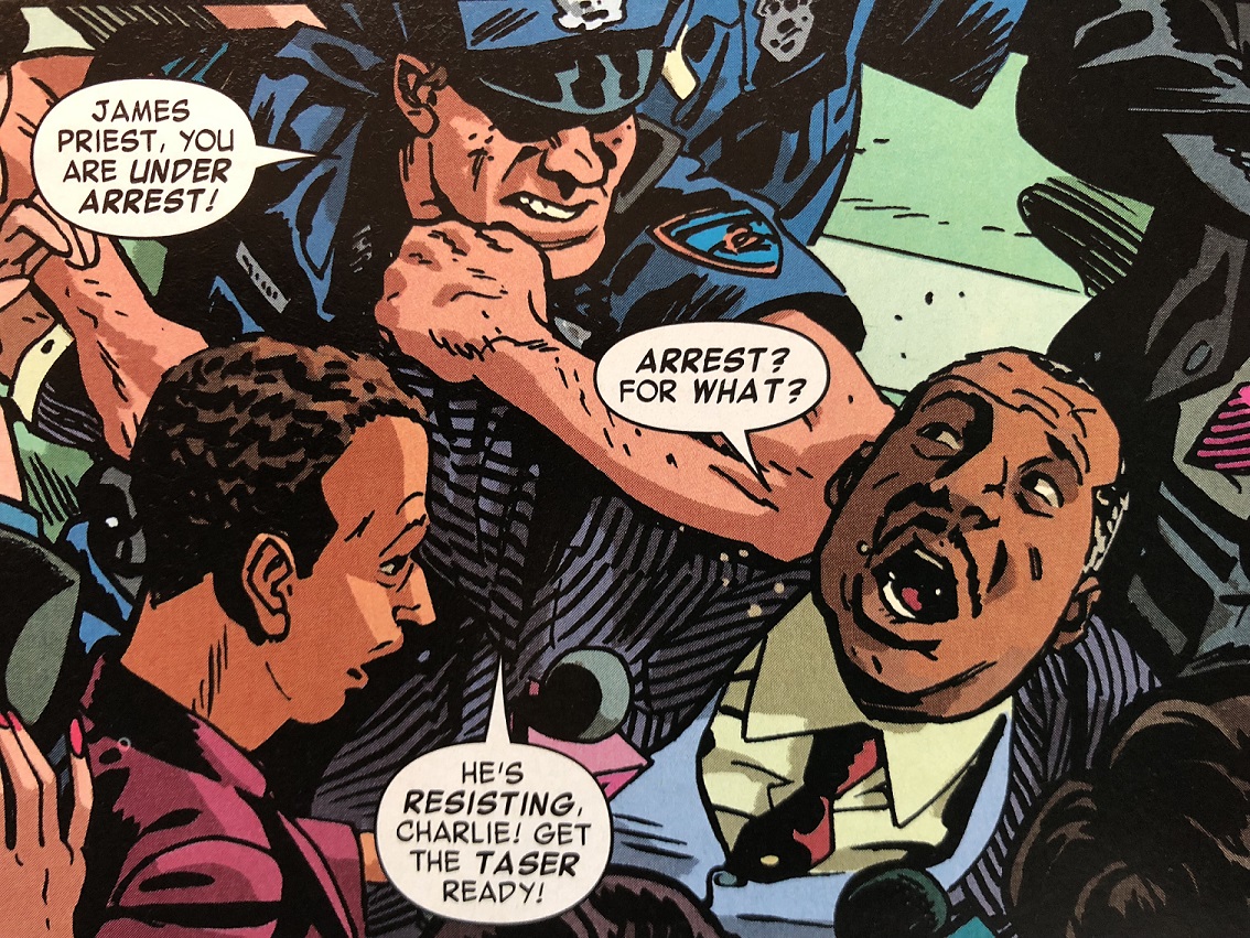
The details serve only as a preamble to the Sons of the Serpent inserting false footage into the Black D.A.’s post-acquittal press conference, revealing the jury’s names and addresses and instructing viewers to attack them. Waid names the DA “James Priest” (possibly an allusion to Christopher Priest, one of the first Black writers and editors at Marvel in the late 70s and early 80s) and describes him as “more powerful than Al Sharpton and Cornel West combined,” making his (apparent) call to “show these repugnant cowards what justice is all about” a reflection on real-world Black activists — or at least the power they were perceived to hold.

Previous Sons of the Serpents episodes turned on a similar trope, casting a nonwhite character as a primary villain, but in this case it’s revealed that the DA had nothing to do with the doxing. Waid and Samnee also depict white police officers assaulting the DA.
Riots follow, “stoked by Serpent agitators planted city-wide.” Again, as with every previous Sons of the Serpent episode (in 1966, 1970, 1975, 1991, and 1994) Marvel is most concerned not with white supremacist violence but with the threat of violent Black protests. Waid reprises that narrative theme in the context of the early Black Lives Matter movement, which emerged in the immediate wake of the Zimmerman acquittal. Though Waid’s Daredevil narrates, “I can’t tell if I just saved a responder or a protestor,” Samnee depicts a white and open-handed officer narrowly escaping a trashcan thrown by a Black figure. The same page includes a white protestor throwing a Molotov cocktail, as well as a close-up of the open fangs of two police dogs.
Daredevil narrated prior to the verdict: “I am very protective of the jury system in this country. It’s far from perfect, but it gives citizens a voice in how justice is achieved, and that voice is generally reasonable and trustworthy. And then there are days like these.” Though Daredevil is depicted as heroically opposing the white supremacists controlling the legal system, his and so the authorial critique never extends to the system itself.

A #32-33 side plot into rural Kentucky both reaffirms the Sons of the Serpent’s KKK identity and also retcons a pre-KKK history. Samne’s costume design for the leader includes a pointed hood, and historical images of lynchings include glowing snake poles instead of burning crosses. Though the organization’s 1966 appearance had been its first appearance within the Marvel storyworld, Waid now establishes that the group is a secret society with a “200-year history.” Though Waid’s Daredevil insists “there’s nothing magical about bigotry and hate,” the retconned occult organization originally worshipped the biblical serpent, with “men of power and entitlement committing unholy acts of violence and cruelty” on “a million innocents.” Merging time periods, Samnee draws an anachronistically blonde man in a toga whipping a dark-skinned man, who, despite the Greek architecture in the background, is tied to what appears to be a wooden mast. The horrors of American slavery turn out not to be American at all.

Now, as Daredevil recaps in #34, “Instead of parading through the streets in hoods and robes … … they’ve gone undercover.” Javier Rodriguez, who returned as penciller on the same issue, draws a dozen white men removing their Sons costumes, throwing them into a bonfire, and redressing as businessmen, firefighters, and police officers, before dispersing into New York streets.

To battle the Sons’ current influence, Daredevil and a colleague hijack New York’s airwaves to reveal that the city has been receiving disinformation designed to destabilize it (an allusion to two previous Sons of the Serpent plots). Waid’s Daredevil scripts an anti-rage speech:
“Let that be our job. To shoulder that rage. Because if we as New Yorkers are going to take our home back from a band of manipulative bigots, we have to rise above our anger. […] They tell us our enemies are the immigrants down the street. Or the food stamp family next door. They encourage us to turn our fear into rage …”
The referent of “we” and “us” seems to be white New Yorkers, or at least non-immigrant ones and ones not in families receiving government food assistance. That changes:
“Pay close attention to your colleagues and peers. Ask yourselves which ones are constantly telling you exactly what you want to hear about your problems — — that it’s the blacks or the wingnuts or the one percent or the have-nots out to get you — — and then decide if that anger serves them more than it serves you. The “friends” and “comrades” who make you feel like a victim? Those people. They’re the enemy.”
While animosity toward “the blacks” has no white counterpoint in the speech (“wingnuts” presumably refers to any set of seemingly crazy people), the “one percent” and the “have-nots” are oppositional economic positions, and while “friends” is neutral, “comrades” connotes leftists. Though white supremacy could attract both white working-class members and white millionaires, nothing in Waid’s portrayal suggests the organization has leftist leanings. All of these varied viewpoints are dangerous because they leave “you” vulnerable to manipulation. Waid warns against, not white supremacy specifically, but political division generally.

After he is blackmailed into defending a leader’s son, Murdock declares under oath that he is Daredevil to reveal that the two judges are vying for leadership of the white supremacist organization, causing a platoon of armed and costumed Sons to storm the courtroom in #36, the series finale. Daredevil is victorious by forcing the Sons of the Serpent into the open.
The series also forces into the open how little Marvel changed since the late 60s and early 70s when fear of Black political movements spurred the creation of the original Sons of the Serpent stories, reprising them in response to later racial conflicts, including both the Rodney King and Trayvon Martin court cases.

January 22, 2024
The Comics Form: A Review of My Reviews
First, an enormous thank you to the reviewers of The Comics Form: Richard Reynolds, Maaheen Ahmed, Lukas R.A. Wilde, Shawn Gilmore, and Sam Cowling; and to the comics journals that published them: Journal of Graphic Novels and Comics, Image [&] Narrative, Closure, INKS, and ImageText (forthcoming).
Being reviewed is no small academic accomplishment, and a reviewer’s careful study is a kindness. All of the reviews were in response to the hardback edition of The Comics Form published in 2022. Despite the institutional pricing, Bloomsbury sold enough copies to warrant a less expensive paperback edition, available beginning this week. I’m taking this as a moment to review my reviews, looking for shared points and possible consensus.
First, a disclaimer: Comics studies is a fairly small room. I know and like all five reviewers. But since they were writing professionally, I’ll refer to them by their last names (and with an implicit wave hello).
Also, forgive me for beginning with the praise.
Cowling writes:
“This is the best scholarly book yet written on the formal structure of comics and mandatory reading for scholars within comics studies.”
Reynolds:
“It feels as if a new phase in the formal analysis of our art form may have arrived … a sign of comics scholarship and comics studies arriving at a new level of maturity – which is a good reason to celebrate the publication of this book.”
Ahmed:
“Chris Gavaler’s The Comics Form therefore offers a welcome and original addition to the still relatively limited reflections on the visual elements of comics. […] The Comics Form is an interesting and important work …”
Wilde gives the most concise praise:
“The bar has been raised, without question.”
And Gilmore introduces some skepticism:
“The Comics Form attempts to rigorously systematize the relationships between sequenced images that exist with its definition of form. Some scholars may find distinctions here that, when applied to particular comics, help explain interesting formal and aesthetic aspects.”
Happily, all agree on the book’s primary goal, and nearly all agree on its accomplishing it. A majority also agree that, in addition to its detailed formal analysis, The Comics Form offers something of further value, its theoretical scope.
Reynolds:
“As a researcher and writer, Gavaler’s greatest strength lies in his tenacity in probing and analysing the complex tissue of existing scholarship, and this new book emerges initially as a summary and a roadmap to this sometimes confusing field of enquiry.”
Cowling:
“Alongside the theoretical toolbox Gavaler carefully assembles over seven chapters, this book accomplishes something of evident disciplinary importance: it places extant research on the comics form (e.g., regarding layout, style, and closure) in productive dialogue. Too often, formal theories of comics engage one another in glancing, anecdotal, or unproductive ways. Throughout The Comics Form, Gavaler articulates and usefully criticizes competing approaches, marking points of theoretical agreement and disagreement. So, while the novel proposals advanced in The Comics Form are substantial and capably defended, this book is no less notable for its successful critique of methodologically disparate work on the comics form by a broad range of scholars.”
Wilde:
“Chris Gavaler now presents what is probably the broadest survey of the last two decades of comic theory, in an almost obsessive quest for ever more precise ways of distinguishing and describing the narrative functions and interrelations of sequential images. […] What makes this sweeping tour as impressive as authoritative [is] the sheer number of comic-theoretical reference texts that Gavaler subjects to critical and detailed scrutiny, especially recent work from the last five years […] Rarely does one see so many threads brought together in original ways. Even authors whose works come from quite heterogeneous directions – Neil Cohn’s cognitive psychology (2013), for instance, Hannah Miodrag’s linguistic works (2013), or Barbara Postema’s semiotic orientation (2013) – are translated benevolently but rigorously into and against each other to expose ever more subtle differences which actually do make a difference! […] hardly any comic-theoretical discussion of the last decades is left out … to which the most relevant problems, classifications, and differentiations are not just concisely reflected but often also substantially expanded.”
Ahmed doesn’t evaluate the scope but does name four comics scholars (Groensteen, McCloud, Cohn, Eco) and four disciplinary theories (visual, linguistic, cognitive science, literary) discussed, adding:
“While the typological inclinations of the analytical framework can sometimes seem overwhelming, every aspect is carefully explained and often grounded in theories stemming from comics as well as other disciplines.”
Only Gilmore seemed displeased:
“Gavaler then begins itemizing the work of various scholars, citing García, Groensteen, Earle, Hatfield, Cohn, Beaty, and Hague on the first page alone, in a litany of definitional quotations, previewing the book’s approach to comics studies. Throughout, scholars and their arguments almost always appear without introduction, typically without first names or textual references to their works, which makes for a mélange of disembodied snippets, including when Gavaler assembles eighteen key definitions of comics, ranging from Waugh (1947) to Duncan and Smith (2015).”
To be fair, Cowling also called that list a “litany,” though with a positive connotation:
“Gavaler’s search for and subsequent defense of his preferred starting point is conspicuously democratic: he assembles a litany of proposed definitions of comics and notes that, if anything has claim to being the orthodox view of comics, it is that they are images in sequence. As he puts it “Sequenced images is the most common denominator of comics definitions” (2). In contrast to approaches that might hinge upon some putatively a priori principle of comics as the foundation from which to build, Gavaler’s strategy actively seeks out the limited common ground among theories of comics. There’s a laudable humility to this methodology. This ecumenical stance also ensures that the specific theses Gavaler defends in the book are of direct relevance to most approaches for understanding comics. Gavaler relies upon the same democratic approach at other points in the book as well—e.g., when carefully navigating views regarding the nature of sequences. The result is a book-length antidote to worries about the fragmentary character of theorizing about comics and the paucity of productive engagement between competing or even complementary formal investigations into comics.”
Four of the reviewers also praise the scope of examples.
Reynolds:
“Furthermore, the book also engages with a refreshingly wide range of cultural references, within and beyond comics and graphic novels.”
Wilde:
“What must be conceded with special appreciation for all of Gavaler‘s obsession with detail, the book remains virtually jargon-free and is interested in actual issues – in narrative differences – which he vividly discusses through many hundreds of current examples.”
Ahmed:
“The explanations are complemented with examples of comics and images stemming from a wide range of image-making techniques and contexts.”
Cowling praises the nature of the scope in detail:
“Crucially, Gavaler resists any view that requires images to be drawn. This is obvious enough from Gavaler’s use of photographic images throughout the book, but it should be noted that this verdict is also a direct consequence of his view of formal analysis. If the comics form is to be distinguished solely by reference to intrinsic features—roughly, those properties a thing has independently of anything else—then we cannot invoke a range of familiar and perhaps intuitively intimate properties of comics. […] The moral here is an interesting one about method: if we are concerned with the comics form rather than the comics medium and contend that the comics form is a purely intrinsic matter, certain familiar features of comics like those regarding production will soon fall outside of the scope of our analyses and definitions.”
Only Gilmore implies that the approach and resulting range is a flaw:
“The Comics Form works by establishing congruent aesthetic elements that appear in any combination of ‘sequenced images.’ This means that the specific examples presented throughout the book are mostly secondary to the configuration of formal categories and subcategories. […] This typology is primarily explained not by specific examples from comics themselves, but by pointing to examples from Jackson Pollock, Andy Warhol, and Tom Phillips, followed by an illustration of Gavaler’s own making …”
Gilmore also refers twice to the book’s “narrow scope” and “very narrow focus,” which, despite seeming to contradict the other assessments, may reveal a point of agreement.
Wilde writes:
“Chris Gavaler’s project at first seems almost modest or overambitious – depending on your point of view: it is about nothing more and nothing less than a purely formal description of comics and its resulting necessary (but also typical) means of representation. […] Thus the book may also conclude with a somewhat less than modest mic drop in the last sentence: ‘These are the qualities of sequenced images, which together explain the comics form’ (TCF, 210).”
The outlier also devotes half of their review to the introduction, which sets up the book’s formal approach in relation to other possible approaches. The others mention the introduction only briefly and positively.
Reynolds:
“a substantial ‘Introduction’ that contextualises his work within the history of the medium and existing definitions of the comics form”
Cowling:
“An introductory chapter places Gavaler’s project in relation to various approaches for analyzing the comics medium.”
Ahmed:
“The book opens with a highly useful contextualization of comics definitions across the past decades of comics scholarship. The overlapping definitions are mapped across the parameters of publishing history, style, conventions and the form of comics (3). Acknowledging that there can be no single definition to comics, Gavaler works with sequenced images as ‘the most common denominator of comics definitions’ (2).”
Wilde:
“From an initially unsurprising definition, namely sequential imagery (“both the most repeated and the least contested features in comics definitions,” TCF, 9), his introductory chapter derives a transmedially connectable and media- or form-specific understanding of discourse vs. diegesis.”
Ultimately, the dissenting review may object not to the book per se, but to formal analysis in general, preferring other areas of comics studies:
“But separating form from context, history, aesthetics, and narrative does just that, leaving this notion of comics form quite apart from much of comics studies.”
I’ll therefore close by suggesting a caveat to the first sentence cited above:
The Comics Form may be “mandatory reading for scholars within comics studies” who are interested in formal analysis.
The paperback is available January 25:

Chris Gavaler's Blog

- Chris Gavaler's profile
- 3 followers

