
Rated YA-MA discussion
Book Chat
>
Book Covers - The Good, The Bad and The WTF?
message 951:
by
Stacia (the 2010 club), groupaholic, YA-MA founder
(last edited Jul 10, 2013 06:26PM)
(new)
Jul 10, 2013 05:46PM
 *edit* I was mistaken.
reply
|
flag
 So I should read the second book first, and then read Roar and Liv?
message 953:
by
Stacia (the 2010 club), groupaholic, YA-MA founder
(last edited Jul 10, 2013 06:27PM)
(new)
Actually, cancel what I said in the last post. I just went and looked back at my review for Roar and Liv and I must have remembered it wrong. I noted that the best way would be to read book 1, then the prequel, then book 2.
Ok, Thats the way I shall do it then :)

 I haven't read either
 or
or
 yet. I voted for this as most anticipated book but a lot of books meddled in the way, as it happened with DoBaS.
That doesn't happen when you get started with completed series!
YEP! hahaha. I think we need to start utlizing our iPhone calendars, lol. Scheduling in these puppies.
Book 2 of the Guards of the Shadowlands series. What is that building on the cover? It has to be somewhere in the Shadowlands I'd guess but I wonder what.
 Any of you into the Lux Series? Been a huge discussion on another board I'm on about the cover of the 4th book - and I wondered what you guys thought. Here's 1,2,3, and .05


And here is the cover for #4:

Personally I love it but some didn't.
Eh, that's not what Daemon looks like in my head so I wouldn't love it anyways, but I don't hate it. In an ideal world they wouldn't show the faces of any of the characters on the cover so we could make them up, but out of all of them I liked Onyx the best. Honestly I don't care what the cover looks like, I can't wait to read it!
I'm anxious to read it to Kira. I have it pre-ordered, lol!
 I agree about liking the cover of Onyx best. I don't hate the other covers, it just isn't what I imagine Daemon or Katy would look like. I know the same male model has been used for all the covers, and quite a few others books as well. I remember Stacia talking about that some months ago.
Daemon looks pretty intense on the new cover. I think I like it.
Amanda wrote: "Daemon looks pretty intense on the new cover. I think I like it."
I agree about liking the cover of Onyx best. I don't hate the other covers, it just isn't what I imagine Daemon or Katy would look like. I know the same male model has been used for all the covers, and quite a few others books as well. I remember Stacia talking about that some months ago.
Daemon looks pretty intense on the new cover. I think I like it.
Amanda wrote: "Daemon looks pretty intense on the new cover. I think I like it."I soooooooooooooo agree! LOL.
Amanda wrote: "I agree about liking the cover of Onyx best. I don't hate the other covers, it just isn't what I imagine Daemon or Katy would look like. I know the same male model has been used for all the covers,..."Seems like Onyx is winning so far - i love it too, lol. Sorry if I'm re-hashing a topic already discussed. Daemon is major eye candy tho!
 I don't really like any of those covers, but that last one looks like a terribad photoshop job.
 Jenny wrote: "I don't really like any of those covers, but that last one looks like a terribad photoshop job."
Indeed.
 And it's so cheesy with his open shirt and determined stride.
It looks like a ripoff of
That's so funny because I didn't know what series it was and thought it was the Never Sky series. It is absolutely a knockoff of that cover.
And it's so cheesy with his open shirt and determined stride.
It looks like a ripoff of
That's so funny because I didn't know what series it was and thought it was the Never Sky series. It is absolutely a knockoff of that cover.
 I don't care for that cover, because...why is he wearing a jacket without a shirt!? It's weird.
I wondered what you guys would think of it! I like it but only cuz i like to look at Daemon, other than that I completely agree with you guys. And you are so right about the rip off, I never read the other series so I wouldn't have known about that cover.
I don't care for that cover, because...why is he wearing a jacket without a shirt!? It's weird.
I wondered what you guys would think of it! I like it but only cuz i like to look at Daemon, other than that I completely agree with you guys. And you are so right about the rip off, I never read the other series so I wouldn't have known about that cover. I love the actual books tho.
Angie wrote: "I don't care for that cover, because...why is he wearing a jacket without a shirt!? It's weird."
Bahahaha.... too right. Daemon goes shirtless a lot but he's never cold, so the jacket is totally weird.
Bahahaha.... too right. Daemon goes shirtless a lot but he's never cold, so the jacket is totally weird.
Just started reading Frigid and noticed a pattern in Jennifer Armentrout's covers. Maybe she got a two-for-one deal on the shirtless guy with the jacket?


 Hahahaha!! Nice find Kira!
The only covers I like of hers are the Covenant covers.
Well no wonder it's Frigid. That happens when you go without clothes in a freaking snowstorm. I'm sure his nipples are probably rock hard.
Is it terrible that I do not want to read that book and at the same time my brain went "WINTER!" for the challenge, lmao.
Wendy F wrote: "Is it terrible that I do not want to read that book and at the same time my brain went "WINTER!" for the challenge, lmao."I heard from several friends that it's excellent - and no that's not terrible! LOL
Why do they do this? I hate it when they use the exact same cover shot for 2 completely different books. It really makes me mad. :-(
 I just peeked at the picture and instantly was reminded of J. Armentrout's Flux series covers. And bingo! It's hers. It must be intentional, I know. Definitely I'm not a fan of these all 'pretty much the same' covers, sorry.
I was wondering, what cover do you prefer for Shadows? The Aussie original?

Or the new one?
 So do I. I find it rather less... pretentious? Besides it intrigues me more the hooded winged boy.
I'm half and half. The original cover is what I associate with the series and the newer cover looks too similar to some of the other angel series, but I also think the newer cover will get new people to read the books. A lot of people I know passed the original cover by, not really thinking much of it.
So do I. I find it rather less... pretentious? Besides it intrigues me more the hooded winged boy.
I'm half and half. The original cover is what I associate with the series and the newer cover looks too similar to some of the other angel series, but I also think the newer cover will get new people to read the books. A lot of people I know passed the original cover by, not really thinking much of it.Becky, there are copyright laws in place, making it so there aren't many pictures in the public domain that people can use for their book covers when they self-publish, so a lot of authors turn to stock photos. There's no way for self-pub authors to know which pictures have been used before. If you write contemporaries and a pic has been used for paranormal books before, you might not be aware of the fact.
Not everyone has a steady GR stream of books going by them daily. :)
When I purchased stock photos for my own use, I noticed many photos that had been used on covers before. I hadn't seen mine used yet but there's no way to guarantee that someone won't come along after me and choose those pics and there won't be anything that I can do about it.
Stacia - thanks for that info! I learn so much here. It still makes me sad tho.
 You can buy exclusive usage for stock photos (completely exclusive or exclusive in your industry) but it's expensive. Not sure that many emerging authors could afford that.
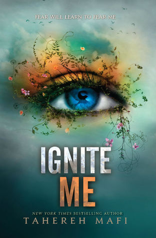
Shatter Me #3 has a cover and a title and I think it rocks! I wasn't sure how they would follow up that cool winter eye, but I really like this one.
Also, can anyone tell me the ideal dimensions to make a cover big? I was just guessing and I can't tell if it's distorting it or not.
Also, can anyone tell me the ideal dimensions to make a cover big? I was just guessing and I can't tell if it's distorting it or not.
message 992:
by
Stacia (the 2010 club), groupaholic, YA-MA founder
(last edited Aug 12, 2013 11:58AM)
(new)
If you just copy the image from the GR cover page and paste it into the img src= code, it should give you a decent size most of the time. You don't actually need to set the dimensions and don't need to use them to make the code work.
 For me these ones suck!! They are awful.


 I used to have a list of running WTF covers about a year ago but ended up deleting it when I switched computers.
I love Brigid Kemmerer's books so much that I think she deserves better covers than this.
I used to have a list of running WTF covers about a year ago but ended up deleting it when I switched computers.
I love Brigid Kemmerer's books so much that I think she deserves better covers than this. 
Although, any news about upcoming books makes me excited for the next book!
Just when you thought her book covers couldn't possibly become worse...THEY DO. /sighNow we have new guys too? /sigh
Hillary wrote: "Just when you thought her book covers couldn't possibly become worse...THEY DO. /sighLMAO! They have outdone themselves !
It's horribly staged looking. I think I actually like the past design more than this, which isn't saying much.

Rated YA-MA
Books mentioned in this topic
Feuerhimmel, Sternennacht (other topics)Of Fire and Stars (other topics)
The Wrath and the Dawn (other topics)
Ink and Bone (other topics)
Paper and Fire (other topics)
More...
Authors mentioned in this topic
Cinda Williams Chima (other topics)Cinda Williams Chima (other topics)
