J. Mark Bertrand's Blog, page 4
January 24, 2012
To Novelists: "Spread Yourself."
Here's some writing advice from John Le Carre -- from one of his characters, anyway. The editor Mencken in The Honourable Schoolboy, giving some parting wisdom to Jerry Westerby before the latter embarks on his trip to Hong Kong. His ostensible reason for going is journalism. His true reason is to spy. But there's some hope he'll make progress on the novel he's supposed to be writing, hence the advice:
"Mind my saying something?" Mencken repeated. "Longer sentences. Moment you journalist chappies turn your hand to novels, you write too short. Short paragraphs, short sentences, short chapters. You see the stuff in column inches, 'stead of across the page. Hemingway was just the same. Always trying to write novels on the back of a matchbox. Spread yourself, my view."
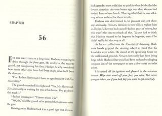
Le Carre wrote that about thirty years ago. Reading it now, when novels read like screenplays and movies have become a compilation of video game cut screens, even journalistic brevity probably strikes us as verbose. I can't help feeling nostalgic for a time when the problem with newspapers was that they were too succinct rather than too wordy.
Which is probably why this post at Criminal Element about "Patterson Syndrome" cracked me up: What's Killing John Doe: Patterson Syndrome and Summaries. When I flip through a book and find a page spread like the one pictured above, back on the shelf it goes.
I don't have time for such a fast read.
October 28, 2011
Roland March Audiobooks!
This week I received word that Brilliance Audio will be producing audiobook editions of the first two Roland March novels. That means you'll be able to listen to Back on Murder and Pattern of Wounds. The ink is still wet on the contract, meaning I have no idea when they'll release, but I'm pretty excited.
And scared to death. Since the stories are told in first person with Roland March narrating, whoever reads these books becomes the voice of March.
When I read from the books myself, alone or in public, there's always a nagging reservation. My voice isn't March's, not at all, and I have no gift for pretending otherwise. I like the way I read, but nobody's going to mistake me for a hardboiled Houston cop. I'm just an author reading a story. I don't become the character.
A good narrator really bonds with the character. Whenever I think of James Lee Burke's Dave Robicheaux, it's Will Patton's voice I hear in my head. Robert Hardy's narration on Patrick O'Brian's Aubrey/Maturin books made them a pleasure to experience (not to mention rendering the ones Hardy didn't narrate impossible to love).
So I'm waiting with bated breath and fingers crossed to see how the March novels turn out. I know one thing: it's going to be crazy listening to them for the first time.
October 27, 2011
First Look at Nothing to Hide
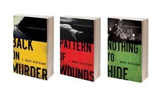
The word is out, so I've decided to share a little bit about the third Roland March novel, Nothing to Hide, which is coming out in July 2012. This installment takes March into the twilight world of the paranoid conspiracy thriller. It also reveals his "origin story." But the question on a lot of minds is, what color is the cover? Back on Murder was yellow, Pattern of Wounds was red, so if you know anything about the traffic laws, you probably won't be too surprised by this:
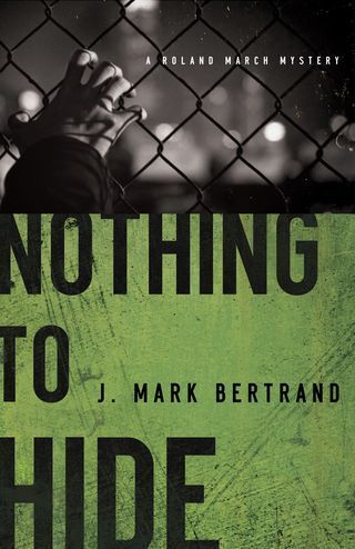
Can I confess what may seem like a superficial trait? I love "sets" of books. If you toured my shelves, you'd see that some of us do judge books by their covers. Books by the same author should look like they go together. These do, which fulfills my little fantasy nicely:
 Here's the back cover copy on Nothing to Hide:
Publishers Weekly calls J. Mark Bertrand's writing "gritty and chilling." He returns once more to the streets of Houston for another twisting mystery featuring Detective Roland March. This time, a new case is launched by the discovery of a headless corpse ... only the investigation quickly becomes complicated when a blood sample analysis brings a phone call from the FBI.
The body was an undercover agent working to bring down Mexican drug cartels. The feds want the case closed rather than risk exposing other agents in the field, but March can't abide letting a murder go unsolved. And he doesn't have to dig long to figure out something isn't right. Someone is covering something up, and it seems that everyone has something to hide. Maybe even March, as the case soon intersects, unexpectedly, with the murder that led him to become a homicide cop, all those years ago.
The bare bones listing at Amazon is up, which means Nothing to Hide is available for pre-order. I'll be sharing plenty more about the book in the months ahead.
October 21, 2011
Hot Off the Presses
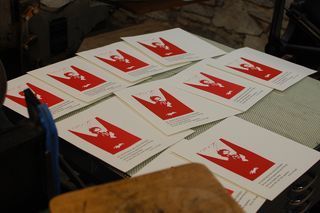
The broadsides are done!
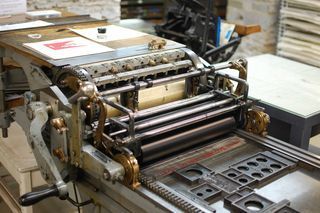
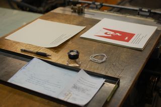
After last week's printing session, I had printed my linocuts and run a few trial prints with the type underneath. The registration was fine, but I had a problem with slurry -- little ink lines dragging across the paper. There's a huge amount of trial and error involved in getting a print perfect, and I'm not always a patient man. This week, I locked up the type vertically to eliminate the slurry, then struggled to get the type aligned correctly. The Vandercook I was working on had a few issues.
Sometimes the text came out with a forty-five degree tilt, sometimes it came out level with the artwork. The simplest fix was to run the paper through at a slight angle, which meant attaching it to the grippers atop the cylinder all askew. Getting a consistent skew was the challenge!
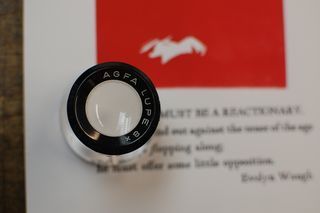
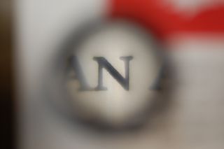
Once the text was on the page, it was time to pull out the loupe. I used quite a bit of packing (paper underneath the page to be printed, intended to raise the height and improve the lead type's contact), which made for a deep impression, and some fuzziness around the debossed letters.
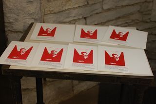
The type was 18 pt. Goudy Modern. Combined with the traditional red-and-black coloring, this lends the broadsides an old school charm. Although the paper size is 10" x 10.5", and the intention is to trim that extra half inch to create perfect squares, you can see I've aligned everything on the lefthand size of the page. Once the classroom broadside exchange is done, I'm going to slice the sides off of the prints that remain, giving me a nice long-and-thin broadside.
So that's the project. I hope you've enjoyed following along. No doubt this will be the first of many letterpress endeavors. My next class will be an introduction to platen presses.
October 19, 2011
Normal Author, Crazy Author
A normal author, when he's revising a novel, will print out a proof copy. It's a simple stack of 8.5" x 11" paper. If he's fancy, he'll slap a mock-up of the cover art up front. Like so:
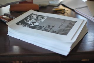
The Devil of Matamoros was my working title for the third March novel, which will actually be called Nothing to Hide. You get the idea, though.
A crazy writer can't stop there. He typesets the entire manuscript, formats it in printer's spreads, then prints the book out in eleven 32-page signatures. With linen thread and a needle, he stitches these together. Like so:
[image error]
This is a trial run laser-printed on 24 lb. copy paper. Since it was 8.5" x 11" to begin with, these signatures are folded against the grain of the paper, which is why they curl up a bit. Next time around, I'll cut down some nice Mohawk Superfine 11" x 17" sheets, which will give me letter sized paper with long grain instead of short.
Still, it's a text block. And it's really cool to flip through:
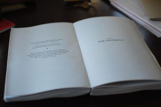
The next step for the crazy author is to make a cover and bind it. My revisions are close to done. Once they're finished, I'll make an updated reference copy. Maybe I'll go back and create a matched set of the March books, entirely written, printed, and bound by the author.
Or maybe that would be too crazy even for me. We'll see.
October 11, 2011
Setting the Type
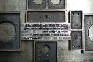
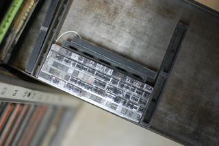
Time for a letterpress update. As I mentinoed before, the project I'm working on is a broadside -- essentially a big piece of paper with some artwork and a few lines of text, the sort of thing you might frame and put on the wall. The text I've chosen is a quote from Evelyn Waugh's Paris Review interview. Click the photo below to enlarge, then see if you can figure out what it says:
The type above is wrapped in string and sitting on a galley, which is a long, thin metal tray. It was set upside down, left to right, but you're getting to see it right side up, right to left. If that sentence confuses you, don't worry: you're normal. If it doesn't, you should be setting lead type.
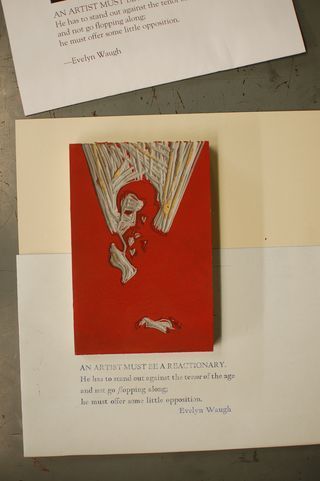
Fortunately, there's a proof press that leaves an impression of the text on carbon paper for examination. In the photo below, I've placed the lino block on top of the proof to approximate the appearance of the finished broadside. Each one will be printed on white Crane's Lettra paper, which I cut down to size (10" x 10.25") on a special cutter. Now can you read the text?
It reads: "An artist must be a reactionary. He has to stand out against the tenor of the age and not go flopping along; he must offer some little opposition." I could write a whole book unpacking that statement. But instead, I'm making a broadside. The book would probably take less time!
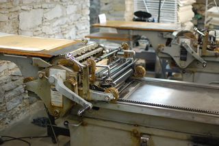
The next step is to ink up the press below, lock up the lino block, and run some prints to get the registration. Since the artwork will be printed in an ink called Dutch Fireball (Pantone 185) and the text in black, the sheets will have to go through twice. The trick is to line the two impressions up so that the artwork and text are in proper relation.
In other words, the fun is just about to begin. I'll share again once more progress has been made.
October 10, 2011
The Straight Truth
Writing fiction and telling the truth ... it doesn't seem like the two go together. But as I've insisted elsewhere, they really do. As a crime writer, I see my job in the simplest of terms. It's all about getting to the truth. To explain what I mean, I wrote a guest post for Mike Mikalatos today. (Mike is the author of Imaginary Jesus and Night of the Living Dead Christian. If you don't know his work already, you should definitely check him out.)
In the post, I explain how a certain part of Back on Murder addresses a certain challenge faced by writers like me who have, shall we say, a theological vision. I'd appreciate it if you'd click through and let me know what you think:
"The Straight Truth" at Burning Hearts Revolution
October 4, 2011
The Linocut
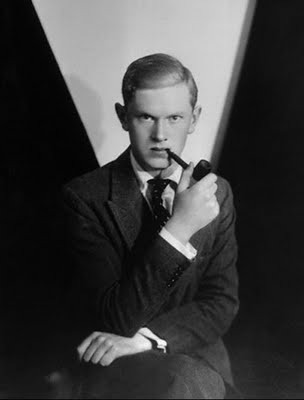
I'm creating a broadside for my letterpress class, which will consist of a quoatation set in lead type and a linocut illustration. The quote is from Evelyn Waugh's Paris Review interview, so I figured a portrait of the man himself would not go amiss. For inspiration, I settled on this:
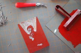
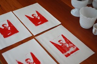
To make the linocut, I created a line art version of the image in Adobe Illustrator, which I then transferred to the linoleum block via tracing paper and graphite paper. Once I'd touched up the lines, I started cutting. Then I inked the block and made some prints:
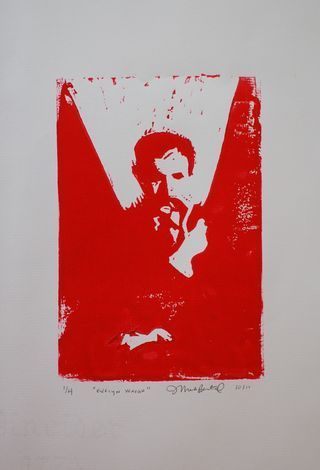
I used some sheets of Pineider 1774 paper (though I should have paid more attention to where the watermarks were positioned). The resulting image is much rougher than the photograph. It's Evelyn Waugh meets Charles Baudelaire, or possibly Francis Bacon. I quite like the result. It will go well with the sentiment expressed in the quote. When it's all done, I'll post a finished photo. For now, here's one of the prints up close:
October 3, 2011
Craftsmanship
For a couple of weeks now, I've been taking a letterpress class at the Minnesota Center for Book Arts. It's the introductory course, which means we're setting lead type, creating linocuts, and printing broadsheets on a Vandercook proof press. Last time, I spent three hours doing by hand something I could do much better on the computer in about ten seconds. Cool, huh?
As a matter of fact, it is. I'm not sure how many teenagers in the 1980s could list "typographer" as their first summer job, but that was me. In the days before the desktop revolution, I learned on what was still called a Linotype machine, although it had a tiny green display screen, a WYSIWIG monitor you could send code to for display, and a printer that used photography chemicals I had to mix myself. It cost $50,000 used, I was told. In the early 90s, I saw the same machine shrink-wrapped on a pallet in a warehouse. They couldn't even give it away.
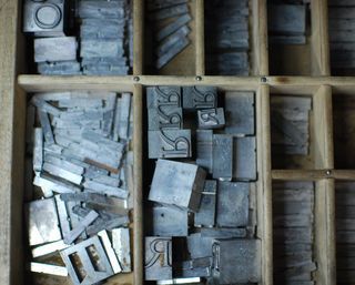
By comparison, letterpress printing is a lot of fun. I started out by setting a line in 72 pt. Caslon. It turns out a case full of 72 pt. lead type weighs as much as, well, a big wooden tray filled with blocks of lead. Before long, I decided I liked 18 pt. Goudy Modern a lot more. The trick for composing is to work left to right, but upside down (remember, the type is arranged as the reverse image of what you want to see on the page). Suddenly phrases like "mind your p's and q's" (or for that matter, your d's and b's) aren't abstractions anymore. I discovered twice what it means to be, quite literally, "out of sorts" -- i.e., without enough of a particular lead character (a "sort") to finish your layout. And of course, I spaced my lines using thin sheets of lead: hence, "leading."
As a bibliophile, while I'm doing all this, I find myself thinking about the private press movement, an early twentieth century phenomenon in which some Arts & Crafts movers and shakers got their hands on printing presses and starting making lots of pretty and meaningful books. The desktop printing revolution kind of sparked similar things, and I suppose you could argue digital printing (and now e-printing) are having a similar effect -- the only difference being the pretty, well-made part of the equation. What I'm longing for as I go through the motions of an earlier kind of craftsmanship is an applicable craft sense for today, a means for not just of doing things cheaply, but doing them well.
September 29, 2011
A Study of Human Nature
A few passages in recent Amazon reviews of the March novels jumped out at me. First, here's one from a reader with law enforcement experience writing about Back on Murder:
It's seldom that I read a cop story that gives me goose bumps, but this one did. His description of a fight in the front seat of a car had me wanting to go for my off duty piece. The gunfight scene had me wanting to duck .... The narrative follows the detective's thought processes and does it very accurately .... If you've done police work you'll recognize your own patterns, if you never have, you'll gain insight into what it's like to be facing the crisis as well and the mundane and all of it filtered through department politics and personal, especially relationship, issues.
Read the rest here.
And this is a recent review of Pattern of Wounds which warms the heart of a Balzac-lover like myself:
Bertrand's characters are a microcosm of the world; the religious, the wicked, the observers, the reactors, the engaged and the disengaged, the political, and the humble. As this story unfolds these people appear as actors on the stage, and in them we see the people we know around us .... More than a mystery novel, Pattern of Wounds is a study of human nature. Read it and see how you find your own identity.
Read the rest here.

