Victoria Sadler's Blog, page 3
May 27, 2016
Film Review: Alice Through the Looking Glass 'An Empty Spectacle'

Oh Lordy, that sinking feeling when a movie rips out the heart and soul of a much-loved story and scrapes it bare in the search for profit...
Given the unreal success of Tim Burton's Alice in Wonderland, it was inevitable, I suppose, that Disney would head straight to its sequel, Through the Looking Glass and What Alice Found There. But Alice Through the Looking Glass is a heartless adaptation. The poignancy of Lewis Carroll's moral lesson on how precious time is becomes lost in a CGI-fest that's all spectacle and no soul.
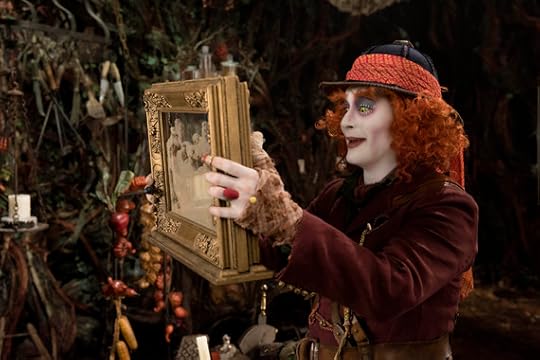
Set a few years after the first story, Alice (Mia Wasikowska) finds herself back in the mysterious, magical Wonderland - ostensibly to start time-travelling through the childhood lives of those characters we have already come to know so well, such as Helena Bonham Carter's and Anne Hathaway's feuding royal sisters - in order to save the wilting Mad Hatter (played once again by Johnny Depp).
But this story should be working on another level - that Alice must learn that time cannot be manipulated, that it is precious and valuable, and given that it is only temporary, we must celebrate and enjoy the time we have with those we love. It's a tender, touching lesson to learn. Only that poignancy is lost in a film that tries to be a rip-roaring pedal-to-the-metal action adventure from director James Bobin (Tim Burton choosing to produce instead) and ends up being actually quite dull.

HOWEVER.
That's not to say that this film is unendurable. It is saved by its stellar supporting cast. Helena Bonham Carter and Johnny Depp are as wildly wonderful and brilliant in their eccentricity as they were in the first film. (We'll just gloss over Anne Hathaway here.) And new joiner Sacha Baron Cohen is terrific as the personification of Time, bringing out as much wit and tendresse as he can from the lines he was given. And even though Andrew Scott is only in it for a brief moment, well, that guy can do anything...
But here's the thing. Even in those compliments, we're having to acknowledge yet another problem with the film - the supporting cast have to be good because the main character is such a vacant, hollow shell.
Mia Wasikowska gives it her feisty best as Alice but there's so little depth or complexity in the script from Linda Woolverton to work with. There's no doubt in Alice, everything she does she seems to get right first time - no matter how impossible the task. Not that the ferocious pace of the film allows any time for Alice to have moments of anxiety or failure, which would give us something to work with. When Alice isn't evading pirates in her storm-beaten ship, she's dodging the fire-breathing Jabberwocky. And when she isn't desperately trying to cling on for dear life to the moving hands of a giant clock, she's rushing to back to the origin of time with the missing piece that will stop the whole of time caving in on itself.
If only this film had taken its foot of the pedal a bit, had given Alice space to breathe, we would have had a far more engaging central character. And a far, far better film.
So, where does this leave us?
Well, ultimately the criticisms probably won't matter - such was the success of the first film that, no doubt, this will follow suit. And, to be fair, if it ain't broke, why fix it? Despite a change in director, the film still looks and feels much like Alice in Wonderland.
But there's always the hope of diminishing returns, that maybe a mix of a lower box office and the poor critical reception will get producers more willing to invest in the screenwriting as much as the visuals. In films generally, we're still on shaky ground with producers being willing to front films with female leads. Please let's not let them flounder in weak films. We don't just need female lead characters; we need these characters to be fully fleshed out and believable.
All images © 2016 Disney Enterprises, Inc. All Rights Reserved.
Published on May 27, 2016 03:36
May 19, 2016
Review: Jeff Koons, Newport Street Gallery 'Desperate, Tired'
It's probably no surprise that Damien Hirst owns a lot of works by Jeff Koons. After all, these two have common ground - they're both provocateurs, both divisive artists. And now, Damien has put his own collection of Jeff Koons works on display in his Newport Street Gallery, which opened last year.
Published on May 19, 2016 09:49
Review: Jeff Koons, Newport Street Gallery 'Desperate, Tired'

It's probably no surprise that Damien Hirst owns a lot of works by Jeff Koons. After all, these two have common ground - they're both provocateurs, both divisive artists. And now, Damien has put his own collection of Jeff Koons works on display in his Newport Street Gallery, which opened last year.
Over thirty works have been curated together (the show was jointly curated by Damien and Jeff) and they cover most of Jeff's career, from 1980 to the present day.
The familiar eye-catching pieces are there, including his brightly-coloured sculptures that look like balloons or inflatable toys for swimming pools (though these are, in fact, made from steel and aluminium). There's also the vacuum cleaners, vivid canvases of Lego pieces and plastic horses, a huge bowl of eggs, and his famous basketballs suspended in water.
But I'm always conflicted when looking at works from Jeff Koons - is this an artist reflecting back at us our own shallow culture and society, or is this just shallow art?

There is something admirable in the craftsmanship of some of his works, particularly the stainless steel pieces that look like balloons blown up to bursting point. Their surfaces seem so taught and shiny - you want to lean in and prick them with pins, as if you were to burst an actual balloon.
And there was a wry observation to Jeff's series of work on Nike posters from the 1980s. There is powerful social critique in these images of famous black American basketball players dressed in suits and ties and passed off as "The Boardroom" or "Secretary of Defense". Indeed, little has changed - the boardroom is still a white man's place.
But now, when you look at these posters which were made in 1985, all you feel is a sense of cultural appropriation - that Jeff Koons has made millions of dollars printing out these posters, the rights to which he bought from Nike. Is the artist now blind to his own privilege? Isn't this just the rich white man just getting richer off exploiting dangerously misleading advertising to black kids?

But, looking at these works, the desperation to shock feels almost palpable. And that stretches from Jeff's notorious Made in Heaven series, which basically is just rather narcissistic explicit pictures of him and his then-wife having sex, created in 1991, right up to the current day with Balloon Monkey (Blue), a giant stainless steel balloon animal that towers above you (it's only when you look down on it from the first floor that you realise this is, in fact, a giant inflatable penis). The artist may try to say his works are challenge notions of taste but, really, it's just trying way too hard.
And so you sigh, take a deep breath, and think, 'really? Is this all you've got to offer?' For none of this ever hits below the surface. And then you see the giant mound of Play-Doh that almost swallows up a whole gallery in the exhibition (again, aluminium) and you realise that even if Jeff did have something to say back in the 1980s, that all seems to have evaporated.
So, despite these tired attempts to shock and outrage, I actually left the gallery much as I went in. The days of this art being revolutionary, I think, are gone.
Burt what do you think? Admission to Newport Street Gallery is free and the Gallery has launched its Summer Lates opening hours to coincide with this exhibition (the Gallery will remain open until 10pm every Saturday) so why not go along and see how you feel , how you react to one of the art world's great provocateurs.
Newport Street Gallery, London to October 16, 2016
Admission Free
Image Credits:
1. Titi, 2004-2009 © Jeff Koons
2. Three Ball 50-50 Tank (Spalding Dr. JK Silver Series), 1985 © Jeff Koons
3. Bowl with Eggs (Pink), 1994-2009 © Jeff Koons
Published on May 19, 2016 02:37
May 6, 2016
Review: Mona Hatoum, Tate Modern
For those unfamiliar with the brilliant Mona Hatoum, she was born in Beirut to a Palestinian family before moving to the UK in 1975. This show at the Tate Modern is the first survey of her work in the UK. And, frankly, it couldn't be more timely.
Published on May 06, 2016 04:03
May 4, 2016
Review: Mona Hatoum, Tate Modern
It is one of the great feelings when a show that you've anticipated for so long turns out to be everything you had hoped for.
The new Mona Hatoum show at Tate Modern has pulled together around 100 of her works for this exhibition. And the range of media on display is impressive - from performance to video, sculpture and installation, and photography and works on paper also.
For those unfamiliar with the brilliant Mona Hatoum, she was born in Beirut to a Palestinian family before moving to the UK in 1975. This show at the Tate Modern is the first survey of her work in the UK. And, frankly, it couldn't be more timely.
Mona's works are intense and politically charged. They are infused with challenging, confrontational themes, including politics, violence and oppression. If this show will be the first time you see Mona's works, you will come away understanding why she is considered to be one of the most important artists working today.
Present Tense, 1996, is a great example of Mona's approach. Here, she uses blocks of olive oil soap a traditional Palestinian product from Nabulus, as the foundation for her map of the 1993 Oslo Peace Accord - the outlines created by pressing tiny red glass beads deep into the soap.
And there's Impenetrable, 2009. At first glance, this seems to be an homage to Jesus Rafael Soto's delicate and mesmerising Penetrable, which was made from thin nylon strands. Only on closer inspection, you see Mona's work is made, instead, from barbed wire. Still mesmerising, but threatening too. And overflowing with connotations of conflict and exclusion.
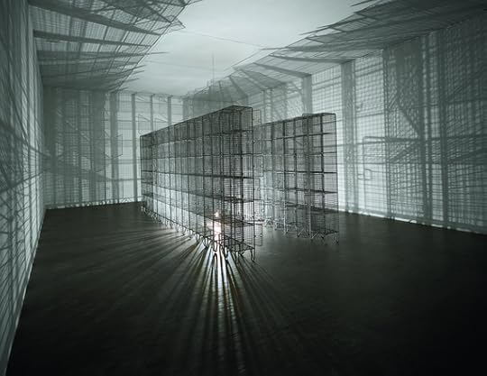
These themes are also evident in Light Sentence, 1992, a work that bristles with containment and oppression. Wire cages fill the room, a stark bare bulb rotates slowly within, its bright glare bouncing off the wire and casting sinister shadows. The title plays on the notion of a lenient prison term but it's apparent that this is anything but.
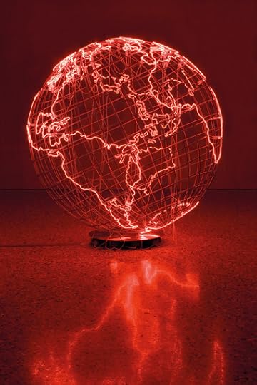
And, of course, there's Hot Spot III, 2009, the electrifying - and electrified - red globe that has already become the defining image of this exhibition. The title plays on the term for an area of political or civil unrest - a spot, a singular place that is unstable and dangerous. Only here, in Mona's eyes, the whole world is a hot spot. This is a world, hissing with electricity, where every place is red with anger and blood. We are living on a tinderbox.
There's also a glorious saturation of gender politics in some of Mona's works.

Twelve Windows, 2012-13, comprises twelve pieces of traditional Palestinian embroidery. The pieces were each made by women from Inaash - the Association for the Development of Palestinian Camps. This NGO was founded in Lebanon in 1969 to both provide work for Palestinian craftswomen, and in an attempt to preserve traditional skills at risk of extinction from the dispersal of the Palestinian community across the region. Each piece of embroidery represents a different region, which is evocative. But then throw in the tense steel cables used as both barriers and washing lines to display these, and you have a piece that drips with politics.
Similarly in Homebound, 2000. A room has been taken over by a very sparse, almost impoverished, domestic scene. Bare tables and basic chairs share space with empty bed frames and wastepaper bins. But all of these items are linked together by electricity cables, cables that are filled with a charge so powerful that if you were to touch it, it would kill you.
The room hisses with energy. And taught wire barriers keep the audience separate from what could kill them - or do these wires, in fact, represent how women are trapped within the home, unable to leave?
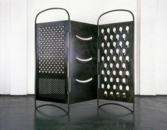
And, add to that, Mona's six foot tall recreations of kitchen utensils nearby - graters and slicers that ominously tower over you, their blades ready to cut - and you have domesticity tilted on its axis to the point where it is lethal. This stuff could kill you.
Mona's works seem to run the full gamut of emotions. Watching Corps étranger, a film of an endoscopic probe's journey through Mona's body, is unsettling to watch. And your heart sinks watching + and -, 1994-2004, where a motor continuously creates and erases patterns in a large box of sand. Creation and destruction playing endlessly on repeat.
Hosting an exhibition with this many installations and large works is a challenge. How do you situate them? And in what order? This may explain why the layout of the show is not chronological - perhaps too difficult to arrange. Shame, as it would have been interesting to witness the development of Mona's style and thinking without having to recreate the chronology of works in my head.
Nevertheless, this is a superb show that, quite literally, hums with energy. It is also one that challenges perceived conventional thought of global society, community, and even what constitutes art itself. If I could, I would take you all there myself. Unfortunately, I can't. But if you can visit - do. This is a show that leaves its mark.
Tate Modern, London to August 21, 2016
Admission £16 (concessions available)
Image Credits:
1. Mona Hatoum, Hot Spot III, 2009. Stainless steel, neon tube. Photo: Agostino Osio, Courtesy Fondazione Querini Stampalia Onlus, Venice ©Mona Hatoum
2. Mona Hatoum, Light Sentence 1992. Galvanised wire mesh lockers, electric motor and light bulb. 198 x 185 x 490. Centre Pompidou, Musée National d'Art Moderne, Paris: Mnam-CCI / Dist RMN-GP. Photo: Philippe Migeat © Mona Hatoum
3. Mona Hatoum, Homebound, 2000. Kitchen utensils, furniture, electrical wire, light bulbs, dimmer unit, amplifier and two speakers. Dimensions variable. Courtesy Rennie Collection, Vancouver © Mona Hatoum.
4. Mona Hatoum, Grater Divide, 2002. Mild steel 204 x 3.5 cm x variable width © Photo Iain Dickens, Courtesy White Cube © Mona Hatoum.
Published on May 04, 2016 06:06
April 18, 2016
Review: Boy, Almeida Theatre 'Painfully Beautiful'
Boy at Almeida Theatre is painfully beautiful. A play that holds up a mirror to our society and asks, what the hell has become of us?
Published on April 18, 2016 05:40
April 13, 2016
Review: Boy, Almeida Theatre 'Painfully Beautiful'
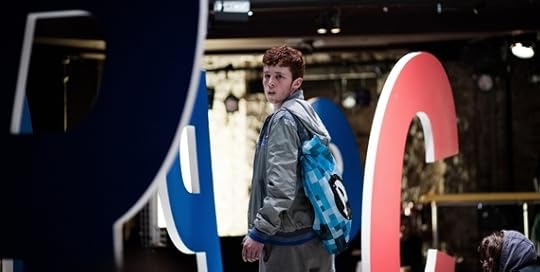
Boy at Almeida Theatre is painfully beautiful. A play that holds up a mirror to our society and asks, what the hell has become of us?
We follow a day in the life of Liam (a quite remarkable debut from Frankie Fox), a young boy without much in the way of a stable home, struggling to find his place in the world. Liam is awkward and unsure of himself - as much grappling with notions of manhood and masculinity, as he is with finding purpose in his life.
Fresh out of school but with no job or guidance, Liam wanders London trying to find something, someone, he can hold on to. His interactions with strangers are clumsy - blundering advances at girls and women collide with eye-wateringly embarrassing attempts to connect with guys he can look up to, the 'big brother' figures he desperately craves. But all his attempts are misplaced. He cannot seem to judge situations or people, lacking the experience or skills to assess either. He cannot fathom that there are bad influences out there, and people he should be wary of. No-one has ever taught him or shown him. So instead Liam lurches from one fumbled attempted connection to another.
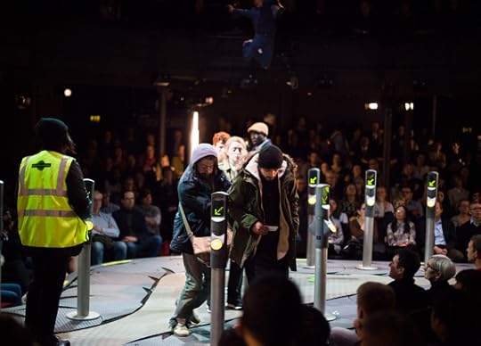
Director Sacha Wares is at the helm and, like her bold vision for last year's Game, Boy too has a remarkable set design. Any orthodox stage has been ripped out and, instead, we are presented with a circular conveyer belt that loops around the auditorium. Its slow, plodding motion is almost hypnotic. It never speeds up, it never slows. And it never goes anywhere but round and round and round.
Obviously this isn't just clever; this is working on a lot of levels. And it's not gimmicky or heavy-handed at all. For when Miriam Buether's set is blended with the subtle sound design from Gareth Fry of a constant, faint clanging of metal cogs and wheels, we have the pointlessness of our existence laid bare. For Liam is not isolated - there are many Liams out there. Too many Liams we don't see, that we pass by every day; maybe even avoid.
And as Liam stumbles through his day, his path crosses with many others we leave stranded, in need of help. In need of our compassion and understanding. And who, like Liam, we avoid. We turn our faces to our phones and pretend we can't see them.
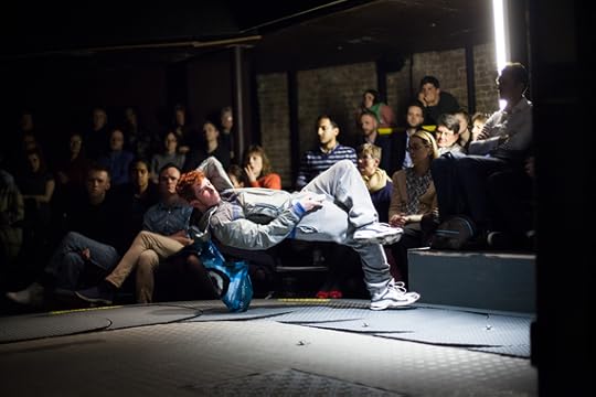
This is an unequivocally brave production. There is no obvious plot; the storyline that exists is subtle and small. No seismic event happens to Liam that shakes the core of his existence. And, of course, that is the point. Huge credit to writer Leo Butler for taking this risk as it's a gamble to offer up a play to an audience that takes a chance that many will want to see a show that is small, that is truthful, and that isn't dependent on plot twists and major confrontations to keep attention.
Boy digs deep. It may be low-key but it is also powerful. A searing indictment of what our society has become, and what trials we force those on the margins to overcome. But what hits home the most is the sense of defeat. Boy isn't an angry rallying cry, but a tragic impression that the damage has already been done. What have we done?
Almeida Theatre, London to May 28, 2016
Tickets £10 - £38
Image Credits:
1.Frankie Fox in Boy © Kwame Lestrade
2.The cast of Boy © Kwame Lestrade
3.Frankie Fox in Boy © Kwame Lestrade
Published on April 13, 2016 15:59
April 12, 2016
April 11, 2016
Review: Conceptual Art 1964-1979, Tate Britain

With its focus on British artists in the 1960s and 1970s, Conceptual Art in Britain 1964-1979 at Tate Britain sets out to demonstrate how radical conceptual art was, how it challenged the very notion of what art is, and caused us to question not only art's purpose, but also how it is made. So this should have been a dynamic and radical exhibition, one that divides and provokes. Instead, Conceptual Art is surprisingly flat and lacking in energy.
The show certainly starts off well. Roelof Louw's seminal work, Pyramid of Oranges, greets the visitor. It's vivid and it's exciting. And it's a great piece of work that sums up what the exhibition is supposed to highlight, that conceptual art was a democratic as well as a radical notion. Art and art materials did not have to be exclusive and expensive, but available for all. This is art that makes the extraordinary out of the ordinary. And the pyramid itself fascinates - a fusion of spheres and straight lines.
[Feel free to take the oranges. That is allowed. Only you do have to wait till you leave the exhibition before you can start eating the orange!)
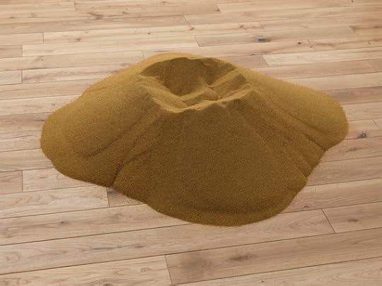
And the oranges are surrounded by all the type of art you know the Daily Mail will hate: Barry Flanagan's pile of sand, Richard Long's photos of the lines he created in a field by walking back and forth over certain patches of grass, Arts & Language's mirror (or, rather, Untitled Painting), a giant black square... Basically it's the kind of art that will have some saying, 'but it really is just a pile of sand. I don't get it'.
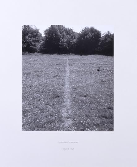
The opening room gave me high hopes - this is art that leads the visitor to question art, and question how they respond to it - but sadly my enthusiasm just deflated after that as, after this high, well, the exhibition's energy just disappears and this becomes a very flat and dreary show.
All colour seems to drain away with the works, primarily, being in black and white. And the pieces themselves do not stimulate: filing cabinet drawers filled with tattered record cards, shelves of cassettes in clear boxes, yet more black squares, yet more mirrors, dozens of sheets of paper with 'hot' and 'cold' written on them.... I hate myself for beginning to sound just like the Daily Mail here but it's not that I don't think this is art (I do) and I don't necessarily think this is because the passing of time has blunted the sharp edges of conceptual art - this is still a genre that can divide and provoke. It's just that these do not seem to be the finest collation of works to showcase British conceptual art at its best.
And there is far too much in display cabinets and vitrines. It's all very passive and unimposing. A conceptual art exhibition should be challenging, it should take up space. This is, bizarrely, staid and conservative.
That's not to say there aren't some interesting messages amongst these works. Stephen Willat's analysis of the mental thought process and the rationalisations made by an elderly woman, Mrs Moran, as she lived alone in her bleak tower block are haunting in their indictment of civil society, and Victor Burgin's juxtaposition of a stock advertising image of a romantic couple with slogans about possession makes for an interesting commentary on how we see relationships. But, sadly, these are rather isolated examples.
The admission fee for this show is £12. That's quite a chunk, especially for such a small show - the exhibition covers only about half a dozen rooms - and many of the pieces come straight from the Tate's own collection. Margaret Harrison's Homeworkers, for example, has only just come down from the walls in the Tate Modern, where you could have seen it for free. I feel you'd have to take a good bagful of oranges to make this value for money.
Tate Britain has had a hard time of it recently with their exhibitions - the Frank Auerbach retrospective a notable exception - so it doesn't feel great giving the team there another knock. But, nevertheless, Conceptual Art is an indication that the mix is still not quite right.
Tate Britain, London to August 29, 2016
Admission £12 (concessions available)
Image Credits:
1.Roelof Louw Soul City (Pyramid of Oranges) 1967 Tate. Presented by Tate Patrons 2013. Image courtesy Aspen Art Museum, 2015 © Roelof Louw
2.Richard Long A Line Made by Walking 1967 Tate. Purchased 1976 © Richard Long / DACS, London
3.Barry Flanagan ringn '66 1966 Tate. Purchased 2010 © The Estate of Barry Flanagan, courtesy Plubronze Ltd.
Published on April 11, 2016 06:47
April 6, 2016
Review: In the Age of Giorgione, Royal Academy of Arts 'Revealing'
Who was Giorgione? After all, he's hardly a household name and yet the Royal Academy has opened a new exhibition dedicated to uncovering more about him and his work. Well, this is most definitely a welcome exhibition because Giorgione was a brilliant artist in 16th Century Venice, a prodigy who died too young and whose full potential, sadly, went unfulfilled.
Published on April 06, 2016 10:09


