
Barb Drozdowich's Blog, page 16
September 27, 2020
What stats do you need to understand for your website: Part 3
Welcome Back!
[image error]
Over the last 2 weeks, I’ve been posting about stats or metrics used to understand activity on our websites. The first post can be found here and the second post can be found here. In the previous posts, we discussed what can be learned from Jetpack – a plugin available to WordPress websites. In today’s post, we are going to move on to Google Analytics – something that is available to all websites.
Google Analytics
Moving on to the topic of Google Analytics. Regardless of how you attach your site to Google Analytics, the full array of results can be overwhelming. I’ve included a video on how to attach Google Analytics to your site in a previous post. Before we go on to the description, keep in mind that with a little elbow grease, any website can be hooked up to a Google Analytics account and the information described in the previous posts can also be viewed via Google Analytics – I generally don’t like that section of the display when I can rely on Jetpack stats but that’s just my personal preference.
I like allowing a small snapshot of Google Analytics information to exist on the dashboard of a website for several reasons. The most important reason is it is less overwhelming. By focusing attention on a small number of items, the information can be meaningful rather than intimidating. For that reason, I included a series of instructions in the first post of this series to help with connecting your site to Google Analytics.
The starting point of the Google Analytics display is typically similar to the screenshot below. The two labels show “Last 30 Days” and “Sessions.” This information will show the visitors for the last 30 days (and that time period can be changed). At the bottom of the display is “Session Duration” which indicates the average time people spend on the website. Another interesting piece of information is “Bounce Rate.” This indicates how fast people leave the site. The higher the number the quicker people leave. These last two numbers I find very important. The longer a visitor spends on your site, the more likely they are to take positive actions – like buy one of your books! The Bounce rate will indicate how well you are resonating with visitors. One thing that many websites don’t do well is to clearly identify the owner. If a visitor can’t determine if they are in the right spot quickly, they will easily leave – or bounce – to try to find another choice. Make sure your “above the fold” information is very clear.
[image error]
Looking at the above screenshot, if the “Session” menu is changed to “Location” as seen in the screenshot below, you can view a graphic display as well as a list of where visitors are geographically located when they visit a website. The information and numbers may surprise you.
[image error]
If that drop-down is changed again – to “Technology” — you will be able to see the type of device people use when viewing a website. Again, this information may not be what you expected.
[image error]
So…why all this information, beyond the idea that “Knowledge is power?” Severalfold. As authors, we want people to buy our books. If we go back to the initial post of this series, you’ll remember that Google doesn’t sell books – Amazon, et al do. But visitors to your website hopefully sign up to your mailing list, subscribe to your blog, click on links to find you on social media, and click on links to purchase your books. By studying the actions of the audience, or visitors to our site, we can determine if any of this is being achieved.
Like with many things, we need to “read the tea leaves” to see if our efforts are paying off. For example, if you have 100 people visiting your website and no one is clicking on the Facebook icon to follow you on Facebook, perhaps it isn’t visible enough. If those hundred people visit your book detail pages and no one clicks on a buy link to purchase a copy at Amazon, etc., perhaps look at the layout of that page and see if the buy links aren’t obvious enough. See if the blurb isn’t compelling enough.
And if your audience is primarily from India and the Far East – as is true of one of my sites – there is not a lot of point offering a US-only giveaway as that will just annoy your readers.
I hope you learned a lot from this series of posts. Be sure to reach out in the comments if you have any questions – I’m always happy to help!
I hope you enjoyed this post. Please use the share buttons below to share with friends that might benefit from this information. If you haven’t already, please subscribe to my blog using the form below.
Email Address
Subscribe
The post What stats do you need to understand for your website: Part 3 appeared first on Bakerview Consulting.


September 23, 2020
Social Media Use Among Millennials
Welcome back!
In my world, the topic of Millenials seems to come up often. When I caught sight of today’s infographic with the title of “Social Media Use Among Millennials,” I went right ahead and clicked to read!
The much-maligned group can apparently be generalized as far as their social media usage is concerned and this infographic covers this topic. In my mind, Millenials are some of the most creative folks I know. They grew up with computers, cell phones, and tablets – apps & online organizers. If you are looking for easy and organized way to manage something online – look to a millennial 
September 20, 2020
What stats do you need to understand for your website: Part 2
Welcome back!
[image error]
Last week I started a series of posts to help you understand all the numbers available for your website or blog. My authors are often offput by the sheer overwhelm of information so I’m hoping to break this down into normal English in a way that everyone can follow.
Let’s start part 2 with a series of definitions.
Referrers – is the referring source of the traffic to your website. It may be Facebook or Twitter, it may be another author’s website, it may be a blogger’s website. We want to keep track of friends and we want to know if actions on social media are sending visitors to our website.
Top Posts & Pages – is the list of the top (usually) 10 blog posts or pages that visitors are viewing
Clicks – this section lets you know what visitors to your website click on.
Location – where your visitors are located geographically. This may not be where you think.
Technology – what device are your visitors using to view your website.
Time on site – from start to finish, how long, on average, are your visitors staying on your website. The longer the better!
I’ll share some screenshots below that explain where to find each piece of information.
Let’s start with Jetpack Stats and screenshots from a WordPress.com account. If you have a WordPress.org site, scroll further down for applicable screenshots for you and your site. There are slight differences between what is seen on WordPress.com and WordPress.org sites as I’ll explain below.
On WordPress.com either look to your dashboard or look for the label of “Stats” on the left-hand side of your dashboard.
The initial view typically shows a bar graph of visitors for each day for a month. It can be adjusted to show this information by month or year also. There are summaries at the bottom of the graph.
[image error]
Scrolling down below this area, you’ll be able to see the Post & Pages section, Search terms (which we ignore), and Countries. WordPress.com allows you to initially see about 7 or 8 top posts and pages – WordPress.org allows you to see usually 10. If you click on the sideways arrow you can see (and I suggest doing this) a larger block of time – 7 days, 30 days, etc. Numbers are always more meaningful when looked at over a longer time frame.
The box labeled Countries will give you a snapshot of where your visitors are from – again, click on the side arrow to see a variety of time periods.
[image error]
The next section (seen in the screenshot below) to direct your attention to is “Clicks.” This lists items on your site that people have clicked on – such as buy links for your books or clicks on your social media icons.
[image error]
The section below Clicks is Referrers. “Referrers” is the section that will list where visitors start their journey to find you. This may be a Search Engine, it may be Facebook or it may be another blog or website. Like above, click on the sideways arrow to see a larger selection of results.
For this section on WordPress.com, what should you pay attention to and why?
Most will focus on the number of hits or visitors a site gets. To a large degree, that doesn’t concern me. I certainly want to see action on a site. However, I’m more interested in what visitors do during their visit? What do they click on? Where did they come from?
Keeping that in mind, let’s go back over the available information. Top Posts & Pages will let you know what your audience is interested in reading. This will give you hints of what to give them more of. Referrers will let you know where your visitors come from. If you are active on Facebook, do a lot of your visitors to your website come from Facebook? Do they follow links from other sites to find you? These little details allow you to better target where your promotions are located. The section on Clicks will help you understand what visitors are interested in finding out more about. Your books should be for sale and you should be able to see clicks on buy links. If you encourage visitors to follow you on Facebook, you should be able to see clicks on the Facebook link, etc. Conversely, if you don’t see any clicks on buy links – why not?
WordPress.org
Let’s move on to WordPress.org. Most of the same information exists on WordPress.com can be found on WordPress.org except for the map.
Because there are small differences between .com and .org versions of Jetpack we’ll walk through a new selection of screenshots.
Looking at the screenshot below you will see the top section of the display shows not only a bar graph but some totals below – such as Best Ever and numbers from the life of the website – interesting, but not something we pay attention to. As I’ve said before, lovely to know how many people visit our site, but more interesting to see what they do when they are there, etc.
[image error]
Scroll down below the bar graph and you’ll see the section in the screenshot below – made up of Referrers, Search Engine Terms, and Top Posts & Pages.
[image error]
As with the description for the .com version, Referrers tells you where your traffic is coming from – great for identifying the effectiveness of a Facebook promotion for example. Search Engine Terms can be entertaining, but Google no longer allows us much information about the search terms people use when searching for us. Because of this, I generally suggest ignoring this section.
To the right in the above screenshot is a selection of Top Posts & Pages. As described previously, this is a list of the top content your visitors are interested in. By clicking on Summaries, you can see a more extensive selection of results. As explained previously, you get an idea of what type of content your readers are interested in and provide more similar information.
Scroll further down and you’ll see the section depicted in the screenshot below:
[image error]
Clicks will let you know what people are clicking on. This will give you an idea of some of the actions your visitors are taking during their time on your site.
I’ll draw this blog post to a close by hoping you learned something new today! Next week’s post will cover Google Analytics.
I hope you enjoyed this post. Please use the share buttons below to share with friends that might benefit from this information. If you haven’t already, please subscribe to my blog using the form below.
Email Address
Subscribe
The post What stats do you need to understand for your website: Part 2 appeared first on Bakerview Consulting.
September 16, 2020
TikTok Limits and Restrictions [Infographic]
Welcome back!
Today’s infographic is the third in a row on the topic of TikTok. Many of you may only be aware of TikTok because it is in the news lately. I have teens in my life so TikTok is an everyday conversation. I hope that these past 3 infographics give you a better idea of the who, what and where of this popular app.
As always, please drop by my favorite blog and read the full post!
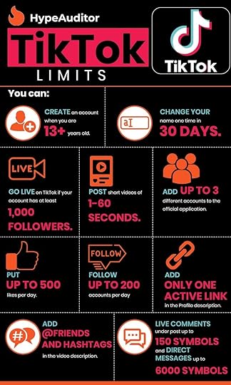
[image error]
The post TikTok Limits and Restrictions [Infographic] appeared first on Bakerview Consulting.
September 13, 2020
What metrics do you need to understand for your website or blog
Welcome Back!
[image error]
Several years ago I wrote a series of articles on understanding the stats information available for your website. I originally posted the content in a series of articles and these articles count amongst my top 20 posts of all time. And of course, I know that because of the stats functionality that I have on my website.
September 2, 2020
Getting to Know TikTok Users [Infographic]
Welcome back!!
To follow up on last week’s post on TikTok where we learned what Tiktok is, this week we will get to know who TikTok users are. If you are just learning about TikTok because it has been in the news recently, I hope this series of infographics helps paint a picture of who, what, and where with respect to this popular app.
As always, please drop by my favorite blog, Social Media Today to read the entire post and while you are there, be sure to subscribe to their feed!

I hope you enjoyed this infographic. Please use the share buttons below to share with friends that might benefit from this information. If you haven’t already, please subscribe to my blog using the form below.
Email Address
Subscribe
The post Getting to Know TikTok Users [Infographic] appeared first on Bakerview Consulting.
August 30, 2020
Use some psychology and some technology to sell more books
Do you dream about creating a group of Superfans who will buy every book you write?
Yes? Well, then, do you make it easy for readers to become your Superfans?
Welcome Back!
I periodically guest post on other authors’ blogs. I recently created today’s post to share on Anne R. Allen’s blog. I’m sharing here in case you aren’t a follower of Anne’s. BTW, if you aren’t following Anne’s site, you should be! Her site can be found here. She shares a lot of quality information that is perfect for beginner to intermediate authors.
For today’s post, I want you to keep the idea of “Superfans” in your mind as we work through this post. To create these Superfans, we need to make sure that we don’t do anything to frustrate our readers. In fact, our job is to make purchasing/following/subscribing as easy as possible.
In order to do that, we will talk about three simple steps:
Create content in a reader-friendly formatUse simple psychology to help guide readersHarness what we know about e-reader technology to make it easier for readers to find us — and buy more of our books
The Science of Writing for Readers
I’m a science grad who became a science prof – so when someone from the publishing industry (in 1995) suggested that textbooks would be converted to electronic format, I jumped for joy!! After decades of lugging around massive science reference texts, the idea of tucking a computer disk into my bag was pretty exciting!

Because the first Kindle wasn’t released until 2007, the idea of reading electronic textbooks was still over a decade away at that point. At the time, though, fresh out of university and thinking I knew everything, I was excited, but my fellow profs – who turned out to be smarter than I was – expressed concern about the differences in reading style. Honestly, back then, know-it-all me thought they were over-reacting.
Over the years since, I’ve done quite a bit of research into the differences between how people read via a paper source, like a paperback book, versus how people read via an electronic source, like a Kindle or e-reader. I’ve created a 20-minute video that explains some of the various theories. I would encourage you to take a few moments and watch here.
To sum up, people don’t actually read material presented electronically. Instead, they scan.
People “read” in a non-linear, non-continuous fashion. They will allow their eyes to take breaks between paragraphs. They will make use of headlines, graphics, bold text, italic text or lists to guide the movement of their eyes.
Another key finding from the existing research is that the more a person reads on electronic sources, the more they exhibit this scanning type of “reading.” This finding implies that scanning behaviour, or non-linear reading, is more pronounced amongst younger readers than older readers.
Why does the way people read matter? I would say it affects various ways you communicate with your readers.
What part of your writing life does this science affect?
The following list of places where “The Science of Writing for Readers” applies offers some suggestions:
Blog postsWebsite contentAmazon book descriptionsLayout of promo newsletters and promo websitesSocial media tactics
Looking at the list above, how does “The Science of Writing for Readers” change how you would create content for these locations? How would you format your blog posts? How would you lay out Amazon book descriptions differently given this information?
Psychology – Loaves of Bread And Jars of Jam
[image error]
Think back to the last time you were at the grocery store to buy a loaf of bread. Did you study the choices available or did you grab your usual brand and walk away? If you were thinking about trying something new and your local grocery store is like mine, you were likely confronted by many different choices.
Did you choose white, brown or multigrain bread? Did you choose a wheat bread or an alternative-grain bread? Organic ingredients or non-organic, seeds & nuts or not. Did you just stand there staring at the shelves, swamped by the number of choices? Did you give up and buy your usual kind of bread? Or, overwhelmed by choice, did you just skip the purchase altogether and stop at your favourite coffee shop for a bagel or blueberry muffin?
Numerous psychology studies have been done around the concept of choice – or having too many choices. My favorite study concerns the display and sale of jars of jam. Perhaps because I’m fond of jam!
The “Jars of Jam” study involved creating two different types of displays of jam in grocery stores. One display had many different flavors of jam, number of jars, size and shape of jars and varying prices. The second display typically had 2 flavors of jam and one size of jars, all at the same price. This experiment was carried out in different types of stores and in different locations within the store.
The second display (the simpler display) always sold many more jars of jam than the first.
Some feel this result is counter-intuitive. Wouldn’t people appreciate having more choices? Or are they, in fact, overwhelmed by too many choices with the result that they don’t make any purchase? The research indicates that they are, and that the sale is lost.
What’s the connection between the bread, jam jars, and turning readers into Superfans?
Look at the menu-line of your website. Do you provide numerous alternatives for a reader to choose from? Or do you use the menu structure to nudge people in the direction you want them to go?
For authors, the “Jars of Jam” theory applies in two critical places:
Website design – especially with respect to the menu-line and buy linksPromotional platforms and & newsletters – think BookBub
Which one below would you think is better for readers to find information?
Example #1
Example #2
If you answered example 2 you would be correct!
Why does BookBub sell so many books?
BookBub is one of the most successful promotional newsletters. Do you think the psychology behind the “Jars of Jam” correlates with the limited number of suggested books in each newsletter?
How to create more effective sales links in the back matter of books.
Depending on what study you read, somewhere around 80% of worldwide book sales are electronic. There are variations from country to country, and genre to genre but let’s generalize and assume the majority of your book sales will be digital, not paper.
What this means is that a large number of readers will read your book on a Kindle or a Kobo or some other type of e-reader. In my experience, many authors are purists. They would prefer to read paperback books and are not as familiar with the e-reader technology.
How much do you know about the capabilities of e-readers?
As someone who has carpal tunnel, I love my Kindle e-reader! By the end of the day, my hands don’t have the strength to hold a paperback book open; however, I love to read.
When I get to the end of a book I can peruse the hyperlinks an author has left for me. Do I want to join their mailing list? Do I want to buy the next book in the series? Do I want to follow them on Facebook? So many choices…
Too many choices? And as we’ll find out, maybe the wrong format!
Several years ago, my family was camping in the mountains. I had my trusty Kindle and was happily reading in my camp chair. I got to the end of the book and found the page that said:
Please join my mailing list here, join my street team on Facebook here, and be sure to check out the rest of my books here.
Since up in the mountains I didn’t have any WiFi to link to my Kindle, I couldn’t click on any of the links. I picked up my phone and tried to use Google to search for what the author might be referring to with her “here” embedded links. I couldn’t find a mailing list link on her website, I couldn’t find the street team on Facebook and I couldn’t remember my Amazon password so that I could shop on my phone.
Feeling somewhat frustrated that I couldn’t decode all the “here” links, I moved on to the next book on my Kindle — even though I had enjoyed the first book and wanted to read more by the same author.
With the immediacy of today’s society, we expect to be able to search and find – or in hyperlinked text, click-and-buy or click-and-find.
When I got back to civilization, I did a bit of research and found that without WiFi millions of simple Kindle and other e-reader devices have no way of connecting to the internet. And yes, you read that number correctly. There are an estimated 70 million Kindle readers out in the world, not to mention other brand-name e-readers. The vast majority of e-readers cannot access a cell signal, so without WiFi, they are just glow-in-the-dark digital books.
My example was from when I was camping in the mountains, but our readers read our books at the beach, in parks, in cars, in trains and so on. Many of these examples have no available WiFi.
Were you aware that readers can’t click or tap on links in an e-book without WiFi? What does the back matter look like in your e-books? Do you have a series of hyperlinks for your readers to click on?
Instead of offering our readers a series of embedded links to click on at the end of our stories we should use our words to direct readers to where they need to go – just like we do at the end of our paperback books. You can find great examples of this in paperback books published in the ’90s – before the birth of the Kindle. Scour your bookshelves for some older books and flip to the back!
Just like the jars-of-jam study, don’t provide too many choices and overwhelm readers, but find a logical place to send them to do what you want them to do. Send them to a retailer to buy some books; send them to your website to join your mailing list; send them to your front-line social media site. Brainstorm where you want them to go to begin their road to becoming your Superfans.
Most readers are pretty good at buying books. They just need you to make it as easy as possible for them – they will love you for it!
I hope I have given you a few things to think about and I hope you will take a few moments over the next weeks or months and give some thought how you will foster your group of “Superfans.” How will you make it easier to buy your books, find your website and join your mailing list, follow you on social media? Your career depends on it!
Did you get some ideas about building a Superfan base?
I hope you enjoyed this post. Please use the share buttons below to share with friends that might benefit from this information. If you haven’t already, please subscribe to my blog using the form below.
Email Address
Subscribe
The post Use some psychology and some technology to sell more books appeared first on Bakerview Consulting.
August 26, 2020
Everything You Need to Know About TikTok
Welcome Back!
TikTok has been in the news recently. Are you familiar with TikTok?
When I stumbled on this infographic recently, I thought it provided a great snapshot summary of what TikTok is. I hope this leaves you smarter!
As always, I found this infographic on my favorite blog – Social Media Today. Be sure to click on the link and read the entire post!
[image error]
I hope you enjoyed this infographic. Please use the share buttons below to share with friends that might benefit from this information. If you haven’t already, please subscribe to my blog using the form below.
Email Address
Subscribe
The post Everything You Need to Know About TikTok appeared first on Bakerview Consulting.
August 19, 2020
Best Post Lengths For Higher Engagement 2020
Welcome back!
Today’s great find in the infographic world is (of course) from my favorite blog – Social Media Today. Be sure to drop by and read the original post – I’m going to just summarize and leave the graphic for you to consume.
There is so much chatter about what the best post length is for various social media posts – but it’s often just that – chatter. Today’s infographic puts together stats based on research to help guide you in your social media endeavors.
[image error]
I hope you enjoyed this infographic. Please use the share buttons below to share with friends that might benefit from this information. If you haven’t already, please subscribe to my blog using the form below.
Enter your email address
Sign Up
The post Best Post Lengths For Higher Engagement 2020 appeared first on Bakerview Consulting.
August 12, 2020
Top 10 Twitter Stats (Infographic)
Welcome Back!
Today’s infographic touches on the subject of Twitter. I have to admit, Twitter is my least favorite of all the social media and I struggle to communicate on it effectively. I would consider myself a work in progress!
As you all know, I like to use stats to guide my actions. Today’s find shares some Twitter stats – mostly from the US that you might find helpful.
Be sure to visit my most favorite social media blog to read the full post!
[image error]
I hope you enjoyed this infographic. Please use the share buttons below to share with friends that might benefit from this information. If you haven’t already, please subscribe to my blog using the form below.
Enter your email address
Sign Up
The post Top 10 Twitter Stats (Infographic) appeared first on Bakerview Consulting.


