Clara Lieu's Blog, page 53
June 16, 2013
Crit Wall #9
Welcome to “Crit Wall“, where I offer online critiques of individual art pieces. To submit, send me a link to one image by commenting here, or by emailing the link to me at clara(at)claralieu.com. Please, NO ATTACHMENTS. Include the media, size, and title if you have one. Only submit original, finished works, no works in progress or sketches. Artwork created for a RISD degree program course is not eligible. You’ll receive notification if your piece is selected to be critiqued. Only one submission per person please, and know that I will not be able to critique every single work due to the volume of submissions. All images will be posted anonymously.

“Acadia Shoreline”
oil on panel
20″ x 28″
Overall, this piece is technically competent in the formal elements of painting. The composition is nicely set up, there is good contrast, the colors are effective and beautifully mixed. However, the painting doesn’t go beyond it’s technical achievements, and for this reason leaves the viewer wanting more. What this image lacks is interpretation, the artist’s opinion on the landscape. The emotional tone of the piece is lukewarm, and thus doesn’t invite the viewer to develop a strong reaction to the work. There is no mood to this piece, it feels neutral and therefore comes across as a technical exercise rather than an artwork that has a statement to make. The great landscape painters from history created paintings that evoked a presence that went beyond simply what they perceived with their eyes. In this painting, it seems that the artist has been too faithful to their perception, painting solely what they saw.
Technically speaking, the most successful aspect of this piece is the activity of the water in the lower left hand corner. In this area, there is a looser, more gestural quality to the brushwork that creates a sense of dynamic activity. The brushwork here is much more sophisticated than in the rest of the painting. In the upper section of the water, the brushwork becomes stale and obvious. The rest of the brushwork in the piece seems predictable and tight. The contrast in the rocks in the middle of the composition are quite effective, especially where the white of the water is splashing against the darkness of the rocks.
Compared to the rest of the piece, the entire sky seems flat and dull, While it is necessary to have some calmer areas where the eye can rest in a composition, the sky feels flat and lacks the kind of atmosphere that is necessary to activate that area. The area where the sky and the water meet is also problematic in that the crispness of the edge of the water is too clearly articulated, and therefore falls flat. Where the sky meets the water would be more effective if it was more suggestive and subtle. The sense of distance in the upper section of the painting could be pushed much further to make the space feel more palpable.
Past “Crit Wall” pieces are below. Click on the images to read the critique.


Refinements

I’m having a blast working on the final illustrations for my book right now. After working on my series of 50 portrait sculptures for a little over a year, working on these little quirky pen illustrations has been enormously refreshing and different. Most people think of me as a fine artist, so many don’t know that I actually have a degree in illustration. Technically speaking, this is my first professional illustration gig!
Above you can see the final illustration for the chickens and eggs that I did a sketch for in this post. I had initially thought that I was going to go for a much tighter look. However, when it came down to the actual drawing I realized that I tend to like to draw with a much looser hand, so you can see the strokes in the texture of the chicken feathers has a more gestural feel.
Conceptually speaking, the illustrations really range from literal interpretations, to metaphors and symbols that represent the ideas and content of the book. The idea is that with each page, you never quite know what image to expect so it will hopefully keep readers engaged in that way.


June 12, 2013
Ask the Art Professor: How can one regain lost satisfaction with their work?
Welcome to “Ask the Art Professor“! Essentially an advice column for visual artists, this is your chance to ask me your questions about being an artist, the creative process, career advice, a technical question about a material, etc. Anything from the smallest technical question to the large and philosophical is welcome. I’ll do my best to provide a thorough, comprehensive answer to your question. Submit your question by emailing me at clara(at)claralieu.com, or by posting here on this blog. All questions will be posted anonymously. Read an archive of past articles here.
Here’s today’s question:
“Ever since I started studying graphic design, I feel like I exchanged a bit of creativity for professionalism. Nowadays, I feel unsatisfied with my work all the time. I still love drawing but I used to feel a lot more satisfied when I was younger. I feel like something seems to lack in my art now. How can one regain lost satisfaction with their work?”
I know that the majority of the time, I don’t allow myself to indulge creatively. Usually I’m experimenting with some new method or subject. I challenge myself to do something unfamiliar and uncomfortable because I know that it’s good for me to be doing new things. I try hard not to sit around polishing my strengths because I want to target my weaknesses in order to build a well-rounded skill set.
I’m going to advise that you do the opposite of what I just described: give yourself the license to artistically indulge. Fully immerse yourself in your greatest strengths, working only with subjects that you feel very excited about. Pick an art medium that you are very experienced with, and can work with fluidly. If it feels good, then do it. Don’t worry about improving, experimenting, what other people think, etc. just focus on what will bring that sense of satisfaction back. Keep this up for several months and I am confident that you will be enjoying yourself again in no time. I had a professor as an undergraduate student who used to say all the time “if you’re not having fun, you’re doing something wrong.”
Another strategy that you can employ is to think back to all of the artistic experiences that you’ve had in your past. Try to home in on the experiences that brought you the greatest satisfaction, and attempt to create those circumstances for yourself again. For me, drawing from a live model has always automatically brought me satisfaction. At all stages of my life, life drawing is one specific activity that brings me a sense of stability and freedom at the same time. Life drawing reminds me of being an art student, and with that I associate the wonderful excitement and rigor of the learning process. Any time I sit down to draw the figure I know that I am always guaranteed to enjoy myself.
Related articles:
“How much of your emotional life do you allow to infiltrate your work?”
“How do you face artistic burnout?”
“How can an artist balance their life?”
“How can an artist overcome their financial issues?”
“How can an artist create an artistic group outside of school?”
“Am I actually an artist?”
“What do you do for art storage?”


June 11, 2013
Book Illustrations

With the sculpture stage of my 50 sculptures series complete, I am setting that project aside temporarily to work exclusively on self-publishing my book, “Learn, Create, and Teach: A Guide to Building a Creative Life“. I’ve given myself an August deadline. The idea behind this deadline is so that I can get the book out there while students/faculty are still on vacation, (and have time to read) with an official launch happening in September when everyone returns to school.
My husband is doing the design work, so over the past few weeks we’ve been working together on fabricating a look for the book. One aspect I had been agonizing over was the use of illustrations and/or images. I really felt that the book needed one or the other to keep the book visually enticing. I finally decided on small line illustrations that would begin each chapter, making for 60 illustrations total. Above is a very rough, quick sketch for one chapter. (why chickens and eggs? You’ll have to buy the book to find out)


June 8, 2013
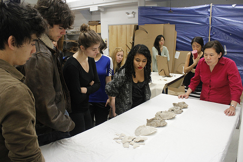
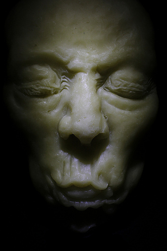
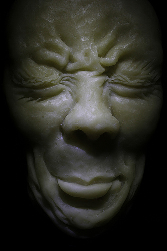
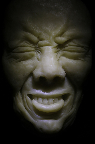
50 sculptures: finished!

After a frenzy of activity in the studio over the past two weeks, I officially finished my 50 sculptures series! Everyone always talks about feeling such a sense of accomplishment when finishing a big project, but for me I’m usually so wiped out from making the work that it’s more a sense of relief than it is anything else. I’m sure I’ll have more to reflect upon in the coming weeks, but I have to say that this was one of the tougher series that I’ve worked on in a while. Not only was it technically challenging to make this many sculptures with all of the modeling and casting that was involved, but I struggled immensely at the very beginning of this project in a way that I never have before. I went through the worst creative crisis in my career when I was conceptualizing this series, and had to wade through more failed attempts than I like to admit.
I still have yet to figure out precisely what the final physical format of these images will be when I present them in a gallery context. For now though, the sculpting aspect of the project is complete, and I’ll take my time troubleshooting their final format in the coming months. I have two solo shows booked for the fall of 2014 at the Sarah Doyle Gallery at Brown University and at the Mazmanian Gallery at Framingham State College, so those two shows will likely feature this series of sculptures.


June 5, 2013
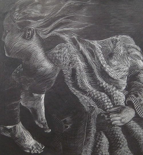
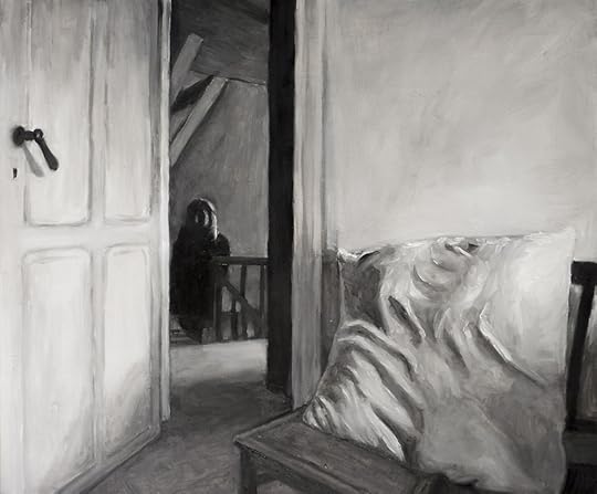
Crit Wall #8
Welcome to “Crit Wall“, where I offer online critiques of individual art pieces. To submit, send me a link to one image by commenting here, or by emailing the link to me at clara(at)claralieu.com. Please, NO ATTACHMENTS. Include the media, size, and title if you have one. Only submit original, finished works, no works in progress or sketches. Artwork created for a RISD degree program course is not eligible. You’ll receive notification if your piece is selected to be critiqued. Only one submission per person please, and know that I will not be able to critique every single work due to the volume of submissions. All images will be posted anonymously.

charcoal on paper
70cm x 50cm
Overall, there is a loose, painterly quality to the charcoal marks in this drawing that keep the marks active and dynamic. The area on the shirt right below the neck has some excellent strokes in the charcoal that look very quick and gestural.
In terms of materials, it appears that the drawing is done exclusively with vine charcoal. Vine charcoal is great for the initial sketch of a drawing, but it’s not good as a final material because it’s too grey and not permanent at all. Mixing both vine charcoal and compressed charcoal is an effective combination, as the compressed charcoal has a richness and darkness that the vine charcoal is not capable of achieving. The compressed charcoal also has a heavier look which is great for expanding the tonal range of a drawing. Also, the using a kneaded eraser in combination with a white plastic eraser to subtract the charcoal from the page would be help the drawing look less messy and smudged.
The head has a good sense of lighting, it is quite clear what direction the light is coming from. Proportionally speaking, the nose appears slightly too large, the chin seems to be too small, and the distance from the left eye to the ear is too wide. The transition from the forehead into the hair is beautifully executed, with a great sense of volume to the hair.
There are some structural issues with the figure, in particular the hand on the right hand side looks awkward and the arm seems to be too thin. The positioning of this arm and hand is particularly tricky, since it is a foreshortened arm. Foreshortening of limbs in general tend to look strange anyway, so it’s a tough thing to make it look natural. In this case, the width of the arm needs to be expanded in order for the proportions of the hand to the arm to look convincing.
The tonal work and the line work are too separate from each other throughout the drawing. Mostly, the lines are too dark heavy and apparent and could be de-emphasized so that the lines sink into the tone more effectively. Areas where the lines are not as prominent tend to come across as having more depth and dimension.
The background is problematic because it appears to be a last minute effort that wasn’t as carefully considered as the rest of the piece. The fact that the right hand side is toned in and the left hand side of the background isn’t touched at all seems inconsistent and confusing.
Past “Crit Wall” pieces are below. Click on the images to read the critique.


June 4, 2013
Ask the Art Professor: What is the best way to simplify the human figure? As cubes or as spheres?

Welcome to “Ask the Art Professor“! Essentially an advice column for visual artists, this is your chance to ask me your questions about being an artist, the creative process, career advice, a technical question about a material, etc. Anything from the smallest technical question to the large and philosophical is welcome. I’ll do my best to provide a thorough, comprehensive answer to your question. Submit your question by emailing me at clara(at)claralieu.com, or by posting here on this blog. All questions will be posted anonymously. Read an archive of past articles here.
Here’s today’s question:
“What is the best way to simplify the human figure? As cubes or as spheres?”
The answer is neither. I see people all the time trying to reduce the human figure into a series of geometric shapes when they’re drawing from a live model. They draw spheres where there are joints (wrists, shoulders, elbows, etc.) and it always ends up looking like an awful mannequin. The problem with this approach is that cubes and spheres used in this manner have nothing to do with the actual anatomical structure and forms of the human figure.
When I teach figure drawing, I simplify the human figure into the three structural concepts listed below. If you draw the human figure with these structural concepts in mind, you’ll be pleasantly surprised that you’ll have a likeness of a figure in no time. The order of these structural concepts is important to maintain as well, as the largest forms are addressed first and then eventually working down into the smaller details.
1)Major Masses: Major masses are essentially the largest forms on the human figure. I recommend beginning a figure drawing by first addressing the torso, by far the largest form. The torso is where all of the limbs and the head intersect, so it’s critical to knock in the torso immediately when starting a figure drawing. The torso can then be subdivided into a ribcage and pelvis, which provides a sense of structure within the torso itself. From there, the head and thighs can be quickly added to provide more mass to the form. The limbs and the hands and feet should come in last.
2)Centerline: There is an imaginary centerline down the front of the torso and down the back of the torso. On the back of the torso, the centerline is easy to spot because it is basically the spine. On the front of the torso, the centerline starts at the pit of the neck, (the point in between the collarbones, aka clavicles) moves down the center of the rib cage, through the belly button down to the pubic bone on the pelvis. A centerline is highly descriptive of the type of pose that is being struck by a figure. Look at the centerline when a model is posing and ask yourself what the centerline is doing: is the centerline perfectly straight? Is it twisted, is it leaning to the right or left? If you quickly establish how the centerline is behaving in your figure drawing, you’ve won half the battle.
3)Boney Landmarks: Boney landmarks are areas on the human figure where the bone is directly under the surface of the skin. These landmarks are significant because they are consistent with every single person, regardless of how large or thin they may be. When you’re looking at a model, search for these boney landmarks and indicate them in your drawing. Some boney landmarks include: collar bones, elbows, kneecaps, ankle bones, shoulder blades, etc. Boney landmarks are considered to be details, so they should not be drawn in until the major masses and centerline are well established.
Related articles:
“What is a gesture drawing?”
“Is drawing considered an innate talent or a craft, which can be learned by anyone?”
“How can I learn to shade objects in my drawings?”
“How can I draw what I see in my head?”
“What is the best way to practice my drawing skills?”
“How can you learn to draw hair?”
“How do you get yourself to practice drawing?”


June 3, 2013
Transitions
I’m on the verge of two big transitions which will be happening simultaneously. For one thing, finishing these 50 face sculptures is imminent. At the rate I’ve been going in the studio these past few weeks, I will have all of the sculptures complete by mid-June. The other big transition is moving out of Wellesley College and converting my garage at home into a studio space. To make this happen, I went on a purging rampage to clear out tons of old artwork out of my house and garage. (you can read about this process in more detail in this post.) It’s going to be a little while before I launch into my next series of 50 figure drawings, as I figure out the logistics of how to make my garage work as a studio.


Crit Wall #7
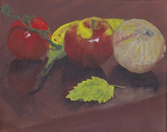
Welcome to “Crit Wall“, where I offer online critiques of individual art pieces. To submit, send me a link to one image by commenting here, or by emailing the link to me at clara(at)claralieu.com. Please, NO ATTACHMENTS. Include the media, size, and title if you have one. Only submit original, finished works, no works in progress or sketches. Artwork created for a RISD degree program course is not eligible. You’ll receive notification if your piece is selected to be critiqued. Only one submission per person please, and know that I will not be able to critique every single work due to the volume of submissions. All images will be posted anonymously.

acrylic on canvas
8″ x 10″
The best aspect of the composition is the way that the banana wraps itself around the apple. Overlapping of objects is one of the easiest and most effective ways to show depth between objects. In this case, the diagonal placement of the banana breaks up the row of the tomato, apple and onion and thus keeps the composition from being too even and predictable. The diagonal line depicting the edge of the table is important as well, as it brings a sense of movement to the composition that contributes greatly to the composition.
The composition could be improved by cropping some of the objects. The fact that the tomato, apple, and onion are placed in the middle of the page, with nothing cropped doesn’t allow for the viewer’s eye to want to reach out into the corners and edges of the page. For this reason, the corners and edges of the page appear to be dull. The leaf helps a little but might work better if it was hanging off the edge of the table, so that it connects more to other elements in the painting. I would recommend spending much more time arranging the objects, choosing an arrangement that is more dynamic and allows for the viewer’s eye to circulate around the page more.
Probably the weakest part of the piece is the lack of contrast, both in terms of color contrast and light/dark contrast. Overall, the majority of colors in both the objects and the background come across as too muddy. Many more intense, highly saturated colors are needed in the objects to activate the color scheme. The tomato and part of the banana begins to introduce a bit of intense colors, but both still lack the kind of punch that the objects need to come forward.
Watch out for the bright white highlights on the apple and the tomato. They appear to be painted with white paint straight out of the tube, which usually has a pasty quality that lacks the luminosity needed for the highlights to read effectively. The pure yellow highlight on the apple isn’t effective either. Instead, mix a slight tinge of yellow into the white paint for the highlights. This will give the highlight just a little kick to feel more intense and luminous.
The method with which the paint has been applied appears to be all opaque paint. Even with acrylics, it’s possible to achieve transparency through glazing techniques. In glazing, the acrylic paint is thinned by adding lots of water, and is then applied over an area of opaque paint. This creates a depth to the paint and a variety that is significantly more sophisticated than just using opaque paint. A combination of both opaque paint and transparent paint is necessary for a painting to accomplish depth.
The brushwork could be handled with more confidence. There’s a hesitation in the brushwork that comes across to the viewer. Right now, the brush strokes are neither tight nor painterly. The brushwork begins to loosen up more in the onion, but could be pushed much further.
Past “Crit Wall” pieces are below. Click on the images to read the critique.


June 1, 2013
Ask the Art Professor: What do you do for art storage?
Welcome to “Ask the Art Professor“! Essentially an advice column for visual artists, this is your chance to ask me your questions about being an artist, the creative process, career advice, a technical question about a material, etc. Anything from the smallest technical question to the large and philosophical is welcome. I’ll do my best to provide a thorough, comprehensive answer to your question. Submit your question by emailing me at clara(at)claralieu.com, or by posting here on this blog. All questions will be posted anonymously. Read an archive of past articles here.
Here’s today’s question:
“Do you have any advice on art storage? What sorts of projects would you recommend keeping? Are epic failures or pieces you hate worth holding on to?”
Storage of both art materials and artwork is a logistical nightmare for most artists. These problems only get worse as you get accumulate more supplies and create more artwork over the years. When I was an undergraduate at RISD, I thought transporting/storing all of the large scale oil paintings, drawings, and prints was bad. Then I did my MFA in sculpture, and storage became exponentially more difficult with all of the fragile, three-dimensional work I was making. Compared to storing sculpture, storing two-dimensional works was a breeze. Most of the sculptures I created were plaster casts, and every single once had to be tightly bubble wrapped and packaged carefully. The summer I finished graduate school I commuted from NYC to Providence to teach in the RISD Pre-College program every week. I remember taking multiple trips in my car, slowly transporting my thesis sculptures from NYC to Boston throughout the summer. On top of that, I had three nearly life-size figure sculptures as well. Each sculpture found a home with a local friend in NYC.

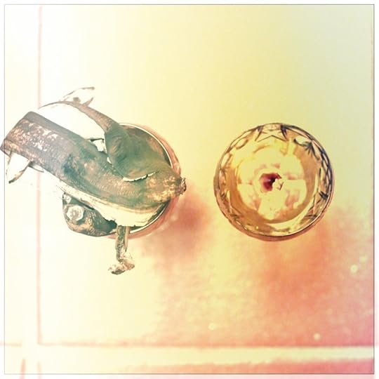
One of my storage closets with bins of art supplies
I rarely throw away art materials, and so I stock up on many, many plastic bins from The Container Store to store everything. I also have a rule that I always hold onto every tool, no matter how specific or obscure it is. You really never know when you’re going to need that tool or material again. Something always emerges unexpectedly years later that you could never anticipate. I once bought a really large rubber mallet that was specifically made for woodcarving for a woodcarving class I took during Wintersession at RISD. That rubber mallet sat untouched in a tool box for seven years, until I discovered during graduate school that it was the perfect mallet for chipping plaster molds. I ended up using this mallet intensively for two years during my graduate degree. Since then, I haven’t picked it up for nine years, but I don’t doubt that it could again prove to be useful in the future.
Coincidentally, this question is being asked at the same time that I went through one of the biggest “art purges” that I’ve ever done in my career. After five years at Wellesley College, I’m moving my studio back home into my garage. My garage has been housing the majority of my artwork for the past nine years, and it was filled to the brim with old sculptures, paintings, etc., with some of the work even dating back to freshman year at RISD back in 1994. My solution: a massive yard sale to give away all of my old artwork in the garage for free. I was so certain that I would be paying exorbitant fees to have a junk service take all of the work away. Some of the work was so awful, really heavy, and awkward that I couldn’t imagine anyone possibly wanting to own any of it. However, I was pleasantly surprised that the majority of work was taken at the yard sale. In my opinion, better to give the work away for free, knowing it’s being given a good home and is being appreciated by someone else. (I know it sounds like I’m talking about a pet, but that really is my reasoning here)
Some of you are probably squirming/wondering how I could possibly bring myself to part with so much of my artwork, and then on top of that, give it away for free. So much of the work is just so incredibly old that I’m completely emotionally removed from the work. The immense amount of space storing all of this work was so overwhelming that keeping the work was a significantly bigger headache than getting rid of it. I understand that I made that work, I learned from it, and that it’s time to move on.
Only you can really determine what is worth keeping. In my opinion, failed work and work you hate isn’t worth the hassle of storage. As long as I have good documentation of the work, it’s fine to let go of the physical work. With digital technology, that’s easier than ever. I always make sure that I keep my most recent projects, so that that work is available for exhibition for at least a few years. In this case, I consider “Falling” and “Wading” to be projects that I’m holding onto. Work from “Digging” and “Waiting” is old enough that I’m either actively selling the work on my Etsy shop, or have given it away.
The one exception I do make in terms of keeping old work is when it’s a large scale, framed piece. In that case, the frame itself worth several hundreds of dollars so that’s an financial investment that I don’t want to part with. When I had a solo exhibition at the Danforth Museum of Art back in 2006, I had a number of 2′ x 3′ woodcut prints matted and framed. These pieces in my opinion are worth the hassle of storage.
Related articles:
“How much of your emotional life do you allow to infiltrate your work?”
“How do you face artistic burnout?”
“How can an artist balance their life?”
“How can an artist overcome their financial issues?”
“How can an artist create an artistic group outside of school?”
“Am I actually an artist?”