Clara Lieu's Blog, page 49
July 26, 2013
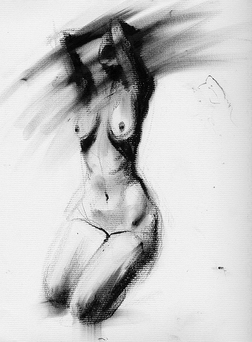
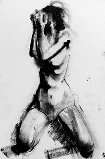
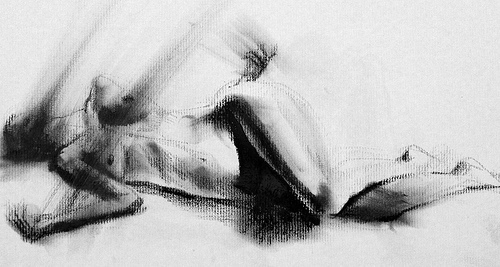
Lithographic rubbing ink
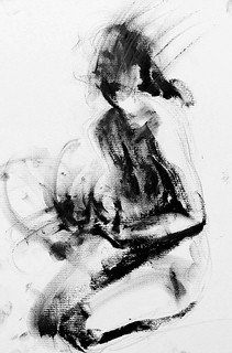
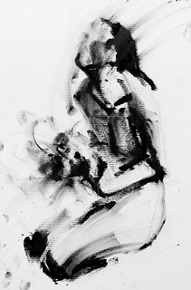
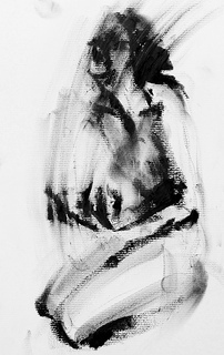
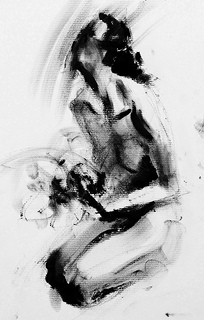
I am loving every moment of the lithographic rubbing ink that I’ve been using in these small 8″ x 10″ sketches. People always think that these drawings are charcoal drawings at first, when actually the behavior of the lithographic rubbing ink could not be more different from charcoal. I feel like the best way to describe it is to say that the rubbing ink is like drawing with tar: thick, greasy, and uncontrollably messy. Another aspect that I like about the rubbing ink is that it doesn’t erase. Many people might see this as a major disadvantage, but what I enjoy about this quality is that I’ve forced to deal with and react to every mark that I make. With an eraser, there is too much indecision, too much back-and-forth with the material that holds me back from moving forward. When I’m working with the rubbing ink, every mark I put down is an instant commitment. You have no choice but to back up each mark with bold confidence.


July 24, 2013
Book Giveaway!
I’m having a book giveaway for a lucky someone to receive a free advance copy of my book, “Learn, Create, and Teach: A Guide to Building a Creative Life.” To enter, please comment on this post. Only one comment per person please. The giveaway closes on Friday, July 26 at 5:00pm, EST time. I’ll announce the winner on Saturday, July 27. The winner will receive a free signed copy of the book. I can ship internationally, so everyone from anywhere is invited to participate! Looking forward to hearing from you!


July 23, 2013
Multiple Iterations
These small lithographic rubbing ink sketches I’m working on are made so quickly that I’m easily able to make multiple iterations of the same pose. With this approach, I can work without being too precious about each drawing, and I can tell myself that each drawing doesn’t matter. Every drawing is in essence a “rehearsal” where I get be bold and make all sorts of mistakes in the process of drawing.
I’m thinking that I may transition to a 18″ x 24″ paper soon. These 8″ x 10″ sketches are starting to feel a little claustrophobic. I don’t like working small in general, as I tend to feel physically constrained to the edges of the paper.


July 22, 2013
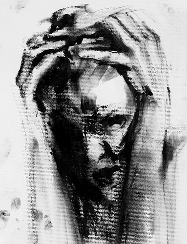
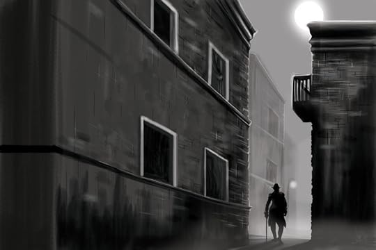
Video: Portrait Gesture Drawing
8 minute portrait gesture drawing
The final drawing:


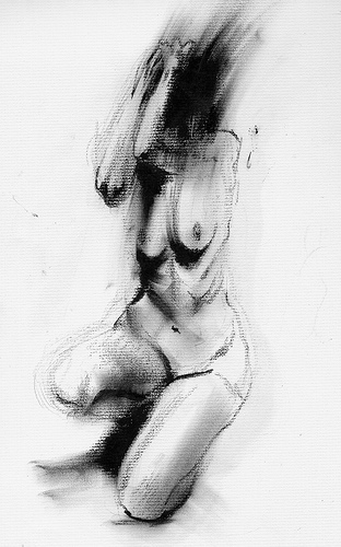
Bad drawings
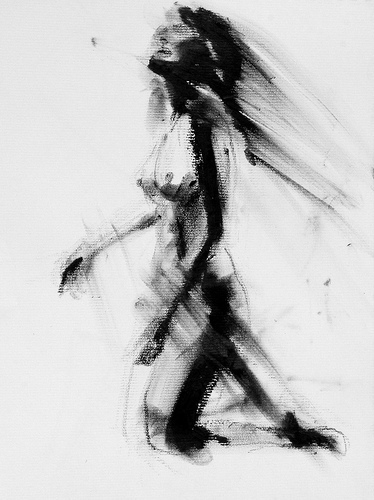
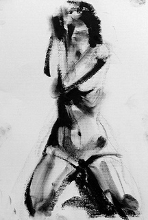
I’m having a great time working on these 8″ x 10″ lithographic crayon drawings. Each drawing takes only about 5 minutes to make, and I’m making so many of them so quickly that there’s no commitment and no pressure to make a “good” drawing. Of course, this means that a lot of bad drawings are getting made; I only post one out of every four drawings since the others are no good.
Mostly what I’m trying to work out in these drawings is the direction of the “action marks”, the streaks of lithographic crayon that move across the figure and the page. I’m trying to think about the essential gesture of the pose, where the pose might be headed, and how the “action marks” can help to emphasize that.
You can watch the video of this drawing above being made start to finish here.


July 21, 2013
Crit Wall #15
Welcome to “Crit Wall“, where I offer online critiques of individual art pieces. To submit, send me a link to one image by commenting here, or by emailing the link to me at clara(at)claralieu.com. Please, NO ATTACHMENTS. Include the media, size, and title if you have one. Only submit original, finished works, no works in progress or sketches. Artwork created for a RISD degree program course is not eligible. You’ll receive notification if your piece is selected to be critiqued. Only one submission per person please, and know that I will not be able to critique every single work due to the volume of submissions. All images will be posted anonymously.

16″ x 20″
oil on canvas
The most accomplished part of this painting is the large vessel in the middle of the page. There is a lovely transparency to the way the patterns are painted on the vessel. The sense of lighting on the vessel is well executed, especially on the right hand side where the vessel slowly fades into shadow. The transition from dark to light is highly convincing because of the smoothness of the paint strokes.
In some ways though, the fact that so much attention and care has been invested in the vessel is also detrimental to the rest of the piece. The vessel is technically well done, but the rest of the piece is lacking and appears to be incomplete by comparison. If one were to look at everything in the painting but the vessel, there wouldn’t be much to stimulate the eye.
The main issue behind this work actually begins with the set up of the still life to begin with. With a still life, there is the ability to control every aspect of the composition by setting up the objects in an interesting way. The way the three spheres on the right are lined up in a row comes across as dull and boring. Overlapping objects is one terrific and easy way to create relationships and depth in a still life. If some of the objects in this piece were overlapped, it would fabricate a more dynamic composition.
Point of view is another tool that can be employed with still life, whether the still life is being seen from above, from below, from the side, etc. In this case, the still life is perfectly at eye level as evidenced by the horizontal line that goes across the lower section of the painting. This horizontal line feels static and makes the painting too predictable.
The streaks of light streaming in on the the left hand side of the painting comes across as imagined rather than observed. This conflicts with the rest of the painting which is clearly done from direct observation. The painting would actually be more effective without this light.
The black background brings contrast to the piece, but is also quite flat. In general, black backgrounds are difficult to create for this reason. One artist who was a master of black backgrounds was the Italian painter Caravaggio, whose black backgrounds had tremendous depth and space to them. It’s impossible to see the depth in his backgrounds in this digital image below, but I know from seeing his paintings in person how complex and rich his backgrounds are.

Caravaggio, Sleeping Cupid
Past “Crit Wall” pieces are below. Click on the images to read the critique.


July 20, 2013
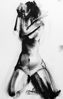
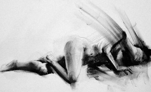
Video: Figure Gesture Drawing
A 5 minute gesture drawing.


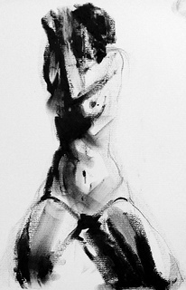
Video: Gesture Drawing
A 5 minute gesture drawing.
Merging References
Someone asked on my Facebook page how long it takes me to do these 8″ x 10″ lithographic crayon images the other day. I was curious, so I timed myself and it turns out that each drawing takes about 5 minutes, which is much shorter than I had thought. I guess it’s hard to have any sense of time when you’re drawing!
One thing that is noticeably different about doing these figure sketches is the way that I have been using my reference photos. With the series of 50 self-portrait drawings, I stuck with using a single reference photograph per drawing. These figures are proving to be more complicated because there’s just so much more to tackle in terms of the form. I have three rounds of reference photographs for these 50 figures, which is a lot of photographs. I’m finding that each round of photographs has something distinctive about it that is important for me to capture in the drawing. So it’s a challenge of picking what aspects of each photograph I want to use, and how to merge them together smoothly in the drawing.
Looking ahead, I’m anticipating that these 50 figure drawings will take a few years to make. This is significantly longer than anything I’ve ever done before; most of my projects take about one year to complete. The scale that I want to work at is a little frightening, (6′ x 4′) and to be able to work at that scale I have to be really prepared. So unlike the 50 self-portrait drawings where I simply did one portrait after another, I’m going to plan out all 50 figure drawings in advance with many, many sketches first. I also currently don’t have a studio space that can accommodate working at that scale, so that’s another issue I will have to come to terms with at some point. For now, I think it will likely be at least a year of sketches and studies before I even think about the final drawings. The sketches for each figure will be made in this order:
1) 8″ x 10″ lithographic crayon sketches on charcoal paper
2) 18″ x 24″ lithographic crayon sketches on charcoal paper
3) 3′ x 2′ etching ink and lithographic crayon studies on Dura-Lar


July 19, 2013
Back to Drawing
With my book proof approved, and 200 copies on their way, I’m now in the waiting period. I have a whole publicity strategy ready to go, but I can’t do any of it until I get the 200 copies. I hate waiting for things, so I decided to start finding other ways to occupy my mind while I wait.
So after a fairly long hiatus, I’m back to working on studies for the final 50 figure drawings in “Falling“. These are small studies, only 8″ x 10″ on charcoal paper, done with lithographic rubbing ink and lithographic crayon. Mostly I’m just experimenting and playing around with these sketches, and troubleshooting different ways of working. It’s very liberating to work so gesturally and messily after making those 60 pen and ink illustrations for my book which were so tightly detailed by comparison.