Clara Lieu's Blog, page 52
June 30, 2013
Crit Wall #10
Welcome to “Crit Wall“, where I offer online critiques of individual art pieces. To submit, send me a link to one image by commenting here, or by emailing the link to me at clara(at)claralieu.com. Please, NO ATTACHMENTS. Include the media, size, and title if you have one. Only submit original, finished works, no works in progress or sketches. Artwork created for a RISD degree program course is not eligible. You’ll receive notification if your piece is selected to be critiqued. Only one submission per person please, and know that I will not be able to critique every single work due to the volume of submissions. All images will be posted anonymously.
“Through Tears”
photograph
dimensions variable
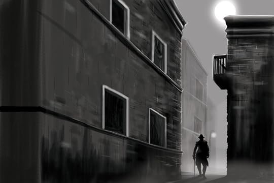
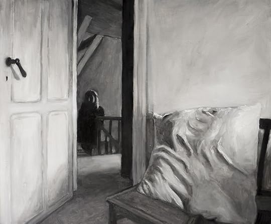
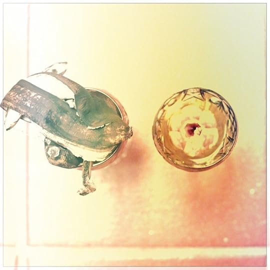
This piece has a quiet power and simplicity to it that is highly effective and lovely. There is an incredible range of subtleties in this piece that strike a beautiful sense of atmosphere throughout the entire piece. Usually such a limited tonal range doesn’t work very well, as most pieces come across as too grey and low in contrast. However, in this situation, the limited tonal range works extremely well, creating an intimate quality to the piece that is exquisite. The sense of depth is also quite impressive, there is a feeling that there is a vast space being depicted in this work.
The combination of detailed moments with more sweeping areas of blurred tone is also working very well. For example, the upper and lower sections of the piece provide a resting place for the eye, while the white vertical streaks on the left hand side of the piece provide specificity and articulation for the eyes to feast on.
The ambiguity of the subject matter is enormously successful and is one of the most intriguing aspects of the work. There are areas that are suggestive of images from nature, but the piece never gets specific enough that you can nail down exactly what it is that you’re looking at. Wind and air seem to be present in the movement of the piece which again adds to the atmosphere of the piece. This piece never really reveals exactly what it is and how it was made.
Where the piece could be improved would be in the composition. The area with the grey tones reads as a horizon line, which on it’s own isn’t particularly innovative compositionally. If the composition could be improved somehow while still retaining the simplicity of this piece this would tremendously add to the work.
Past “Crit Wall” pieces are below. Click on the images to read the critique.


Patrick Earl Hammie’s studio
I’m slowly starting to brainstorm different ideas for potential covers for my book. I’m pretty nervous about selecting the right layout and image for the cover. Let’s face it, we ALL judge books by their covers.
One thought I had was to have a photograph of an artist’s palette. Since my book is very much about creative realities and practicalities, it made sense to me to visually depict the messy side of being an artist. I thought of a palette because it’s the quintessential image that many people associate with visual art. Since I don’t paint anymore, I asked several of my colleagues who are oil painters to send me photographs from their studios. I don’t know what will come of it, but it’s possible that I might find something that works.
The first artist to get back to me was Patrick Earl Hammie, a wonderful artist who I met back in 2009. I was the gallery director of the Jewett Gallery at Wellesley College at the time, and I helped to organize Patrick’s solo exhibition, “Equivalent Exchange” at the gallery when he was the Alice C. Cole Fellowship recipient. You can also read this interview I did with Patrick for my “Thursday Spotlight” interview series.
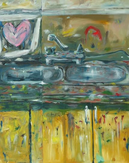
Patrick generously sent me numerous photographs of his studio space, and these ones that you see in this post are the ones that fit what I’m looking for in a book cover. Out of these three photographs, my favorite is this one above. The point of view on the palette is really great, and I like that there are paint tubes and a brush as well.
Below is Patrick working in his studio with one of his paintings in the background. You can read more about him on his website, or on his Facebook page.
.


June 28, 2013
Doubt
I’m getting very close to completing the illustrations, and my husband has finished the first pass of the layout with the text. This point in the project brings conflicting feelings that I’m having trouble reconciling. On one hand, it’s thrilling to see the layout with the text in place, it makes everything feel more “real”. This sounds silly, but seeing the text in the layout makes the writing seem more meaningful and polished as I read it. At the same time, I’m developing serious doubts about what I’m about to put out there with my name on it. I have all sorts of irrational, negative thoughts going through my head right now. What if the writing and content isn’t as interesting as I think it is? What if I sell 10 copies and that’s the end of it? What if people think I’m stupid? (yes, that thought truly goes through my head) I think these kinds of feelings are inevitable when you’re on the verge of releasing a big project, but it still doesn’t make it easier to deal with.


June 26, 2013
Shrinking
Lately I’ve been noticing that I’m purposefully drawing the illustrations a lot larger than before. I realized that I’ve been doing this because when I place the image with the text, I shrink the image. Basically, the more the image shrinks, the more the illustration will appear to be more finely detailed. I’ve had several illustrations that looked okay in their original size, but then really looked great when I shrunk them.
This illustration of shaking hands above has to be redone because I drew the original illustration almost at the size of the final illustration. Therefore, the drawing hardly shrunk at all when I placed it with the text, making the lines appear to be too bold and clumsy.


June 25, 2013
Stumped
Another rejected illustration
I’ve been slowly chipping away at the more conceptually difficult illustrations for my book. I’ve been pleasantly surprised that I’ve been able to resolve some of the really tough ones that I was feeling were impossible just a few days ago. Mostly I’ve been brainstorming out loud with my husband, talking through possibilities and ideas. For the most part this process has been very effective, and we’ve come up with a number of solutions that I know I wouldn’t have been able to do on my own.
I have five concepts that have me completely stumped. Here they are:
1) Diversity, peer group, community
2) Being objective
3) Making a mistake
4) Face to face interactions (without drawing two faces)
5) two way exchange, alertness
Any suggestions for images that could represent these ideas?


June 24, 2013
Milk
I was working on an illustration of a gallon of the milk earlier this week. It’s interesting to me that something as simple as a gallon of milk still requires a good quality reference photo. I’ve been using Google Image search for the majority of my reference photos for these illustrations, so I lazily used a photo of a gallon of milk from a Google search. You would think that from the thousands of photographs of milk online that this would work out. This illustration below was what came out of it, and it was no good; the cross-hatching isn’t well done, the lighting doesn’t make sense, and the cap is too large in relation to the rest of the jug.
So I went ahead and shot a photograph of a gallon of milk myself, with the lighting and point of view that I was looking for.
Below is the final illustration, which I think was a huge improvement from my initial illustration. The lazy way out never works!


June 23, 2013
A Wall
I’ve hit a wall in these illustrations for my book. I’ve finished 2/3 of the illustrations so far and the ones that are left are feeling impossible to deal with right now. Either I can’t come up with a concrete image because the idea for the chapter is so abstract, or the image that is right isn’t that visually interesting enough on its own. For example, I have a chapter that involves the image of a butter knife, which on its own isn’t exactly visually stimulating to look at. I can tell already that these last illustrations are going to really challenge me conceptually.
There’s also a learning curve that is starting to happen with the illustrations. As my new illustrations become more refined and realistic, the older illustrations are starting to look more like cartoons. This illustration of Rome that you see above was fine to me a few weeks ago, but now compared to the more recent illustrations comes across as overly simplified and flat. It seems like more than ever, the rejection pile is getting thicker by the moment.


June 21, 2013
Ask the Art Professor:Is it bad to start another piece of art before finishing another one?
Welcome to “Ask the Art Professor“! Essentially an advice column for visual artists, this is your chance to ask me your questions about being an artist, the creative process, career advice, a technical question about a material, etc. Anything from the smallest technical question to the large and philosophical is welcome. I’ll do my best to provide a thorough, comprehensive answer to your question. Submit your question by emailing me at clara(at)claralieu.com, or by posting here on this blog. All questions will be posted anonymously. Read an archive of past articles here.
Here’s today’s question:
“Is it bad to start another piece of art before finishing another one?”
Starting a new piece while working on another is actually a terrific strategy that many artists use. If you only work on one piece at a time, that creates unnecessary pressure on the creation of that specific work. You’re essentially putting all of your eggs in one basket, investing everything you’ve got into that one work. For many people, this situation causes them to be too precious with their artwork. This mindset makes it impossible to take creative risks and try new approaches.
There can be many advantages to working on many pieces all at once. I find that it’s important to be able to step away from your artwork and get some emotional distance from the work. Having multiple pieces in progress enables me to achieve that distance by working on a different piece every day. I’m able to make a piece, step away from it for several days and then come back to it with a fresh eye. When things aren’t going well with one piece, I can take a break from that piece and work on another. I’m less precious about each individual work because I know that if that one piece is a dud that I have many more. If you’re working in a series, working on several pieces all at once can create cohesion in the body of work.
I myself always make sure that I have not only many artworks in progress at the same time, but multiple projects as well. When something isn’t going well with one project I divert my attention to another. This keeps me from getting overly frustrated with any given project, because I know there’s always something else waiting for me. Sometimes what I’m working on is based on the time constraints of my current schedule, an opportunity that I’m pursuing, while other times it just happens to be the project I’m the most excited about. I enjoy leaping back and forth between projects. Each project is different and therefore exercises different parts of my mind.
An illustration from my children’s book series
I have projects that I keep on the back burner that I know I will return to when the time is right. My children’s book series which I worked on feverishly for a few years is currently on the back burner. Due to my change in studio space, I’ve had to put the future 50 figure drawings from “Falling” aside temporarily. While those two projects “rest”, I’m working on illustrations for my book “Learn, Create, and Teach: A Guide to Building a Creative Life,” as well as this advice column, which I’m hoping will be my next book.
Related articles:
“How can I tell if I’m skilled enough?”
“How do you find your own individual style?”
“How do artists manage to get their soul out into images?”
“How do you develop an idea from a sketch to a finished work?”
“How do you make an art piece more rich with details that will catch the eye?”
“How do you learn the basics?”
“Is photography art?”


June 20, 2013
Tougher
I feel completely consumed by these illustrations for my book right now. All I think about is the illustrations and I’m spending every possible waking moment working on them. For this reason, I’m taking a short breather from my “Ask the Art Professor” column and “Crit Wall“, my online critique program. I am definitely one who believes in striking while the iron is hot. As of today, I’ve finished 31 out of the 60 illustrations that I need to complete.
The illustrations are getting much tougher and more challenging at this point. I took care of the most straightforward illustrations first because I wanted to immerse myself into the project quickly. I knew that if I tried to tackle the most difficult illustrations first that I wouldn’t have been as productive initially. Now that most of those beginning illustrations are finished, it’s on to the concepts that are much more abstract and more challenging to visualize. Right now I’m wracking my brain for ways to visually represent concepts like consistency, predictability, objectivity, diversity, as well as others.
You’ll get to see lots of rejected illustrations here on my blog. The latest reject from today is this illustration of a mailbox. Like the ambulance illustration I rejected the other day, this image has some perspective issues and I wasn’t happy with the cross-hatching either. As you’ve probably noticed by now, I’m being careful not to reveal too much of the final, approved illustrations. I want the majority of the illustrations to be a surprise when people buy the book!


June 18, 2013
Illustration Rejects
These illustrations for my book are proving to be very tricky. Some seem to nearly draw themselves, (such as the sandwich seen above) while others have required a lot more troubleshooting. While I work on the final illustrations, I find myself second guessing my ideas all the time. I’m making spur of the moment changes all of the time in the imagery for this reason, which I think for the most part is a good thing.
I have already rejected numerous final illustrations because I didn’t like the way that they were working conceptually. Others have been rejected because I felt that the technical execution wasn’t as solid as I wanted it to be. This illustration of an ambulance below is one of my recent rejects; the perspective on it is not quite right, and therefore compromises the image.
Some of the illustrations get rejected because they don’t seem to have enough visual presence. I really like the idea of a potato chip illustration because it fits the text well, but when I sat down to draw it, the potato chip just wasn’t able to hold the space on its own. (see image below)


