Steve Bull's Blog, page 1314
September 15, 2017
Keynes: A Master of Confused and Confusing Prose

[This article is a selection from Where Keynes Went Wrong ]:
Paul Samuelson, professor of economics at MIT after World War II and author of a best-selling economics textbook, was one of Keynes’s most ardent American disciples. Here is what he has to say about the latter’s General Theory:
It is a badly written book, poorly organized. . . . It is arrogant, bad-tempered, polemical, and not overly generous in its acknowledgements. It abounds in mare’s nests and confusion….
In reading this, one recalls Keynes’s infatuation with paradox. Samuelson, the ardent disciple, is telling us that the master’s book is good because it is bad.
We do not, however, have to take Samuelson’s word about the bad writing, poor organization, and general confusion of The General Theory. Following publication in 1936, many leading economists pointed to the same problems, although some of them hesitated to criticize or quarrel with Keynes and thus chose their words carefully. Frank H. Knight, a leading American economist, complained that it was “inordinately difficult to tell what the author means. . . . The direct contention of the work [also] seems to me quite unsubstantiated.”
Joseph Schumpeter noted Keynes’s “technique of skirting problems by artificial definitions which, tied up with highly specialized assumptions, produce paradoxical-looking tautologies. . . .” British economist Hubert Henderson privately stated that: “I have allowed myself to be inhibited for many years . . . by a desire not to quarrel in public with Maynard . . . . But. . . I regard Maynard’s books as a farrago of confused sophistication.”
French economist Etienne Mantoux added that the whole thing simply appeared to be “rationalization of a policy … long known to be . . . dear to him.
In The General Theory itself, Keynes has a good word to say about clarity, consistency, and logic.He is quick to pounce on what he considers the errors of others. But he then leads us down a rabbit hole of convolution, needless and misleading jargon, mis-statement, confusion, contradiction, unfactuality, and general illogic.
…click on the above link to read the rest of the article…


September 14, 2017
World Out Of Whack: Electricity YAY!
Britain to ban sale of all diesel and petrol cars and vans from 2040
So says the Guardian.
Which follows on from:
France to ban sales of petrol and diesel cars by 2040
This follows Norway, The Netherlands, Germany and now – the big Daddy…
China plans to ban sales of fossil fuel cars entirely
China is the world’s largest auto market, with 28.03 million vehicles sold last year, a boost in demand of 13.7 percent vs. 2015 sales numbers. The nation has already done a lot to incentivize manufacturers to develop and sell new EVs, including allowing foreign automakers to create a third joint venture with local automakers (a standard requirement for doing business in the country for auto OEMs) so long as it’s dedicated to the creation of EVs exclusively.
CO2 emissions from EVs are substantially lower than their fossil-fuel-guzzling cousins. And since most of us prefer swallowing our air without having to chew it first, the appeal is as easy to understand as Cameron Diaz in a bikini.
Here’s an excellent chart which you can go and play around with which shows vehicle emissions. The yellow are the EVs (click the chart):
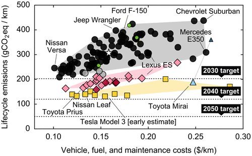 Source: http://carboncounter.com
This news has tree-hugging beardies everywhere rejoicing because they will, once and for all, get rid of all those ghastly baby-seal-murdering bastard oil and gas executives.
Two Things Worth Thinking About Here
If EVs take over the planet, prevent air pollution, cease the destruction of the short-eared owl’s habitat, and cure halitosis, surely more electricity will be required, no?
And secondly, if the internal combustion engine is going to prop up landfills, then what exactly goes into making these EVs? Because being a simple guy I couldn’t help stop and do simple math. That is: if car (a) being satan’s transport (diesel, of course) is replaced with car (b) the unicorn rainbow (EV), surely there will be massive demand for all the stuff that makes up car (b).
…click on the above link to read the rest of the article…
What Does the QE Experience Say About Rates in a Shrinking Fed Balance Sheet World?
The Federal Reserve is likely to decide next week to begin letting assets roll of its balance sheet as bonds mature, instead of reinvesting the proceeds. This means that the balance sheet will begin to shrink in size and other market participants will be forced to absorb the supply of new issuance of treasury and mortgage backed securities. Conventional analysis of supply and demand dynamics might suggest the exiting of a large marginal buyer of these securities would cause yields to rise to some higher equilibrium level, but the QE experience suggests something else entirely. When the Fed was engaged in asset purchases and the rate of change in the Fed’s balance sheet was rising (late 2010, mid 2012 through early 2013) long-term treasury yields rose on the back of juiced growth and inflation expectations produced by the stimulus. When the rate of change in the Fed’s balance sheet would flat line or fall (most of 2010, most of 2013 through 2014) treasury yields fell on the back of subdued growth and inflation expectations. Importantly, it was both real rates (TIPS) and breakeven inflation that followed this pattern, which is indicative of the level of economic stimulus produced by QE. Chart 1 below shows 10-year nominal rates (red line, right axis) overlaid on the three month difference in the Fed’s balance sheet (blue line, left axis). Chart 2 below shows 10-year real rates (red line, right axis) overlaid on the three month difference in the Fed’s balance sheet (blue line, left axis). Chart 3 below shows 10-year implied breakeven inflation expectations (red line, right axis) overlaid on the three month difference in the Fed’s balance sheet (blue line, left axis).
…click on the above link to read the rest of the article…
Florida Farmers Say Irma’s Damage Is The Worst They’ve Ever Seen

Almost half of Florida’s citrus crops were destroyed during the hurricane and when Florida farmers survey the damage caused by Hurricane Irma, and most are saying it’s the worst destruction to their farms that they’ve ever seen.
When the worst of Irma’s fury had passed, Gene McAvoy hit the road to inspect the citrus groves and vegetable fields in Florida. McAvoy is a specialist on vegetable farming at the University of Florida’s extension office in the town of LaBelle. LaBelle is located in the middle of one of the country’s biggest concentrations of vegetable and citrus farms.
According to NPR, the storm made a direct hit to those fields. “The eyewall came right over our main production area,” McAvoy says. Irma had destroyed almost half of the citrus crops in the central Florida area, meaning prices are likely going to go up sharply.
Many of the destroyed groves of oranges and grapefruit were actually approaching harvest too. But after Irma blew through, it left “50 or 60 percent of the fruit lying in water [or] on the ground,” says McAvoy. Many trees were standing in water, a mortal danger if their roots stay submerged for longer than three or four days. About a quarter of the country’s sugar production comes from fields of sugar cane near Lake Okeechobee, just east of LaBelle. Harvest season for the sugar cane crop is only a few weeks away, but Irma knocked much of the cane down, making it more difficult to harvest. “We won’t know the exact extent of the loss until it’s harvested,” McAvoy says.
…click on the above link to read the rest of the article…
Dear Jamie Dimon: Predict the Crash that Takes Down Your Produces-Nothing, Parasitic Bank and We’ll Listen to your Bitcoin “Prediction”
This is the begging-for-the-overthrow-of-a-corrupt-status-quo economy we have thanks to the Federal Reserve giving the J.P. Morgans and Jamie Dimons of the world the means to skim and scam the bottom 95%.
Dear Jamie Dimon: quick quiz: which words/phrases are associated with you and your employer, J.P. Morgan? Looting, pillage, rapacious, exploitive, only saved from collapse by massive intervention by the Federal Reserve, the source of rising wealth inequality, crony capitalism, privatized profits-socialized losses, low interest rates = gift from savers to banks, bloviating overpaid C.E.O., propaganda favoring the financial elite, tool of the top .01%, destroyer of democracy, financial fraud goes unpunished, free money for financiers, debt-serfdom, produces nothing of value to society or the bottom 99.5%.
Jamie, if you answered “all of them,” you’re correct. The only reason you have a soapbox from which you can bloviate is the central bank (Federal Reserve) saved you and your neofeudal looting machine (bank) from well-deserved oblivion in 2008-09, and the unprecedented, co-ordinated campaign by global central banks to buy trillions of dollars of bonds and stocks.
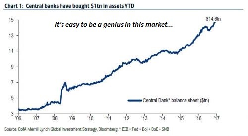
Central Banks Have Purchased $2 Trillion In Assets In 2017
This 8-year long central bank intervention has:
1) transferred billions in what were once interest payments earned by savers and pension funds to banks such as J.P. Morgan
2) boosted your sales by flooding the financial system with low-cost credit
3) lifted your stock far above its value in an unmanipulated market and thus
4) awarded you immense stock-option and bonus-based wealth for doing nothing but letting the central banks enrich J.P. Morgan and its peers.
…click on the above link to read the rest of the article…
Fathom Consulting: “There Is A Bubble In Everything Except Housing”
Presented with minimal comments, the following ‘picture’ from Fathom Consulting paints a thousand words of unsustainability and delusion…

While we agree with most of the chart above’s content, we note that the call on the ‘housing’ non-bubble all depends on which market you are looking at…

Of course, the charts above are merely the symptoms.
This is the cause…

Compared to the ‘normalized’ movement in central bank balance sheets before Lehman; the current (and utterly ridiculous) size of the G-3 central banks balance sheet is 47 standard deviations above trend!!
So where is the real ‘disease’ that needs to be cured? “I’m the hero of the new world” … “No, you’re the disease…”
“Bad Options” Regarding 2% Inflation Targets (And Other Silly Notions)
The Wall Street Journal and Bloomberg both posted ridiculous articles regarding today regarding inflation.
The former was on “bad options” the latter on “inflation expectations”.
Let’s take a look at both articles because both represent widely believed nonsense.

In Bad Options for Addressing Too-Low Inflation, Wall Street Journal writer Greg Ip says the Fed’s choice is to overheat the economy or give up its 2% target.
Unemployment and inflation are near their lowest levels in decades. Who wouldn’t love that?
Janet Yellen, for starters.
What looks like a dream economy could be a nightmare for the Federal Reserve chairwoman. Ms. Yellen’s worldview assumes that when unemployment is this low—4.4% in August—inflation should move up to the Fed’s target of 2%. Instead, it may have stabilized around 1.5%. That presents the Fed with some unpalatable options: deliberately overheat the economy for years to get inflation back up, then potentially induce a recession to stop it from overshooting; or give up on the 2% target, which could hobble its ability to combat future recessions.
This isn’t scaremongering: It’s the logical consequence of how central banks believe inflation operates. At the center of their model is the Phillips curve, according to which inflation edges lower when unemployment is above its natural, equilibrium level and putting downward pressure on prices and wages. Below that natural rate, also known as full employment, inflation crawls higher.
Until recently, Fed officials scoffed at the possibility [Trend inflation has fallen]. They noted surveys that suggest the public still expects inflation to return to 2% and credit their oft-repeated promise to hit their 2% target. But are they fooling themselves? Expectations of inflation are determined in great part by what inflation actually has been, and after every recession since 1982, core inflation has averaged less than in the previous business cycle: 4.1% in the 1980s, 2.1% in the 1990s, 1.9% in the 2000s, and 1.5% since 2009.
…click on the above link to read the rest of the article…
Which is Fraudulent – Bitcoin or JP Morgan?

I’m really grateful JP Morgan CEO Jamie Dimon decided to once again lash out in anger at Bitcoin, as it provides us with ample opportunity to highlight a practice very near and dear to how the bank operates. Fraud.
The way the news cycle works, any topic that isn’t already at the forefront of enough people’s minds will be largely ignored irrespective of its importance. The fact that Jamie Dimon ironically called Bitcoin a fraud, allows us to ask highlight some very important facts about the seemingly systemic fraud inherent in America’s largest bank, JP Morgan.
First, let’s take a quick look at some of what Mr. Dimon said. Courtesy of the financial plutocrat network, CNBC:
Jamie Dimon has not changed his mind about bitcoin.
Mr. Dimon, the long-time CEO at J.P. Morgan Chase, continued his well-documented criticism of the digital currency bitcoin. Speaking at the Barclays financial services conference on Tuesday, Mr. Dimon was asked whether his bank had a trader who traded bitcoin.
His response? “If we had a trader who traded bitcoin, I’d fire them in a second,” he said. “It’s against our rules” and any trader that deals in them is “stupid.”
Ultimately though, Mr. Dimon said that he thinks Bitcoin is “a fraud” and it “will eventually blow up.” He referenced approvingly the comments of another titan of the traditional markets, Howard Marks, who recently called bitcoin “an unfounded fad.”
Of course he hasn’t changed his mind about Bitcoin, and he never will. As he himself noted back in 2014.
It’s not the first time Dimon has issued a warning about Silicon Valley businesses.
“They all want to eat our lunch,” he told investors a year ago. “Every single one of them is going to try.”
…click on the above link to read the rest of the article…
How the NSA Built a Secret Surveillance Network for Ethiopia

Photo: Minasse Wondimu Hailu/Anadolu Agency/Getty Images
HOW THE NSA BUILT A SECRET SURVEILLANCE NETWORK FOR ETHIOPIA
“A WARM FRIENDSHIP connects the Ethiopian and American people,” U.S. Secretary of State Rex Tillerson announced earlier this year. “We remain committed to working with Ethiopia to foster liberty, democracy, economic growth, protection of human rights, and the rule of law.”
Indeed, the website for the U.S. Embassy in Ethiopia is marked by press releases touting U.S. aid for farmers and support for public health infrastructure in that East African nation. “Ethiopia remains among the most effective development partners, particularly in the areas of health care, education, and food security,” says the State Department.
Behind the scenes, however, Ethiopia and the U.S. are bound together by long-standing relationships built on far more than dairy processing equipment or health centers to treat people with HIV. Fifteen years ago, the U.S. began setting up very different centers, filled with technology that is not normally associated with the protection of human rights.
In the aftermath of 9/11, according to classified U.S. documents published Wednesday by The Intercept, the National Security Agency forged a relationship with the Ethiopian government that has expanded exponentially over the years. What began as one small facility soon grew into a network of clandestine eavesdropping outposts designed to listen in on the communications of Ethiopians and their neighbors across the Horn of Africa in the name of counterterrorism.
In exchange for local knowledge and an advantageous location, the NSA provided the East African nation with technology and training integral to electronic surveillance. “Ethiopia’s position provides the partnership unique access to the targets,” a commander of the U.S. spying operation wrote in a classified 2005 report. (The report is one of 294 internal NSA newsletters released today by The Intercept.)
…click on the above link to read the rest of the article…
Adjusting Measurements to Match the Models – Part 3: Lower Troposphere Satellite Temperatures
 Except for small gaps over the poles the satellite temperature series are the only truly global temperature series we have; their defect is that they do not begin until 1979. Published series are constructed using raw records from different satellites that require large adjustments to bring them into line, but the good comparison between the most widely-referenced series – the University of Alabama Huntsville (UAH) lower troposphere (TLT) series – and radiosonde series suggests that these adjustments are valid. The other widely-referenced series – the Remote Sensing Systems (RSS) TLT series was adjusted in 2015 to show over 0.2C more warming since 1979 than UAH. Data reviews do not tell us which series is the more correct, but the circumstances surrounding the RSS adjustments are suspicious. In any event, both series show significantly less warming in the lower troposphere than predicted by climate model simulations – yet another instance of the measurements not matching the models.
First a disclaimer. Satellite temperatures are a highly-specialized field in which I have no particular expertise, so I may have made some factually incorrect statements. Readers who find any are encouraged to point them out.
Satellite temperature measurements
Satellites use microwave sounding unit (MSU) sensors to measure radiances in various wavelength bands that require mathematical inversion to obtain temperature values. Three MSU units measure temperatures at three different atmospheric levels:
MSU2: The middle troposphere (TMT)
MSU3: The upper troposphere/lower stratosphere (TTS)
MSU4: The lower stratosphere (TLS)
Rather than pinpoint a specific elevation the three MSUs measure temperatures over wide and overlapping ranges of elevations, as shown in Figure 1A. But none of them zero in on the lower troposphere, so to obtain TLT data the outputs of the three MSUs are weight-averaged (UAH uses 1.538*MSU2 – 0.548*MSU3 + 0.01*MSU4).
…click on the above link to read the rest of the article…