T. Rae Mitchell's Blog, page 19
October 25, 2013
Kirsty Mitchell’s Wonderland is a true wonder
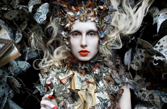
There’s nothing better than discovering something so beautiful you’re caught in a moment of breathless wonder. I am in awe of Kirsty Mitchell’s sheer imagination and ability to execute her vision with this level of commitment to detail in each and every one of her fairy tale settings. The amount of painstaking work and hours involved with creating all the many costumes and props is overwhelmingly impressive. After taking a whole year to make all the props for my Fate’s Fables book trailer, I understand and appreciate the effort that’s gone into Kirsty’s magical scenes.
Her labor of love began in the summer of 2009 when she was drawn to create a storybook world in the woods as a tribute to her mother who’d passed away the year before. She worked in her spare time with no budget, the help of friends and the donation of unwanted treasures. Now after four years of waiting for the right seasons to arrive so she could illustrate the passage of time within her enchanted forest, her work is “being recognized by Harper’s Bazaar, Italian Vogue, The Daily Mail, the BBC News, MSN, the Huffington Post and countless magazines and blogs around the world.”
For a glimpse of the work that went into setting up this gorgeous photo called, “The Ghost Swift”, be sure to watch this behind-the-scenes video.


October 22, 2013
Top 10 worst CGI movie effects. Is yours on the list?
Have you ever hunkered down into your seat at the theater with popcorn in hand and your eyes round with excitement as that blockbuster fantasy or sci-fi movie you’ve been dying to see starts up on the big screen? Sure, we’ve all been there. A feeling not unlike a visit to Disneyland when we were kids, because we know we’re in for a two hour thrill ride of awesome visuals, an all-star cast and great story. Then just as the movie’s humming along and it’s becoming one of your absolute favorites, IT happens. A scene that suddenly blemishes this kick-ass film (like a mountainous zit on your face nobody can ignore) with one horribly conspicuous CGI effect that’s as cheesy as the herky-jerky stop-motion effects of Clash of the Titans, circa 1981.
Remember the Scorpion King in The Mummy’s Return? If you do, you know he wasn’t much better than Medusa. Actually, I’ll take Medusa over him. She’s at least creepy with that rattlesnake tail, whereas the Scorpion King just makes me cringe with how computery and fake he looks. So it was no surprise to find out he’s No. 1 in the top 10 worst CGI movie effects of this video.
October 21, 2013
The new Sleepy Hollow is not only good and creepy but it’s also a fresh spin on the old legend
I’ve always been a fan of The Legend of Sleepy Hollow, from Irving’s original scary tale to Disney’s humorously tense version, and of course, Tim Burton’s atmospheric rendition with the famed steampunk style, Johnny Depp playing a very nervous, fainting Ichabod Crane. Now we have the Sleepy Hollow TV series, which I’ve held off from writing about until I saw a few episodes.
Well now that I have, I’ve got to say I’m really digging it. There’s witchcraft, time travel, a biblical apocalypse on the way and some super creepy demons that are truly chilling. The demon in the woods bent one of his follower’s head back like a “Pez dispenser” before bringing him back to life with a stretched out neck and the Sandman haunts peoples’ dreams and turns their eyes to sand after he tortures them into killing themselves. But what I’m really liking are the main characters, Abbie and Ichabod. She’s a tough African American cop with a troubled past and he’s one of President Washington’s honourable colonial soldiers who hasn’t seen emancipation of the slaves, or a car for that matter. There’s a lot of great story material here, and so far they’re pulling it off very well.

October 12, 2013

October 9, 2013
Want to get happy? Listen to Take Your Shoes Off!
Just wanted to share the new release of my good friend, Troy Tilley’s new song, Take Your Shoes Off. If this doesn’t put a smile on your face and get your toes tapping, then…well…you need to be tickled. 
October 1, 2013
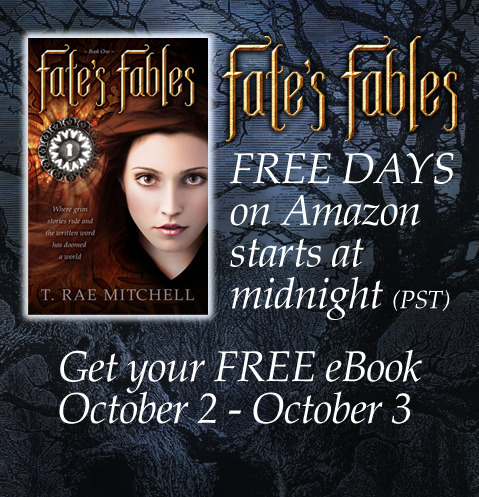
Last chance to get Fate’s Fables eBook FREE!
For those of you who missed out on getting a FREE eBook copy of Fate’s Fables back in August, you’ve got one more chance to download from Amazon this Wednesday and Thursday. But make sure you don’t miss out. This is the last time you’ll see Fate’s Fables free. http://amzn.com/B00B6K2EPC
September 30, 2013
A good time was had by all at WORD Vancouver yesterday
I had so much fun meeting all the new people who stopped by the RWA-GVC booth at WORD Vancouver yesterday. I got to hang out with my RWA-GVC writing friends and met my new readers in person. That’s always such a thrill for me. I also met Laura Thomas, the event coordinator for the Fall 2013 Junior Author’s Conference. For all you young writers who live in the lower mainland, be sure to check it out. There’s six writing workshops, goody bags and prizes (one of which is a copy of Fate’s Fables).

September 27, 2013
You’ve got to watch this Dear JJ Abrahms letter about handling Star Wars with care
At last someone has finally defined why the new Star Wars movies never quite measured up to the pure awesomeness of the original trilogy. It may have taken 5 months for Prescott Harvey and team to create this open letter to J.J. Abrahms about following these four rules for the future making of Star Wars movies. But they really nailed where the prequels went wrong by pointing out it was the threatening environments of the remote frontiers like Hoth, the ice planet, that created those killer adventures. And it’s true, I wasn’t as taken with the action that took place in the pristine cities and pretty much boring galactic senate. Then there’s the rule, “Star Wars isn’t cute!”, the reference being Jar Jar Binks. But you know what? Ewoks weren’t exactly scary. They were cute. So I think Prescott kind of gave those tough teddy bears a pass.
After all this deliberation, I’ll just say after what J.J. Abrahms did with Star Trek, I trust him with our precious Star Wars future.
September 21, 2013
Curious about the power of a well-designed book cover?
How many times have you been shopping for a particular book and been inadvertently drawn off course by an eye-catching cover? Suddenly you’re mesmerized like someone zapped by a spell. You can’t pry your eyes away. You’re instantly engaged in reading the blurb and sampling pages. Before you know it, the book you intended to buy is forgotten in the excitement of discovering this new promise of adventure. Whether you realize it or not, you’ve been successfully enticed by a book package crafted to compel you to take those very actions.
Publishers have long known the power of a well-designed book cover to cut through the first major barrier to sales–get the reader to notice the book. They understand we’re predominantly visual beings and that the outer packaging influences how we react to what’s behind that alluring cover.
As the self-publishing market explodes, I’m seeing a lot more low quality book covers. This is unfortunate, because there’s some fantastic writing out there which could be showcased in a more advantageous light. I think this is because many of these authors are either designing their own covers or hiring the least expensive service they can find.
Having spent the entirety of my adult life as a graphic designer, I felt quite confident in my ability to craft the cover for my YA fantasy novel, Fate’s Fables. I came up with about six different designs before I settled on the one I thought was perfect for my book–a story about a girl named Fate who becomes trapped inside a book of eight dark fables she must turn into happily-ever-afters in order to escape. I thought I’d hit the mark with this design, which portrayed a huge open book with letters lifting off the pages and swirling around Fate’s face like a flurry of snowflakes against a black backdrop.
While this may sound intriguing, I soon discovered the design didn’t work in thumbnail. For those who don’t know what a thumbnail is, it’s the tiny book cover size you see when you’re searching online. With more and more online shopping, this is an important detail. Much to my great frustration, my design was unreadable at this size. So I went back to the drawing board, but I kept going around in circles trying to somehow make the same concept work for thumbnail.
I finally had to relinquish control and place my precious baby in the hands of a trusted designer with more expertise than I had in this arena. And boy, was I glad I did. I didn’t think it was possible to love this new cover more than the one I’d become so attached to. His design choices seemed obvious to me once I saw it, but being the author, I realized I’d been way too close to the story to design effectively. I’m happy to say there’s been positive praise for the cover. One reviewer commented, “The cover of this book (Fate’s Fables) is amazing. Look into her eyes. They’re captivating.”
This is not to say authors–whether they’re designers or not–can’t hit on a cover that works, but it’s generally not the rule for many reasons, some of which I’ve noted here. I encourage self-published authors to recognize the power of a book cover to either attract or repel readers. It’s been said a million times to never judge a book by its cover, but let’s be honest, everyone does. With that in mind, take extra care to ensure your book cover halts readers in their tracks and draws them into taking a closer look. Don’t rely on your opinion only. Get feedback from others and be open to it, just as you did with your editor and beta readers.
Originally posted on Tracy Riva.com.
Curious about the power of a well-designed book cover? Visit @TracyRiva .com to find out in my guest post.

A really compelling book cover doesn’t just happen. A lot of thought goes into designing a cover that will make a book jump out at readers. If you’d like to learn more, read my guest post at Tracy Riva.com.