
Andrew Macarthy's Blog, page 34
June 14, 2013
YouTube Cover Art Template PSD Free | 2560 x 1440 Photoshop, GIMP
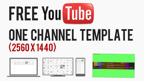
There was something bothering me about my last YouTube One Channel cover art template - not just the fact that, since it was made, YouTube has significantly upped its recommended dimage size without warning! While it aids well in creating an image that will scale well for any resolution or device, it does not take into account the position of the channel icon, which overlays the image from the top left-hand corner. This new template is the new, bigger size, and optimised to take into account channel icons.
A quick recap on how YouTube channel art works: The YouTube One Channel artwork is massive (2560 x 1440 pixels), and designed to present consistent branding on whichever device it is viewed on, from a HD television down to a mobile device. What proportion of the image a person sees depends on the device they are using. On HD televisions and mobile devices, the channel icon does not even appear, but this template is designed to provide an optimised design for any device: television, desktop, tablet, or mobile.
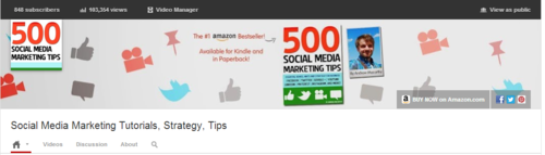
Example of Non-Optimised Channel Art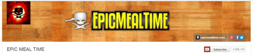
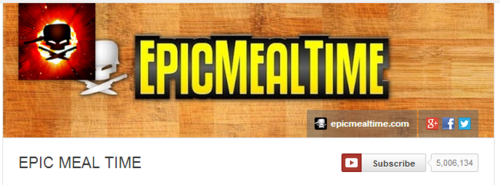
As you can see in the above example from the EpicMealTime channel, the channel art looks great at higher resolutions on desktops, but at 1024 x 768 pixels, the channel icon infringes on their cover art branding. My new template will help you avoid encountering any problems like this.
An Explanation on the Template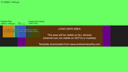
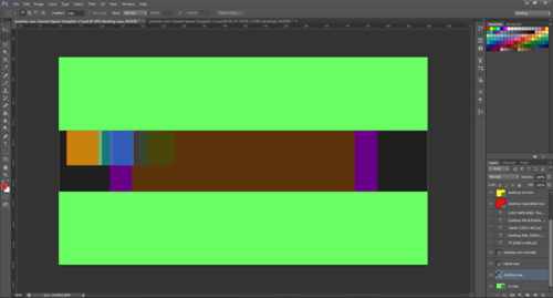
When you open up the .psd template in Photoshop or GIMP, it'll look like this (click for an enlarged view). It might look complex, but it's pretty simple, really. Here's how the different sections break down:
Lime green background: portion of art seen on HD televisionsOrange rectangle (full width): maximum portion of art seen on desktops.Purple rectangle: Maximum portion of art seen on tablets. Brown rectangle: Logo safe area - this portion of the art will be visible on all devices. Multicoloured squares: Representation of the positions and size of channel icons at different resolutions - it does not appear on mobile devices.How to Use the TemplateHere are a few quick steps to use my YouTube One Channel template:
1. Hide or delete the instructional text layers.
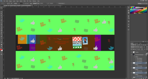
2. Design your channel art over the coloured rectangles, covering the whole space as you like. However, make sure to add the most important elements in the LOGO SAFE AREA, so that whichever device someone views your channel on, they can see it.
Avoid placing important elements of your design behind the multicoloured squares that represent the position of channel icons at different resolutions on varying devices, otherwise they will be hidden and obscured.
3. Once your design is complete, hide the remaining template layers - the coloured rectangles and squares - and save your image as a .png or .jpeg.
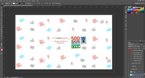
5. Upload your channel art to YouTube. Do not adjust the crop.
6. Click Select and admire the finished work!
Download the Template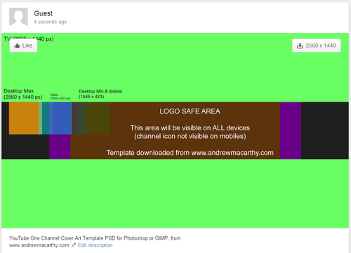
My latest YouTube One Channel template is available for download at minus.com via the link below. When you visit the site, hover over the image and click the download icon to grab it. Link not working? Tweet me @500socialmedia and I'll upload a new one!
Download here: http://min.us/lkrfvpnmTTIeq
ABOUT THE AUTHOR
Andrew Macarthy is the author of the #1 Amazon Web Marketing Bestseller, 500 Social Media Marketing Tips, available for Kindle and in paperback.
Buy 500 Social Media Marketing Tips
Amazon US: http://www.amazon.com/dp/B007L50HE6
Amazon UK: http://www.amazon.co.uk/dp/B007L50HE6
Follow Me:
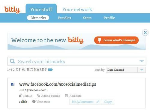
http://www.fa
cebook.com/500socialmediatips/
https://pinterest.com/500socialmedia/
http://www.twitter.com/500socialmedia
http://www.youtube.com/5
00socialmediatips


June 11, 2013
A Top YouTube Channel Trailer Tip: Use Shortened URLs
One of my most popular video tutorials is about how to make a great YouTube channel trailer. A point I neglected to make in it, though, is how you can use shortened links to make the channel trailer video's description as enticing and clickable as possible.
The old description (and three reasons why I didn't like it)
This is how my YouTube channel trailer and its description looked before. If you take a close look, you'll see that several of the links to my social media profiles - which I obviously want users to click on - are not visible in their entirety. This small detail bothered me for three reasons:
1. It just looks a little messy.
2. The links cannot be glanced at and memorised, even if they aren't clicked on immediately.
3. Any clicks on these links - visible front and centre on my YouTube profile - cannot be tracked easily, and I cannot measure their effectiveness over time.
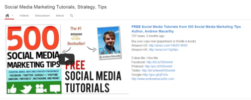
I my updated YouTube channel trailer description recently, and there are a couple of main differences:
1. The links are all shortened, look much neater, and are visible in their entirety.
2. Several of the shortened links are customised with my own branding to make them much more memorable.
3. All of the shortened links can be tracked via the sites on which they were created.
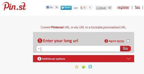
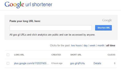
I used several different URL shortening sites in my description, including:
bit.ly: My preferred choice, which adds the shortened Amazon ("amzn") text to products on the site, and allows link tracking - sign up required for URL customisation.
pin.st: Mirrors Pinterest site name and allows tracking - sign up required for URLcustomisation.
goo.gl: Google's own URL shortener, includes publicly visible tracking but no customisation option at present.
ConclusionNeatening up your YouTube channel trailer description and links is only a small detail, but I guess these little things are the elements that add up to make the big impacts :)
ABOUT THE AUTHOR
Andrew Macarthy is the author of the #1 Amazon Web Marketing Bestseller, 500 Social Media Marketing Tips, available for Kindle and in paperback.
Buy 500 Social Media Marketing Tips
Amazon US: http://www.amazon.com/dp/B007L50HE6
Amazon UK: http://www.amazon.co.uk/dp/B007L50HE6
Follow Me:
http://www.fa
cebook.com/500socialmediatips/
https://pinterest.com/500socialmedia/
http://www.twitter.com/500socialmedia
http://www.youtube.com/5
00socialmediatips

June 8, 2013
Facebook Cover and Profile Photo Template for Desktop AND Mobile App
Not so long ago, I published a blog post containing a free template to help you design a really great-looking profile and cover photo for your desktop-viewed Facebook Page. The thing is, the way your Page design displays on desktops is not the same as on mobiles...
And as the latest figures show that of the 1.11 billion monthly active Facebook users, 751 million of them access the site via their mobile devices, that's a huge and ever-increasing group of people you should take into consideration. The key, then, is to optimise your cover photo design for viewing on desktop and mobile devices.
A Comparison of Facebook desktop and mobile cover photos
As you can see in the image above, there is a distinct difference between the desktop and mobile (iPhone app) view of the profile and cover photos of a Facebook Page. On the mobile app:
The profile photo takes centre stage, relegating the cover to the backgroundThe profile photo spans almost the whole height of the cover photo, and over a quarter of its width from the left-hand edge. The cover photo is obscured by the Page name and category, as well as a dark gradient overlay that begins from the left-hand edge. To see the cover photo in full and read its description, a mobile viewer must tap on it. How to optimise your Facebook profile and cover photos for desktop and mobile
With so many people accessing Facebook Pages on mobile, it is more important than ever to cater to their needs and encourage them to engage with your content - and an optimised cover and profile photo can go a long way to make that happen.
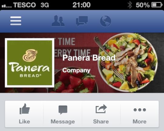
And now you know how the mobile view affects the appearance of the profile and cover photo, you can work within these parameters. In the example above, Panera Bread has not taken mobile users into account, so their "For a short time, it's strawberry time" slogan is lost on what is probably hundreds of thousands of customers.
My Facebook cover and profile photo template for desktop and mobile users
Here it is, my template to help you create a Facebook profile and cover photo that is optimised for both desktop and mobile views:
The orange box represents the space covered by the desktop profile photo.The blue box represents the space covered b the mobile profile photo.The dark green box represents the general area covered by your Page's name and category on the mobile view.The gradient emerging from the left represents the same gradient seen on mobile devicesThe light green area represents the space where your design will be unobstructedExamples of Facebook profile and cover photos optimised for desktop and mobile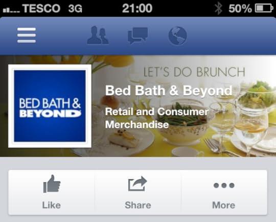
Taking both desktop and mobile views into consideration means that quite a lot of the cover photo's space is obstructed, but that does not mean you can't still have a great design, as long as you are creative. In the above example, Bed Bath & Beyond's cover and profile photo looks great on mobile, and its "Let's do brunch" slogan is unobstructed by any of the elements on the page.
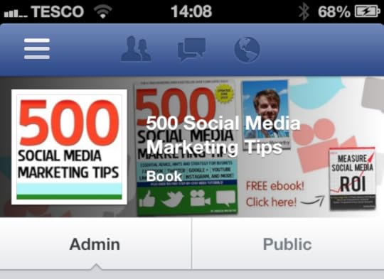
And here's my new cover and profile photo for mobile viewers. Using the template, I have made sure that my free ebook call to action is visible, and that nothing crucially important is behind where the huge square profile photo sits.
I think one of the most important points to make is that even though much of your cover photo is covered up - fully or partially - that doesn't mean that it still can't be visually appealing.
Download the template[image error]The template is hosted over at minus.com. Click the link below to visit the download page, hover your mouse over the image and click the download icon that appears to grab it.
Download link: http://min.us/l15Ew50uNtrnJ Link not working? Contact me or tweet @500socialmedia and I'll upload a new one!
Simply work around the template layers to add your design, save it as a .png file and upload it via the desktop Facebook site. Check how it looks on mobile, then tweak and re-upload if necessary.
ABOUT THE AUTHOR
Andrew Macarthy is the author of the #1 Amazon Web Marketing Bestseller, 500 Social Media Marketing Tips, available for Kindle and in paperback.
Buy 500 Social Media Marketing Tips
Amazon US: http://www.amazon.com/dp/B007L50HE6
Amazon UK: http://www.amazon.co.uk/dp/B007L50HE6
Follow Me:
http://www.fa
cebook.com/500socialmediatips/
https://pinterest.com/500socialmedia/
http://www.twitter.com/500socialmedia
http://www.youtube.com/5
00socialmediatips
June 5, 2013
How to Get A Verified Facebook Page or Profile
In a roll out that will make it easier for people to find the authentic presence of a personal profile or Facebook Page and help to create a better user experience and increased authentic engagement with high profile people like celebrities, journalists, and popular brands, verified Pages were introduced at the end of May 2013.
How do people know my Page or Profile is Facebook Verified?
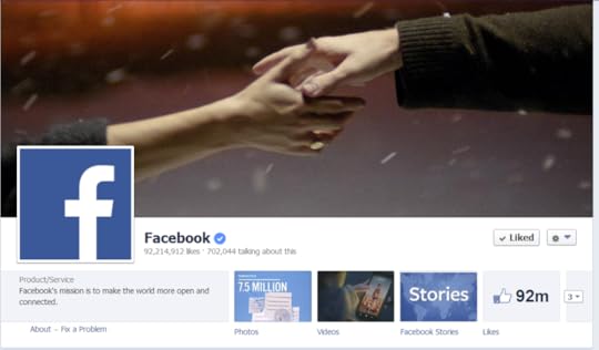
Once a Page is verified, it will be adorned with a "verification badge" - a check mark in a blue circle, as in the example of Facebook's official page above. To make it as easy as possible to identify which Pages are authentic, verification badges will appear in a number of other places:
Next to the name of the PageWhen hovering over the name of a PageIn Graph Search queriesIn stories about people liking a PageIn News Feed ads for your PageHow do I get a Verified Page or Profile on Facebook?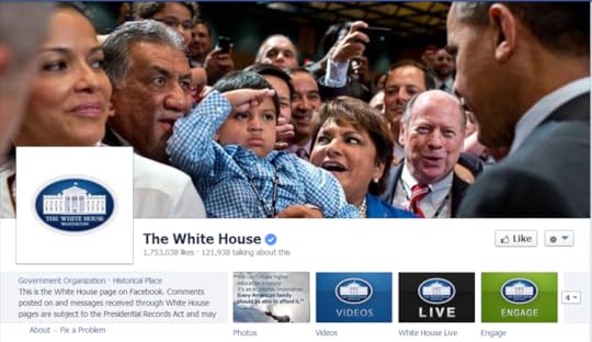
At the moment, the short answer to this question is you don't have to do anything. Facebook will automatically be adding verification badges to the Pages and personal profiles that are at greatest risk of duplication, and it won't, at present, accept requests for verification from other Pages.
What do I do if someone is pretending to be me or my company?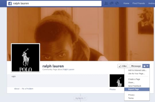
If you want to report an account that is fake or a duplication of your Page or personal profile, click the cog icon on its timeline, select Report/Block and follow the on-screen instructions to file a report.
ABOUT THE AUTHOR
Andrew Macarthy is the author of the #1 Amazon Web Marketing Bestseller, 500 Social Media Marketing Tips, available for Kindle and in paperback.
Buy 500 Social Media Marketing Tips
Amazon US: http://www.amazon.com/dp/B007L50HE6
Amazon UK: http://www.amazon.co.uk/dp/B007L50HE6
Follow Me:
http://www.fa
cebook.com/500socialmediatips/
https://pinterest.com/500socialmedia/
http://www.twitter.com/500socialmedia
http://www.youtube.com/5
00socialmediatips
June 2, 2013
How to Add a YouTube Subscribe Widget Box to Your Website or Blog | YouTube Widget Embed Code
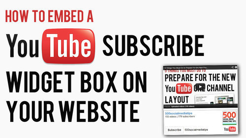
If you regularly blog and create video content for YouTube, one of the simplest ways to permanently promote your YouTube presence on it and to encourage new subscribers is with a YouTube widget. box, which you can embed in your site's side bar or somewhere else similarly prominent
The Anatomy of the YouTube WidgetAbove is an example of a working YouTube widget - in this case, it's mine, but yours will be customised to reflect your account details. It features several elements, all of which, in their own small way, should help to attract people to click and/or subscribe to your channel:
Username (which is a clickable link to your channel)Total number of video uploads (proof of your activity on the site) Current subscriber count (proof of your popularity on the site)YouTube channel icon (also a clickable link to my channel)The all-important "Subscribe Button."How to Install and Customise Your YouTube WidgetHere's how to install and customise your own YouTube widget,:
1. Copy the code in the text box above and paste it into the section of your site where you want your widget to appear.
2. Replace the youryoutubeusername text to your own YouTube username - do not delete the single speech mark that follows it.
3. Change the "height" and "width" numbers to increase or decrease the size of your widget in pixels as required.
4. Save, refresh your web page, and voila!
The Finished Result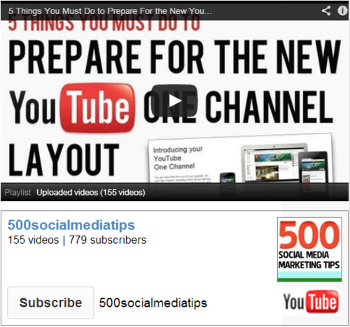
Here's how your YouTube widget will look. In my example above, you'll notice I have embedded a playlist of my most recent uploads on top. While the widget might work okay by itself, by adding a playable video for people to click on as a sample of your content, you're increasing your chances of snagging another new subscriber. You can embed any individual video here, but in a future blog post, I'll show you how to embed a playlist too.
ABOUT THE AUTHOR
Andrew Macarthy is the author of the #1 Amazon Web Marketing Bestseller, 500 Social Media Marketing Tips, available for Kindle and in paperback.
Buy 500 Social Media Marketing Tips
Amazon US: http://www.amazon.com/dp/B007L50HE6
Amazon UK: http://www.amazon.co.uk/dp/B007L50HE6
Follow Me:
http://www.fa
cebook.com/500socialmediatips/
https://pinterest.com/500socialmedia/
http://www.twitter.com/500socialmedia
http://www.youtube.com/5
00socialmediatips

May 30, 2013
How to Pin Images to Pinterest on iPhone App | How to Use Pinterest on iPhone
Pinning images to Pinterest from the iPhone was something of a faff before an update to the official Pinterest app in the spring of 2013. Now, it's much easier. Here's how:

1. Make sure you've got an up-to-date version of the Pinterest app, and when you load it up, you'll see a "plus" icon in the middle of the home screen. Click that to begin the pinning process.
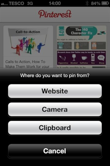
2. You'll be given three options at this stage - Website (search for a website or enter a a website address where there is an image you want to pin), Camera (take a photo to pin), or Clipboard (paste in a website address that you have copied whilst browsing the web in Safari, Chrome, etc.)
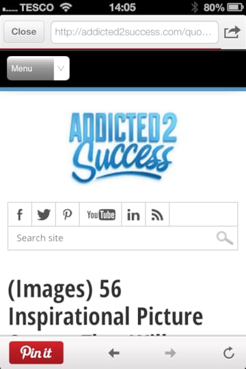
3. Once you're on the page that contains the image you want to pin, tap the "Pin it" button.
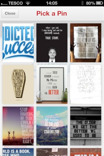
4. The Pinterest app will scan the page for pinnable images . Just tap the one that you want to pin.

5. With your image chosen, pick the board that you want to add it to (or create a new one by tapping the "plus" symbol), and that's it! You'll get a message to let you know that the image has been pinned successfully.
ABOUT THE AUTHOR
Andrew Macarthy is the author of the #1 Amazon Web Marketing Bestseller, 500 Social Media Marketing Tips, available for Kindle and in paperback.
Buy 500 Social Media Marketing Tips
Amazon US: http://www.amazon.com/dp/B007L50HE6
Amazon UK: http://www.amazon.co.uk/dp/B007L50HE6
Follow Me:
http://www.fa
cebook.com/500socialmediatips/
https://pinterest.com/500socialmedia/
http://www.twitter.com/500socialmedia
http://www.youtube.com/5
00socialmediatips
May 28, 2013
Google Plus Profile Photo Template for Square Logos | FREE Download PSD Photoshop

In the first major design change to Google Plus earlier on this year, the social network's profile photos were changed from a square to a circle. While a circular shape works well for head and shoulder photos of individuals and plenty of company logos, if your logo is a square shape - like mine for 500 Social Media Marketing Tips is - then, by default, it doesn't fit... some proper squarelogoism going on from Google! As you can see from the examples in the image above, uploading a square logo sees it being cropped on all four corners, and it just looks messy. Even if you play around with the site's cropping or scaling tools, you really fix it.
The Solution: A Google Plus Profile Photo Template
As a work around to this problem, I have built a simple template for Photoshop or GIMP that will allow you to create and upload a square logo that fits inside the default circular parameters, as in the image above. Of course, you stand to lose a smidgen profile photo "real estate," but what you gain is logo that will display without cropping on your cover photo, and next to every post and comment you make around the site.
The template is 1000 x 1000 pixels big - four times the minimum size that Google+ recommends - meaning your logo will enlarge into a nice, large image when clicked on from your page.
How to Use the Template
When you first open the template, this is what you will see. The green circle represents the Google+ profile photo circle, while the red square shows the "safe" area in which you can add your square logo design. You've got some leeway in all four directions outside of the red square, but anything that passes into the white area will not be visible. So, first of all, hide my "Place your logo within this red square" layer and insert your logo on top of the red square layer instead.
Note: I have chosen a white background for this template to match and blend seamlessly the white of the Google+ layout, though you may choose to experiment with different colours if you wish. If you delete the background and make it transparent, Google+ will not recognise it, and replace your image with a black background by default.
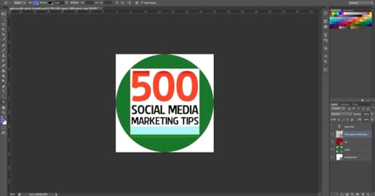
Once you have inserted your logo, hide the red square layer and you'll have something like this.

To finish, hide the green circle layer to remove all traces of the template, as above, and save your image as a PNG or JPEG file.
Uploading the Profile Photo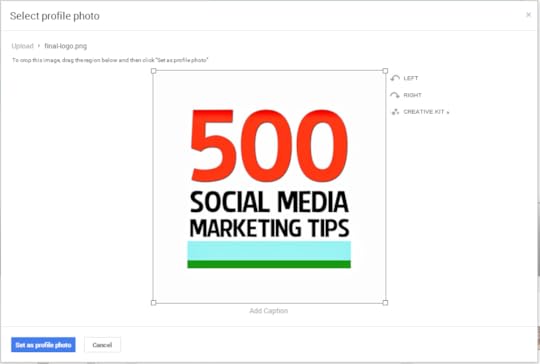
Visit your Google+ page and click on your existing profile profile photo to upload your new one in its place. When you select the file and it uploads, make sure to drag the cropping lines all the way out to the corners, as above. If you don't, your logo will not look right. When you're done, click the "Set as profile photo" button.
The Finished Result
Here's that finished result once again. Hopefully yours will look very similar!
Template Download Link[image error]The template is hosted over at minus.com. Click the following link to visit the download page, hover your mouse over the image and click the download icon that appears to grab it.
Download link: http://min.us/lbiOFC8yCxA2Em Link not working? Contact me or tweet @500socialmedia and I'll upload a new one!
ABOUT THE AUTHOR
Andrew Macarthy is the author of the #1 Amazon Web Marketing Bestseller, 500 Social Media Marketing Tips, available for Kindle and in paperback.
Buy 500 Social Media Marketing Tips
Amazon US: http://www.amazon.com/dp/B007L50HE6
Amazon UK: http://www.amazon.co.uk/dp/B007L50HE6
Follow Me:
http://www.fa
cebook.com/500socialmediatips/
https://pinterest.com/500socialmedia/
http://www.twitter.com/500socialmedia
http://www.youtube.com/5
00socialmediatips
May 27, 2013
10 Examples of Terrible LinkedIn Profile Photos | Bad LinkedIn Profile Pics

Whatever your aims are on LinkedIn - to make new connections with professionals in your field, to tout yourself to potential employers, or just to demonstrate how generally awesome, friendly, and talented you are to anyone who comes across your profile - arguably the most important primary factor in achieving your goal is an eye-grabbing profile photo.
I'm going to save examples of great LinkedIn profile images for another blog post - in short, they should be simple, clear, and professional - but for now, the following examples are the kinds of images that you should definitely avoid uploading.
1. Cropped and blurry
2. Just a screen grab
3. Proportions squeezed

4. Subject miles away!

5. Unprofessional photo
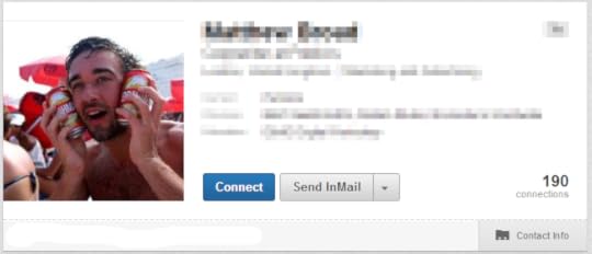
6. Photo not a square
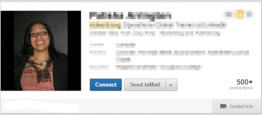
7. Can't see person's face
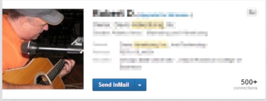
8. Poor lighting

9. Logo instead of photo
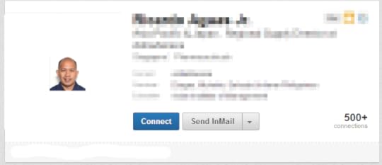
10. Tiny photo!
For a lot more advice and information about using LinkedIn to its full potential, check out my book, How to Build the Ultimate LinkedIn Profile in Under an Hour.
ABOUT THE AUTHOR
Buy 500 Social Media Marketing Tips (Kindle or Paperback)
Amazon US: http://www.amazon.com/dp/B007L50HE6
Amazon UK: http://www.amazon.co.uk/dp/B007L50HE6
Follow Me:
http://www.fa
cebook.com/500socialmediatips/
https://pinterest.com/500socialmedia/
http://www.twitter.com/500socialmedia
http://www.youtube.com/5
00socialmediatips
May 24, 2013
How to Create A Seamless Twitter Header Background and Profile Image

One of the most inventive ways to utilise your Twitter header space is to create a header background image that blends seamlessly into the profile photo that overlays it, as shown in the examples above. If you'd like to do something similar, it's really not too difficult, even if you are a photo editing newbie. All you need is to download my Twitter Header Template .psd file for Photoshop or GIMP (link opens in a new window), and follow the simple step-by-step instructions below:
Alternatively, if you'd just like me to do it all for you or your business, get in touch and hire me via the Contact Me page.
1. Open the template.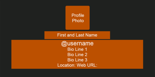
When you first load the template, this is what you will see. The grey area represents the size of your Twitter header's background image, while the orange boxes represent the different sections that sit on top of it - name, bio, website address, etc..
2. Hide every layer except the profile photo box.
In this instance, we're only concerned about the position of the profile photo because we want it to overlay on top of our background image in exactly the right position. So, go ahead and hide every layer except the orange profile box layer, as above.
3. Insert your background image behind the profile box layer.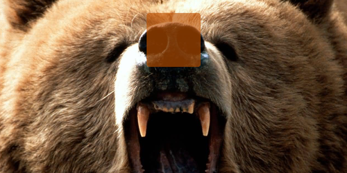
I want my header image to show this ferocious grizzly bear. Whatever image you choose, insert it into the template and move the layer so it is positioned behind the profile box. To make sure the image is lined up as you want, lower the opacity of the profile box to get a better look.
4. Select the profile box layer, then copy from the background layer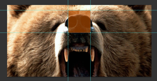
Here's where we create the profile pic that will sit above your background image. Choose the profile box layer and use the Magic Wand tool to select the orange box, as above. With the selection made, highlight the background image layer from the Layers panel, and copy the selection.
5. Create a new image file and paste the copied selection into it.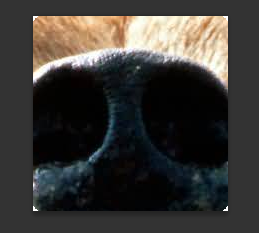
With your selection copied, create a new image file and paste the selection in - if done correctly, it should be 195 x 195 pixels big. Save this file as a PNG and keep it safe for later.
6. Save your Twitter background image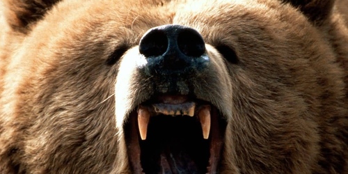
Return to the Twitter background template, hide the orange profile box layer and save the image as a PNG. You should now have two images - this one, and the profile image you created in the last step.
7. Visit Twitter and click 'Edit' on your Header image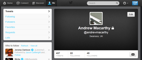
It's time to upload your seamless header image! Visit your Twitter account, hover your mouse over the header and click the "Edit" button that appears.
8. Upload your profile and header background images.
Click the "Change photo" and "Change header" buttons to upload your profile photo and header images. Don't adjust the position and zoom of them when prompted, just save them as is.
9. Tweak background image position if necessary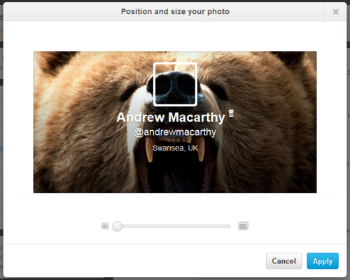
If, as above, your background image doesn't line up with the profile pic seamlessly when you upload it, no worries. Head back to the template file and shift the position of your background image up or down a four or five pixels, then upload it again. It might take a try or two, but you'll get there :)
10. View the finished product!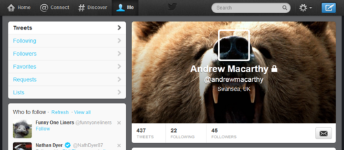
Here it is, the finished header and profile image, perfectly lined up with each other and looking great!
Want me to do it for you?If you'd like me to create a Twitter header image like the ones above for you or your brand, please get in touch via the Contact Me page for more information.
ABOUT THE AUTHOR
Buy 500 Social Media Marketing Tips (Kindle or Paperback)
Amazon US: http://www.amazon.com/dp/B007L50HE6
Amazon UK: http://www.amazon.co.uk/dp/B007L50HE6
Follow Me:
http://www.fa
cebook.com/500socialmediatips/
https://pinterest.com/500socialmedia/
http://www.twitter.com/500socialmedia
http://www.youtube.com/5
00socialmediatips
May 23, 2013
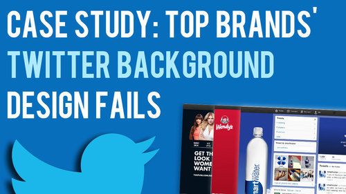
Case Study: Top Brands' Twitter Background Design Fails
In a recent blog post, I offered my new Twitter background template as a free download so that you can easily optimise your profile's design to be viewed as intended on whichever screen resolution a desktop viewer is using. That got me wondering... with teams dedicated to design and social media management, how do the Twitter background designs of some of the world's biggest companies fare?
Across a random sample, I screen grabbed the 1920 x 1200 (the biggest screen resolution at which people are likely to view a Twitter profile) and 1366 x 768 (currently the most common screen resolution, according to global statistics). The results were pretty surprising...
The BadWhere the companies I came across had attempted specific Twitter branding on both sides of the news feed, i.e. not just a single-image background), lots of the designs had not been optimised for viewers on different resolutions. Here are a few examples:
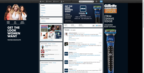
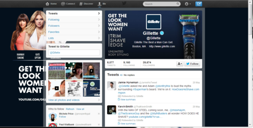
Here's the Twitter page for Gillette. At 1920 x 1200 pixels, the design looks great but for the big black bar on the right-hand side which reveals that the navy gradient hasn't been made big enough to accommodate for large displays. And at 1366 x 768 pixels, the "Get the Look Women Want" branding is hidden behind the feed, while the image on the right-hand side of the feed completely disappears!
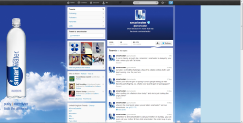
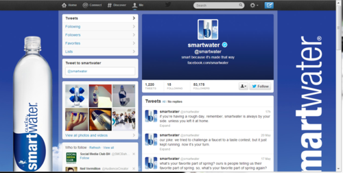
Onto SmartWater now. As with Gillette, its Twitter profile suffers from a big empty space on the right-hand side at high resolutions. At the most common resolution, however, a "SmartWater" brand logo appears... well, most of it.
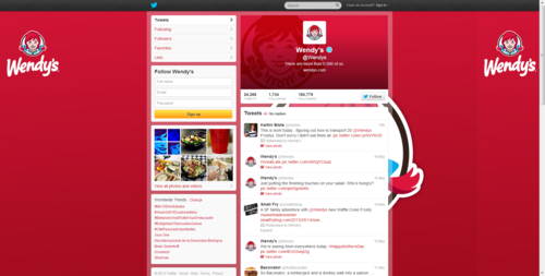
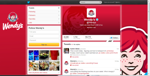
Last up, here's fast food company, Wendy's, who get things half-right. At high resolution, its left-hand side Twitter branding is fine, but a second large image is obscured by the news feed. At 1366 x 768 pixels, the design looks as it was probably intended to.
The GoodIt was surprisingly difficult to find good examples of optimised Twitter backgrounds from the hour or so I spent looking at the feeds of big brands, so props go to Gap and Sprite (kinda) for these examples!

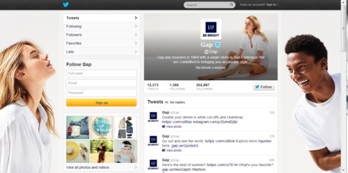
Gap's Twitter background works at both the biggest resolution, and at the most commonly viewed resolution. While one person is chopped off either side in the reduced view, the design still looks great.
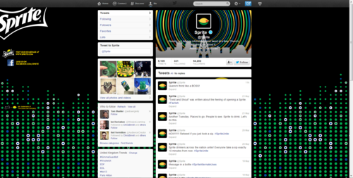
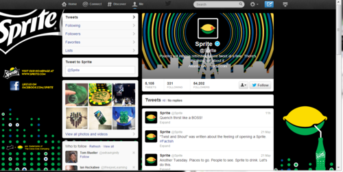
Finally, here's Sprite. Okay, the logo is chopped off the side in both examples, and the lemon-sipping-a-drink graphic is missing in the high resolution review, but both designs still mostly work!
ConclusionFrom my terribly unscientific experiment, it seems that a significant proportion of big brands, while keen on branding their Twitter accounts, have not done so in a way that takes into account all of the different resolutions that people will be viewing their pages at on desktop computers, resulting in branding that is unusually slack for such big commercial voices.
If you want to stay one step ahead of Gillette, SmartWater, Wendy's, and many others with an optimised Twitter background design, have a read of my Twitter background Template blog post and grab a link to download the template there too.
ABOUT THE AUTHOR
Buy 500 Social Media Marketing Tips (Kindle or Paperback)
Amazon US: http://www.amazon.com/dp/B007L50HE6
Amazon UK: http://www.amazon.co.uk/dp/B007L50HE6
Follow Me:
http://www.fa
cebook.com/500socialmediatips/
https://pinterest.com/500socialmedia/
http://www.twitter.com/500socialmedia
http://www.youtube.com/5
00socialmediatips


