
Bhakta Jim's Blog: Bhakta Jim's Bhagavatam Class, page 5
December 13, 2016
Another Underrated Classic
 The Space Merchants by Frederik Pohl
My rating: 5 of 5 stars
This is science fiction as it ought to be. Good science fiction authors take you to new worlds, but the great ones don't let you come back. You won't look at the world the same way after reading this, and that's a good thing.
The world of this novel is a Libertarian paradise where only the very wealthy have any liberty. The protagonist is an ad copywriter in a world where nothing is worth buying. Cadillac cars have to be pedaled. Living quarters are tiny. "Meat" is artificially grown in vats. A substitute for coffee is habit forming to the point that it is cheaper to keep drinking it than to kick the habit. The government is wholly owned and operated by large corporations, with Senators and Congressmen representing Yummy Cola rather than States or Districts. The President is an inherited title with mostly ceremonial duties.
The one hope for humanity is the colonization of Venus, and it's the protagonist's job to convince consumers to want to do it. The fact that Venus is a hellhole doesn't discourage him.
His job will be complicated by his "wife" (a contract arrangement that will expire soon), an opposing ad agency that wants the Venus job for itself and which will stop at nothing to get it, and the pilot of the first successful round trip to Venus, who happens to be a midget.
The novel reads a bit like a Philip K. Dick story, but was written before Dick started writing.
The story holds up very well for something written in the fifties.
View all my reviews


November 29, 2016
Another Heinlein Juvenile
 Time for the Stars by Robert A. Heinlein
My rating: 5 of 5 stars
I read this book in middle school, along with Rocket Ship Galileo. It's a good one. It's a convincing story about the first explorers to visit other stars and evaluate the planets they find for human colonization. To make this possible Heinlein makes a couple of really unlikely predictions:
1. There are Torch Ships which can accelerate constantly until they nearly match the speed of light.
2. Some identical twins and triplets are not only telepathic with each other, but they can communicate instantaneously across distances of light years.
Of course, in what passes for science fiction these days these predictions aren't that bold. They practically make this a hard science novel.
Heinlein does a wonderful job of world building here, as he does in all of his juveniles. The story is compelling, the characters are memorable, and everything just seems real.
Some other reviewers complained about Heinlein's treatment of female characters in this book. I don't myself. He makes it clear that the women on the starship are very capable and willing to put their lives on the line to save others, but the captain of the starship won't give a woman a risky job if a man can do it. Under the circumstances in the story this makes sense.
I think this story holds up better than many of Heinlein's works for adults, and that anyone who enjoys the current crop of Young Adult S.F., no matter what his age, should find plenty to enjoy here.
View all my reviews
November 20, 2016
Format Your Own Damned Book: Cover Preview
I finished the last post in this series and have prepared interior pages and cover art for the book, which is now being reviewed for Create Space:

November 19, 2016
Format Your Own Damned Book Part XIII -- Cool Tricks For Book Nerds
The tricks in this chapter are for those who are comfortable writing their own computer programs. The examples run on Linux and probably could be persuaded to run on Windows and the Mac, too. Doing this is left as an exercise for the student.
You don't need these tricks to publish your own books, but those who can take advantage of them will find that they save time and make the process less tedious.
If you look down on the art of computer programming and the practitioners thereof you should skip this chapter.
No warranty is offered for these code samples. They work for the author, and should work for the reader as well, but if they do not the reader will need to diagnose the problem himself. Remember the title of these posts: Format Your Own Damned Book. Not Let's Bug The Author.
Strip HTML Utility
The first utility should be copied into a file named striphtml.py. You will need Python 2 and Beautiful Soup 3 installed to run it. Beautiful Soup is a Python library that extracts information from the HTML in web pages. Badly formatted web pages are sometimes called "tag soup", hence the name of this library. A version of Beautiful Soup may be included in your Linux distribution.
You can read about Beautiful Soup here:
https://www.crummy.com/software/Beaut...
What the utility does is take an input HTML file and strip out anything that is not needed to create an XHTML file for an EPUB.
It strips out <pre> and <img> tags, because most word processors don't handle these well.
It also inserts a link to a style sheet, generates a table of contents, and inserts a special marker before each H1 tag that can be used later to automatically split up the file into multiple chapter files.
The generated table of contents only works if you split up the chapters into multiple files. If you used a table of contents in your source document the generated TOC will have "None" for all the chapter titles and will be useless. I mostly use this script for my novels, which do not include a Table of Contents.
The code is available for download here:
https://raw.githubusercontent.com/sug...
You run it with this script:
The script actually goes all on one line, but I have split it up into multiple lines to make it fit better on a printed page. Place it in a file named genbook.sh and make that executable. Or download it here:
https://raw.githubusercontent.com/sug...
The script uses the sed utility to search and replace things in the HTML that the Python program can't remove itself. Sed is a Linux utility that is part of that operating system. Versions of that utility may be available for lesser operating systems.
To run it, save your manuscript as input.html in the same directory where the Python program and genbook.sh live. Run
./genbook.sh
and it will create a file TOC.xhtml which you may import into Sigil.
For best results, if your printed book has a TOC page you should save a copy of your manuscript under a new name, delete the TOC page from that copy, and then generate your input.html file from that copy. The automatically generated TOC will not work well as an ebook TOC and will interfere with the Python program generating a TOC.
A Mystery Script
Have a look at this script and try to guess what it does:
I'll give you a hint: myfile.txt is a text file containing the full text of the Bhagavata Purana, an important Hindu scripture that I wanted to publish on Create Space. You can get that text file here:
http://www.gutenberg.org/ebooks/39442
Download the Plain Text version of the book and replace "myfile.txt" with that file, then run the script.
To understand what the script does, let's take it a step at a time:
1. Enchant is a front end to command line spell checkers provided by all Linux distributions. You can read about it at http://www.abisource.com/projects/enc.... The command enchant -l -d en myfile.txt means "scan myfile.txt using an English dictionary and list out all misspelled words, one on each line.
2. sort takes the list and sorts it into ascending sequence.
3. uniq -c means remove duplicated words from this sorted list and count how many times the word occurred before each word. The count goes before the word in the output.
4. sort -nr > myfile-words.txt takes that list and sorts it into numeric sequence, but in reverse order (high to low), then puts it into file myfile-words.txt.
So when we're done we have a list of all the misspelled words in the Bhagavata Purana, sorted from most commonly misspelled to least commonly misspelled. Can you guess why this would be useful?
The Bhagavata Purana is full of character names that don't appear in an English dictionary, and hence would be considered misspellings by enchant. The ones that appear most in the list are the most important characters in the book and vice versa. And it turns out that Libre Office will generate an index for you, if you supply it with a list of the words you want to index. Thus in a few minutes I was able to add a decent index to my Create Space edition of this book, something the original book never had.
You don't need these tricks to publish your own books, but those who can take advantage of them will find that they save time and make the process less tedious.
If you look down on the art of computer programming and the practitioners thereof you should skip this chapter.
No warranty is offered for these code samples. They work for the author, and should work for the reader as well, but if they do not the reader will need to diagnose the problem himself. Remember the title of these posts: Format Your Own Damned Book. Not Let's Bug The Author.
Strip HTML Utility
The first utility should be copied into a file named striphtml.py. You will need Python 2 and Beautiful Soup 3 installed to run it. Beautiful Soup is a Python library that extracts information from the HTML in web pages. Badly formatted web pages are sometimes called "tag soup", hence the name of this library. A version of Beautiful Soup may be included in your Linux distribution.
You can read about Beautiful Soup here:
https://www.crummy.com/software/Beaut...
What the utility does is take an input HTML file and strip out anything that is not needed to create an XHTML file for an EPUB.
It strips out <pre> and <img> tags, because most word processors don't handle these well.
It also inserts a link to a style sheet, generates a table of contents, and inserts a special marker before each H1 tag that can be used later to automatically split up the file into multiple chapter files.
The generated table of contents only works if you split up the chapters into multiple files. If you used a table of contents in your source document the generated TOC will have "None" for all the chapter titles and will be useless. I mostly use this script for my novels, which do not include a Table of Contents.
#! /usr/bin/env python
from BeautifulSoup import BeautifulSoup

def _attr_name_whitelisted(attr_name, attr_value):
 if attr_name.lower() == "align" and attr_value.lower() == "center":
 return True
 else:
 return False

# remove these tags, complete with their contents.
blacklist = ["head", "img", "pre" ]

# remove attributes from these tags, except
# those whitelisted.
striplist = [ "p", "h1", "h2", "h3" ]

# Anything not in this list will be replaced with <span>
# tags with no attributes.
whitelist = [
 "p", "br", "pre", "meta",
 "table", "tbody", "thead", "tr", "td",
 "blockquote", "h1", "h2", "h3",
 "ul", "li",
 "b", "em", "i", "strong", "u"
 ]

soup = BeautifulSoup(open("input.html"))

print "<html>\n<head>\n"
print "<meta http-equiv=\"CONTENT-TYPE\" content=\"text/html; "
print "charset=UTF-8\">"
print soup.title
print "<link href=\"../Styles/ebook.css\" rel=\"stylesheet\""
print " type=\"text/css\"/>"
print "\n<head>\n<body>"

print "<h1>Contents</h1>"
print "<ul>"
print "<li><a href=\"TOC_0001.xhtml\">Title Page</a></li>"

i = 1
for chapter in soup.findAll("h1"):
 i = i + 1
 print("<li><a href=\"TOC_" + str(i).zfill(4) + ".xhtml\">")
 print(chapter.string)
 print("</a></li>")

print "</ul>"
print "<hr class=\"sigilChapterBreak\" />"

print "<p class=\"title\">"
print soup.title.string
print "</p>"

print "<p class=\"author\">Author Name</p>"

for tag in soup.findAll():
 if tag.name.lower() in blacklist:
 # blacklisted tags are removed in their entirety
 tag.extract()
 elif tag.name.lower() in striplist:
 tag.attrs = [(a[0], a[1])
 for a in tag.attrs if _attr_name_whitelisted(a[0], a[1])]
 elif tag.name.lower() not in whitelist:
 # not a whitelisted tag. I'd like to remove it from the tree
 # and replace it with its children. But that's hard. It's much
 # easier to just replace it with an empty span tag.
 tag.name = "span"
 tag.attrs = []

print(soup.renderContents("utf-8"))
print "</body></html>"
The code is available for download here:
https://raw.githubusercontent.com/sug...
You run it with this script:
./striphtml.py
| sed 's_<!DOCTYPE HTML PUBLIC "-//W3C//DTD HTML 4.0 Transitional//EN">__'
| sed 's/<span>//g'
| sed 's_</span>__g'
| sed 's_<h1>_<hr class="sigilChapterBreak" /><h1>_'
| sed 's_<hr class="sigilChapterBreak" /><h1>Contents</h1>_<h1>Contents</h1>_'
| sed 's/<p align="CENTER">/<p style="text-align: center">/' > TOC.xhtml
The script actually goes all on one line, but I have split it up into multiple lines to make it fit better on a printed page. Place it in a file named genbook.sh and make that executable. Or download it here:
https://raw.githubusercontent.com/sug...
The script uses the sed utility to search and replace things in the HTML that the Python program can't remove itself. Sed is a Linux utility that is part of that operating system. Versions of that utility may be available for lesser operating systems.
To run it, save your manuscript as input.html in the same directory where the Python program and genbook.sh live. Run
./genbook.sh
and it will create a file TOC.xhtml which you may import into Sigil.
For best results, if your printed book has a TOC page you should save a copy of your manuscript under a new name, delete the TOC page from that copy, and then generate your input.html file from that copy. The automatically generated TOC will not work well as an ebook TOC and will interfere with the Python program generating a TOC.
A Mystery Script
Have a look at this script and try to guess what it does:
enchant -l -d en myfile.txt
| sort | uniq -c | sort -nr > myfile-words.txt
I'll give you a hint: myfile.txt is a text file containing the full text of the Bhagavata Purana, an important Hindu scripture that I wanted to publish on Create Space. You can get that text file here:
http://www.gutenberg.org/ebooks/39442
Download the Plain Text version of the book and replace "myfile.txt" with that file, then run the script.
To understand what the script does, let's take it a step at a time:
1. Enchant is a front end to command line spell checkers provided by all Linux distributions. You can read about it at http://www.abisource.com/projects/enc.... The command enchant -l -d en myfile.txt means "scan myfile.txt using an English dictionary and list out all misspelled words, one on each line.
2. sort takes the list and sorts it into ascending sequence.
3. uniq -c means remove duplicated words from this sorted list and count how many times the word occurred before each word. The count goes before the word in the output.
4. sort -nr > myfile-words.txt takes that list and sorts it into numeric sequence, but in reverse order (high to low), then puts it into file myfile-words.txt.
So when we're done we have a list of all the misspelled words in the Bhagavata Purana, sorted from most commonly misspelled to least commonly misspelled. Can you guess why this would be useful?
The Bhagavata Purana is full of character names that don't appear in an English dictionary, and hence would be considered misspellings by enchant. The ones that appear most in the list are the most important characters in the book and vice versa. And it turns out that Libre Office will generate an index for you, if you supply it with a list of the words you want to index. Thus in a few minutes I was able to add a decent index to my Create Space edition of this book, something the original book never had.
November 18, 2016
Format Your Own Damned Book Part XII - A Few Words About Interior Illustrations
One thing Create Space does not do all that well is interior illustrations.
I have already mentioned that color interior illustrations are a waste of money. Unless every page in your book has color, your book will cost four times as much as it would with no color illustrations.
Create Space recommends that all illustrations be 300-600 DPI. That is a good recommendation for illustrations that go on the cover. For interior illustrations, it's a bit more complicated than that.
Imagine how your manuscript would look printed on a laser printer or an inkjet printer using no color cartridges. That will give you some idea of what a Create Space interior page will look like.
This is both good and bad. The good part is that if your book is full of screen grabs demonstrating how to use software that has a GUI, the illustrations will look fine even though they are no more than 72 DPI, the normal resolution of screen grabs and web illustrations. Diagrams will probably look OK at 72 DPI.
Artwork should look good at 300 DPI. When I did The Mahabharata in twelve volumes I had over 300 illustrations to include. Some were originally color, but most were black and white. I used as many of the full color illustrations as I could on the front and back covers of the books and repeated them as interior illustrations with the rest. They looked very good, but none were under 300 DPI.
Photos don't look good as interior illustrations, period. These should definitely be 300 DPI or better, but they're going to be printed on the same non-photo quality paper the rest of the pages are on. Black and white photos in regular books are printed on glossy paper that is "tipped in" with the rest of the pages. That's the only way to get good looking photos in a book.
Photos of things will look better than photos of people. I discovered this when preparing high quality interior photos for The Life And Times Of Bhakta Jim.
Do you have an author photo? Put it on the back cover, and make it in color. It will not look nearly as good on an interior page.
November 12, 2016
Format Your Own Damned Book Part XI -- The Palm Book Wizard
There are several cover creating wizards available for Create Space. I recommend using only one of them: The Palm.

You'll need to go through four out of five pages of possible cover creator wizards to get to it. What it does is allow you to submit a fully formatted front cover, a fully formatted back cover, and choose the colors and text you want to appear on the spine.
The options for the spine are limited. There are four different fonts to choose from, and the font size will depend on how much text is in the title. If you want your spine to be fancier than this you'll need to find another way to make your cover. Before you do, consider that the width of the spine is controlled by the number of pages in the book. If you rewrite your book before submitting it for publication you'll find that letting the wizard deal with the width of the spine will save you work and possibly grief.
If you absolutely must have a wrap-around cover (and some books will require them) then you can't use The Palm and you won't want to use any of the other wizards, with the possible exception of The Pine, which lets you submit your complete cover as a single image. You could also consider submitting a PDF with a fully formatted cover.
I'm going to assume you've chosen to use The Palm.
Your cover images must be 300-600 DPI. Most images you'll find on the Internet are 72 DPI, and you may well wonder how to go about creating a 300 DPI image. The GIMP makes it easy, once you know how.
Create a new image using the File menu. You'll see a dialog like this:
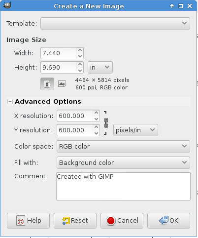
The dialog has image size default to pixels, which is what you'd want for a web image, and it hides the Advanced Options. You'll want to change the image size to be measured in inches (or centimeters, if you roll that way) and in the Advanced Options you'll specify 300 DPI up to 600 DPI. This will create an empty image at the proper DPI. Any art you paste into this image will adopt that DPI.
There are two book sizes I use: 6 x 9 inches, and 7.44 x 9.69 inches. The second one is for how-to books. I wrote some books for FLOSS Manuals and that is the size they prefer for their printed books. They call that size Crown Quarto, which may not be accurate. I use 6 x 9 for everything else. That is the size that Create Space recommends for most books. Unfortunately, once an ISBN has been assigned to a book you cannot change the page size, so put some thought into your selection so you can get it right the first time. Again, look at books in your own collection to help you decide, and remember that page count, not page size, determines the cost of the book.
I'm going to publish this book at 7.44" x 9.69". At 300 DPI that works out to 2232 x 2907 pixels. That means art on the cover needs to be be large enough in pixels to fill that size image. It doesn't have to be 300 DPI though, because when you paste the image on top of your blank 300 DPI canvas it will become 300 DPI.
You should set up your canvas to be the size that you want the book to be, but before you can use it as a cover image you'll need to add a half inch to the outer edge of the front and back cover images. In other words, for the front cover you'll need extra space on the top, bottom, and right sides, and for the back cover you'll need extra space on the top, bottom and left sides.
(If you're Japanese, correct these instructions as needed).
You can easily add this extra space with The GIMP:

Use the Image->Canvas Size to make the canvas larger. I'd recommend doing this in two steps:
1. Change the vertical height first, and use the Center button to vertically center your existing cover inside the larger canvas.
2. Then change the width and leave your image on the left side of the canvas for front covers and drag it to the right side for back covers.
3. Flatten the image using Image->Flatten Image. This will set the extra space in the canvas to the background color.
Now you can add your cover images to The Palm wizard:

It would be a good idea to wait until you have interior pages submitted before you run the cover wizard, otherwise the wizard won't let you work on the spine.
Next up: cool tricks for book nerds!
You'll need to go through four out of five pages of possible cover creator wizards to get to it. What it does is allow you to submit a fully formatted front cover, a fully formatted back cover, and choose the colors and text you want to appear on the spine.
The options for the spine are limited. There are four different fonts to choose from, and the font size will depend on how much text is in the title. If you want your spine to be fancier than this you'll need to find another way to make your cover. Before you do, consider that the width of the spine is controlled by the number of pages in the book. If you rewrite your book before submitting it for publication you'll find that letting the wizard deal with the width of the spine will save you work and possibly grief.
If you absolutely must have a wrap-around cover (and some books will require them) then you can't use The Palm and you won't want to use any of the other wizards, with the possible exception of The Pine, which lets you submit your complete cover as a single image. You could also consider submitting a PDF with a fully formatted cover.
I'm going to assume you've chosen to use The Palm.
Your cover images must be 300-600 DPI. Most images you'll find on the Internet are 72 DPI, and you may well wonder how to go about creating a 300 DPI image. The GIMP makes it easy, once you know how.
Create a new image using the File menu. You'll see a dialog like this:
The dialog has image size default to pixels, which is what you'd want for a web image, and it hides the Advanced Options. You'll want to change the image size to be measured in inches (or centimeters, if you roll that way) and in the Advanced Options you'll specify 300 DPI up to 600 DPI. This will create an empty image at the proper DPI. Any art you paste into this image will adopt that DPI.
There are two book sizes I use: 6 x 9 inches, and 7.44 x 9.69 inches. The second one is for how-to books. I wrote some books for FLOSS Manuals and that is the size they prefer for their printed books. They call that size Crown Quarto, which may not be accurate. I use 6 x 9 for everything else. That is the size that Create Space recommends for most books. Unfortunately, once an ISBN has been assigned to a book you cannot change the page size, so put some thought into your selection so you can get it right the first time. Again, look at books in your own collection to help you decide, and remember that page count, not page size, determines the cost of the book.
I'm going to publish this book at 7.44" x 9.69". At 300 DPI that works out to 2232 x 2907 pixels. That means art on the cover needs to be be large enough in pixels to fill that size image. It doesn't have to be 300 DPI though, because when you paste the image on top of your blank 300 DPI canvas it will become 300 DPI.
You should set up your canvas to be the size that you want the book to be, but before you can use it as a cover image you'll need to add a half inch to the outer edge of the front and back cover images. In other words, for the front cover you'll need extra space on the top, bottom, and right sides, and for the back cover you'll need extra space on the top, bottom and left sides.
(If you're Japanese, correct these instructions as needed).
You can easily add this extra space with The GIMP:
Use the Image->Canvas Size to make the canvas larger. I'd recommend doing this in two steps:
1. Change the vertical height first, and use the Center button to vertically center your existing cover inside the larger canvas.
2. Then change the width and leave your image on the left side of the canvas for front covers and drag it to the right side for back covers.
3. Flatten the image using Image->Flatten Image. This will set the extra space in the canvas to the background color.
Now you can add your cover images to The Palm wizard:
It would be a good idea to wait until you have interior pages submitted before you run the cover wizard, otherwise the wizard won't let you work on the spine.
Next up: cool tricks for book nerds!
November 8, 2016
Format Your Own Damned Book Part X -- Making Create Space Book Covers
I'm not ready to write the next installment yet, so until I am I will refer you to previous posts on the topic which contain much of the information I intended to put in that next installment:
https://www.goodreads.com/author_blog...
https://www.goodreads.com/author_blog...
https://www.goodreads.com/author_blog...
https://www.goodreads.com/author_blog...
https://www.goodreads.com/author_blog...
In the next installment you will learn about The Palm AKA The Only Book Cover Wizard You Will Ever Need.
https://www.goodreads.com/author_blog...
https://www.goodreads.com/author_blog...
https://www.goodreads.com/author_blog...
https://www.goodreads.com/author_blog...
https://www.goodreads.com/author_blog...
In the next installment you will learn about The Palm AKA The Only Book Cover Wizard You Will Ever Need.
November 6, 2016
Format Your Own Damned Book Part IX -- A Book Interior Template
As readers we don't pay much attention to the format of the pages of printed books, but as publishers we need to start doing that. Before you prepare the PDF to submit to Create Space, have a look at the books in your collection, especially those books that are like what you're going to sell. If it's a science fiction novel, just look at those. It it's a how-to book, look at ones on similar subjects. For example, if you're going to do a how-to book on computer programming, don't look at books on getting the most from your new gas grill.
I'm going to recommend that you use Libre Office to format your book, even if you use something else to write it. MS Office lets you style paragraphs, which is sufficient for e-books, but Libre Office lets you also style pages, which makes formatting book interiors much easier. Libre Office is free to download and use, and I recommend that you do that and try out the things I'll describe in this installment. That way, even if you decide to use something else to format your interior pages you'll have a better idea of what you're doing and why. Libre Office is available for Windows, Macintosh, and Linux. It has excellent documentation on the web, so you can easily learn to use all of its features.
When you have that installed you can download and open templates from archive.org:
https://archive.org/details/BhaktaJim...
Select Show All Files and pick the one that matches the size of the book you want to create.
I should point out that Create Space has its own collection of templates for MS Word. You'll find it on the part of the site where they tell you how to format a PDF for interior pages. There are two templates for each size of book that they publish. One just sets the page size and margins for you, and the other has sample text in it for the different parts of a book. If you use MS Word you could check them out.
There is much room for improvement with the Create Space supplied templates. Whoever created them didn't realize that MS Office will automatically generate a nice Table of Contents for you as long as you use Heading 1, Heading 2, etc. as styles for your chapter headings and subheadings. Thus he defined styles for chapter headings that don't work with these feature, and he put in a table of contents that is literally a table you must fill in by hand.
If you're willing to use Libre Office instead you'll find that my template is much better, because it uses the right kind of headings but mostly because Libre Office has Page styles, not just paragraph styles.
When you open my template in Libre Office you'll see this:

My template has the following page styles:
1. First Page. This is for the title page of the book, the verso (copyright page on the other side of the title page) and other front matter that would not have numbered pages. If you have glowing reviews of your book given by famous people you can also put them in front of the title page using this page style.
2. Front Matter First Page which has a title (like Introduction, Preface, Acknowledgments, etc.) and a page number in lower case roman numerals, but no page heading.
3. Front Matter pages, which are the pages that come after the Front Matter First Pages and have a page heading plus a page footer with the page number in lower case roman numerals.
4. Chapter First Pages, which are much like the Front Matter First Pages except that they are numbered with Arabic numbers. These are the first pages of your book's chapters.
5. Default Pages, which are the rest of the pages of the book. They have page headings and footers. The footers have page numbers in Arabic numerals.
Before you use the template you may want to customize it. Here are things you might change:
1. Page size. This template was created for a friend, who needed an 8.5 x 5.5 inch size. Most of my own books are 6 x 9. That is a size that Create Space recommends for novels, etc. Be aware that Create Space books are priced by page count, and smaller pages are no cheaper than larger ones. The best thing is to use a size that is common for the kind of book you're selling.
You can change the page size in the Page Style. You need to change the size of every page style you plan to use in your document. There is no way to change it one place and have all page styles affected.
2. Page headers and footers. The way my stylesheet does these is to put the title of the book on the left pages and the current chapter title on the right pages. Chapter titles are automatically gotten from your Heading 1 chapter titles.
This is a good way to do things if you name your chapters, but if you just number them then you might put author name on the left pages and book title on the right pages.
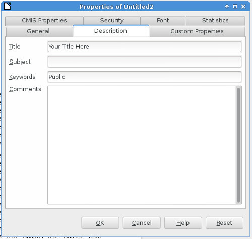
In my template the title is taken from the Properties dialog (File->Properties... in the menu):
You might also consider whether you want the headings left justified on left pages and right justified on right pages.
3. Text alignment. Really only two options here: Left and Justified. Most published books use Justified, which spaces out the words so you have a neat left column of text and a neat right column. I favor Left because it makes for easier reading. In Left only the left column is neat, and the right is ragged (in other words, the lines are allowed to be different lengths).
4. Fonts. Update the Text Body style to use your choice of fonts. There is no shame in using 12 point Times New Roman (AKA Liberation Serif in Linux) but if you want to impress people you'll pick something else. Serif fonts are supposed to be easier to read.
You can be more adventurous when choosing your chapter heading fonts.
5. Paragraph indent. Two choices: indent the first line and don't space between paragraphs or don't indent the first line and do put space between paragraphs. Publishers seem to favor a very small indent and no spacing. It saves paper, if nothing else. I favor no indent and a small amount of space between paragraphs and that is what the style sheet is set up to do.
Something you'll see in many published books is the drop cap. This is where the first letter of the first paragraph in every chapter is much larger and maybe in a different font than the rest of the text. This is something that you should apply to each first paragraph rather than to the Text Body style.
Personally, I don't like drop caps and don't use them.
When you're happy with your template save it and close it, the do New->Templates from the menu. You'll see a dialog like this:
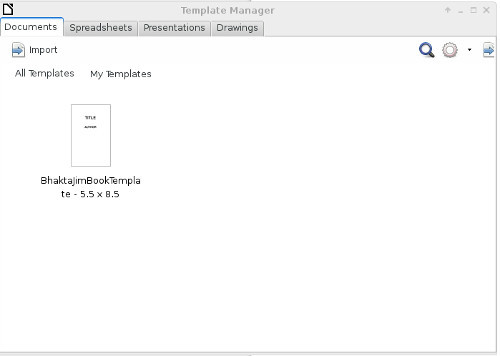
Use the Import button to copy the template into this window. To create a new document using this template, select the template and click on the Open button that appears above it when you select it. You'll get a new document with my sample text in it. Replace my sample text with your own content.
If you use Copy and Paste to move your content from some other word processor, be sure to use the Paste Special menu option and choose Unformatted text as the option. This will copy your text into Body Text without copying unwanted formatting (fonts, font size, etc) with it. You'll have to manually replace italicized and bolded text afterwards, but your text will be in the Text Body style and you can change the appearance of that style in one place and affect all the text in the document, which would not be possible if you had copied formatting as well as text from the old document.
Experiment with your new document until you're happy with it, then use File->Export as PDF to create a PDF ready to submit to Create Space.
I'm going to recommend that you use Libre Office to format your book, even if you use something else to write it. MS Office lets you style paragraphs, which is sufficient for e-books, but Libre Office lets you also style pages, which makes formatting book interiors much easier. Libre Office is free to download and use, and I recommend that you do that and try out the things I'll describe in this installment. That way, even if you decide to use something else to format your interior pages you'll have a better idea of what you're doing and why. Libre Office is available for Windows, Macintosh, and Linux. It has excellent documentation on the web, so you can easily learn to use all of its features.
When you have that installed you can download and open templates from archive.org:
https://archive.org/details/BhaktaJim...
Select Show All Files and pick the one that matches the size of the book you want to create.
I should point out that Create Space has its own collection of templates for MS Word. You'll find it on the part of the site where they tell you how to format a PDF for interior pages. There are two templates for each size of book that they publish. One just sets the page size and margins for you, and the other has sample text in it for the different parts of a book. If you use MS Word you could check them out.
There is much room for improvement with the Create Space supplied templates. Whoever created them didn't realize that MS Office will automatically generate a nice Table of Contents for you as long as you use Heading 1, Heading 2, etc. as styles for your chapter headings and subheadings. Thus he defined styles for chapter headings that don't work with these feature, and he put in a table of contents that is literally a table you must fill in by hand.
If you're willing to use Libre Office instead you'll find that my template is much better, because it uses the right kind of headings but mostly because Libre Office has Page styles, not just paragraph styles.
When you open my template in Libre Office you'll see this:
My template has the following page styles:
1. First Page. This is for the title page of the book, the verso (copyright page on the other side of the title page) and other front matter that would not have numbered pages. If you have glowing reviews of your book given by famous people you can also put them in front of the title page using this page style.
2. Front Matter First Page which has a title (like Introduction, Preface, Acknowledgments, etc.) and a page number in lower case roman numerals, but no page heading.
3. Front Matter pages, which are the pages that come after the Front Matter First Pages and have a page heading plus a page footer with the page number in lower case roman numerals.
4. Chapter First Pages, which are much like the Front Matter First Pages except that they are numbered with Arabic numbers. These are the first pages of your book's chapters.
5. Default Pages, which are the rest of the pages of the book. They have page headings and footers. The footers have page numbers in Arabic numerals.
Before you use the template you may want to customize it. Here are things you might change:
1. Page size. This template was created for a friend, who needed an 8.5 x 5.5 inch size. Most of my own books are 6 x 9. That is a size that Create Space recommends for novels, etc. Be aware that Create Space books are priced by page count, and smaller pages are no cheaper than larger ones. The best thing is to use a size that is common for the kind of book you're selling.
You can change the page size in the Page Style. You need to change the size of every page style you plan to use in your document. There is no way to change it one place and have all page styles affected.
2. Page headers and footers. The way my stylesheet does these is to put the title of the book on the left pages and the current chapter title on the right pages. Chapter titles are automatically gotten from your Heading 1 chapter titles.
This is a good way to do things if you name your chapters, but if you just number them then you might put author name on the left pages and book title on the right pages.
In my template the title is taken from the Properties dialog (File->Properties... in the menu):
You might also consider whether you want the headings left justified on left pages and right justified on right pages.
3. Text alignment. Really only two options here: Left and Justified. Most published books use Justified, which spaces out the words so you have a neat left column of text and a neat right column. I favor Left because it makes for easier reading. In Left only the left column is neat, and the right is ragged (in other words, the lines are allowed to be different lengths).
4. Fonts. Update the Text Body style to use your choice of fonts. There is no shame in using 12 point Times New Roman (AKA Liberation Serif in Linux) but if you want to impress people you'll pick something else. Serif fonts are supposed to be easier to read.
You can be more adventurous when choosing your chapter heading fonts.
5. Paragraph indent. Two choices: indent the first line and don't space between paragraphs or don't indent the first line and do put space between paragraphs. Publishers seem to favor a very small indent and no spacing. It saves paper, if nothing else. I favor no indent and a small amount of space between paragraphs and that is what the style sheet is set up to do.
Something you'll see in many published books is the drop cap. This is where the first letter of the first paragraph in every chapter is much larger and maybe in a different font than the rest of the text. This is something that you should apply to each first paragraph rather than to the Text Body style.
Personally, I don't like drop caps and don't use them.
When you're happy with your template save it and close it, the do New->Templates from the menu. You'll see a dialog like this:
Use the Import button to copy the template into this window. To create a new document using this template, select the template and click on the Open button that appears above it when you select it. You'll get a new document with my sample text in it. Replace my sample text with your own content.
If you use Copy and Paste to move your content from some other word processor, be sure to use the Paste Special menu option and choose Unformatted text as the option. This will copy your text into Body Text without copying unwanted formatting (fonts, font size, etc) with it. You'll have to manually replace italicized and bolded text afterwards, but your text will be in the Text Body style and you can change the appearance of that style in one place and affect all the text in the document, which would not be possible if you had copied formatting as well as text from the old document.
Experiment with your new document until you're happy with it, then use File->Export as PDF to create a PDF ready to submit to Create Space.
November 3, 2016
Format Your Own Damned Book Part VIII -- Create Space Articles
When I first started this blog I wrote a series of articles about preparing a book for publishing with Create Space. I got distracted from that topic, but the articles are still accurate and if I prepare a book from the current series of blog posts I'd go back and rework these older installments as content for that book.
So while I'm working on the next chapter, which will cover using a Libre Office template to format your interior pages for publication, you can look at these older posts and get much useful information:
https://www.goodreads.com/author_blog...
https://www.goodreads.com/author_blog...
https://www.goodreads.com/author_blog...
https://www.goodreads.com/author_blog...
October 26, 2016
Format Your Own Damned Book Part VII -- Cover Images
If you're going to spend money on a professional then the best place to do it might be the cover image. I have done all my own cover images. The kind of books I have been writing don't need fancy covers. I'd suggest that before deciding to do the cover image yourself you look at books in your own collection in the same genre as what you're trying to sell and see what kind of covers they have. If you're writing a how-to book you can get by with a simpler cover than you would if you're writing a bodice-ripper. Thoughtful science fiction can get by with something simpler than you'd need for high fantasy or space opera.
If you use art on your cover, bad art is worse than no art. I use public domain art, which means art salvaged from old books (pre 1923) and photos of art pieces created before 1923. I use The GIMP to dress up the art by cropping, resizing, and colorizing. You'll see examples in this post, starting with very simple covers I did early on and progressing to the fancier ones I did later.
The first cover image I did for a book was this one:

This was for a how-to book for the One Laptop Per Child project. While I sold the book on Amazon, I also gave it away on archive.org. I never expected to make any money from the book, and the simple cover image got the job done. This book has been read more than anything else I've written, so the lackluster cover didn't hurt anything.
After writing this book I got interested in Project Gutenberg and transcribed several books that had fallen into the public domain. The first of these was a book from my own collection, a novel by Pierre Louys with lots of interior illustrations, mostly of unclad women. I adapted one of the more restrained interior illustrations to make this cover image:

I used a special GIMP filter to give the illustration a fuzzy edge. I was still using the fonts that came with my word processor at this point.
A later Project Gutenberg project got this cover:

For this one I found an Indian miniature painting using Google image search. The painting was done long before 1923 so was legal to use.
Then I wrote a memoir of my wasted youth which got this cover:

This was my first time publishing with Create Space, so I needed a much higher resolution image than I would have needed for an e-book cover. The photo was one that my brother took of me for a photography class. I had no pictures of myself in the Hare Krishna movement. Taking photos in the 1970's was expensive.
An article on the Create Space website had good advice on using Display Fonts and suggested using the Chunk Five font from font squirrel, which is what I used here.
Believe it or not, I read a blog post where someone said he bought this book because he liked the cover.
I got some really nice reviews for this book, which encouraged me to write a novel, the cover of which is here:

Again I used a public domain image found using Google Search, but this time I needed one with really high resolution for Create Space, which likes 600 DPI images for covers and interior illustrations. I used two different free fonts for the cover: Akashi and Yataghan. I also put a drop shadow on the text using The GIMP. This gives a three dimensional effect to the lettering and makes the title look a bit more professional.
This cover went through several iterations. The first one said "A Science Fiction Novel By Bhakta Jim" until I read an article saying that the word "By" never appears on covers or title pages of professionally published books, and noting that Neal Stephenson's books just say "A Novel", not "A Science Fiction Novel".
I had a lot of fun preparing my books for Create Space and that led me to create a twelve volume edition of the great Indian epic The Mahabharata. This is perhaps the longest work of fiction ever written (although John Galt's radio speech in Atlas Shrugged seems longer) and every word of it was already transcribed by volunteers for Project Gutenberg. As an ebook this is challenging to read. There are thousands of subtitles and archaic English like using "hath" for "has", "seemeth" for "seems", etc. I thought it would work better as a printed book, and for cover and interior art I found a Bengali translation of the book that had hundreds of illustrations at the website archive.org.
Having the illustrations clinched the deal. I decided that I would use Create Space to publish a twelve volume set of books, with illustrations, putting the footnotes put at the bottoms of pages (which you cannot do with an e-book) and modernizing the language.
This set of books outsells everything else I publish, and since the only thing it has to offer that you cannot already get for free is good formatting I must conclude that I am a competent book formatter.
The cover of the first volume uses a color interior illustration from the Bengali translation. The illustration showed many signs of age which I was able to clean up and make new looking using filters in The GIMP.

Note that all of these images have something in common: a black border, added using a GIMP filter. If you use a white background for your book cover you'll want to add a black border to the image so it looks good when displayed on the Amazon website. I always do that with my e-book covers. Unfortunately, Create Space does not give you a way to do that with your printed books. It might be a good idea to avoid white backgrounds for book covers for that very reason.
I'd like to conclude with some cover designs for my second novel, still being written. There is something to be said for doing a book cover while you're still writing the book. Editors of science fiction magazines would sometimes buy cover art and then commission a story to go with it. F. Scott Fitzgerald liked the cover art for The Great Gatsby so much that he rewrote part of the book to go along with the imagery on the cover.
I think that books in a series should have similar covers, so I wanted to make the cover illustration the same size and shape as it was on the first book. I had a lot of high resolution images I could use from that Bengali Mahabharata, but most of them were black and white and most of them were vertical rather than horizontal. However, where there is the GIMP there is a way:

I was able to crop the top and bottom of this illustration and resize it horizontally (but not vertically). That makes the figures in the drawing chubbier than they were, but the effect isn't that bad. I also used the "colorize" filter to give the black and white illustration a blue tint.
Here is another possibility:

I wanted a blueprint for an old plane and was able to find a PDF of a very old model airplane plan. I flipped it so the plane faced right instead of left, removed sections of the plans that suggested a model plane rather than a real one, and flipped the colors to make it white on blue rather than black on white.
This is one that still needs work:

I used the "Layer" feature of GIMP to put a second illustration with a transparent background on top of the first illustration. The second illustration was part of a larger illustration and was tinted blue.
I hope that this post shows that you can make a pretty passable cover illustration using public domain art, free fonts, and a free program called The GIMP. The GIMP is well documented and worth taking the time to learn.
In the next installment I'll talk about making and selling printed books using Create Space.
If you use art on your cover, bad art is worse than no art. I use public domain art, which means art salvaged from old books (pre 1923) and photos of art pieces created before 1923. I use The GIMP to dress up the art by cropping, resizing, and colorizing. You'll see examples in this post, starting with very simple covers I did early on and progressing to the fancier ones I did later.
The first cover image I did for a book was this one:
This was for a how-to book for the One Laptop Per Child project. While I sold the book on Amazon, I also gave it away on archive.org. I never expected to make any money from the book, and the simple cover image got the job done. This book has been read more than anything else I've written, so the lackluster cover didn't hurt anything.
After writing this book I got interested in Project Gutenberg and transcribed several books that had fallen into the public domain. The first of these was a book from my own collection, a novel by Pierre Louys with lots of interior illustrations, mostly of unclad women. I adapted one of the more restrained interior illustrations to make this cover image:
I used a special GIMP filter to give the illustration a fuzzy edge. I was still using the fonts that came with my word processor at this point.
A later Project Gutenberg project got this cover:
For this one I found an Indian miniature painting using Google image search. The painting was done long before 1923 so was legal to use.
Then I wrote a memoir of my wasted youth which got this cover:
This was my first time publishing with Create Space, so I needed a much higher resolution image than I would have needed for an e-book cover. The photo was one that my brother took of me for a photography class. I had no pictures of myself in the Hare Krishna movement. Taking photos in the 1970's was expensive.
An article on the Create Space website had good advice on using Display Fonts and suggested using the Chunk Five font from font squirrel, which is what I used here.
Believe it or not, I read a blog post where someone said he bought this book because he liked the cover.
I got some really nice reviews for this book, which encouraged me to write a novel, the cover of which is here:
Again I used a public domain image found using Google Search, but this time I needed one with really high resolution for Create Space, which likes 600 DPI images for covers and interior illustrations. I used two different free fonts for the cover: Akashi and Yataghan. I also put a drop shadow on the text using The GIMP. This gives a three dimensional effect to the lettering and makes the title look a bit more professional.
This cover went through several iterations. The first one said "A Science Fiction Novel By Bhakta Jim" until I read an article saying that the word "By" never appears on covers or title pages of professionally published books, and noting that Neal Stephenson's books just say "A Novel", not "A Science Fiction Novel".
I had a lot of fun preparing my books for Create Space and that led me to create a twelve volume edition of the great Indian epic The Mahabharata. This is perhaps the longest work of fiction ever written (although John Galt's radio speech in Atlas Shrugged seems longer) and every word of it was already transcribed by volunteers for Project Gutenberg. As an ebook this is challenging to read. There are thousands of subtitles and archaic English like using "hath" for "has", "seemeth" for "seems", etc. I thought it would work better as a printed book, and for cover and interior art I found a Bengali translation of the book that had hundreds of illustrations at the website archive.org.
Having the illustrations clinched the deal. I decided that I would use Create Space to publish a twelve volume set of books, with illustrations, putting the footnotes put at the bottoms of pages (which you cannot do with an e-book) and modernizing the language.
This set of books outsells everything else I publish, and since the only thing it has to offer that you cannot already get for free is good formatting I must conclude that I am a competent book formatter.
The cover of the first volume uses a color interior illustration from the Bengali translation. The illustration showed many signs of age which I was able to clean up and make new looking using filters in The GIMP.
Note that all of these images have something in common: a black border, added using a GIMP filter. If you use a white background for your book cover you'll want to add a black border to the image so it looks good when displayed on the Amazon website. I always do that with my e-book covers. Unfortunately, Create Space does not give you a way to do that with your printed books. It might be a good idea to avoid white backgrounds for book covers for that very reason.
I'd like to conclude with some cover designs for my second novel, still being written. There is something to be said for doing a book cover while you're still writing the book. Editors of science fiction magazines would sometimes buy cover art and then commission a story to go with it. F. Scott Fitzgerald liked the cover art for The Great Gatsby so much that he rewrote part of the book to go along with the imagery on the cover.
I think that books in a series should have similar covers, so I wanted to make the cover illustration the same size and shape as it was on the first book. I had a lot of high resolution images I could use from that Bengali Mahabharata, but most of them were black and white and most of them were vertical rather than horizontal. However, where there is the GIMP there is a way:
I was able to crop the top and bottom of this illustration and resize it horizontally (but not vertically). That makes the figures in the drawing chubbier than they were, but the effect isn't that bad. I also used the "colorize" filter to give the black and white illustration a blue tint.
Here is another possibility:
I wanted a blueprint for an old plane and was able to find a PDF of a very old model airplane plan. I flipped it so the plane faced right instead of left, removed sections of the plans that suggested a model plane rather than a real one, and flipped the colors to make it white on blue rather than black on white.
This is one that still needs work:
I used the "Layer" feature of GIMP to put a second illustration with a transparent background on top of the first illustration. The second illustration was part of a larger illustration and was tinted blue.
I hope that this post shows that you can make a pretty passable cover illustration using public domain art, free fonts, and a free program called The GIMP. The GIMP is well documented and worth taking the time to learn.
In the next installment I'll talk about making and selling printed books using Create Space.
Bhakta Jim's Bhagavatam Class

If I have any regrets about leaving the Hare Krishna movement it might be that I never got to give a morning Bhagavatam class. You need to be an initiated devotee to do that and I got out before that
...more
- Bhakta Jim's profile
- 15 followers

