
Jonathan Snook's Blog, page 20
May 27, 2015
Just Right For Me
You’re doing it wrong.
OMG. I can’t believe you still use jQuery.
You’d be stupid to use Angular.
OOCSS is horrible for building websites! It leads to classitis!
Or, you know… maybe it doesn’t really matter.
I can be opinionated about how I build things. I have tools and approaches that I prefer over others. I willingly (and hopefully not forcefully) share those opinions.
I even wrote a book that encompasses a bunch of those opinions. And in said book I shared a thought that I still believe very much:
When it comes to web development, the answer to most questions is “it depends”.
The right way to build a web site is one that works. Yes, we all want the most maintainable, most delightful, most consumable, most quick website ever. It works on watches, phones, tablets, phablets, desktops, and billboards. Everybody knocks down your door because you know how to design and build web sites better than everybody else.
Or you come to realize that, like in life, it’s about tradeoffs. You don’t have all the time in the world and you need to ship this by Friday. Maybe using the latest JavaScript framework makes it harder to find and onboard new developers because nobody knows it. Maybe you like a particular CSS naming convention but the rest of the company disagrees. Maybe the nice web fonts are impacting performance.
You weigh the pros and cons. And at the end of the day, you compromise. You can’t predict the future. You can’t know what your needs will be in a month or a year and build the perfect web site that will easily scale to meet those needs.
Rebuild. Refactor. Redesign. Realign.
Build stuff and find the right way for you. Chances are, the right way for you will be different in a year. I once complained that CSS animations shouldn’t exist and now I think they’re they cats pyjamas.
I build things that are just right for me.
But if you ever use a clearfix the wrong way, I’ll kick you in the shins.


May 26, 2015
Just Write For Me
She said, “Just write for me.”
Yes, I don’t blog very much anymore. To think I’ve run out of things to talk about couldn’t be further from the truth. I have plenty to talk about. But I seem to have lost my ability to put those thoughts into words and to do so eloquently.
“This isn’t blog worthy,” I’d say.
I have a list of a dozen blog posts that I’ve wanted to write. About design. About front-end development. About building a team. About building a product. About working remotely. And a few other topics in between.
I’ll get a couple paragraphs in and then stall, unable to get over the hurdle of writing the rest.
I struggled with my last post until I reframed who I was writing for, until I reframed the voice I was writing in.
Maybe writing, for me, needs to be like product development. Have a persona in mind. Have a person in mind that I’m writing for. If I try to write for everybody, I’ll please nobody—especially myself.
Time to start writing.
April 26, 2015
Icons and Type
As of late, I’ve been thinking about icons and type.
Here’s the example HTML I’m working with here:
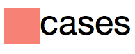
<div><i class="icon"></i>cases</div>
Now, that div could be a button, it could be anything. That i could be an image, it could be an svg. Essentially, it’s something that is icon-like, set to display: inline-block. My goal is to center it next to the text beside it.
Let’s take a look at this first example:

Icon next to lowercase text
Here’s the CSS I’m using to position the icon next to the text:
.icon {
width: 1ex;
height: 1ex;
display: inline-block;
background-color: salmon;
vertical-align: middle;
}
The key part here is vertical-align: middle. Instead of resting the icon on the baseline, as it would be default, I’m centering the image with the text.
The reason for this becomes evident when I go with a larger image:
Larger icon next to lowercase text
Awesome.
So, what’s the problem?
Of course, rarely is copy conveniently all lowercase. Usually it’s title case and full of ascenders, sometimes it’s all caps.

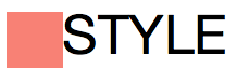
Not so awesome.
In this case, aligning the icon to the middle isn’t quite what I want. None of the usual vertical-align values do the trick, though. (Except in cases where we get lucky and the image height just happens to be at the right size to use text-bottom, baseline, or text-top.)
Thankfully, I can adjust the alignment manually.
.icon {
vertical-align: -.25ex;
}

Icon aligned properly next to title text
Ex Unit
In researching this, I came across the ex unit. I may have already known about it but usually when I want to size relative to type, I’ll use the em or rem unit. The ex unit can be useful because it’s based on the x-height—the height of the letter X.
I decided to use the ex unit for sizing the icon. I like that the icon size is relative to the type. I can change the font size or change the font family and the icon will match the x-height. (Which, with the first example of lowercase type works really well.)
Sadly, most icons at smaller resolutions will look blurry if not aligned to their designed pixel dimensions. Using ex units for icon sizing probably isn’t all that practical. (For example, Arial versus Helvetica will render the icon at different sizes.)
But I digress.
Back to Px
Using pixel units for the icon, none of vertical-align options work “out of the box”. I’ll go go back to vertical-align: middle to, at least, align to the middle of the type, regardless of font size.
.icon {
width: 16px;
height: 16px;
display: inline-block;
background-color: salmon;
vertical-align: middle;
}
I need one more piece. The icon is currently aligned to the middle of the text including ascenders and descenders (or aligned to the middle of the x-height, I didn’t actually confirm which but close enough).
To align to the middle of the x-height plus the height of the ascenders, I need to move the icon up.
Using Translate
With one extra line of code*, I used em units to tweak the alignment. Increasing or decreasing the font size will keep the icon centered due to the em-based translate.
.icon {
width: 16px;
height: 16px;
display: inline-block;
background-color: salmon;
vertical-align: middle;
transform: translateY(-.1em);
}
Sweet, everything aligns!
* One line? I still have browser prefixes to deal with for now, so not quite one line…
Using Top
If we don’t want to deal with browser prefixes, we can also use position:relative and top to adjust accordingly.
.icon {
width: 16px;
height: 16px;
display: inline-block;
background-color: salmon;
vertical-align: middle;
position:relative;
top:-.1em;
}
Recap
Using ex units to size and position the icon offers lots of flexibility but will likely result in blurry icons at smaller sizes. (SVGs or hi-res images on higher res displays may make this more of a moot point in the future.)
Using px units to size the icon and then using em units to adjust the position of the icon results in a more predictable situation (at least, at default browser settings for font size).
March 14, 2015
Comparing Smartwatches: Moto 360 vs Pebble
My first impression of the Moto 360 is “sweet!” The screen is gorgeous. I love the inductive charger/nightstand. The notifications on it look fantastic.
The “ok google” voice commands work mostly well but sometimes doesn’t do what I’d expect. For example, when I set a timer or alarm, it’s not setting the alarm on the phone; it’s only setting it on the watch.
I’m never quite sure what is on the watch and what is on the phone. This is an area where the Pebble was always good: I always knew it was an interface to my phone.
Battery life on the Moto 360 is a drag. You can get through a day but that’s about it. Going on trips, bringing the charger is a hassle. I just want to leave the watch at home. The upcoming Apple Watch will likely suffer the same fate. I went on a 5 day trip recently and the Pebble had charge for the entire trip.
I find swipes on the Moto 360 don’t always do what I expect or don’t work at all, leaving me to shut the display off and turn it back on again to bring me back to the home screen. The wrist twist action to turn on the display requires me to bend my wrist too far, making it uncomfortable. Most times I just press the button to turn it on. The “always on” of the Pebble definitely works better. I can glance down and see the time. With the Moto 360, checking the time at a glance feels like a hassle.
The buzz notification on the Moto 360 is a little too faint, making it easy to miss. The Pebble always felt just right. When wearing a watch, I disable the vibrations on my phone to prevent double buzzes. It has the added bonus of getting rid of phantom vibrations. (“Did my phone just buzz? *Checks phone* Nope.”)
I got the Moto 360 in black leather. I like the touch of gold on the crown. It looks great on my large wrists but have heard from those with smaller wrists that it’s a bit big.
My Pebble is the original from Kickstarter, in white. It looks nice along with the white iPhone but I find the e-ink screen looking dated now. The screen feels too far from the “glass” (it’s plastic) and the grey on black feels retro.
I preordered the Pebble Time (colour!) and will try out the Apple Watch, too, I’m sure.
Why get a watch at all?
I like the look of a watch. They’re a nice accessory. They’re less intrusive than a phone and easier to glance at. While driving, I find it nice to just glance at my wrist to see if it’s important. If I’m in a meeting and my phone rings, I can quickly dismiss the call.
While having your phone out in the company of others can seem rude, as you’re not giving them any attention, glancing at your watch repeatedly makes you look impatient.
February 3, 2015
Windows Substitutes Helvetica for Arial
I just ran into this issue today and honestly a little surprised I haven’t run into it before.
The problem was with a font stack that I wanted to try out:
font-family: "Helvetica Neue", Helvetica, "Segoe UI", Arial, sans-serif;
If a user has Helvetica Neue or Helvetica, that’s fantastic! This is likely to be the case if they’re on a Mac.
On Windows 7 and 8, Segoe UI is installed by default. Neither Helvetica Neue nor Helvetica are. Failing all that, they’ll get the tried and trusty Arial.
Except, when I went to try it, I got Arial instead of Segoe UI, even though it’s installed. Odd.
I changed the font stack to:
font-family: "Helvetica Neue", "Segoe UI", Helvetica, Arial, sans-serif;
Notice how Segoe UI is before Helvetica this time? Sure enough, I get what I expected: Segoe UI.
Oh, did you want Helvetica?
Turns out, in Windows, there’s a registry key that aliases Helvetica to Arial. If you specify Helvetica, you’ll get Arial. If you specify Helvetica and then specify any fonts after it, you’ll get Arial.
This was tested on Windows 8.1 in Internet Explorer 11 and Chrome and both did the substitution.
January 11, 2015
Ten Years in Contrast
Ten years ago today I wrote a colour contrast checker. I put together this tool because, at the time, I needed to check the contrast between two values and the tool I used to use was buggy and then stopped working.
The code I put together was extremely hacky—a combination of 3rd-party scripts and ill-architected JavaScript. I just needed something that worked.
In the beginning, you could set RGB values or a hex value and it’d tell you if it passed, didn’t pass, or sort of passed. Since then WCAG introduced different guidelines and I updated it to show whether it definitively passed each of those checks.
Eventually, I added HSV sliders, as well. Once you get a colour you like, you usually just want to tweak the lightness of it to get it to where you want.
I’ve had some requests over the years to be able to pass in foreground and background colours via the URL. I added it in maybe 3 years ago but a subsequent server crash (and a poor backup strategy) meant that I lost that version and never fixed it.
So today I jumped in and decided to add that code…
Sliders!
Over the past ten years, browsers have gotten better. After checking caniuse.com, I decided to scrap the custom JavaScript-based sliders and just use the range input type. Go go HTML5!
After stripping out unnecessary JavaScript and CSS, most of the code for changing RGB to Hex to HSV remained intact. That was a good sign.
The bonus about using range inputs is that the contrast checker now works on mobile devices, too. (Well, any device that supports range inputs.)
Bookmarking colours
The previous iteration of being able to pass in colours was only one way. You could send someone a URL but it didn’t update the URL if you made any changes.
I was able to use window.location.hash to update the URL whenever the foreground or background colours changed.
10
After making the changes, I went to update the modified date and suddenly realized that it had been 10 years—to the day! That caught me by surprise. In that time, the page has been viewed more than 1,000,000 times since I started tracking with Google Analytics back in 2007.
I’m glad it has been useful to so many people for so many years. Here’s to the next 10!
January 2, 2015
My Custom Video Setup
For a couple years now, I’ve wanted to do an online version of the SMACSS Workshop—one that people can buy and download any time they want. I’ve hosted a couple online workshops (thanks e4h!) but I wasn’t happy with the videos that resulted from it. I streamed from home which resulted in poor audio and a crappy backdrop. (Which was all my fault, not e4h!)
More recently, I partnered up with Frontend Masters to produce said workshop for the site. They know what they’re doing.
I decided that I wanted personal intros and outros for each section of the workshop. I have no idea what I’m doing but figured that iMovie and a little time would be all I need to figure things out.
Here are a few things that I learned along the way:
Pick a format
In iMovie, you have 4:3 or 16:9. The videos were in 16:9 so I wanted everything else to match. My slides were in 4:3, however, and when I went to import them as a resource in iMovie, they got cropped. That’s bad.
It’s best if you can keep all your assets in the same format. In Keynote, I resized the presentation to 16:9, re-exported, and then imported. No more cropping. I recommend doing the same for pretty much any images that you might use.
Editing in iMovie is pretty much non-existent so best to do everything you need before importing. Same goes with audio.
Exporting from Keynote
99.9% of the time I export from Keynote, I’m exporting to PDF. I’m trying to bundle up everything into a nice package for delivery to attendees and organizers.
For iMovie, though, there are two options to consider depending on what you care about. If you care about the animations then export as Quicktime. If you don’t, then export as images.
Exporting as Quicktime requires fiddling with timelines in iMovie, which is a hassle if you need to break it down into a dozen or more parts.
The Recording Setup
The iPhone.
To do the interstitial videos, I decided to use my iPhone. The quality of the camera these days is great (or at least, good enough). I put it in a little tripod on some boxes. I set up a handful of lamps in the room to provide enough light without a lot of shadows.
Teleprompter
While I could’ve ad libbed, it was a little beyond me. I decided to write a script and then pasted it into a free teleprompter app on the iPad. I positioned the teleprompter on some boxes so that it would sit as close to the camera as possible. I wanted it to look like I was looking at the camera even though I was looking at something else.
If you know that you’re going to be breaking up the video/audio afterwards then add pauses to the script with a bunch of carriage returns. These gave me a chance to breath and stretch before diving into the next part of the script.
Rode Podcaster
As great as the iPhone is, the mic picks up everything. I didn’t want the sound of my kids in the background. I hooked up my Rode Podcaster mic and plugged it into my laptop.
That means that I would have separate audio and video tracks and would need to figure out how to merge them back together afterwards.
Recording
I hit record on the iPhone, hit record on the laptop, then hit play on the teleprompter.
Showtime!
First thing you should do is clap. Yes, clap. They use clapboards in the movies for a reason. You’ll want the clap since it creates a spike in the audio. This spike will help you align the audio with the video track in post-production.
Having done some videos for Adobe, I learned that if you stumble, don’t worry about. Just start over wherever you think you need to splice the video. For me, I had 15 interstitials that I was doing. If I flubbed my lines, I restarted that interstitial by backing up the teleprompter and going again. I kept the audio and video recording the whole time.
I did a bunch of takes, rewriting some of the script whenever I thought it felt awkward while saying it.
Post-production
Post production was done in iMovie. I dragged all the assets in and then went to work.
Audio
I mentioned that you’ll need to align the audio. Getting the beginning to line up is easy enough but I discovered that time is relative. By the end of the video, the audio had become completely out of sync.
To fix this, right-click on the audio track and select Show Speed Editor (or hit Cmd-R). You’ll get a circle handle in the top right. Drag that to stretch the audio out or in until the audio matches when you play the end of the video.
I find (on my slow machine, at least) that the audio and video previews won’t get updated and therefore aren’t an accurate reflection of whether you’ve resized things accurately. Play the video and listen.
You’ll also want to mute the audio from the original video. At first, it’s handy to see if audio is out of sync because you’ll get an echo. But once your higher quality audio is working then you’ll want to mute the video audio. With the video selected, click on the speaker icon in the preview pane. Then click on the speaker icon next to the Auto button to mute the audio.
Cutting it up
Once I had the audio synced, I needed to cut everything up. Cmd-B will cut wherever the white line is which is usually wherever your mouse is hovered. You can use markers but for the most part I found them useless.
Select both the video and audio tracks when you go to cut them. The audio track is attached to the video and therefore you need to make sure that they’re cut in tandem. Now you can move or delete the video segments and the audio should go along with it.
Wrapping it up
My 2011 MacBook Air is severely underpowered for this kind of work. The six hours of video took nine hours to export. (That’s what it says, anyways. It’s still exporting as I write this.)
After that’s done, I need to cut up the video into 8 parts. (Ain’t nobody got time for one 6-hour video!) I’ll be using Quicktime Player to do that. I wish there were an easier way to do this automatically from iMovie. Markers would’ve actually been a great use for this kind of thing!
This has been a fun exercise to go through. Like everything else I’ve done with SMACSS to date, I’ve really enjoyed exploring new processes on my own. From writing the book, to self-publishing it in 3 formats, to building the site, to printing the book, and now to video editing.
I’ve become such a fanboy of self-publishing!

(Oh, and yes, the SMACSS Workshop will be available in the future on Frontend Masters and on SMACSS.com.)
November 25, 2014
Design Engineering
“Front End Dev isn’t just JavaScript. FED is a melting pot of design & dev skills to implement accessible UIs to accepted standards.” — Matt Hill
When it comes to development on Shopify Admin, we have—up until recently—only had two specializations: designers and engineers. There is a third specialization, however, that has had a tough time finding a solid home: front-end developers. The skills of a front-end developer can be varied and blends into design as much as it blends into engineering. We had been very lucky to have hired talented designers who can also create high quality front-end code without the need for dedicated front-end developers.
Any talk of growing a dedicated team of front-end developers had been met with the rebuttal: “if they’re developers, then they’re part of the engineering team.” That is, all backend developers are front-end developers and vice versa. Shopify expects their developers to be full stack. But if front-end development is development, why did we have our designers do it?
The problem is that we use the terms front-end development and backend development but people are often confused as to where a front-end developer starts and where a backend developer ends.
When we examine the development process, there are three phases: “Design”, “Design Implementation”, and “Application Development”.

Spectrum of Application Development
Design
Designers use many tools and while they should understand how their designs are implemented, it should not be a requirement for them to implement their own designs into HTML, CSS, and JavaScript. (Just as we don’t expect print designers to do their own printing. We have printers for that.) It’s advantageous when a designer can focus on multiple iterations of a design or can work through more design problems as a result of not having to focus on design implementation: the act of turning their designs into production-ready HTML and CSS.
I’ll put the clarification here that I do believe that designers should know how to code but with a growing organization comes increasing specialization.
Application Development
Application Development is about hooking up the interface and serving it in the best way possible. Should we be using a client-side MVC or server-side rendering? What’s the caching or storage system? What’s the data model? These types of concerns bleed across the HTTP barrier and shouldn’t be restricted to one side of it or the other.
Understanding OOP and prototypal inheritance requires a different set of skills than understanding how multiple browsers render a CSS property and how to best implement a design across multiple devices—phone, tablet, or desktop—and be accessible with multiple input methods—mouse, keyboard, gestures, or screenreaders.
Design Implementation
Implementing a design means writing HTML and CSS (and some JavaScript) and ensuring that the design holds up under the various design constraints: different browsers, different dimensions, different resolutions, and different interaction methods (mouse, keyboard, gestures, screen readers). It also can mean building out prototypes for UX validation. These people are design-minded but not necessarily designers. These people are technically-minded but not necessarily developers.
People in this role provide a great bridge between design and engineering. I’ve often called these people the “arbiters of design”. They inform design of possibilities and constraints and help ensure that designers build a consistent and usable interface for as many users as possible. They help codify the design work. They have a developer mindset with concerns about render performance and load times and can work with engineering to build out a performant front-end.
Roles
It’s important that we have generalists that can bleed across these lines and specialists that can go deep in each of these sections. Up until a short while ago, we were not doing enough to foster the practice of design implementation within Shopify Admin. This has been affecting our designers’ ability to focus on design and affecting our ability to hire people due to our expectation of requiring generalists over specialists.
What to call these people?
“Could front-end translate as being design engineering?” — Dan Donald
We debated on what this role should be called. Design Implementors felt less than impressive. We almost settled on Design Engineers but it sounded a little too “Disney”.
We also already had a well-established team of front-end developers in Toronto focused on Shopify.com and other growth projects. Their needs were a little different than ours since their front-end developers bled more into backend development.
In the end, we came back to Front-End Developer.
It was more general and enveloped all front-enders, regardless of what end of the spectrum they are at.
As an industry, though, we’re trending towards a greater specialization around design/code architecture and we’re seeing new workflows around that as we try to scale product and site development with larger teams and larger codebases, much like we’ve seen with other technologies.
November 19, 2014
Specificity Graphs
Harry Roberts recently wrote about creating a Specificity Graph to get a better picture of your CSS.
Harry’s conclusion is that a spiky graph is a bad graph. Spikes that occur mid-graph could lead to maintainability issues since CSS that occurs afterwards needs to meet or exceed that level of specificity to override earlier CSS.
In a SMACSS world, however, that’s not likely what your specificity graph would or should look like.
At the beginning of the graph, specificity starts out low with all the base element styles along with a few pseudo-class styles.
From there, the layout styles (generally just class selectors) will get added.
From there, each module gets added. It’s here where we start to see a teeth pattern emerge. Each module, depending on whether you use more of a BEM class-only approach, could be flat; or if you don’t mind using child selectors, the specificity will climb towards the end of the file. In the next module, the same pattern will happen again.
If you keep your modules isolated in design and implementation, then you really only care about specificity within a module, not across your entire CSS, making the overall site graph less useful.
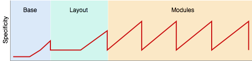
High specificity in itself isn’t bad but is usually a sign of either being needlessly complex or having too many dependencies between rules. High specificity is only problematic when two rules with the same properties need to be applied to the same element—which is usually where designs become brittle.
If you'd like to create your own specificity graph, there's an online generator.
November 17, 2014
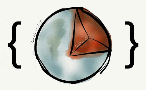
Evolving Code: From the Crust to the Core
At Shopify, as our team scales, we’ve been trying to figure out how to manage the influx of new design and new components into the codebase. On one hand, we want all code to meet our coding standards, use the existing system where it can, and expand it when necessary.
As new functionality and new experiments get introduced, we are finding ourselves unsure how best to manage this.
Quick and dirty and refactor later? Problem is, people are lazy. Things might not get revisited and we’ll be left trying with the less-than-desirable code for some time.
Spend the time up front to “do it right”? It might limit our ability to iterate quickly if we fuss too much on doing it right. With experiments, much if not all of the code might just be thrown away anyways or changed with the knowledge gained from the experiment.
From the Crust
We’re approaching this now by placing code in the crust and then moving it to the core as it is refined and needed.
What does the crust look like from a code perspective? We have different files that we’ve been using:
Area files
Often times, the designs are specific to a section of the app. They haven’t yet been abstracted out to apply elsewhere.
Shame file
While not specific to one area, we know that this is code that we don’t want. We know that this is code that desperately needs to be refactored and will be tackled sooner rather than later.
Experiments class
This is relatively new. At the ruby level, we’ve done beta flags for years but hadn’t considered what this meant from a CSS perspective until recently. We’re trying an experiments prefix to identify stuff that will be tested and then decide what to do with it when the experiment is done.
To the Core
I have a motto as of late: “Make the right things easy and the wrong things hard.” I fear that these approaches make it easier for code to live at the fringe and that people won’t take the time to refactor the code, pushing it closer to the core.
However, I have been thinking about component systems — especially ones that live outside of the core product. In such a situation, having components developed on the crust that then ‘graduate’ to the core sounds like a good approach.
In this way, there’s a higher bar that would need to be met, due to the longevity of these core pieces.
In the world of Object-Oriented Programming, there is a saying: “Make it work, make it small, make it fast.” This is an approach that we’re trying on for size and will hopefully create the right balance of code quality.
Jonathan Snook's Blog

- Jonathan Snook's profile
- 4 followers

