
Icons and Type
As of late, I’ve been thinking about icons and type.
Here’s the example HTML I’m working with here:
<div><i class="icon"></i>cases</div>
Now, that div could be a button, it could be anything. That i could be an image, it could be an svg. Essentially, it’s something that is icon-like, set to display: inline-block. My goal is to center it next to the text beside it.
Let’s take a look at this first example:
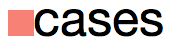
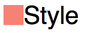
Icon next to lowercase text
Here’s the CSS I’m using to position the icon next to the text:
.icon {
width: 1ex;
height: 1ex;
display: inline-block;
background-color: salmon;
vertical-align: middle;
}
The key part here is vertical-align: middle. Instead of resting the icon on the baseline, as it would be default, I’m centering the image with the text.
The reason for this becomes evident when I go with a larger image:
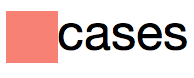
Larger icon next to lowercase text
Awesome.
So, what’s the problem?
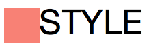
Of course, rarely is copy conveniently all lowercase. Usually it’s title case and full of ascenders, sometimes it’s all caps.
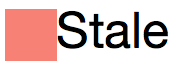
Not so awesome.
In this case, aligning the icon to the middle isn’t quite what I want. None of the usual vertical-align values do the trick, though. (Except in cases where we get lucky and the image height just happens to be at the right size to use text-bottom, baseline, or text-top.)
Thankfully, I can adjust the alignment manually.
.icon {
vertical-align: -.25ex;
}
Icon aligned properly next to title text
Ex Unit
In researching this, I came across the ex unit. I may have already known about it but usually when I want to size relative to type, I’ll use the em or rem unit. The ex unit can be useful because it’s based on the x-height—the height of the letter X.
I decided to use the ex unit for sizing the icon. I like that the icon size is relative to the type. I can change the font size or change the font family and the icon will match the x-height. (Which, with the first example of lowercase type works really well.)
Sadly, most icons at smaller resolutions will look blurry if not aligned to their designed pixel dimensions. Using ex units for icon sizing probably isn’t all that practical. (For example, Arial versus Helvetica will render the icon at different sizes.)
But I digress.
Back to Px
Using pixel units for the icon, none of vertical-align options work “out of the box”. I’ll go go back to vertical-align: middle to, at least, align to the middle of the type, regardless of font size.
.icon {
width: 16px;
height: 16px;
display: inline-block;
background-color: salmon;
vertical-align: middle;
}
I need one more piece. The icon is currently aligned to the middle of the text including ascenders and descenders (or aligned to the middle of the x-height, I didn’t actually confirm which but close enough).
To align to the middle of the x-height plus the height of the ascenders, I need to move the icon up.
Using Translate
With one extra line of code*, I used em units to tweak the alignment. Increasing or decreasing the font size will keep the icon centered due to the em-based translate.
.icon {
width: 16px;
height: 16px;
display: inline-block;
background-color: salmon;
vertical-align: middle;
transform: translateY(-.1em);
}
Sweet, everything aligns!
* One line? I still have browser prefixes to deal with for now, so not quite one line…
Using Top
If we don’t want to deal with browser prefixes, we can also use position:relative and top to adjust accordingly.
.icon {
width: 16px;
height: 16px;
display: inline-block;
background-color: salmon;
vertical-align: middle;
position:relative;
top:-.1em;
}
Recap
Using ex units to size and position the icon offers lots of flexibility but will likely result in blurry icons at smaller sizes. (SVGs or hi-res images on higher res displays may make this more of a moot point in the future.)
Using px units to size the icon and then using em units to adjust the position of the icon results in a more predictable situation (at least, at default browser settings for font size).


Jonathan Snook's Blog

- Jonathan Snook's profile
- 4 followers

