
Jonathan Snook's Blog, page 14
January 8, 2018
Lone House on the Hill

A lone house sits on the hillside. In the spring of 2017, I went to the Faroe Islands to do a photography workshop. It's mostly an excuse to travel to cool places but it gave me a chance to level up my photography skills, as well. My style has already changed quite a bit in the last year or so as I learn new techniques and try new styles.


Hemingway's Office
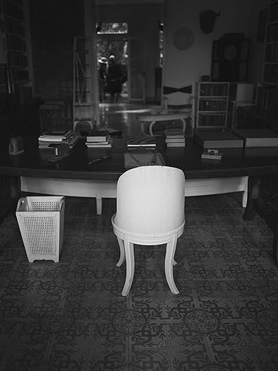
We took a tour of Hemingway's home in Cuba. You can't actually go inside but you can walk around and take pictures through the open windows. His office looks like a place I'd like to get some work done. Although, I think I'd like the desk to be facing towards the outside.
View on Flickr
December 13, 2017
Curation
Personal curation is one way in which we create good experiences. We choose how to use our time, choose the friends we have, and choose the things we collect.
Feeling dispassionate about my experiences on Twitter, I decided to spend some time curating it. Like an overgrown garden, I needed to cut back the branches and pull out some weeds.
I mute keywords. I mute some people. I turn off retweets. (People often retweet different content than they produce.) I switched to Tweetbot from the native Twitter experience to help facilitate some of these changes.
On Facebook, I realized that I don’t have the same ability to curate. All I can do is tell it to show me less of “posts like this” and hope it figures out what I meant by that.
In the name of holy engagement, the native experience of products like Twitter, Facebook, and Instagram are moving away from giving people the ability to curate. They do this by taking control away from you, the user. By showing what other people liked, or by showing recommendations, without any way to turn it off, they prevent people from creating a better experience for themselves.
Curation as Expertise
I think curation, in and of itself, is something that experts do. Beginners need time to acclimate and learn what they do and don’t like about a particular thing. With art, for example, we need to sample a wide variety of works before we know what we prefer and can curate for ourselves. The same applies for wine, whisky, or whatever wonderful object you wish to collect.
For beginners, services push the act of curation as a way to educate, build interest, and create engagement. Like getting a flight of beers every time you go to a restaurant. It’s an important process to learn what your preferences are.
For experts, though, this forced act of curation is intrusive. When I order my Rochefort 8, I don’t want the waiter to keep dropping IPAs at my table. Curation is an active task that is often treated as (and seen as) an act of intrusion to those that have already gone through a lot of curation. It sours the experience.
And to that end, many services are geared towards the beginner. Getting new people onto a platform and getting them engaged is how they make their money. An advertising revenue-driven platform rarely caters their experience to the experts. A platform, however, can create an ecosystem that is friendly to experts.
Twitter does this (both well and poorly) via their API. Third-party apps like Tweetbot and Twitterrific give experts the tools for curation.
Midnight in the Garden of Good and Evil
Many services, with their walled gardens, don’t let you pull out the pruning sheers. As a result, people are leaving these services. Maybe not in droves yet and maybe not enough to offset the new users coming in but enough.
I believe it is important that platforms consider people at all points in their journey—from onboarding all the way to being experts.
December 8, 2017
Calendar with CSS Grid
Laying out events on a calendar can be somewhat tricky. Many years ago, I had a client project where I needed to do a calendar similar to Google Calendar. I ended up using bitwise operators to figure out if there was room to put an event on a particular line. If there’s no room, it placed the event on the next available line.
There’s a lot of looping involved just to place an event on the calendar.
With CSS Grids, I wondered if I could take advantage of its auto-placement to accomplish the same thing.
The HTML
Of course, the first thing to worry about is the HTML. How should I mark up my events?
Here’s what I ended up going with:
<div class="week">
<div class="day">
<h3 class="day-label">1</h3>
<div class="event event-start event-end"
data-span="2">Class</div>
<div class="event event-end">Interview</div>
</div>
</div>
Each week has its own container and each day has its own container. Within each day, we have a heading and then a list of events.
Why not use an actual list? A definite possibility. I tend to only go with a list if I think I’m going to normally have more than a couple items. I don’t want to overload people with too much information. (But this is conjecture. I should probably ask a bunch of people who use screen-readers.)
The CSS
I make each week a grid with each day taking an equal amount of space.
.week {
display:grid;
grid-template-columns: repeat(7, 1fr);
grid-auto-flow: dense;
grid-gap: 2px 10px;
}
Each week is its own grid because I need all the events to naturally flow into new rows. If the entire month was one big grid, it’d be difficult to flow events within a single week.
With Grid, we have a parent element that declares the grid and the child elements that are part of the grid. In this case, that would be the .day. We don’t want that part of the grid. We want its contents to be part of the grid. Therefore, I set the day to display:contents.
Unfortunately, display:contents only works in Chrome (with experimental features turned on) and Firefox. Womp womp. If we wanted to broaden support, we’d have to remove our day wrappers. (This would work fine since they don’t really do anything anyways.)
Getting Days on the First Row
The day numbers should all be on the first row, so we specify that with grid-row-start.
.day-label {
grid-row-start: 1;
}
Now, because we specified grid-auto-flow: dense; on our grid, all of the events will just find a spot where it can fit. Without that, each event is placed after the one before it, regardless of whether there’s room somewhere earlier in the grid.
And not a lick of JavaScript to do this!
Spanning Days
The next piece to this is having an event span over multiple days. I opted to use a parameter to do this. Thus, anytime an event needs to span more than a day, a data-span attribute is added to the element. The CSS then uses the span # syntax to span over a number of grid cells.
[data-span="1"] { grid-column-end: span 1; }
Keep in mind that if an event spans beyond the bounds of your 7 column grid, it’ll create new columns to fit in. (This’ll likely create some display side effects that you don’t want.)
James Finley went further and used CSS Custom Properties in his version.
.event {
--span: 1;
background-color: #CCC;
grid-column-end: span var(--span);
}
Doing this, there’s less code in the CSS. In the HTML, you now need to specify an inline style instead of the data attribute.
<div class="event" style="--span:2;">
Start Day
Now that we have the events spanning the correct number of days, we also need the events to display as starting on the right day. The grid auto-placement will try to just find the first available box but what we really want is the first available box that starts on the right day of the week.
For this, I chose to use nth-child since the day wrapper will let the selector still work.
// “1” is the left-most edge, so the first day of the week
.day:nth-child(1) > .event { grid-column-start: 1; }
Without the day wrapper, you’d need to find another way to tell the events what day of the week to start on. Either by adding a class to each event or by making some assumptions in our HTML.
For example, if we know that day labels are always h3 headings and the events for that day come after it, then we can use nth-of-type to do the same thing.
h3:nth-of-type(1) ~ .event { grid-column-start: 1; }
h3:nth-of-type(2) ~ .event { grid-column-start: 2; }
...
Essentially we’re saying that any events that come after the first heading start on day 1. Any events that come after the second heading start on day 2. Due to the weight of the specificity, these styles need to be declared in order of the days of the week.
Other Calendar Considerations
The other thing that I cared about was styling events to indicate that they spanned over multiple weeks. Each week has their own events. That means that an event that starts on Friday of one week and goes to Monday of the following week would be two events. One 2 day event that displays on Friday to Saturday and another 2 day event that displays on Sunday to Monday.
(If your calendar starts on a Monday instead of a Sunday then, of course, you’d have a 3 day event and a 1 day event. Same problem!)
I add an event-end class to indicate the event ends in the current week. That rounds off the right-side corners of the event. I add an event-start class to indicate that the event starts in the current week. That rounds off the left-side corners of the event.
Check it out
Now that I’ve blathered on, go check it out!
On CodePen
On YouTube
November 21, 2017
Quiet Time
Unbelievably—at least, to me—I’ve been speaking at conferences for over 11 years now.
I’m finding it difficult not to be self-congratulatory in recognizing that I’ve been doing it so long.
I still remember my first talk at Webvisions. I had a full slide deck of JavaScript tidbits to cover. I don’t think I looked up from my computer once as I delivered my talk. I was nervous and wholly unsure of what I was doing.
All these years later, I still get nervous but I learned to look up from the computer and talk to the audience.
I’m not sure that I ever became a great speaker but I think I managed to become a good speaker. I enjoyed sharing my experiences with whatever it was that I had been working on in hopes that it might spark an idea in someone else.
I’ve seen our industry fill with highly qualified, passionate, and excited people clambering for a chance to speak. There’s nothing I have to say that someone else isn’t already saying and they’re probably saying it better than I am.
For that reason among others, I’ve decided to take an extended break from public speaking. I’m in need of some quiet time.
August 30, 2017
Smart Home
A couple months ago, I bought a new car. However, I realized after the purchase that the car didn’t have a built-in garage door opener like my old car had. The new car has Apple CarPlay. I tried to use Siri in the car to open the garage door but to no avail. To which, I thought, maybe I should by a HomeKit powered garage door opener!
This idea opened the floodgates of research into the world of having a “smart home”. I started buying smart switches and smart lights and smart thermostats and, wow, is this stuff complicated.
Constraints
I’m a fan of being able to easily move between ecosystems. I have Windows and macOS. I have Android and iOS. There’s voice control on the desktop, on mobile, and as a standalone device.
Can I build a system that works across all of these? The short answer is: no.
Long answer: we can come pretty damn close and maybe that’s okay.
The other requirement I had was that anybody in the house shouldn’t necessarily need something complex to work the lights. I shouldn’t have to get them to install an app to be able to interact with the house. Not a terribly difficult requirement, per se, but there are some considerations here.
How does it work?
In the most vaguest terms, you have a device (light bulb, light switch, outlet, or whatever) that can communicate and be controlled by another device (hub, phone, voice device, or whatever). The trick is to get all the devices talking together.
Communication
The first thing to consider is how everything will communicate with each other. Here are just a few of the more popular ways:
Z-wave
Zigbee
TCP/IP
Bluetooth
HomeKit
Insteon
Pick the wrong one and you might find yourself limited.
I bought some Hue lights at first. They worked with HomeKit but I could also hook them up to Google Home. And as it turns out, a bunch of other stuff, too.
Then I bought a switch that was HomeKit-enabled. Sadly, it only worked with HomeKit and nothing else. I had to pull it out and put something else in its place.
Z-wave is probably the most popular with multiple hubs and devices that work on it. I decided to go that route since it had the best support. Again, with some caveats.
Z-wave hubs like Wink and SmartThings don't work with HomeKit. They work with Alexa and Google Home, though. To fix the HomeKit integration, there’s an open source project called Homebridge that acts like an accessory that will sync all your devices to Homekit. You can run it on a Raspberry Pi, too, which is fantastic.
Hubs
Once you've figured out what protocol things will communicate with, you may need a hub. I say "may" because if you pick HomeKit, for example, then there's no hub. For pretty much everything else, there is.
If you go the Hue lights route, there's a Hue hub. If you go Z-wave or Zigbee or Insteon, there's a hub that'll work for each of those.
Since I went Z-wave, the two most popular hubs are Wink and SmartThings. I've heard good things about SmartThings, including how good the API is (if you're interested in programming). I went with Wink out of convenience; my local HomeDepot had them in stock. The Wink hub has an API, too.
Hubs don't have a user interface. You'll need your phone or tablet to connect to the hub to make any changes to your configuration, such as adding or removing devices.
The Wink app is pretty good for adding new devices from many different manufacturers with step-by-step instructions.
Wink and SmartThings also support devices that use Zigbee or TCP/IP. With either of those hubs, you're pretty much golden.
Devices
Once you have a hub, now you need devices! Having decided on a hub, picking devices might seem like the easy part. Does it communicate with the hub? Yes? Great! But not so fast.
Devices are a big part of the user experience. When somebody wants to turn on a light, how do they do it? How does it feel?
Hue
Hue lights, for example, sound fantastic. Great integration with pretty much everything. Ability to change colour to fit mood, sound, or time of day. With one huge flaw: the light switch. Turn off the light switch and suddenly the Hue light is useless. With power cut off, there's no way to communicate with the light to turn it back on.
Hue sells light switches that are really just remotes that you stick to the wall. The actual light switch still remains. Which means removing the actual switch or taping it in the on position or telling people never to touch the switch. Which is kind of silly. I have Hue lights in a few select places where I don't have a light switch: bedside lamps and corner lamps.
LED lights and dimmers
I picked up some Lutron dimmer switches, because I liked the look of them. Sadly, they didn’t work with my LED fixtures. Lots of blinking and flickering. Depending on your lighting and wiring, pick only one up to make sure it works before you buy a dozen of them.
I switched to Leviton (again, because HomeDepot had them in stock) and they worked well with my LED lights. On the downside, they make a rather annoying clunk sound when they turn on or off. It feels okay when you hit the switch but when you do it via the app or voice control, the noise is surprisingly loud. I’ve ordered some GE switches to compare.
Controlling the Devices
With wall switches, there’s not much that changes. People can still turn the lights on or off without needing to use an app. However, what’s the fun in that?
App Control
Every device that gets added needs to go through a process of being linked to the hub so that it can be controlled by the app. This linking process is generally done through the app along with some unique incantation that needs to performed on the device.
After this is done, pretty much all apps allow you to put a device into a group or room. Surprisingly, Lutron, Leviton, HomeKit, and Wink all seem to do this poorly. They all try to spit you into your accessories list, which isn’t organized in any useful way. Rooms (especially if it could tell what room I’m actually in) is the most useful default view but even then, a combination of rooms and accessories would be even better.
Voice Control
I like using voice control. I’ve got Siri on the iPhone, Google Assistant on the Pixel, and Google Home. It’s handy to be able to say “turn off all the lights” or “turn on the bedroom lights” before I head upstairs. I feel like the voice interface is currently the best interface (beyond the actual switches) for interacting with devices.
In my research, Cortana for Windows was supposed to be able to be able to control my devices but I couldn’t find a way to do this. It looks like it might be limited to the phone. Which, as it turns out, is the case for Siri, as well. Siri control only works from the phone. It won’t work from the desktop.
Also of note, Google Assistant on iOS doesn’t pass the request onto Google Home, which is unfortunate. (That’s why Homebridge is important to link up non-HomeKit devices.)
Family
Having a house device like Google Home means that anybody in the house can control lights in the house without needing to download an app. (Thankfully, my kids haven’t abused this by turning lights off on each other.)
However, being able to invite family or guests to use the app can be useful. If you go all in on a particular ecosystem like HomeKit, everybody else will need to be on the same ecosystem, too. With something like Wink, it’s on iOS and Android, so there is some cross-platform support.
Most platforms don’t have desktop apps, although there are often third-party solutions that can interact with your devices.
Automation
Part of the fun of having a smart home is being able to automate how devices interact.
Wink has a thing called “Robots” that lets you create various triggers. You can make triggers based on time, device, or location. For example, you can tell it to turn off a bathroom light if left on for longer than an hour. Or send an email notification when a motion sensor is triggered.
HomeKit can do some of that automation but requires an “always on” device in the home. This has to be an Apple TV or an iPad that never leaves the house.
Random Notes
As I went through this process, I came across random stuff that I thought worthy to mention.
Google Auth
Some services make it easy for you to register by allowing sign-in using Google OAuth. That’s fine when you’re initially signing up for the service. But afterwards, when you go into the Google Home and try to add that service, it loads up in an embedded web view that Google doesn’t allow. Thus, you won’t be able to add the service into Google Home. (I’m honestly a bit surprised at how Google screwed this up on both iOS and Android.)
When signing up for a service (like Hue, Wink, etc), always specify an email address and password instead of using the Google authentication.
HomeKit Codes
You add a HomeKit device using a code. For something like a light switch, this is on a piece of paper provided with the switch. Now I have to hang onto all these pieces of paper and store them somewhere in case I ever need to re-add them to HomeKit. Whoever thought this was a good idea?
Google Home
It would be nice to be able to control things within the app. Instead, you only get voice control, or you go into the device app. In which case, it makes sense to pull these into a single app, if you can. Wink, as mentioned, supports Hue and Nest, so you can control these from within the Wink app. Otherwise, you’re going to the Nest app to control the Nest, the Phillips app to control the Hue lights, and the Wink app for everything else.
Sync issues
I haven’t figured out why or when this happens, but the Wink app, or the Hue app, or HomeKit will show me a device is on when it’s really off. I haven’t figured out if it’s a case of turning it on or off in one app making it out of sync in the other apps. Or maybe it just gets confused from time to time.
Also, another fun issue with Hue lights in particular: when the power goes out and comes back on, it turns the lights on. My bedroom lamps came on in the middle of the night unexpectedly and I had some disorientation trying to figure out why the lights magically turned themselves on. (I swear there’s a horror movie plot point here.)
Next Steps
I’ve only just begun this journey. Dav Glass, for example, has over 200 devices in his home. I have a ways to go to catch up.
June 5, 2017
Photo Editing Workflow With Lightroom and Lightroom Mobile
From time to time, I like to take photos. (See Instagram and Flickr.) I have a couple phones and a couple DSLRs. Over the years, I’ve muddled my way through different processes and have struggled to find something that felt easy and effortless—especially when working across multiple devices like I do.
In the past, I’d move all images off a device, into a big ol’ folder, sorted by date, and then eventually moved off to external drives for safe keeping.
That really didn’t take into account the editing of said images. Enter Lightroom.
I had been playing with Lightroom on the desktop for a little while but never quite made a routine of it. With a purchase of a more recent DSLR that lets me transfer images directly to my phone or tablet, however, I found myself wanting to ditch the laptop and do editing directly on my mobile device.
At first, I was transferring over JPGs, editing in VSCO or Instagram, and then posting right away. This had been good enough that I actually became quite lax in managing my photo collection.
Along came iOS 10, with RAW image support, and suddenly I wanted something to take advantage of that. Lightroom once again came to mind. This time, Lightroom Mobile (LRM). Since it supports editing RAW files, I decided to try my hand at using just Lightroom Mobile with my phone or tablet to manage things.
I could add my images to LRM and they could sync across all my devices—including desktop.
This is where it all gets a bit confusing.
First of all, the syncing of photos to desktop is slow as molasses. I had 1500 photos and it took a day to download to my desktop.
The other problem was that it downloaded everything to the desktop. Nothing was stored in the cloud and downloaded when needed. This is when I realized that this mobile workflow wasn’t going to work. I couldn’t store my entire photo collection and have it sitting on my desktop. I’d run out of hard drive space.
After some fiddling with trying to understand the relationship between folders, catalogs, and collections, I realized that Lightroom Mobile is a slightly less effort way of being able to work on a small set of files and move them between desktop and device.
For me, the key is that when Lightroom Mobile syncs my photos to my desktop, I organize them with my usual folder naming convention. (Folder per year and folder per month, with specific folders for specific trips. e.g “/2016/2016-11 Atlanta”.)
Once I’m done with a set of photos, I create a Lightroom catalog for that set and then move the catalog and photos over to the external drive. (And from there, I make additional backups of that drive.)
Lightroom Mobile, then, is relegated to just moving the occasional file across device, to be removed once I’ve done what I want with it, such as upload to Instagram. (Lightroom on the desktop lets me sync to Facebook or Flickr, so Mobile isn’t needed there.)
Other Workflows
One of the workflows I had hoped to have with the iPad was quickly move between Adobe apps such as Mix, Fix, or Express, tweaking the images to get them to where I want.
Sadly, if it supported files in Lightroom, files needed to be synced to the cloud and back again. It made editing files slow and cumbersome. If it didn’t support Lightroom, then files were converted to flat JPGs, returned to Lightroom as a completely new image. I didn’t really want multiple copies of essentially the same file.
If I chose to keep the files in the iOS format, I could use Google SnapSeed to do edits and have it save to the original file, allowing me to revert changes if I desired.
Sticking to Lightroom
With my desire to move between iOS, Android, macOS, and Windows, I really felt like Lightroom came the closest to solving my problem. Some things aren’t very intuitive. Some of it felt like institutional knowledge about how Lightroom works. Now that I understand it better, it’s easier for me to move a bunch of files and the catalog file between desktop environments.
I believe Adobe has an opportunity here to solve the image editing and storage lifecycle and do so in an elegant way.
Until then, I’ll make do.
April 24, 2017
Container Grids
There’s been a rumbling of people that want Container Queries—myself included. (Come see my talk this year... it’s all about container queries!)
The idea behind container (née element) queries is that you specify that under certain conditions—most commonly, the width of a particular container—apply different CSS.
The problem with container queries is that it opens up the window for circular references. You could theoretically have CSS that says the following: if the width of the container is under 500px then make the contents 600px. At which point, your container is no longer under 500px and the CSS is no longer applied. At which point, the contents are no longer 600px and the width of the container is now back under 500px and the CSS should be applied. That’s bad.
In my exploration of CSS grids, I’ve been building a mental model of how they work. Let’s start with the following example:
.grid {
display: grid;
grid-template-columns: 200px 500px;
}
Guess what happens when the container doesn’t have enough room for the two columns? It just overflows the container. There’s no reflow and the container remains the same size.
Container Grids?
One purpose for container queries is to specify different layouts. Maybe adjust the size of something or rearrange something.
My “what if” lightbulb wondered if there were a way that we could one day solve the container query circular reference problem by using a grid layout system exclusively with container queries. (Other layout systems could still be used. They just couldn’t be used in conjunction with container queries.)
Since this system would be specific to grid, I’m imagining a syntax similar to responsive images that allows you to specify the minimum width for which the grid would apply.
.grid {
display: grid;
grid-template-columns:
200px 300px 600w,
200px 200px 1fr 900w;
}
Container Other?
This doesn’t solve the problem of how to apply other design changes like font and colour changes or margin and padding changes that would also be applicable under those conditions.
I don’t have an eloquent solution for that. It’d need to be something that can deal with the cascade.
Now, I’m just spitballing here and don’t know enough about how the CSS specification works to know whether this could even work but what if you could name those grid templates?
.grid {
display: grid;
grid-template-columns:
200px 300px 600w tablet,
200px 200px 1fr 900w desktop;
}
From there, being able to style elements using those keywords.
.item:grid(tablet) {
padding: 20px;
}
.item:grid(desktop) {
padding: 40px;
}
Due to inheritance, the keywords would be applicable to child elements. If you have a grid inside a grid then the same inheritance rules apply, with the child element outranking the parent element.
You could have the same cascade rules, too.
Where to go from here?
I suspect there are many holes in this idea. But maybe it’s enough to spur someone somewhere along the way to make container queries a reality.
April 18, 2017
Template Technology Agnosticism
Brad Frost recently wrote about managing technology-agnostic design systems. In his post, he recommends using a technology that doesn’t tie itself to any specific framework.
When I was at Yahoo!, we took a very similar approach. We knew we wanted to build out these components and be able to use them across multiple projects. And due to product acquisitions or teams deciding different stacks, we knew that we had the real possibility of needing to support templating in JavaScript, PHP, and Java environments.
Mustache
We chose Mustache because of its agnostic approach. (Pattern Lab—of which Frost is a contributing member—also uses Mustache under the hood.)
It’s an approach that worked well for us at Yahoo! and one that I’ve been advocating for ever since.
Like Frost says in his post, we wired up much of the system using some lightweight JavaScript for simple interactions. Some components, however, had a full JavaScript API. Something like an autocomplete widget would have Mustache, CSS, and JavaScript counterparts that would all be part of the final deliverable to other teams.
Our prototyping engine was able to render (at request time) a small part or a large part of a page through a combination of file hierarchy and naming convention. And all of this was done outside of any team’s engineering efforts.
The advantage to separating this out from other teams allowed us to avoid the complexity of their build process and release cycles—of which, different teams had different processes and different cycles.
Single Stack
On the flip side, when I was at Xero, I had made a different recommendation. Instead of an agnostic design system, I recommended picking a specific tech stack.
Xero, too, had different tech stacks used across the application. Unfortunately, the plethora of platforms was more a hindrance, slowing down the ability to iterate on design and maintaining a consistent experience across the entire application.
Some parts of the application wouldn’t have a team looking after it and thus would languish. Likewise, it was difficult to have people who had knowledge of all the tech stacks to roll design changes out system wide. As a result, inconsistency grew over time.
By choosing a single tech stack, the intent was to build an API that allowed new projects to ramp up quickly while also allowing designers and front-end developers to roll out changes across the entire platform.
Decisions
When do you choose an agnostic platform versus a specific one? I believe it comes down to an organizational one.
At Yahoo!, the Mustache templates were the source of truth. Thus, any design changes started within the prototyping platform and then pushed out to other teams.
For that approach to work at Xero, a generic platform would need to be established as a source of truth and then pushed to an intermediate stage. Personally, I’m not sure that the intermediate stage is necessary. The more layers between designers and production, the more resistance to change is likely to occur.
As Brad Frost intimates, if you’re using an intermediate step, you’re going to need a build process that converts the generic components into platform-specific ones. You’ll want to do this to avoid platform-specific implementations from becoming the new source of truth for any implementation. Otherwise, changes will have to roll back and forth between intermediary and preliminary stages.
Conclusion
I’m a big fan of Mustache, even over its more feature-laden cousin, Handlebars. I like it because of its simplicity and because it requires the heavy work with the data to be done before it sees a template. (This is a strategy I’ve been using in web development for 15 years now and I find it works well.)
March 20, 2017
Matias Wireless Keyboard
I don’t normally do product reviews but the Matias Wireless Keyboard looked like a great addition.
The Matias keyboard has the same layout as the full wired Apple keyboard—with full-sized arrow keys and full number pad. But it’s wireless!
The keyboard comes in colours to match your MacBook. In my case, I got the Gold. They've done a good job of matching the style.
The keyboard takes about 5 hours for a full charge and should last for up to a year before needing to be charged again (according to the box). Best thing is that it can be charged and be used at the same time! (This shouldn’t be a novelty but considering neither the Apple Magic Mouse nor the Apple Pencil can be used while charging, this is something special.)
Overall, it has a similar feel to the older wired keyboard with a similar amount of travel. (I believe the newest Apple keyboard is closer to the newer Apple MacBooks.)
Another really nice feature that really clinched it for me is the ability to connect the keyboard to 4 different devices. With a quick tap of the button, the keyboard will switch over to that device. I currently have the keyboard linked to my Mac, my PC, and my iPad Pro. It takes about a second for it to connect, which has been barely noticeable when switching devices.
When connected up to the Surface, the function keys work but the media keys don’t. Speaking of connecting to the Surface, it took a few tries before it even saw the keyboard. Once it found it, though, it worked fine.
One last thing to mention about the keyboard is that I can feel the printing of the letters on the keys. I can’t think of a keyboard I’ve had in the last decade where that's been the case. It doesn’t really bother me—at least, it hasn’t yet.
(Thanks Kitt for ordering the keyboard for me!)
Jonathan Snook's Blog

- Jonathan Snook's profile
- 4 followers

