
Jonathan Snook's Blog, page 16
June 30, 2016
Lunch and Learn
A couple months ago, I started letting people book some time on my calendar to chat. Working from home by myself, things can be somewhat isolating.
Years ago, a handful of folks in the Ottawa area would get together for lunch from time to time. We called it GeekLunch.
I wanted to recreate a bit of that connection but expand it beyond my locale. Tools like Skype and Google Hangouts makes it really easy to hang out with people around the world (bandwidth withstanding).
I’ve done a couple dozen of these phone calls now and this is what I’ve learned.
Scheduling
The first time I did this, I had two slots a day of 30 minutes each, Monday to Friday. Way too much!
The second time I did this, I had one 1 hour slot a day, Monday to Friday. Still way too much!
One of the problems with doing it every day is that I’m tied down. If I wanted to go out for lunch—by myself or with someone—then I needed to cancel one of my calls and reschedule. Recently, my kids have had a bunch of field trips and I had to reschedule calls. Finding time when every day is taken is difficult.
I’ve adjusted my schedule to only Tuesdays and Thursdays. Yes, I’m talking to less people but I still need “me” time, too.
Missed Connections
Sometimes people forget. Sometimes emails don’t make it through. It’s always a bit unfortunate to sit on an empty call for 10–15 minutes before coming to the conclusion that the other person isn’t coming.
Thankfully, this hasn’t happened very often and I’ve tweaked my process to minimize the occurrence of these.
Careers
Probably the number one topic has been about careers. People are at various points of their career and, since I’ve seemingly done well with my career, people are curious what they can do to move their career along.
As I’ve struggled with my own career goals, I’ve also directed some of the conversations in that direction. It’s been interesting to learn about people’s careers, whether they’re just getting started or have been at it for years.
Some people are struggling mid-career, some are just getting started, and others have sold companies and doing quite well.
These chats have had me wanting to do a podcast on web careers. Think Hired but from the other side.
I’m trying to focus on writing right now, so I haven’t pulled the trigger on doing the podcast, but I’ll probably do it at some point.
Advice
Whenever I provide advice, I recognize that what worked for me may not work for other people. I’ve been able to build a career slowly over 15 years. I’ve seen people rush to the forefront of our industry in a year. Most of my advice can be boiled down to “build stuff then share stuff”.
Book it
I’ve been using YouCanBook.Me, which is free for a single calendar like mine. It took a bit to tweak the emails. I simplified the form to the bare minimum. I’d definitely recommend it to anybody else looking to do something similar.
If you’d like to chat, you can book some time with me!


June 29, 2016
Bad Manager
Over my career, I’ve had the opportunity of being a manager from time to time.
In my late teens and early 20s, I worked at Toys’R’Us. I stocked shelves, hopped on cash, built bikes, and unloaded trucks. It was retail but it was a job and it paid the bills. Barely. Kind of.
The hierarchy within a given store is the store manager, the assistant manager, the department heads, and then everybody else. At one point, I was promoted to department head. As a department head, there was no pay raise but you were given the added responsibility of managing a section of the store. There was no training for the role.
On a busy day, I remember trying to delegate some work to someone else so that I could help another customer. The employee said no. Huh. Well, um, that’s … uh, not helpful. As a department head, I had no authority. There wasn’t anything I could do. I soon realized that responsibility without authority leads to frustration.
In my mid 20s, now in my career as a web developer, I took on the role of project manager. Break down a project into its constituent parts and delegate.
I think I did an okay job as a project manager. I learned how to budget time for projects (take any estimates and double them; the salesperson would then take my estimates and double them again). I delegated to the people I had available.
Sometimes, though, I got frustrated when things took longer to finish than I thought they should. I remember a couple devs trying to get a SQL Server up and running. After 2 days, they were no further ahead. I jumped in and had it running in a couple hours. I started doing more and more of the work myself. I realized that maybe I’m not that great at delegating.
In my early 30s, I worked as a freelancer. Nobody to manage, nobody to delegate to. I had a fairly successful career as a freelancer (albeit with the usual ups and downs in cashflow). Sometimes things would get busy and I’d think about bringing someone on to handle the overflow of work.
I subcontracted from time to time but could never muster the courage to hire someone full time. Knowing my history as a manager, I didn’t feel that I could handle it. And so I didn’t.
In my late 30s, I worked on a small team, all of which worked in an office while I worked remotely. When my manager quit, I was given the opportunity to lead the team.
It’s difficult to have much oversight working remotely with a team that’s not set up well to do so. Communication broke down and the role moved to someone in the office.
I realized that I work well autonomously—something that doesn’t work well when you’re the go-between for multiple teams.
In my early 40s, I advocated for a new team to exist and I was asked to lead the team. I resisted but eventually said yes.
I read books on management. I read books on building performant teams. I did 1-on–1s and tried to mentor the people on my team as best I could.
At the same time, I had a product roadmap set out and delegated to the team to move the product forward. Everybody on the team did fantastic work.
When I left there, I felt like I had finally done a decent job of being a manager. On my way out, I worked to find someone to replace me. I tried to find another me.
What I didn’t do, though, was to ask my team what they needed in a manager. I assumed I knew what the team needed and what the company needed. (I have a habit of assuming I’m always right.)
I’m back to working by myself, for myself. I still have a long career ahead of me and I suspect I will again be in the position of managing a team.
In recent discussions with friends, we’ve talked about working for bad managers. I’ve worked for them, too. To which I said, “maybe one day, I’ll run my own company. I’ll be the bad manager, everybody will quit, they’ll run their own company, and the cycle will be complete.”
Management is a very uncomfortable role for me. It doesn’t come naturally. If and when I find myself in that position again, I hope I’ll be better. (And maybe realize that I don’t have all the answers.)
June 6, 2016
Avoid Overstyling Base Styles
In SMACSS, I talk about the different categories of CSS that we write. The very foundation are base styles—plain element selectors. No classes, no IDs. The purpose of these selectors is to style those elements on every page across the site in a consistent way.
Many people I know like to use a CSS reset—like Eric Meyer’s or Normalize—on their project. These resets are base styles.
Something Something Considered Harmful
One of the things I often recommend in my workshop that people do is try removing their reset at the end of the project and see what happens. You might be surprised at how little the design changes.
There are two reasons for that:
Many of the styles declared in a reset are defaults across a large swath of HTML elements that are never used in a project. You’re literally using CSS that does absolutely nothing.
As we style parts of the page, we specify styles that override reset styles (and browser default styles). As a result of that subsequent redeclaration, that original reset style becomes unnecessary.
Generally speaking, I prefer to write CSS that solves a specific problem and I only write it when I need to solve that problem.
That’s not to say that I don’t believe in having a reset at all. I am saying that my resets are much more judicious and only declare default styles for a few elements—elements that I reset on every project.
I’ll set html, body, and maybe some default heading and paragraph styles (if it’s a blog/content site).
Although even to that last point, these days, I’m inclined to scope styles like .article h2.
Global isn’t so Global
Again, the reason for declaring base styles is to have everything look the same. For example, my blog only has one button, which is the ‘submit comment’ button on the article page. Why bother using a class selector when a simple element selector will do?
For my little ol’ blog, an element selector would be fine. The concept hasn’t changed much in the 15 years I’ve been running a blog.
At Shopify, the marketing site doesn’t have a lot of buttons. In fact, there was just one in the main sign-up form. It was big and bold and full of style to draw people in.
We also had a contact form which, originally, was sitting in an iframe. As a result of said iframe, the inputs and buttons used a default styling supplied by the third-party contact form service we were using.
I wanted to move the form from the iframe and put it on the actual page, where I believed it should’ve been. I felt the use of an iframe negatively impacted performance and accessibility.
When I moved the form, however, it suddenly picked up the base styles that had been declared. They were huge! Of course. They were never designed for this contact form. They were designed for a simpler, smaller sign-up form.
Now I had to write a bunch of CSS to undo the base styles that were originally declared. Definitely less than ideal.
Had the styles been originally declared using a class selector, the new form controls wouldn’t have needed any extra CSS. Any styles would be ones I specifically wrote to serve the design and not to override another design.
Slowing Iteration
Maybe there is only a single style applied throughout a project. All text inputs, for example, might look the same and should always look the same.
Again, at Shopify, this was the case. Again, we had base styles that gave all text inputs a very specific look.
We wanted to update the design that required changing the HTML and CSS around inputs. With probably a couple hundred templates of screens, modals, and partials to update, doing this in one large pull request wasn’t ideal. The time required to make the change, have people review the change, and dealing with merge conflicts with other teams working on dozens of other pull requests meant that we needed to do this piecemeal.
The problem is that, again, we had to undo all the default styles in order to apply our own. In this case, we created a Sass mixin that handled our reset that was mixed in with our new style that used a class selector.
Once all styles used the new input styles, the old input styles could be removed along with the mixin.
During that transitional period, you have three times more code than you actually want.
If we had not used base styles and instead used a class for our text inputs, our transitional phase would’ve had a third less code and it would’ve been much more obvious as to when we could remove the old code—the class would be gone from all templates.
Solve the Problem
To reiterate, I prefer to write CSS that solves a specific problem and I only write it when I need to solve that problem. By keeping base styles minimalistic, I end up with less code to start the project and less code during design transitions and greater clarity around what code is and isn’t used. Win, win, win.
May 26, 2016
Semantic CSS
Subtitle: Why everybody who talks about the importance of semantics is both right and wrong at the same time.
I’ve often heard people talk about semantic CSS. That is, the names we come up for IDs and class names should be meaningful.
When people say “semantic”, I think they do so in a way that assumes that we all know what it means. Yet, the way it’s normally applied is never quite clear. Maybe we could look to something and nod approvingly when told that the “.products” class name is, of course, semantic.
So, what do people mean when they say that we should use semantic class names. It usually means that the names we choose should describe the content contained within.
For example, if you have a list of products, the class name would be products. If you have a list of events, the class named would be events. And so on.
There’s little consideration within this naming convention to how things look. It’s about describing what they are.
Why do we want to use class names that describe the content?
In the case of Microformats, meaningful class names provide a hook for other sites, applications, and add-ons to use the embedded data. There are about a dozen different specifications that you can use in your projects.
For the purpose of styling, however, browsers don’t care whether the class names are meaningful or gibberish. It’s only useful to us humans and its usefulness is quite minimal. What do you care whether it’s a list of products or not? How does knowing that it’s a list of products help you in styling said list of products?
One thing that I’ve seen from people who use this type of semantic classes aren’t necessarily consistent in how they apply this throughout their project.
Along with products, events, and collections, they’ll have class names like navigation, dropdown, and modal which don’t actually describe the content. They describe the design function.
The Design Function
Describing the design function—what the thing actually does—is important. We use patterns within our design to establish a learnable and consistent interface for users to learn. These design patterns are codified in our CSS. Therefore, the class names we choose help inform us when we’re building an interface.
Names that describe a design function allows us to ensure that we’re using and reusing interface elements in the right way.
Defining products, events, and collections separately allows differences between those interfaces to crop up. (Although, yes, people use a preprocessor’s ability to “extend” to help mitigate these issues.) Having multiple classes when a single one will do also increases CSS bloat.
They say there are two hard things in programming: off-by-one errors and naming things.
For example, on the SMACSS.com workshop page, I had a number of locations that I highlighted with a blue background and rounded corners. I called it location since it highlighted each of the locations I was doing a workshop.
When I opened the online store, I had a list of products and wanted to highlight each product using the same design pattern. Problem was, they weren’t locations. They were products. Being the lazy developer I was, though, I just reused the location class and applied it to my products. Clearly not ideal (but hey, it worked)!
The design function was, of course, to highlight something. That was what I should’ve called it!
When a project starts, it might seem like we’ll only use a style in one place. As a project evolves, those one-offs will often creep into other elements throughout the site. Choosing something that defines the design function instead of the content contained within allows reuse of that CSS much more readily.
After all my years of developing web sites, I still instinctively fall into using content-based class names instead of function-based class names. I have to be diligent and thoughtful in my development.
Generic Functions
Now, trying to come up with class names to describe its design function can sometimes be easy, like button, navigation, or dropdown. Sometimes, with more generic chunks, it can be quite difficult.
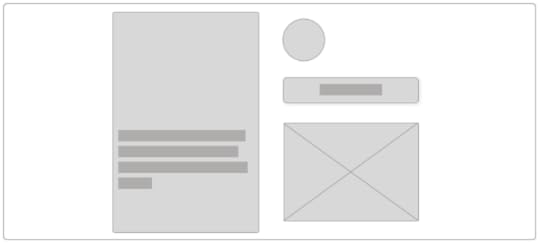
Take a look at this example from the Twitter web site.
Twitter cards with call to action
What do you call this? Are they cards? That would probably be confusing since Twitter calls their embedded tweets cards. This is where it gets difficult.
I remember at Yahoo!, we had a similar dilemma as we were building out a new feature. What do you call a generic container with varying content? We pulled out the thesaurus and end up settling on the word pod. I still felt a bit awkward about the name we settled on.
This is where documentation can be important, too. If you have a card, box, and pod in your project, when do you decide when to use which?
Gray Area
Some names could be considered content-based but could still also be considered function-based.
Let’s look at the Engadget web site.
Engadget cards with call to action
Engadget called each of these a lede. This might feel like it’s describing the content but I’d say it satisfies the functional test. The purpose of this design piece is to present a lede to entice the visitor to read the article. An article and lede are generic enough to be applied to pretty much any kind of content, whether it’s a tech story, a news story, an editorial, or whatever.
It’s that genericness that is the important part.
What if Engadget wants to present ledes in different visual styles? This gets a little bit tricky. Why? Because I like components to be distinct visual styles. If different ledes are presented in distinct visual styles, I’d avoid them using the same root module name.
For example, in SMACSS, a module name would be lede. If we named this alternate but distinct lede style as lede--special then you end up having to know that this special style is meant to be standalone and not layered onto the standard lede. It also means that other variations and child elements are likely not applicable with this variant.
In which case, come up with a unique module name. It might be special-lede or uber-lede or intro or whatever your team decides to come up with.
A rose by any other name…
I feel like every post I write these days should come with a disclaimer. This is not dogma. This is a process that has worked well for me. With a bit of forethought, thinking more about the naming convention has reduced the need to refactor code as often.
Using my location class to highlight a product didn’t hurt anybody. No babies died. Buildings didn’t crumble. It won’t be the end of the world. But sometimes a bit of clarity can go a long way to making the maintenance of a project more enjoyable.
May 24, 2016
Considerations in Component Design
In developing a component-based interface, how we decide to construct our components can sometimes make a considerable difference.
Consider this carousel design.

Carousel with multiple cards and pagination controls
The carousel contains a number of items and includes pagination controls.
Let’s start with a very clean HTML structure with a single class to mark the container of our carousel.
<div class=“carousel”>
<div>
<div>
<img src=“…”>
<p>Item description</p>
<a href=“…”>Buy Now</a>
</div>
<div>
<img src=“…”>
<p>Item description</p>
<a href=“…”>Buy Now</a>
</div>
</div>
<div>
<button>Previous</button>
<button>Next</button>
</div>
</div>
The surrounding div provides the shell within which to scroll the items. The items are surrounded by a div, and each item is surrounded by a div. Likewise, the pagination controls are surrounded by a div.
It’s possible the HTML structure could be simplified or adjusted. Should the pagination controls be in a <nav>? Do the items need a surrounding <div>? You decide. This is the HTML I’m going with.
No Classes
We can go with this and try to style everything using the carousel class along with element selectors.
.carousel { }
.carousel > div::first-child { }
.carousel > div > div { }
.carousel img { }
.carousel p { }
.carousel a { }
This works because we have a known HTML structure that hopefully won’t change out from under us. Any changes to the HTML will require us to come back and revisit the CSS. (Which, in my experience, almost always needs to be done, anyways.)
If we only have one carousel design on our site, this is fine. If there are other carousels with different HTML structures, we’ll either get some messy selectors or we’ll have to come up with another set of CSS based off the new root. Like, .home-carousel.
BEM it up.
Let’s take a look at the HTML now with the classes applied to each item.
<div class=“carousel”>
<div class=“carousel-items”>
<div class=“carousel-item”>
<img src=“…” class=“carousel-item-photo”>
<p class=“carousel-item-description”>Item description</p>
<a href=“…” class=“carousel-item-link”>Buy Now</a>
</div>
<div class=“carousel-item”>
<img src=“…” class=“carousel-item-photo”>
<p class=“carousel-item-description”>Item description</p>
<a href=“…” class=“carousel-item-link”>Buy Now</a>
</div>
</div>
<div class=“carousel-navigation”>
<button class=“carousel-navigation-button”>Previous</button>
<button class=“carousel-navigation-button”>Next</button>
</div>
</div>
The CSS ends up being a collection of simple class selectors.
.carousel { }
.carousel-items { }
.carousel-item { }
.carousel-item-photo { }
.carousel-item-description { }
.carousel-item-link { }
The design of the component, however, hasn’t changed. We’ve just chosen to use class selectors instead of element selectors to reach the elements we care about.
Depth of Applicability
In SMACSS, I talk about the Depth of Applicability. When I originally wrote about the concept, it was about how the selectors we use establish a link to a specific HTML structure. The further the distance from the parent to the deepest descendent element, the more complex and rigid the HTML structure needs to be for the selectors to work.
We also run the risk of styling things we didn’t originally intend to style. By using simpler selectors, we remove the dependence on a specific HTML structure.
However, in the years since, I’ve extended this to also consider the depth of the HTML structure itself with regards to component design.
Our links, for example, are 4 levels deep (if we consider the root of the element the first level). It’s not hard to imagine the HTML structure of the carousel items going even deeper.
Component Boundaries
Likely through my own experience having done this for a number of years, but my general rule of thumb is that if the component is more than 3 levels deep, it might be up for breaking apart into smaller components.
Why break it down into smaller components?
Smaller components allow for easier reuse. We can use individual pieces in other contexts much more easily.
When developing or designing within a specific context, it might seem like this is a unique component and thus doesn’t need to be decomposed into smaller components. And it’s true that that may very well be the case.
However, I often see where the design of one component is similar enough to a design of a part of another component, that we can take the time to solidify them into one and the same.
Going back to our carousel example, we have 3 or more individual components that can be used to build the larger interface. How you decide to break these down will be based on what you know of the rest of the design.
Breakdown of components
For example, the pagination controls might be a button style that you might use elsewhere. Or it may be very specific to this component. I could go either way on this, depending on the design.
The carousel item, however, is a pretty common pattern that I see in a lot of designs and it might make sense to break this down.

5by5.tv carousel
In an older version of the 5by5.tv web site, there was a carousel at the top and a list of shows in the main content area. The presentation of the items were very similar.
Let’s break the items out into their own component, then, and call them cards.
.carousel { }
.carousel-items { }
.card { }
.card-photo { }
.card-description { }
.card-link { }
We haven’t created any more or less CSS. We’re still defining the same properties and value. The only thing that has changed is the name of the classes that we’re using. However, by breaking this down into smaller pieces, we don’t have to come up with possibly unwieldy class names.
If we use 5by5.tv as an example, the photo treatment of the white padding and the gray border is used in a number of places. Not just within the card.
The button style that has been applied to the links is likely to be used elsewhere. We can, therefore, break that out into their own components.
.carousel { }
.carousel-items { }
.card { }
.card-description { }
.photo { }
.button { }
Recognizing this pattern is something that I see many people struggle with. Once we get past the initial shell of a page, I find that people look at chunks of the design is just that: large chunks of design that need to be coded as one thing, rather than break it down into smaller components.
The 3-levels deep rule can be a good indicator to reconsider your component design.
The Shell/Content Pattern
The other common pattern that I often see is what I call The Shell/Content Pattern. Often, there’s a shell, a container, that might have some design to it, and then the content that goes within that.
The shell usually falls into a header-content-footer sub-pattern. Although, it’s not unusual for it to not have either a header or a footer.
A modal dialog, for example, has a header, content, and footer.
Going back to the 5by5.tv example, the carousel has a header (the New ribbon), content (the shows), and a footer (the link to more new episodes).
Going back to our carousel, there’s the content (the cards), and a footer (the pagination controls).
This pattern can be a great way to recognize when to break things down from one larger component into a few smaller components.
Biggie Smalls
Component design is a bit of an art. How you decide to define the boundaries between one object and another can be very subjective.
Recognizing Depth of Applicability and the Shell/Content Pattern are just two ways that I use to help me decide when to decompose my objects.
May 23, 2016
Dealing with the Cascade and Specificity
One of the things that I enjoy covering in my workshops is how to deal with managing the CSS cascade. We all have different techniques that we use and each come with their pros and cons.
The cascade is the rule-based system that rendering engines use to decide what properties should apply to an element when multiple rules are declared for the same element.
For example, let’s say you have a header with a navigation bar. The header is light text on a dark background. As you hover over the navigation, a dropdown appears. It features dark text on a white background. Both the navigation and the dropdown have links.
The HTML structure could look like this:
<nav>
<ul class=“navigation”>
<li><a href=“#”>Home</a></li>
<li><a href=“#”>About</a>
<ul class=“dropdown”>
<li><a href=“#”>Company</a></li>
<li><a href=“#”>Hiring</a></li>
</ul>
</li>
<li><a href=“#”>Contact</a></li>
</ul>
</nav>
The elements within the dropdown will, by default, inherit color and font properties from the header. Not a big deal, since we’re going to redefine all of those properties for the dropdown.
.dropdown a { color: black; background-color: white;}
.navigation a { color: white; background-color: black; }
Excellent! All links in the dropdown are defined and all the links in the navigation are defined.
But did you notice something?
Specificity
Both rules have the same specificity. And since the dropdown is in the navigation, both of these rules apply to the dropdown. And since the navigation rule is declared after the dropdown rule, the dropdown will be white text on a black background. Boo.
There are, as they say, many ways to skin a cat. I’ve never actually skinned a cat, nor do I plan to, but it’s a saying. I don’t know why. Ahem.
Let’s fix this.
Rearranging CSS
The first thing we can do is simply rearrange the CSS such that the dropdown rule appears after the navigation rule. This’ll fix the specificity and we’ll be all set.
Within your project, you’d have to make sure that CSS for any HTML deeper in the DOM tree is declared after that which is higher up the DOM tree. Depending on the complexity of your project, this might not be a big deal.
At Yahoo!, for example, we did conditional loading of component CSS. That meant that blocks of CSS could load in a different order. Therefore, this wouldn’t work.
Increase Specificity
We can increase the specificity of the dropdown CSS. We can do this by doubling up on selectors.
.dropdown.dropdown a { color: black; }
.navigation a { color: white; }
The first is a bit hacky but it works. Mind you, if you styled #navigation a then no amount of .dropdown.dropdown.dropdown will help you.
Or we can pull out the dreaded !important!
.dropdown a { color: black !important; }
.navigation a { color: white; }
That works a treat. Let’s all go home!
Well, until the day when you have other links inside dropdowns that need to be a different colour and suddenly you’re throwing !important on everything.
Use Child Selectors
We can use child selectors. This is something I advocate whenever I do a SMACSS workshop. A child selector limits the impact since it doesn’t target every descendent element; it only targets the direct child element, which were the only ones that you actually wanted that colour, anyways.
.dropdown > li > a { color: black; }
.navigation > li > a { color: white; }
Depending on the complexity of your HTML, this can result in longer selectors to target the elements you care about, such was the case here where we had to go through the list item to get to the link.
If your component has a deeper hierarchy of elements, your selectors could get out of hand. Tangentially, if you have a deep component hierarchy, that might be an opportunity to reconsider the design of your component.
BEM Classes
In getting more meaningful CSS, maybe each link style should have its own class.
.dropdown__link { color: black; }
.navigation__link { color: white; }
This certainly works a treat. Our specificity is low and manageable. Our selectors are succinct. We’ve put the burden on declaring a class name on every single link in both the dropdown and the navigation. A bit tedious but templating can make this moot.
<nav>
<ul class=“navigation”>
<li><a href=“#” class=“navigation__link”>Home</a></li>
<li><a href=“#” class=“navigation__link”>About</a>
<ul class=“dropdown”>
<li><a href=“#” class=“dropdown__link”>Company</a></li>
<li><a href=“#” class=“dropdown__link”>Hiring</a></li>
</ul>
</li>
<li><a href=“#” class=“navigation__link”>Contact</a></li>
</ul>
</nav>
Atomic Classes
We can decide to turn things on their head and instead of considering the dropdown and navigation as components and styling within that context, we can consider that we have links that need to be styled and just style those directly without thinking about it being a component.
Atomic CSS uses separate classes for each property to be applied. We have 4 different property/value pairs that we want to apply.
<nav>
<ul>
<li><a href=“#” class=“C(#fff) Bgc(#000)”>Home</a></li>
<li><a href=“#” class=“C(#fff) Bgc(#000)”>About</a>
<ul>
<li><a href=“#” class=“C(#000) Bgc(#fff)”>Company</a></li>
<li><a href=“#” class=“C(#000) Bgc(#fff)”>Hiring</a></li>
</ul>
</li>
<li><a href=“#” class=“C(#fff) Bgc(#000)”>Contact</a></li>
</ul>
</nav>
At least in our simplistic example, the HTML isn’t any bigger than it was before than with BEM-style classes. Here’s what the Atomic CSS looks like:
.C\(\#000\) { color: black; }
.C\(\#fff\) { color: white; }
.Bgc\(\#000\) { background-color: black; }
.Bgc\(\#fff\) { background-color: white; }
Skinned
There’s no right or wrong way, but I’m admittedly and unsurprisingly biased towards a SMACSS-based approach, which means either picking classes or child selectors where appropriate.
Trying to win the specificity war by increasing specificity is just going to make your life increasingly more difficult with each new component you add to the site.
May 18, 2016
All or Nothing
There’s a recent CSS property that I had originally been quite excited about: all.
The all property is a shortcut for resetting all of the properties on a given element. Like a big ol’ CSS reset in one line. Reset them to what? Either a complete blank slate using the initial value or by having everything inherit from the parent using the inherit value.
When would you want to use the all property? The problem with answering this question is that it depends on what you think the all property would actually do.
My expectation was such that it creates a blank slate, resetting all properties and allowing you to declare what you really care about on this element.
Why would I want a blank slate?
In creating a module that could apply to different HTML scenarios, I’d like to create a consistent baseline without having to write extra code to do so.
Let’s look at this scenario and see why the all property, as currently implemented, fails this expectation.
Creating a baseline
Take this scenario of wanting to style a link like a button. (Why not use a button, you ask? Because it’s a link to another page, that’s why, and we want a big ol’ button to get people to click on it.)
<a href=“…” class=“button”>Buy Now</a>
We need to style up this button, of course.
.button {
border: 1px solid blanched almond;
border-radius: 3px;
padding: 5px 10px;
background-color: cornsilk;
color: brown;
}
Because it’s a link, we need to add some extra CSS to deal with the default browser styles for links.
text-decoration: none;
But now we want to apply this to <button>, too. Again, though, we have to add some extra CSS to deal with the default browser styles for buttons.
font-size: 16px; /* or ems or rems or inherit */
font-family: Arial; /* or inherit or pick font stack */
cursor: pointer; /* or not, if you don’t care */
My expectation was that I could add all: initial and everything would suddenly be reset to a blank slate. Instead, each browser does something a bit different.
In Chrome, everything is reset. This comes the closest to what I expect. The font gets reset to the browser default. Oh wait. Except cursor. Link cursor is still pointer.
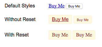
In Firefox, we get pretty close, too. The only problem is that there’s 1 extra pixel of padding that it adds to buttons. You need to use the following code to get things aligned. (Which you’d need to do anyways.)
.button::-moz-focus-inner {
padding:0;
border:0;
}
(Which, by the way, removes any focus ring. Please add one back in some other way.)
Oh, and link cursor changes to text selection. Why? I have no idea.

In Safari, though, the behaviour is much different. The link font resets to Arial, not Times New Roman. The button font resets to the system font. And the link cursor, like Chrome, remains a pointer.

IE and Edge don’t have support for all yet. Maybe that’s a good thing.
Excuse me while I step outside to flip some tables. (Because I keep my tables outside, apparently. Oh, look, there’s a table on my deck. It has now been flipped.)
Oh, and one more thing to mention, in case you are deciding to use all on your project. Like some CSS resets, it also removes any focus ring and this is consistent across browsers. Please add something back in!
Conclusion: Useless
In conclusion, the problem with all is such that the implementation is so inconsistent across browsers that it’s useless. There’s no way to create a consistent baseline in which to build on, thereby negating when I would ever want to use this property.
There may be some cases where it might be useful but, at this point, I think being explicit—by declaring the properties you actually care about—is likely to create a more consistent and predictable result, even if it might end up creating more code.
May 17, 2016
More Meaningful CSS
Tim Baxter wrote an article for A List Apart discussing the possibly dogmatic, and maybe unnecessary, use of classes for styling HTML elements.
Why do ‘.button’ when you can do ‘button’? Why do ‘.form’ when you can do ‘form’?
I think it’s important to understand the context of which class-based systems like OOCSS, SMACSS, and BEM have made their way into being.
With large, oft-changing web applications, there are certain problems that arise that don’t occur on simpler, less dynamic web sites.
My blog, for example, is a relatively straightforward site. I’ve made only minor revisions to the design over the last 7 years and my entire CSS weighs in an easily manageable 6 KB uncompressed.
There’s not a lot of complexity to the site design. I could use element selectors liberally. I could and have returned to that code after years of neglect and understand the code relatively quickly.
So then, why the need for classes on everything as advocated by myself and others?
These systems address the complexity of not only large projects and large teams but also of changing designs and changing code.
Back when I was at Shopify, we had inputs. Every project has inputs. They were styled using input selectors.
One of the problems we ran into was a redesigned input style that needed us to update the HTML structure around our input elements. Where this was especially problematic was trying to update the style and HTML across the entire application in stages.
Using input selectors meant that we needed to write extra CSS to undo the input styles to then be able to apply the CSS that we wanted via a class. We did this using a mixin to make it clear that this code was unwanted and that we could remove this mixin once the transition to the new style was complete.
When you have multiple teams working away on multiple branches, you can’t stop the presses so that you can apply site wide changes. Using element selectors inhibits the ability to make incremental changes to a project because you can’t be judicious with their use. Element selectors apply to all occurrences.
Another problem is that HTML5, while it introduces a number of new elements, does not go far enough to describe all of the unique components of a design. Nor do I think HTML ever will or ever should. (See Web Components.)
An element may also look different under different contexts. Not all navs look the same. Not all buttons look the same. Which requires you to concoct a selector for a specific context.
You can always come up with element selectors for a specific scenario, a specific combination of HTML. But large projects change and with those changes, requires the ability to decipher what the CSS is doing and under what conditions, in order to be able to change it at will. Otherwise, you end up with code you don’t understand and a reluctance to delete it or change it for fear something might break.
This is where class-based CSS systems like SMACSS excel. You can give something meaning with a name—a name that you and your team can decide together what it means.
With that class name comes a simplicity to your CSS. With a succinct grouping of classes, we begin to develop boundaries between objects on the page, like borders around a country. Each object has its own design and rules.
It’s no longer a single page, static in time. It’s a collection of pages, built with an array of components that change from page to page and change in design and composition over time.
A rigid system will break under the heavy winds of an ever-changing project. A flexible system will bend to your will, allowing your project to grow with greater ease.
Meaningful CSS is important. It’s also important to ask where and how we give it that meaning.
April 27, 2016
What’s Next?
The writing was on the wall. For over a year now, I’ve waffled, hummed, and hawed on what I wanted to do. Last May, I left Shopify. For a brief two months, I filled my time up with conferences and relaxation before taking a position at Xero.
Going into Xero, I was apprehensive. It’s probably not the feeling you want to have going into a new job but it was a good offer and I had hope that my apprehension would fade, with an excitement that would fill its place.
I straddled between the design team and the front-end team. I helped the design team come to terms with designing with patterns and I helped the front-end team figure out a direction to enabling a component-based workflow.
My ideas were welcomed and encouraged. That’s always a wonderful feeling. On the design side, however, ideas were one thing but implementation was another. Once I worked on the actual design work, I felt my ideas getting whittled away due to perceived constraints and user needs.
Perceived. I found it interesting how many of us could look and come to different conclusions of what to do.
In this, the possibly unfortunate conclusion I’ve come to is that either most design critique and user research before launch is useless, or that I have no idea what I’m doing and should stop designing altogether.
With not having much confidence in my design skills, I decided to refocus my energy on the front-end. However, to be effective remotely—I was working from home—I saw that I would have to sacrifice more of my evenings to be effective in working with the many teams across the United States, New Zealand, and Australia. I had already missed many meetings to shuttle my kids off to evening events, make dinner, or read them stories.
I found myself, again, wondering what’s next. I gave my notice at Xero. April 15th was my last day.
In thinking of my values, I need to consider my strengths. I am also considering where I want to grow and where I feel I need to prove myself.
I’m back to working for myself, something I haven’t done in over 6 years. My plan is to work on products for the web development community (and maybe beyond, if I’m particularly inspired).
By the fall, I hope to be talking about all the projects I’m releasing and I hope to have rekindled my love for being both a designer and a developer.
I suppose I should stop hoping and start doing.
April 19, 2016
Educating Users In App
I read this post on the dangers of using ARIA roles with a common markup format for tabs.
From the outset, it looked like they were doing everything correctly. Semantic HTML. Added ARIA roles. And yet…
Even though they could see that the tabs existed, some people weren’t able to figure out they needed to use the arrow keys to toggle the inactive tabs, so they couldn’t access that content.
I remember a lot of the work that Todd Kloots and I did to add ARIA roles and keyboard accessibility to Yahoo! Mail.
For a web application, there can be a lot of focusable elements. As a result, tabbing can be tedious. We used ARIA roles and managed tab indexing to minimize the amount of work required to navigate the interface. The implementation is near identical to what Jeff Smith uses in the Simply Accessible post.
Marco, an accessibility QA engineer and evangelist with Firefox, did a review of Yahoo! Mail. He had this to say about the tabs:
Speaking of tabs: There are instructions given on navigation wherever something might work slightly differently from what one is used to from desktop applications. For example when focused on the tabs, one is instructed to navigate left and right, and that enter will actually make that tab active. […] Very nice!
The problem with new interactions is educating users on those new interactions. That is necessary regardless of whether the users are sighted or not (or anywhere in between). There’s an education step required to ensure users are aware of what is possible. We see this education step in many apps that break away from the norm.
In the case of a site with limited navigation, maybe using an ARIA-enabled tablist is overkill. In our case, taking a moment to teach people can save them time and make their use of the application a much better one.
Marco went on to say…
Personally, I can even see myself switching to a web client away from a desktop client for the first time since this is the first instance of a web e-mail client that I found I can use as productively as my favourite desktop client.
Of course, this is just one person’s review. The application could very well have been a failure for a large segment of the user base. What works for one user may not work for other users. What works for one site may not work for other sites.
Which, goes back to what Simply Accessible did: test your implementation with your users to see if it hits the mark.
Jonathan Snook's Blog

- Jonathan Snook's profile
- 4 followers

