
Khoi Vinh's Blog, page 133
August 23, 2013
How Sci-Fi Portrays the Cosmos
Photographer Charles Morgan Smith combed science fiction movies and television series to cull these various depictions of outer space. Shown together, it really becomes apparent how each creative team’s vision of the cosmos is unique.

More at It’s Nice That.
To follow me on Twitter click here.


August 22, 2013
Recreating Photoshop Blend Modes
It’s kind of ironic, but one of the things that has made it easier to move away from Photoshop is the immense popularity of some of its very own features. A good example is the program’s blend modes — darken, multiply, color burn, lighten, screen, color dodge, etc. These have become so popular that when other graphics programs like Acorn, Pixelmator and Sketch implement similar functionality, they generally replicate them almost exactly. Switching made simple.
My favorite of these blend modes, by far, is multiply. As the name suggests, this mode gives you the product of two or more layers, multiplying each pixel on the top layer by the pixel or pixels in the layers directly beneath it. The result is a darker image that is usually quite visually rich. I use it all the time.
Multiplication Approximation
While these blend modes, including multiply, are popular in design software, they are not as popular in Web browsers. This is something my friend Matt and I encountered this week while working on a new side project (coming soon!). Though there is apparently a new blend mode specification coming to CSS, wide support is still a ways off.
Here’s what the multiply blend mode looks like in Photoshop. In this example I’ve put a ‘translucent’ red box over a Google map.
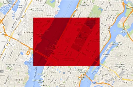
The best emulation of that effect that today’s Web browsers can manage is to use simple alpha compositing, which creates the appearance of transparency. The result effectively reduces the strength of the red and turns it into something cloudier, almost pink.

As you can see, the difference between true multiply blending and merely altering opacity is similar to the difference between a sheet of red-colored acetate and a sheet of red-colored tissue paper.
As with every shortcoming on the Web, there is a hack that gets you somewhat close to the desired result, albeit with diminished elegance. Matt found that putting a translucent tiling background image in the red box can achieve something similar. He prepared an image in Photoshop (ironically) by first creating a layer filled with red. On top of that, he added a layer of 100% black, set to about 20% opacity. Then he grouped both of those layers and set the resulting layer group to 80% opacity. He exported the image as a PNG and ran it as a background pattern, and this is what it looks like:
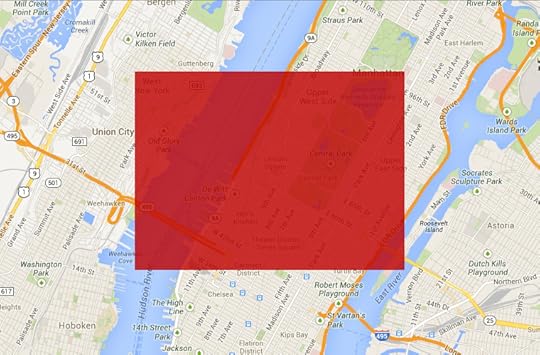
Not perfect, but better — richer, more truly red — than using simple opacity controls.
Anyway, the point of all this is that after working through this exercise, it occurred to me that this is a good proxy for understanding how Photoshop is seeping into the rest of the software ecosystem. We can gauge what I consider to be Photoshop’s inevitable obsolescence by where else its features show up.
So it’s meaningful that competing graphics programs have replicated most of Photoshop’s core features, which is to say that we are on our way to having the best parts of Photoshop available to us in other software. But we’re not there yet. It will be even more meaningful — and potentially a very different world, where we don’t need Photoshop at all — when that functionality makes its way into Web browsers too.
To follow me on Twitter click here.

Sticky Jots
A new product from two students at The School of Visual Arts’ MFA Interaction Design program. Sticky Jots are pre-printed sticky notes that facilitate sketching and brainstorming for digital products. There are versions for user stories, for phone apps and tablet apps — and there are even clipboard-like device mockups of the iPhone and iPad that the stickies fit into, for more convincing presentation of your ideas. Sticky Jots come in several different combos, and they’re already sold out of their initial run, but you can pre-order the next run.
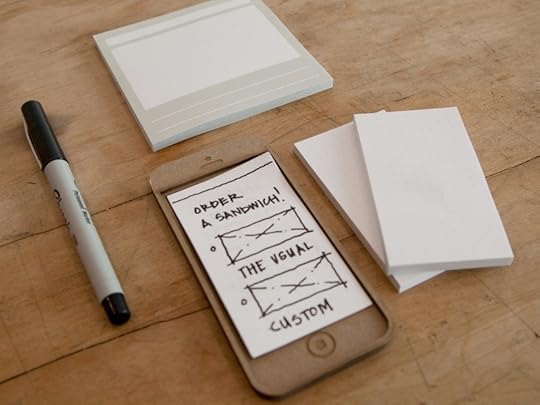
As a side note, the app POP — which stands for Prototype on Paper — lets you snap pictures of your sketches and make them interactive easily. More here.
To follow me on Twitter click here.

August 20, 2013
PDFpen for iPad from Smile Feed Sponsorship

Sign and return documents without printing or faxing, directly from your iPad. Fix typos and correct price lists immediately while an issue is foremost in your mind. Take PDF documents with you, and add notes, highlighting, and other markup during your mobile downtime. Sync with your Mac via iCloud or Dropbox. Retrieve and save documents via Evernote, Box, and Google Drive.
Edit your PDFs anywhere you are with the complete, feature rich, mobile editing power of PDFpen for iPad.
Get $5 off PDFpen for iPad, only $9.99 on the iTunes App Store, this week only.

Erika Hall on “Founder’s Choice”
My friend Erika at Mule Design Studio wrote a really salient follow-up to my post yesterday about designer founders of startups. It’s an essential complement to what I wrote, so I encourage you to read it in full on Mule’s blog.
To follow me on Twitter click here.

My Favo(u)rite Magazine
Compiled by Andrew Losowsky and Jeremy Leslie to benefit Bob Newman, a legend of editorial art direction who suffered a serious accident earlier this year, leaving him in a coma. “My Favo(u)rite Magazine” features dozens of designers, writers and artists honoring their favorite magazines in text and images. It’s available for sale in standard and limited editions, with all proceeds going to Newman and his family. See also the full list of contributors.
To follow me on Twitter click here.

August 19, 2013
Designer Founders and Choosing Problems
Now and then, designer founders of new startups ask me for advice on the companies they’re building. Having tried and failed to build a sustainable business as a designer founder myself, I feel a little leery about offering advice. At the same time, with the benefit of hindsight, I can recognize some of the same missteps that we made with Mixel.
The most prevalent one is not putting the user at the center of the company. This is somewhat ironic, because designers often pride ourselves on being advocates for the user experience. But there is a difference between user-centric design and building a user-centric business.
99 ProblemsAs designers, we are quite naturally attracted to a certain kind of problem that may in fact turn out to be a distraction from the real work of building a company: crafting elegant, thoughtful user interfaces that solve real needs. On its surface, doing this work feels very much like the most productive way to put our skills in service to users.
But in a designer-founded startup that’s frequently not the case. Building a great UI, while almost always important to a technology startup, might not always deserve to be the central focus of the business itself. Because startups always have extremely limited time and resources, prioritizing the UI comes at an enormous cost to the company. Sometimes it’s the right thing to do, but when it’s not, when it gets top priority because it’s the challenge that the designer founder might be most comfortable with, or simply the one that he or she prefers the most, that can be disastrous. Because when you’re designing, you’re not necessarily acquiring customers, or marketing your product, or forging partnerships — or any of the many other complex, taxing and ongoing efforts that startups require, but which are only tangentially related to design.
This is the essence of the unexpectedly huge gap between being a designer and being a designer founder. As a member of a product team, a designer can focus on the UI, can make it the central focus of his or her day. As a designer founder, there are many, many priorities to balance all at once. The two roles are very different, even if they might sometimes seem very similar.
To follow me on Twitter click here.

August 15, 2013
Tension and Practice in Photography
In this video, veteran documentary photographer John Free gives five minutes of unrehearsed advice on how to become a better street photographer. His central concept is that tension is a major impediment to getting the right shot, and that practice — which is normally foreign to the art of photography even as it’s a core concept of most any other skill — is a key to “getting rid of tension.” It’s good stuff. Watch the video here.
To follow me on Twitter click here.

August 14, 2013
Cartoon Network Trains in Taipei

About a decade ago it suddenly became possible to buy all of the ad spaces in a New York City Subway car. The Taiwanese have raised the bar considerably: it’s now possible, as Cartoon Network has done, to advertise throughout the inside and outside of a train. More images at the animation blog Catsuka, and a write-up and video at Cartoon Brew.
To follow me on Twitter click here.

How Master Cinematographer Roger Deakins Got These Ten Shots
Deakins is responsible for some of the most stunning and memorable cinematographic works of the past two decades, including almost every major Coen Brothers film and last year’s “Skyfall.” In this short piece for Vulture, he gives background on ten of his works. Full article here.
To follow me on Twitter click here.

Khoi Vinh's Blog

- Khoi Vinh's profile
- 5 followers

