
Khoi Vinh's Blog, page 130
September 30, 2013
Alternative Film Posters
Author Matthew Chojnacki collected two hundred posters from designers in twenty countries, each interpreting famous cult and classic movies. These works are independently generated and not sanctioned by the Hollywood studios that in most cases owns the films. Chojnacki claims “the artwork is essentially in the same vein as music gig (concert) posters, and is the first book to be written on this topic.” The work is certainly as vividly illustrative and frequently muscular as gig posters often are. Some of the winners I spotted:
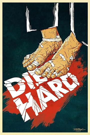

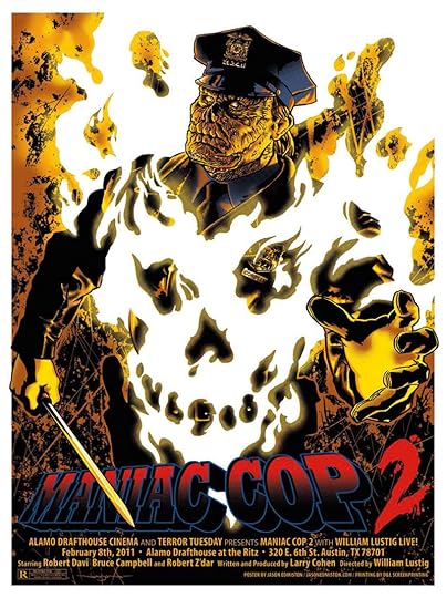


“Alternative Film Posters: Film Art from the Underground” is due out at the end of October and will be available on Amazon, but you can download a PDF sample now from Chojnacki’s site.
To follow me on Twitter click here.


September 26, 2013
Time Stamps in iOS 7 Messages
With each passing day, my unfinished writeup of thoughts on iOS 7 seems less and less like it’s going to happen. Hopefully in the next week sometime.
Meanwhile, here’s something I discovered in iOS 7 last night: if you pull the speech bubbles in Messages to the left just slightly, the interface reveals time stamps for each individual message. There’s also a subtle but noticeable color change in the blue bubbles, drawing attention away from them towards the new information coming onto the stage. Fantastic.
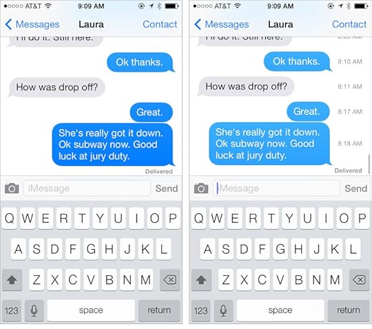
When I mentioned this on Twitter, some folks complained that, clever as it is, it’s not very discoverable. Normally, hiding this feature in this way would seem somewhat user-unfriendly. But I think this is an elegant solution to a long-running but minor complaint about this app.
Since its inception, Messages has only selectively displayed time stamps, usually after a long lull between exchanged messages. I admit having wanted to see the time stamps on plenty of occasions, but not so much so that it broke the experience of using the app for me. In fact, I think that Apple made the right call originally: only show time stamps where they add meaningful value; anything more is superfluous. I still regard these time stamps as superfluous; but this new availability is the best of both worlds: the time stamps are there, but they add no visual clutter until the user actively calls for them.
I still take issue with iOS 7’s many glaring imperfections, but I admit that I’m finding it really enjoyable too. Stuff like this, small as it is, counts for a lot.
To follow me on Twitter click here.

September 25, 2013
Google Visual Assets Guidelines
Google posted this design document to Behance. The company says:
“Google’s brand is shaped in many ways; one of which is through maintaining the visual coherence of our visual assets. In January 2012, expanding on the new iconography style started by Creative Lab, we began creating this solid, yet flexible, set of guidelines that have been helping Google’s designers and vendors to produce high quality work that helps strengthen Google’s identity.”
The document comes in two parts. The first covers product icons and logotypes, and the second covers user interface icons and illustrations. It’s all done expertly; it’s just a little hard to get excited about. Via Potluck, which really has some good stuff.
To follow me on Twitter click here.

September 24, 2013
Igloo Feed Sponsorship

Stop waiting for your IT department to move off SharePoint and start using an intranet you’ll actually like. Igloo is free to use with your team, it’s built around easy to use apps like blogging and file sharing, and it has social tools built right in to help you get work done.
It works on your desktop, your tablet and your phone. Inside or outside of your office. With your team or with your customers. Igloo is 100% white label, so you can make it look like your brand (with your developers or our in-house design and services team).
And if you’re in San Francisco, come learn how a social intranet can help your business succeed. Hear real world examples from our customers, technologists, and writers from Forbes and The Huffington Post. Our Social Intranet Tour hits San Francisco on October 15. We hope to see you there.

Nice Letterform
Some people like specific letterforms from specific fonts for their minds, but all Matt Mitchell thinks about is the way they’re shaped.

In this single-purpose Web site, he highlights a particularly lovely character from a given typeface and gives it its moment in the spotlight, displaying it big and bold, adding a little background and a short, loving appreciation of its curves. Completely charming. See the first few letters at Nice-letterform.com.
To follow me on Twitter click here.

September 23, 2013
Optimizing User Interface Icons for Faster Recognition
The new icon style in iOS 7 — pencil thin, and line- rather than shape-based — has received its share of criticisms. Aubrey Johnson argued at Medium.com that they produce unnecessary “cognitive fatigue.” In this article, Alla Kholmatova tests this out, timing recognition speeds in a set of icons in the “line” style versus another set in the “filled” style. The results are not particularly definitive, and go to illustrate the point that every icon is different, and people will probably continue to argue about this forever. Read the full article at Boxes and Arrows.
To follow me on Twitter click here.

September 20, 2013
Origins of the Trapper Keeper
I feel like I’ve just been relieved of a tremendous burden I never knew that I had. For serious, I am so happy to learn the story of how Trapper Keepers came to be. For those who did not grow up with them as a coveted school supply:’;
“Launched in 1978 by the Mead Corporation (which was acquired by ACCO Brands in 2012), Trapper Keeper notebooks are brightly colored three-ring binders that hold folders called Trappers and close with a flap. From the start, they were an enormous success: For several years after their nationwide release, Mead sold over US$100 million of the folders and notebooks a year. To date, some 75 million Trapper Keepers have flown off store shelves.”
Read the whole story ̵ which I admit is somewhat unremarkable, but which I savored word for word nevertheless — at Mental Floss. Via Digg.
To follow me on Twitter click here.

September 19, 2013
The Pleasure of Tiny Things
Artist Diem Chau carves miniature sculptures on the tips of writing implements.
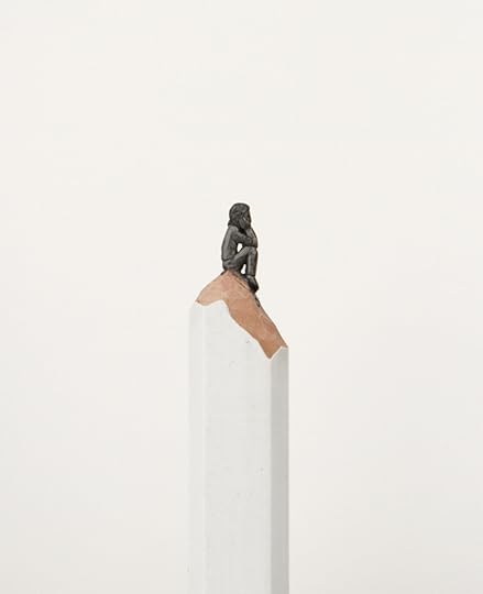
See more at her site. Via Potluck.
To follow me on Twitter click here.

Gary Hustwit’s “The Complete Interviews”
Hustwit is the director of three already classic documentaries about design: “Helvetica,” “Objectified,” and “Urbanized.” For each, he scored copious interviews with design luminaries, including:
“Paola Antonelli, Alejandro Aravena, Chris Bangle, Michael Bierut, Ronan and Erwan Bouroullec, Neville Brody, Tim Brown, David Carson, Matthew Carter, Candy Chang, Yung Ho Chang, Wim Crouwel, Ellen Dunham-Jones, Tobias Frere-Jones, Experimental Jetset, Dan Formosa, Sir Norman Foster, Naoto Fukasawa, Jan Gehl, Jonathan Hoefler, Jonathan Ive, Hella Jongerius, Bruce Katz, David Kelley, Rem Koolhaas, Rahul Mehrotra, Bill Moggridge, Marc Newson, Oscar Niemeyer, Enrique Peñalosa, Michael C. Place, Rick Poynor, Dieter Rams, Karim Rashid, Alice Rawsthorn, Stefan Sagmeister, Paula Scher, Erik Spiekerman, Davin Stowell, Jane Fulton Suri, Massimo Vignelli, Rob Walker, Hermann Zapf, and many more… over 75 of the world’s most creative and innovative people. ”
Because of the constraints of documentary film length, his movies only include a small fraction of the wisdom conferred in those interviews. Hustwit is now raising money via Kickstarter to turn the interviews in a book.

The final product will be a “high-quality paperback, approximately 400 to 500 pages long,” and is being designed by Michael C. Place. Find out more and back the project at Kickstarter.
To follow me on Twitter click here.

September 18, 2013
Spy Cameras of the Stasi
Highly entertaining images captured from The Stasi Museum, which immortalizes the paraphernalia and tradecraft of East Germany’s infamous state security apparatus. These shots highlight the Cold War era’s infatuation with hidden cameras, like the one below, with its lens disguised as a coat button, allowing the camera itself to be concealed under the garment.
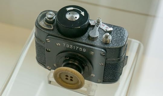
Other examples include cameras hidden in tree trunks, watering cans and of course brief cases — straight up Sean Connery style. See the images here.
To follow me on Twitter click here.

Khoi Vinh's Blog

- Khoi Vinh's profile
- 5 followers

