
Khoi Vinh's Blog, page 194
November 10, 2010
The Ultimate Dropbox Toolkit and Guide
This exhaustive inventory of things you can do with everyone's favorite cloud-synchronized file utility is a true marvel. The Dropbox folks have to be completely blown away by pages like this, which speak so loudly to their tremendous success. Because this is what every startup wants: such pervasive enthusiasm for your product that you can hardly keep track of the many ways in which people are integrating it into their own products, and such uniform acceptance of your product as a de facto standard that new businesses feel the urgent need to integrate with it. All of this for a file utility. Amazing.


November 9, 2010
Minka
A very promising trailer for a documentary about a 250-year-old farmhouse in Japan that was restored by an American journalist and his adopted Japanese son.
"In Fall 2007, Princeton Architectural Press published 'Minka: My Farmhouse in Japan," the memoir of retired AP foreign correspondent John Roderick. Moved by the story of this remarkable house and the memories it contained, and with seed funding from the Graham Foundation, we began work on a documentary film about John, his adopted son architect Yoshihiro Takishita, and the 250-year old house they shared. John died in March 2008 at the age of 93. 'Minka' is a meditation on place, architecture, memory and the meanings of home."
The movie, a production by two friends of mine at Birdling Films, is only available as a trailer right now here on Vimeo. But the filmmakers have launched a Kickstarter campaign to raise the funds to complete it — as of this writing they're just shy of halfway to their goal of US$10,000. You can donate here and help get this done.

Five Torrent Files That Broke Records
BitTorrent-focused blog TorrentFreak has this roundup of I guess what you'd call historically significant torrent files, including the largest torrent on record, the oldest torrent on record, the torrent shared by the most people at once, etc. It's a fascinating look inside a sharing medium that I bet most people (like me) assume can't be easily quantified.

November 8, 2010
Unofficial Movie Posters from Mondo
A treasure trove of unofficial art for famous movies. Some of them are quite beautiful, like this one from artist Frank Stockton.
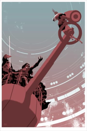
Mondo sells screen prints of the art in limited editions. See more here.

November 5, 2010
I Wrote a Book
I've been in the Bay Area all week for work, and I've been meaning to post this news since Monday when I finally made my deadline: my forthcoming book "Ordering Disorder: Grid Principles for Web Design" is now officially complete and in the hands of my publisher, New Riders. According to the listing over at Amazon, it'll ship in early December, so you can pre-order your copy today and have it in time for the holidays. At some booksellers the current pre-order price is over a third off of the cover price, plus if you buy it through any of these links, its humble author gets a little kickback: Amazon (US), Barnes & Noble or Borders.com.
The Story"Ordering Disorder" is an overview of all of my thoughts on using the typographic grid in the practice of Web design. The first part of the book covers the theories behind grid design, the historical underpinnings of the grid, how they're relevant (and occasionally irrelevant) to the work of Web designers — and a bit of my personal experience coming to grips with grids as a tool.

The second part of the book, which makes up its bulk, walks readers through the design of a full Web site from scratch, over the course of four projects. These are brand-new projects and much more diverse than the examples some of you may remember from my "Grids Are Good" talk from several years ago. All of the projects are presented in step-by-step, in-depth detail. There are something like ninety illustrations, and they're presented in a beautiful two-color design that, through the graciousness of New Riders, I was able to art direct myself, which is apparently rare. Frankly, a lot of books about Web design are a little less than beautiful, but thanks to the help of a few of my friends from the print design world, I'm really proud to say that "Ordering Disorder" looks really damn good.
This is my first book and even though I'm incredibly excited to see it published, I'm also exhausted from the act of writing it. I fully intend to talk a lot more about my experiences putting it together in the coming weeks, but for now I'm going to take a little breather and coast for a few days on this euphoric personal milestone — holy shit, I wrote a book!
Update
By request, UK customers can pre-order the book through this link. Canadian customers pre-order the book through this link.
Thanks!
Also: the publisher informs me that "Ordering Disorder" will be available from iBooks, for Kindle from Amazon, for Nook at Barnes & Noble, and as an e-book or a PDF direct from Peachpit.com. More info soon!
I Wrote a Book
I've been in the Bay Area all week for work, and I've been meaning to post this news since Monday when I finally made my deadline: my forthcoming book "Ordering Disorder: Grid Principles for Web Design" is now officially complete and in the hands of my publisher, New Riders. According to the listing over at Amazon, it'll ship in early December, so you can pre-order your copy today and have it in time for the holidays. At some booksellers the current pre-order price is over a third off of the cover price, plus if you buy it through any of these links, its humble author gets a little kickback: Amazon (US), Barnes & Noble or Borders.com.
The Story"Ordering Disorder" is an overview of all of my thoughts on using the typographic grid in the practice of Web design. The first part of the book covers the theories behind grid design, the historical underpinnings of the grid, how they're relevant (and occasionally irrelevant) to the work of Web designers — and a bit of my personal experience coming to grips with grids as a tool.
The second part of the book, which makes up its bulk, walks readers through the design of a full Web site from scratch, over the course of four projects. These are brand-new projects and much more diverse than the examples some of you may remember from my "Grids Are Good" talk from several years ago. All of the projects are presented in step-by-step, in-depth detail. There are something like ninety illustrations, and they're presented in a beautiful two-color design that, through the graciousness of New Riders, I was able to art direct myself, which is apparently rare. Frankly, a lot of books about Web design are a little less than beautiful, but thanks to the help of a few of my friends from the print design world, I'm really proud to say that "Ordering Disorder" looks really damn good.
This is my first book and even though I'm incredibly excited to see it published, I'm also exhausted from the act of writing it. I fully intend to talk a lot more about my experiences putting it together in the coming weeks, but for now I'm going to take a little breather and coast for a few days on this euphoric personal milestone — holy shit, I wrote a book!
Update
By request, UK customers can pre-order the book through this link. Canadian customers pre-order the book through this link.
Thanks!
Also: the publisher informs me that "Ordering Disorder" will be available from iBooks, for Kindle from Amazon, for Nook at Barnes & Noble, and as an e-book or a PDF direct from Peachpit.com. More info soon!
November 1, 2010
Glaser Stencil
A revival of a wonderful typeface from the design master Milton Glaser. Looks completely at home in 2010.
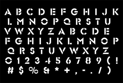
Available for sale from You Work for Them .

October 31, 2010


October 28, 2010
More on iPad Magazines
I want to thank everyone for the overwhelming response to my post from yesterday, "My iPad Magazine Stand," in which I laid out my thoughts on why most of the current crop of iPad magazine apps have dim prospects for long-term success. The thoughtful comments left here on the blog as well as the steady stream of RT'ing on Twitter have been terrific. It reminds me how lucky I am to get consistently intelligent and lively conversation in response to what I write. For a blogger, there's nothing better. (It also makes me glad as heck that I didn't follow my original instinct; when I finished my first draft of that piece on Monday, I actually decided not to publish it, fearing it was too shapelessly reasoned.)
In fact, I had wanted to jump into the conversation myself earlier but I'm under two deadlines at the moment so life is kind of hectic. Plus, I often like to see comment threads play themselves out without my interference before I engage — I find that the general direction of a conversation evolves more naturally if I hold back from potentially derailing it too early. After following along for a while though, there were a few quick things that came up that I felt I should respond to. So this morning I started adding a comment at the end of the thread but, as it got lengthier and lengthier, I decided to publish it as this blog post instead.
CorrectionFirst, my apologies for incorrectly (and unintentionally) implying that the Popular Science app was a part of Adobe and Conde Nast's recent collaborations. As Matt points out, the magazine is owned by Bonnier and the app runs on the mag+ platform.
Zinio
Commenters Scott G. Lewis and Anne both mentioned Zinio, another digital delivery platform that many magazines have been using for the past several years that essentially replicates issues as DRM-encrypted PDFs. I find Zinio a little bit quaint, but I can't argue with how logical the idea is. For an audience that truly wants the magazine, why not give them just that, the way Zinio does? Why expend the enormous time, energy, talent, money and publicity that go into wasteful iPad apps when you can very directly and simply translate your print product into exactly what you say people want?
If publishers really feel it's critical to satisfy that dwindling market of people who can't get their hands on the physical magazine but who will settle for a PDF, then Zinio or similar products are a great solution. In fact, that's what we did at The New York Times in our redesign of T Magazine late last year.
The bulk of Tmagazine.com was a re-imagination of the print edition's content as a kind of blog — which greatly improved the site's overall usability, as well as page views and time-spent metrics. But we knew there were users out there who could not get their hands on the printed edition and who really wanted to
So alongside the blog posts and all the video, audio and interactive pieces, we offered them the next closest thing to print: every single page of the magazine just as it appears in the magazine — but in a browsable UI powered by Issuu. It's been a big hit for that audience; you can see a sample over here, and I think it's a fine solution. It's not a game changer, and by itself it would have failed the test of extending the T Magazine franchise online. But for what it was, it did the job very well — and cheaply.
On Innovation
In case you missed it, reader David Sleight added some smart thoughts to the comment thread (at 10:44 pm; sorry, I really should have anchor links for all comments, I know). In response to another reader who insisted that the Adobe method of magazine-to-app translation was a legitimate form of innovation, David wrote:
"…translating print magazines to iPad apps which merely treat them as 'digital replicas' (actual industry quote) is actually a rejection of genuine experimentation by publishers, in favor of something seemingly safe and familiar."
That's exactly right, in my opinion. David is expanding upon the idea I alluded to in my post: the strategy that these apps are following is a stand-in for true experimentation. True, it gets something into the market that can then be learned from, iterated and evolved. But in truth it's really just stalling.
The default reaction of most print publishers since the advent of the Internet has almost always been "Let's make it just like print." It's been tried again and again and it never works. So the fact that publishers are trying it yet again on the iPad doesn't strike me as experimentation at all. There might be a grain of truth when we say that this is "an experimental year" for publishing on the iPad, yes. But that doesn't mean we also need to repeat the same mistakes that we made when Flash promised that we could make Web sites flip pages like print magazines, or when the Web was still so new that the only model we had to understand it with was print publishing, or when CD-ROMs tried their best to recreate magazines in 'multimedia' form. Those lessons have been learned already.

Paris vs. New York
Vahram Muratyan of Parisian design studio ViiiZ has been producing these terrific diptychs that contrast various aspects of Paris and New York. My father lives in Paris and so I go back and forth about twice a year, and so these visual observations strike me as charmingly canny.
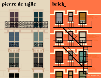
See all the illustrations on his full blog here.

Khoi Vinh's Blog

- Khoi Vinh's profile
- 5 followers

