
Khoi Vinh's Blog, page 189
January 26, 2011
The Coenfographic
Another film-related post today: Belgian designer Tom Muller created this visualization of the most prominent actors across all of the films of Joel and Ethan Coen, showing where they've recurred.
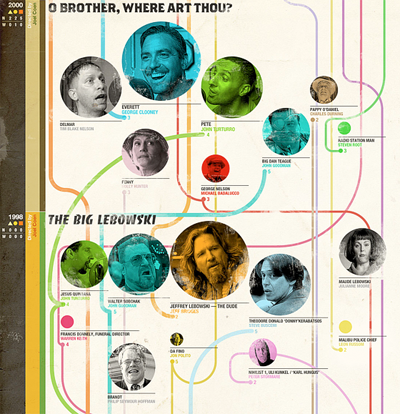
Slight, but nicely done. See the graphic in its enormous entirety here.


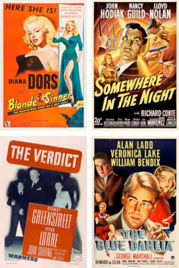
The 100 Best Film Noir Posters
Yes, I'm on a real film noir kick. The classic crime films blog Where Danger Lives is in the midst of counting down the one hundred best noir posters — the first eighty have been listed already. The images of the posters are of pretty good quality, too, having been color corrected, cleaned up and presented at fairly large sizes (click through each image to see the enlargement).

January 25, 2011
This Could Be Google's Design Moment
Last week's news that Apple CEO Steve Jobs is taking a medical leave of absence led many people to wonder whether the company truly has a vision that will sustain it in his absence. I happen to think that in the short term, at least, Apple will be just fine, but it's interesting to note that implicit in this worry is whether Apple's singular attention to good design will continue to prosper. Which is to say, perhaps the paramount anxiety surrounding Jobs' leave — and his inevitable departure, whenever that is — is whether it represents the point at which Apple's ability to design wonderful products went on the decline.
It's true that when visionaries leave a company, a lot can go wrong, though of course right now it's impossible to know for sure what will happen. But by the same token, major shifts in leadership are also an opportunity for a company's design acumen to improve.
This is what I'm hoping happens over at Google where, as also reported last week, Eric Schmidt is handing over the reins to co-founder Larry Page. Page is an engineer, of course, and quite private, so I have no particular insight as to whether he has any meaningful appreciation of design. But as a founder he has a unique power to influence the priorities at his company, and as the new CEO he has a unique opportunity to imbue his organization with a new design sensibility. If he wants to.
And hopefully he does. Few companies seem to understand the concept of design so cannily and yet so incompletely as Google does. It's abundantly evident that they pay exceedingly close attention to usability and they slave over getting that right. And yet the total, intangible effect of their hard work is little more than the sum of its highly efficient parts. Google products are rich with design intelligence, but they also suffer from a paucity of design inspiration. They could be so much more than they are — they could be surprising, witty, fun and, yes, they could be truly beautiful. (Read former Google designer Doug Bowman's notes on this for added perspective.)
We tend to think that design is a function of good process, well-structured organizations, and copious time and budgetary resources. But design is just as much a function of leadership. Who's in the top seat matters very much to whether a company can design well. If the leader cares passionately about producing amazingly well-designed products, then you can get a string of indelible successes that capture the popular imagination like we've seen at Apple for the past decade-plus. We haven't seen that kind of result from Google during that same span of time, though. Beyond the iconic minimalism of the original Google home page, not one of their subsequent products has truly inspired us. I hope that Larry Page realizes that, with the resources and design talent he probably already employs, there's no reason that has to continue to be the case.
January 24, 2011
Museum of Modern Art Acquires 23 New Typefaces for Permanent Collection
The brand of typography that I 'grew up with' is becoming a matter of the historical record. Curator Paola Antonelli writes:
"This first selection of twenty-three typefaces represent a new branch in our collection tree. They are all digital or designed with a foresight of the scope of the digital revolution, and they all significantly respond to the technological advancements occurring in the second half of the twentieth century. Each is a milestone in the history of typography. These newly acquired typefaces will all be on display in "Standard Deviations," an installation of the contemporary design galleries opening March 2."
There are some worthy additions, but there are some — like Verdana — that I'm less than fond of. Of course, that doesn't mean they're not historically significant. Read the announcement here.
New Yorker: Atul Gawande on Cutting Health Care Costs
Last week's issue of The New Yorker features another installment in staff writer (and surgeon) 's ongoing reports on the cost of health care. It's called "The Hot Spotters," and it's well worth a read. Gawande looks at individuals and organizations who have already taken the initiative in meaningfully reducing health care costs by focusing on the surprisingly slim fraction of health care consumers — as little as one percent — who can drive a shockingly huge portion of total costs — as much as thirty percent. Profiling Jeffrey Brenner, a doctor in Camden, New Jersey who and took a statistical look at how health care was distributed across that city, Gawande writes:
"He found that between January of 2002 and June of 2008 some nine hundred people in [just] two buildings accounted for more than four thousand hospital visits and about two hundred million dollars. One patient had three hundred and twenty-four admissions in five years. The most expensive patient cost insurers US$3.5 million.
"Brenner wasn't all that interested in costs; he was more interested in helping people who received bad health care. But in his experience the people with the highest medical costs — the people cycling in and out of the hospital — were usually the people receiving the worst care."
It's an eye-opening report that shows how fundamentally broken the health care system is in the United States. New Yorker subscribers can read the article online for free here, but others are locked out, unfortunately. As a consolation, Gawande's highly influential 2009 report, "The Cost Conundrum" is also available and also completely fascinating.
January 21, 2011
How Disney Won the War
During the Second World War, Walt Disney Studios designed over 1,200 insignias for military units — the 503rd Parachute Battalion, the 74th Field Artillery Battalion, the U.S.S. Hornet, etc. — as a way of showing support for fighting troops. The historical record for these designs has been scant, but the Disney-focused blog 2719 Hyperion has unearthed this incomplete catalog of many of them. They're uniformly fantastic.

Interesting to note, though not reflected in what 2719 Hyperion was able to dig up, is the fact that Donald Duck was the most popular character, having appeared in over two hundred designs. I guess no one wanted to be the Mickey Mouse battalion. See all forty of the found designs here.
Noir City Film Festival 2011
Last year I told myself, "I really, really want to go to next year's Noir City, the annual San Francisco film noir festival. Sadly, there's nothing quite like it in New York, as far as I know: ten days of screenings — twenty four movies — from the golden age of noir filmmaking. Several of these classic flicks have been newly restored, and all have been impeccably curated by The Film Noir Foundation. I've really become fascinated by this genre in recent years, and I can't get enough of them.
Alas, this year's festival kicks off tonight and runs through 30 Jan, but I won't be able to make it. Next year, I gotta figure out a way to be in the Bay Area during the week when this happens. More information here.
January 20, 2011
HTML5 Logo Animated…in Flash
A friend of mine put together this animation of the new HTML5 logo animated — with irony — in Flash. It got a lot of chuckles on Twitter so I thought I'd link to it here for good measure. (Anecdotally, it's apparently crashed more than one user's Web browser out there. Perfect.) See the animation here.
Thinking more about the logo itself, I've become increasingly perplexed about why the W3C and its designers, Ocupop, decided to make the "HTML" and the "5" two distinct elements, rather than joining them together. To date, the people behind this specification have gone through reasonably significant efforts to make it clear that the proper style for citing it is as a single unit, sans space. It's "HTML5," not "HTML 5," right? Am I missing something? (I'll admit, I'm not as fascinated by the narrative around these specifications as a lot of designers are.) Anyway, if that singularity is what they're going for, it seems like an error in judgment to design a logo that doesn't acknowledge it, that even suggests that the two elements can be broken apart.

HTML5 Logo Animated…in Flash
A friend of mine put together this animation of the new HTML5 logo animated — with irony — in Flash. It got a lot of chuckles on Twitter so I thought I'd post it here for good measure. See the animation here.
Thinking more about this logo, I've become increasingly perplexed about why the W3C and its designers, Ocupop, decided to make the "HTML" and the "5" two distinct elements, rather than joining them together. To date, the HTML5 spec has gone through reasonably significant pains to make it clear that the proper style for citing it is as a single unit, sans space. It's "HTML5," not "HTML 5," right? Am I missing something? (I'll admit, I'm not as fascinated by the narrative around these specifications as a lot of designers are.) Anyway, if that singularity is what they're going for, it seems like a error in judgment to design a logo that doesn't acknowledge that.
January 19, 2011
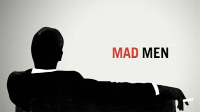
Mad Men's Furniture Showroom
 Part of the awesome responsibility inherent in having your own blog is admitting when you're wrong. People should do it more often, including me. So here goes: I was wrong about "Mad Men," cable television's zeitgeisty dramatization of life in the American advertising industry at its mid-century peak. I originally pegged it as being tedious and overblown, but now, having just caught up with all four of the seasons that have aired to date, I have to correct the record and say that it is not tedious at all, and that it is in fact, a very, very good show.
Baltimore No More
The origin of my premature judgment is understandable, I think: I tried to watch a few episodes when it debuted, and then tried again several times thereafter, based on the uniformly good reviews I'd heard from lots of people that I respect. But, I was living in the wake of "The Wire," which to my mind remains unmatched as the best television show ever, and I was feeling dispirited by what dramatic shows had left to offer. I'd heard amazing things about "Battlestar Galactica" and "Lost," but neither of them were ever able to escape the awkward confines of the hour-long format the way David Simon's Baltimorean epic did. Where television comedy is an art form unto itself, it's always been true that most dramatic shows play like cut-rate facsimiles of movies, and that never felt truer than in these few years since "The Wire."
Cut-rate was exactly how "Mad Men" struck me during its the first few episodes, which seemed to sorely lack for subtlety. Those scripts signaled too loudly, conspicuously and self-consciously that the show's early 1960s milieu is wackily similar yet outrageously different from how we live today, can you believe it? At least at first, the show seemed preoccupied with consoling us in the knowledge that we've come a long way, baby, from the chain smoking, liquor lunching, rampant sexism of a half-century ago. Which is to say that what it had to offer was more of what we already knew, rather than revealing things we'd never known before (which, again, is one of many reasons that I think "The Wire" was such a triumph).
Familiarity Breeds
In many ways, I still think it's true that the show trades in familiarity. I stuck with it and ultimately found it to be rewarding but I still feel there's nothing inherently revealing about "Mad Men," nothing that you'd be much the poorer for if you can't be bothered to watch it yourself. Everything that makes it work is an idea you already know: people have difficulty reconciling their private and public lives; those internal conflicts lead people to treat one another poorly; and everyone used to dress much, much better before hippies ruined it for all of us.
What drives "Mad Men," and what made me stick with it past those first few episodes, is not inspiration so much as incredibly polished storytelling mechanics. Series creator, executive producer and writer Matthew Weiner has one of the surest narrative hands I've ever seen; story arcs, plot details and character development are all so well paced, so exacting that it's truly a marvel to behold.
The universe that Weiner has created achieves a kind of naturalism that has eluded virtually every television series that has preceded it. Nothing feels rushed, nothing feels opportunistic or adversely reactive to the constraints of the format or the commercial interests that make it possible. Every facet of the show is thoughtful, decisive and precise — though it's not the kind of precision that feels hollow, either. Its craftsmanship sticks with you; its meticulousness is mesmerizing but it delivers an emotional wallop that's substantive and truthful, without pretension or histrionics. And its drama is resonant, too. Yes, the show deals in what you already know, but it doesn't take those things for granted. Rather it uses the familiarity of its ideas to make them unexpectedly meaningful. I often find myself turning over plot twists in my head long after I'd expected to forget them, and long after I feel like I should be thinking about characters on a TV show.
Unnatural Acts
Actually, it's ironic to call this 'naturalism' because its beautifully evolving story arcs aside, "Mad Men" can also be shockingly artificial. Its scripted dialogue is surprisingly wooden and often delivered woodenly, and much of the acting is underwhelming at best. None of the actors' performances are particularly illuminating (aside perhaps from John Slattery's unremittingly hilarious Roger Sterling, but then he usually serves only to remind us of the artifice of the whole affair) though I would also say that they're all effective enough.
I've spent a lot of time thinking about this artificiality, wondering how it's caused me to like "Mad Men" so much, almost in spite of myself. As it turns out, what sometimes seems like a liability actually turns out to be an asset: "Mad Men" revels in its artificiality.
This is perhaps most prominently true in this cast, who are unreasonably, unrealistically, unconscionably good looking. From top to bottom, male and female, nearly ever member of the cast is off-the-charts attractive. Of course that's not unusual for a television show, but to see a collection of beautiful people shaped by exceptional writing and storytelling is surprisingly rare. Watching gorgeous specimens of humanity wrestle with the mundanity of living is a perverse pleasure in which we can all share, especially when it's done with such delicate precision. This was the secret behind many of Michelangelo Antonioni's films, and it's no accident that much of "Mad Men" is highly reminiscent of — to say nothing of being contemporaneous with — the alienation that was rife in movies like "L'Eclisse" and "La Notte" (in fact, the show has established that the lead character, Don Draper, is a fan of these films).
What They've Done with the Place
It's not just that these people are good looking, either. They're surrounded by beautiful spaces, gorgeously recreated environments from the 1960s: offices, board rooms, nightclubs, hotels, middle class homes — and the furniture that fills them. Like many television shows with limited budgets, "Mad Men" is rarely able to let us see the buildings that occupy these spaces, but we do get a good look at what fills the buildings. More than a good look. The camera lingers over desks and chairs, pulls back so that long, reflective corridors and wide windows are in full view, frames faces against cabinets and wall hangings so that they're as prominent a participant in any dialog as the actors themselves.
Furniture is truly central to this universe. It's impossible to watch this show without watching the furniture, without noticing the diligent mix of the oaky decades that preceded the 1960s and the sleek Modernism that was then taking over. Heck, even the show's logo is the silhouette of a man relaxing on a sofa, as seen from behind, a pose that reflects the way furniture lets us regard the world.
At first, I suspected that the show's furniture accounted for as much of the show's popular appeal as its actors did, but then I realized that its actors are a kind of furniture. They're as beautiful as the objects that surround them. They too are shiny idealizations of a time gone by, expertly arranged so that we may luxuriate among them, contrasting the familiar but strange way of life that they evoke with our own, all for an episode at a time. "Mad Men" is the best show about furniture ever and I admit I think it's great.
Khoi Vinh's Blog

- Khoi Vinh's profile
- 5 followers

