
Khoi Vinh's Blog, page 188
February 7, 2011


February 3, 2011
Facebook, For the Win
 This week's episode of KCRW's excellent radio show The Business features a great interview with Dana Brunetti, producer of the critically lauded and Oscar-nominated movie "The Social Network." In it, Brunetti goes into fascinating detail about how the book and the movie came to be.
"The Social Network" is of course based on the book "Accidental Billionaires" by Ben Mezrich. Apparently, Mezrich and Brunetti have a standing, informal book-to-movie deal — the former writes books that make for good movies, and the latter options them, sometimes before they're even done. (The Kevin Spacey film "21" is another example.) Such was the way "Accidental Billionaires" turned into "The Social Network"; screenwriter Aaron Sorkin was working on his script while Mezrich's manuscript was still in progress, working practically in parallel, with the two comparing notes and research. You can listen to or download the interview here.
Nothing Succeeds Like Success
It seems entirely appropriate that a movie about Facebook would get done in this just-in-time fashion. As a phenomenon, Facebook has happened so quickly, with such totality that it makes complete sense that a movie would be made before the book was even done, before the original story itself is even done. And, pursuant with that unstoppability, of course the movie would go on to win plaudits from every film society and of course it would score Golden Globes and Oscar nominations left and right. The Facebook story is a winner's story; so thoroughly American in its bigness and inevitability and success that it won't be denied. I say this not out of criticism but utter fascination; Mark Zuckerberg's rapid ascent to the pinnacle of social media is ostensibly a tale of an awkward kid done right, but come on, he went to Harvard, okay? This is a hardly an odyssey of the disadvantaged. Facebook is the new American archetype for winners winning, through and through.
The Facebook Movie
I didn't write about "The Social Network" during its original run because so much was being said about it at the time, but I did see it in theaters and I did enjoy it thoroughly. I found it insightful, rewarding and good solid entertainment.
As I recall it was greeted with a fair amount of initial disappointment, at least from the technorati, but really, what were they expecting? This is about as good a movie as Hollywood could possibly make from this material. It was helmed by an A-list director from a script written by an A-list screenwriter, with home run-level performances by an eager and hardworking cast; it went out of its way to be at least vaguely realistic (note the lack of Hollywood-style digital chirping when actors type on keyboards), and it was actually genuinely enjoyable, to boot. All of that amounts to a huge, huge leap forward from the way Hollywood has handled technology in the past, especially for those of us who remember the abysmal "Pirates of Silicon Valley."

What Winning Costs
What's impressed me most about the movie is that it continues to inspire conversation about its message, its meaning and its import — again, just like its inspiration. In The New York Times, Opinion Page columnist Frank Rich pits the movie against "True Grit" (another film I really enjoyed), arguing that the latter is about a "clear-cut sense of morality and justice, even when the justice is rough." By contrast he finds that "The Social Network" excuses all "moral transactions" and promotes a worldview predicated on impunity.
That argument struck me as more than a little specious, but I couldn't articulate a more effective response than The New Yorker's movie editor Richard Brody did over at his blog, The Front Row. Brody writes:
"As for the question of whether, in 'The Social Network,' anything must be paid for: the entire film is structured around a pair of civil suits that exist to determine payment. Mark Zuckerberg, at the beginning of the film, pays for his peculiarly insensitive sensibility with a relationship; he's well aware, as is shown in the course of the hearings, that he has lost his closest friend due to his disloyalty; and the movie ends with the law-firm associate played by Rashida Jones telling Zuckerberg that he will indeed have to pay — and with Zuckerberg finding, once again, that he is still paying, socially, for his emotional disconnection. In other words, Aaron Sorkin's script underlines at every turn the price that Zuckerberg pays for his unremedied character flaws and his ambitious misjudgments."
That too is a dimension of winning: success doesn't come for free. And it's no accident that this notion of accountability is at the heart of this irresistible story of winning; this critical insight is what made Sorkin's script more than just a celebration of Facebook's unfettered rise to dominance. It's what made the movie truly resonant and thoroughly fascinating. In fact, if you ask me, it may also be the reason that "The Social Network" will endure, why 'the Facebook movie' will be remembered and revisited long after Facebook shuts down.

February 2, 2011
Explanations Worth Reading
In my post yesterday about instructional screens, those meta-states that apps sometimes use to literally explain how their functionality works, I said that if an interface has to be explained, then it's probably broken.
Of course, there are no absolutes in interface design, so a declaration like that should be taken with a grain of salt. The concept of coach marks can work, and quite well, but usually not in the static, superficial manner of the examples I cited in that post.
Interface Plus Time
Usually what makes instructional text work is some sophisticated acknowledgment of context; instructions are most useful when the user is directly engaged with the interface or asking for help. Animation, particularly, can make them more valuable, so long as the animation is quick and to the point.
Here's another way of tackling instructional text that I found recently and that I thought was quite clever: to introduce some recently released features, MeetUp uses a single notation at a time, placed directly on top of its interface.
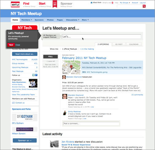
The text is very short and just as importantly it comports with my assertion that you can really only get users to read or focus on one thing at a time by offering just one point at a time. Any more than that, and the user is liable to skip reading everything altogether.
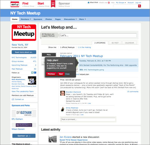
The designers are having their cake and eating it too by including a very simple navigation (previous, next) within the notation bubbles, letting users advance to more text if they feel so compelled.
This is a clever method of breaking down into bite-sized bits what could easily have been a much more cluttered — and much more easily ignored — instructional screen. But what's really great about this approach is that the navigation has a certain irresistibility to it. Having viewed the first notation, and having seen how painless it was to consume, how could you not want to click on the second one? And then the third?
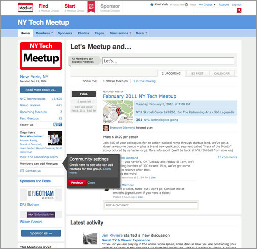
Even better, there are only three of these notations. Just three. So not only is each one mercifully brief, but the whole course of them is wonderfully judicious. It's not only that the designers here have found a sly way of getting users to consume lots of instructional text, but they've also developed an interface where not a lot of instructional text is needed. If you start with a good design, you don't need to do a lot of explaining.

And Now, Freezing Rain

What a winter. New York woke up to freezing rain and a sheet of ice over everything this morning.

February 1, 2011
MTA.me
A clever project that "turns the New York subway system into an interactive string instrument. Using the MTA's actual subway schedule, the piece begins in realtime by spawning trains which departed in the last minute, then continues accelerating through a 24 hour loop. The visuals are based on Massimo Vignelli's 1972 diagram." Built with HTML5 and JavaScript. See it in action here and read the project summary here.

Unnecessary Explanations
Introducing users to a new app or set of functionality is a difficult task for which there are no easy answers. One of the oldest tricks in the book is to create a kind of instructional screen in which the interface is explained, either diagrammatically or through the use of elucidating circles, arrows, lines and notational text (what Apple has in the past called "coach marks," a term I haven't heard elsewhere but that I really like) directly over the interface. The idea is to add a meta level of guidance to help acquaint the user with the key parts of the interface and how to use them.
I've been noticing these more and more lately, a trend that I find regrettable. I've designed products with instructional screens and coach marks in the past, and they were miserable failures. In my experience, these types of parenthetical interfaces are almost always misguided, mostly because they run up against one of the (nearly) immutable laws of interface design: people don't read interfaces.
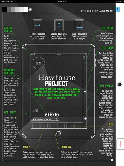
Look and Read Here and Here and HereHere's an egregious example, one of a few that I've been casually collecting over the past few months. The welcome screen for Richard Branson's misbegotten Project magazine app is practically a visual assault on the user's desire to consume the actual content. Where any rational user would expect to be able to start reading after they've launched the app, this screen basically insists that you assemble a piece of Ikea furniture before you can get started.
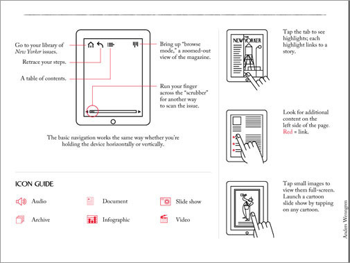
Not every instructional screen is as woeful as Project's of course. Here is much more elegant screen from The New Yorker app.
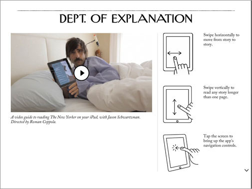
It features dramatically less text of course, but it's still far too much for my taste. A very skilled or efficient designer might be able to get the reader to read one or two notes like this, but most readers won't bother reading any of them. What's more, this is just one part of the instructional screen for this app; users are expected to swipe down for an additional page of notations and even an icon key. Who's going to bother?
This might sound like I'm picking on iPad magazines yet again but it really does seem that the biggest offenders in this regard are usually print publications making gimmicky leaps to the iPad. What's inspiring these instructional screens is an ill-informed grasp of how people really interact with digital media, and that obstinate misapprehension is at the very heart of why I dislike the genre so much.
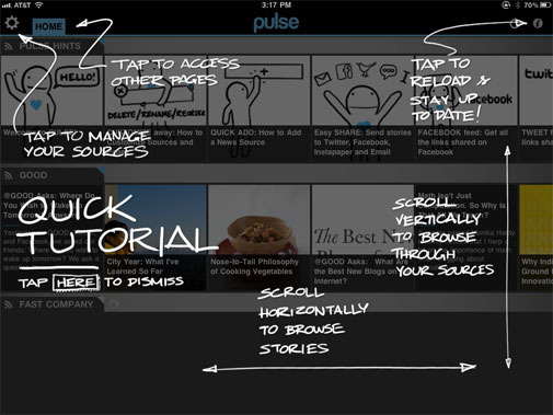
But 'pure play' digital apps are guilty of similar transgressions, too. Here's one from the RSS reader Pulse. Unfortunately, this is as good as instructional screens usually get, which is to say it's still not very good. There's too much text here but there's some attempt at keeping it minimal, and the descriptions are fairly straightforward without a lot of fussiness in the language.
Stepping away from the iPad, here's an example I came across from the scheduling app Tungle. This product lives in the browser, but applications across all platforms are starting to be governed by the same expectations we bring to iOS apps. The rough lines have a nice humanistic quality, and there's an earnest attempt at minimizing clutter on the interface, but there's just too much text here and too many concepts to absorb.

Back to iOS: here's one from the BlipSnips app, which crams lots of coach marks into a very small space.
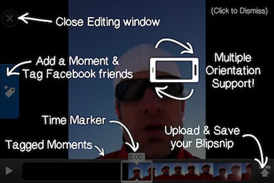
The marks and the dark gray overlay obscure the app itself so thoroughly that very little of the actual interface peeks through, which would seem to run counter to the main goal altogether: what a user wants is to attach meaning to the interface, which is hard to do when you can barely see it.
Don's Say It
The issue of using too much text aside, the fundamental problem that underlies all of these examples is that they just shouldn't exist in the first place — especially on multitouch devices, which are fully predicated on the idea of intuitiveness. The most important idea at the heart of every iPhone, iPad and, to a lesser but still significant extent, every Android device is that they need no explanation. You pick them up and use them. No no training course, no certification, and certainly no manual. The apps that run on them should be the same way: just launch them and start using using them.
In spite of their best intentions, instructional screens are diametrically opposed to this core idea. Of course, they're attractive because creating interfaces in the iOS mold — minimal, unambiguous, self-evident — is very difficult work, and the idea of just being able to explain away the ambiguities is a seductive one. But all they really serve to do is call attention to the fact that the interface itself was poorly designed. If it needs to be explained, then it's probably broken.
Side note: if you've come across similar instructional screens, please point me to them or send them to me via email. I'm building up a little collection.

Unnecessary Explanations
Introducing users to a new app or set of functionality is a difficult task for which there are no easy answers. One of the oldest tricks in the book is to create a kind of instructional screen in which the interface is explained, either diagrammatically or through the use of elucidating circles, arrows, lines and notational text (what Apple has in the past called "coach marks," a term I haven't heard elsewhere but that I really like) directly over the interface. The idea is to add a meta level of guidance to help acquaint the user with the key parts of the interface and how to use them.
I've been noticing these more and more lately, a trend that I find regrettable. I've designed products with instructional screens and coach marks in the past, and they were miserable failures. In my experience, these types of parenthetical interfaces are almost always misguided, mostly because they run up against one of the (nearly) immutable laws of interface design: people don't read interfaces.
Look and Read Here and Here and HereHere's an egregious example, one of a few that I've been casually collecting over the past few months. The welcome screen for Richard Branson's misbegotten Project magazine app is practically a visual assault on the user's desire to consume the actual content. Where any rational user would expect to be able to start reading after they've launched the app, this screen basically insists that you assemble a piece of Ikea furniture before you can get started.
Not every instructional screen is as woeful as Project's of course. Here is a much more elegant screen from The New Yorker app.
It features dramatically less text of course, but it's still far too much for my taste. A very skilled or efficient designer might be able to get the reader to read one or two notes like this, but most readers won't bother reading any of them. What's more, this is just one part of the instructional screen for this app; users are expected to swipe down for an additional page of notations and even an icon key. Who's going to bother?
This might sound like I'm picking on iPad magazines yet again but it really does seem that the biggest offenders in this regard are usually print publications making gimmicky leaps to the iPad. What's inspiring these instructional screens is an ill-informed grasp of how people really interact with digital media, and that obstinate misapprehension is at the very heart of why I dislike the genre so much.
But 'pure play' digital apps are guilty of similar transgressions, too. Here's one from the RSS reader Pulse. Unfortunately, this is as good as instructional screens usually get, which is to say it's still not very good. There's too much text here but there's some attempt at keeping it minimal, and the descriptions are fairly straightforward without a lot of fussiness in the language.
Stepping away from the iPad, here's an example I came across from the scheduling app Tungle. This product lives in the browser, but applications across all platforms are starting to be governed by the same expectations we bring to iOS apps. The rough lines have a nice humanistic quality, and there's an earnest attempt at minimizing clutter on the interface, but there's just too much text here and too many concepts to absorb.
Back to iOS: here's one from the BlipSnips app, which crams lots of coach marks into a very small space.
The marks and the dark gray overlay obscure the app itself so thoroughly that very little of the actual interface peeks through, which would seem to run counter to the main goal altogether: what a user wants is to attach meaning to the interface, which is hard to do when you can barely see it.
Don's Say It
The issue of using too much text aside, the fundamental problem that underlies all of these examples is that they just shouldn't exist in the first place — especially on multitouch devices, which are fully predicated on the idea of intuitiveness. The most important idea at the heart of every iPhone, iPad and, to a lesser but still significant extent, every Android device is that they need no explanation. You pick them up and use them. No no training course, no certification, and certainly no manual. The apps that run on them should be the same way: just launch them and start using using them.
In spite of their best intentions, instructional screens are diametrically opposed to this core idea. Of course, they're attractive because creating interfaces in the iOS mold — minimal, unambiguous, self-evident — is very difficult work, and the idea of just being able to explain away the ambiguities is a seductive one. But all they really serve to do is call attention to the fact that the interface itself was poorly designed. If it needs to be explained, then it's probably broken.
Side note: if you've come across similar instructional screens, please point me to them or send them to me via email. I'm building up a little collection.
January 31, 2011
Otherworld Computing's Media Center Solution
This well-regarded vendor of Mac products is now selling this turnkey, Mac mini-based home theater solution. The preconfigured bundles include additional RAM, up to 12TB of storage, an optional HDTV tuner and an optional, third-party Blu-Ray drive. I would imagine most people who can manage as sprawling a solution as this have already started to build them for themselves, but maybe I'm wrong. In any case, there's nothing listed among the bundles that mentions a universal remote control option which to my mind would be the single most important part of any turnkey home theater package. Pricing has yet to be released, but you can peruse the offerings here.

January 30, 2011
The Argument for Florida

Pictures from last Thursday morning, when an overnight snowstorm left a foot and a half of snow all over the city.

January 27, 2011
Netflix Performance on Top ISP Networks
Netflix, who are now obviously streaming video content to a huge number of users, has published their unique insight into the performances of the major U.S. and Canadian broadband providers. Charter ranks best, Clearwire worst, and my own ISP, Time Warner, is among the top four or five (I guess?). Clearly, it's a less-than-subtle attempt to goad the poorer-performing providers into improving their service, and to establish the question of "How well does Netflix work on your ISP?" as a metric for how consumers choose providers. See the data here.

Khoi Vinh's Blog

- Khoi Vinh's profile
- 5 followers

