
Khoi Vinh's Blog, page 127
November 12, 2013
How Google Lost the Maps Battle
In spite of nearly everyone I know preferring Google Maps to Apple’s own Maps app on iOS, this article from The Guardian (which is excellent and mercifully un-multimedia-ized) argues that in fact Apple Maps emerged as the dominant player on iOS.
“Apple’s maps have turned out to be a hit with iPhone and iPad users in the US — despite the roasting that they were given when they first appeared in September 2012. But Google — which was kicked off the iPhone after it refused to give Apple access to its voice-driven turn-by-turn map navigation — has lost nearly 23 million mobile users in the U.S. as a result.”
The article argues that the power of incumbency is apparently difficult to resist. Google’s offering is superior in accuracy and, arguably, in user experience, but “all roads lead to Apple’s maps” throughout the operating system, which is a tremendous advantage.
For my part, I’m incredibly frustrated by the whole maps ecosystem on my phone. I’m one of those tortured souls who would prefer to avoid giving Google more of my information if I can, though my efforts to do so are not exactly thorough. But using Apple Maps is not a realistic option, in my view, because it’s so frequently wrong. Worse, Apple missed a terrific opportunity when Google acquired Waze last summer. That’s my favorite maps app by far and would have injected a much needed sense of populism into Apple’s ivory tower approach to mapping data.
Read the full article at The Guardian.
To follow me on Twitter click here.


November 11, 2013
Teehan + Lax’s iOS 7 GUI for Sketch, iPhone
The Toronto studio, who have rightly received a lot of acclaim for crafting and maintaining Photoshop templates of the iOS graphical user interface, just released a version of their work for Sketch. This new pack, which was prepared largely by designer Tyler Howarth, is an invaluable resource for those of us who have moved to Sketch for the majority of our design work.

As always, Teehan + Lax are releasing it entirely free. Accordin to Geoff Teehan, an iPad version is forthcoming.
To follow me on Twitter click here.

November 8, 2013
Sinem Erkas Redesigns F. Scott Fitzgerald
London designer Sinem Erkas designed the covers for new editions of Fitzgerald’s books from Orion Publishing Group. Contemporary cover designs for historical books often leave me somewhat cold, but these seem really appropriate.


More information on the books at Orion. See all of the coers at Erkas’ site.
To follow me on Twitter click here.

November 7, 2013
Riikka Sormunen
Beautiful, Gustav Klimt-esque work from this Finnish artist and illustrator.


More at Riikkas.com.
To follow me on Twitter click here.

November 6, 2013
Everpix and Everyone
A bummer of a coincidence from yesterday: after using Everpix for several months and enjoying it immensely, I decided to pony up for the US$49 annual fee. Hours later, I happened to read that Everpix is shutting down. A note signed by the Everpix team said: “We were unable to secure sufficient funding in order to properly scale the business, and our endeavors to find a new home for Everpix did not come to pass. At this point, we have no other options but to discontinue the service.”
Possibly losing forty-nine dollars doesn’t bother me so much, since Everpix promises to refund all of its subscribers (they hope to do this by 15 Dec). It’s the fact that Everpix was a terrific product that in many ways fit the bill for what I think a modern photo experience should be: an inexhaustible storage locker in the cloud that effortlessly backs up my photos from every source.
Facebook, Twitter, Path, Instagram, my phone’s camera roll, even pics that people sent to me via MMS; Everpix comprehensively backed up all of these sources to the Web and made them navigable through an intelligently self-organizing and elegantly designed web interface. It was really a pleasure to use, especially its Flashback feature, which would send me daily emails to remind me of photos taken a year or two ion the past.
While I have no inside knowledge of what went wrong with Everpix (the writing was on the wall for a long while, apparently, and The Verge has a lengthy account of the wind-down), I have some guesses.
Fighting Free, and for Whom?First, it’s incredibly hard to build a service that unseats an incumbent as entrenched as the iPhone’s Photos app. That is essentially what Everpix was doing with its own iOS app, which looked very much like a photo browser. Worse, what Everpix was actually competing on was superior cloud storage, putting it in the same game as iCloud, which of course is also free. So it was never immediately apparent to the average consumer why one would need Everpix if one had the Photos app and iCloud. Never mind that Everpix offered a stark advantage by backing up every photo you have while iCloud only backs up the last month or so; the distinction between the two services was fuzzy for those who barely understand cloud computing to begin with. (As an aside, I personally found iCloud and Everpix to be highly complementary, but then again I think a lot about having redundant backups.)
Absent a crystal clear value proposition, and apparently lacking the marketing budget to push its message far and wide, Everpix made the fatal mistake of trying to be a tool for everyone, or to be more accurate, marketing itself to no single customer base. The target Everpix customer, from what I could tell, was everyone, which is a fantastic aspiration for the team and a wonderful story for investors, but it presents a formidable challenge for a new business trying to crawl its way into the consciousness of consumers.
When you have a product for everyone, the old saw goes, you really have a product for no one. This is one of the most telling lessons I took away from my experience building Mixel. The notion of pitching something to “everyone” is simply too wide a net to cast.
Startups take on so many challenges on so many fronts, but they can compound all of them by not settling on a specific, narrow understanding of who their first customers are, and just as importantly, where and how they can be reached. When your audience is as broad and undefined as ‘anyone who takes photos,’ there’s no ‘there’ there in terms of a single venue where you can reach a plurality of them, or a means for you to aggregate them together and get them talking to one another, or a method for you to measure how well you’re converting them into customers.
It might have worked better for Everpix to have chosen a particular slice of the photography market — sports photographers, say, or family photographers — and focused solely on that audience. A choice like that may have forced the product to take on features or nuances that didn’t make sense for a mass market, but it also would have made the company’s job much easier in terms of finding specific cohorts of users, speaking to them in a relevant vocabulary, servicing their needs, turning them into effective evangelists, and then measuring their adoption.
The emphasis is on “might,” I suppose. All my speculation here amounts to an impolite brand of Monday morning quarterbacking. I guess I’m turning it over because I was such a fan of the service, and thought it represented something that really should exist in the world. I wish the team the best of luck, and I also hope someone else comes along to make something new from these hard lessons learned.
To follow me on Twitter click here.

November 5, 2013
DP Review First Impressions of Nikon Df
Nikon’s new hotness is a full-frame digital camera styled in a flagrantly retro fashion. It looks fantastic, if you ask me, a welcome break from the Nike sneaker-esque styling of digital SLRs from the past decade-plus.
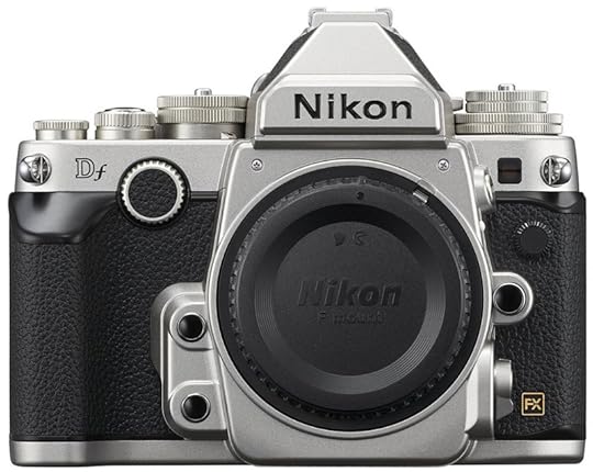

On the other hand, DP Review, in its first impressions of the camera, has some thoughtful comments about the practicality of this nostalgic sensibility.
“As far as I can see there are no unequivocally good reasons, either from an engineering or ergonomic point of view, for the Nikon Df to look like an over-sized [Nikon] F3… My worry about the Df is that Nikon might have gone too far backwards for the sake of cosmetic appeal, without really adding any practical benefit to the shooting experience… from a cold, hard practical point of view, I can’t shake the feeling that the Df is a little bit… silly.”
Read full DP Review piece here. There are also some good pictures at The Verge.
To follow me on Twitter click here.

November 4, 2013
Steven Soderbergh on His Favorite Bond Film
The prolific director writes about his affection for “On Her Majesty’s Secret Service”:
“For me there’s no question that cinematically ‘On Her Majesty’s Secret Service’ is the best Bond film and the only one worth watching repeatedly for reasons other than pure entertainment (certainly it’’s the only Bond film I look at and think: I’m stealing that shit). It’s like [director] Peter Hunt (who cut the first five Bond films) took all the ideas of the French new wave and blended them with Eisenstein in a Cuisinart to create a grammar that still tops today’s how-fast-can-you-cut aesthetic.”
I agree, it’s a terrific film, though I’m not sure it would edge out “From Russia, with Love,” for me as the most interesting installment in the franchise. Read full article here.
To follow me on Twitter click here.

November 1, 2013
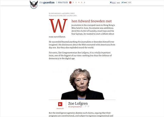
The Guardian’s “NSA Files Decoded” and Multimedia Journalism
A new multimedia extravaganza from The Guardian takes an in-depth look at what Edward Snowden’s leaks “mean for you.” It comes replete with plenty of high quality video, a gorgeous custom page layout, and lots of doodads throughout. It wouldn’t be inaccurate to say that it’s The Guardian’s volley in the “Snowfall” game first served up by my former colleagues at The New York Times.
I’m pretty ambivalent about this new strain of multimedia journalism. As well executed as these early examples are, both this and “Snowfall” clearly cross the line from utilitarian storytelling to superfluous bells and whistles. Also, in my own personal, decidedly unscientific polling, of all the people I’ve met who marvel at “Snowfall,” no one has ever told me that they actually read it. (That’s actually not true; someone told me they did read it, but then again that person has three newspapers delivered to her doorstep every morning, so I would say she’s an outlier.) I suspect the same thing will be true of “NSA Files Decoded.” These kinds of things, I think, are meant to be marveled at more than they are meant to be read.
New News
On the other hand, there is the oft cited if not entirely convincing argument that these things push the medium forward, and help forge new modes of delivering and consuming journalistic content in a world in which there are no longer practical dividing lines between text, sound, video and behavior.

No doubt there is probably some merit to that argument except for the fact that, again, it doesn’t seem to me, anyway, that people are reading these things. Also, there’s the fact that both “NSA Files Decoded” and “Snowfall” so clearly take the form of what I like to call “The Editor’s Prerogative.” What is The Editor’s Prerogative? It’s when you take a piece of journalism and make it huge in scale and elaborate in delivery so that it is more in line with how important an editor thinks the story is than how new audiences actually want to consume it.
There is an important bit of subtlety in that last point. Plenty of Times fans lauded “Snowfall,” but it’s not so relevant, I think, whether a news organization’s existing audiences love these multimedia productions. These articles (or whatever appellation is more fitting of their varied nature) are so intensive in human effort and require so much lead time to produce that to publish something on this scale that new audiences aren’t actually reading seems to miss the mark. To be clear, if you are The Guardian or The New York Times, and people aren’t reading the text that you’re putting in front of them, you are not delivering the core value that only you can deliver, that your whole enterprise is based on. Also, it would seem, you are expending resources questionably. And it’s not like news businesses have lots of resources to waste these days.
To follow me on Twitter click here.

October 31, 2013
FAQs on the FAA’s Relaxation of Personal Electronic Device Usage on Flights
From this press release today:
“The U.S. Department of Transportation’s Federal Aviation Administration Administrator Michael Huerta today announced that the FAA has determined that airlines can safely expand passenger use of Portable Electronic Devices (PEDs) during all phases of flight, and is immediately providing the airlines with implementation guidance. ”
It shows you how established the agency’s obstinacy had become that the introduction of this completely obvious bit of common sense had to be accompanied by a press release. Practically speaking, what this means is that airlines must first prove that they can “safely handle radio interference from portable electronics” before passengers can start openly admitting that they’re not turning off their tablets, phones and laptops when they’re told to. Read the frequently asked questions here.
To follow me on Twitter click here.

October 30, 2013
LiveSurface
A new Mac app that applies two-dimensional graphic designs into three-dimensional renderings — a label for a soup can, for instance, can be turned into a convincing image of a real soup can in just a few steps. Works with Adobe Illustrator. Read more here.
To follow me on Twitter click here.

Khoi Vinh's Blog

- Khoi Vinh's profile
- 5 followers

