
Khoi Vinh's Blog, page 132
September 4, 2013
Survata Tests Yahoo’s 30 Logos
This is the kind of nonsense that results from fundamentally misunderstanding what a logo is. As has been widely reported (and lamented by designers), Yahoo engaged in a bit of stunt identity design over the past month or so, fielding thirty re-imaginings of the company’s logo, one per day, You can see the first twenty-nine on this page, and when it loads in your browser, don’t feel bad if you think for a moment that you’ve stumbled across one of those sites that promises you hundreds of fonts for free — most of these logos are half-hearted at best.
To Yahoo’s credit, they did not put the logos forward as candidates, i.e., they refrained from asking the Internet to vote on them. That didn’t stop market research startup Survata from doing just that, though.
“We were curious about which logo consumers preferred as the best fit for the Internet giant, so we used the Survata logo testing tool to find out. We asked 12,725 respondents to pick their favorite of five logo variants (randomly selected from the 28 variants released prior to publication).”
Just skimming the results they’ve published on the Survata blog demonstrates the absurdity of both their own research and the fact that Yahoo put these logos out into the world. This “face-off chart” in particular has all the charm of pulling out a spreadsheet on a date.
A logo is really a visual manifestation of all the complex ideas, values and people that fuel a company — crunched and munged and somehow blacksmithed together to look simple and understandable. It does nothing for one’s confidence in the Yahoo brand to see that the company cares so little for its public image that it would be willing to float thirty random, meaningless expressions of itself out there, expressions that have clearly not been through the real process of logo development. It just looks like Yahoo doesn’t take this seriously.
Imagine that I threw four wheels and a mess of auto parts together, with no regard to how they actually function or work as a single machine, and said, “What do you think of this car?” Actually it’s as if I did that thirty times. And then someone came along and asked 12,000 people to vote on their favorite pile of wheels and auto parts. What good could come of that?
Feast on Yahoo’s thirty or so logos here, and read the Survata report here. Also, if you’re a company in the market for a new logo, please don’t follow these examples.
To follow me on Twitter click here.


September 3, 2013
Encoding.com: The World’s Fastest Cloud Encoding Service Feed Sponsorship

Still encoding video with on-premise hardware? Encoding.com is the world’s fastest cloud encoding service. We’ve made proprietary optimizations for ingest, queue times, processing, and egress of your source content that rivals the fastest on-premise equipment, with infinite scalability.
We support nearly every video format imaginable, including a few that only we offer. We can accommodate a number of different transcoding workflows with an easy to use web interface, a flexible watch folder, a desktop uploader, or our robust and mature API. You can even automate basic editing tasks such as video overlays and concatenation programmatically using our API.
Vid.ly is a unique feature of our service that completely takes the guesswork out of your transcoding workflow, combining transcoding, device detection, delivery, and storage into a single short url.
Don’t take our word for it, try our forever free account today, complete with your own API key.

Designing Fictional Interfaces
Jayse Hansen designs imaginary interfaces for Hollywood movies. His credits include “The Avengers” and “Rise of the Planet of the Apes.” In this interview, Hansen talks about how he came to specialize in FUIs (fictional user interfaces)”; “Star Wars” was an early influence, but I was happy to see him mention being influenced by K.I.T.T.’s then-fantastical dashboard in “Knight Rider” too. He also discusses his process, and how his work is an offbeat mix of interface design, motion design, research, staging, animation and client service. Great stuff. Full article here.
To follow me on Twitter click here.

September 2, 2013
Sketch 2.3
Sketch, which I now use for the majority of my design work, has a new version out today. It still lacks the feature that I want most — symbols/smart objects — but there are lots of promising improvements nevertheless.
Two of the biggest are integration with Sketch Mirror, a new iOS companion app that lets you preview your Sketch documents in real time, and background blur, which as the name suggests renders a Gaussian blur-like effect on anything directly beneath a shape set with this property.
In this example, the right half of the coffee cup image is obscured by a yellow rectangle set to 7% opacity, with a 10 pixel background blur. The blurring effect updates immediately when images below are moved on the canvas. Just in time for iOS 7, people.

(Image courtesy of Unsplash.)
More on the update here. By the way, while writing this post I just noticed that Bohemian Coding, the publishers of Sketch, cite an interview I did with .Net Magazine praising Sketch right on the app’s marketing page. Just to be clear, I am in no way associated with Bohemian Coding.
To follow me on Twitter click here.

August 31, 2013
Lou Reed Acoustic Demos from 1970
“In August of 1970 Lou Reed quit The Velvet Underground. This decision was followed by a severe mental breakdown and two long years of regret and isolation… These demos were recorded during the fall and winter of 1970. They reflect Lou at his lowest point. He didn’t make any more live appearances that year after leaving The Velvet Underground. The only thing he recorded were these twelve tracks. They are the first known recordings of Lou Reed as a solo artist.”
To follow me on Twitter click here.

August 30, 2013
Kazuki Umezawa
Twenty-eight-year old Japanese artist Kazuki Umezawa assembles digital collages from imagery he encounters online.
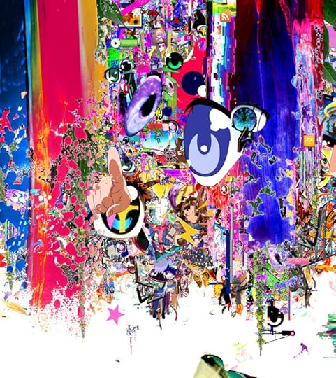
Nice enough stuff but not much better than lots of the stuff that used to be done in Mixel on iPad. Sniff. More on Umezawa’s work at Spoon & Tamago.
To follow me on Twitter click here.

August 29, 2013
Long Live the King
Jack Kirby, the legendary artist, writer, and so-called “King of Comics,” would have turned ninety-six this week. Though he built one of the most vaunted bodies of work in the industry, there are still plenty of folks outside of comics fandom who have at best only a passing idea of who he was or why he is so revered — even if they’ve paid out of their own pockets many times for the movies, toys, books and countless other forms of paraphernalia that have been adapted from his many, many creations.
Thankfully, there are lots of points of entry for those curious about the man and his work. Here are just a few off the top of my head.
Over at The A.V. Club yesterday they ran a very helpful beginners’ guide to Kirby’s career, which is relatively brief but still comprehensive. This is a good place to start, as is the Web site for The Jack Kirby Museum & Research Center, which is currently virtual-only but has ambitions to “manifest itself in the physical realm.”
A few years ago I picked up a copy of Mark Evanier’s beautiful, oversized hardcover monograph “Kirby: King of Comics” from a Barnes & Noble bargain bin. It’s a brisk, engaging read and a visual delight. Kirby drew in a style designed to deliver a maximum of drama within each of the many panels on a page. He could get a whollop out of just a few square inches, but in this book’s huge reproductions, his work is practically explosive. It’s a beautiful way to pore over the artist’s very particular way with scale, composition, line, depth, and human anatomy.
Finally, for those curious about Kirby’s somewhat tortured role in the evolution of the American comic book industry, I highly recommend Sean Howe’s “Marvel: the Untold Story,” an account of the business and editorial side of the company that was the platform for Kirby’s greatest run of work. It’s essentially the secret origin for this huge strain of pop culture, tracing the emergence of comics from seedy, early-20th Century publishing, through their initial golden age in the late 1930s and 1940s, their rebirth in the late 1950s and 1960s, and on to the industry’s lurching growth through the ensuing decades.
To follow me on Twitter click here.

August 27, 2013
Climate Name Change
A petition to the World Meteorological Organization to switch away from naming extreme storms after normal people, e.g., Katrina, Sandy, Andrew, and instead name them after climate change deniers like Rick Perry, Michelle Bachmann and Marco Rubio.
“Since 1954, the World Meteorological Organization has been naming extreme storms after people. As scientific evidence shows that climate change is creating increasingly frequent and devastating storms, and with climate scientists declaring these extreme weather events as the new normal, we propose a new naming system. A system that names extreme storms caused by climate change after the policy makers who deny climate change and obstruct climate policy.”
The proposal is of course meant to provoke a laugh, but the accompanying video is surprisingly well made. Watch it and read more at .
To follow me on Twitter click here.

Coming Soon: Facebox
My friend Matt and I spent a few days earlier this week working on a new side project. It’s called Facebox and it’s almost ready. Starting today if you sign up for the launch at Facebox.io, we’ll give you a discount on the debut pricing too.

Technically Facebox will live on the Internet, but part of its appeal to us was that it was a project that would let us get up from our desks and get into the real world. In fact, it practically required us to walk all over New York City in order to get it done. We lucked out; the weather around here has been unseasonably, almost unconscionably pleasant for August.
So what is Facebox? I’m not going to explain too much about it now except to say that it’s built for designers. It’s also decidedly not huge or world-changing in any respect; it’s small and specific, focused on a relatively minor problem that nevertheless plagues designers everywhere. It’s one of those things that Matt and I have both found ourselves wanting many times, but we never found that anyone had bothered to build it, so we decided to do it ourselves. Anyway, you’ll find out when it launches, which should be in just a week or two. For now, sign up to hear about the launch.
To follow me on Twitter click here.

August 26, 2013
Square v. Portrait
This photo I put on on Instagram last week turned out to be one of my more liked posts.

Though I’m a sporadic Instagram user, I think it’s an amazing product. Their early selection of the square photo format was a genius response to the constraints of the camera phone and a spot on insight into how to simplify photo composition for a mass audience.
All the same, I often lament the success of the Instagram square. Rectangles just make pictorial storytelling more interesting. Here’s how I would have cropped the same image in a portrait-oriented frame. (I had to recreate the vintage effects, so they don’t match the photo above perfectly.)

I’m not arguing that Instagram should allow portrait images. I’m just saying the world is more interesting than just squares.
To follow me on Twitter click here.

Khoi Vinh's Blog

- Khoi Vinh's profile
- 5 followers

