
Khoi Vinh's Blog, page 137
June 16, 2013
PortKit
Brisbane, Australia Web design company Kintek put together this fantastic resource for designers and developers working cross-platform between iOS and Android. PortKit presents side-by-side visual illustrations and nomenclature for each Cocoa UI element in iOS 6, iOS 7 and its Android 4 equivalent. Where appropriate, they’ve also provided links directly to the relevant developer documentation. Incredibly handy, and incredibly helpful of Kintek.
To follow me on Twitter click here.


June 14, 2013
Requiem for a Back Button
 I’m working up to writing at greater length about iOS 7 because, well, blogging. In the meantime, I thought I’d make one specific point. The thing that bothers me most about the new operating system is the completely revised back button, which is now less of a button and more of a left-facing arrow that looks a bit like a compressed bracket, plus a text label. I’m not going to critique it extensively right now, except to say that my least favorite thing about it is that it’s not the old back button.
If you ask me, that back button, the one that has been with us since the iPhone debuted, was the best back button design of all time. Most back buttons, like the ones in desktop browsers, are just an arrow-shaped icon with a text label above or below that says only “Back.” If you want to know where they’ll take you, you usually have to click and hold on the button to reveal a list of the screens you previously viewed.
The pre-iOS 7 back button consolidated these things into a single button shape that tapers into an arrowhead on the left side, and it housed a text description of where the button would lead you. It basically did three jobs with a single element. First, it visually signaled the way back, so that even if you didn’t read the descriptor text, you would still recognize the button’s function instantly. Second, if you did read what it said, it gave you the title of the previous view, without forcing you to tap and hold or take some secondary action to reveal that information. And finally, unlike the new back button in iOS 7, it was explicit about what you could tap and where; the target area was clearly demarcated by the button shape, and managed to do so without crowding the title of the view to its right (by contrast iOS 7’s new back button text often seems to run right into the title of the screen).
You Can Go Back Again
Just as importantly, the old back button was a visually pleasing design. Its left side wasn’t just a standard, angular arrowhead — its angles were ever so slightly sloped, softening the shape just enough to suggest that going back would be smooth and instantaneous.
The effect was tremendously elegant, in a very subtle way, and it became a hallmark of iOS apps. No other operating system’s back buttons worked quite the same way, but even better most iOS developers who customized the look of this button would preserve its basic shape, size and function. They might have changed up the color, swapped in a new typeface, or even altered the dimensionality of the button so that it was flat or embossed, but they rarely strayed very far from the original. I always liked to look closely at third party developers’ renderings of this button, to see if they replicated those gentle curves on the arrowhead. In my mind, the very best designed iOS apps always captured that tiny but important detail.
I’ve been using the past tense here as if this back button has left us, passed on to that great big operating system in the sky, but of course it will be around at least until iOS 7 officially ships. I’m holding out a little bit of hope, though, that in the intervening months Apple re-evaluates both the old and new buttons, and realizes what a great thing it had in the former. Maybe they’ll give the old guy a last minute pardon, too, and bring him back from death row.
To follow me on Twitter click here.

June 12, 2013
Before Midnight and the Perils of Sequels
I suspect that a lot of people of my generation have become somewhat inured to the consistent fallibility of sequels. Our experience over the past few decades, whether you’re talking about long-delayed sophomore albums, movie trilogy prequels or Tiny Toons-style presidencies has shown us that franchise extensions lead to almost certain disappointment.
That’s why Richard Linklater, Julie Delpy and Ethan Hawke’s follow-ups to 1995’s “Before Sunrise,” are so remarkable. Each installment has enriched its predecessors, rather than diminishing them. What began almost twenty years ago as an unexpectedly charming flight of fancy between two lovestruck twenty-somethings has blossomed into the quietest, loveliest kind of epic trilogy ever imagined. It’s a series of acutely human, almost mundane conversations played across decades that somehow manage to brilliantly illuminate the arc of adulthood at the end of the 20th and beginning of the 21st Centuries.
That there is a third installment at all — in theaters now — is brazen; 2004’s “Before Sunset” was a nearly flawless bit of storytelling that ended with a thrilling, satisfyingly ambiguous fade-to-black that seemed like an impossible act to follow.
But this year’s “Before Midnight” is richer still, if less perfect. It turns a corner in the story of these two characters whose meet-cute lasted an unnaturally long ten years; their preoccupations are no longer the transcendent ideals of young love, but the quotidian hurdles of being older, raising kids, getting through life. The exchanges between Hawke and Delpy’s characters are still riveting, but also more explosive and more forlorn now. An undercurrent of bitterness runs through it all, borne from the burdens of accommodating loved ones and their ineluctable foibles for years. The first two movies were about ideas of adulthood, and how difficult it can be to aspire to them; this one is about being adults, and how paltry the upsides can be. If that sounds grim, rest assured: it’s an unremittingly talky movie, but the dialogue is still repartee, still frequently hilarious.
The best part of “Before Midnight,” though, is that it affords us the opportunity to visit again with these two amazingly imperfect characters given life by Ethan Hawke and Julie Delpy, to enjoy their company for another hundred minutes or so, and to discover new things that deepen our love for them. This movie gives us exactly what most sequels never do: the chance to burnish our original affections not just through repetition of the familiar, but through challenging our ideas of them, and of ourselves.
At this point, it would be hard to argue that this series is anything less than a cultural landmark. Rarely have we seen fictional constructs grow and evolve over so tremendous an arc of real time, and with so much verisimilitude. These movies have unexpectedly become important works of art. But they’ve also become incredibly intimate for those of us who have followed along, who have grown up alongside them. I have to admit there’s a swelling in my chest every time I see these characters on the screen. They’re like good friends who visit only every once in a while. I can’t wait for the next time.
To follow me on Twitter click here.

June 11, 2013
X WordPress Theme Feed Sponsorship
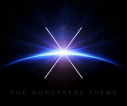
Themeco is proud to launch X, a first of its kind WordPress theme built in conjunction with leading business and marketing experts. To celebrate our release, we wanted to share a really powerful SEO technique that you can implement today.
Did you know there’s a little piece f code you can add to your popular posts or pages that will almost double or triple the amount of clicks you get? Google tracks on-site engagement closely, so anytime you can get your visitors to click through to multiple pages of your site it’s great for your SEO efforts. We’ll show you this one amazing trick and how we built it into our incredible new WordPress theme plus show you how to implement it even if you don’t use WordPress.

iOS 7 Thins Out
Was there a lot that was terribly wrong with the look and feel of iOS 6? Not in my book. It certainly wasn’t perfect, and many swaths of it were begging for some kind of house cleaning, but it didn’t need to be chucked away entirely. Apple decided to do just that, though, in their just announced iOS 7. The new operating system is significantly less ornamental than its predecessor; if you can call something “more minimal,” then iOS 7 looks to be just that. It’s simpler, less cluttered, and decidedly flatter, as folks like to say.
It’s also more like the cosmetics counter at your local department store than ever before, because, apparently, it makes liberal use of the thin or ultra light weights of Helvetica Neue throughout its many revamped interfaces.
Historically, these fonts have figured prominently into the typographic vocabulary of the beauty and fashion industries, where they’ve been used for years to connote notions of modernity, Euro-centric sophistication and near-anorexic thinness. They facilitate aspirational marketing messages, ideals that consumers can aspire to by applying that perfect shade of lipstick or putting on that perfect summer dress. And more often than not they’ve also been meant to indicate femininity.
New LookNevertheless it’s probably no accident that they’ve found currency with the technology industry today, when digital devices are becoming ever more a part of our thinking about style and personal presentation, and digital media as a whole has been striving to appear less male-centric, less geeky, more worldly.
This is a perfect mission for these fonts, too. When companies seek to add legitimacy to their design lexicon, Helvetica is a common shortcut. (Take it from a guy who’s used Helvetica for almost everything for two decades; it is an extremely efficient vessel for prepackaged ideas.) This is especially true if a given flavor of the type family can so clearly communicate specific concepts the way that thin and ultra thin weights of Helvetica Neue can signal aspirational sophistication.
Apple is hardly the first to use Helvetica in this way, of course. Google’s recent iOS apps — Gmail and Google Maps in particular — use similar weights of Helvetica Neue for this same effect. For Google, Helvetica is one remedy to the long drought in design elegance that plagued the company in the years before Larry Page took over as CEO. Where the company once looked on design as a delivery system for algorithmic outputs, the use of Helvetica Neue in their iOS apps is meant to declare their embrace of design as a kind of status symbol: “We used Helvetica Neue, ergo we have taste.”
But in the case of both Apple and Google, their uses of Helvetica Neue are so prominent that they’re almost indiscriminate, and as a result both of these efforts skirt that thin line between aspiration and desperation. Where many graphic designers would mix in additional typefaces or even just different weights of Helvetica Neue to achieve an optimal reading experience and a balanced aesthetic, both Apple and Google seem overeager to use the thin and ultra light weights wherever they can.
Anyone is welcome to use these fonts in any way that they like, of course, but to my mind, the thinnest weights of Helvetica Neue are best used as display faces — meaning at larger sizes, for headlines and titles, and in relatively short bursts. Their very shapes were optimized for those cases where there’s ample room for the eye to truly travel along their supple curves, leisurely tracing the long, sprawling stems, bars and bowls of each letterform. To use them as both Google and Apple do, in text settings, in small sizes, in paragraphs, makes reading more visually cramped and more difficult than it should be. It also feels like too much sophistication — which is often indistinguishable from poor taste.
To be fair, these uses of Helvetica Neue’s thin and ultra light weights are not necessarily indictments of the design strategies that Apple and Google are pursuing. Google’s iOS apps have been exemplars of thoughtful design for mobile devices, and their typography approach has been a cosmetic misfire, at worst. As for iOS 7, it’s still too early to fully pass judgment on its major design shift towards the minimal. Only hands-on usage will reveal whether their use of Helvetica Neue is indicative of deeper-rooted problems with the revamped operating system, or just a surface blemish. There’s a lot to mull over and about in this release, but then with Apple there always is.
To follow me on Twitter click here.

June 10, 2013
Hoping Apple Puts Family First
I’m not sure what Apple will announce at its 2013 WWDC Keynote later today, but I suspect the thing at the top of my list is probably not at the top of theirs: significantly more robust multi-user account support throughout iOS.
This is a need that has been sorely felt for some time. To describe it in more detail, I’d break it down into two parts.
First: allow more than one user to login to an iOS device — if not iPhones, which are admittedly intensely personal, then iPads, which are heavily shared devices. Two years ago I called iPads “post-personal computers,” because I saw that they were being readily passed around within households. Since then, I’ve only come to see more of that kind of real world usage. Adding support for those use cases strikes me as not only necessary, but also an opportunity for Apple to gain a meaningful competitive edge over other mobile platforms, which still think in terms of user accounts and not in terms of real usage patterns.
The second part is: allow users to combine their Apple IDs. This is something that I also happened to write about two years ago in a post titled “Multiple User Account Disorder,” and the situation remains unimproved. The gist of it is that people inadvertently create multiple Apple IDs all the time, then find themselves needing to combine them — but Apple has no facility to make that happen, even if you call tech support and elevate your predicament to the highest-ranking and most sympathetic support supervisor you can find. Fixing this problem will relieve untold confusion for many, many users, especially those who are less adept at negotiating the technicalities of having multiple accounts.
I complain that these two elements have not budged much in two years, but that’s not entirely true. In the second half of last year, Apple shipped a modest update to its Apple TV software, which ostensibly runs on iOS, that allows a family to add more than one Apple ID to that device. It’s a bit kludgy, because it requires that users trudge back to the Apple TV’s settings each time they want to switch to a different ID, but I’m hoping it’s a start.
To follow me on Twitter click here.

June 6, 2013
Redesigning the International Symbol of Access
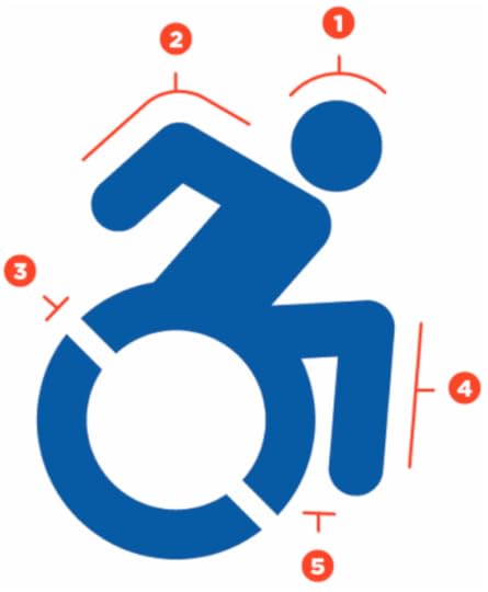
Some people cite the ubiquitous International Symbol of Access for inadvertently projecting an image of people with disabilities as being passive: “Its arms and legs are drawn like mechanical parts, its posture is unnaturally erect, and its entire look is one that make the chair, not the person, important and visible.” By graphically correcting those details, The Accessible Icon Project aims to transform the symbol “into an active, engaged image.” The redesign is already slated to be implemented in New York City this year. Find out more at the project’s Web site, and read an interview with project founder Sara Hendren at Print.
To follow me on Twitter click here.

June 5, 2013
Radium Feed Sponsorship

Radium is a new way to listen to internet radio. It sits in your menu bar and stays out of your way. And it just works.
With its clean user interface and album cover display, you’re always just a click away from beautiful sounds. Add your favorite tracks to the wish list and check them out later on the iTunes Store. Take the sounds with you using Radium’s built-in AirPlay streaming support. It’s all there.
With the proliferation of services like Spotify and Pandora, why choose Radium? Because with Radium, you don’t have to build up playlists, constantly answer questions about your music preferences, or navigate a cumbersome user interface. Radium is all about the sounds. And these sounds come from over 6000 free stations, maintained and curated by real people like you.
Available for $10 on the Mac App Store. Check it out.

Weighing Sketch and Photoshop
A few of us on the Etsy design team have started using Sketch instead of Adobe Photoshop for UI design. It took some getting used to, but I’ve been getting very comfortable working with Sketch’s distinctly un-Adobe-like approach to crafting interfaces, in particular the way it delivers all the advantages of working with vector graphics while producing results that are indistinguishable from raster graphics.
I’m planning on posting more of my thoughts on my transition to Sketch soon, but yesterday, when Adobe notified me of an update to Photoshop, I was reminded of another reason why I prefer Sketch so much.
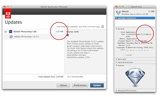
On the left is the update screen for Photoshop. This particular software patch weighs in at 129 MB — just for the update. Sketch itself weighs in at less than a tenth; just 12 MB — that’s for the entirety of the app, the whole megillah; not just a software update.
You can argue that Photoshop needs to be bigger because it does so much more, but that is just the point. It does too much for my taste, and I’m a little tired of paying the freight costs of all those features I don’t need: the slowness, the crashes, the progressively exploitive pricing. I’m really enjoying Sketch’s more streamlined feature set, and how it is clearly purpose-built for designing user interfaces. Simpler tools are very often better tools.
To follow me on Twitter click here.

Weighing Sketch and Photoshop
A few of us on the Etsy design team have started using Sketch instead of Adobe Photoshop for UI design. It took some getting used to, but I’ve been getting very comfortable working with Sketch’s distinctly un-Adobe-like approach to crafting interfaces, in particular the way it delivers all the advantages of working with vector graphics while producing results that are indistinguishable from raster graphics.
I’m planning on posting more of my thoughts on my transition to Sketch soon, but yesterday, when Adobe notified me of an update to Photoshop, I was reminded of another reason why I prefer Sketch so much.
On the left is the update screen for Photoshop. This particular software patch weighs in at 129 MB — just for the update. Sketch itself weighs in at less than a tenth; just 12 MB — that’s for the entirety of the app, the whole megillah; not just a software update.
You can argue that Photoshop needs to be bigger because it does so much more, but that is just the point. It does too much for my taste, and I’m a little tired of paying the freight costs of all those features I don’t need: the slowness, the crashes, the progressively exploitive pricing. I’m really enjoying Sketch’s more streamlined feature set, and how it is clearly purpose-built for designing user interfaces. Simpler tools are very often better tools.
To follow me on Twitter click here.

Khoi Vinh's Blog

- Khoi Vinh's profile
- 5 followers

