
Redesigning the International Symbol of Access
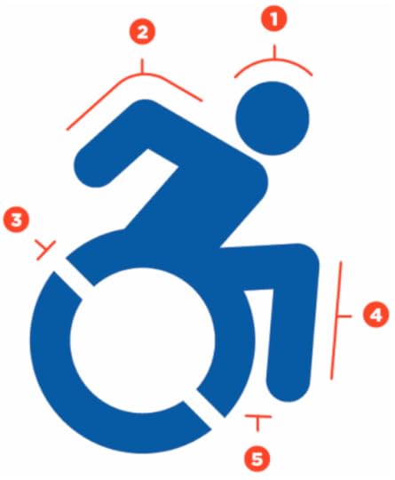
Some people cite the ubiquitous International Symbol of Access for inadvertently projecting an image of people with disabilities as being passive: “Its arms and legs are drawn like mechanical parts, its posture is unnaturally erect, and its entire look is one that make the chair, not the person, important and visible.” By graphically correcting those details, The Accessible Icon Project aims to transform the symbol “into an active, engaged image.” The redesign is already slated to be implemented in New York City this year. Find out more at the project’s Web site, and read an interview with project founder Sara Hendren at Print.
To follow me on Twitter click here.


No comments have been added yet.
Khoi Vinh's Blog

- Khoi Vinh's profile
- 5 followers
Khoi Vinh isn't a Goodreads Author
(yet),
but they
do have a blog,
so here are some recent posts imported from
their feed.

