
David Petersen's Blog, page 45
April 18, 2017
Mouse Guard Model Video: Barrel Carrier
 For the prologue of The Black Axe (a story originally published on Free Comic Book Day in 2010), I built a model of a a barrel carrier for the mice to re-por the scent border. With the fan excitement over the video of Adam Savage talking to me about my models on Tested.com I wanted to do some videos where I talk about a specific model, how I built it, what the materials were, and why I built it in the first place.
Below you can watch as I explain the thought process of how mice would pour the border:
2017 Appearances: Emerald City Comic Con: Mar. 2-5C2E2: April 21-23Heroes Con: Jun. 16-18San Diego Comic Con: July 19-23Baltimore Comic Con: Sept. 22-24New York Comic Con: Oct. 5-8


April 11, 2017
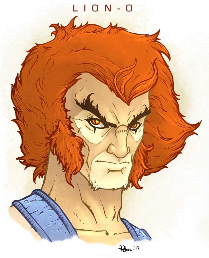
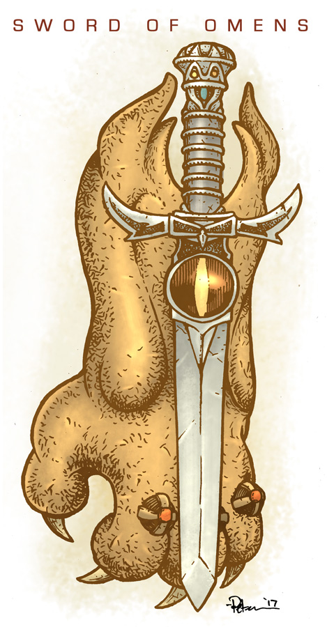
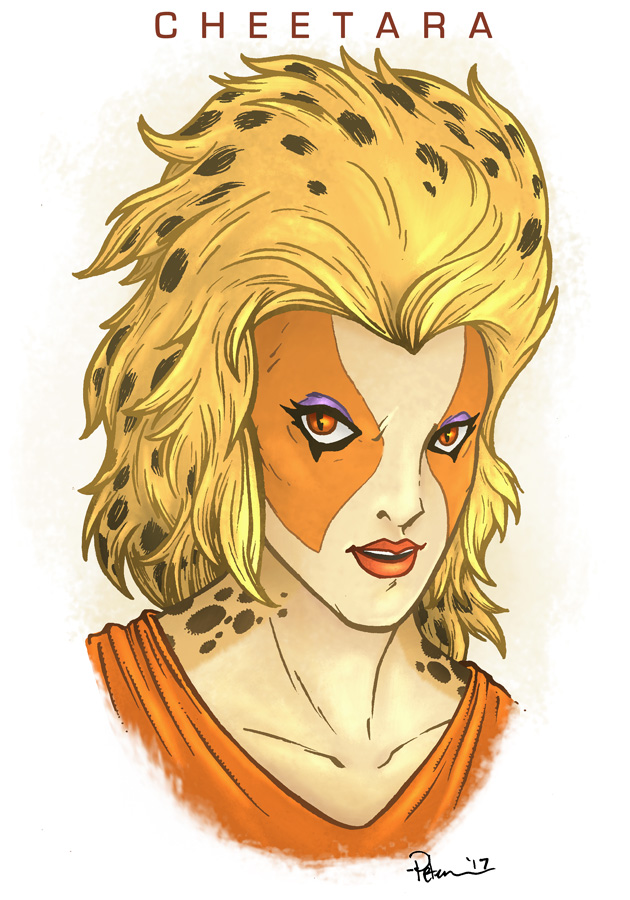
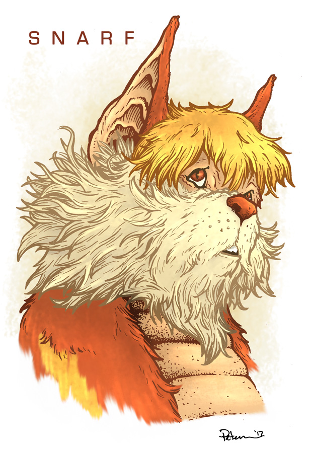
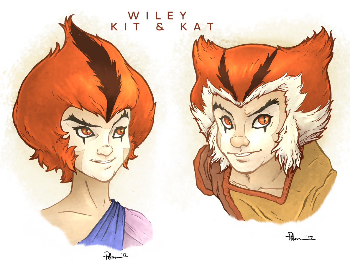
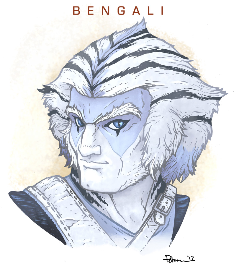
Thundercats
Thunder...Thunder...THUNDERCATS, HO!
I want to reiterate, these were only for fun. I'm not working on any Thundercats Project, and I won't make prints of characetrs I don't own. With that said, enjoy!


Many of the original inked pieces are available in my online store:http://mouseguard.bigcartel.com/category/original-artwork
2017 Appearances: C2E2: April 21-23Heroes Con: Jun. 16-18San Diego Comic Con: July 19-23Baltimore Comic Con: Sept. 22-24New York Comic Con: Oct. 5-8
April 4, 2017
TMNT/Usagi Cover Process
 Usagi Yojimbo and the Teenage Mutant Ninja Turtles are crossing over and teaming up!!! The stand-alone issue is written and drawn by Usagi creator Stan Sakai, and published by IDW.
I was lucky enough to be asked to do a variant cover for the occasion. This marks my 13th TMNT cover and my 4th time drawing Usagi for publication. And when Bobby Curnow (TMNT editor) asked if I could do a cover, I pushed a few days of Mouse Guard work to the side to be a part of this.
In this blogpost I'm going through the process for creating the cover art.
Roughs:
 I don't want to say much about the plot of the issue...but Usagi and the TMNT team up and there is a catfish in the tale too. For the cover, I wanted to show Usagi and the turtles piled in a classic team-up pose with the catfish ethereally looming behind & overhead. For the turtles...I'd done a TMNT rough for a possible licensed print from one of the well-known slikscreen print companies. For various reasons, it didn't come to fruition, but it meant I had a set of Leo, Raph, Mike, & Don unused...
 So I set to drawing Usagi first. Then I traced over my old versions of the TMNT to make new tighter pencils of them in an arrangement that would flank Usagi. Doing this allowed me to also make anatomical and detail corrections as well as mirror Donatello & Leonardo.
And then the big old catfish on another sheet of copy paper.
With these sketches/pencils done, I could scan them into Photoshop for....
 Layouts:
Now most artists wouldn't go so far as to color-flat the layout that they submit to their editor for approval (and in this case approvals went through Nickelodeon & IDW for TMNT and Stan & Dark Horse for Usagi), but I wanted to make sure the tone and palate as well as the subtle handling of the catfish would be handled.
I had a TMNT title-mastead & IDW logo from my TMNT covers to place as a reference point for what would most likely be covered up for the final publication.
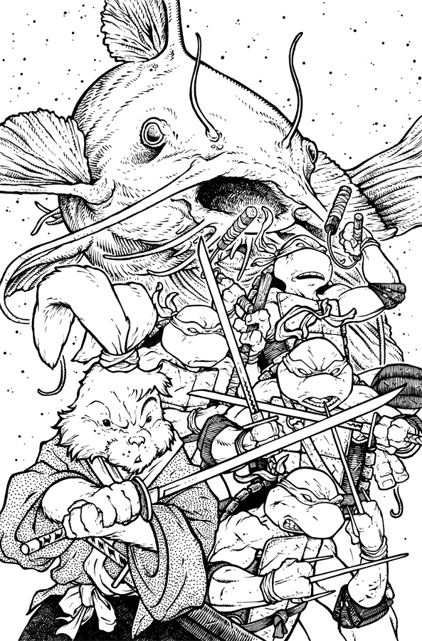 Inks:
Inks: Once the layout was approved by all (no changes, thankfully) I printed out the layout and taped it to the back of a sheet of Strathmore 300 series bristol board. On a light pad (I use a Huion brand large enough to fit most of a cover) I was able to see through the bristol to the layout print and then ink on the surface of the bristol without having to transfer the image or have any pencil lines to erase (and ultimately smear the not-quite-dry ink that I all-too-often do). I used Copic Multiliner pens to ink the cover. I tent to use the 0.7 & 0.3 nibs mainly.
 Flats:
Once the inks are completed, I scanned them into Photoshop and started flatting in colors...unfortunately it was easier to just re-color this instead of trying to re-register & correct the flats from the layout.
I am a fan of the all-red bandannas from the original Eastman & Laird comics, but to fit in with current IDW continuity, I was told by my editor to give them the multi-color treatment. The other colors were stock from the existing character designs & my original layout. To push back the catfish I added a color hold to it's inkwork as well as all those little dots (meant to give that etherial particles in the air/water catching the light feel).
Here again are the final colors. All of the rendering was done in Photoshop using the Dodge & Burn tools with a textured brush. This crossover issue will be available to pre-order soon with the book to be released in July.

2017 Appearances: C2E2: April 21-23Heroes Con: Jun. 16-18San Diego Comic Con: July 19-23Baltimore Comic Con: Sept. 22-24New York Comic Con: Oct. 5-8
March 28, 2017
Frog 5x7" Print Process
 For 2017 I'll be introducing a lot of new 5"x7" matted prints to my convention appearances and in my online store. Fans have been enjoying the Saxon, Gwendolyn, Sadie, and Kenzie prints in the same format, so in addition to adding more guardmouse characters for 2017, I'm also adding more animals/scenes.
In this post, I'll be sharing the process of creating the frog and mouse artwork to the left from concept to finished colors.
 Julia and I made a list of the type of animals that would work well in this format. On her list of suggestions was "something like the frog and mouse-harvester on the cover of my 2015 sketchbook". Looking directly to that piece of artwork, I set to doing a piece that would fit the taller orientation and have a less tropical-looking frog species while making the frog more the focal point than the mouse.
 I drew a frog (using some online reference for a northern leopard frog) and the mouse on separate sheets of copy paper. I assembled them all in Photoshop tinting each character a different color to help me see where one character started and the other ended. The outer line is a pre-set template I've made for this size of print so that it will float in the mat nicely...though, I'm not working at actual size, I'm working larger, but the proportions are right so that when the final version is printed to scale, everything will fit inside the mat.
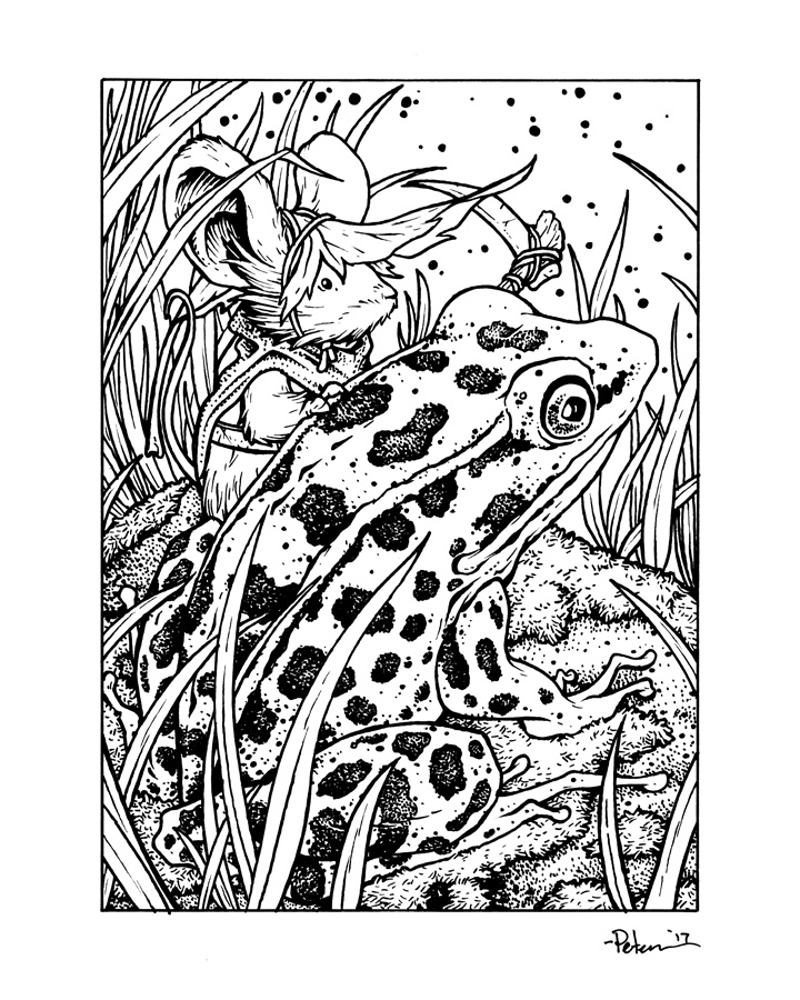
I printed out the photoshop assembled layout and taped it to the back of a sheet of Strathmore 300 series bristol and inked on a lightpad. I use a Huion lightpad that allows me to see the printout through the surface of the bristol. This means that on the surface of the bristol will only be my inks, no pencil lines to erase (though sometimes, I do tighten up the pencils a bit as I work if the layout sketch is too loose). For pens I used Copic Multiliners, the 0.7 & 0.3 nibs. All of the grass I did on the fly as I inked.

Once the inks are scanned, I start the process of flatting the piece for color. This means laying in flat color (no concerns with shading or texture) to establish that areas like the frog's skin will be a different color than the rock, grass, of the mouse, etc.
Once the flat colors are in I start rendering each area using the dodge and burn tools (lighten and darken) with a textured brush. I also added some color holds on those stars/will-o-whisps in the background.
Here again is the finished colored artwork. This print and many more will be available at any of my convention appearances this year was well as in my online store.

For process posts on previous prints:http://davidpetersen.blogspot.com/search/label/Print
2017 Appearances: C2E2: April 21-23Heroes Con: Jun. 16-18San Diego Comic Con: July 19-23Baltimore Comic Con: Sept. 22-24New York Comic Con: Oct. 5-8
March 21, 2017
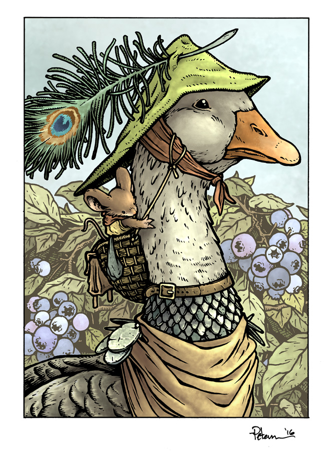
Goose 5x7" Print Process
 For 2017 I'll be introducing a lot of new 5"x7" matted prints to my convention appearances and in my online store. Fans have been enjoying the Saxon, Gwendolyn, Sadie, and Kenzie prints in the same format, so in addition to adding more guardmouse characters for 2017, I'm also adding more animals/scenes.
In this post, I'll be sharing the process of creating the goose and mouse artwork to the left from concept to finished colors.
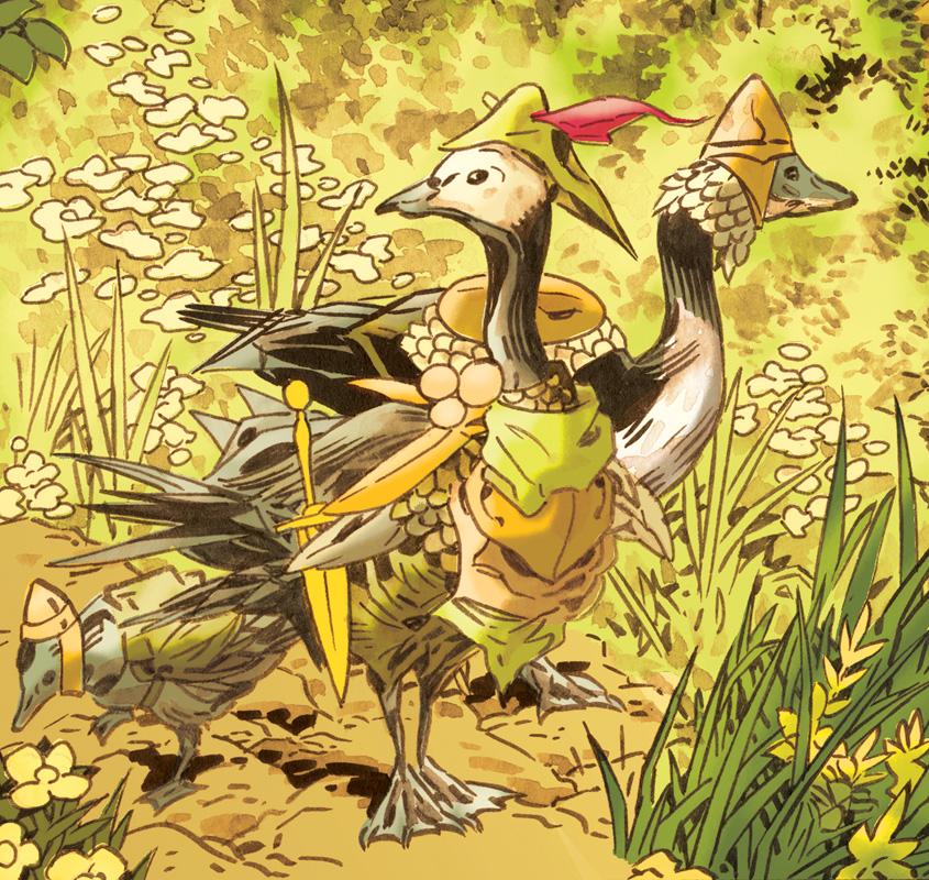 I started with being inspired by the geese Mark Buckingham illustrated in his Legends of the Guard story ("The Gosling and the Ghost" in Vol. 3). I'd seen a goose piece Mark had done as part of a Fables promotion and asked him if he'd feature a goose in his Legends of the Guard story. The image of this gaggle from his page 1 of that story stuck with me, especially the hats. And in an effort to want to embrace and take advantage of all the great concepts contributors have added to the Mouse Guard world in the pages of Legends of the Guard, I set out to draw my own clothed goose.
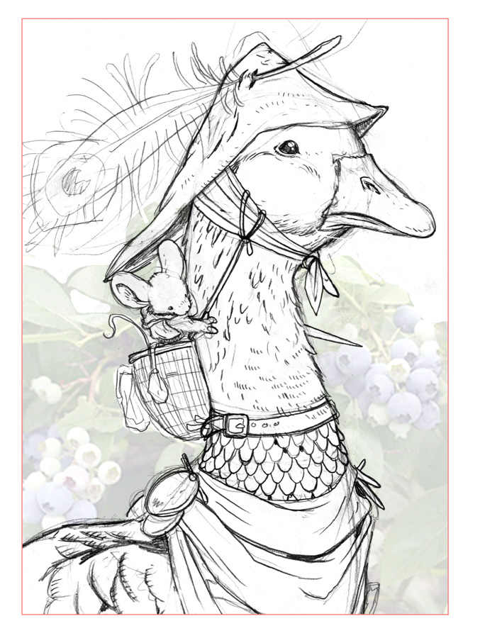 I drew a goose wearing a hat with scarf and armor on a sheet of copy paper. On another sheet, I also drew a mouse in a basket. After scanning them both, adding a stock photo of some blueberries, and assembling them all in Photoshop, I had this composition for my print ready. Orange line is a pre-set template I've made for this size of print so that it will float in the mat nicely...though, I'm not working at actual size, I'm working larger, but the proportions are right so that when the final version is printed to scale, everything will fit inside the mat.
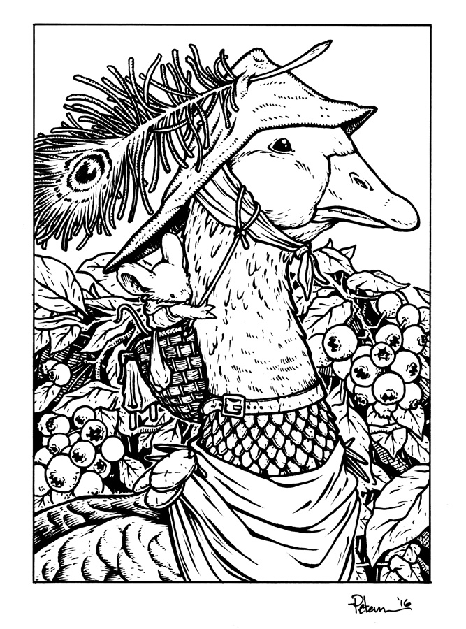 I printed out the photoshop assembled layout and taped it to the back of a sheet of Strathmore 300 series bristol and inked on a lightpad. I use a Huion lightpad that allows me to see the printout through the surface of the bristol. This means that on the surface of the bristol will only be my inks, no pencil lines to erase (though sometimes, I do tighten up the pencils a bit as I work if the layout sketch is too loose). For pens I used Copic Multiliners, the 0.7 & 0.3 nibs.
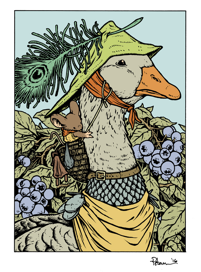 Once the inks are scanned, I start the process of flatting the piece for color. This means laying in flat color (no concerts with shading or texture) to establish that areas like the goose's feathers will be a different color than his hat or scarf, of the mouse, etc.
Once the flat colors are in I start rendering each area using the dodge and burn tools (lighten and darken) with a textured brush. I also added some color holds (areas where I want the inkwork to appear as a color rather than a black line) on the background lines, and the eye of the peacock feather.
Here again is the finished colored artwork. This print and many more will be available at any of my convention appearances this year was well as in my online store.
For process posts on previous prints:http://davidpetersen.blogspot.com/search/label/Print
2017 Appearances: Emerald City Comic Con: Mar. 2-5C2E2: April 21-23Heroes Con: Jun. 16-18San Diego Comic Con: July 19-23Baltimore Comic Con: Sept. 22-24New York Comic Con: Oct. 5-8
March 14, 2017
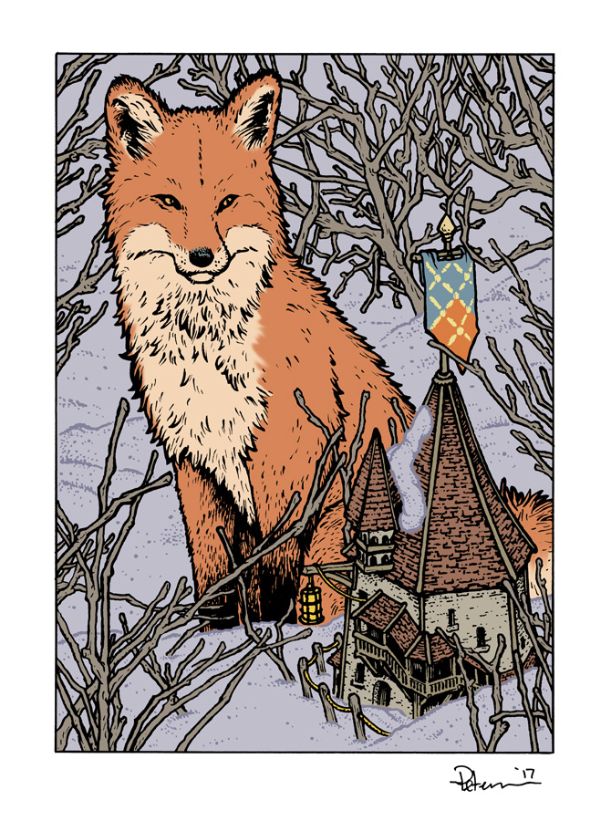
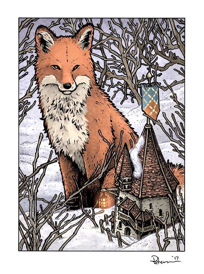
Fox 5x7 Print Process
 For 2017 I'll be introducing a lot of new 5"x7" matted prints to my convention appearances and in my online store. Fans have been enjoying the Saxon, Gwendolyn, Sadie, and Kenzie prints in the same format, so in addition to adding more guardmouse characters for 2017, I'm also adding more animals/scenes.
In this post, I'll be sharing the process of creating the Fox and mouse-dwelling artwork to the left from concept to finished colors.
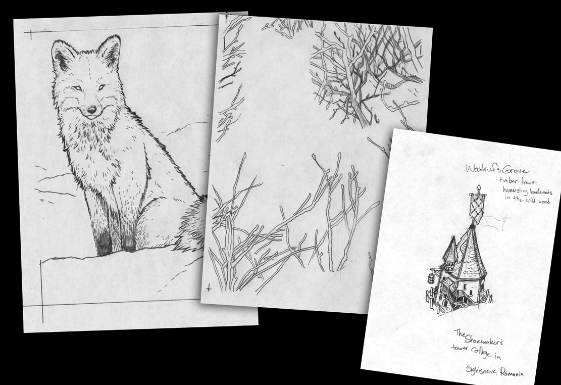 I started with a fox drawing (from reference of a fox in the snow) on copy paper. With all the dead thicket branches I planned to have in this piece getting in the way of the snow lines, I made life easier by laying a new sheet of copy paper over the fox drawing and then on a light pad draw them in around the fox. On yet another sheet of paper, I drew a little mousey building...
 I found a photo online of this building called "The Shoemaker's Tower" in Sighisoara, Transilvania, Romania. I loved the shape of the roof peak, the offset tower, and the canopied balcony staircase. So, when I drew the little mousey version, I didn't change much other than making the lantern bigger and adding an existing mouse flag (see Black Axe). I decided that for one of the as-yet-unseen mouse towns, I'd use this aesthetic. So on my sketch I jotted down notes about one of the fallen towns: Woodruff's Grove. This is a small step towards developing that location, but this is a small step on which I can build much more in the future...but back to this print...
After I assembled the three drawings in photoshop (tinting them all to help my eye see where one ended and the other began...this is where having the branches separate from the snow-lines made a big difference) having these elements all on different sheets/layers I was able to make lots of adjustments to resize parts without affecting the lines of the things around them.
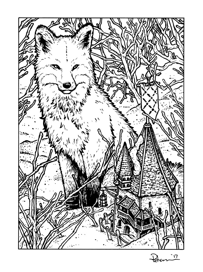
I printed out the photoshop assembled layout and taped it to the back of a sheet of Strathmore 300 series bristol and inked on a lightpad. I use a Huion lightpad that allows me to see the printout through the surface of the bristol. This means that on the surface of the bristol will only be my inks, no pencil lines to erase (though sometimes, I do tighten up the pencils a bit as I work if the layout sketch is too loose...in this case the eyes). For pens I used Copic Multiliners, the 0.7 & 0.3 nibs.
Once the inks are scanned, I start the process of flatting the piece for color. This means laying in flat color (no concerns with shading or texture) to establish that areas like the Fox's two different fur tones and making sure they are different from the branches, snow, building, etc.
Once the flat colors are in I start rendering each area using the dodge and burn tools (lighten and darken) with a textured brush. I added minimal colorholds on the snow linework and the flag embroidery.
Here again is the finished colored artwork. This print and many more will be available at any of my convention appearances this year was well as in my online store.
For process posts on previous prints:http://davidpetersen.blogspot.com/search/label/Print
2017 Appearances: Heroes Con: Jun. 16-18San Diego Comic Con: July 19-23Baltimore Comic Con: Sept. 22-24New York Comic Con: Oct. 5-8
March 7, 2017
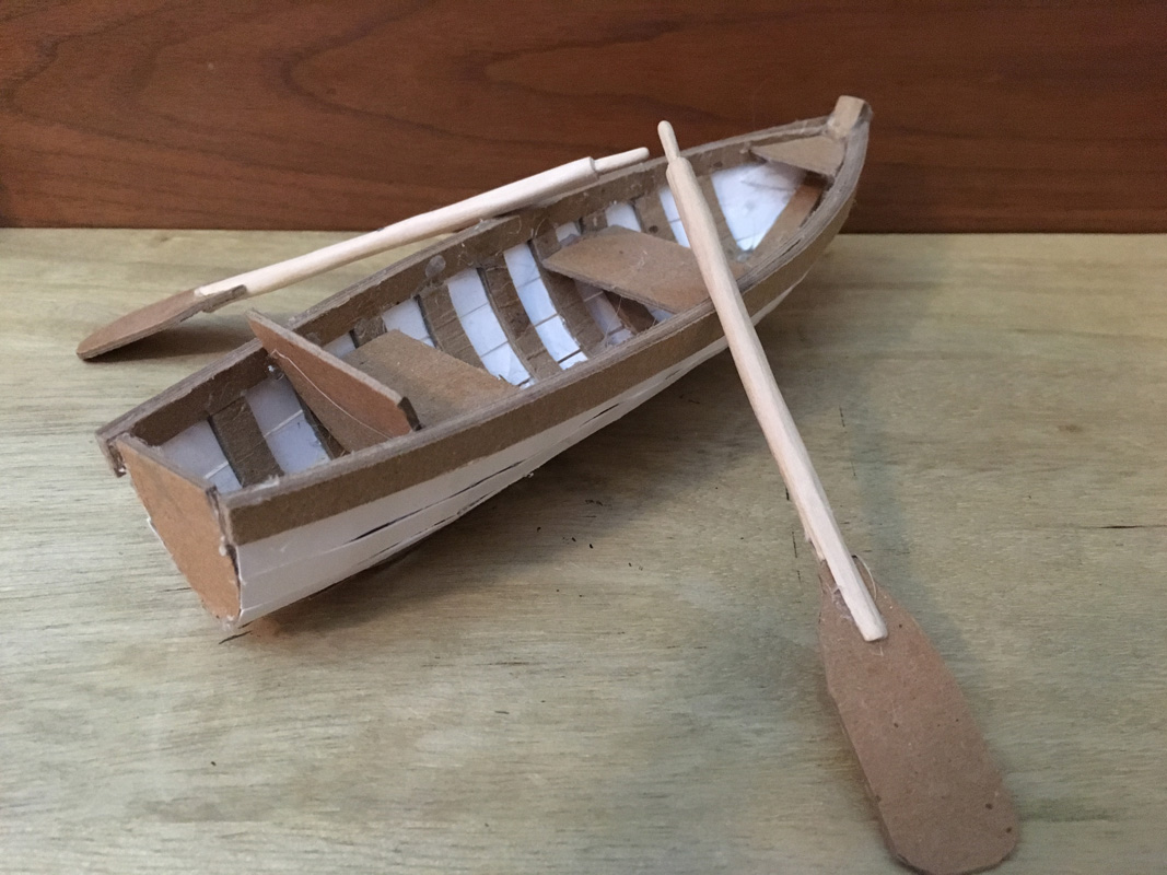
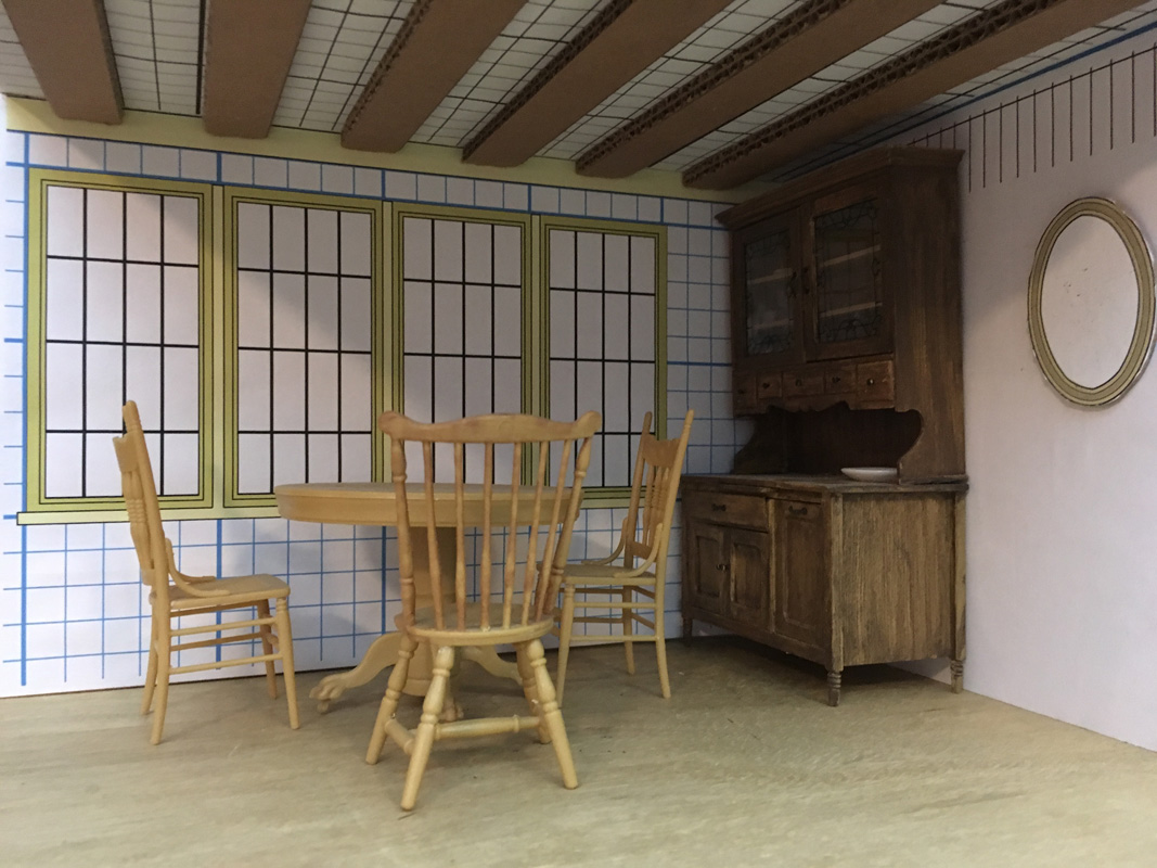
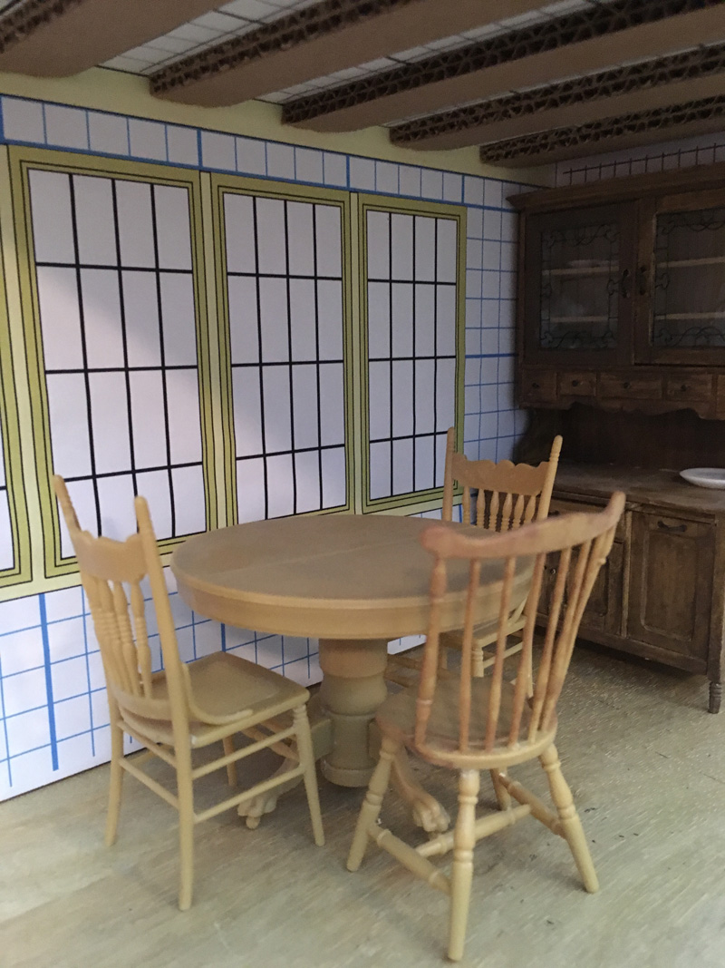
Wind in the Willows Models: Rat's Boat & Dining Area
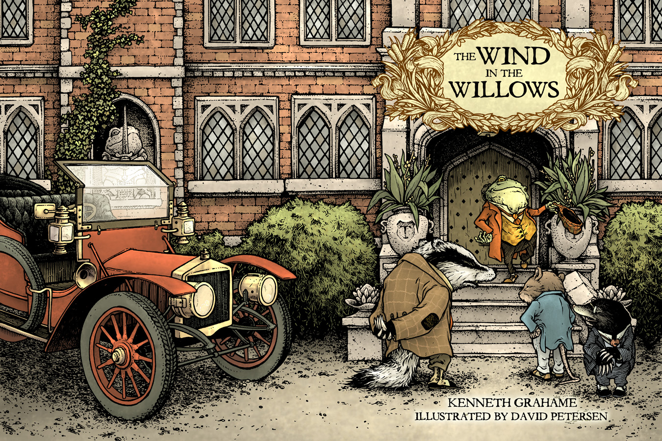
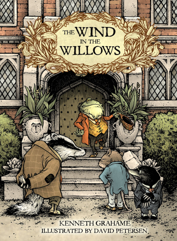 My illustrated edition of Kenneth Grahame's classic Wind in the Willows published by IDW has been released! The book has Grahame's original text, with over 70 illustrations by me.
For this week's blogpost I'm going to share a few of the physical models I used/built to help me visualize & illustrate the book. Below are photos of the models of Rat's boat & Rat's Dining Area. I've also included a few videos of me talking about the models.
RAT'S BOAT:The first model I made for Wind in the Willows was Rat's boat. It's chipboard & bristol board. The oars are basswood & chipboard.


RAT'S DINING AREA:I did purchase a few Victorian/Edwardian doll house furniture kits. Here I used a cupboard, round table & chairs with some printed paper windows, chip board & cardboard ceiling, and a paper oval mirror to make Rat's Dining area.

Wind in the Willows from IDW is available to order at your local comic or book shop -or-
on Amazon.com:https://www.amazon.com/Wind-Willows-Illustrations-David-Petersen/dp/1631403435
For all my other Wind in the Willows Process Posts:http://davidpetersen.blogspot.com/search/label/Willows
2017 Appearances: Emerald City Comic Con: Mar. 2-5C2E2: April 21-23Heroes Con: Jun. 16-18San Diego Comic Con: July 19-23Baltimore Comic Con: Sept. 22-24New York Comic Con: Oct. 5-8
February 28, 2017
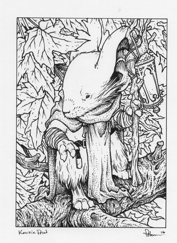
Kenzie 5" x 7" Print Process
 Kenzie, the blue cloaked patrol leader of Lockhaven, deserves a print all to himself. I've been trying to offer up more of the 5" x 7" matted prints at conventions and in my online store. With a Saxon, Sadie, and Gwendolyn print already available, I wanted to include that stalwart mouse of wisdom to the lineup. Because of his lack of a sword, and his calm nature, he's not the most requested of characters, but the fans who love Kenzie, really love him and they are not in any small number. In today's blogpost I'll share the process for creating the image for this print.
Sketch:
 I did two sketches for this piece. It's rare I get this torn between sketches. I can usually hone in on what I like more about one idea/concept/rough and decisively choose. But for some reason, I had to call in the assitance of my Editor Cameron Chittock to talk me through this choice. The one on the left was calm, resolute, and peaceful....but ultimately a bit dull. And the one on the right was better, but didn't drive home those Kenzie qualities in body posture as well as the other. With Cam & my wife Julia both weighing in, I came to the decision that the more dynamic pose was best.
 Layout:
I scanned in the rough pencils and re-sized them to match the size & ratio I'd need for the final artwork & print. I think (though I'm not entirely sure) I fiddled a bit in Photoshop with the proportions and angle of the head. I also added in a drawing of a lantern. I didn't use the lantern design Kenzie has from Winter 1152 because the Saxon print already had that criss-crossing wire frame and I didn't want to repeat myself. I opted to do something tall and lender to match Kenzie's frame (I try to make every detail about Kenzie make him feel tall: the long straight cheek hair, the staff, the long front-cloak, etc.)
Inks:
 I printed out the above adjusted layout and taped it to the back of a sheet of Strathmore 300 series bristol. On a light pad (I really like the Huion brand of these) I can see through the surface of the Bristol and ink using the printout as my 'pencils' to guide me. I used Copic Multiliners (the 0.7 & 0.3 nibs). After Wind in the Willows, it was hard not to want to add hatching in on every leaf to give a better sense of depth and to help Kenzie stand out a bit more, but I reserved to do that in color instead...
 Color Flats:
After scanning in the inked piece (and adjusting the levels and cleaning up any dirt, dust, etc from the scan) the first step to coloring is Flatting in colors. This means, like any good coloring book user, you color spaces inside the lines. But when flatting, you don't need to worry at all about shading, lighting effects, or even if you are going to use the real colors (here I stuck close to what I knew the palate was for the final piece). Unlike some colorists, I like to use new Photoshop layers for new areas of color. This allows me to not have to 'cut in' precisely when I butt up against an area I've already colored and it allows me to smudge up and fade out the color in places where my linework isn't closed off completely without disturbing the color next to it.
 Final Colors:
After the areas of color are isolated by flat colors, I went in an rendered each part using the Dodge & Burn tools in Photoshop. I have my settings on Range: Highlights and 1% exposure most of the time and I use a textured brush. I tweaked color balances with leaves and subtle areas like Kenzie's nose. At this stage, I also added in a glow to the lantern and made the veins of the maple leaves more subtle.
The final 5" x 7" matted print will be available at my 2017 convention appearances and in my online store.
More of the 5x7" Mouse Guard character print process Blogposts:
Saxon Print: http://davidpetersen.blogspot.com/2015/04/5x7-saxon-print-process.html
Sadie Print: http://davidpetersen.blogspot.com/2016/04/sadie-5x7-print.html
Gwendolyn Print: http://davidpetersen.blogspot.com/2016/05/gwendolyn-print.html
2017 Appearances: Emerald City Comic Con: Mar. 2-5C2E2: April 21-23Heroes Con: Jun. 16-18San Diego Comic Con: July 19-23Baltimore Comic Con: Sept. 22-24New York Comic Con: Oct. 5-8
February 21, 2017
2017 Bookplate Process
 For this year's Mouse Guard bookplate (For new fans, I've done an annual limited-edition bookplate since 2012...links at the bottom of this post to see process on them all) I decided to once again ape the design of a character from Jeremy Bastian's Legends of the Guard story: Faulknir.
To the left you can see the 2017 bookplate, which will be available at my convention appearances as well as in my online store, and for this week's blogpost, I'll share the process for creating the image.
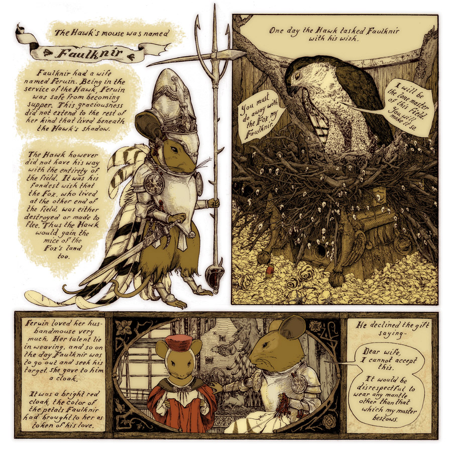 I started with this brilliant page of Jeremy's from "The Tale of the Hawk's Mouse and the Fox's Mouse" from Legends of the Guard Volume 1 (which I'm fortunate enough to own the original of). Jeremy did a fantastic job of creating a myth about the creation of the Mouse Guard that I'm jealous of to this day. I've drawn from this story for the Mouse Guard short story "Service to Seyan" as well as last year's bookplate (and a few easter eggs in Black Axe). Here we see Jeremy's design for Faulknir, his armor, & feather cape.
 On copy paper with a mechanical pencil, I set to draw my version of Faulknir. I tried to keep as much of the detail of Jeremy's version in as possible, but executed with my proportions, line style and sensibilities. Though, it was hard not to include more lines for shading like an etching.
I'd considered doing this piece as an etching (my degree is in Printmaking) but time & access to a press, acid, & supplies made me opt to just ink this traditionally as an illustration.

I took that drawing and composited it in Photoshop inside the borders that Jeremy drew on the bottom panel of his page. I, of course, checked with Jeremy before doing this to get his blessing. Like last year's bookplate I wanted to keep the motifs and aesthetics that Jeremy infused into those mice.
I'd be able to make it my own in the inks...
 I printed out and taped the above layout to the back of a sheet of Strathmore 300 series bristol. On my light pad (I like using the Huion brand of these) I could see through the surface of the bristol to use the printout as 'pencil' guides as I inked. I used Copic Multiliner (the 0.7 & 0.3 nibs) to ink this piece. To the left you can see a phone-photo of the inks in-process on the light pad.
 Here are the finished inks for the piece. I added a vertical line pattern behind Faulknir to help him pop a bit. Like I did on Wind in the Willows, the key to having these lines look organic, but still evenly spaced & straight is to use a t-square and pencil them onto the back or print out a lined guide and then ink them by hand with no ruler, allowing for little hiccups and imperfections as you go.
 To color this piece, I pulled my first-pass palate from Jeremy's panels. Jeremy purposely used a limited color-range when doing his Legends story, and unlike last year's bookplate of Silfano, I chose to use the same limitation of hue Jeremy did.
Ultimately, as I did the final rendering, I adjusted the colors a bit, so that they had some of my voice, but still payed homage to the wonderful work of Jeremy's. Here is the finished artwork sans-text & bookplate trappings.
The bookplate will be available at all my 2017 convention appearances and later in march in my online store.
 Past Bookplates:
2012: http://davidpetersen.blogspot.com/2012/02/2012-bookplate-this-year-im-starting.html
2013: http://davidpetersen.blogspot.com/2013/01/2013-bookplate-like-last-year-ill-be.html
2014: http://davidpetersen.blogspot.com/2014/03/2014-bookplate-process.html
2015: http://davidpetersen.blogspot.com/2015/03/2015-bookplate-process.html
2016: http://davidpetersen.blogspot.com/2016/05/2016-bookplate.html
2017 Appearances: Emerald City Comic Con: Mar. 2-5C2E2: April 21-23Heroes Con: Jun. 16-18San Diego Comic Con: July 19-23Baltimore Comic Con: Sept. 22-24New York Comic Con: Oct. 5-8
February 14, 2017
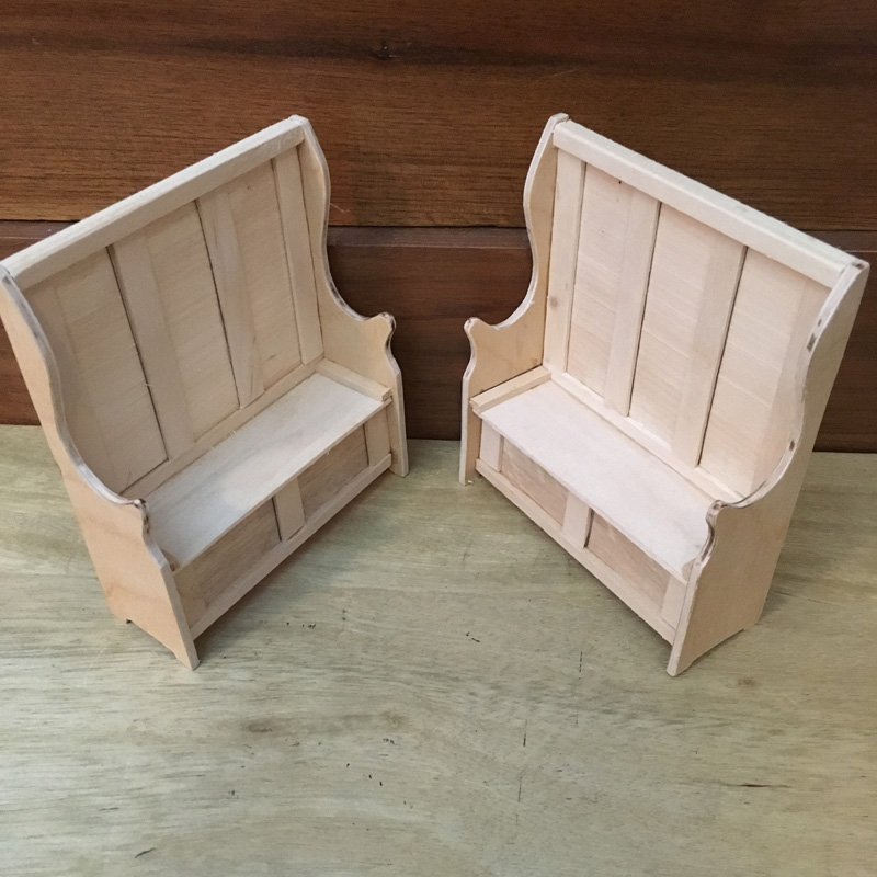
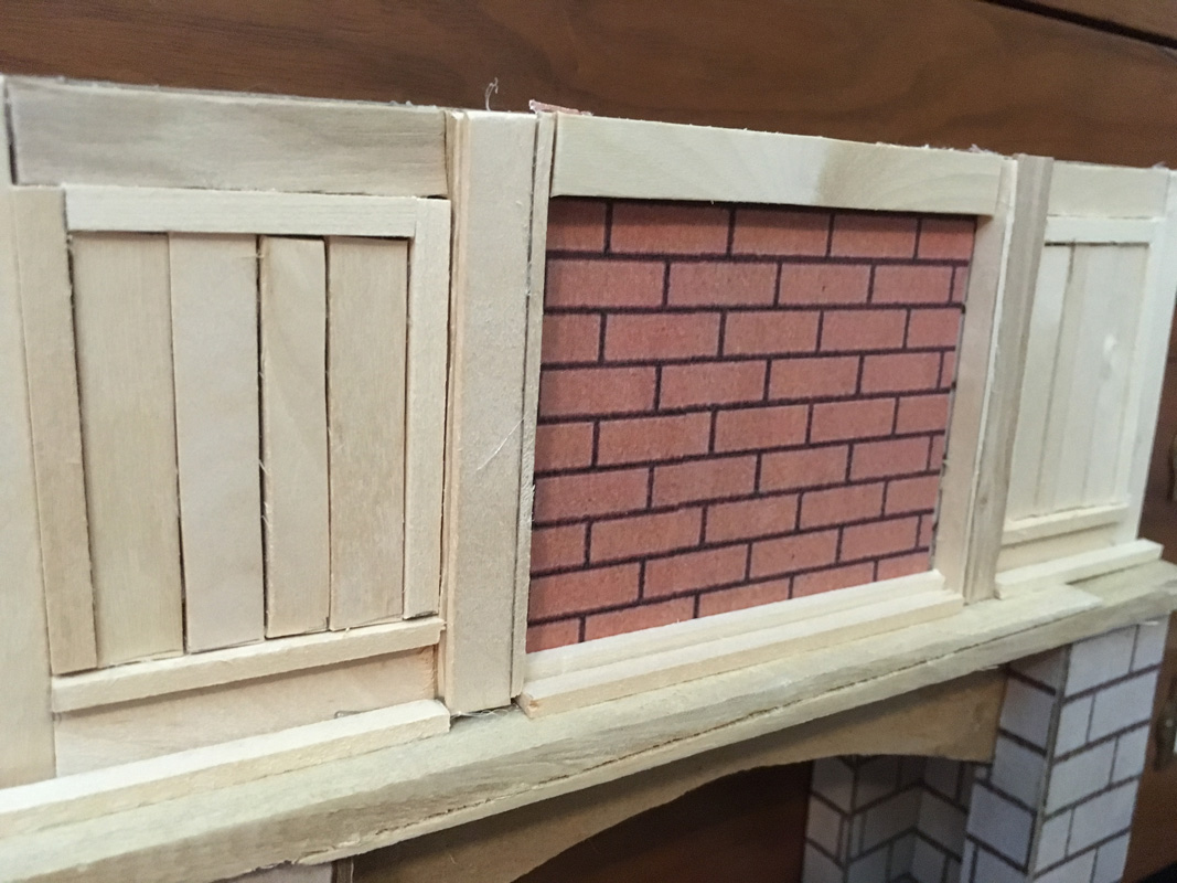
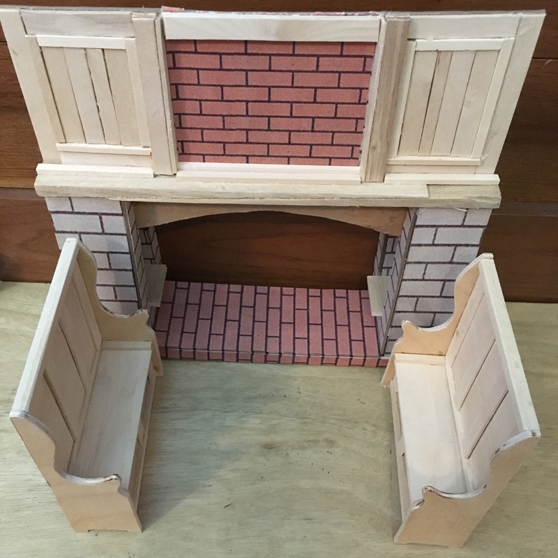
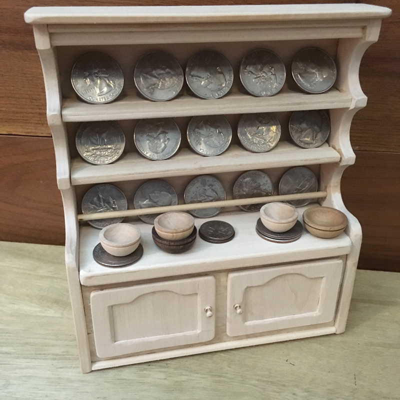
Wind in the Willows Models: Badger's Kitchen
My illustrated edition of Kenneth Grahame's classic Wind in the Willows published by IDW has been released! The book has Grahame's original text, with over 70 illustrations by me.For this week's blogpost I'm going to share a few of the physical models I built to help me visualize & illustrate the book. Below are photos of the models from Badger's Kitchen. I've also included a video of me talking about the models.
BADGER'S HEARTH:The hearth model itself is made from chipboard with paper printed as brick glued on and basswood & popsicle stick details. The matching settles are basswood and the stand-in hanging hams & braided garlic is tissue & string.


BADGER'S CUPBOARD SHELVES:This was made out of basswood (typically used for doll-house parts) I referenced a few Edwardian pieces, and then built this to-scale with quarters as dinner plates. The bowls you see are store-bought doll-house pieces.


Wind in the Willows from IDW is available to order at your local comic or book shop -or-
on Amazon.com:https://www.amazon.com/Wind-Willows-Illustrations-David-Petersen/dp/1631403435
For all my other Wind in the Willows Process Posts:http://davidpetersen.blogspot.com/search/label/Willows
2017 Appearances: Emerald City Comic Con: Mar. 2-5C2E2: April 21-23Heroes Con: Jun. 16-18San Diego Comic Con: July 19-23Baltimore Comic Con: Sept. 22-24New York Comic Con: Oct. 5-8
David Petersen's Blog

- David Petersen's profile
- 339 followers
David Petersen isn't a Goodreads Author
(yet),
but they
do have a blog,
so here are some recent posts imported from
their feed.

