
David Petersen's Blog, page 43
September 5, 2017
Tellos: Baltimore Comic-Con Yearbook 2017 process
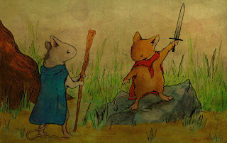
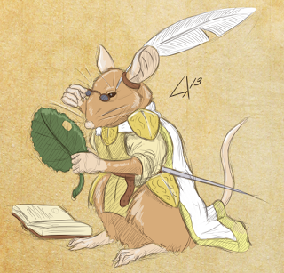
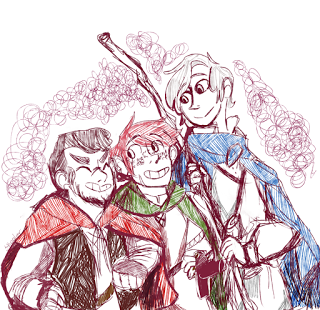
 The Baltimore Comic Con has an anual tradition of publishing a Yearbook, each year featuring a comic property or title, and asking the guest artists to contribute a pinup in their own style (or also mashing in their characters). Two years ago, I was fortunate enough for Mouse Guard to have been the focus of the Yearbook. This year that honor has gone to Tellos. It is the 10 year anniversary of Mike Wieringo's passing. The book will be available at the Baltimore Convention and probably on their website afterwards.
On the left you can see my finished piece, but below, I've gone through and shown the process and steps.
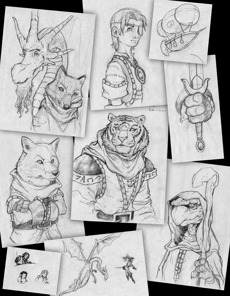 The first issue I had was what character(s) from Tellos would I focus on or use for my piece. Obviously I wanted to draw Koj, the Tiger character, but I figured everyone for this yearbook would be drawing him as well. So I just started drawing all of the characters, Jarek the boy, Tom the turtle-wizard, Rikk the fox-theif, and Brad the dragon. Not being great at drawing human characters, I opted to draw Hawke (who's an elf) and Serra as characters further away in the distance on airships or riding dragons. All of these were drawn on copy paper separately using the Tellos Colossoal collection for reference as I went...
 I then scanned all of my sketches and started assembling them into a composition. This took a lot of puzzle-work, adjusting, re-adusting, scaling, leaving out character drawings, mirroring...until I had a layout that worked for me where somehow all the characters fit, there was a focus, and their scales, relative to each other, made sense.
The background skyline & zeppelin silhouettes were drawn quickly in Photoshop based on architecture & ship designs from the first 2 page spread in Tellos.
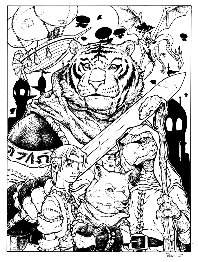 I then printed out the above composite layout (onto two sheets of legal paper taping them together to form the entire 14x17"piece) and then taped that to the back of a sheet of Strathmore 300 series Bristol. On a light-pad (I use a Huion) I can see through the surface of the bristol to the printout and use it as a guide as I ink on the bristol. For pens I used Copic Multiliners (SP, the 0.7, 0.2, & brush nibs here).
To help the background not feel as flat, I left a gap between it and the character outlines, which also helped me in the next step isolating them as color holds...
 After the inks were done, I scanned them for the start of the coloring phase, 'flatting'. This is a term that simply is about laying in flat colors (no rendering, no lighting, no effects) like a professional version of coloring within the lines. I established color holds (areas where I wanted the inkwork to be a color and not just black) for the skyline, zeppelins, and background characters, as well as a few details on Koj's sleeve.
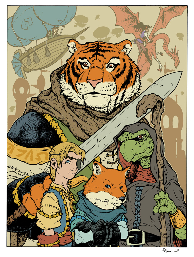
With the flats finished, it was then just a matter of rendering everything. To add the highlights & shadows I use the Dodge & Burn tools in Photoshop using a textured brush.

Here again is the finished piece which will be included in the 2017 Tellos yearbook sold at Baltimore Comic Con
I look forward to signing these in a few weeks there.
See you in Baltimore!
Past Baltimore Yearbook process posts: 2016: Archie:http://davidpetersen.blogspot.com/2016/08/baltimore-yearbook-2016-archie-process.html
2015: Mouse Guard:http://davidpetersen.blogspot.com/2015/09/baltimore-comic-con-yearbook-cover.html
2014: Grendel:http://davidpetersen.blogspot.com/2014/08/baltimore-yearbook-grendel.html
2012: Liberty Meadows:http://davidpetersen.blogspot.com/2012/09/baltimore-comic-con-yearbook-2012-this.html
2017 Appearances: Rose City Comic Con (at the BOOM! Booth) Sept. 8-10Baltimore Comic Con: Sept. 22-24New York Comic Con: Oct. 5-8


August 29, 2017
Quietus Revisit
 For the second episode of THE PLOTMASTERS PROJECT, Jesse Glenn & I revisited one of his characters: QUIETUS.
To the left you can see my finished new piece for the QUIETUS episode of THE PLOTMASTERS PROJECT, and below I'll break down who the character was, and how I created this updated image for the podcast.
 Let's start off with the original character. To the right you can see Jesse's early 90's high-school drawings of her. Quietus was a espionage type hero who's father made a pact with a demon which also included an arrangement of marriage for her. All of this dark muddling gave Quietus untested and vague--yet immensely powerful magic.
Jesse said her key design feature was drawing 'scribble hair'.
 For my update drawing for the podcast I was challenged. I not only rarely draw ladies, especially sexy ladies, but even in my youth, I'd never drawn Quietus. I used some photo reference for the pose (a yoga model doing a sorcerer pose?) and then tried to keep the basic design of flat-black bodysuit, red accents, metal bangles & bracelets, and curly scribble hair to make Merida from BRAVE jealous.
 I ran out of room on the copy paper I was sketching on and had to tape another sheet on to get the full body in.
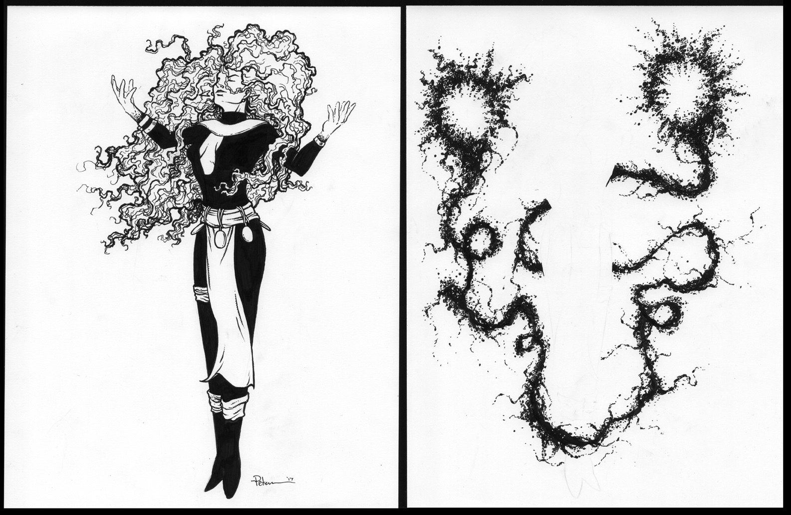 With the sketch penciled, I taped a copy of it (one I'd darkened & resized on the photo copier) to the back of a sheet of Strathmore 300 series bristol. Using a lightpad to see the sketch I used Copic multiliners to ink the piece. I inked Quietus on one side and then removed the sketch and inked 'vague magic' effects on the back side (using the lightpad to register the hands and body)
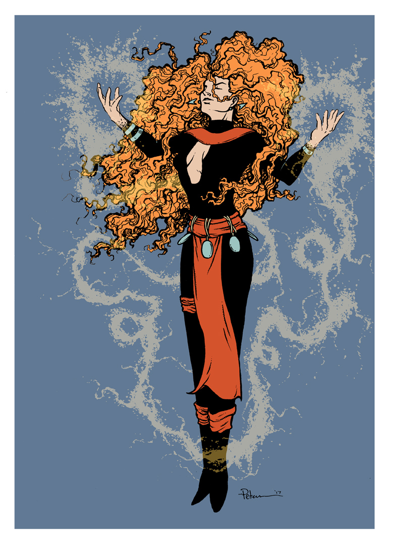 After the inks were finished I scanned both sides (mirroring the magic effects so they registered with Quietus) and started flatting the piece in Photoshop. The colors were established for me mostly by Jesse's original design. The magic (seen here as a separate semi-translucent layer). With the areas all established with flat colors, I could start the rendering and effects to get to the final piece.
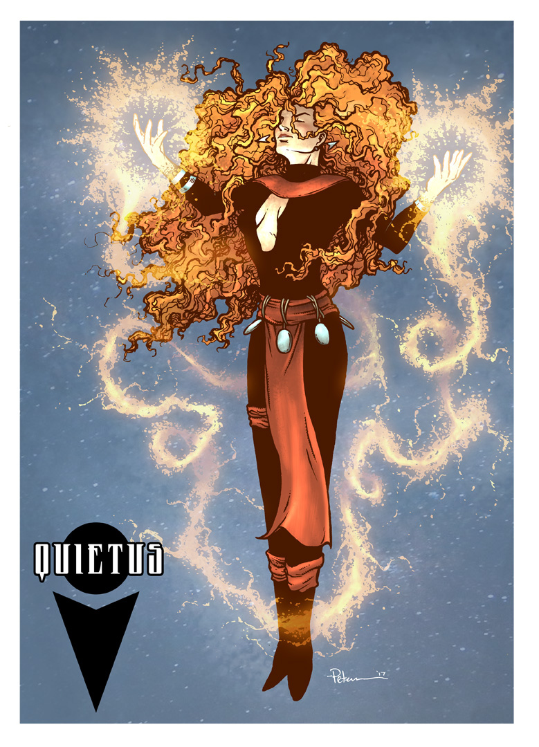 Here again is the finished piece. All of the rendering was done using the dodge and burn tools and a textured brush in Photoshop. I toyed around with the color of the magic...shifting it from yellow to green to blue to red and back again. This was the version I was happiest with and I added in Jesse's symbol for the character with a little name typography to fill the composition in a bit better.
It was an interesting challenge to redraw not only someone else's character, but one who is all the things I try to avoid drawing normally. But, as we go forward with more Plotmasters Project episodes, I'm sure I will be pushed out of my comfort zone again...
You can watch the QUIETUS episode of The Plotmasters Project on YouTube:
And follow us on Facebook & Twitter
2017 Appearances: Rose City Comic Con (at the BOOM! Booth) Sept. 8-10Baltimore Comic Con: Sept. 22-24New York Comic Con: Oct. 5-8
August 22, 2017
Mouse Guard Model Video: Puppet Theater
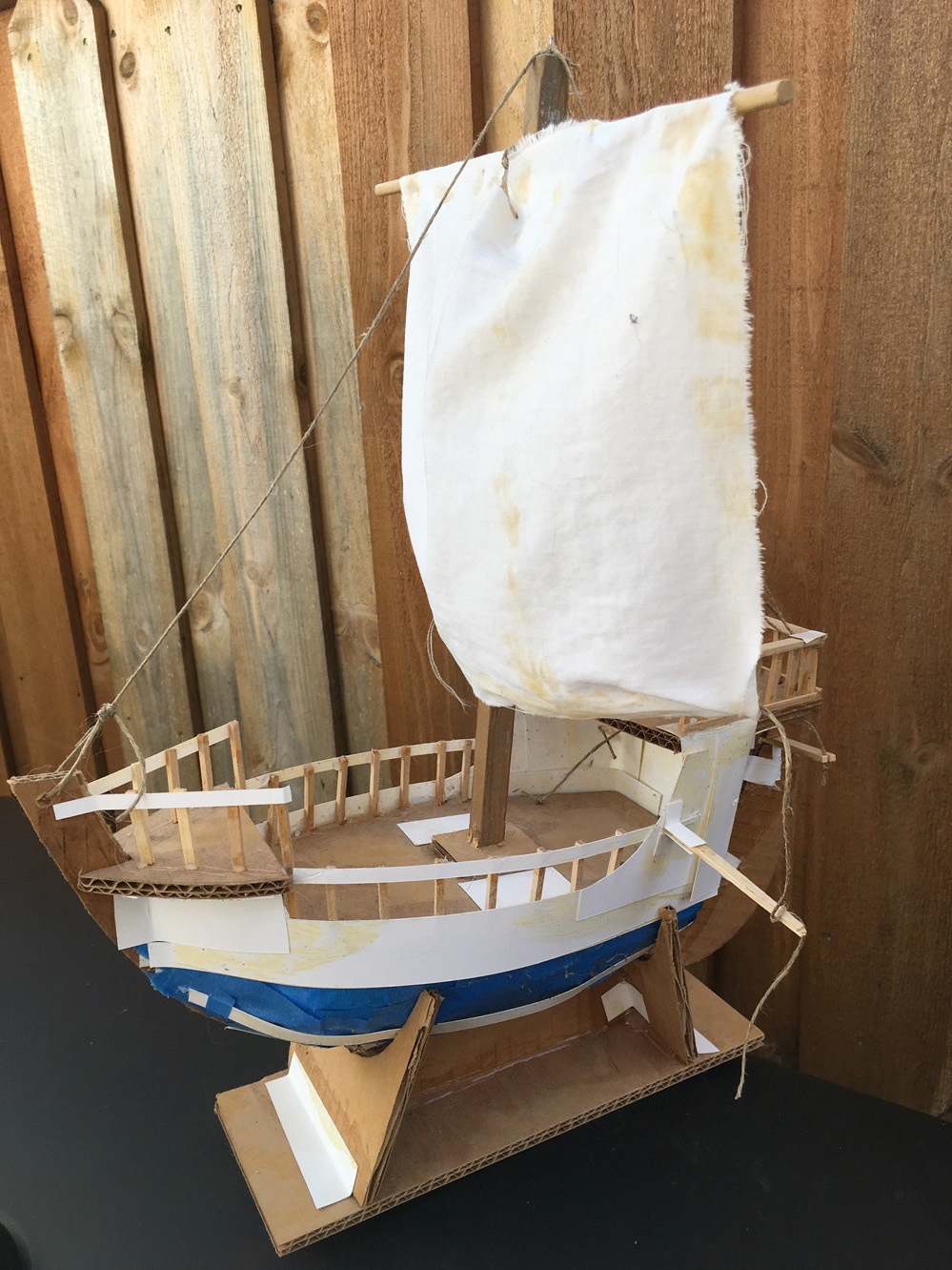
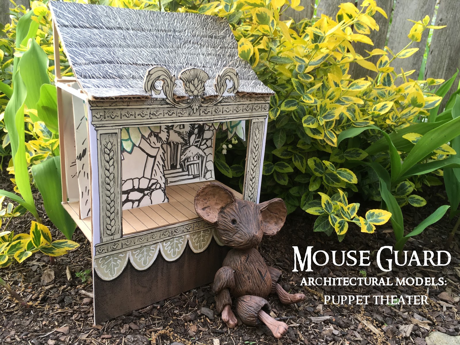 For my 2012 Free Comic Book Day story "The Tale of Baldwin the Brave (included in the short story collection Baldwin the Brave and Other Tales), I built a model of the puppet theater and a mouse marionette.
I made a video where I talk about these models, how I built them, what the materials were, and why I built them in the first place. Below you can watch as I explain how having the models helped frame scenes and block where the puppet mice should stand in them:
I also recorded a video of the story narrated by me:
2017 Appearances: Baltimore Comic Con: Sept. 22-24New York Comic Con: Oct. 5-8
August 15, 2017
Mouse Guard Fan Art
I love that fans are excited enough about Mouse Guard, Legends of the Guard, or the Mouse Guard RPG (and their player-characters) to lend their talents to creating Mouse Guard Fan Artwork! I share this work from time to time on the blog, so here is a fresh batch of work sent directly to me, or pointed out to me online by other fans.
 Archaeoptryx
 Adam Waldman
 Alex Kolakowski
 Alexander Schafer
 Alexander Schafer
 Alison Pinto
 Alison Pinto
 AMS (?)
 Andrew Craft
 Delicut Cakes
 Draconder
 Elio Finnocchiaro
 Evan Dickson
 Grotezco
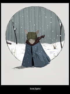 Igor Krstic
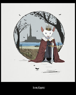 Igor Krstic
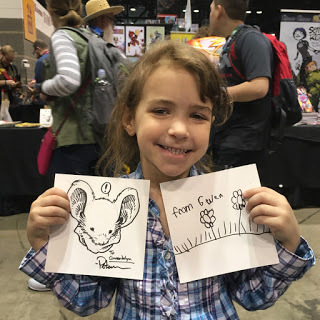 Gwendolyn (her flowers on the right)
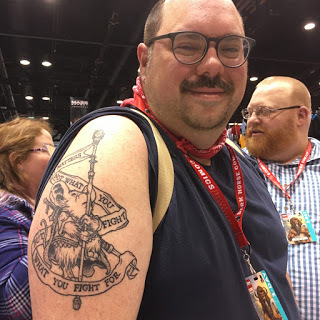 Chris Lopez's tattoo
 Ines Korth
 Jessica Shibley
 Melisa Mi Qin Ong
 Natalie Becker
 Natalie Becker
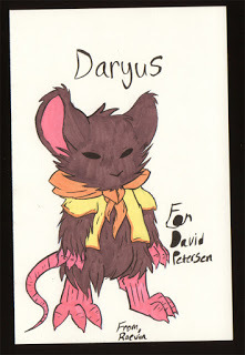 Raevin
 Ramel Hill
 Shoze
Shoze
 Saxon, Lieam, & Kenzie as humans by skoolar
 Steven Maye
 (???)
(???)
 Ciyuunhe
 Shandria
 Trey Patterson
 Ewa "truskawka" Onisk
 'Putrid Cheese'
 Chris Richard
2017 Appearances: Baltimore Comic Con: Sept. 22-24New York Comic Con: Oct. 5-8
 Archaeoptryx
 Adam Waldman
 Alex Kolakowski
 Alexander Schafer
 Alexander Schafer
 Alison Pinto
 Alison Pinto
 AMS (?)
 Andrew Craft
 Delicut Cakes
 Draconder
 Elio Finnocchiaro
 Evan Dickson
 Grotezco
 Igor Krstic
 Igor Krstic
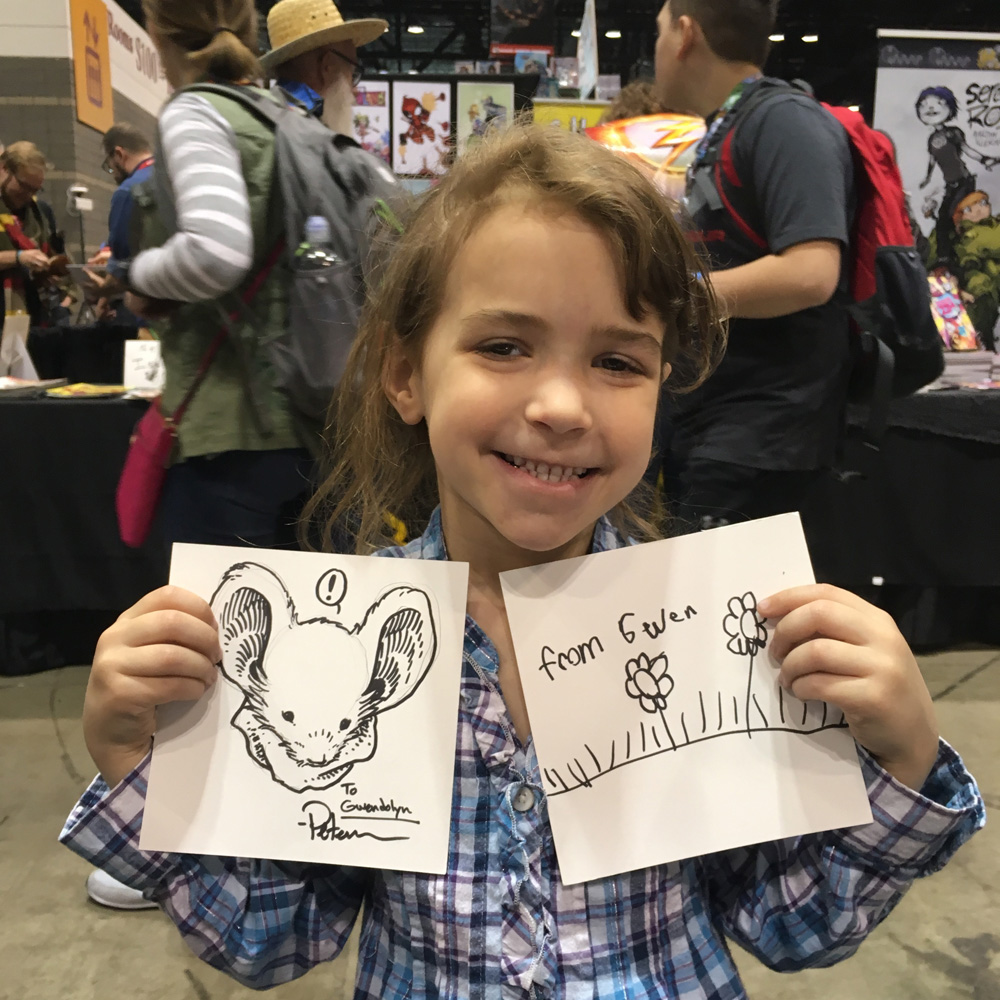 Gwendolyn (her flowers on the right)
 Chris Lopez's tattoo
 Ines Korth
 Jessica Shibley
 Melisa Mi Qin Ong
 Natalie Becker
 Natalie Becker
 Raevin
 Ramel Hill
 Shoze
Shoze Saxon, Lieam, & Kenzie as humans by skoolar
 Steven Maye
 (???)
(???) Ciyuunhe
 Shandria
 Trey Patterson
 Ewa "truskawka" Onisk
 'Putrid Cheese'
 Chris Richard
2017 Appearances: Baltimore Comic Con: Sept. 22-24New York Comic Con: Oct. 5-8
August 8, 2017
Mouse Guard Alphabet Book
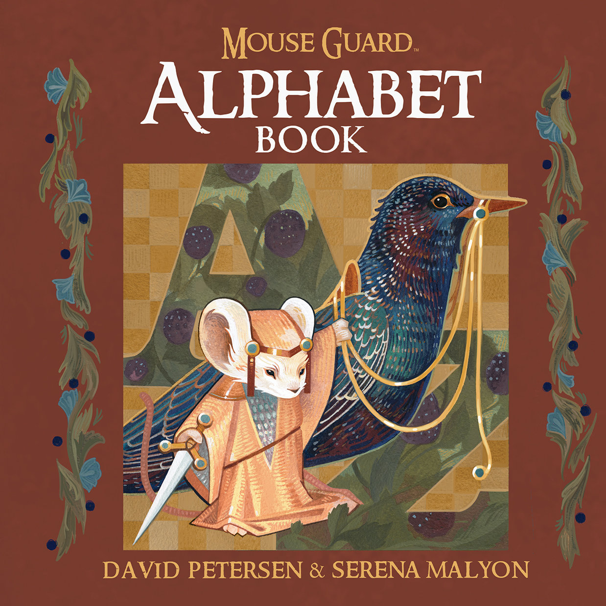 The Mouse Guard Alphabet Book will be released in September. This is the last week to have your local comic shop pre-order it for you (Diamond Code: MAY171234)
This 64 page book is the ABCs, through the lens of the world of Mouse Guard, featuring alphabetic poems by me and gorgeously illustrated paintings by Serena Malyon.
For this blogpost I run through the choice for Serena to illustrate the book, and several of the letters' illustrations & poems:
 My wife Julia is the person responsible for getting this project's ball rolling. But something she and I both realized was that I had too much on my plate with conventions and working on the next Mouse Guard book: The Weasel War of 1149, that I couldn't be the one to illustrate the ABC book.
Serena was the perfect choice. I'd discovered her work from Mike Mignola who saw her at an Illustration Master Class session. With this being the first full Mouse Guard book with no art of mine, I made this decision to hire Serena carefully.
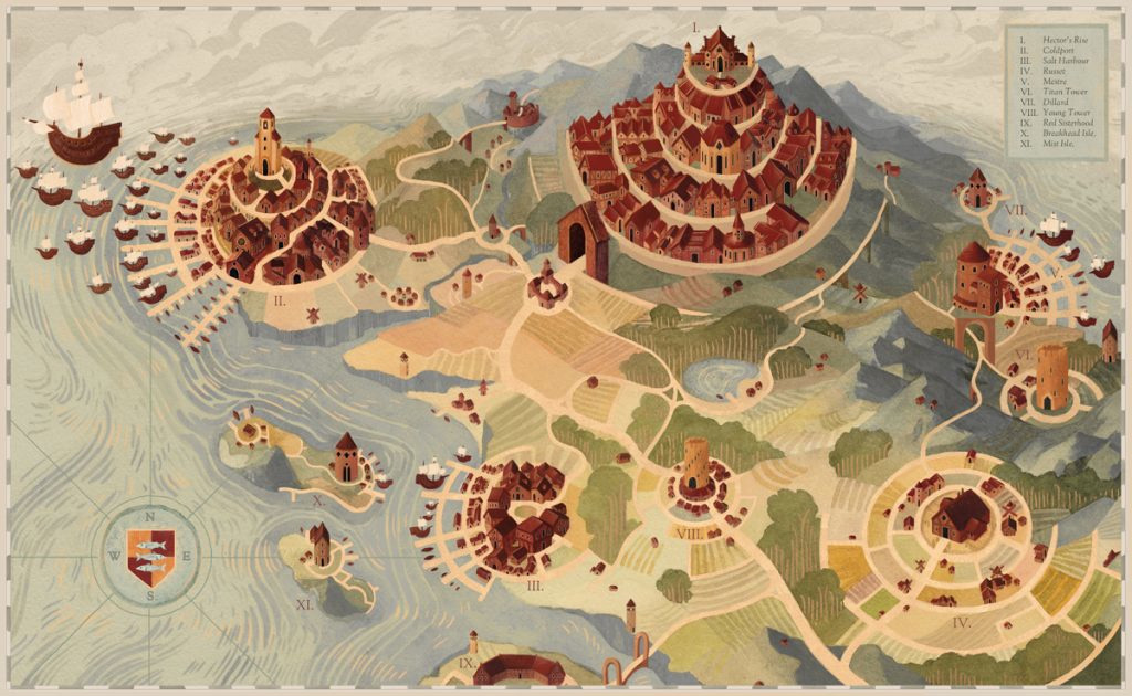 Two pieces of Serena's especially spoke to me: a map & a triptych of witch sisters. I'd use these two examples as the basis for describing what the visual language of the Mouse Guard ABC book should be. We also looked at certain reference of my books for motifs, character & architecture designs, as well as color palates & themes.
 We talked over Skype about a few Alphabet themed books we wanted to model by Edmund Dulac & William Nicholson, but also stylization like what Serena was already doing in her work as well as being inspired by Mary Blair, Eyvind Earle, Arts & Crafts era printmaking & quilts.
We wanted this book to feel in-world, that this is the book that the mice in cities from Barkstone to Burl would use to teach their youngfurs their letters and important lessons.
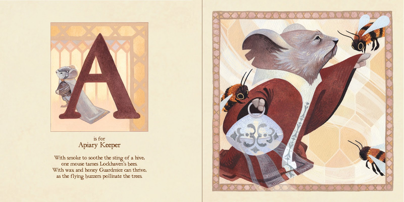
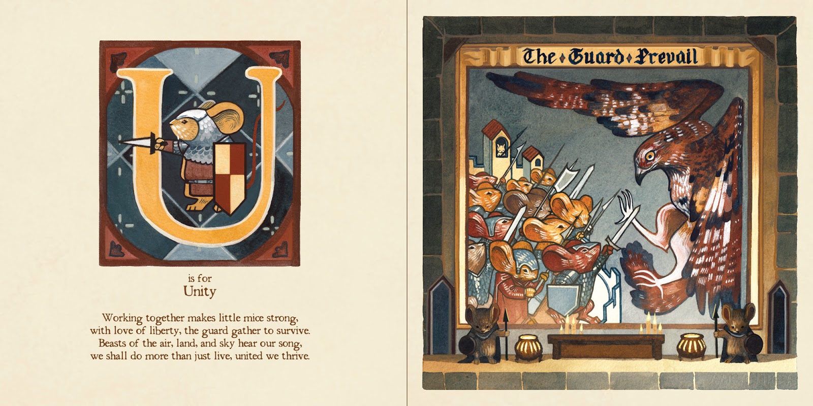
The letters in the Mouse Guard Alphabet Book represent characters and locations from Mouse Guard, but also animals, trades, and conceptual life-lessons. I wrote four-line-stanza poems for each letter's subject. Below are the pages for the letters A, M, N, & U:


The Mouse Guard Alphabet Book will be available in-stores in September. And can be PRE-ORDERED through your local comic or book store using the Diamond code: MAY171234

2017 Appearances: Baltimore Comic Con: Sept. 22-24New York Comic Con: Oct. 5-8
August 1, 2017
Cats Trio Revisit Cover
 Jesse Glenn (real-life Kenzie) and I have started a video podcast called 'THE PLOTMASTERS PROJECT" Where he and I revisit our oldest characters and stories and then each create a new piece as an exercise. For our first episode we looked back to the first project we ever worked on together: CATS TRIO! I've blogged about Cats Trio in the past, but to quickly summarize, it was a TMNT homage where three mutated/anthropomorphic cats befriend a similar raccoon as the group discover their shared origins, survive in abandoned places away rom human eyes, and avoid being hunted by another of their kind. To the left you can see my new finished piece for The Plotmasters Project, but below I show the process from sketch & concept to finished colors.
I also want to state, that Jesse and I have no current plans to develop Cats Trio (or any of the subjects for our series) beyond these exercises.
 The first order of business in creating this piece was to review the archive of Cats Trio stuff Jesse and I have as well as look at some of my most recent attempts to draw the Cats characters. Back in 2011 (20 years after Jesse and I first drew them) I started this piece. I was looking for something that spoke to their transient lifestyle. So they are out of doors, in the field near their abandoned farmhouse, cooking, drinking, and relaxing. But I never really took this piece further than this rough stage.
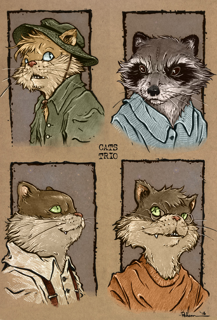 Much more recently, in 2016 (25 years after Jesse and I first drew the Cats) I did these pieces on toned paper at a sketch session with some other artists including Jesse. I inked them and added white like i would a typical toned paper commission, and then colored them digitally using the same technique for my Gotham Academy story. I felt really good about these headshots. They felt like the old friends, but not outdated or stuck-in-time artistically. These headshots and the unfinished outdoor rough above formed the foundation for my new piece.
 My plan was to do a mock cover. It would feature all four of the main characters, have the transient outdoor vibe, and the feel of the headshots. I started sketching new poses for each character. As I drew I kept wanting to add details of gear they'd each own that not only help tell the story of what they do on a daily basis, but individually give them personality (flasks, canteens, binoculars, kitchen knife, kerosene blowtorch, wieners on a skewer, a beat-up roadsign, etc.). The only problem I had, was that I didn't like any of the new heads I drew better than my toned paper pieces...
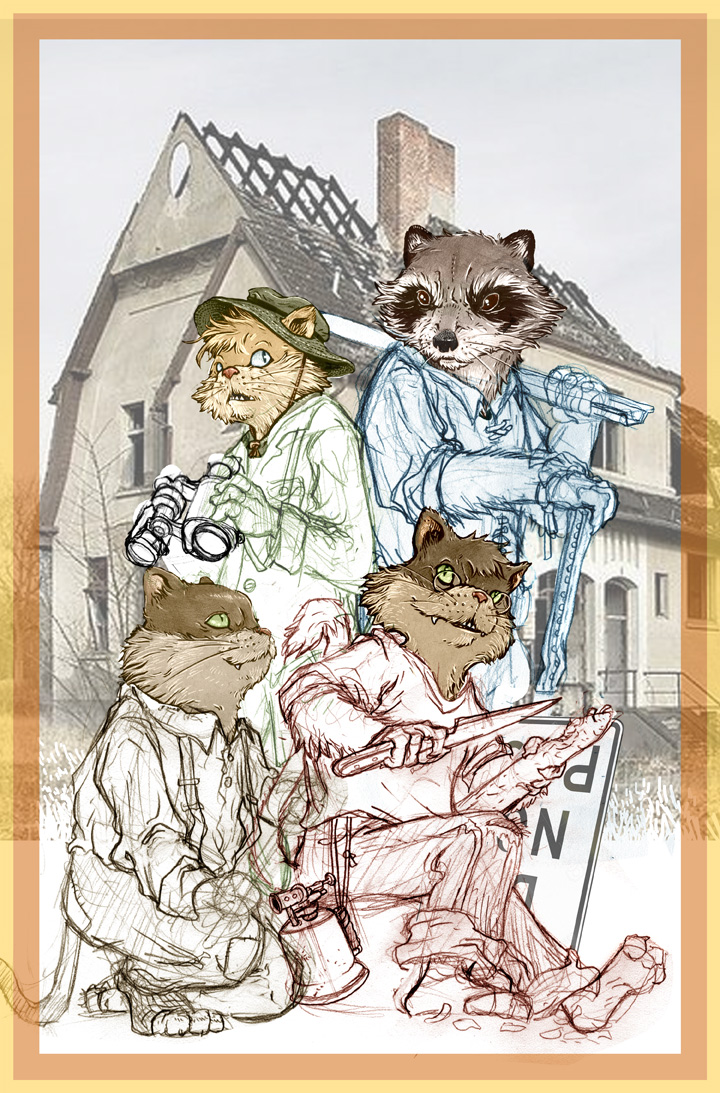 ...So, as I composited the figures together into a photoshop cover template, I also plopped in the headshots in place of new sketched heads. I also wanted to show their house, for what may be, the first time it's ever really been seen. It's an abandoned derelict farmhouse far away from prying eyes. Jess and I always had them using the basement as shelter, so when searching for reference (which I didn't redraw, but just dropped into the rough) I liked the photo of a farmhouse where part of the roof is missing and all of the windows are broken and missing. As per usual, I tinted each character's sketch to help me understand what lines belong to which character.
Below are some in-process shots as I inked and tightened up pencils (I inked this with the above rough taped to the back of my bristol board on a lightpad, but had the light off when snapping these shots.
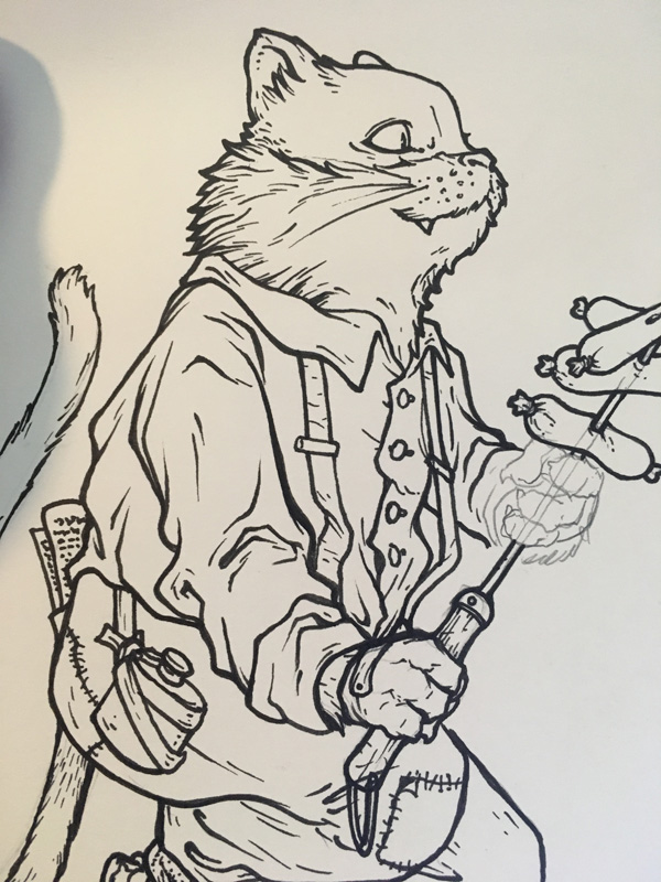

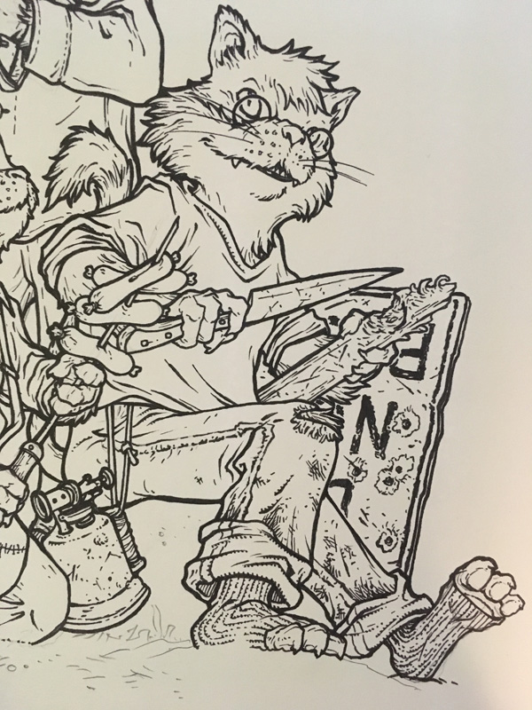
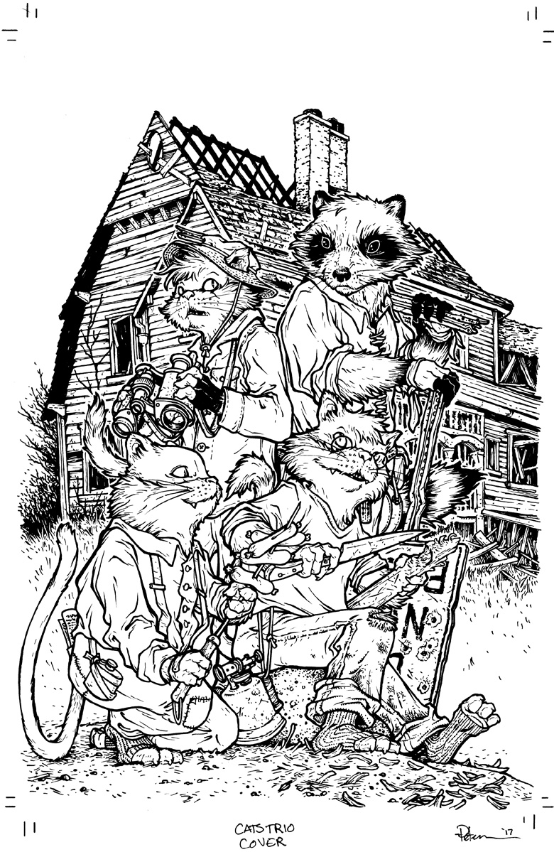 As I said above, I inked this on a Huion lightpad with the rough printout taped to the back of a sheet of Strathmore 300 series Bristol board. I used Copic Multiliners (the 0.7 and 0.3 nibs...tough I did also resort to a 0.2 in a few tricky spots). I tried to keep the contours more important than the textures, but for their fur and some of the bits of their clothing and inventory, I had to add some dings, scratches, wear, and dents. When inking the house, I made sure I didn't ink those lines directly up to the characters. This helped me isolate that linework in the next coloring step, but also allowed a bit of breathing room around them and gave them some depth-of-field distance from the background.
 After the inks were finished, I scanned them into Photoshop and started the coloring process by isolating the inked linework of the background and doing a brown color hold on it, and then laying in flat colors. This process of adding the color is called 'flatting' and is like the professional act of "coloring within the lines". It establishes that the various parts of an image are different colors from one another. This allows me, as I render the image, to quickly isolate each section to either shade and highlight it independently of the other parts or shift and adjust the hue & contrast.
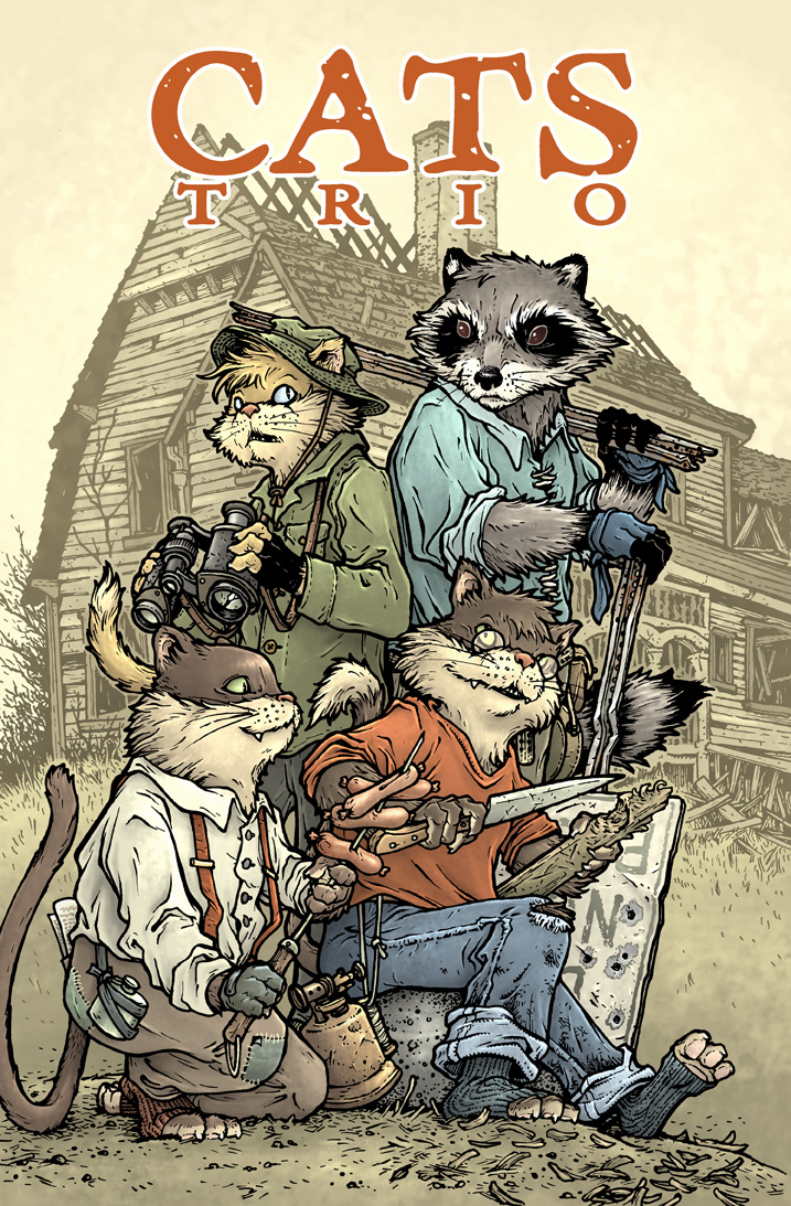 Again here is the finished 'cover' with a "Cats Trio" typeface logo treatment. For the Plotmasters Project, I do not always intend doing something as big and as involved as this piece. But Cats is very special to me. These characters feel like old friends. They occupy a special place in my heart that idealizes a great time in my life. So I wanted to give them the respect and level of quality they've deserved from me for years.
You can watch the CATS TRIO episode of The Plotmasters Project on YouTube:
And follow us on Facebook & Twitter
2017 Appearances: Baltimore Comic Con: Sept. 22-24New York Comic Con: Oct. 5-8
July 25, 2017
Mouse Guard Model Video: The Red Snapper
 For the second issue/chapter of The Black Axe, I built a model of Conrad's ship: The Red Snapper. With the fan excitement over the video of Adam Savage talking to me about my models on Tested.com I wanted to do some videos where I talk about a specific model, how I built it, what the materials were, and why I built it in the first place.
Below you can watch as I explain how having the model helped frame scenes and block where the mice should stand in them:
For another Blogpost about the model of the Red Snapper: http://davidpetersen.blogspot.com/2011/05/reference-model-conrads-ship-because-of.html
2017 Appearances: Baltimore Comic Con: Sept. 22-24New York Comic Con: Oct. 5-8
July 18, 2017
Animal Farm
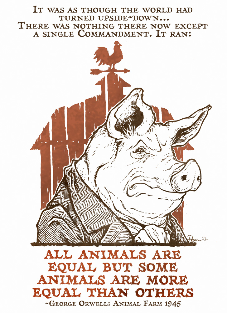
 Back in January, I drew a propaganda-esque image of Napoleon from George Orwell's Animal Farm using a quote from the book: "It was as though the world had turned upside-down...There was nothing there now except a single Commandment. It ran: ALL ANIMALS ARE EQUAL BUT SOME ARE MORE EQUAL THAN OTHERS." I know Animal Farm is an allegory about Communism, but I think the sentiments about corrupt leaders, rule manipulation, forced inequality, and hypocrisy can be used as a warning for many-a-circumstance
At a time when I was hearing from some fans on social media that they didn't think I should talk politics but post art instead, I decided to illustrate a powerful quote from a 70+ year-old book that would speak louder than my own type. The social media posts were shared, liked, & retweeted. The original art (left) was offered up for sale with 100% of the proceeds going to the ACLU.
I have made the poster available in 2 FREE variations: Classroom & Protest with links to the High-Res 11"x17" .PDFs for you to download, print,
and use for your classroom, library, home, office, or march.
Classroom Poster
High res Poster file:Animal Farm 11x17 classroomposter.pdf
Protest Poster
High res Poster file:Animal Farm Protest.pdf
2017 Appearances: San Diego Comic Con: July 19-23Baltimore Comic Con: Sept. 22-24New York Comic Con: Oct. 5-8
July 11, 2017
Lieam 5x7 Print Process
 I've been trying to offer up more 5" x 7" matted prints at conventions and in my online store. The most requested character for one of these prints in 2016 was Lieam. The redfurred mouse never was supposed to be as important to the Mouse Guard story as he ended up being, but after his heroic moment in issue #1, his role only became more important with each appearance. In today's blogpost I'll share the process for creating the image for this print.
Layout:
 I merged together several rough sketches (one of Lieam, one of his sword, another of the stairs and then a fourth of the ivy) in Photoshop to create this rough. This way, I could reposition and alter each component (resizing, rotating, etc.) and add some tinted color to help me see the difference in what was ivy vs stone wall or Lieam himself.
 Inks:
Inks: I printed out the above layout and taped it to the back of a sheet of Strathmore 300 series bristol. On a light pad (I really like the Huion brand of these) I can see through the surface of the Bristol and ink using the printout as my 'pencils' to guide me. I used Copic Multiliners (the 0.7 & 0.3 nibs). I broadcast LIVE as I inked this piece over on Facebook and you can watch the video here: https://www.facebook.com/david.petersen.777/videos/10155779637514778/
Color Flats & Final Colors:
 After scanning in the inked piece (and adjusting the levels and cleaning up any dirt, dust, etc from the scan) the first step to coloring is Flatting in colors. This means, like any good coloring book user, you color spaces inside the lines. But when flatting, you don't need to worry at all about shading, lighting effects, or even if you are going to use the real colors.
After the areas of color are isolated by flat colors, I went in an rendered each part using the Dodge & Burn tools in Photoshop. I have my settings on Range: Highlights and 1% exposure most of the time and I use a textured brush.
I also broadcast as I flatted and colored this piece: https://www.facebook.com/david.petersen.777/videos/10155799623789778/
The final 5" x 7" matted print will be available at my 2017 convention appearances and in my online store.
More of the 5x7" Mouse Guard character print process Blogposts:
Saxon Print: http://davidpetersen.blogspot.com/2015/04/5x7-saxon-print-process.html
Sadie Print: http://davidpetersen.blogspot.com/2016/04/sadie-5x7-print.html
Gwendolyn Print: http://davidpetersen.blogspot.com/2016/05/gwendolyn-print.html
Kenzie Print: http://davidpetersen.blogspot.com/2017/02/kenzie-5-x-7-print-process.html
Rand Print: http://davidpetersen.blogspot.com/2017/05/rand-5x7-print-process.html
2017 Appearances: Heroes Con: Jun. 16-18San Diego Comic Con: July 19-23Baltimore Comic Con: Sept. 22-24New York Comic Con: Oct. 5-8
July 4, 2017
Haven Guild Founders process
 This piece of the four founders of the Haven Guild (see Mouse Guard: The Black Axe) will appear in my 2017 sketchbook. I'd depicted representations of these characters in various Mouse Guard volumes as embroidery and wooden statuary shrines, but never the real-mouse versions. So, in an attempt to deepen the lore of the world of Mouse Guard, I created this piece both for reference as well as fodder for my sketchbook (to be available at SDCC and in my online store thereafter). For today's blogpost, I walk through the steps (including a video stream) of creating this piece.
 SKETCH:
In The Black Axe volume, I'd introduced the clandestine order called the "Haven Guild", an architectural discipline group who held the secrets of creating the grandest of mouse architecture (including all the ins and outs of secret passageways for the Black Axe) as well as the most important developments for each of their trades. On copy paper, I drew out the four mice, roughly in the same posture as their wooden counterparts in Black Axe. There are two other mice who play a role in the history of the Haven Guild, one is a rejected founder, the other a later addition...but for the purposes of the lore of the Haven Guild, there are only 4 founders.
 LAYOUT:
I'd always thought of these guys as my mousey versions of the Hogwarts founders, but perhaps without the drama of Salazar Slytherin exiting the group. While wanting to show real-mouse depictions of the characters, I wanted the framing of them to still show some reverence, some clout, and prestige. I found a border pattern in an online search and then squashed, stretched, chopped, condensed, and tweaked it until it became a nice frame for each Haven Guild member. I dropped in scans of the mouse sketches (tinted for clarity) as well as each's symbol from the Black Axe Hardcover extras, and a checkerboard background and some typography for their names.
INKS:
 I printed out the photoshop composited layout seen above onto copy paper. I then taped that printout to the back of a sheet of Strathmore 300 series bristol. On my Huion lightpad I can see through the bristol down to the printout and ink the piece without having to transfer it or erase any pencil lines. To ink I use Copic Multiliners (the SP aluminum bodied refillable versions) with the 0.7 & 0.3 nibs.
I streamed this part of the process on Facebook LIVE as I worked on it back in March. You can watch that video below, as I ink and take questions from the viewers:
 FLATS:
After the inks were finished and scanned, I started the coloring process. In photoshop, I set the scan of the inks as my topmost layer and set it to 'multiply' mode (which means that everything white is treated as transparent and anything black is opaque. On layers below the inks layer I then start drawing in flat colors for all the various parts. The important thing here isn't so much the color choices as it is about just coloring everything a different color and staying within the lines. I did have a rough palate I knew to use based on color notes I'd already given the characters in the Black Axe Hardcover extras (and pulling in a little Hogwarts as well)
 COLORS:Here again are the final colors. Using the Dodge and Burn tools in Photoshop with a stock textured brush, I rendered all the fur, clothing, checkers, borders, tools, and flesh of the Haven Guild.
I also added some color-holds, a term which basically amounts to painting over the inkwork so those lines become a painted color rather than flat back. This allows me to temper the checker pattern grid, the type, and the symbols.
2017 Appearances: San Diego Comic Con: July 19-23Baltimore Comic Con: Sept. 22-24New York Comic Con: Oct. 5-8
David Petersen's Blog

- David Petersen's profile
- 339 followers
David Petersen isn't a Goodreads Author
(yet),
but they
do have a blog,
so here are some recent posts imported from
their feed.

