
David Petersen's Blog, page 39
June 12, 2018
Heroes Con 2018 Auction Piece
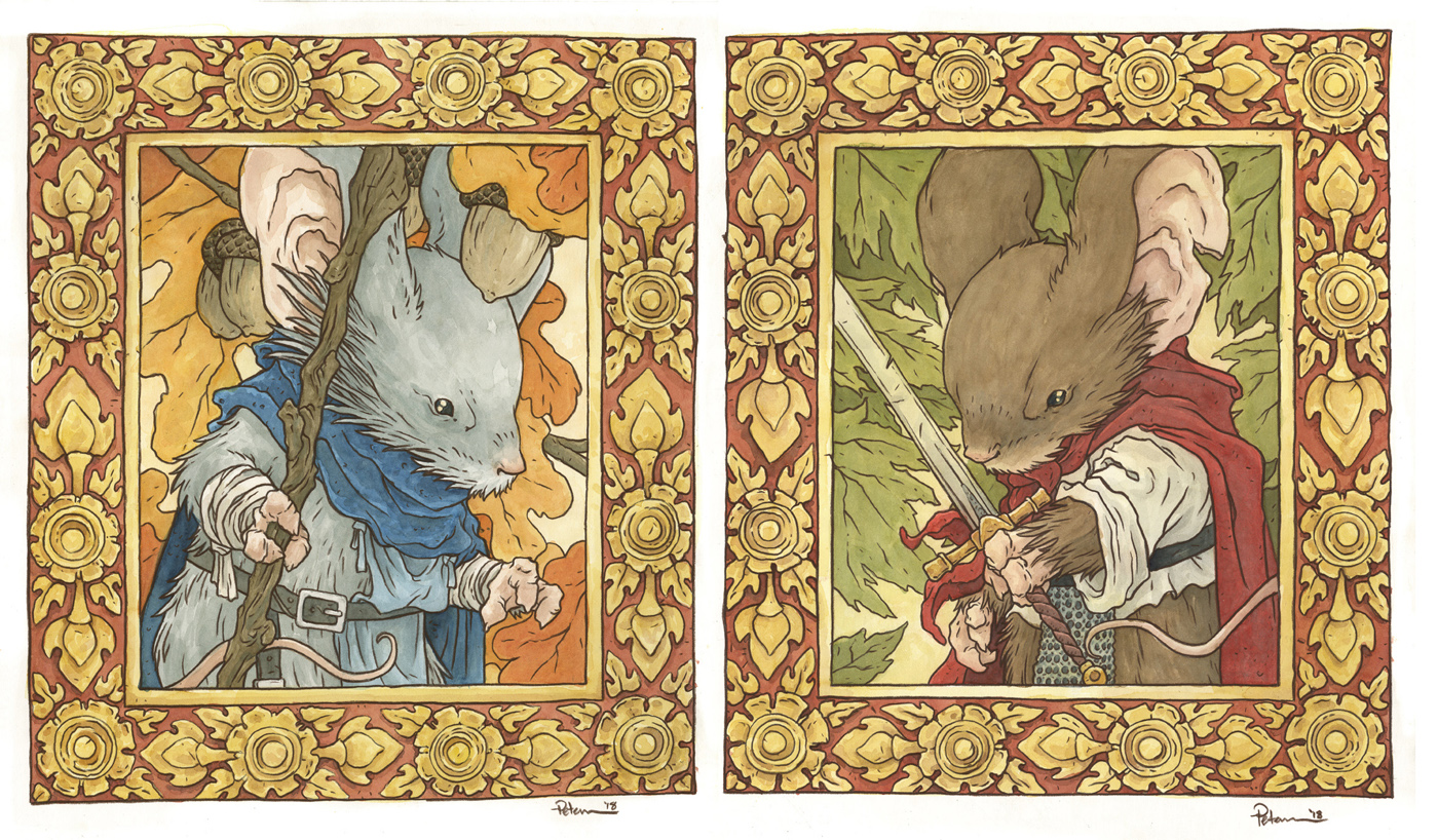
Heroes Con is this weekend in Charlotte, NC. Each year they do a huge original art auction, which is definitely a highlight of the convention. Many of the pieces in the auction are created live at the convention during the day Friday and Saturday on the Live Art Stage...but in past years, I've found it to be too much time away from the table, too much pressure, and not up to my own standard if I attempt to do a piece there. So, I do my piece ahead of time, and bring it with me. To the left you can see the final results, and below the process to get there...and how they will be available...
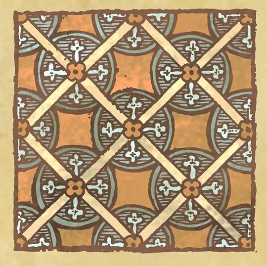
 Instead of doing one large piece (20" x 32") I decided to cut my surface and do two smaller 16" x 20" pieces. The reason for this is that unlike past years, I did not have someone close to me driving to Heroes to transport something so large as my past pieces...the two smaller pieces fit inside my luggage I'll be flying with to the convention. I started by laying out a digital composite of two sketches (one of Saxon and one of Kenzie...both traditionally drawn on paper and scanned) inside a frame border that I interpreted from a carved wooden frame I found doing some reference searching for medieval borders.
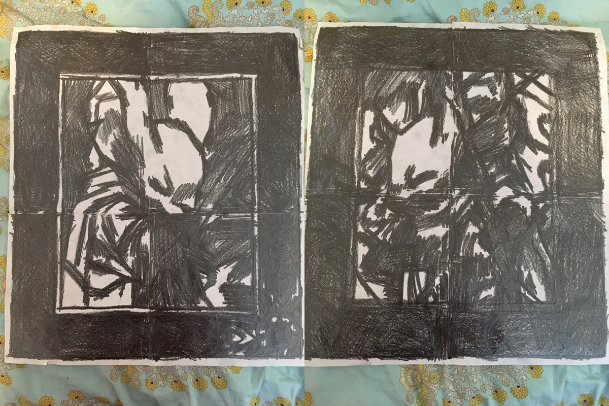 Once I had the digital composites the way I wanted them, I printed them out to scale. This meant each piece was made up of 4 sheets of printer paper, aligned (hence the grid on the above image) and taped together. On the back side of the taped together printouts, I rubbed graphite all over them...or at least wherever there were lines I needed transferred onto the mat board.
 I taped the printouts, graphite side down, to the mat board, and then traced over all my linework with a ball point pen. Wherever I applied pressure with the pen, the graphite transferred onto the surface of the mat board. When both pieces were successfully transferred, it was time to get set up for painting. Some of my fans got to watch the following steps as I broadcast on Twitch (sorry, I didn't record them). For watercolors I used mostly Windsor Newtons and mostly colors that were already dried onto the plastic palate: Cadmium red, Yellow Ochre, Cadmium Yellow, Burnt Sienna...I'm forgetting the other colors...I know I used a bit of Payne's Gray too...
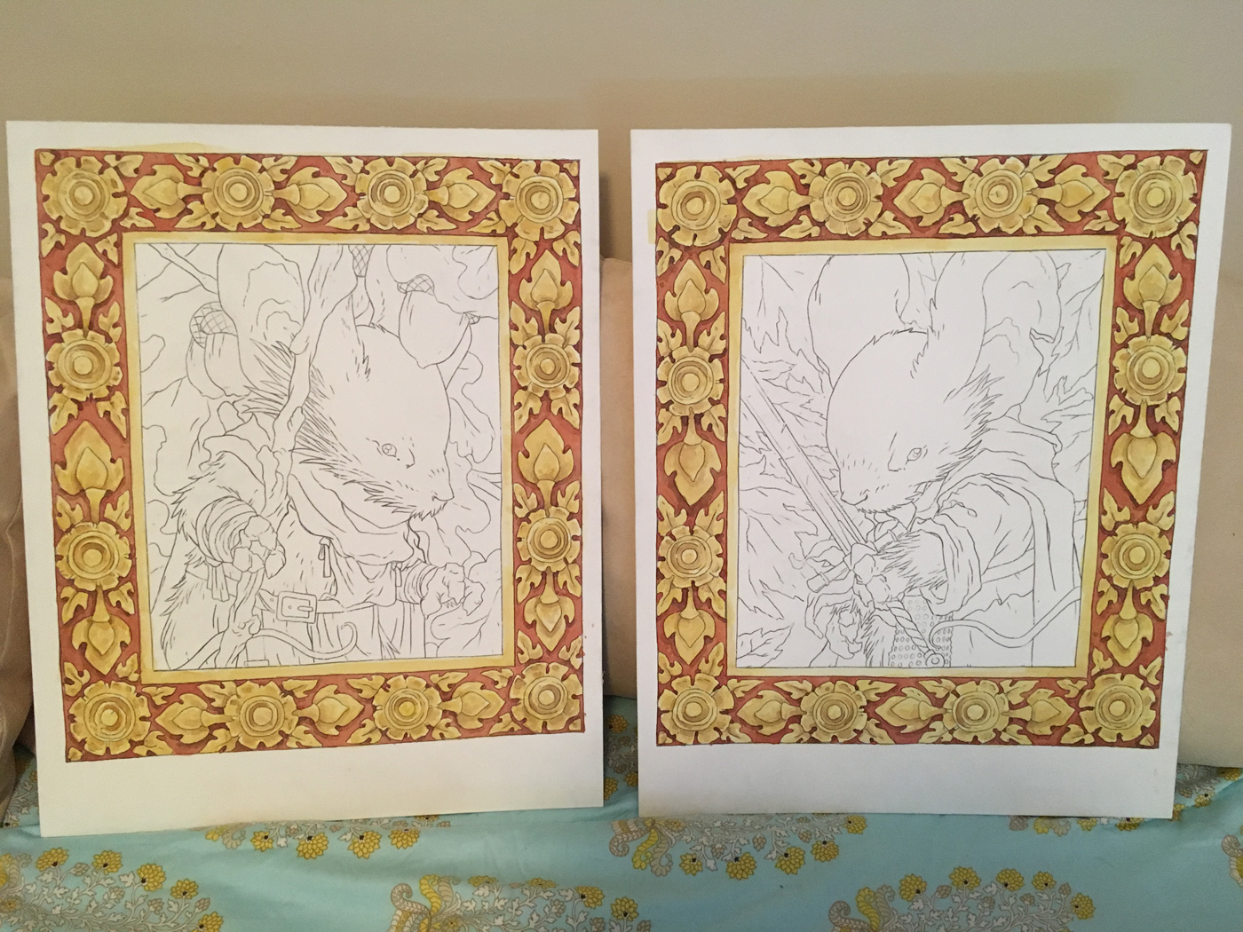 Over one long night I built up layers of yellows and golds and then reds and crimsons to get the border done. Fans on Twitch asked me why I started with the border, and I didn't have a great answer. Some of the reason was to get the big area wash of yellow/golds down as a light color (in watercolor you tend to work light to dark) but I think some of it was also to get the fiddly bit done so that the end of the painting was looser and more organic. At the completion of the borders of both pieces, I set them aside and went to bed.
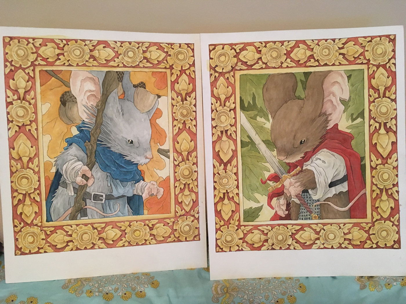 Two days later when I was able to get back to the paintings and broadcast, I dug into painting the middle areas. I worked mostly from light to dark, building up the larger areas and then focusing down to smaller elements (Kenzie's staff, Saxon's sword) as I got closer and closer to being finished.
The last step (seen below) was to 'ink' the piece with a dark brown color pencil. I find that my paintings need a bit of linework and that inking with black ink tends to be a bit too high-contrast and heavyy handed, and the color pencil gives some structure without overbearing the piece with line.
One of these pieces will be up for auction at the convention Saturday.
The other will be privately for sale at my table on Sunday.


I have also scanned them so that I can possibly reprint them in a sketchbook or art book at some point.
2018 Appearances:
Heroes Con: June 15-17
San Diego Comic Con: July 18-22
Baltimore Comic Con: Sept. 28-30
New York Comic Con: Oct. 4-7


June 5, 2018
Creator Commentary: Fall 1152 Issue/Chapter 5
I've made a Creator Commentary video for the fifth issue/chapter of Mouse Guard Fall 1152: Midnight's Dawn. For this issue and the remaining issues in Fall 1152, I’ll be doing the commentary as audio-only. But please feel free to follow along in your copy of the story in either issue form of from the hardcover as I talk about the behind the scenes details, art notes, and my head-space as I go page by page and panel by panel. Enjoy!
Direct YouTube Link:https://youtu.be/JfLkKrIHnWw
2018 Appearances:
Heroes Con: June 15-17
San Diego Comic Con: July 18-22
Baltimore Comic Con: Sept. 28-30
New York Comic Con: Oct. 4-7
Direct YouTube Link:https://youtu.be/JfLkKrIHnWw
2018 Appearances:
Heroes Con: June 15-17
San Diego Comic Con: July 18-22
Baltimore Comic Con: Sept. 28-30
New York Comic Con: Oct. 4-7
May 29, 2018
Blogpost Re-Run: Critiques & Portfolio Reviews
Below is a blogpost I did four years ago about reviewing people's work and giving them portfolio reviews. Seemed relevant to repost it (though I did some editing on the early paragraphs):
 I'm asked to review people's work at conventions and as we head into the 2018 convention season, I'd like to share my thoughts on portfolio reviews, what I do, and what I'm thinking about when giving them.
Receiving a critique is hard. Bravo to the folks that are brave enough to put their work together, walk up to someone in the industry, and show them work opened up for comment. It's a vulnerable place to be. Hopefully, it's also an opportunity to get fresh eyes and ideas on the work with the hopes of improving it.
Giving a critique is hard too. When I first started attending conventions and people plopped down heir work for me to look at, I had to prepare a way to approach giving critiques that would be helpful. I'd had my share of critiques of my work when I was an art student at Mott Community College and Eastern Michigan University...some were very positive, some were negative...but the ones that helped me most, were a mix of both: honest, but fair.
 When I start with someone's portfolio, I first flip through most of the pages without giving very little feedback. I found after a few of these, that it's best to explain that to the artist first so that my silence isn't misconstrued. I want a chance to get a whole lay of the land, an impression of the work without explanation. As I'm doing this, I'm identifying what I see as the strongest piece and the weakest piece. By doing this, I can now talk to the artist in relative terms about their work. I can show how the other pieces could benefit from whatever techniques or composition, or methodologies they used in the strongest piece. How could the things that they are doing right and well be applied to any piece of theirs with faults. I could hold them to some idealistic standard, but I think that is both too abstract and vague, and also discouraging. I want to show them what they can fix right now, and they they are already capable of it.
 I developed this approach because of my experiences in later college. I was frustrated with professors at the 30 & 400 level classes wanting to 'break you' and remold you in their image (or their idea of art) instead of trying to help you make what you are already doing better...even lightyears better...but within the framework of the work you are already doing. Now, when an art student is beginning, there are a LOT of bad habits that need to be taught out of you, where you need to be reformed, taught a visual foundation, not allowed to explore 'style', and shown how to see. But by the time a student is beyond those core skills, the tearing them down and building back up with whatever idea of art that professor has is pointless and unproductive.
 With every review I try to help them fix their own mistakes. Not to break them or tell them they need to draw like artist X or shake off what makes them unique. I want to congratulate them on what is working and how to make what they already do better. We talk about contour line, line weight, inking techniques, creating greys, texture, style influences, subjects, and mood. I tailor the advice to the work in the portfolio. Sometimes my comments are about needing to focus on those basics, or perspective or anatomy...but other times, I'm digging way in and nit-picking details about storytelling or line weights. As the conversation is ending, I usually give the artist some exercises and a handful of artists to reference I think will lead them in the direction they want to go...and those assignments can vary from "draw basic shapes and build up forms from them" to "start making comics"
There is also something to be said for how to prepare a portfolio and how to receive a critique.
 A portfolio should contain a limited selection of your work showcasing the BEST you have to offer.
It should have a focus that gives the reviewer a sense of your voice as an artist. There is some merit in showing a wide range of all the varied styles, techniques, and mediums you can use, but ultimately, I find this can lead to too wide a variety of artistic voice that doesn't tell me who you are. It's ok to mix in some color and inks, and pencils, but a portfolio shouldn't be a Swiss-army knife of artistic deeds. Show the type of work you want to do: spot illustrations, or comic storytelling, or children's book illustrations, or environments, whatever the case is, this portfolio should show the kind of work you want to get hired for and are interested in doing. And all of this should be your best work to-date.
 The best way to receive a review is to listen. Too often I hear the artist who is asking for an opinion, jumping in to self-deprecate, make excuses, or add too much background information. A reviewer can't give you their thoughts and suggestions if you are talking. That's not to say I conduct my reviews being the only one who talks. I ask questions, ask about influences, find out why some pieces were handled certain ways, and try to engage the artist as much as possible. And then I listen to those answers to tailor my advice. It's totally fine if you disagree with what I or any other reviewer is saying (we may be very wrong about your work), but the only way you really find out if we have anything worth taking to heart is to listen.
 So with all of that in mind, I wish you the best of luck when developing and showing a portfolio. I hope the review leads to you growing and improving as an artist or to getting hired for the work you want to do.
2018 Appearances:
Heroes Con: June 15-17
San Diego Comic Con: July 18-22
Baltimore Comic Con: Sept. 28-30
New York Comic Con: Oct. 4-7
May 22, 2018
Mouse Guard Model Video: Feather Knighting Room
 Several years ago I made an 18" x 24" print called "Feather Knighting" with a mouse trading violence for wisdom. The background of the large print was to be a room full of references from past mouse guard stories, artifacts, story cues, and easter eggs. In this video below, I go over the reference model I made to help me get the geometrical perspective correct as I worked on the piece.
Direct link to watch on YouTube: https://youtu.be/RPCf0_igzMg
You can still purchase the Feather Knighting print here:
https://mouseguard.bigcartel.com/product/feather-knighting-18-x-24-offset-print
And read the full art process blogpost about the piece here:
http://davidpetersen.blogspot.com/2014/09/feather-knighting-print-art-process.html
2018 Appearances:
Heroes Con: June 15-17
San Diego Comic Con: July 18-22
Baltimore Comic Con: Sept. 28-30
New York Comic Con: Oct. 4-7
May 15, 2018
Mott Community College
 Back in February I returned to Mott Community College (where I started my degree) for a gallery exhibition of my work and to give a talk about my work & process. It was wonderful to share with the program that I started in and gave me so much. The presentation elaborated on my creative process & the influence 2-D design & Printmaking courses had on me there.
Below is a video that shows not only the gallery exhibit, but also my talk and Q&A:
Photos from the day:
 Presenting
 The Gallery
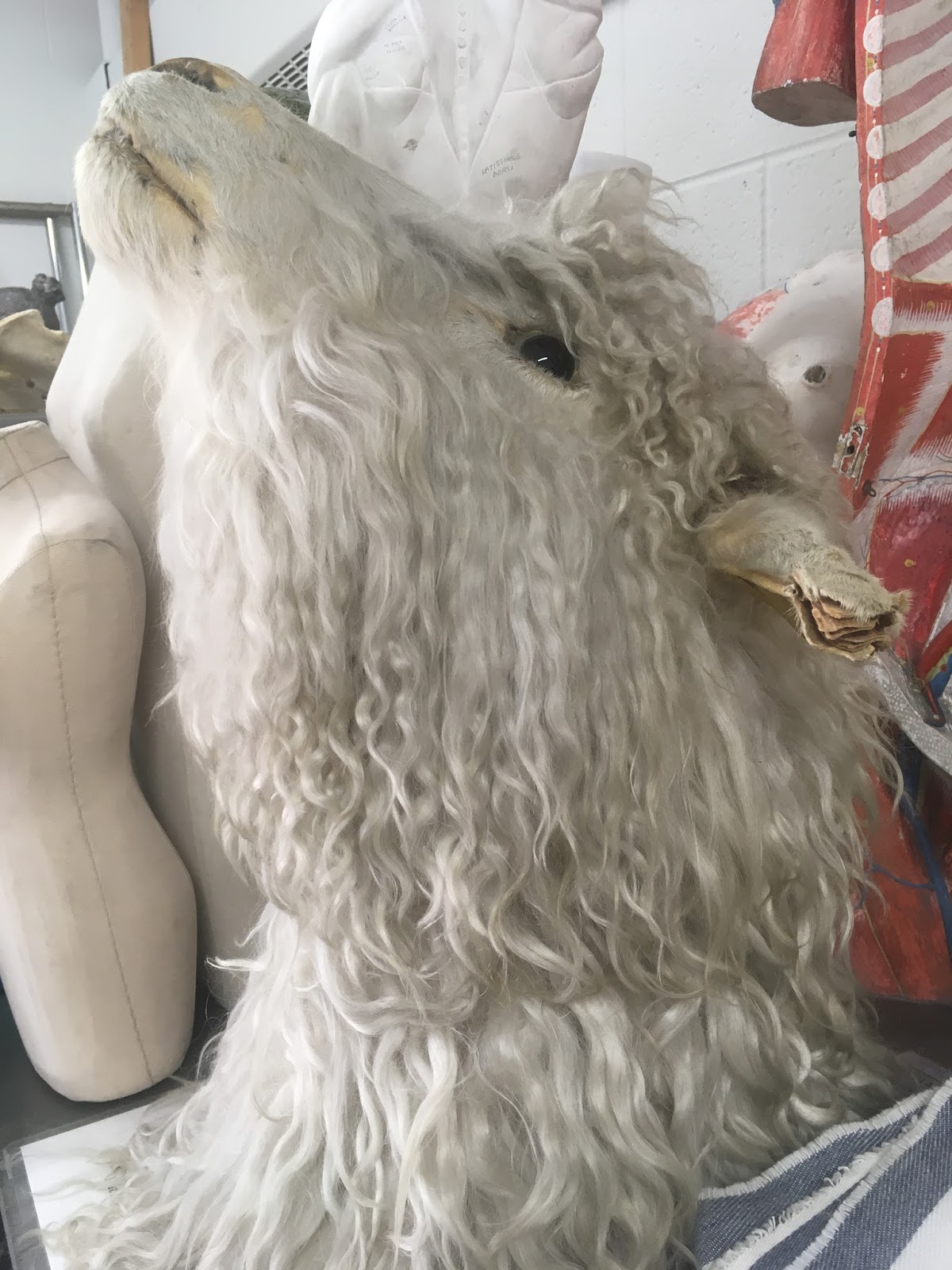 The sheep's head I drew 20 years ago was still in the drawing room's still life props closet
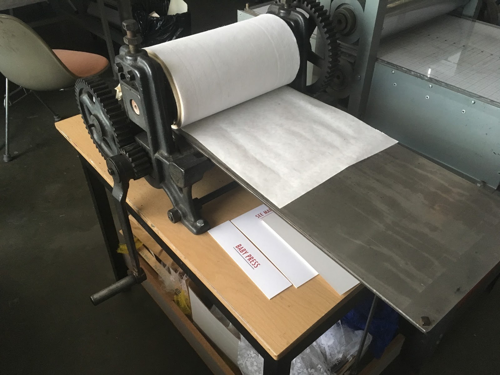 This is the first etching press I ever used. After 20 years apart, I greeted it like an old friend
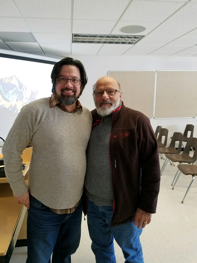 But the biggest highlight/emotional crescendo was Sam Morello, the professor who changed my life with his 2-D design class and introduced me to printmaking was front row for my presentation.
2018 Appearances:
Heroes Con: June 15-17
San Diego Comic Con: July 18-22
Baltimore Comic Con: Sept. 28-30
New York Comic Con: Oct. 4-7
May 8, 2018
Recommendations of Comics by Genre
On Free Comic Book Day this year I tweeted:
Is there someone in your life who doesn't read comics? Use today as a way to show them how many types of styles, genres, tones, & age ranges of material there are in this medium. Comics are stories. And who doesn't like stories?
This is an echo of a sentiment I used in my Keynote speech at last years Ringo Awards:
https://youtu.be/Zw75G5ykkM4. That there are already comics out there for every type of reader, no matter what type of story/tone/genre they already consume in other forms of media.
So, now that it's a few days after FCBD, you may be wondering what to put in front of your non-(or new)-comic reader's eyes to keep them interested. Below is a list of genres (and in the case of 'webcomics'--less about genre and more about methods to find & read the material) with suggestions for each mostly gleaned off of my own bookshelves. This is by no means some definitive list, but meant only to be personal examples I could use to illustrate how many types of books exist out there. Enjoy, I hope you find something for the newly initiated in your life as well as perhaps yourself.
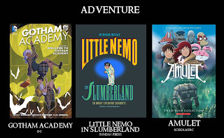 Gotham Academy, Little Nemo, Amulet
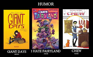 Giant Days, I Hate Fairyland, Chew
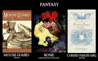 Mouse Guard, Bone, Cursed Pirate Girl
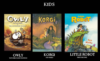 Owly, Korgi, Little Robot
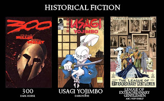 300, Usagi Yojimbo, Leauge of Extra Ordinary Gentlemen
 Through the Woods, Hellboy, Locke & Key
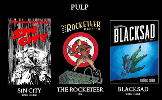 Sin City, The Rocketeer, Blacksad
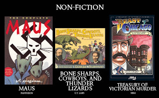 Maus, Bone Sharps, Cowboys, & Thunder Lizards,Treasury of Victorian Murder
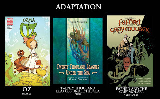 Oz, Tenty Thousand Leauges, Fafhrd & The Gray Mouser
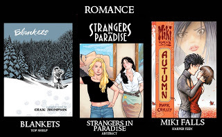 Blankets, Strangers in Paradise, Miki Falls
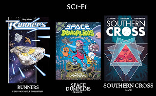 Runners, Space Dumplins, Southern Cross
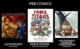 Lackadaisy, Table Titans, Abominable Charles Christopher*(All of these have content available for free, but also have collections printed as beautifully published books too)
2018 Appearances:
Heroes Con: June 15-17
San Diego Comic Con: July 18-22
Baltimore Comic Con: Sept. 28-30
New York Comic Con: Oct. 4-7
Is there someone in your life who doesn't read comics? Use today as a way to show them how many types of styles, genres, tones, & age ranges of material there are in this medium. Comics are stories. And who doesn't like stories?
This is an echo of a sentiment I used in my Keynote speech at last years Ringo Awards:
https://youtu.be/Zw75G5ykkM4. That there are already comics out there for every type of reader, no matter what type of story/tone/genre they already consume in other forms of media.
So, now that it's a few days after FCBD, you may be wondering what to put in front of your non-(or new)-comic reader's eyes to keep them interested. Below is a list of genres (and in the case of 'webcomics'--less about genre and more about methods to find & read the material) with suggestions for each mostly gleaned off of my own bookshelves. This is by no means some definitive list, but meant only to be personal examples I could use to illustrate how many types of books exist out there. Enjoy, I hope you find something for the newly initiated in your life as well as perhaps yourself.
 Gotham Academy, Little Nemo, Amulet
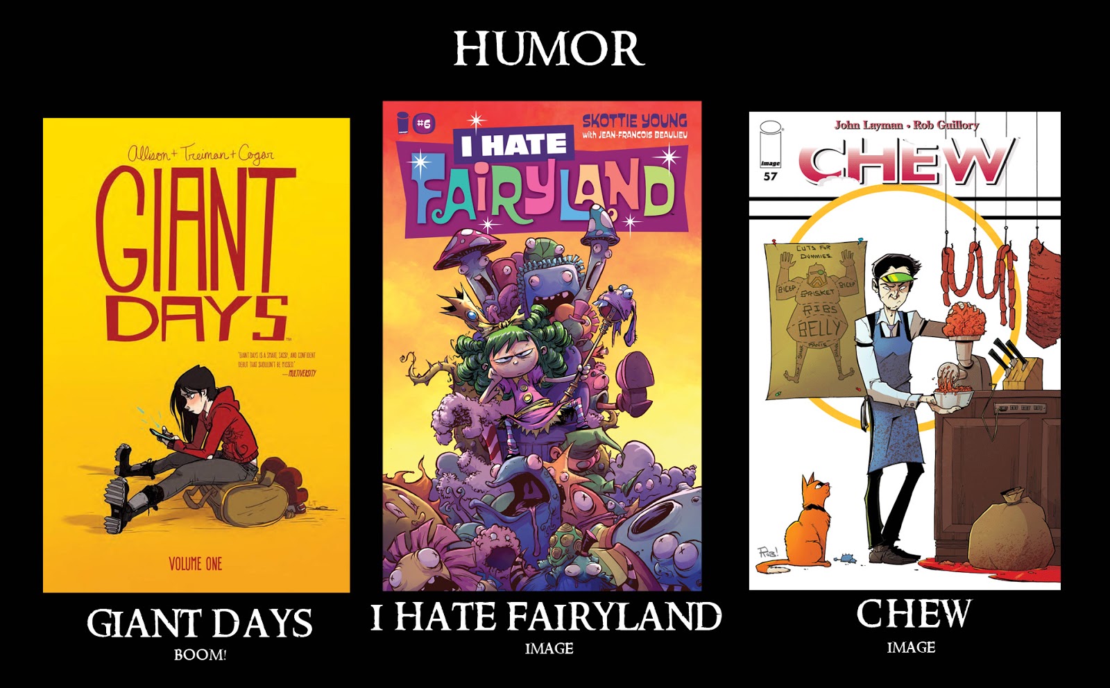 Giant Days, I Hate Fairyland, Chew
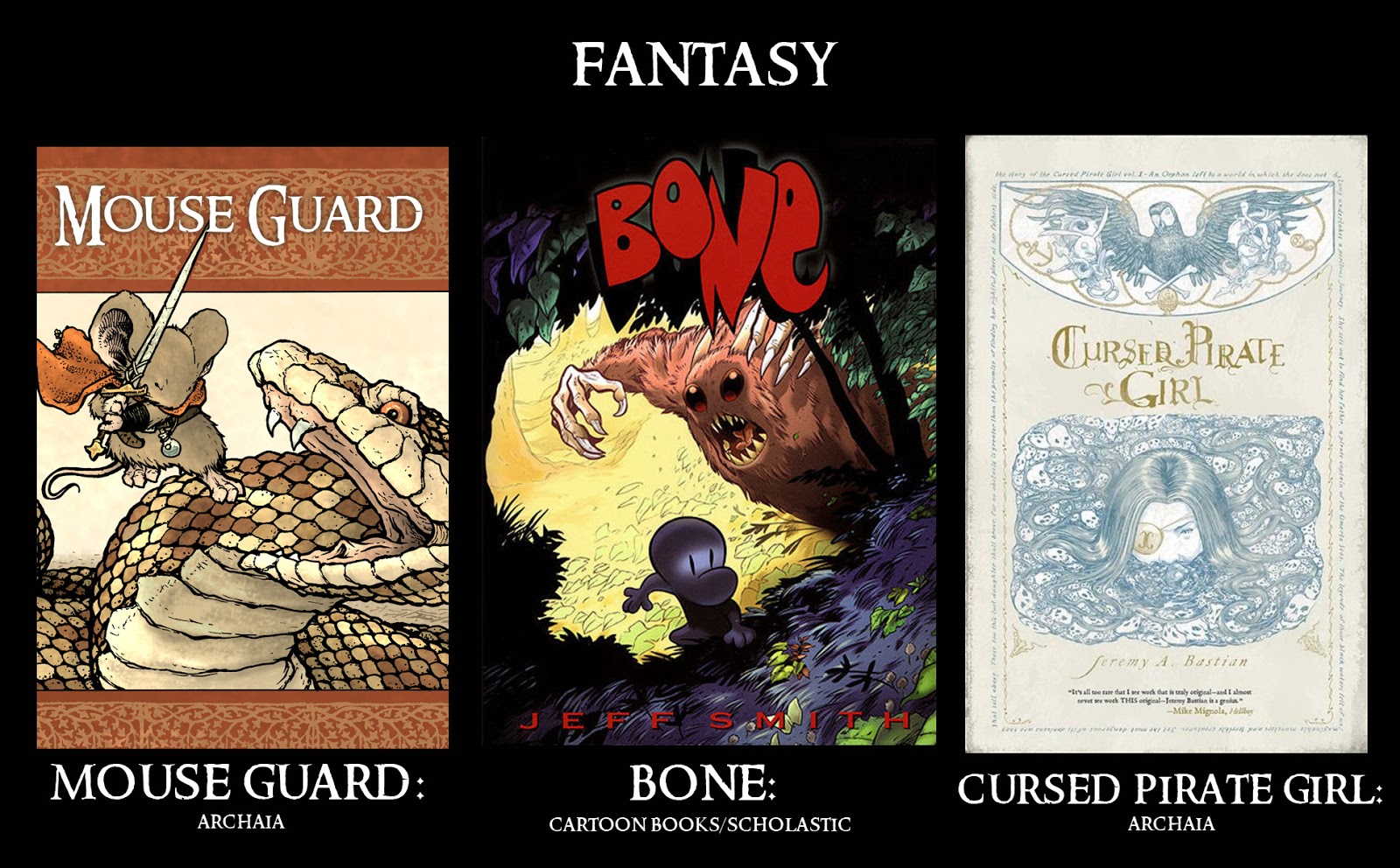 Mouse Guard, Bone, Cursed Pirate Girl
 Owly, Korgi, Little Robot
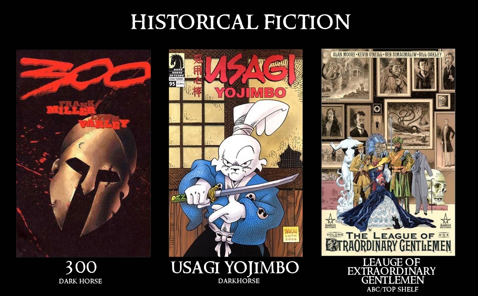 300, Usagi Yojimbo, Leauge of Extra Ordinary Gentlemen
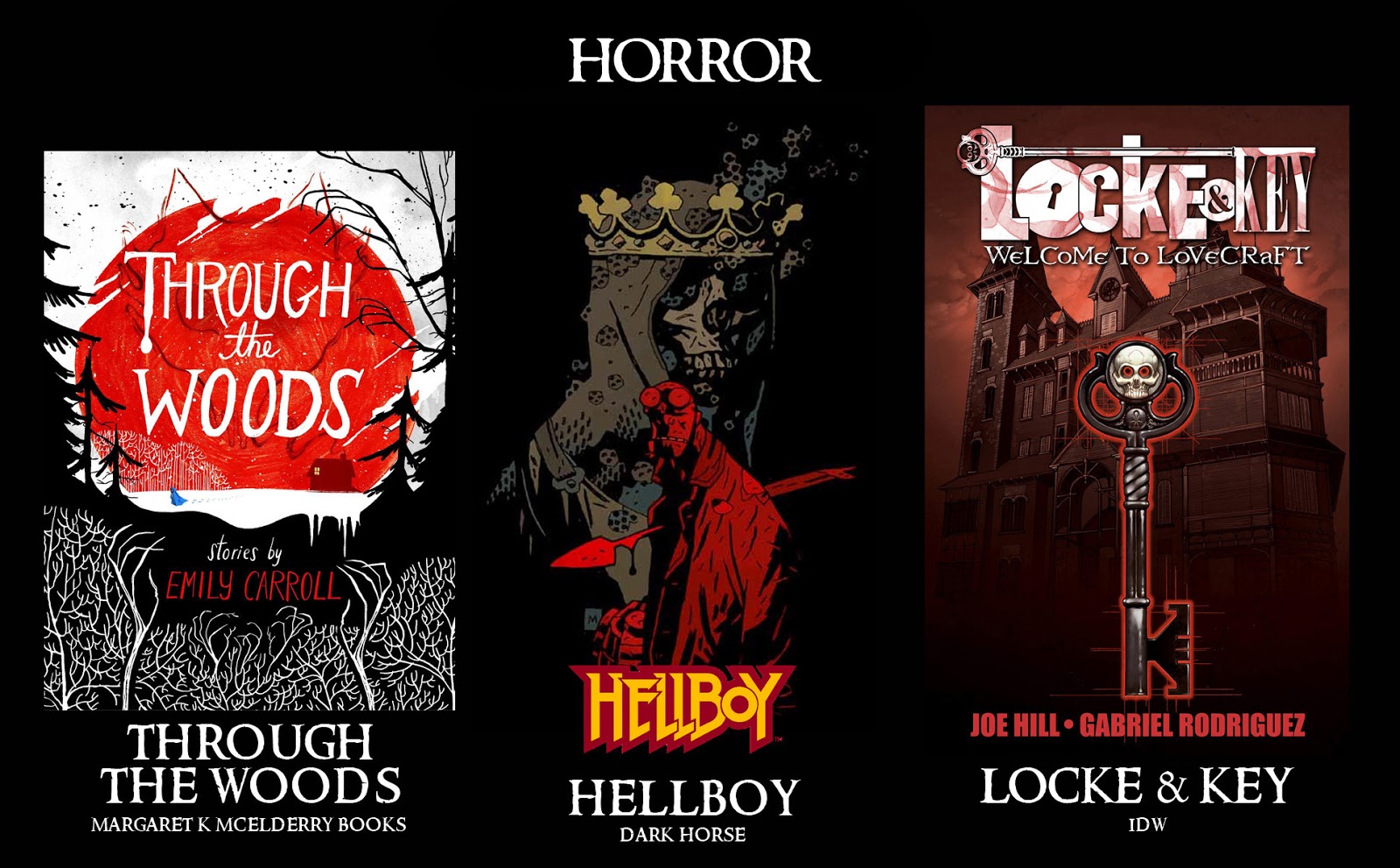 Through the Woods, Hellboy, Locke & Key
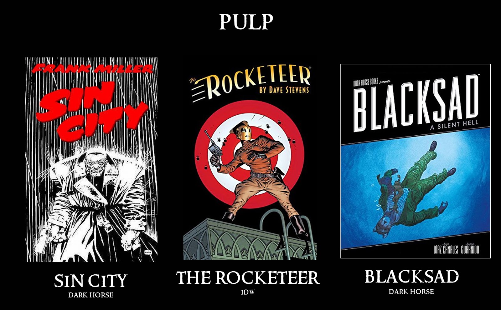 Sin City, The Rocketeer, Blacksad
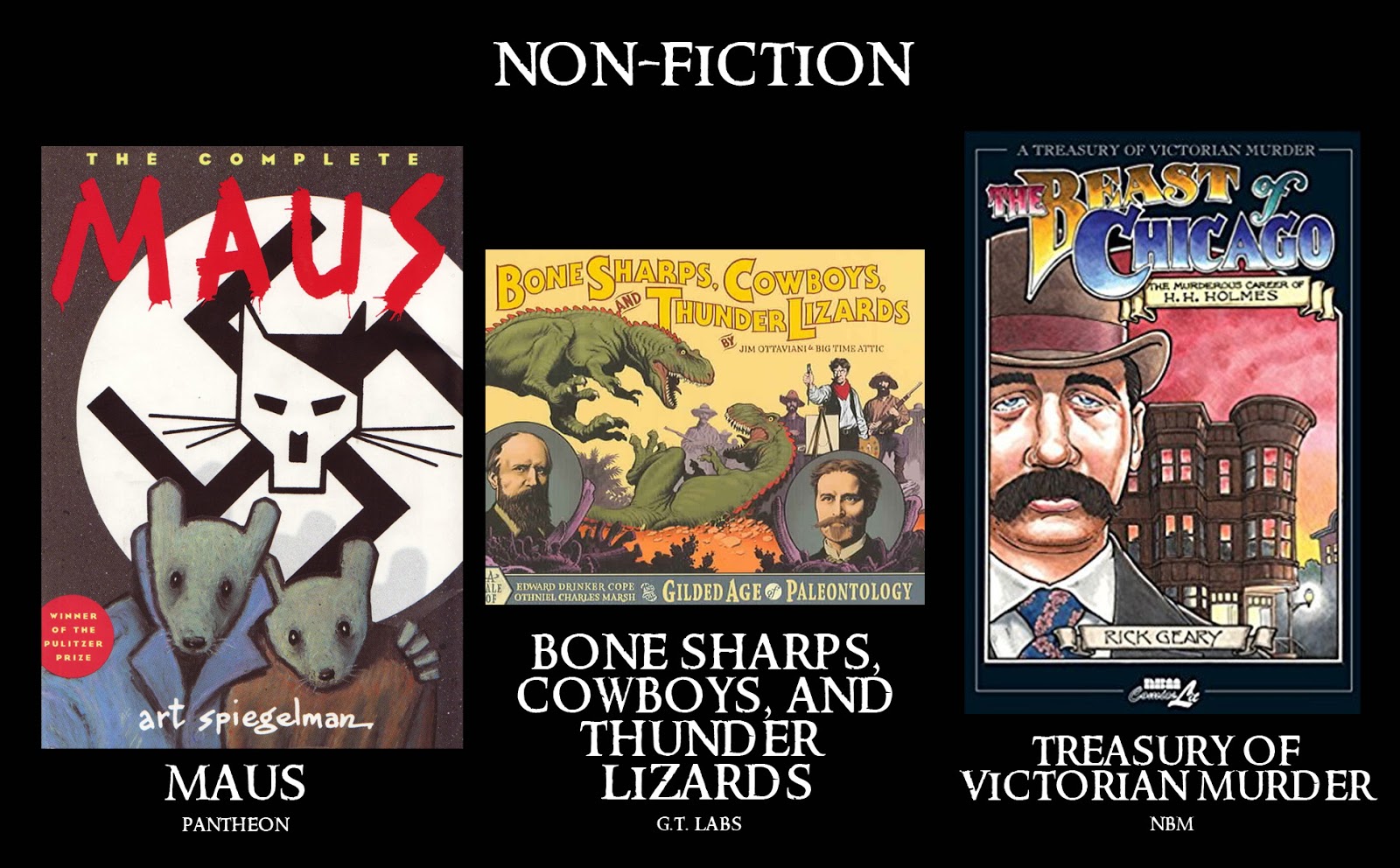 Maus, Bone Sharps, Cowboys, & Thunder Lizards,Treasury of Victorian Murder
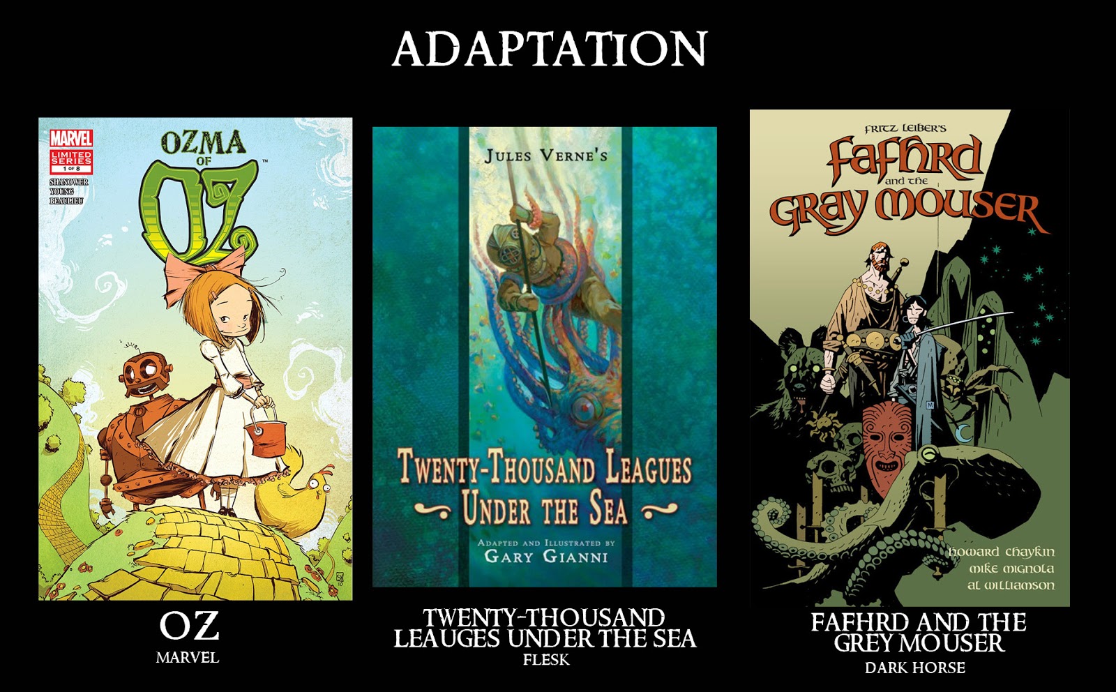 Oz, Tenty Thousand Leauges, Fafhrd & The Gray Mouser
 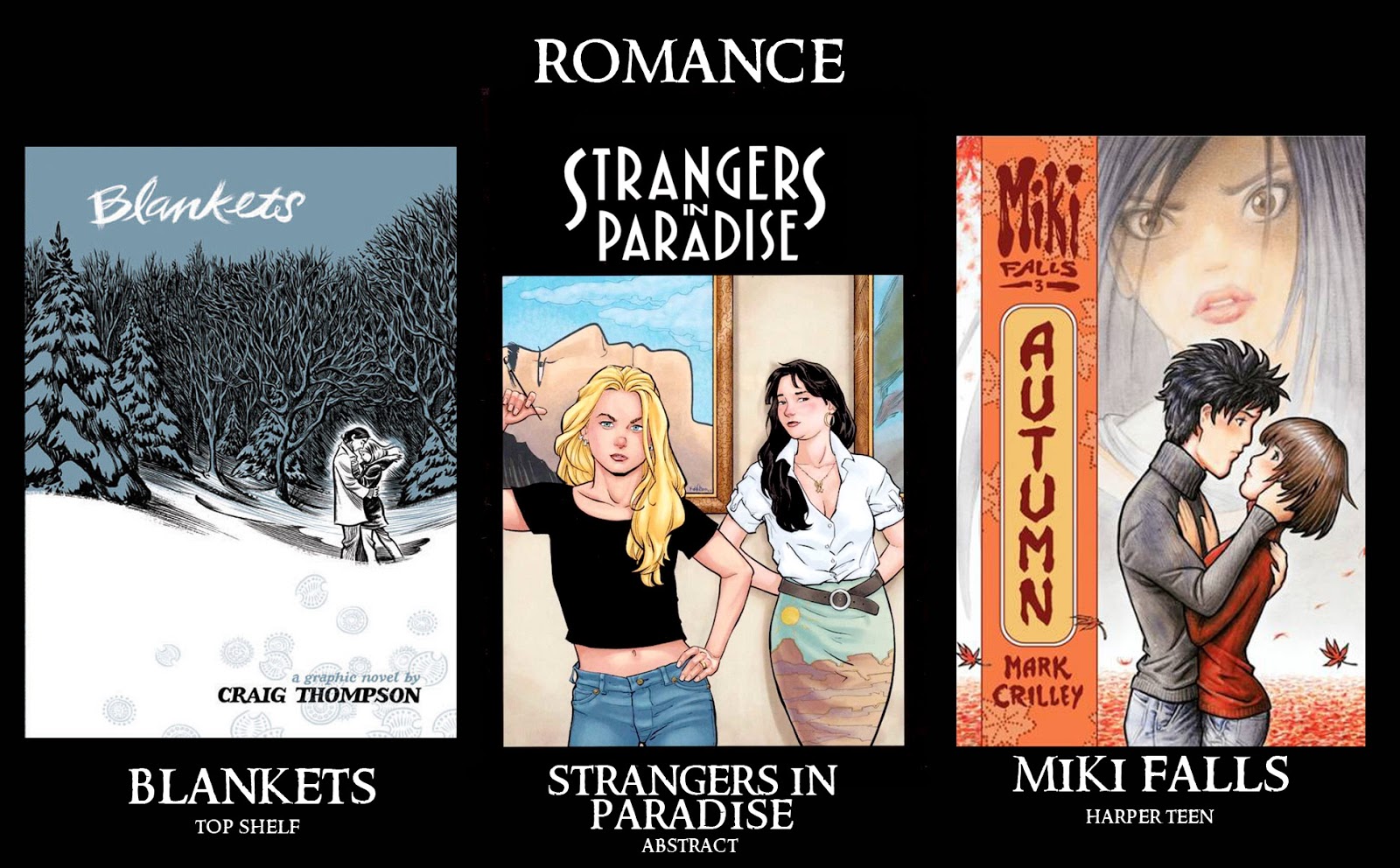 Blankets, Strangers in Paradise, Miki Falls
 Runners, Space Dumplins, Southern Cross
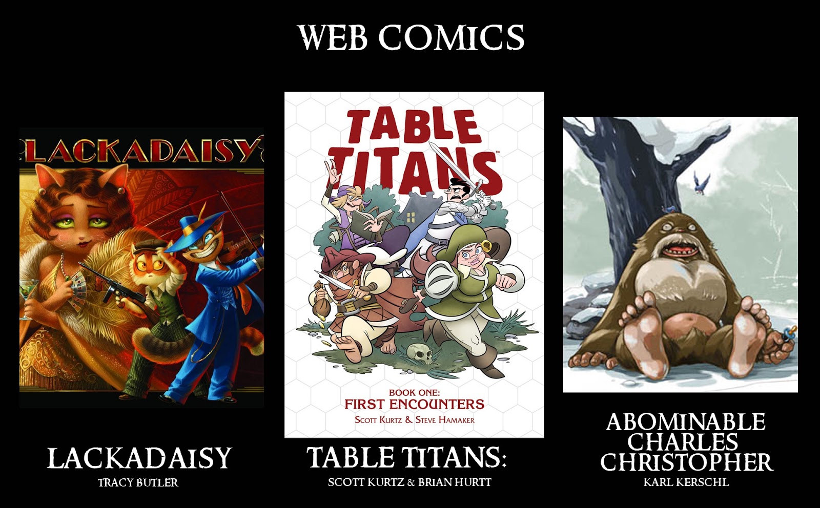 Lackadaisy, Table Titans, Abominable Charles Christopher*(All of these have content available for free, but also have collections printed as beautifully published books too)
2018 Appearances:
Heroes Con: June 15-17
San Diego Comic Con: July 18-22
Baltimore Comic Con: Sept. 28-30
New York Comic Con: Oct. 4-7
May 1, 2018
Creator Commentary: Fall 1152 Issue/Chapter 4
I've made a Creator Commentary video for the fourth issue/chapter of Mouse Guard Fall 1152: The Dark Ghost. For this issue and the remaining issues in Fall 1152, I’ll be doing the commentary as audio-only. But please feel free to follow along in your copy of the story in either issue form of from the hardcover as I talk about the behind the scenes details, art notes, and my head-space as I go page by page and panel by panel. Enjoy!
Direct YouTube Link:https://youtu.be/YOTyMyrjCDk
2018 Appearances:
Heroes Con: June 15-17
San Diego Comic Con: July 18-22
Baltimore Comic Con: Sept. 28-30
New York Comic Con: Oct. 4-7
Direct YouTube Link:https://youtu.be/YOTyMyrjCDk
2018 Appearances:
Heroes Con: June 15-17
San Diego Comic Con: July 18-22
Baltimore Comic Con: Sept. 28-30
New York Comic Con: Oct. 4-7
April 24, 2018
New Mouse Guard Tee!
 A new Mouse Guard tee-shirt for 2018! I've taken the inkwork for The Black Axe Black and White Edition cover and used it for the tee-art. Celanawe, Em, Conrad, & King Luthebon are in black as the briar wreath is in dark slate blue. The art is printed on a Heather Indigo Gildan softstyle unisex tee.
Look for this shirt at my 2018 convention appearances as well as eventually in my online store.
2018 Appearances:
Heroes Con: June 15-17
San Diego Comic Con: July 18-22
Baltimore Comic Con: Sept. 28-30
New York Comic Con: Oct. 4-7
April 17, 2018
Conrad 5x7 Print Process
 Conrad, the salty old peg-legged Guardmouse from Fall 1152 and The Black Axe, is the subject of a new 5X7 print (matted to 8" x 10") I'll be offering at conventions and in my online store. Conrad joins a portrait series that also includes: Saxon, Sadie, Gwendolyn, Kenzie, Rand, and Lieam.
To the left you can see the final artwork for the print, but below I walk through the process for creating this piece (which I also streamed LIVE several portions of on Twitch).
 I started with a sketch of Conrad and a photo referenced location. The sketch is all in pencil on copy paper. I like to use copy paper because I don't feel precious about it, there is less at stake and so I'll feel more free to dig in to the drawing and worry less about mistakes. This isn't the final drawing and putting pencil on copy paper reinforces that in my head as I draw. I didn't put the XXX jug into the composition because I had the feeling I was going to move it around once I had everything in the size of the mat. The beach photo is one I took, setting the camera very low to get a mouse-eye-view at the beach in Ludington, Michigan.
 I scanned the sketch into Photoshop and moved the jug into place. I also placed the photo behind it. Zooming in and shifting around, I was able to find a composition that I liked, where the horizon line felt right where the breaking wave had the most impact. I drew over the photo at this scale (printed out for reference) on copy paper on a light pad to define the shape of the breaking splash of the wave and the shape and placement of the rocks. Lining that drawing (tinted blue) with the Conrad sketch I had my final layout. Since the background photo was providing some color tone, I spotted in some flat colors for Conrad and the fish to help me visualize the finished piece as I worked.
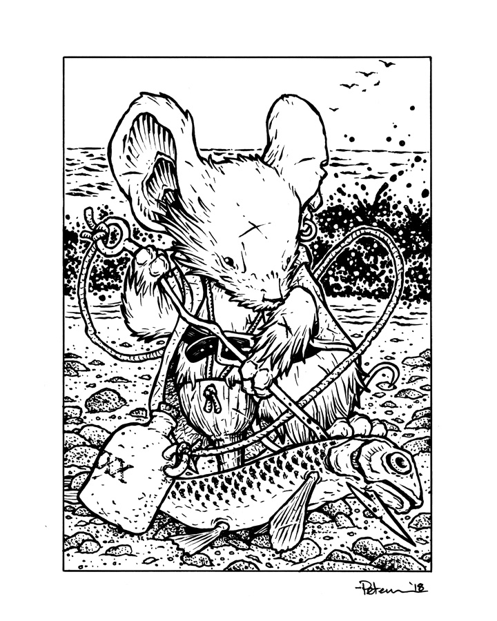
A printed version of the above digital layout was taped to the back of a sheet of Strathmore 300 series bristol. On a light pad, I was able to see the printout as a guide and ink the lines confidently with Copic Multiliners (I think I only used the 0.7 nib here). Notice I didn't ink the water marks coming into contact with Conrad. That's in part to visually push the background back, but it's also so that on the next step my life is a bit easier...
 That step is called 'flatting'. It's about establishing what areas are what colors, including the color holds (areas where I want the inkwork to be a color other than black).
There no worry about rendering here. Just flat color space. in this screenshot I've included my layer menu to show how I break down what colors go on what layers and where they fall in order above or below the inks layer (note the color holds are all above the inks and the image colors all are below).
I find that being able to click between layers to select what part of the piece you want to effect as you render is quicker than having the flats on one layer and using the magic-wand tool (a more common and popular method). To render this piece I used the dodge and burn tools in Photoshop and a stock textured brush.To the right you can see the final results.
And you can purchase the matted print in my online store: http://mouseguard.bigcartel.com/product/conrad-matted-print
More of the 5x7" Mouse Guard character print process Blogposts:
Saxon Print: http://davidpetersen.blogspot.com/2015/04/5x7-saxon-print-process.html
Sadie Print: http://davidpetersen.blogspot.com/2016/04/sadie-5x7-print.html
Gwendolyn Print: http://davidpetersen.blogspot.com/2016/05/gwendolyn-print.html
Kenzie Print: http://davidpetersen.blogspot.com/2017/02/kenzie-5-x-7-print-process.html
Rand Print: http://davidpetersen.blogspot.com/2017/05/rand-5x7-print-process.html
Lieam Print: http://davidpetersen.blogspot.com/2017/07/lieam-5x7-print-process.html
2018 Appearances:
Heroes Con: June 15-17
San Diego Comic Con: July 18-22
Baltimore Comic Con: Sept. 28-30
New York Comic Con: Oct. 4-7
April 10, 2018
Em of Appleloft 5x7 Print Process
 Celanawe's distant kin, caller to action, and companion on the quest of the Black Axe (not to mention ancestor of Farrer, forger of the Black Axe itself) Em of Appleloft is the subject of a new 5X7 print (matted to 8" x 10") I'll be offering at conventions and in my online store. Em joins a portrait series that also includes: Saxon, Sadie, Gwendolyn, Kenzie, Rand, Lieam, and Conrad. To the left you can see the final artwork for the print, but below I walk through the process for creating this piece (which I also streamed LIVE several portions of on Twitch).
 The first sketch of Em, I didn't care for so much (top left sketch). Nothing major was off, just lots of little somethings. On a lightbox, I redrew her, tweaking things as I went, adjusting her head angle and drape of her dress (bottom right). As she's from Appleloft, I decided to have her amongst the namesake fruit of that village. The stock photo reference was gathered (top right), cropped and amended, and then drawn onto copy paper on a light pad (bottom left).
Th emain motifs for Em was to make her wise and studious, carrying her notes and illuminations concerning the Black Axe history and lore while holding a feather quill to associate in her connection to birds.

The various drawings above were scanned in and assembled into a finished layout. The figure drawing scan is all tinted warm and the background cool. This helped me to make sense of the lines not only as I assembled this, but in the next step as I inked, helping me distinguish forms from one another. For similar reasons, I added in the color tones for the whole piece to help me start to solve any tangents or light on light or dark on dark areas that may not help the figure to separate from the background.

The above layout was printed out on copy paper and then taped to a back of a sheet of Strathmore 300 series bristol. On a light pad, I can see through the bristol to the printout and use it as a guide as I ink. For pens, I use Copic Multiliner SPs. The SP version has replaceable nibs and ink cartridges. I used the 0.7 nib for this exclusively I believe.
Knowing tone & value information from the layout, I was careful about where and how much texture I put into things like the leaves and branches.

When the inks were scanned, I flatted the colors in preparation for the final colors. This process is like a coloring book for professionals: 'stay inside the lines'. Here I'm putting in flat color where it belongs, establishing that her dress color is different than her hood or her fur, or her inner ear. I've also established some color-holds (areas where I want the ink lines as a color rather than black): her dress & sash pattern, the book cover details, and the spots on the apples.
 The final step is the color rendering. I use the dodge and burn tools with a stock textured brush to do all the shading and highlighting. There are a few settings in Photoshop for dodge and burn to take note of for how I get the colors the way I want them, most importantly the 'range', which not only controls what values are effected the quickest/most by the tool, but also if it saturates or desaturates to get there.
To the right you can see the finished print for Em of Appleloft.
And you can purchase the print from my online store:
http://mouseguard.bigcartel.com/product/em-of-appleloft-matted-print-8x10
More of the 5x7" Mouse Guard character print process Blogposts:
Saxon Print: http://davidpetersen.blogspot.com/2015/04/5x7-saxon-print-process.html
Sadie Print: http://davidpetersen.blogspot.com/2016/04/sadie-5x7-print.html
Gwendolyn Print: http://davidpetersen.blogspot.com/2016/05/gwendolyn-print.html
Kenzie Print: http://davidpetersen.blogspot.com/2017/02/kenzie-5-x-7-print-process.html
Rand Print: http://davidpetersen.blogspot.com/2017/05/rand-5x7-print-process.html
Lieam Print: http://davidpetersen.blogspot.com/2017/07/lieam-5x7-print-process.html
2018 Appearances:
WonderCon: Mar. 23-25
C2E2: April 6-8
Heroes Con: June 15-17
San Diego Comic Con: July 18-22
Baltimore Comic Con: Sept. 28-30
New York Comic Con: Oct. 4-7
David Petersen's Blog

- David Petersen's profile
- 339 followers
David Petersen isn't a Goodreads Author
(yet),
but they
do have a blog,
so here are some recent posts imported from
their feed.

