
David Petersen's Blog, page 49
July 12, 2016
Re-Run: Cats Trio
 With nine years of blogposts, I will continue to Re-Run past posts for the new fans or folks who may have missed a post the first time around.
Part of the reasoning is also that for various reasons (The health of my Mother, convention travel, behind on deadlines, and projects I'm not able to share yet) I see the need to revisit an old post once a month or so.
You can also go back and see any past posts using the Blog index: http://davidpetersen.blogspot.com/2013/12/blog-index.html)This week:
From the Vault: Cats Trio

In high school my friends and I conceived and started on a comic called Cats Trio. It was mostly a TMNT homage, but as we developed it and revisited it for the remainder of High School and college, it became something more. And even more than what is on paper, it solidified a bond between four friends. (Art Note: the above is by Jesse Glenn)
Full Cats Trio History Post:
http://davidpetersen.blogspot.com/2011/08/from-vault-cats-trio-in-past-i-have.html
2016 Appearances:San Diego Comic Con: July 20-24Boston Comic Con: Aug 12-14Baltimore Comic Con: Sept. 2-4New York Comic Con: Oct 6-9


July 5, 2016
Legends of the Guard Vol.s 1-3 Boxed Set Art
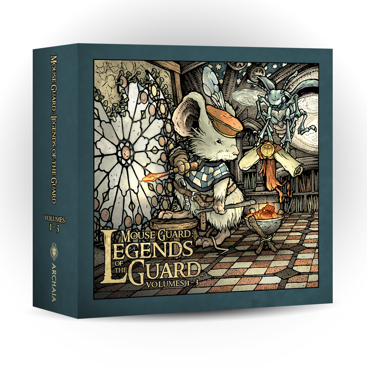
Archaia and I have decided to put together a slipcased box set of Legends of the Guard Volumes 1-3. It contains all three hardcovers (40 Mouse Guard tale tales & tavern yarns) and I've done some new box art for the slipcase.
The Legends of the Guard Box Set can be Pre-Ordered on Amazon -or- Through your Local Comic Shop using Order Code *******-On Sale: November 2016
-Price: $59.99
For Today's post I'll be going over the full process of creating that artwork.
 The first step was to decide on a subject. On this scan of my pencils of the mouse character, you can also see my notes for possible images: a mouse/bird delivery service, a mouse cartographer, and a mouse blessing or knighting a bat. But I ended up going with the idea of a Mouse Glazier. I drew this mouse while also researching how medieval glaziers soldiered lead or cut glass. On a lightbox I drew the background on another sheet.
 I assembled these two drawings in Photoshop along with a stock image of a rose window design and a tile floor. The drawings are tinted to help me keep track of everything. Two things of note: 1) The assembly of a stained glass window is not done upright like this, but I thought it was more visually interesting and took some mouse-scale artistic license. 2) As this stage came together, I was mentally writing a story for this image (which is printed on the slipcase in the same way the Legends covers are all one paragraph legends).
 Using my digital composite layout as a guide (I printed it out and taped it to the back of a sheet of Strathmore 300 series bristol and placed it on my lightbox) I was able to ink the piece. I use Copic Multiliner SP pens (the 0.7, 0.5, & 0.3 nibs). There wasn't much texture in this piece (stippling, crosshatching, etc) so most of the clarity of the image came down to line wights and strong contour lines.
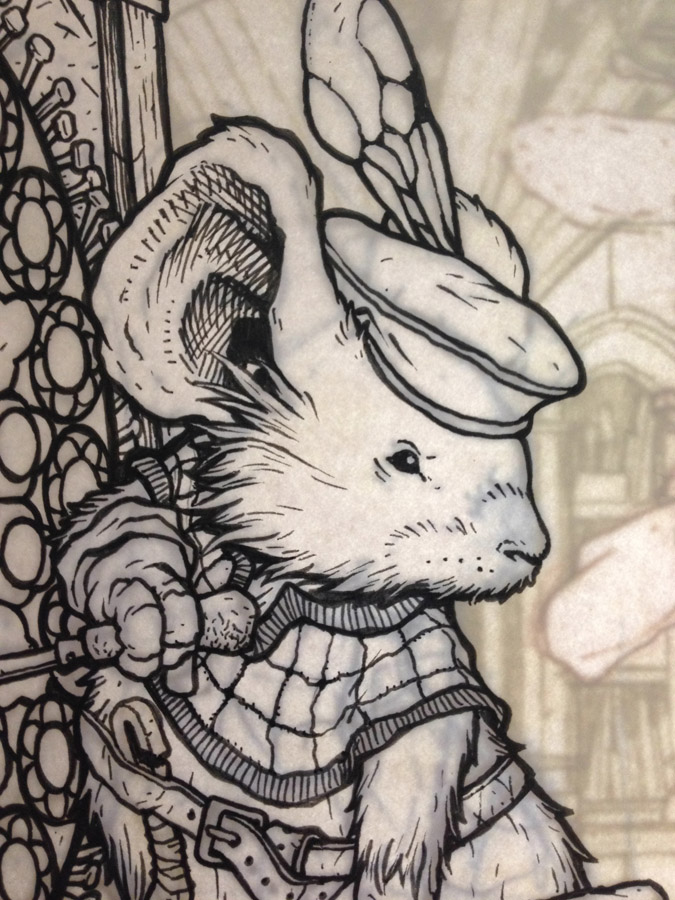 I posted this image on Twitter as I worked on this piece. Unfortunately, I wasn't able to reveal what it was that I was working on, but here you can see the mouse fully inked, while I haven't started on the background and the layout image shows through on the lightbox.
 After the inks are finished, I scanned them in and started coloring. This image is the finished 'flats' the part of the coloring process where you establish what areas are what colors with nothing but flat color. For color choices, I kept the basic tones I had in my rough for the checkerboard floor, and then re-used those colors and the star-fresco on the arches to supply the palette for the glazier's clothes.
I also established the colors of the stained glass pattern at this stage too, but I guess I didn't save a flats file after that...I just went into the next step.
 The last step was to render the piece. Not only is this the part where I add all the texture and highlights and shadows, but also where I add lighting effects and subtle glows around the window, hot coals, and soldering iron.
I'm really proud of the Legends of the Guard Volumes 1-3. It was a huge honor to work with all those creators and get to see them flesh out corners of the Mouse Guard world I may never get to. This collection will make a nice gift and help tidy your shelf keeping you Legends of the Guard books together. Plus you can read about this Mouse Glazier and his tale in the wider Mouse Guard lore.
The Legends of the Guard Box Set can be Pre-Ordered on Amazon -or- Through your Local Comic Shop using Order Code *******
Mouse Guard: Legends of the Guard Volumes 1-3 contains the stories by: Jeremy Bastian, Ted Naifeh, Alex Sheikman, Gene Ha, Lowell Francis, Sean Rubin, Alex Kain, Terry Moore, Katie Cook, Guy Davis, Jason Shawn Alexander, Nate Pride, Craig Rousseau, Karl Kerschl, Mark Smylie, Joao P. Lemos, Stan Sakai, Nick Tapalansky, Alex Eckman-Lawn, Ben Caldwell, Christian Slade, Rick Geary, Jemma Salume, Eric Canete, C.P. Wilson III, Cory Godbey, Bill Willingham, Jackson Sze, Justin Gerard, Cliff Monear, Dirk Shearer, Mark Buckingham, Skottie Young, Hannah Christenson, Nicole Gustafsson, C.M. Galdre, Dustin Nguyen, Kyla Vanderklugt, Mark A. Nelson, Jake Parker, Ramon K. Perez, Becky Cloonan, Ryan Lang, Aaron Conley, Fabian Rangel Jr., & Lauren Pettapiece.
2016 Appearances:San Diego Comic Con: July 20-24Boston Comic Con: Aug 12-14Baltimore Comic Con: Sept. 2-4New York Comic Con: Oct 6-9
June 28, 2016
Mouse Guard: Art of Bricks
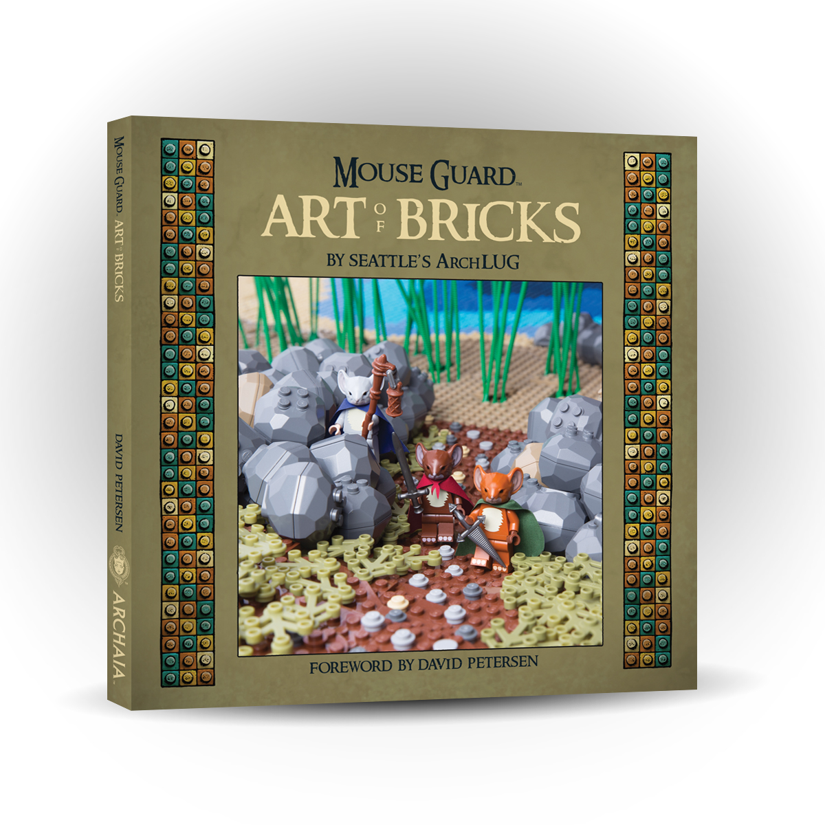
Tomorrow sees the release of Archaia publishing's Mouse Guard: The Art of Bricks showcasing the wonderful LEGO display put on by ARCHLUG (the Seattle LEGO Builder Club). The display was originally built and displayed in 2015 and then was updated and shown again in 2016 at the Emerald City Comic Con. For the fans of LEGO or Mouse Guard who couldn't make it to those events, or want to admire the work again, this photo art book is a full look at Mouse Guard in Brick form.
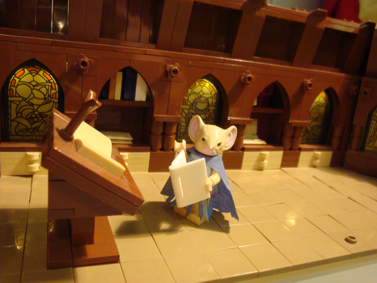
I have written a foreword for the book. And to accompany it, I drew a pinup image of the Guardmice in Brick-form. Today's blogpost will go through the steps in creating that piece. I started by pulling down my LEGO model of the Matriarch chamber given to me at ECCC'15 by Alice Finch. I used the Mouse Guard mini-figs that Guy Himber at Crazy Bricks sent me to set a scene of familiar mice gathered around Gwendolyn.
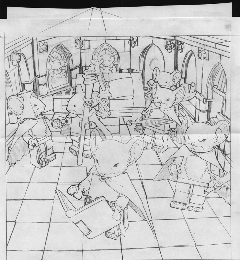 After I took a photo of the diorama model, I cropped and enlarged it to suit the format of the square book, and then printed it out to-scale. On my light box I traced over the printout on a clean sheet of paper to get my drawing. Normally, I don't like blatantly tracing reference photos. I've done it in the past, and it's a shortcut that often does more harm than good (it sticks out like a sore thumb, you don't usually have photo reference from other angles, and it's a crutch that is easy to grow accustomed to.) However, because of the precise geometric nature of LEGO and the deadline on this piece, I did exactly that.
(Note: I still had to figure out the vanishing point to make some corrections as I went)
 The next step, once I had a clean line drawing, was to ink the piece. I taped my pencils to the back of a sheet of Strathmore 300 series bristol. And seated at my lighbox again, I started inking with Copic Multiliner SP pens. I made an effort to add some texture, dings, dents, and line weights so that the end result didn't look like a traced technical drawing.
I also made an effort to not use a ruler and draw every line straight. For the floor I tried to emulate some of the LEGO tiles poping up a bit.
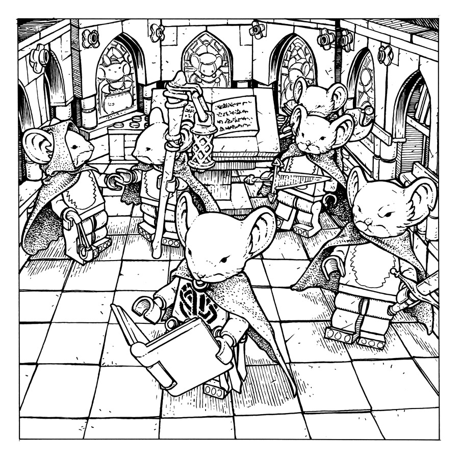
 After the inks were completed, I started flatting the colors in Photoshop. I pulled up a color chart for the official LEGO brick colors to use for my palette, but found it a bit too restrictive and used it as a guideline instead. You'l notice the weapons, books, and some miscellaneous items are drastically the wrong color. I'll often do that with all the little fiddly bits of minutia so make sure I got it all flatted. I then will desaturate that later and color each item as need be.
 The last step is to do the final rendering. Because these are supposed to be like LEGO, I went a bit more drastic on the highlights than I normally would. I used the Dodge tool to add those highlights and the shadows were applied using the Burn tool (I used a textured brush with both). For the weapons, I didn't follow the LEGO tendency to have a single color of molded plastic (only getting multiple colors with stamp printed details) in favor of making the items look more like their Mouse Guard comic counterparts.
This pinup, along with my foreword and some special brick endpapers (see in-process image below) will be included in Mouse Guard The Art of Bricks out this June.

On Sale: June 29 2016-Price: $34.99-Page Count: 240
2016 Appearances:C2E2: March 18-20BD À Bastia (Corsica) March 31-April 3Emerald City Comic Con: April 7-10
Motor City Comic Con: May 13-15Heroes Con: June 17-19San Diego Comic Con: July 20-24Boston Comic Con: Aug 12-14Baltimore Comic Con: Sept. 2-4New York Comic Con: Oct 6-9
June 21, 2016
Mr. Toad Heroes Con Auction Piece Process
 Every year HEROES CON has an art auction. The proceeds go to help fund next year's HEROES CON, which is one of the last remaining independently owned comic-centric conventions. Shelton Drum & Co. Do a fantastic job of making everyone (exhibitors & attendees alike) feel at home & welcome. Some folks do their piece for the art auction up on a live art-stage at the convention (where attendees can watch the process). I've done that a few times, but prefer to do my piece at home in the studio where I can take more time, assure a level of quality, and not take away any table time for fans at the convention. For today's blogpost, I'll be sharing my process from start to finish:
To start I decided to do a Mr. Toad piece this year because of my upcoming Wind in the Willows book coming out later this year. I robbed a rough sketch for one of the interior illustrations and made a few alterations so that it worked as an isolated stand-alone image. I also added in parts of a stock border pattern I found online and printed out an enlargement to match the size of the mat-board stock I was going to be painting on to. The printout (shown w/ sketch below is a taped together quilt of 8.5" x 11" printer paper pieces. You may be able to see a faint grid on the piece, I used that to help me re-assemble the printouts in proper registration.

To transfer the image onto the mat-board, I had Julia rub a graphite stick on the back wherever there was art. She did this work on the lightbox so that she could see through the paper and only apply graphite where it was needed and not everywhere. I know some fans & other artists questioned why I didn't just use carbon/graphite paper. I opted this method because it was just easier, I didn't have any of the transfer paper, but I did a have a graphite stick...and I'd done this before and knew it would work.

With the graphite backed printout taped to the mat-board, I re-drew over the lines with a ball point pen. Wherever I applied pressure with the pen, the graphite of the back transferred onto the surface of the mat-board. To ensure proper registration of the transfer, I taped the printout down well on multiple sides so that it couldn't slip or shift as I worked. Below you can see the image fully transferred. There were a few gaps or odd points where the graphite didn't come off or I missed tracing over a line with the pen, so I drew with a pencil right on the mat-board to fix those spots.

First step in the painting process was the lightest of washes. I used a cheap large watercolor tray, the kind of tray they give kids in schools...nothing fancy. Here I focused on getting the lighter details in the border and the background behind Toad a warm pale yellow/beige.

The first washes dried, and I applied more to build up warmer colors, variance of tones & values, and subtle little organic textures. I also added a detailed darker wash to the darker warm-border elements.

The skin tone on toad started with warmer yellow greens, especially around his lower jaw-line and the palms of his hands. Looks like while I had the yellow part of the pan still wet, I also got Toad's necktie & shirt started.

The light orange washes were then started on the jacket and pants while I added darker greens and rendered details to Toad's face.

I'm starting to sound like a broken record describing the additional layers of watercolor washes, but that's pretty much the process over and over...sometime applying it onto wet or damp work or waiting until that area is dry (or bast it with a hairdryer if you can't wait) depending on the desired effect. Here I added more tone to the jacket, pants, and cigar.

The last painting step as to add the darkest tones and sharpest details. The blue-grey border tone was something I raced to get done, because I was then delivering this piece to Comfort Love & Adam Withers, artists from Michigan who were driving down to Charlotte for Heroes Con. They graciously offered to deliver this 20" x 30" piece that would not fit in my luggage....but I wasn't done with it yet...

When I arrived in Charlotte and got my piece from Comfort & Adam, I went into the 'inking' stage back in my hotel room. I put inking in quotes because, instead of using ink to add in clarity through line, I used a dark brown color pencil. Here below, I am getting the details of the border outlined (which was the most tedious part of the outline work)

The more enjoyable part of the color pencil work was on the figure itself, especially around Toad's knuckles.

Here again is the final piece. It raised $2,400 for Heroes con and went home with a lovely couple who came by the day after the auction so we could get a photo together.

To see the process for last year's piece:http://davidpetersen.blogspot.com/2015/06/mouse-guard-heroes-2015-auction-piece.html
2016 Appearances:San Diego Comic Con: July 20-24Boston Comic Con: Aug 12-14Baltimore Comic Con: Sept. 2-4New York Comic Con: Oct 6-9
June 14, 2016
Toned Paper Con Drawings
 Instead of taking pre-order commissions as I've done at conventions past, a few weeks ago at the Motor City Comic Con, I tried doing head/bust drawings on toned paper at the convention. My schedule at home has been such that it left me no room to do pre-order commissions for conventions much this year. And I cant get more than 1-2 of my detailed ink pieces completed while at a convention either at my table or back in the hotel after dinner.
So, using toned paper, I'm able to do a piece that I'm happy with, has a full range of tonal value (without hours of cross-hatching & stippling) using a felt tip marker, a pencil, and a white gel pen.
Heroes Con is up next for me, and I'll be trying to do these types of head/bust single figure pieces live at the convention for $150 (first come, first served..new list every day). I'd like to stick to mice (because I'm comfortable doing them and we will both be happy with the result) but I'd be open to discussing something else if it's in my wheelhouse.
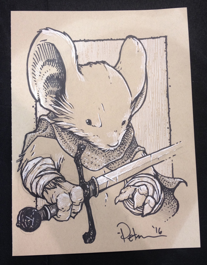
Below are examples of the types of pieces:
 Saxon
Saxon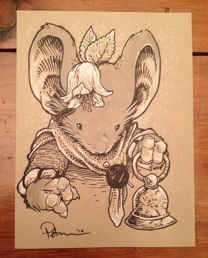 A Bell-Mouse
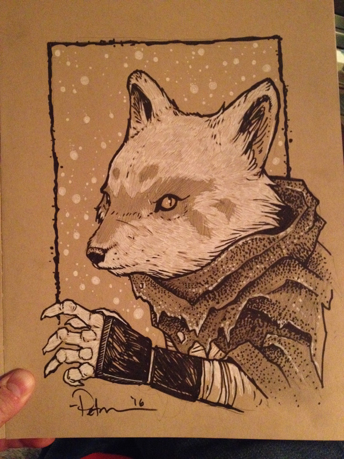 Alopex
 Double Sword-Mouse
 Mr. Toad(This was a gift to Terry Jones of Monty Python)
 Staff wielding Guardmouse
 Hellboy
 Leaf adorned Guardmouse
 Hagrid
 Ringmail Guardmouse
2016 Appearances:Heroes Con: June 17-19San Diego Comic Con: July 20-24Boston Comic Con: Aug 12-14Baltimore Comic Con: Sept. 2-4New York Comic Con: Oct 6-9
June 7, 2016
Juniper Limited Edition Print
 Since 2012 I've released a new 11" x 11" limited edition print every year. Past year's pieces have been titled "Peacock", "Raspberry","Moonflower", & "Lavender". Julia requested that these prints be pretty and not just a mouse doing battle, but more aesthetically feminine. To the left is the finished artwork, and below I'll show the full process.
The print is available in my online store and at my convention appearances until the print sells out
http://mouseguard.bigcartel.com/product/limited-edition-juniper-print
 For this year's print, "Juniper" I have a mouse harvesting juniper berries as a northern pygmy owl watches. I drew the owl first referencing photos gathered from an online image search. And then I drew the mouse with her basket of berries (and a sword some eagle-eyed Mouse Guard fans may recognize). I also looked up reference for some medieval dresses, but other than finding a color scheme I liked, I didn't find what I wanted so I made it up as I went (though the hat is based on one I drew on a storyteller in Legends Vol 3) These were drawn separately on copy paper.
 I scanned the drawings and then went about placing and resizing them within an 11" x 11" template in Photoshop. I hadn't figured out in the drawings how the two related to each other or how they sat (other than that because of the eye position of the owl, I'd planned for it to be Northeast of the mouse). With the Juniper berries as my plan, I collected some cedar branch images online and copied and pasted them around my drawings until I had a believable structure for them as well as an aesthetically pleasing framework. I painted in some branches and berries. And I had my layout all set.
 I printed the layout onto two sheets of legal copy paper (being 11" square, the layout wouldn't fit across one sheet, so I had to print the top and bottom separately and then puzzle them back together). Using my lightbox, I was able to see through a sheet of bristol to the printout of my layout below. I taped the layout to my bristol to make sure I didn't lose registration as I inked. To the right you can see the finished ink (this was inked all with Copic Multiliner SP pens (the 0.7, 0.5, & 0.3 nibs). And below are several in-process photos I took as I worked:


Once the inking was done, I started coloring the piece. This process starts with a job called 'flatting' where you simply lay in flat colors to establish which parts are which colors. Initially, before I'd seen how busy my layout was going to get with all the cedar, I'd thought about setting this print in a snowy setting...perhaps not enough to have accumulated on the mouse, owl, or branches, but just falling delicately around them. I kept that in mind as I placed in these colors and I went for something a little cooler palette wise.
The final step was to render the image. This means going in and adding depth and texture with shadow, and highlights. I do this using the Dodge and Burn tools in Photoshop (and a textured stock brush). I tweaked the final colors a great deal on this piece trying to get the right cool/desaturated look without it becoming washed out or too bleak.Again, the print is available in my online store and at my convention appearances until the print sells out.
http://mouseguard.bigcartel.com/product/limited-edition-juniper-print
2016 Appearances:Heroes Con: June 17-19San Diego Comic Con: July 20-24Boston Comic Con: Aug 12-14Baltimore Comic Con: Sept. 2-4New York Comic Con: Oct 6-9
May 31, 2016
Mouse Guard Coloring Book
 Archaia & I have decided to publish a Mouse Guard coloring book! Fans have asked for it, and now one is on the way.
 Mouse Guard Coloring Book:
-On Sale: October 2016
-Price: $14.99 US
-96 pages
Preorder on Amazon.com
Or through your LCS using order code JUN16 1233
For this week's blogpost, I will show the process of creating the cover, a piece I designed specifically for the coloring book.
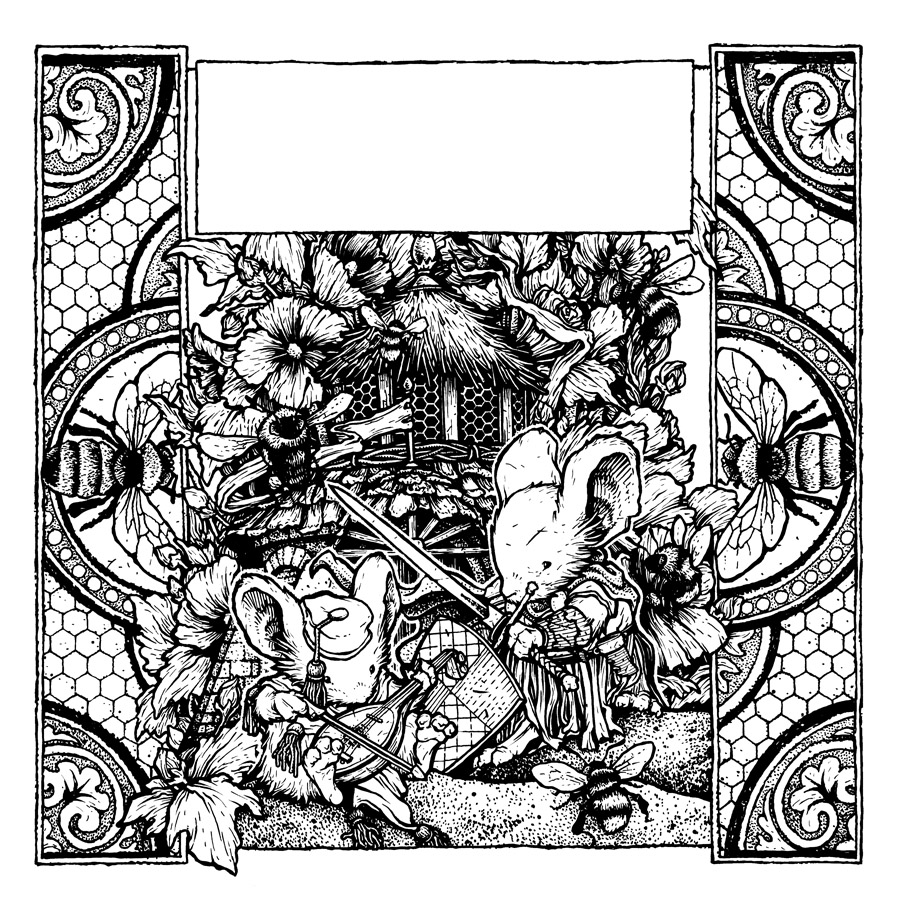
 My plan was to to something of a vertical image, with mice and architecture that would be flanked by a design pattern on the left and right (but more on that later). Because the details and little open spaces are what make one of these coloring books, I wanted the mice to have lots of specific clothes and accessories. And the architecture needed to be made of multiple building materials. Here are my pencils for the center section of the cover where on one sheet of copy paper I've drawn the architectural background of a round building with a beehive cupola, and on the other a musician mouse and a Guardmouse with some bees.
After scanning those drawings, I set about making a layout within a template for the cover's measurements (and keeping a space open for the title and text). I assembled the two drawings together, tinting each so that they were easier to 'read' visually as I worked out the design and later when inking on a light box. For the pattern designs up the side, I disassembled a stock stained glass window design, filled the gaps with honeycomb hexagons, and replaced the center floral motif with bees.
 I printed out the above layout (I had to do that onto two sheets of legal paper because it was too large to fit on one sheet of anything my home printer can handle) and then taped that layout to the back of a sheet of Strathmore 300 series bristol.
I used Copic Multiliner SP pens (0.7, 0.5, 0.3 nibs) to ink in all the linework and details. I was so focussed on overdoing the details for the coloring book, I didn't think about how tight the linework was and if it would reduce well for publication, so I went back over several areas with white correction paint to open up some parts.
Below you can see several in-process images I posted on Twitter as I worked:


The last step, once the inking was complete was to get the title and byline typeset
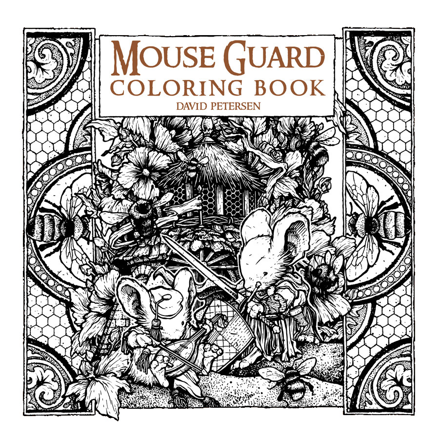
Mouse Guard Coloring Book:-On Sale: October 2016-Price: $14.99 US-96 pagesPreorder on Amazon.com
2016 Appearances:Heroes Con: June 17-19San Diego Comic Con: July 20-24Boston Comic Con: Aug 12-14Baltimore Comic Con: Sept. 2-4New York Comic Con: Oct 6-9
May 24, 2016
Wind in the Willows Jacket Process
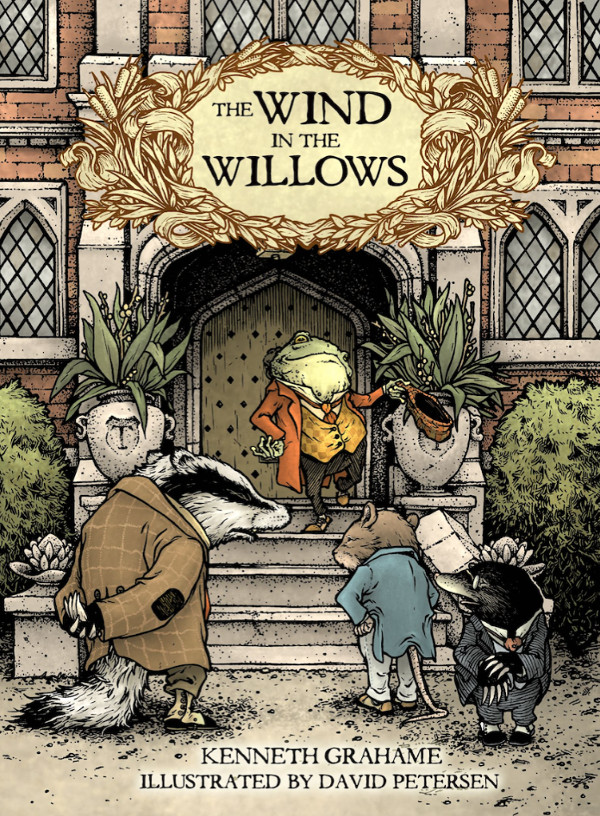 The illustrated edition of Wind in the Willows I'm doing with IDW Publishing was announced last week. The Wind in the Willows has long been a favorite of mine. I love talking animal stories and I don’t know that they get better than Kenneth Grahame’s. This has also been a bucket list project for me, something I needed to illustrate before I die. This project started in 2014, and a combination of its intensity as an illustration task and other projects & commitments has led us to a release of Oct 2016.
Pre-Order on Amazon -or- Through your Local Comic Shop using Order Code: JUN16 0571
For this week's blogpost I'm going to detail the process I used for creating the jacket cover (a wrap around, like Mouse Guard books)
 Because books are often judged by their cover, I wanted to make sure Wind in the Willows is perceived as an ensemble cast book with 4 main characters, rather than just "Mr. Toad & his Wild Ride". I chose this moment from chapter 6: Mr Toad:
"They reached the carriage-drive of Toad Hall to find, as the Badger had anticipated, a shiny new motor-car, or great size, painted a bright red (Toad's favourite colour), standing in front of the house. As they neared the door it was flung open, and Mr. Toad, arrayed in goggles, cap, gaiters, and enormous overcoat, came swaggering down the steps..."
The sketches for the characters were fairly straight forward. I'd drawn them a few times previously just for fun, so the only decisions I was making was getting postures right for the scene (Badger anticipating Toad's antics, Rat & Mole a bit nervous about them, and Toad strutting proud about them) and locking in on their proportions.

For the setting, I opted not to make a model of Toad Hall, but to do a front facade rough drawing (I only drew half of it and then mirrored it). It's thoroughly based on Mapledurham House, the same house E. H. Shepherd used as reference when he illustrated Willows back in 1960.
 Using my rough, I enlarged and refined the Toad Hall drawing with the motor-car drawn in that I found era-appropriate reference for. and used the composite of all the sketches as my pencils/layout for the jacket wraparound. Having every character drawn separately allowed me to position them and resize them for scale as I needed. In this step I also planned space for the spine of the book and tested the book's title and bylines. The yellow border was my visual note for where the "trim" line and where the "bleed" are.
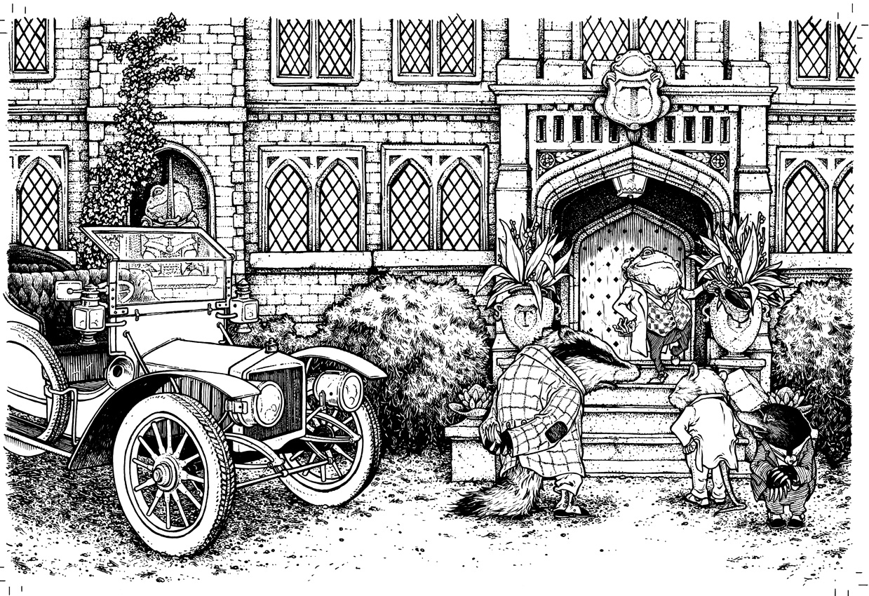 I printed that digitally composited layout out on several sheets of copy paper to a size of 22" x 15" and taped that to the back of a big sheet of Bristol. On my lightbox I was able to see through the surface of the Bristol to the printout underneath. I inked using Copic Multiliners. Because this jacket was to also be in color, I didn't render the textures as heavily as I may have if this had been a strictly black & white illustration. Below you can see a few photos I took with my phone as I made my way across the piece:
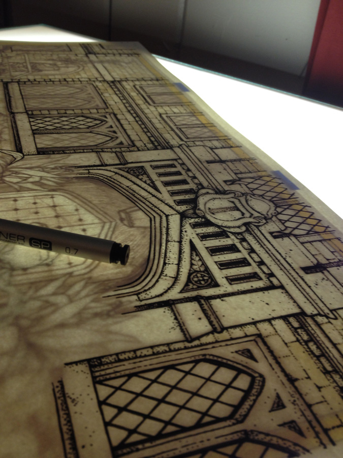


 Once all the inking was done, I scanned the artwork. This took a few passes on may scanner (11" x 17") and some careful re-assembly back in Photoshop. Then I flatted in all the color for the piece. The term 'Flatting' in coloring refers to adding in flat color, no rendering, no effects, just color swatches. This step is like a grown-up version of coloring inside the lines (even when sometimes the lines aren't closed off...so no fill-tool here folks). I'd decided on most of my color choices for this piece before I started (I had previous character illustrations to pull from and the notes from the text as well as Mapledurham House).
 I rendered the color in Photoshop using a textured brush and the Dodge (Lighten) & Burn (Darken) Tools. This is done in same way I render any Mouse Guard piece or freelance cover/pinup I've covered here on the blog. In this step, I also established a few color-holds (places where I paint the inkwork to be a color rather than just black) on the motor-car's glass parts and Toad, Rat, & Badger's clothes.
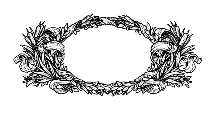 The last step was the Text...but, the Title text needed a better treatment than to just sit on the art. It could easily get lost in the details of Toad Hall above Toad's head, and I didn't want to just apply an outline or shadow behind the type for it to stand out, so I inked a wreath border the type could sit in. I found a stock border to use as inspiration, but then populated the foliage with willow leaves and cat tails. Because this is a separate piece it can be easily removed from the jacket art for use as a stand-alone illustration.
It’s been tremendously difficult to illustrate as I’m trying to live up to the spirit of the original text while living in the shadows of illustrators like E. H. Shepard, Arthur Rackham, Inga Moore, and Robert Ingpen (among many others) who have visualized this tale in ways impossible not to be influenced by. The challenge of doing this story right has lead me to push my work further than I ever have, and I think my artwork will be forever changed by it for the better.
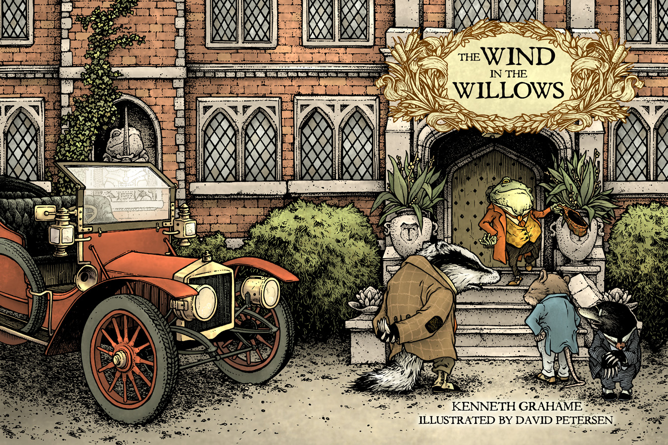
Wind in the Willows can be Pre-Ordered on Amazon -or- Through your Local Comic Shop using Order Code JUN16 0571
2016 Appearances:Heroes Con: June 17-19San Diego Comic Con: July 20-24Boston Comic Con: Aug 12-14Baltimore Comic Con: Sept. 2-4New York Comic Con: Oct 6-9
May 17, 2016
2016 Bookplate
 Every year, for the last four years, I've released a new Mouse Guard bookplate. (You can look over the past years here: 2012, 2013, 2014, & 2015). I started this tradition because fans approaching my table at a convention would be disappointed they didn't have their Mouse Guard books with them for me to sign. By making a unique bookplate every year, I not only make a fun mini-print, but since they are signed, a fan can paste one into their book when they return home and have a signed book.
This week's blogpost is going to be all about the process of creating the 2016 bookplate you see on the left.
 When doing a new bookplate I need to think of two important things: The artistic technique and the subject. For the subject I decided to pay homage to Jeremy Bastian's story from Mouse Guard: Legends of the Guard Volume 1.
His story was the only one I was jealous enough of I felt I needed to weave it into Mouse Guard history not just as a legend, but as partial-history. The mouse Silfano became the subject of my bookplate for this year.
 Like I said above I also needed to decide on the technique. With past years bookplates being done as embroidery, mosaic, and stained glass, I settled on a realistic rendered pencil drawing (this was also in prep for my Gotham Academy Story released last week). I drew the mouse Silfano on copy paper and the background design (based on Jeremy's panel border) on a toothier drawing paper.
 Tool-wise, I used the same stuff I used for Gotham Academy (though technically I drew this first). Knolled here are my (L-R) Stick Eraser, Mechanical Pencil (0.5 w/ HB lead), a Tortillon (fancy word for a smudging stick), and a kneaded eraser. I protected the drawing from getting smudged as I drew, blended, and erased away highlights, by putting down a piece of paper under my hand.
 The two drawings were combined after being scanned into Photoshop. To color the image I used the technique of placing layers over the rendered pencil set to layer mode 'color' This keeps the integrity of the value (light/dark) of the drawing, but adds the hue and saturation of what you paint on the 'color' layers to the rendered pencil.
I'll have this bookplate at my 2016 convention appearances, but it is also available in my online shop: http://mouseguard.bigcartel.com/product/mouse-guard-2016-bookplate
2016 Appearances:Heroes Con: June 17-19San Diego Comic Con: July 20-24Boston Comic Con: Aug 12-14Baltimore Comic Con: Sept. 2-4New York Comic Con: Oct 6-9
May 10, 2016
Gwendolyn Print
 Last year I introduced a matted Saxon print to my convention and online store offerings. This year, I've added Sadie. And this week I'm revealing Gwendolyn in her Matriarch Chamber. Below I'll show the full process of the new Gwendolyn print. (finished image to the left)
The print debut at C2E2 2016, and I'll have it in my online store as well as my other convention appearances.
http://mouseguard.bigcartel.com/product/gwendolyn-print-matted-8x10
 I drew this version of Gwendolyn on copy paper. I didn't know what the background should be, but decided since Saxon & Sadie were outside, Gwendolyn would be a good mouse to have an interior architecture background.
I didn't know what interior space to use through. An existing location in Lockhaven, a cool stone arch pattern or window? I didn't go further than what you see here and decided to figure out the background in the next step after I scanned the drawing.
 In Photoshop, I was able to size the drawing and crop it to suit the needs of the print. I then tried out a few stock images of arches and windows to get a feel for what would work. I ended up pulling my Matriarch Chamber model off the shelf and photographed a corner of that for the background. In this step I was also able to resize and fix the scale and angle of her pike axe head (which only just enters frame now). The last ting I did before printing this out was to add in a celtic knot pattern I've used on Gwendolyn's tunic before.
Once all that digital tweaking was set, I printed out the layout on my home printer. I taped it to the back of a sheet of Strathmore 300 series bristol. On my Huion light pad I could see through the surface of the bristol to the printout to use as a guide as I inked without needing to re-pencil the drawing. I inked it with Copic Multiliner pens (the 0.7, 0.5, & 0.3 nibs). I avoided inking the stained glass details right up to the lead lines or the tile floor pattern right up to Gwendolyn. This makes isolating those lines for color holds easier in the coloring step.
 I tweeted this photo I took in-process with my phone as I worked on the piece. I try and establish the major outlines to the character before going in and doing much rendering on any area (though here I did do the cross-hatching in her ear). Before I used Multiliners, I used Uniball Vision office pens. One of the things I think improved when I switched tools is that I became more concerned with varying my line weight. And not just the heavier lines for the outer contour vs the thinner inner lines, but also the change in a given line like the fur around the face or the wrinkles in the cloak.
After I finished inking the piece, I scanned the inks into Photo shop to start coloring. First step of that process is called 'flatting' where you color each part that is a different color with just flat colors and stay within the lines. For the room, I already had a color palette because of the room appearing in The Black Axe. Gwendolyn had also been established color-wise, but I just did my best eyeball match for her fur and clothing colors.
The last step is to render out, shade, highlight, and texture the colors. I use the Dodge & Burn tools with a textured brush to accomplish this.Again, I'll have this print in my online store as well as at my other convention appearances.
http://mouseguard.bigcartel.com/product/gwendolyn-print-matted-8x10
2016 Appearances:
Motor City Comic Con: May 13-15Heroes Con: June 17-19San Diego Comic Con: July 20-24Boston Comic Con: Aug 12-14Baltimore Comic Con: Sept. 2-4New York Comic Con: Oct 6-9
David Petersen's Blog

- David Petersen's profile
- 339 followers
David Petersen isn't a Goodreads Author
(yet),
but they
do have a blog,
so here are some recent posts imported from
their feed.

