
Nate Silver's Blog, page 82
September 10, 2018
Politics Podcast: Inside The Trump Administration
More: Apple Podcasts |
ESPN App |
RSS
| Embed
Embed Code
Over the past week, the inner workings of the Trump administration were laid bare both in Bob Woodward’s new book, “Fear: Trump in the White House,” and in an anonymous op-ed published in The New York Times. The FiveThirtyEight Politics podcast discusses what, if anything, we learned about the administration from the book and op-ed. The crew also talked about The Upshot’s foray into live polling.
You can listen to the episode by clicking the “play” button above or by downloading it in iTunes , the ESPN App or your favorite podcast platform. If you are new to podcasts, learn how to listen .
The FiveThirtyEight Politics podcast publishes Monday evenings, with occasional special episodes throughout the week. Help new listeners discover the show by leaving us a rating and review on iTunes . Have a comment, question or suggestion for “good polling vs. bad polling”? Get in touch by email, on Twitter or in the comments.


September 6, 2018
Election Update: The Most (And Least) Elastic States And Districts
Welcome to our Election Update for Thursday, Sept. 6!
After reaching a new high of 4 in 5 on Tuesday, Democrats’ chances of winning a House majority in our forecast have fallen back to Earth a bit. Recent national generic-ballot polls have been a bit less optimistic for Democrats, and as a result, their chance of taking control of the House have ebbed to 7 in 9 (or 77 percent) in our “Classic” model.1
Shifts of a few percentage points are a pretty commonplace occurrence for our forecast. But not all districts swing in tandem, even when the only new data available is national polls (as opposed to individual district polls). That’s because some districts are more “elastic” than others.
FiveThirtyEight editor-in-chief Nate Silver introduced the concept of an “elastic state” during the 2012 presidential campaign. A state’s elasticity is simply how sensitive it is to changes in the national political environment. A very elastic state is prone to big shifts in voter preferences, while inelastic states don’t blow as much with the political winds.
An elastic state isn’t necessarily a swing state, or vice versa. Think of the difference between a state that is decided by 1 percentage point every election (an inelastic swing state) and one that votes 10 points Democratic one year and 10 points Republican the next (an elastic swing state). In other words, elasticity helps us understand elections on a deeper level. Just knowing that both of those districts are competitive doesn’t tell you everything you need to know; for example, the two call for different campaign strategies (turnout in the former, persuasion in the latter).
Today, we’re excited to unveil not only an updated elasticity score for each state, but also, for the first time, the elasticity scores of all 435 congressional districts! These scores are derived from the 2016 version of the Cooperative Congressional Election Study, a massive, 60,000-plus person survey conducted by Harvard University in conjunction with YouGov. The scores work by modeling the likelihood of an individual voter having voted Democratic or Republican for Congress, based on a series of characteristics related to their demographic (race, religion, etc.) and political (Democrat, Republican, independent, liberal, conservative, etc.) identity. We then estimate how much that probability would change based on a shift in the national political environment. The principle is that voters at the extreme end of the spectrum — those who have close to a 0 percent or a 100 percent chance of voting for one of the parties, based on our analysis — don’t swing as much as those in the middle.
You can download the data, which our forecast uses to translate generic-congressional-ballot polling to individual districts, on GitHub via this link. However, here, at a glance, is the elasticity of every state (and the District of Columbia), plus the top 25 and bottom 25 congressional districts (higher scores are more elastic, lower scores are less).
Elasticity scores by state
Updated for 2018
state
elasticity score
state
elasticity score
Alaska
1.16
Illinois
1.01
Rhode Island
1.15
Arkansas
1.00
New Hampshire
1.15
Pennsylvania
1.00
Massachusetts
1.15
Oregon
1.00
Maine
1.13
Kansas
1.00
Vermont
1.12
Washington
1.00
Idaho
1.12
Indiana
0.99
Wyoming
1.08
Connecticut
0.99
Nevada
1.08
Tennessee
0.98
Iowa
1.08
North Carolina
0.98
Wisconsin
1.07
North Dakota
0.98
Colorado
1.07
New York
0.97
Hawaii
1.07
South Carolina
0.97
Montana
1.07
Maryland
0.96
Michigan
1.07
Louisiana
0.96
Utah
1.06
Missouri
0.95
Arizona
1.05
Virginia
0.94
West Virginia
1.04
California
0.94
Texas
1.03
Oklahoma
0.94
Florida
1.03
Kentucky
0.94
Minnesota
1.03
Delaware
0.93
Ohio
1.02
Mississippi
0.92
New Mexico
1.02
Georgia
0.90
South Dakota
1.01
Alabama
0.89
Nebraska
1.01
Washington, D.C.
0.80
New Jersey
1.01
Elasticity score by congressional district
The 25 most and least elastic House districts in 2018
Most elastic
Least elastic
district
elasticity
district
elasticity
Michigan 5th
1.24
California 5th
0.83
Illinois 8th
1.22
Illinois 1st
0.83
Nevada 4th
1.22
New York 7th
0.82
Massachusetts 1st
1.22
Virginia 8th
0.82
Massachusetts 6th
1.21
California 15th
0.82
Massachusetts 2nd
1.21
California 28th
0.82
New York 21st
1.21
Georgia 10th
0.81
Florida 26th
1.20
Georgia 13th
0.81
Massachusetts 9th
1.20
Washington 7th
0.81
Florida 25th
1.20
California 37th
0.81
Minnesota 7th
1.19
Mississippi 3rd
0.80
New Hampshire 1st
1.19
New York 9th
0.80
Massachusetts 4th
1.18
New York 5th
0.79
California 26th
1.18
California 44th
0.79
Massachusetts 3rd
1.18
California 13th
0.79
Rhode Island 1st
1.17
Alabama 3rd
0.79
Illinois 12th
1.17
Alabama 6th
0.78
Texas 33rd
1.17
New York 13th
0.77
Iowa 2nd
1.17
Missouri 4th
0.77
Washington 5th
1.17
New York 15th
0.77
Utah 2nd
1.16
California 2nd
0.76
Alaska at large
1.16
New York 8th
0.74
Texas 29th
1.15
New York 14th
0.73
Maine 1st
1.15
Illinois 7th
0.72
Oregon 2nd
1.15
Pennsylvania 3rd
0.72
Congratulations, Michigan’s 5th — you’re America’s most elastic congressional district! The Flint- and Saginaw-based district has an elasticity score of 1.24, which means that for every 1 percentage point the national political mood moves toward a party, the 5th District is expected to move 1.24 percentage points toward that party.2 In practice, that means the district votes differently from year to year and even within elections. For example, in 2016, it voted for Hillary Clinton for president 50 percent to 45 percent, according to Daily Kos Elections, but Democratic Rep. Daniel Kildee for Congress 61 percent to 35 percent. In the top 25 are also six Massachusetts districts and one each from Maine, New Hampshire and Rhode Island.
As a general principle, the swingiest districts tend to be those with lots of white voters who do not identify as evangelical Christians. (By contrast, white evangelical voters are overwhelmingly Republican, while nonwhite voters — with a few exceptions like Cuban-Americans in South Florida; note the presence of Florida’s 25th and 26th districts in the top 10 — are overwhelmingly Democratic.) These voters are plentiful in the Northeast, and in the Upper Midwest, where they were vital to President Trump winning states such as Ohio and districts such as Maine’s 2nd Congressional District.
On the other end of the spectrum, Pennsylvania’s 3rd District, covering downtown Philadelphia, is the most inelastic district the nation has to offer. That makes sense, given that it’s majority-African-American, a group that consistently votes for Democrats at rates around 90 percent. Seven other majority-minority districts in New York City likewise make the bottom 25. Two of the bottom 10 are in Alabama, where most voters are either African-American (reliably Democratic) or evangelical white (reliably Republican), making it very inelastic overall.
The list illustrates what I noted earlier: that competitive districts can be elastic or inelastic, and elastic districts can be competitive or uncompetitive. For example, Massachusetts’s 1st District is quite elastic (1.22), but it’s not closely pitted between Democrats and Republicans (according to FiveThirtyEight’s partisan lean metric,3 it’s 27 points more Democratic than the country),4 so when it bounces back and forth, it’s usually between mildly blue and super blue. And there are competitive districts up and down the elasticity scale: Nevada’s 4th District (rated as “likely D” by our Classic model) has an elasticity score of 1.22, Iowa’s 3rd District (“lean D”) has an elasticity score of 1.00 and Georgia’s 7th District (“lean R”) has an elasticity score of 0.85.
Keep these numbers in mind as the 2018 campaign goes on. Right now, we have Democrat Steven Horsford as a 5 in 6 favorite in Nevada’s 4th, but if the national environment sours for Democrats, Republican Cresent Hardy could make up ground in a hurry because the district is so elastic. Democrat Carolyn Bourdeaux in Georgia’s 7th, by contrast, who’s a 3 in 10 underdog, will probably need to rely on goosing turnout among her voters, in addition to a good national environment, because that district is so inelastic.
Here’s A New, Less Volatile Version Of Our Generic Ballot Tracker
On Tuesday morning, a poll came out from ABC News and The Washington Post showing Democrats ahead by 14 percentage points on the generic congressional ballot. On Wednesday morning, another generic ballot poll, from Selzer & Co., also rated as an A+ pollster by FiveThirtyEight, had Democrats ahead by only 2 percentage points.
True, these sort of disagreements happen some of the time in other polling series, such as for President Trump’s approval rating. And that’s not a bad thing — pollsters disagreeing with one another, and even publishing the occasional “outlier” that bucks the consensus, is proof that they’re doing good, honest work.
But these big disagreements happen a lot more often for the generic congressional ballot than for other types of polls. For whatever reason, generic ballot polls tend to disagree with one another. They also tend to be fairly volatile even within the same poll: CNN has shown Democrats ahead by as few as 3 points and as many as 16 points in generic ballot polling they’ve conducted this year, for instance.5 Whereas for presidential approval numbers, you usually only need a few polls for the average to stabilize, it can take a dozen or more polls in your average before the generic ballot stops bouncing around.
We learned about this the hard way, after seeing our generic ballot average wobble around, variously showing Democrats with leads of anywhere from 4 to 13 points at different points this year. Importantly, the average tended to be mean-reverting. Whenever our average showed Democrats with a lead in the double digits, it predictably retreated to a more modest lead — typically in the range of 6 to 9 percentage points. Likewise, when the Democrats’ lead fell below 6 points, it predictably moved back upward into that 6-to-9 point range. A metric should do a good job of predicting itself instead of bouncing around in this way. The more technical name for this problem is autocorrelation, and when you see it in a data series you’re generating, it’s often a sign that you haven’t designed the metric as well as you could have.
The reason we were surprised by this is that the settings for our generic ballot tracker had been imported from our presidential approval rating tracker — and we’d tested them extensively on past presidential approval data and were happy with how they were working this year. You’ll notice, for instance, that when there’s a change in our Trump approval rating average, it usually sticks around for at least several weeks if not longer. “Usually” does not mean always: Just as it’s a problem to show movement in the numbers when it’s really just noise, it’s equally problematic to have the average fail to pick up on real changes in Trump’s popularity because it’s too slow-moving. But our approval-rating average tends to strike a pretty good balance between being too aggressive and too conservative.

Our generic ballot tracker was not striking that balance well, by contrast, as we discovered when creating our House forecast. It was being too aggressive.
Using a slower-moving generic ballot average6 — one that uses a larger number of polls even if those polls are less recent — would have done a better job of maximizing predictive accuracy and minimizing autocorrelation in past years, so that’s what we used for the House model. And as of today, we’ve changed our generic ballot interactive to match the settings that our House model is using.7 The average is designed to be slightly more aggressive as we approach Election Day, but in general, it will yield a much more stable estimate of the generic ballot than the one we’d been using before. We’ve also revised our generic ballot estimates for previous dates to reflect what they would have been using our new-and-improved methodology.

You can see that the new average takes more convincing before jumping at a new trend. (The generic ballot numbers as originally published will still be available — you can see them using the link under the chart.)
As an aside, this is one of the reasons that averaging polls isn’t quite as straightforward as it might seem. How to manage the trade-off between using the most recent polls on the one hand and a larger sample of polls on the other hand is a tricky question and one where the right answer can vary between different types of elections. For the generic ballot, you should take a rather conservative approach. But that doesn’t necessarily hold for something like a presidential race — being too conservative would have caused you to miss crucial late movement toward Trump in 2016.
September 5, 2018
2018 NFL Predictions
2018 NFL Predictions
For the regular season and playoffs, updated after every game.
More NFL:Every team’s Elo historyCan you outsmart our forecasts?
Standings
Games
1651
NE-logoNew EnglandAFC East11.24.8+114.782%66%47%14%
1647
PHI-logoPhiladelphiaNFC East11.05.0+105.876%61%40%12%
1602
MIN-logoMinnesotaNFC North9.96.1+66.163%50%25%7%
1601
ATL-logoAtlantaNFC South9.96.1+66.759%39%23%8%
1596
PIT-logoPittsburghAFC North9.96.1+67.367%51%29%7%
1584
NO-logoNew OrleansNFC South9.26.8+43.449%30%17%5%
1571
KC-logoKansas CityAFC West9.56.5+52.058%41%22%5%
1550
CAR-logoCarolinaNFC South8.67.4+20.540%22%12%3%
1547
DAL-logoDallasNFC East8.87.2+27.143%24%13%3%
1545
SEA-logoSeattleNFC West8.97.1+30.548%37%16%4%
1545
LAC-logoL.A. ChargersAFC West9.07.0+34.751%33%17%4%
1535
BAL-logoBaltimoreAFC North8.77.3+25.648%31%14%3%
1535
JAX-logoJacksonvilleAFC South8.87.2+27.653%43%17%4%
1530
LAR-logoL.A. RamsNFC West8.27.8+5.639%28%12%3%
1524
DET-logoDetroitNFC North8.27.8+8.438%25%11%3%
1502
BUF-logoBuffaloAFC East8.08.0+0.536%16%9%2%
1496
TEN-logoTennesseeAFC South8.17.9+5.043%32%12%2%
1483
ARI-logoArizonaNFC West7.48.6-22.927%18%6%1%
1475
CIN-logoCincinnatiAFC North7.58.5-16.830%17%7%1%
1472
GB-logoGreen BayNFC North7.18.9-33.023%14%5%1%
1472
WSH-logoWashingtonNFC East7.28.8-29.322%10%5%1%
1469
TB-logoTampa BayNFC South6.89.2-41.118%9%4%
1469
SF-logoSan FranciscoNFC West7.38.7-26.025%17%5%1%
1465
OAK-logoOaklandAFC West7.38.7-25.726%14%6%1%
1450
DEN-logoDenverAFC West7.09.0-34.223%12%5%
1450
MIA-logoMiamiAFC East7.09.0-34.823%9%5%
1444
CHI-logoChicagoNFC North6.69.4-48.019%11%4%
1432
NYJ-logoN.Y. JetsAFC East6.99.1-40.121%8%4%
1412
NYG-logoN.Y. GiantsNFC East5.810.2-76.910%5%2%
1407
IND-logoIndianapolisAFC South6.39.7-61.519%13%3%
1398
HOU-logoHoustonAFC South6.39.7-61.118%12%3%
1302
CLE-logoClevelandAFC North3.812.2-149.93%1%
Forecast from
How this works: This forecast is based on 100,000 simulations of the season and updates after every game. Our model uses Elo ratings (a measure of strength based on head-to-head results and quality of opponent) to calculate teams’ chances of winning their regular-season games and advancing to and through the playoffs. Full methodology »
Design and development by Jay Boice and Gus Wezerek. Statistical model by Nate Silver and Jay Boice.
How Our NFL Predictions Work
Autocorrelation / Elo rating / Monte Carlo simulations / Regression to the mean
The Details
FiveThirtyEight has an admitted fondness for the Elo rating — a simple system that judges teams or players based on head-to-head results — and we’ve used it to rate competitors in basketball, baseball, tennis and various other sports over the years. The sport we cut our teeth on, though, was professional football. Way back in 2014, we developed our NFL Elo ratings to forecast the outcome of every game. The nuts and bolts of that system are described below.
Game predictions
In essence, Elo assigns every team a power rating (the NFL average is around 1500). Those ratings are then used to generate win probabilities for games, based on the difference in quality between the two teams involved, plus the location of the matchup. After the game, each team’s rating changes based on the result, in relation to how unexpected the outcome was and the winning margin. This process is repeated for every game, from kickoff in September until the Super Bowl.
For any game between two teams (A and B) with certain pregame Elo ratings, the odds of Team A winning are:
\begin{equation*}Pr(A) = \frac{1}{10^{\frac{-Elo Diff}{400}} + 1}\end{equation*}
ELODIFF is Team A’s rating minus Team B’s rating, plus or minus a home-field adjustment of 65 points, depending on who was at home. (There is no home-field adjustment for neutral-site games such as the Super Bowl1 or the NFL’s International Series.) Fun fact: If you want to compare Elo’s predictions with point spreads like the Vegas line, you can also divide ELODIFF by 25 to get the spread for the game.
Once the game is over, the pregame ratings are adjusted up (for the winning team) and down (for the loser). We do this using a combination of factors:
The K-factor. All Elo systems come with a special multiplier called K that regulates how quickly the ratings change in response to new information. A high K-factor tells Elo to be very sensitive to recent results, causing the ratings to jump around a lot based on each game’s outcome; a low K-factor makes Elo slow to change its opinion about teams, since every game carries comparatively little weight. In our NFL research, we found that the ideal K-factor for predicting future games is 20 — large enough that new results carry weight, but not so large that the ratings bounce around each week.
The forecast delta. This is the difference between the binary result of the game (1 for a win, 0 for a loss, 0.5 for a tie) and the pregame win probability as predicted by Elo. Since Elo is fundamentally a system that adjusts its prior assumptions based on new information, the larger the gap between what actually happened and what it had predicted going into a game, the more it shifts each team’s pregame rating in response. Truly shocking outcomes are like a wake-up call for Elo: They indicate that its pregame expectations were probably quite wrong and thus in need of serious updating.
The margin-of-victory multiplier. The two factors above would be sufficient if we were judging teams based only on wins and losses (and, yes, Donovan McNabb, sometimes ties). But we also want to be able to take into account how a team won — whether they dominated their opponents or simply squeaked past them. To that end, we created a multiplier that gives teams (ever-diminishing) credit for blowout wins by taking the natural logarithm of their point differential plus 1 point.\begin{equation*}Mov Multiplier = \ln{(Winner Point Diff+1)} \times \frac{2.2}{Winner Elo Diff \times 0.001 + 2.2}\end{equation*}This factor also carries an additional adjustment for autocorrelation, which is the bane of all Elo systems that try to adjust for scoring margin. Technically speaking, autocorrelation is the tendency of a time series to be correlated with its past and future values. In football terms, that means the Elo ratings of good teams run the risk of being inflated because favorites not only win more often, but they also tend to put up larger margins in their wins than underdogs do in theirs. Since Elo gives more credit for larger wins, this means that top-rated teams could see their ratings swell disproportionately over time without an adjustment. To combat this, we scale down the margin-of-victory multiplier for teams that were bigger favorites going into the game.2
Multiply all of those factors together, and you have the total number of Elo points that should shift from the loser to the winner in a given game. (Elo is a closed system where every point gained by one team is a point lost by another.) Put another way: A team’s postgame Elo is simply its pregame Elo plus or minus the Elo shift implied by the game’s result — and in turn, that postgame Elo becomes the pregame Elo for a team’s next matchup. Circle of life.
Elo does have its limitations, however. It doesn’t know about trades or injuries that happen midseason, so it can’t adjust its ratings in real time for the absence of an important player (such as a starting quarterback). Over time, it will theoretically detect such a change when a team’s performance drops because of the injury, but Elo is always playing catch-up in that department. Normally, any time you see a major disparity between Elo’s predicted spread and the Vegas line for a game, it will be because Elo has no means of adjusting for key changes to a roster and the bookmakers do.
Pregame and preseason ratings
So that’s how Elo works at the game-by-game level. But where do teams’ pregame ratings come from, anyway?
At the start of each season, every existing team carries its Elo rating over from the end of the previous season, except that it is reverted one-third of the way toward a mean of 1505. That is our way of hedging for the offseason’s carousel of draft picks, free agency, trades and coaching changes. We don’t currently have any way to adjust for a team’s actual offseason moves, but a heavy dose of regression to the mean is the next-best thing, since the NFL has built-in mechanisms (like the salary cap) that promote parity, dragging bad teams upward and knocking good ones down a peg or two.
Note that I mentioned “existing” teams. Expansion teams have their own set of rules. For newly founded clubs in the modern era, we assign them a rating of 1300 — which is effectively the Elo level at which NFL expansion teams have played since the 1970 AFL merger. We also assigned that number to new AFL teams in 1960, letting the ratings play out from scratch as the AFL operated in parallel with the NFL. When the AFL’s teams merged into the NFL, they retained the ratings they’d built up while playing separately.
For new teams in the early days of the NFL, things are a little more complicated. When the NFL began in 1920 as the “American Professional Football Association” (they renamed it “National Football League” in 1922), it was a hodgepodge of independent pro teams from existing leagues and opponents that in some cases were not even APFA members. For teams that had not previously played in a pro league, we assigned them a 1300 rating; for existing teams, we mixed that 1300 mark with a rating that gave them credit for the number of years they’d logged since first being founded as a pro team.
\begin{equation*}Init Rating = 1300\times\frac{2}{3}^{Yrs Since 1st Season} + 1505\times{(1-\frac{2}{3})}^{Yrs Since 1st Season}\end{equation*}
This adjustment applied to 28 franchises during the 1920s, plus the Detroit Lions (who joined the NFL in 1930 after being founded as a pro team in 1929) and the Cleveland Rams (who joined in 1937 after playing a season in the second AFL). No team has required this exact adjustment since, although we also use a version of it for historical teams that discontinued operations for a period of time.
Not that there haven’t been plenty of other odd situations to account for. During World War II, the Chicago Cardinals and Pittsburgh Steelers briefly merged into a common team that was known as “Card-Pitt,” and before that, the Steelers had merged with the Philadelphia Eagles to create the delightfully monikered “Steagles.” In those cases, we took the average of the two teams’ ratings from the end of the previous season and performed our year-to-year mean reversion on that number to generate a preseason Elo rating. After the mash-up ended and the teams were re-divided, the Steelers and Cardinals (or Eagles) received the same mean-reverted preseason rating implied by their combined performance the season before.
And I would be remiss if I didn’t mention the Cleveland Browns and Baltimore Ravens. Technically, the NFL considers the current Browns to be a continuation of the franchise that began under Paul Brown in the mid-1940s. But that team’s roster was essentially transferred to the Ravens for their inaugural season in 1996, while the “New Browns” were stocked through an expansion draft in 1999. Because of this, we decided the 1996 Ravens’ preseason Elo should be the 1995 Browns’ end-of-year Elo, with the cross-season mean-reversion technique applied, and that the 1999 Browns’ initial Elo should be 1300, the same as any other expansion team.
Season simulations
Now that we know where a team’s initial ratings for a season come from and how those ratings update as the schedule plays out, the final piece of our Elo puzzle is how all of that fits in with our NFL interactive graphic, which predicts the entire season.
At any point in the season, the interactive lists each team’s up-to-date Elo rating (as well as how that rating has changed over the past week), plus the team’s expected full-season record and its odds of winning its division, making the playoffs and even winning the Super Bowl. This is all based on a set of simulations that play out the rest of the schedule using Elo to predict each game.
Specifically, we simulate the remainder of the season 100,000 times using the Monte Carlo method, tracking how often each simulated universe yields a given outcome for each team. It’s important to note that we run these simulations “hot” — that is, a team’s Elo rating is not set in stone throughout the simulation but changes after each simulated game based on its result, which is then used to simulate the next game, and so forth. This allows us to better capture the possible variation in how a team’s season can play out, realistically modeling the hot and cold streaks that a team can go on over the course of a season.
Late in the season, you will find that the interactive allows you to experiment with different postseason contingencies based on who you have selected to win a given game. This is done by drilling down to just the simulated universes in which the outcomes you chose happened and seeing how those universes ultimately played out. It’s a handy way of seeing exactly what your favorite team needs to get a favorable playoff scenario or just to study the ripple effects each game may have on the rest of the league.
The complete history of the NFL
In conjunction with our Elo interactive, we also have a separate dashboard showing how every team’s Elo rating has risen or fallen throughout history. These charts will help you track when your team was at its best — or worst — along with its ebbs and flows in performance over time. The data in the charts goes back to 1920 (when applicable) and is updated with every game of the current season.
Model Creator
Nate Silver The founder and editor in chief of FiveThirtyEight. | @natesilver538
Version History
1.1 Ratings are extended back to 1920, with a new rating procedure for expansion teams and other special cases. Seasonal mean-reversion is set to 1505, not 1500.Sept. 10, 2015
1.0Elo ratings are introduced for the current season; underlying historical numbers go back to 1970.
Sept. 4, 2014
Related Articles
The Complete History Of The NFLMay 1, 2018
Introducing NFL Elo RatingsSept. 4, 2014
The Best NFL Teams Of All Time, According To EloSept. 18, 2015
Does The GOP Belong To Trump?
Welcome to a special edition of FiveThirtyEight’s weekly politics chat. Today, we’re partnering with The Weekly Standard to explore a question that everyone seems to have an opinion on: To what extent does the Republican Party now belong to President Trump?
micah: This being a special chat and all, let’s just start with quick introductions!!!!
Mike and David, can you briefly introduce yourselves to FiveThirtyEight readers?
Nate and Julia, can you briefly introduce yourselves to Weekly Standard readers?
(Just ~1-2 sentences … we don’t need your whole life story, Nate.)
natesilver: My name is Nate Silver and I’m editor in chief of five-thirty-eight-dot-com
I was born in 1978 in Lansing, Michigan …
julia_azari: Hello! I am a political science professor at Marquette University. I study the president-party relationship and presidential communication. I am a contributor to FiveThirtyEight. I prefer the title “hired nerd,” but that’s not official.
David_Byler: Sure! I’m chief elections analyst at The Weekly Standard. Basically I cover elections from a quantitative/data-driven angle — it’s similar to a lot of the stuff you see at FiveThirtyEight.
Mike_Warren: Hi, everyone. I’m Mike Warren, and I’m a senior writer at The Weekly Standard. I cover the White House, politics, national security and everything in between.
micah: 
September 4, 2018
Election Update: Democrats Are In Their Best Position Yet To Retake The House
If Labor Day is the traditional inflection point in the midterm campaign — the point when the election becomes something that’s happening right now — then Democrats should feel pretty good about where they stand in their quest to win the U.S. House.
Although it can be a noisy indicator, the generic congressional ballot is showing Democrats in their best position since last winter, with a handful of high-quality polls (including one from our ABC News colleagues) giving them a double-digit advantage over Republicans. Meanwhile, President Trump’s approval rating — as of late Tuesday morning, an average of 40.1 percent of adults approved of his performance according to our calculation, while 54.1 percent disapproved of him — is the worst that it’s been since February.1
As a result, Republicans are in their worst position to date in our U.S. House forecast: The Classic version of our model gives them only a 1 in 5 chance of holding onto the House. Other versions of our model are slightly more optimistic for the GOP: The Deluxe version, which folds in expert ratings on a seat-by-seat basis, puts their chances at 1 in 4, while the Lite version, which uses district-level and generic ballot polls alone to make its forecasts, has them at a 3 in 10 chance. Whichever flavor of the forecast you prefer, the House is a long way from a foregone conclusion — but also a long way from being a “toss-up.”
There are three questions that we ought to ask about this data. First, why have the changes in presidential approval and the generic ballot happened? Second, how likely are they to stick? And third, how much do they matter?
Question 1: Why has Republicans’ position apparently been worsening?
Well, I don’t know. The changes are modest enough that they could be statistical noise. (More on that point below.) But, the fact that both Trump’s approval rating and the generic ballot are moving in the same direction should make us more confident that the trend is real and should suggest that both indicators have something to do with the president.
One clue is that recent polls show an increase in support for special counsel Robert Mueller as well as an increase in the number of voters who want to begin impeachment proceedings. The most obvious explanation, therefore, is that the changes have something to do with the Russia probe and the other investigations surrounding Trump and his inner circle, including the news late last month about Trump’s former attorney, Michael Cohen (who pleaded guilty to illegal campaign contributions), and his former campaign manager, Paul Manafort (who was convicted on eight counts in his tax fraud trial). Before you snicker that none of this matters because the public doesn’t care about “the Russia stuff,” keep in mind that the largest change in Trump’s approval numbers came after he fired former FBI Director James Comey last May, the event that touched off the Mueller probe in the first place.
Another plausible explanation is that voters are tuning into the campaign to a greater degree than they had before — and not liking what they see once they give Trump and Republicans a longer look. The stretch run of the midterms begins on Labor Day, and the generic ballot has historically been a more reliable indicator once you pass it.
There’s just one problem with that explanation. Although we’re past Labor Day now, the polls filtering into our averages were mostly conducted in late August.2 Also, most of the generic ballot polls were conducted among registered voters rather than likely voters. (Pollsters traditionally switch over to likely-voter models in polls conducted after Labor Day.) Republicans usually gain ground when you switch from registered-voter to likely-voter polls, but with signs of higher Democratic enthusiasm this year, that may not be true in this election.3 So although we’re very curious to see what post-Labor Day, likely-voter polls will show about the midterms, we don’t actually have those yet.
Question 2: How likely are these changes to stick?
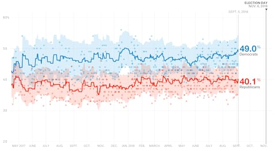
I have a confession — although it’s one that I’ve made before. The method of calculating the generic ballot that we use on our generic ballot interactive, which currently shows Democrats ahead by 10.8 percentage points, is too aggressive and will usually overestimate swings.4 Our House forecast actually uses a different, slower-moving version of the generic ballot average. In that version, Democrats currently lead the generic ballot by 8.7 percentage points. That’s still pretty good, but the House forecast will need to see Democrats sustain their most recent numbers for a few weeks before it concedes that they’re really up double digits.
Your guess is as good as mine — and probably as good as the model’s — as to whether they’ll do that. Historically, it’s been rare for a party to win the popular vote for the U.S. House by double digits.5 But it wouldn’t be surprising if Democrats wound up with a popular vote margin in the high single digits (i.e. 8 or 9 percentage points) rather than the mid-to-high single digits (i.e. 6 or 7 percentage points). In fact, our model calculates a historical prior based on long-term trends in midterms and presidential approval ratings. That prior figures that Democrats “should” win the popular vote by 8 to 9 percentage points given that midterms are usually rough on the president’s party and that Trump isn’t a popular president.
Put another way, a slight Democratic uptick on the generic ballot to 8 or 9 percentage points6 is arguably bringing the race for Congress more in line with historical norms. That’s one reason to think it could hold. But we’ll need to see more evidence — not only from the generic ballot but also from other indicators — to conclude that Democrats are really ahead by 10 or 12 or 14 points, which would produce a gargantuan wave.
Question 3: How much does all of this matter?
It might seem like we’re parsing awfully fine distinctions — e.g., between an 8-point popular vote margin and a 7-point one. But they matter, because it doesn’t take that much for Democrats to go from House underdogs to potentially taking 40 or more seats.
Here, for example, is the output from a Tuesday morning run of our Classic forecast, showing how a projected margin in the House popular vote translates into potential seat gains for Democrats. If Democrats win the popular vote by “only” 5 to 6 percentage points — still a pretty comfortable margin, but not necessarily enough to make up Republicans’ advantages due to gerrymandering, incumbency and the clustering of Democratic voters in urban districts — they’re only about even-money to win the House. If they win it by 9 to 10 points, by contrast, they’re all but certain to win the House and in fact project to gain about 40 seats!
Democrats have no room for error
How the popular vote translates into House seats for Democrats per FiveThirtyEight’s Classic model as of Sept. 4, 2018
Democratic outcome
Popular Vote Margin
Projected Seat Gain
Chance of Winning House
14-15 point lead
+66
>99%
13-14
+61
>99%
12-13
+56
>99%
11-12
+51
>99%
10-11
+46
>99%
9-10
+41
>99%
8-9
+36
98%
7-8
+32
92%
6-7
+27
78%
5-6
+24
56%
4-5
+20
29%
3-4
+16
11%
2-3
+13
3%
1-2
+10
0-1
+7
With that said, there are several reasons for caution. The House popular vote doesn’t actually count for anything, and it’s possible that Democrats (or Republicans) could run up the score in noncompetitive districts. In 2006, for example, Democrats did extremely well in noncompetitive seats, enough to win the popular vote for the House by 8 percentage points, but Republicans did well enough in swing seats to hold their losses to “only” 30 seats — not good, but a lot better than what Democrats experienced in 1994 or 2010, for example.
From a technical standpoint, the popular vote is also challenging to model, as you need to not only project the margin of victory in every district — including a lot of districts where there’s no polling data — but also forecast turnout. As compared with the Classic version of our forecast, which has Democrats performing particularly well in swing seats, both the Lite and Deluxe versions think there’s more risk of Democrats wasting votes in noncompetitive seats.7 So I’d approach our model’s forecasts of the popular vote with a few more grains of salt than its forecasts of seat gains or losses.
Bonus question: Apart from these technical issues, why should Democrats still be worried about their ability to win the House?
You mean, aside from the fact that 1 in 5 chances still happen 1 in 5 times, which is kind of a lot?! Or that the Senate map is still very difficult for Democrats, even if the House looks reasonably favorable to them?
One reason for Democrats to remain nervous — and for Republicans to keep their hopes up — is that we haven’t yet seen the sort of polling at the district-by-district level that would imply a House landslide. In particular, some Republican incumbents are holding their own, such as in a series of three polls of GOP-held congressional districts published late last month by Siena College. Although Democrats will pick up a fair number of open seats as the result of GOP retirements, and a couple more as a result of Pennsylvania’s redistricting, they will need to knock off some GOP incumbents to win the majority — and not just the low-hanging fruit, but Republicans like John Faso in New York’s 19th District, which has historically proven resistant to high-profile Democratic challenges.
These district-level polls, taken in the aggregate, aren’t bad for Democrats, but they imply a popular vote win of “only” 6 or 7 percentage points, with some GOP overperformance among incumbents in swing districts. Those polls make the House look more like a toss-up than the generic ballot or other indicators do.
The caveat to the caveat is that, historically at this point in the election cycle, district polls have had a slight statistical bias toward incumbent candidates. (Or at least they have in House races; we haven’t observed that for other types of elections.) That perhaps reflects name-recognition deficits on the part of challengers, some of whom only recently won their primaries or have not even held them yet. But Democrats have recruited competent candidates in almost every swing district, and they’ve also raised a lot of money, so they should be capable of running vigorous campaigns and perhaps picking up the majority of undecided voters.
To put it another way, Democrats are well-positioned to win the House — but they still have a lot of work to do to turn good prospects into a reality on the ground.
Check out all the polls we’ve been collecting ahead of the 2018 midterms.
September 3, 2018
Politics Podcast: Is The Path Of Trump’s Presidency Set?
More: Apple Podcasts |
ESPN App |
RSS
| Embed
Embed Code
The FiveThirtyEight Politics podcast is using the Labor Day holiday to take a step back from the news of the moment and assess how President Trump is faring after more than a year and a half in office. To guide their analysis, the crew uses Nate Silver’s article, “14 Versions Of Trump’s Presidency, From #MAGA To Impeachment.” He wrote the piece shortly after Trump’s inauguration, and while some versions have been pretty prescient, others now seem off the table.
You can listen to the episode by clicking the “play” button above or by downloading it in iTunes , the ESPN App or your favorite podcast platform. If you are new to podcasts, learn how to listen .
The FiveThirtyEight Politics podcast publishes Monday evenings, with occasional special episodes throughout the week. Help new listeners discover the show by leaving us a rating and review on iTunes . Have a comment, question or suggestion for “good polling vs. bad polling”? Get in touch by email, on Twitter or in the comments.
August 30, 2018
Model Talk: Features And Bugs
More: Apple Podcasts |
ESPN App |
RSS
| Embed
Embed Code
The FiveThirtyEight Politics podcast brings you another installment of “Model Talk,” in which Nate Silver answers questions about the forecast. In this episode, Nate discusses bugs he found in the model, why he isn’t adjusting North Carolina’s forecast just yet, and how he’s thinking about the forthcoming Senate forecast.
You can listen to the episode by clicking the “play” button above or by downloading it in iTunes , the ESPN App or your favorite podcast platform. If you are new to podcasts, learn how to listen .
The FiveThirtyEight Politics podcast publishes Monday evenings, with occasional special episodes throughout the week. Help new listeners discover the show by leaving us a rating and review on iTunes . Have a comment, question or suggestion for “good polling vs. bad polling”? Get in touch by email, on Twitter or in the comments.
Politics Podcast: Features And Bugs
More: Apple Podcasts |
ESPN App |
RSS
| Embed
Embed Code
The FiveThirtyEight Politics podcast brings you another installment of “Model Talk,” in which Nate Silver answers questions about the forecast. In this episode, Nate discusses bugs he found in the model, why he isn’t adjusting North Carolina’s forecast just yet, and how he’s thinking about the forthcoming Senate forecast.
You can listen to the episode by clicking the “play” button above or by downloading it in iTunes , the ESPN App or your favorite podcast platform. If you are new to podcasts, learn how to listen .
The FiveThirtyEight Politics podcast publishes Monday evenings, with occasional special episodes throughout the week. Help new listeners discover the show by leaving us a rating and review on iTunes . Have a comment, question or suggestion for “good polling vs. bad polling”? Get in touch by email, on Twitter or in the comments.
Nate Silver's Blog

- Nate Silver's profile
- 730 followers

