
Todd Klein's Blog, page 299
September 17, 2012
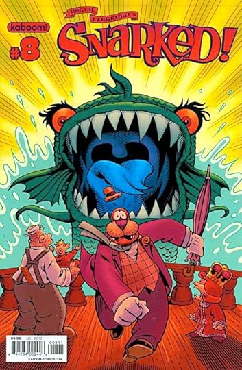
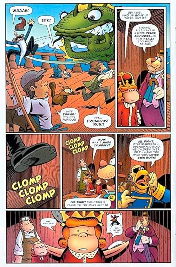
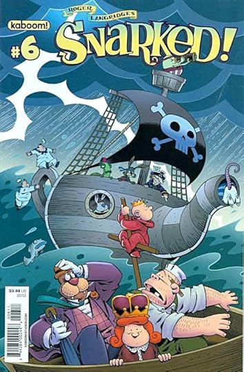
And Then I Read: SNARKED! 7 & 8
Images © Roger Langridge.
The voyage to find the Red King hits land in issue 7, and Wilburforce J. Walrus and his friend carpenter Clyde McDunk find themselves in hot water—literally. The natives want to eat them! This is even funnier because the natives are cartoonish birds, who should be no match for a Walrus, but then we’re in the funny world of Roger Langridge borrowing characters from Lewis Carroll and making them his own. Issue 8 has them back at sea, nearing Snark Island, but bedeviled by a Bandersnatch, as seen above and below, as well as their old nemesis the bounty hunter Gryphon, who has caught up to them at last. While there is plenty of action in this comic, the best thing about it is the whimsical humor, clever dialogue, and wonderful characters.
Roger’s art is as delightful as his writing, with some elements of animation art but with a British flavor that’s refreshing. These issues conclude Book Two, but Book Three is up right away, and I can’t wait.
Recommended.


September 16, 2012
Fall Fluttering
Images © Todd Klein.
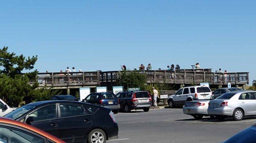
Yesterday was another lovely late summer/early fall day; sunny and with gentle northwest breezes making it a good day to be out and a good day for migrating birds and butterflies. After doing chores in the morning we drove down to the Cape May Point State Park at the southern tip of New Jersey to look for some of those migrants. Quite a few human migrants had ended up there, too.
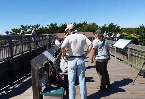
Up on the platform there were about three dozen birders, including the official hawk counter and several docents to talk to folks about the birds and point them out when they came close.
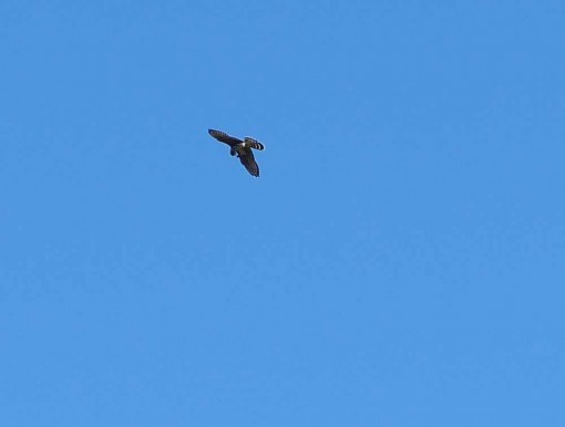
It wasn’t a huge day for migrating hawks, but we did see some like this Merlin eating a small songbird on the wing, and a number of Kestrels, Sharp-Shinned Hawks, and a distant Bald Eagle. This was the best bird photo I got, they’re quite tough to catch on the wing, and not all that close usually.
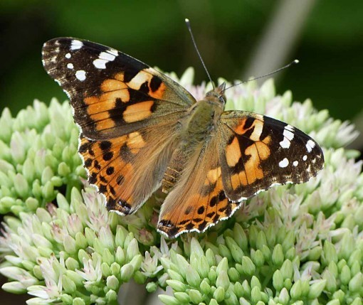
After a while we went for a walk on one of the park trails, where there were lots of wildflowers and lots of butterflies, some migrating ones like this Painted Lady, and some residents.
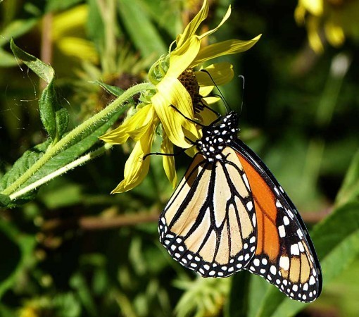
The star of butterfly migration is surely the Monarch, and there were lots of them around feeding on the flowers. Some of them will fly all the way to the high mountains of Mexico, where they gather in large colonies for the winter.
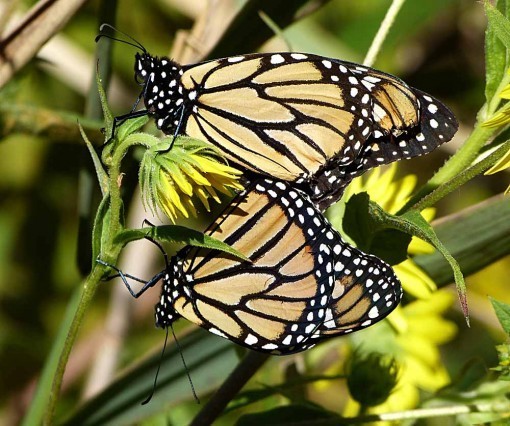
Monarch pictures are easy to get, in fact most butterflies are much easier to photograph than birds, but I don’t think I’ve ever gotten a picture of Monarchs mating before (with all the relevant body parts tastefully hidden by wings).
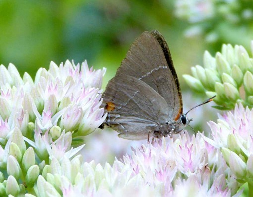
Small butterflies like this Banded Hairstreak can be harder to shoot. this one is about 10% of the size of the Monarchs.

A Buckeye, about midway between the two in size, and one of the prettiest ones we see here. Buckeyes also migrate, but no one is sure how far they go. The large eye spots suggest the eye of a buck or male deer, I suppose.
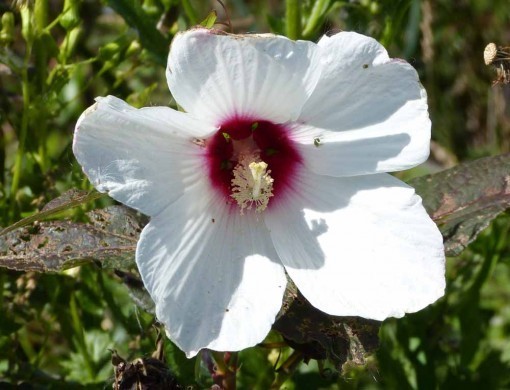
This is a Marsh Mallow, a large wildflower similar to Hibiscus. Early marshmallows (the edible kind) were made with the sap of this plant as a thickener.
A great outing, hope you had time to get out and enjoy the weather yourself, if it was good where you are!
September 14, 2012
And Then I Read: BANNER IN THE SKY
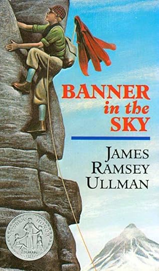
© James Ramsey Ullman, cover illustration by Wendell Minor.
I remember seeing this book many times over the years, it was a Newbery Honor Book in 1955, and I’m sure was in our grade school library. Disney made a film version that I remember seeing on TV, but I never read it until recently.
Rudi Matt lives in a town high in the Alps surrounded by tall peaks, and the men of the town have become guides for mountain climbers over recent decades. Rudi’s father Josef was one of the best until he died along with his climber client trying to reach the top of a mountain called The Citadel. Rudi wants desperately to follow in his father’s footsteps (literally) but his mother won’t hear of it, and his uncle, another guide, also refuses to let Rudi climb with him. Rudi has a job at a local hotel washing dishes, and his mother wants him to pursue a career there, but Rudi is always sneaking away to climb the lower mountains.
While out doing that one day, he rescues a climber, Captain Winter, who has fallen into a crevasse in a glacier. Rudi doesn’t have the proper climbing gear, making the attempt much more difficult, but after some thrilling and tense moments, the man and boy are able to return safely. Captain Winter is very impressed with Rudi’s abilities, and talks Rudi’s mother and uncle into letting him come on a climb to the top of a much lower and easier peak than The Citadel. Rudi is over the moon with excitement, but on that climb he makes a big mistake that puts everyone in a great deal of danger. Soon, Rudi is back washing dishes.
Captain Winter is determined to attempt The Citadel, though he has to go to another village to find a guide willing to try it. When Rudi learns of their attempt, he runs away from home to join them, lying to Captain Winter about having permission from home. The climb that follows is truly epic and full of drama and excitement.
While the human relationships in this story are fairly predictable, the writing about climbing is terrific, and kept me turning pages and wondering how they would get out of one fix after another. A Newbery Honor Book is usually a good read, and this one is no exception.
Recommended.
September 13, 2012
A Chris Ware Page Examined
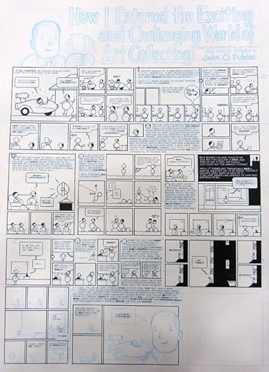
Images © Chris Ware.
At the Baltimore Comic-Con I recently attended, an art dealer had a page of Chris Ware original art for sale. It’s the first one I’ve seen, and I asked and was given permission to take it out of its plastic sleeve and photograph it. The page is unfinished, with some panels complete, some partially complete, and some only pencilled in non-repro blue, meaning a pencil color that is easily removed after scanning or photographing for publication. (I know of a few other artists who work or worked this way.)
I asked the dealer if he knew why it was unfinished, and he didn’t but said the page is in print in one of the ACME NOVELTY LIBRARY volumes, he wasn’t sure which. I don’t know either, it’s not one I have. The dealer suggested Ware might have completed the page digitally, either adding in pieces done on other paper, or just inking it on the computer, which seems possible. This could also be a page that was abandoned and redone completely. Without the printed page to compare, it’s hard to say. In any case, I was quite interested to see all this original Chris Ware lettering.
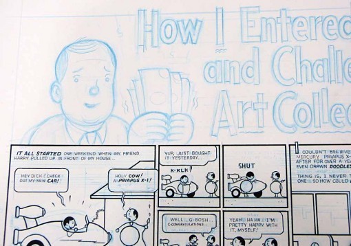
Here’s a closer look at the upper left section. The page is pretty large, and even showing just this part, the lettering is clearly quite small. That’s characteristic of much of Ware’s lettering, it’s often too small when printed for me to read comfortably, which is one reason why I haven’t read a lot of his work. I like his blue pencil layouts for the title: very old-school sans-serif open letters with a nice bounce to them.
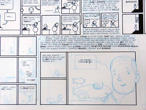
Here’s a similar section at lower right. Even at this distance you can see from the amount of blue pencil behond the large block of lettering in the center that he wrote out all the text in pencil before inking it, something I like to see. It was the standard method at DC Comics when I started there in 1977, many of the artists, especially ones that had worked for the company for years, loosely pencilled in all the text so they knew about how much space it would take up, and could draw the art around those areas. Curt Swan and Kurt Schaffenberger were both quite good at this, and it made lettering their work much easier. Only a very few artists do this now, P. Craig Russell being a prominent example.
Here’s one tiny panel very close, about as large as it would look if your nose was nearly touching the paper. You can see that Ware began with horizontal guidelines drawn with his blue pencil, and probably made with the help of an Ames Lettering Guide. Then he pencilled in the actual words. You can see the word BE at the end of the third line. When he inked the lettering, he didn’t follow his pencils exactly, but instead made adjustments for good spacing. I would say the lettering is done with a Technical Drawing Pen, like the ones in THIS post, though perhaps not the same brand.
Part of another panel with even smaller lettering! This is approaching the limit of what’s possible with pen in hand, I’d say, at about an eighth of an inch high. A little shaky, but still quite readable at this size. (Probably barely so at printed size, at least for me.)
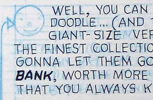
Here’s part of that large block of text. Note that he uses a different size pen point for his emphasized word BANK, though not for the comma after it, as I probably would have. Ware’s letterforms are very traditional and most would fit into a rectangle that’s a little narrower horizontally than vertically, giving them a slightly condensed look. The imperfections visible at this size are usually not apparent when printed at a smaller size.
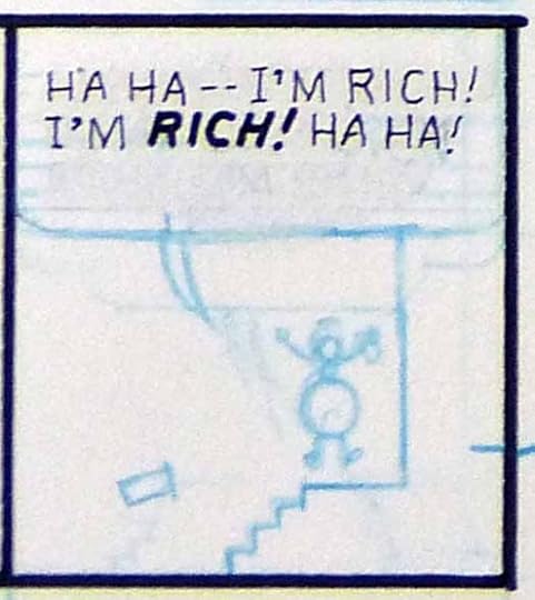
One last panel which has only the lettering inked. This is a great example of getting maximum interest and excitement out of minimal linework.
The only letterer I know of who consistently worked as small as Ware was Bob Lappan. He lettered for DC in the 1980s-1990s. Lappan’s work was further from the classic lettering model than this, and I think perhaps harder to read, though I haven’t looked at any of it in a long time. Chris Ware’s lettering is often too small for my taste, but it’s well done and his title and display lettering are truly masterful.
More about lettering can be found on my COMICS CREATION page and the HOW TO section of my website.
September 11, 2012
And Then I Read: WONDER WOMAN 11 & 12
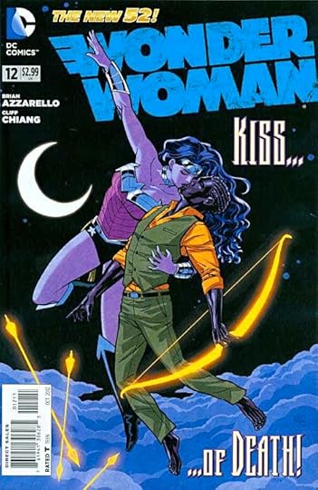
Images © DC Comics, Inc.
The plotline that has been running in this relaunch since issue 1 comes to a conclusion in these issues. More Greek gods and goddesses take the stage, and for the most part writer Brian Azzarello’s versions work okay for me (now that Hades is off the scene). Wonder Woman continues to try to protect Zola, the young girl who is pregnant by Zeus, and the subject of a tug of war among the gods. The storyline takes us to Olympus at last, and battles both physical and mental ensue. Diana handles herself well. At the end there are hints of a new storyline going in an unusual direction (if I’m reading it right) that seems intriguing. I’m a little tired of gods and goddesses, so a change from that would be good.
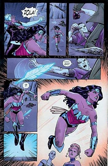
Cliff Chiang’s art on both these issues is wonderful, perfectly suited to the character and the story. I know he can’t work fast enough to do all the issues, but what he does is worth waiting for.
Recommended.
September 10, 2012
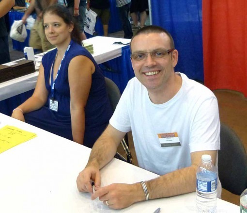
Baltimore Comic-Con 2012 Part 2
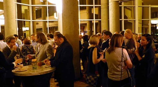
Saturday evening the Harvey Awards dinner was preceded by cocktail hour at 7 PM. I enjoyed talking to a number of people there, some I knew and some I didn’t.
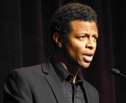
After a few opening speeches, awards host Phil LaMarr, above, got things going. Phil is very funny and entertaining, and is a comics fan as well as a cartoon voice actor and TV star. He made a great host.
The Lettering award was up first, as it often is, and it went to Chris Eliopoulos this year. Chris is a good guy and a fine letterer, I’ve known him a long time, and I was pleased that he won. Also, with that out of the way I was able to relax and enjoy the rest of the awards.

As sometimes happens, about half the winners were not present, but I was happy to see Walt Simonson accept two awards for WALT SIMONSON’S THE MIGHTY THOR ARTIST’S EDITION, the deluxe oversized hardcover from IDW. That’s Thom Zahler behind him, one of the award presenters, who were also all good.
David Petersen, creator of MOUSE GUARD was a presenter and also accepted some awards, he was pretty funny, too.
Joe Rubinstein is a long-time inker I’ve known since I was on staff at DC in the 1970s-80s, though I hadn’t seen him for many years. Joe did several presentations, including giving the Inking award to Joe Rivera for DAREDEVIL.
In fact, DAREDEVIL won quite a few awards, making Best Writer Mark Waid very happy, as well as the art team penciller of Paolo Rivera and his dad Joe Rivera. I decided I need to read that storyline!
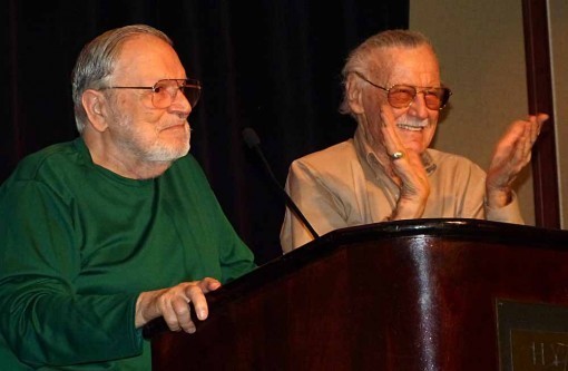
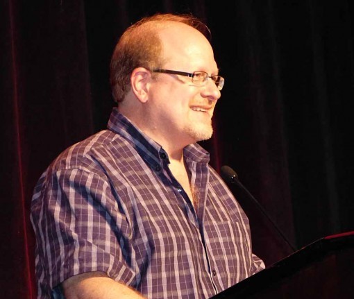
I think my favorite moment at the awards was this one. Stan Lee got up on stage, saying he was there to present an award, and he asked John Romita Senior to join him. I’ve been to a lot of comics awards presentations, and this is the first time I’ve ever seen Stan Lee at one, so I figured it was for something special.
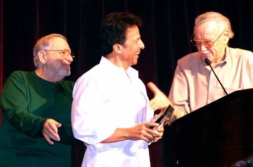
Turns out they were giving John Romita Junior a Lifetime Achievement award, which really shocked the younger Romita. And there can’t be another instance in comics where such an award was presented by the recipient’s father! All three of them were quite entertaining, but I was most impressed by Stan, who is really quite sharp, funny and spry for his age.
I was also delighted that my friend J.H. Williams III won two Harveys: Best Cover Artist and Best Artist for his work on BATWOMAN. He wasn’t able to be there, but I texted him with the news and made his day.
Several speeches dwelled on the loss of Joe Kubert, who had planned to be there, the best from Paul Levitz. In all the awards were too long, as they all are, but I enjoyed them anyway. Each audience member got a large and heavy bag of books from publishers attending the show, some of which I’ll be reading and reviewing here. Getting into the elevator afterwards, we had a full car, and the books probably added the weight of at least one more person!
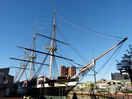
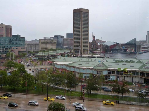
The next morning the storms had passed, and the weather was beautiful. I went for a long walk before breakfast, first over to the harbor, just a block or two from the hotel. I’ve been there a few times before, and the one constant is the sailing ship U.S.S. Constellation. There are several other ships you can tour as well.

Looking across the harbor, and that’s a submarine you can tour on the left. There’s a fine aquarium here, too.
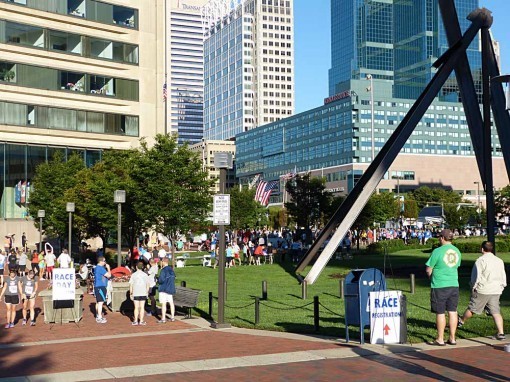
On another side participants were preparing for a 5K race.
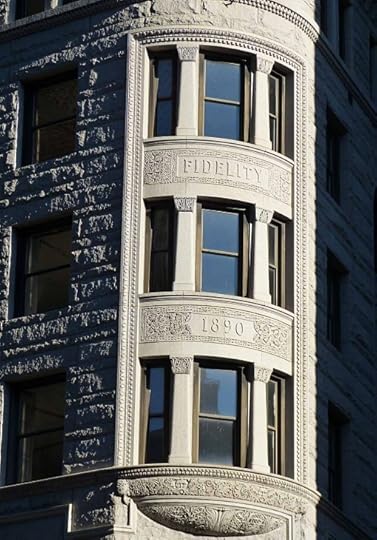
From there I walked about 10 blocks up Charles Street, enjoying some of the old buildings like this one.
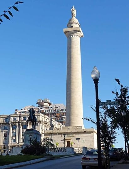
I reached Baltimore’s Washington Monument before turning back.
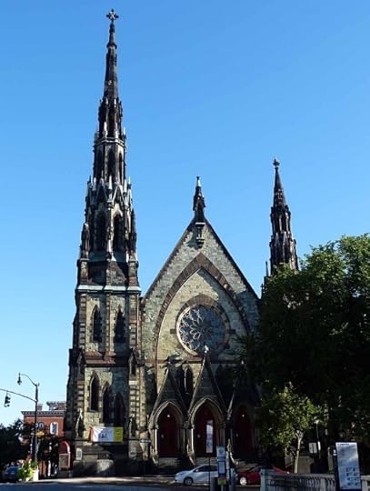
This handsome church is nearby, one of many in the downtown area.
I got back to the hotel for a planned breakfast with artists Gene Ha and Mark Buckingham, and we were soon joined by a few others including Barry Kitson and Brian Bolland. I enjoyed those conversations, and have just realized I didn’t get a photo of Gene, who I also sat with a while on Saturday. Sorry, Gene! Or maybe he’s happy about that.
I had originally thought I’d head home after breakfast, but decided I had time to go back to the convention for about an hour first. On the way over I found Jose Luis Garcia Lopez sitting outside enjoying the nice weather, and talked to him for a bit. At the con I found a few more folks to talk to and also a copy of the DAREDEVIL trade paperback collecting the series that had won all the Harvey Awards.
Then I did head home, about a two and a half hour drive, but not a bad one. I had a great time at the con, and hope to get to future ones.
September 9, 2012
Baltimore Comic-Con 2012 Part 1
Images © Todd Klein.
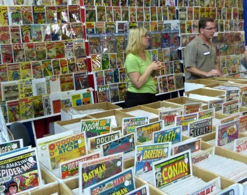
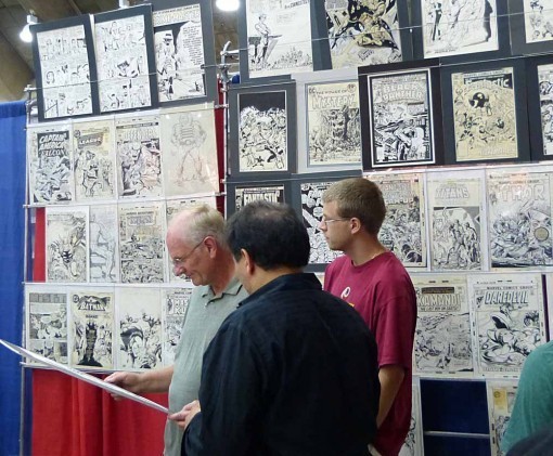
Saturday morning I drove down to Baltimore for this year’s Comic-Con. I’d been once before about five years ago I think, and I can’t say the show has changed much, but it’s a good show for comics fans. The vast majority of the show focuses on comics; no TV or Movie personalities or studio presence, almost no video game stuff. There are lots of old comics in every price range from 10 for a dollar to thousands, and everyone seemed friendly and welcoming to the fans.
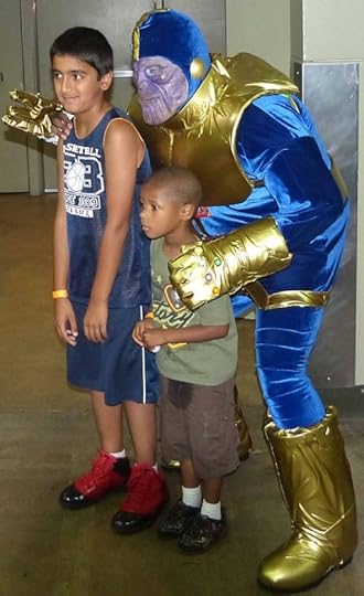
There were quite a few people in hall costumes, this was one of my favorites: Marvel villain Thanos. That younger boy doesn’t look too sure about the photo op.
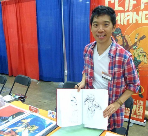
I did my usual con thing: wandering around looking at everything and talking to friends and workmates. Here’s Cliff Chiang, whose work on WONDER WOMAN I’ve been loving, with a sketch. He also has some terrific prints for sale.
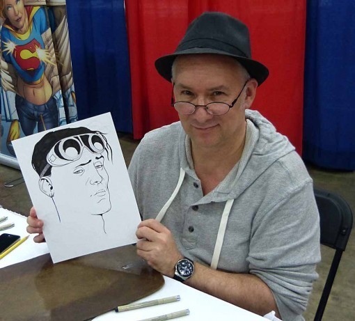
I hadn’t seen Kevin Maguire in quite a while, he was busy doing lots of sketches, like this one of Tom Strong.
Here’s former DC staffer Bob Greenberger and his daughter Kate, who I last saw when she was about two feet high I think. Kate lives in the area, so it was a fun show for both of them to share.
The show had a few dealers specializing in original comics art. I looked for logos I need for my FaceBook “Logo of the Day” feature, and only found one, but it’s a great one.

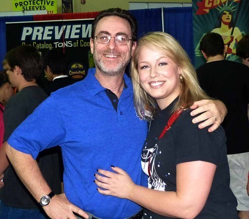
Here I am with former DC Editor and workmate Jack C. Harris. We’ve gotten back in touch through FaceBook, and agreed to meet here. I’m not sure when I last saw Jack in person, but it has to be at least 20 years ago. We had lunch and caught up. Jack is still teaching once a week at the School of Visual Arts, and occasional other classes, but calls himself “semi-retired.” He hasn’t been involved in comics for a while, but did write an article for Craig Yoe’s new book about Steve Ditko. Jack and Steve have stayed in touch.
Here’s colorist Danny Vozzo, who hasn’t been doing much comics work lately, but would like to get back into it, and was here looking to make some connections.
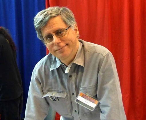
I always enjoy talking to Paul Levitz, who was telling me about a class he teaches.
I’ve worked with Frank Quitely several times, but met him for the first time at the show.
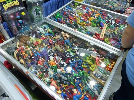
In addition to comics there were lots of comic-related toys, t-shirts, and other such paraphernalia.
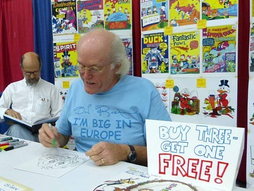
Don Rosa was at the show selling his prints and doing sketches. I love his t-shirt, which reads: DON ROSA — I’M BIG IN EUROPE (especially Finland), which is quite true. When he does appearances there he’s treated like a rock star!
Barry Kitson was at the show, someone I haven’t seen in a long time. We had a bit of time to chat on Sunday.
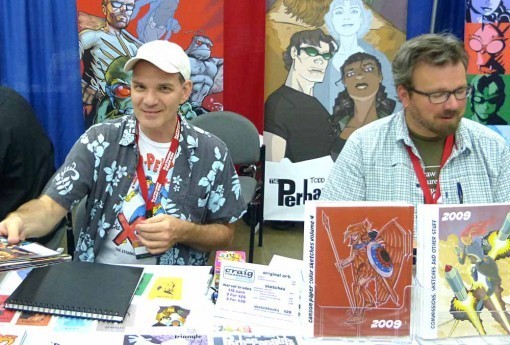
I met writer Todd DeZago for the first time; we’d both been involved in a motion-comic project last year that fell through. Next to him is his artist partner Craig Rousseau on THE PERHAPANAUTS, which I plan to read soon.
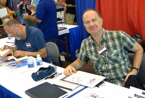
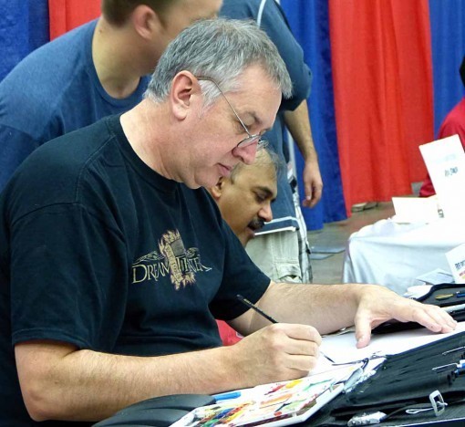
Brian Bolland and Mark Buckingham were both busy signing and sketching. Two more people I had time to talk to a bit on Sunday.
The day was showery, as seen in this photo of the harbor in the afternoon. I took a break from the con to come back to the Hyatt to check into my room, and then was stuck there for about an hour while it rained torrentially. Just as well, my feet needed a rest! I went back to the con for another hour or so before returning to the hotel to get ready for the Harvey Awards dinner and ceremony in the evening. I’ll cover that in Part 2 tomorrow, along with Sunday walks around the city and a bit more comics stuff.
September 7, 2012
And Then I Read: NIGHT FORCE 5 & 6
Images © DC Comics, Inc.
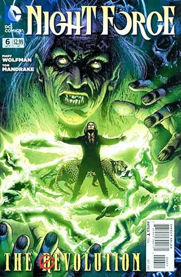
As this book rolls toward a conclusion in issue 7, writer Marv Wolfman is revealing more each issue about the complex cabal behind all the troubles Baron Winter and his cohorts are having. At first it seemed quite other-worldly and alien, but gradually that semblance is changing. The Baron does not fare very well in this storyline, but then when did he ever? A man who seems in control of much power and many resources, yet somehow they always slip out of his grasp at crucial moments. Jim and Zoe, the other characters who’ve become caught up in this arcane madness are still trying to figure things out, and getting a lot closer to real answers, while doing their best to stay alive against many threats. It’s a good read, reminding me a bit of that old horror soap “Dark Shadows,” but with more modern horrors.
The art by Tom Mandrake is wonderful when he can really let loose on the creepy stuff, as on this page, a little uneven at times when more mundane character moments are called for, but in general I like it a lot. I think Tom’s work on this book owes something to the original NIGHT FORCE artist Gene Colan, but there’s plenty of Tom’s own unique energy and creativity as well.
Recommended.
September 6, 2012
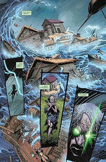
And Then I Read: SNARKED! 5 & 6
Images © Roger Langridge.
If you haven’t tried this delightful droll humor series yet, you’re missing something special. Roger Langridge’s art and writing are very much in the classic cartoon tradition that spawned Carl Barks’ DONALD DUCK and UNCLE SCROOGE, though the style is very much his own. If you saw any of his work on other books, you know what it’s like. There’s an added layer of enjoyment for fans of Lewis Carroll’s work, too: many of the characters are drawn from the “Alice” books and his humorous poem, “The Hunting of the Snark.” While there are many nods to Carroll, the style and humor is very much pure Langridge.
The Red King has gone missing at sea, and his feisty daughter, Queen Scarlett has contrived a rescue voyage to search out and find him. The ship is the one from “Hunting of the Snark,” with it’s very eccentric crew, and along for the ride are a Walrus, a Carpenter, and the Queen’s baby brother Prince Rusty. In these issues the voyage continues, and they must deal with a very hungry crocodile and a pirate ship manned by the characters from Carroll’s Mad Tea Party, among others. Queen Scarlett is a pretty sharp character, but the real conniver is Wilburforce J. Walrus, and his funny struggles to keep things going the way he wants are always entertaining. I see him as something of a W.C. Fields character (the crafty ones).
The story is about to get scarier, I think, as the ship approaches Snark Island, where the King is being held captive, or so our heroes believe. I’m looking forward to the next two issues, which I’ll be reading soon.
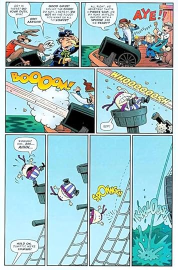
Here’s a page that made me laugh as Humpty Dumpty takes a tumble, but not with the result one might expect.
Highly recommended.
September 5, 2012
And Then I Read: GREEN LANTERN CORPS 10 & 11
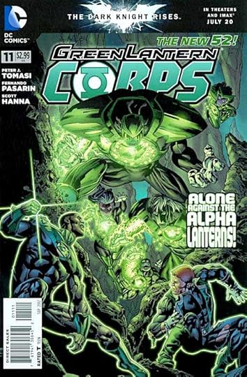
Images © DC Comics, Inc.
So, apparently the Guardians of the Universe, that lame group of little blue men, has decided to sabotage their entire Green Lantern Corps structure for reasons not yet revealed. The main way they’re doing so is to allow the Alpha Lanterns to wield dictatorial authority over the rest of the Corps, and encouraging all kinds of extreme behavior by them and others. This is essentially how GL John Stewart has been put on trial for murder, and why Guy Gardner and a few other friends are forced to rescue him with major force. The rescue attempt is a grand ride through the innards of Oa, and there’s plenty of explosive action as Guy uses some old remnants of Guardian history to help him out. But is the rescue worth what it unleashes? Good stuff from writer Peter Tomasi in these issues, as it’s as much about the characters relationships and loyalties as about the fighting.
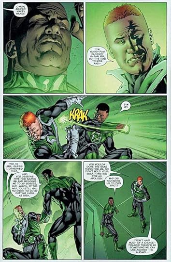
The art by Fernando Pasarin and Scott Hanna continues to be excellent.
Recommended.
Todd Klein's Blog

- Todd Klein's profile
- 28 followers

