
Todd Klein's Blog, page 302
August 16, 2012
And Then I Read: WONDER WOMAN 10
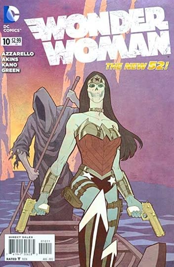
Images © DC Comics, Inc.
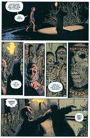
Wonder Woman is about to be married to Hades, the ruler of the underworld. Not some large scary fellow, or even a mysterious hooded figure, this version of Hades is a boy child with his head covered in burning candles and dripping candle wax. If there’s some intended symbolism in that by writer Brian Azzarello, I don’t get it. Hades not only looks a child, he acts like a thoroughly spoiled one, deciding to put his betrothed to a test with her own golden lasso, which forces the wearer to speak the truth. (One part of the original Wonder Woman concept they’ve kept.) As you can imagine, Hades doesn’t get the answer he wants, and from there it quickly becomes a battle, and one that WW seems unlikely to win.
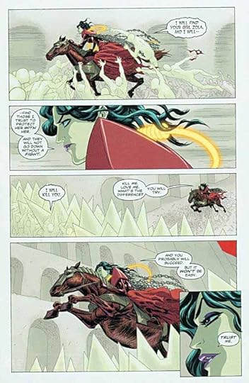
The art by Kano and Tony Akins is generally fine, though doesn’t come up to the high bar set by Cliff Chiang on his issues.
I sure hope this is the last we’ll see of young Hades for a while.
Mildly recommended.


August 15, 2012
And Then I Read: SECRET SERVICE 1
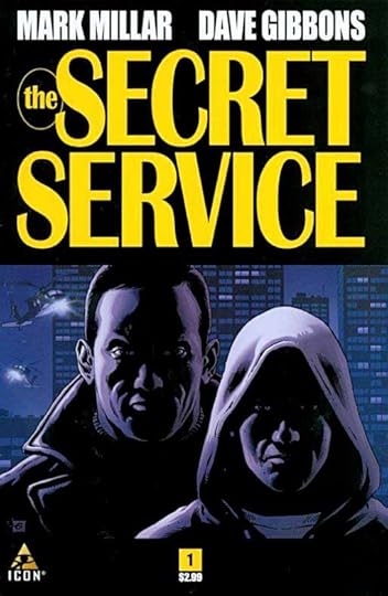
Images © Millarworld Ltd, Marv Films Ltd and Dave Gibbons Ltd.
Unless one reads the indicia carefully it’s hard to know that this book is published by Marvel. It’s the first one I’ve seen under their Icon imprint, which perhaps is meant for creator-owned properties like this one. And from all those Ltds in the copyright, looks like this is intended as a film treatment as well.
I haven’t read anything by Mark Millar in a while, and this one is pretty good, though the story type is not really to my taste. It’s a police story with a decidedly grim and violent side which opens on an apparently secret hostage rescue operation in Germany conducted by British Secret Service operatives. The kidnap victim is actor Mark Hamill, who must have given permission for his use (with a possible film role in the deal) though the operation goes pretty badly wrong.
Back in London, we have a look at brutal family life in a poor section of London: a wife taking abuse from her husband, her younger son being taught to roll marijuana cigarettes, while the older one leaves angry, and gets into big trouble with the law after a stolen car chase.
Next we see a leading British agent, Jack, and his boss having dinner, interrupted by a frantic text from the wife above, his sister, begging him to come and get the son out of jail, using his influence.
So, I guess this is sort of a mix of spy thriller, police procedural on the dangerous streets, and urban gang story.
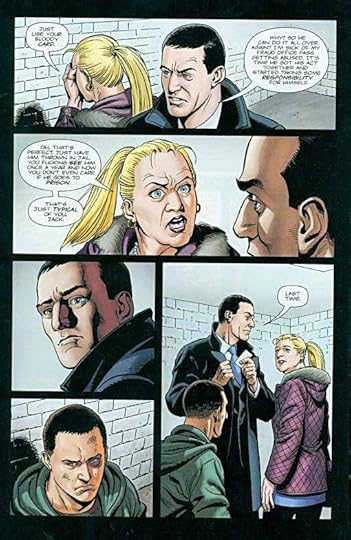
The art by Dave Gibbons is, of course, excellent, though in a way it’s almost too clean for the subject matter, at least the urban poor part. On the other hand, Dave’s storytelling is always top-notch, and that goes a long way toward making this comic fun to read. Despite the violence, and storylines that aren’t really to my taste, I’ll be reading more.
Recommended.
August 14, 2012
And Then I Read: A GAME OF THRONES Vol. 1
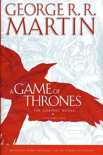
Images © George R.R. Martin.
I’ve been a fan of the writing of George R.R. Martin for decades, and have bought and read all the books in the “Game of Thrones” series of novels as they came out in hardcover. I have a lot of mental imagery invested in the series, and had not thus far been tempted to watch the TV series or read the comics version, but I’ve heard a lot of good things about both, and finally decided to give this collection of the first six issues a try.
The publisher is Bantam Books, also the publisher of the novels, and one thing that’s quite clear from the cover on is that Martin is running the show. I know it’s a decision driven by marketing, but I find it a little irritating that the adapter and artist’s names are so small at the bottom when they did the vast majority of the work here. That said, Martin does provide a fine introduction describing his actual involvement, and there’s a long section in the back written by the editor outlining exactly how the series is created, giving lots of well-deserved props to artist Tommy Patterson and adapter Daniel Abraham, as well as a few kudos to the colorist Ivan Nunes and letterer Marshall Dillon. Cover artists Alex Ross and Mike S. Miller are lightly mentioned. I found the editor’s “gosh, this is so different from editing novels” confessions kind of amusing, too.
It’s been a long time since I read the first novel, so I’m not sure how closely the comics are following it, but they do seem to be giving enough space to many of the important characters. Visually there are some issues with a story like this, in that many of the characters are from the same few families, and those family members tend to dress alike, especially the children. It takes a while to figure out who’s who among them on some pages, but as the story goes on, and the characters split into different storylines, that problem largely goes away, though there were still some places where a “setting and character” caption would have been helpful.
I won’t attempt to outline the story, which is famously complex, but in short, this is a fantasy with only a little magic and a large dose of grim reality. The land at the center of the story is one of many competing factions only loosely tied into a kingdom (in fact, it’s called the Seven Kingdoms), and lots of plotting is always afoot, violence and cruelty are commonplace, and no character is ever safe. The world it takes place in is decidedly not Earth, even a past Earth, as it goes through a seasonal cycle that covers decades. It’s been “summer” for the last few, allowing people to flourish, but now the days are shortening, the nights are colder, and winter is coming. It will be a winter to test and try everyone, especially those in power. Standing at the north end of the land is a huge wall (sort of like the great wall of China, but made of ice) meant to keep horrors of the frozen north out, and manned by a dedicated brethren. This volume begins in that frozen country north of the wall, giving us just a taste of what is to come.
Then there’s the distant land on another continent where young Daenerys and her brother are plotting to ally themselves with a tribe of fierce warriors, hoping to return to the Seven Kingdoms someday at the head of an army. Daenerys has what might be the most unusual story arc of the saga. It involves dragons, and it begins here.
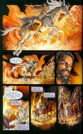
The art by Tommy Patterson is well done. One small complaint is that everyone is clean, beautiful and fashionably dressed throughout, while in the books the feel is much more gritty and hands-in-the-dirt, but in general it works well, and by the end of the volume I was completely involved in the world of the story. There were a few glaring errors in the lettering that were missed, and it’s a bit strange seeing Dave Gibbons’ font being used throughout, but the lettering and coloring were mostly at a high level of professionalism.
Recommended.
August 13, 2012
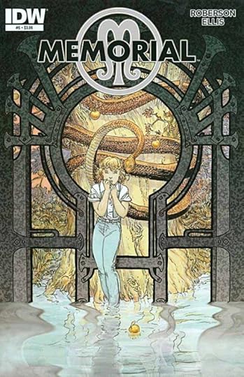
And Then I Read: MEMORIAL 6
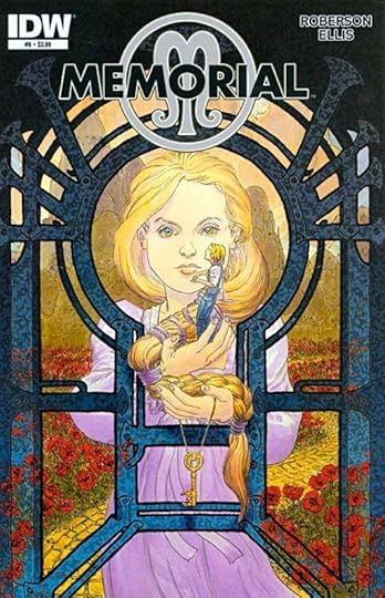
Images © Monkeybrain, Inc. and Richard A. Ellis.
The conclusion of this six-issue series, once again behind a stunning Michael Wm. Kaluta cover, gives us the final reveals and confrontations between Moment, the queen of the Everglade, and Em, now revealed as her sister Memory. I suppose that’s a spoiler, but really, it’s been pretty easy to figure out since at least issue 3, if not sooner. Moment fills us in on the missing parts of the backstory for this fantasy realm divided into three parts, the other one being Maybe, each with a sister in charge of it. This is a nicely thought-out setting by writer Chris Roberson, but I found the ending a bit anti-climactic. While everyone is battling Moment, Em and her friends slip away back to our world, with Memory’s memory now restored, and in possession of a powerful talisman, setting things up for a new set of adventures in the future, but not really resolving the main one in this series. Has Moment been subdued? One would guess not, but we’ll have to wait for another series to find out, I suppose. I did enjoy the storyline overall, and would be on board for more.
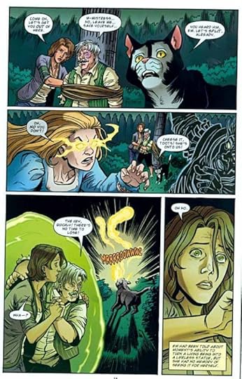
The art by Richard Ellis continues grow on me, and I think has improved over the span of the story. There are some areas that could use improvement, but in general he did a fine job.
Recommended.
August 12, 2012
Ira Schnapp’s “The Art of the Ages”
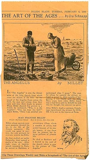
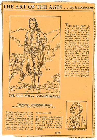
A few weeks ago, logo designer Alex Jay posted a fascinating article on his blog about Ira Schnapp, a man we both have an interest in, as he was the main logo, cover lettering and house ad designer and letterer for DC Comics from about 1949 to 1968. I’ve written several articles about Schnapp recently, but in all my research I failed to uncover what Alex did: a series of 24 newspaper articles like the one above, published in The Toledo (Ohio) Blade from January to July of 1940. Since Schnapp lived in New York and the articles were published in Ohio, it seems likely they were syndicated, though there’s no information about that in any of them.
While Ira Schnapp is revered by some for his lettering and design work, until Alex came up with these articles (you can see poor but readable reproductions of all of them in his post), nothing he had written or drawn had ever come to light in the comics world, as far as I know. Jack Adler of DC Comics, who worked with Ira, once said that he was well educated, and knew a lot of things one wouldn’t expect. Yet, Alex Jay found evidence in the 1940 census that Ira had only two years of high school education. This strip proves Ira did know a lot about classical art, and we can only guess that he was self-educated, making good use of libraries and other resources to build the kind of knowledge seen in these articles.
So, Alex found poor scans of the articles, each of which describes and shows a particular piece of art by a wide range of artists. The articles are interesting and well written, if rather dry. The art is all done by Ira (some of it signed) interpreting the original paintings, sculptures and so forth in line work, as well as a portrait of the artist. While newspapers are notoriously bad at reproducing such things, I thought the scans we had must be even worse, and suggested to Alex that, if we could find examples of the printed articles, the art would look a lot better. About a week later, Alex had found four of the 24 articles for sale on an eBay store! The price was quite high for some old, browning newsprint clippings, but we both made offers to the seller anyway. I was willing to pay more than Alex, and so ended up with the articles. I’ve scanned them for this post, and at the end of it are links to higher resolution scans, if you’re interested.
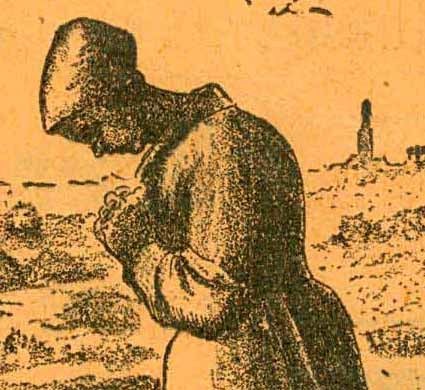
Here’s a detail from the painting as reproduced by Schnapp. It looks to me to have been drawn on some kind of textured paper and then inked with a combination of regular brush or pen lines first. Then texture was added either with a dry brush or a china marker (also known as a grease pencil or a lithography crayon) allowing the texture of the paper to come through in varying amounts. While this is probably a pale shadow of the original art, it’s miles better than the poor scans Alex found online, and I think pretty attractive work.
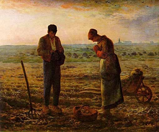
Here’s a scan of the original painting, “Evening Prayer – Angelus” by Millet. As you can see, it’s full of soft textures and I think would be quite a challenge for any artist to reproduce in line work. Perhaps many wouldn’t think it was worth the attempt, and in today’s internet world there would be no need to try, but in 1940 most people would have no access even to photographs of many of the paintings and sculptures in Schnapp’s series.
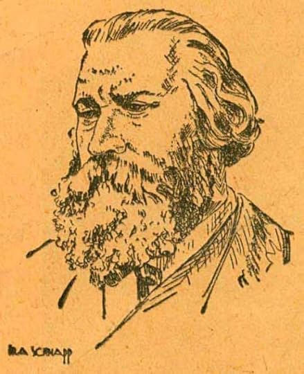
I also like Ira’s line drawings of the artists from various sources, and look, this one is even signed by Ira in a very Art Deco style. Perhaps if he’d ever done any comics art, and was allowed to sign it, the signature would have looked like this. Ira also hand-lettered all the large text in the articles like the painting titles, and it’s very much in his style.
 Here’s the second clipping with not only the painting title but the artist’s name and subtitle info lettered by him.

The original painting is in the Huntington Library in California, and I saw it on my visit there a few months ago. As you can see from the above scan, Schnapp could only hint at the details in the clothing and background in his linework version, but still, I think it gets the feeling of the original across pretty well. Of course the blue satin clothing that made the painting famous can’t be conveyed in the line drawing at all.
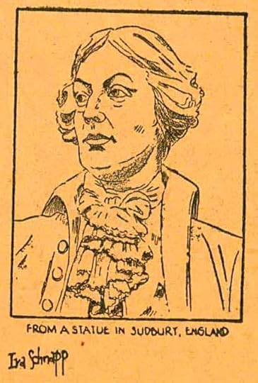
Here’s a closer look at the artist portrait with another Schnapp signature, a little different this time, with a serif I. The lettering under the picture is similar to a block letter style he often used on comics covers.
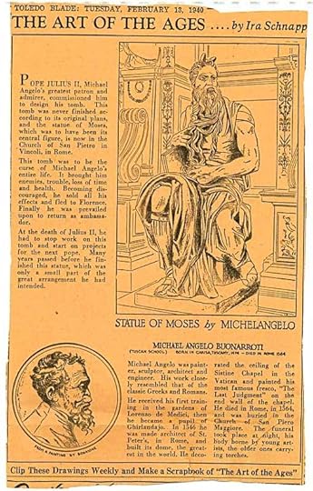
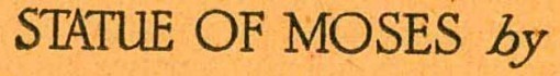
In this third clipping, Schnapp tries something even more difficult I think, a line drawing of a statue.
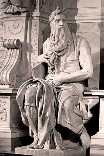
Here’s a photo of part of what Schnapp drew. Again, I think he did a pretty good job considering the limitations of the medium. This is not something one could simply trace, it takes a lot of thought to work out what lines to put down, and what to leave out so the essence of the statue comes across.
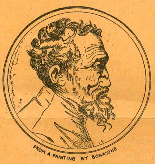
Schnapp’s portrait of the artist again shows a lot of character, I think.
And here’s a closer look at a bit of the hand-lettered title. Classical Roman letterforms that Schnapp knew well.
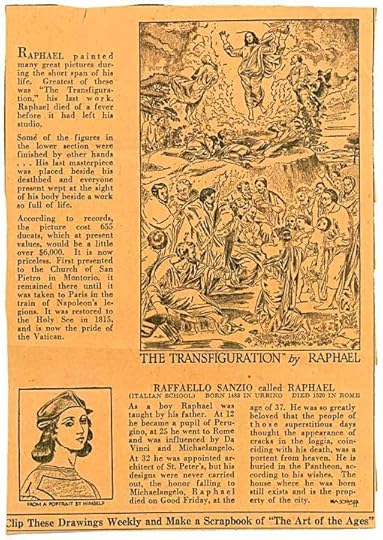
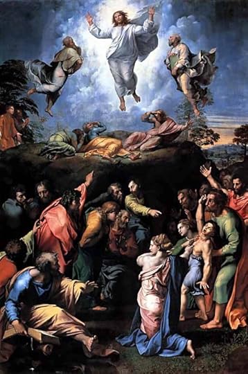
The fourth clipping has what is probably the most ambitious attempt by Schnapp to capture a painting in line work. Here’s the original:
I don’t think this one is as successful, there’s just too much going on, too many figures in the painting to capture well in a few lines and textures, but I have to admire Ira for trying.
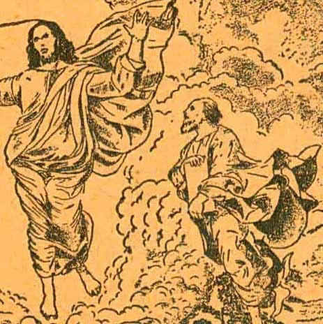
Here’s a detail showing the Christ figure, and it loses a lot in this version.
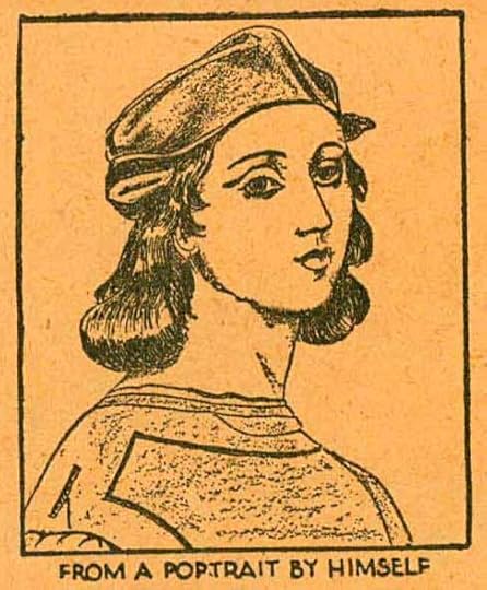
Schnapp’s version of the artist’s own portrait is charming, though.
“The Art of the Ages” represents a large body of hard work on Ira Schnapp’s part, and I’m really glad to have seen it. Huge kudos to Alex Jay for discovering them. We don’t know if it ran in other papers, but that seems likely. Even so, the series could not have been a financial success, or he would have done more, I’d guess. Selling high culture to the masses is always tough! But at least one person liked these enough to clip them and save them. I have to admit that my favorite things in the articles are those cool Schnapp signatures. They show me how proud the man was of the hard work he did here.
Below are links to higher resolution scans of the four articles.
STATUE OF MOSES BY MICHELANGELO
THE TRANSFIGURATION BY RAPHAEL
August 11, 2012
Cats’ Bath Day

Once a year, like it or not (and, oh how much they DON’T like it) our cats get a bath. Ellen’s family will be visiting for a week soon, and her sister Ann is allergic to cats. This seems to help some. Tigger is the first victim.

Oh, the indignity!
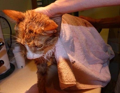
Getting towelled off.

Leo’s the next victim. He’s a little more cooperative.

What are you doing to me?!

Leo get’s towelled.

And now the licking begins, and will continue for several hours as they put all that cat saliva back onto their fur. Our older cat, Katie, has been spared the ordeal this year, Ellen says she’s too old to go through it. Just as well, she got the drift quickly and is thoroughly hidden!
August 10, 2012
A Froggy Day

A showery day here, but with some breaks in the weather. I slipped out to take frog pictures around our little pond. We have two kinds at the moment, this is the smaller one, a Southern Leopard frog. I think there are four of them, could be more. They like to get out in the grass and catch bugs, this one was right at my feet.

Not full grown yet, but about three times the size of the others is this Bullfrog, sitting in the running water from the little artificial waterfall. Perfect weather for frogs today.
August 9, 2012
And Then I Read: DARK HORSE PRESENTS 9
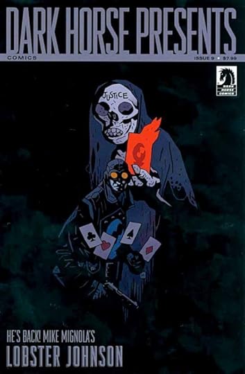
Images © Dark Horse Comics and the respective copyright holders.
DHP is, I think, an excellent package for the price. Squarebound, 80 pages, an anthology of continued stories in chapters, one-offs, and a nice mix of familiar Dark Horse regulars and new stuff (often acting as a preview for new series). In short, it’s very much the sort of package you might have picked up for a dime on the newsstands any time in the 1940s, and though the price is much higher, considering the value received in high-quality printing and content, I find it one of the best deals around.
This issue begins with a new Lobster Johnson short written by Mike Mignola, with nice art by Joe Querio. Not much to the story itself, but entertaining. I find it notable that Mignola keeps finding artists who work well in his “house” style.
Continuing episodes of “The Massive,” “Concrete Park,” “Skultar,” and “The Many Murders of Miss Cranbourne” leave me with nothing new to say about them. Each has good points.
Richard Corben adapts what I suspect is a fairly brief poem by Edgar Allan Poe, “The City In The Sea,” and probably in ways that would confuse the author, but it’s choice Corben work, so I’m not complaining. Nate Piekos of Blambot seems to have created a font from Corben’s old lettering, or at least that’s how it looks to me. Nicely done.
“1969″ by Paul Pope is an interesting idea, but his art doesn’t do a lot for me.
“The Once and Future Tarzan” has wonderful art by Tom Yeates, but the writing by Al Gordon takes some strange turns in this chapter, and the dialogue doesn’t sound to me like anything real people would be likely to say, even in the future, if that’s where the story is set.
“Amala’s Blade” by Steve Horton and Michael Dialynas looks like the beginning of a pretty good steampunk pirate story.
“Alabaster: Wolves” is a preview of an upcoming book by Caitlin R. Kiernan and Steve Lieber that looks pretty good.
Recommended.
August 8, 2012
And Then I Read: MEMORIAL 5
Images © Monkeybrain, Inc. and Richard A. Ellis.
I read the first four issues of this six-issue series a while ago, and am finally getting to the last two. This is a highly structured story by Chris Roberson that would probably benefit from reading all six issues together, so I’d recommend that. MEMORIAL begins in our world but much of it takes place in a fantasy world where a power struggle is underway between a mad queen of sorts and forces that oppose her in various surrounding lands. Em, a young girl from our world seems to have a pivotal role in this struggle, one she doesn’t understand yet. She’s been drawn into the Everglade and is caroming back and forth between various groups who want whatever unknown power or importance she holds.
In issue 5, Em becomes convinced she must face her nemesis, Moment, at the center of the Everglade, and with some help from a steampunk inventor, Timothy Sparks, and his flying machine, she travels there. What happens next clearly sets up the final revelations coming in issue 6.
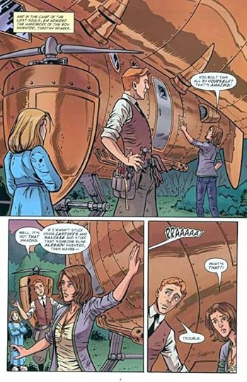
The art by Rich Ellis is pretty good. In fact, it’s growing on me. Perhaps it’s just me, but I seem to see Ellis’s skills in character acting improving over the run of the book. And of course Michael Wm. Kaluta’s covers are outstanding. This is a fun story with a well-thought out setting, and I’m looking forward to the last issue, which I’ll be reading very soon.
Recommended.
August 7, 2012
And Then I Read: GREEN LANTERN NEW GUARDIANS 9
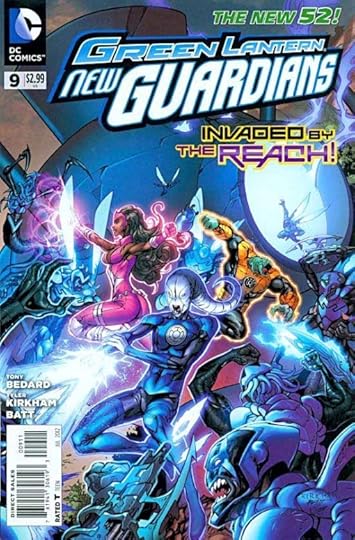
Images © DC Comics, Inc.
The world of the Blue Lanterns is under attack from space. The foe is powerful. The Blue Lantern Saint Walker has arrived home just in time to take part in this battle, and does his best, but the blue guys are not really equipped mentally for this kind of combat, and don’t fare well. A call goes out to the rest of the rainbow coalition, which has scattered, but all of them are facing their own problems and crises. Doesn’t look good for the blue guys.
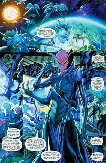
The art by Tyler Kirkham and Batt is, as always, quite well done. They handle all the alien creatures in this book well, not an easy task, and don’t slouch on the human characters either.
Recommended.
Todd Klein's Blog

- Todd Klein's profile
- 28 followers

