
Todd Klein's Blog, page 303
August 6, 2012
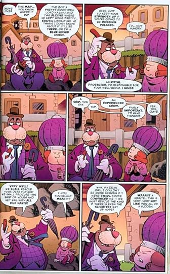
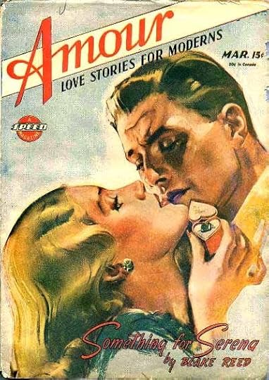
And Then I Read: LOVE AND CAPES Vol. 3
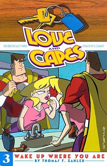
Images © Thomas F. Zahler.
If you’re not reading LOVE AND CAPES, you’re missing a good thing. It’s a situation comedy with superheroes. Think “Friends” crossed with The Justice League. In Volume 1 our hero, The Crusader (in his civilian guise as Mark, a mild-mannered accountant) meets a feisty bookstore owner, Abby. They date, they have misadventures, he reveals his identity to her, funny situations ensue. In volume 2 their romance takes a number of hairpin turns and ends up with a wedding. Volume 3 begins with the end of the happy couple’s honeymoon, and continues with the trials of their new life together, finding and buying a home, getting along with each other’s relatives and friends, and more, all complicated by Mark’s super-powered job. For instance, an important dinner with his in-laws gets sabotaged when a sorcerer turns him into a child.
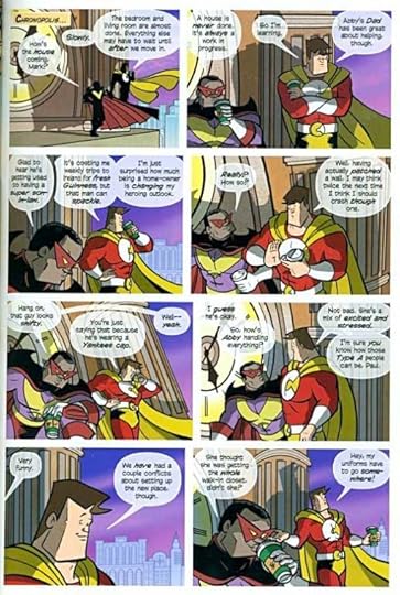
Thom’s art is on the cartoony side, but his stories and dialogue are maturely wise and funny. I do have a few problems with some elements of his style, like the huge eyes on the women versus the tiny ones on the men, but mostly I can overlook that and enjoy the stories and characters. It’s not all laughs, there are some serious character moments, but overall it’s a fun series with quite a few amusements and gags, especially for fans of superhero comics.
Recommended.


August 5, 2012
And Then I Read: STORM THIEF
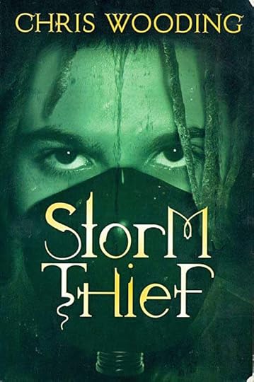
© Chris Wooding, cover art by Craig White.
This is the first young-adult novel I’ve read by Wooding, though he’s written about a dozen of them, including several trilogies. This is a stand-alone work set in a dystopian world. That’s something I generally find unappealing, but this one’s cover synopsis intrigued me, and I’m very glad I tried it.
Orokos is a remote, rocky island that in the distant past was colonized and developed as a haven for a group of humans from somewhere else. Their civilization rose to great heights, developing scientific skills that allowed the building of a high-tech city of marvelous strength and complexity. Their government was a strict one that attempted to create a perfect society by stamping out any resistance, but that led to a stagnant society. Things changed when they built something called the Chaos Engine. It began causing probability storms that would descend upon the island and its inhabitants and change things unpredictably, sometimes in massive ways, sometimes small ones, making life indeed chaotic. Soon the golden age was a distant memory, and Orokos became a place divided into small walled sections; some still held by the wealthy and powerful, some virtual prisons for the poor and sick, some invaded by deadly beings called Revenants, whose very touch meant death or worse.
In this society’s poorest areas, thieves are common. Two of them, a young man and his girl companion, Rail and Moa, struggle to survive. When they find an artifact having “fade technology” from the island’s golden era, Rail decides to keep it, and not turn it over to his thief-mistress. That’s a mistake, and soon Rail and Moa are on the run. Only the fact that the artifact can open any solid wall allows them to escape their pursuers. They fall in with a strange half-human half-machine creature named Vago, who helps them reach a refuge of sorts deep beneath the city, but that’s only the beginning of their strange journey that will ultimately bring them face to face with the Chaos Engine itself, in a cataclysmic conflict that will once again change the island completely.
I thoroughly enjoyed this story. The characters are fresh and believable, the ideas are clever, the world of the story is well thought out and beautifully described. There’s plenty of action and suspense, as the characters careen from one deadly situation to another, but also enough breathiing room along the way so that we can know their hearts and minds. The ending was spectacular and not at all predictable.
Highly recommended!
August 3, 2012
And Then I Read: SNARKED!
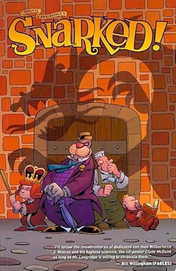
Images © Boom Entertainment & Roger Langridge.
I’ve enjoyed Roger Langridge’s take on The Muppet Show, but I like this new creation even better. (I was about to say original, and it certainly is that, but as you’ll see, it’s built on the work of another writer.)
Wilburforce J. Walrus is your typical shady con-man with a clever mind and a quick tongue. His associate, carpenter Clyde McDunk seems to have no gifts in either department…in fact no gifts of any kind. While they’d rather be enjoying the fruits of their petty thievery, the pair are commandeered by a willful young princess Scarlett to help find her missing father. The king has been away at sea for months, and her supposed “advisors” are plotting to take over the kingdom by appointing her baby brother the king and themselves as regents.
Before long the royal children have escaped the palace and are hiding out with the dubious pair, planning a sea voyage of their own with a dangerously mad crew you might have read about in Lewis Carroll’s “The Hunting of the Snark.” That’s right, these are characters drawn from Carroll, but all with a decidedly new and often quite funny twist by Langridge.
Roger’s art is just as charming and funny as his storyline and characters, cartoony in an animated way, but full of personality and theatrical expressiveness. This is a great read including issues 0 to 4, and a nice helping of additional poetry and game pages. I have the next few issues, and am looking forward to reading them.
Highly recommended!
August 2, 2012
SCHNAPP, DONENFELD and the PULPS Part 4
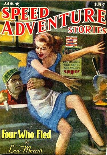
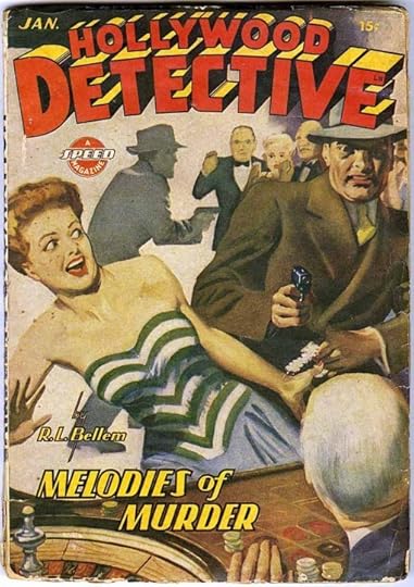
In late 1942 Harry Donenfeld and his partners (Jack Liebowitz and others) discontinued the Culture Publications imprint, and relabeling the “Spicy” line of pulps under a new imprint, Speed Publishing. Initially these carried the same logos with the word SPEED replacing SPICY. The covers showed considerably less skin, and were generally toned down, which pleased critics like the Post Office (who had denied mailing permits for the Spicy line). The logo revamps would most likely have been handled by Ira Schnapp, who I believe had designed many of them in the first place. That looks like his cover lettering on this first issue of SPEED ADVENTURE STORIES as well.
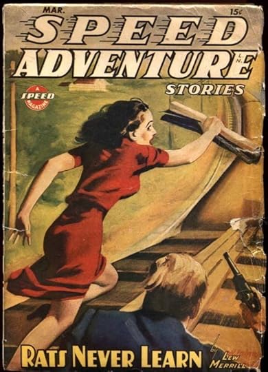
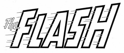
By 1944 the book had a new logo using the same letterforms in straight lines that leaned to the right, and incorporated motion lines on SPEED that are very similar to the ones Ira Schnapp used on his logo for the silver age FLASH revival at DC Comics in 1959, including the small white gaps in the black outlines of the large letters. The rest of the lettering on the pulp cover also looks like the work of Schnapp, including the new “A Speed Magazine” symbol, something reminiscent of the round DC symbol on their comics.
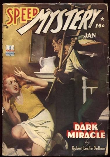
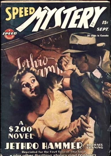
SPEED MYSTERY replaced SPICY MYSTERY (a logo I think Schnapp didn’t do). The title DARK MIRACLE on the first cover again uses triangles for the A’s, but the rest does look like Ira Schnapp’s lettering, so perhaps he did use that idea from time to time. By 1945, the word SPEED was in a more typical Schnapp style with speed lines.
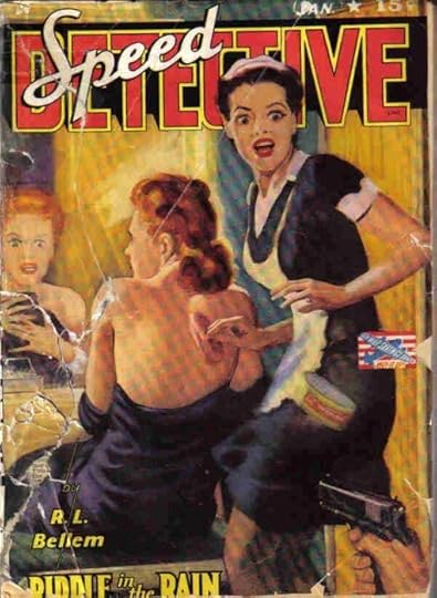
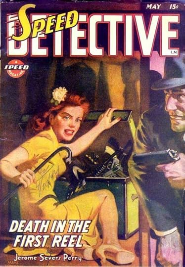
SPEED DETECTIVE first simply replaced SPICY with SPEED in the same style, then used a new SPEED with speed lines. It’s interesting to note that the broken outlines on DETECTIVE seen in the first version of this logo from 1934 have been completed here. And I have to say, the more of these covers I see, the more clearly the lettering seems to be by the same person, who I believe to be Ira Schnapp.
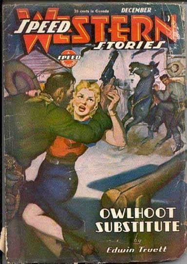
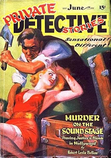
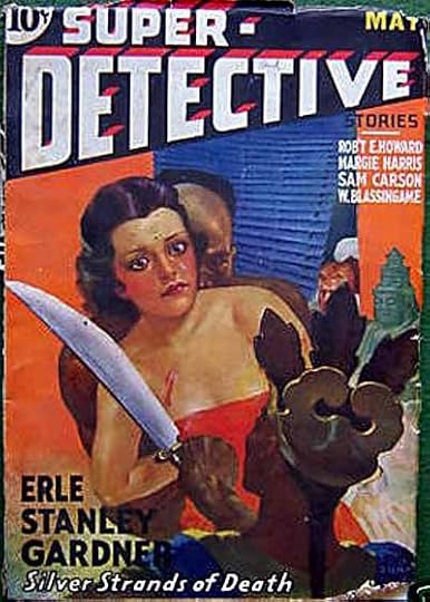
SPEED WESTERN seems to be a completely new design based on the Art Deco style of the Speed symbol. I like the implied raised areas inside WESTERN, another very Art Deco idea that Ira Schnapp would have been familiar with. And it’s interesting to see how much of the WE in WESTERN is covered up, the publishers assuming everyone would still know what the word was. All these titles began with January, 1943 cover dates. SUPER-DETECTIVE, DAN TURNER: HOLLYWOOD DETECTIVE and PRIVATE DETECTIVE STORIES all gained the Speed symbol and joined the imprint in 1943 as well. In addition to cleaning up the sleazier aspects of his pulps, Donenfeld tried to distance them further from his growing comic book business by creating a new distribution company for the pulps, Leader News, with his wife as one of the co-owners, but not himself.
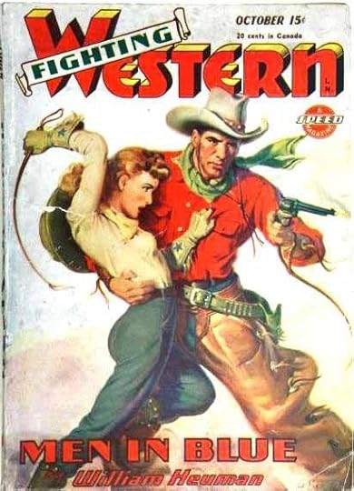
Speed Publishing added FIGHTING WESTERN in 1945, using the logo style from ROMANTIC WESTERN for the word WESTERN, and a new banner for FIGHTING. WESTERN also adds telescoping with open areas at the top and shading lines in the now familiar Ira Schnapp style. Very hard to imagine anyone else doing this logo.
A new imprint, Arrow Publishing, was begun in 1945 mostly for romance pulps. They also carried the Speed Magazine symbol. This logo looks very much like some of Ira Schnapp’s logos and house ad lettering for DC Comics. The style of the E in LOVE is one he used a lot there.
Not sure if this was under the Arrow or Speed imprints, but it began in 1945 also. The earlier logo is very much in the Schnapp style. The revised one from 1948 might be by someone else. It has more typical block letters with ragged ends on WESTERN, and set type below that.
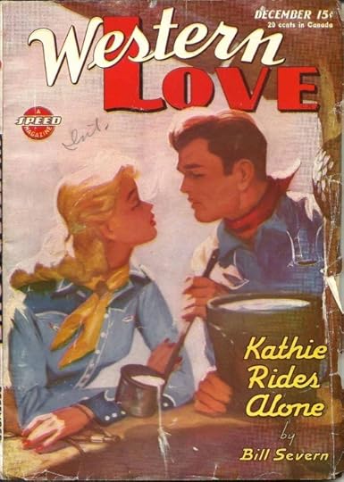
WESTERN LOVE is under the Arrow imprint, and began in 1945. Another logo that looks very much like the work of Ira Schnapp to me, and the rest of the lettering as well. The contrast between the script arced WESTERN and the much bolder straight LOVE is charming.
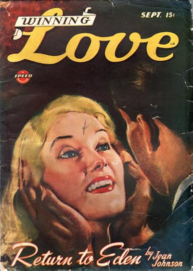
WINNING LOVE is another Arrow title that began in 1945. Also Schnapp, I’d say. The story title is quite nice on this one.
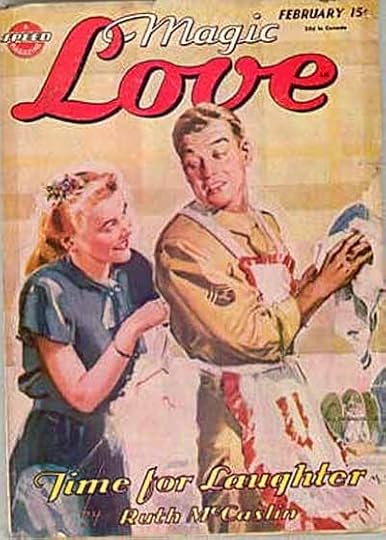
This title from Arrow in 1945 uses the same LOVE as the one above. I like the way the loop of M in MAGIC entwines with that of the L in Love, like they’re holding hands. So romantic. And all these romance pulps are a far cry from the sleazy sexuality that Donenfeld’s pulps began with, designed to appeal to women readers.
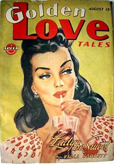
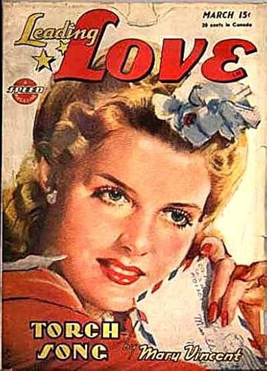
An Arrow romance pulp that began in 1946 with what I’d say is an Ira Schnapp logo and cover lettering. They must have sold, as the company kept releasing new titles. I really like the story title on this one, too.
One last Arrow romance title, which verges on slick sophistication. And what a long way we’ve come from LA PARISIENNE! Very probably all by Ira Schnapp.
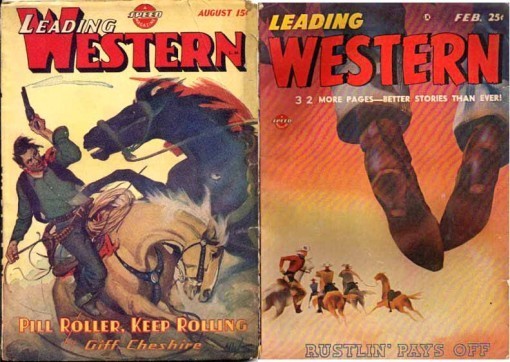
Speed Publishing began this title in 1946. Notice that they’re promoting 16 pages of comics inside. Many of Donenfeld’s pulps had had a small amount of comics since 1934, but this seems to acknowledge that comics were overtaking typical pulp content in reader appeal. The logo, I believe by Ira Schnapp, goes back to his earlier western style of rounded E’s, and adds a rounded W this time. He continues to favor Art Deco styles.
I believe the last new title from Speed with new material was this one, begun in 1947. The logo breaks the previous mold and goes for a real western look, making the letters out of nailed-together boards, and adding a nice flame effect. I think this is also by Ira Schnapp, though unlike anything else he did that I know of.
The pulp magazine era was ending as the 1940s drew to a close. The last titles that Donenfeld put out under the Trojan Publishing umbrella were digest-size collections of previous material like these. Type was becoming the norm on magazine covers rather than hand-lettering, and while it’s possible Ira Schnapp did the words DETECTIVE and WESTERN, the rest seems to be all typeset. This last gasp ended soon after, and the Donenfeld pulp line folded in 1950. Trojan tried a line of comic books edited by Adolphe Barreaux in the 1950s, but they didn’t last long either, and that was the end of Harry Donenfeld’s pulp empire. Of course, he still had very successful comics and magazine distribution companies.
National Periodical Publications, which we now know as DC Comics, was doing well. They’d hired Ira Schnapp to produce at least some of their logos in the 1940s, and around 1949 he joined their staff as the in-house logo, cover lettering and house ad designer and letterer. I’ve surmised this because in that year the amount of Schnapp work on the company’s covers takes a large jump, and by 1950 nearly all of it is by him. And it makes sense to me that he would be offered that job, since I think he was doing much the same thing (on a freelance basis I believe) for Donenfeld’s pulp line for many years, and had a proven track record as a logo designer for both companies. Ira was either 55 or 58 in 1950, and the kind of hand-lettering work he’d been doing for magazines, advertising and movie theaters was disappearing, except in comics. I imagine the chance for a staff position that allowed him to continue doing what he did best was appealing. Schnapp would continue to produce his unique, somewhat old-fashioned by this point, but always graceful and well-crafted work for the company, providing them with a house style almost single-handed until about 1967, when most of that work shifted to another great designer, Gaspar Saladino. Schnapp was kept on for a year or two doing less important things as an acknowledgment of his long service to the company, but was let go in 1968, and died in 1969.
Harry Donenfeld continued to run or oversee his businesses I assume, though not always at 480 Lexington, aided by his son Irwin, who joined National Periodical Publication’s management in 1948. Donenfeld was injured in a fall in 1962 from which he never recovered, and died in 1965.
Hope you’ve enjoyed this rather different logo study. Please keep in mind that I have no hard evidence that Ira Schnapp worked for Donenfeld’s pulp magazines, and that all the opinions expressed about that here are my own, and based simply on examinations and comparisons of style. Thanks again to designer Alex Jay for his research help. More logo studies can be found on my LOGO LINKS page.
August 1, 2012
SCHNAPP, DONENFELD and the PULPS Part 3
All images © the respective copyright holders.
As I mentioned last time, Harry Donenfeld and his partners (Jack Liebowitz and others) launched a new pulp magazine imprint in 1937 called Trojan Publishing. The intent was to tone down the sexual themes (which the authorities were castigating in obscenity trials), but the second title, PRIVATE DETECTIVE STORIES, doesn’t seem to have gone very far in that direction. Indeed, while the covers did tend to show less skin, the contents of the Trojan pulps were much the same as the previous ones under the Culture Publishing imprint and others. In fact, it’s reported that all the Donenfeld pulps routinely reprinted each other’s stories. My main focus here is the logo and cover lettering, and I think this is all the work of Ira Schnapp. The style choice for all but DETECTIVE is kind of an odd one that looks back to Old English thick and thin brush strokes, but it’s somewhat similar to what Schnapp did in the comics occasionally. The placement of PRIVATE and STORIES over DETECTIVE is also a bit odd, and I would say this is one of the less successful logos by Schnapp from the pulp period, if it is indeed by him.
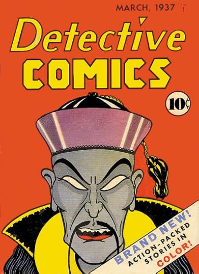
Something else was going on in the publishing world of Harry Donenfeld in 1937: his printing company produced this comic book, the third title edited by Major Malcolm Wheeler-Nicholson. The Major had been involved in comics since 1934, and in pulp magazines before that, but he was not a good businessman, and in order to get this issue printed, he had to form a legal partnership with Harry Donenfeld and Jack Liebowitz. (Are alarm bells going off in your head, yet?) The imprint, Detective Comics, Inc., was the beginning of what would become DC Comics (with the DC being drawn from the initials of this title). Wheeler-Nicholson did not last long in the venture, and was pushed out before the launch of the company’s next title, ACTION COMICS, in 1938. The Major’s company had been at 432 Fourth Avenue in Manhattan I believe, but once he had control, Donenfeld brought it to his headquarters at 480 Lexington Avenue, where it remained for many years.
As for the logos of these early comics, some have long attributed them to Ira Schnapp, I don’t think any are by him until 1940. See my article on DC’S EARLIEST LOGOS for my thoughts on the subject, and reported testimony by Ira himself in THIS article, where he told a young Michael Uslan that his first work for DC Comics was refining Joe Shuster’s SUPERMAN logo. Ira’s version initially appeared on the cover of SUPERMAN #6 in 1940.
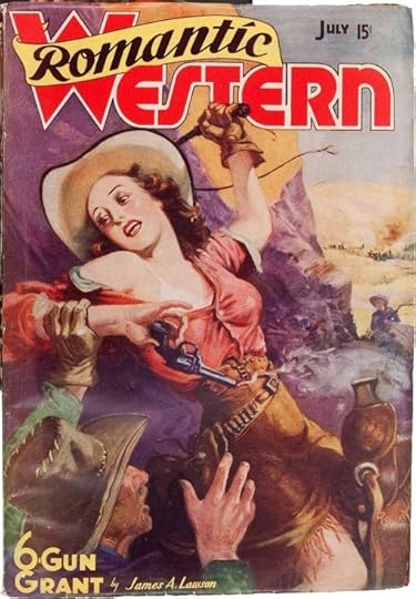
Back to Donenfeld’s pulps. After eight issues of THE LONE RANGER MAGAZINE, the character was dropped and the magazine retitled as ROMANTIC WESTERN in either late 1937 or early 1938. This handsome logo seems like the work of Ira Schnapp to me. He always did fine script lettering, as in ROMANTIC here, often liked to use banners like the one behind it, and WESTERN is once again in an Art Deco style rather than the more expected old west poster look. Some of the letterforms in WESTERN are not typical of Ira’s work: the rounded E and the lower case N, but I find them quite attractive. One oddity is the way the banner goes behind the letters of WESTERN but in front of the outline around it, suggesting that was added after the banner. The rest of the cover lettering is similar to work we’ve seen before and probably also by Schnapp.
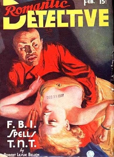
Also beginning with this February, 1938 issue is a companion Trojan Publishing title using the same logo lettering for ROMANTIC and a very square DETECTIVE (except for the D). It seems likely it’s also by Schnapp. The square corners are not typical for him, but the clever way the letters are tucked in around each other suggests a master designer at work. In a sense it’s a very modern approach, especially the way the I is tucked under the T, something I used to do in the 1980s and 1990s. The rest of the lettering is in familiar Art Deco styles we’ve seen on these pulps before, probably by Schnapp. Note the use of rounded E’s again there.
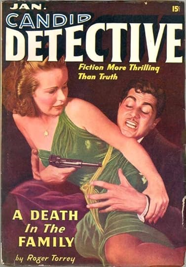
Later in 1938 Trojan began this title. The design seems very much in Ira Schnapp’s style, both in the way CANDID fits into DETECTIVE, and the telescoping drop shadow, which is a little hard to see on this dark background. CANDID is sans serif with an inline fill (here in blue) and DETECTIVE has very small serifs that add a touch of elegance to my eye. The rest of the cover lettering is likely by Schnapp. Logo designs were a plum assignment, and hopefully paid well, but the story title and author lettering was a more regular source of income that I’m sure Schnapp would appreciate.
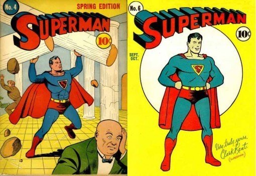
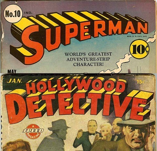
When ACTION COMICS #1 featuring Superman hit the newsstands in 1938, it was a smashing success, and soon the title was selling millions of copies. (And much has been written about the poor business deal made by the character’s creators Jerry Siegel and Joe Shuster with Donenfeld and Liebowitz for Superman’s ownership, so I won’t go into that here, but you can see that it follows a familiar pattern for them.) This created an upheaval in the comics and pulp publishing world as everyone scrambled to try to imitate that success with similar books and characters. Donenfeld consolidated his comics publishing under the National Periodical Publications name (which included the distribution company Independent News) at 480 Lexington Avenue, and by 1939 had not only launched another smash hit with Batman in DETECTIVE COMICS, he increased his Superman output with the character’s own title. Joe Shuster, with help from assistants, was producing all or most of the Superman material, including the covers for this new title, but there was a problem with the logo. He would redraw it for nearly every issue, and while his intent was clear, the results were uneven. I’ve suggested that Harry Donenfeld brought in Ira Schnapp to refine Shuster’s design in 1940, with Schnapp’s version first appearing on the cover of issue 6. You can see what an improvement it is from the Shuster version that appeared on issues 4 and 5. (You can read more about this HERE.)
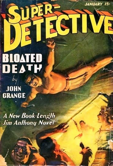
Back in the pulps, Donenfeld and his partners must have felt it would be a good time to revive their previous title SUPER-DETECTIVE, this time featuring Jim Anthony, a character very similar to Doc Savage, and having some nearly Superman-like abilities. The title seems a natural for the company, combining two ideas and titles that were selling like hotcakes in the comics.
The logo for this one is kind of surprising in that it seems to be modeled after the Joe Shuster logo seen on issue 4 of SUPERMAN above. The uneven shape of the S, the way the letters overlap, and the overall approach are much more like that than Schnapp’s refined version. Both the first issue of SUPER-DETECTIVE and the sixth issue of SUPERMAN are cover dated October, 1940. If Ira Schnapp did this logo, why wouldn’t it more closely reflect his version of SUPERMAN? One reason might be that Donenfeld had applied for a trademark on Ira’s Superman logo, and didn’t want to confuse things by mimicking it elsewhere. He might have asked Ira to imitate the Shuster version instead. Or, perhaps this logo was done by someone else with the same mandate. While some of the cover lettering looks like Schnapp, the title BLOATED DEATH is atypical for him. Before this I’d never seen Schnapp use triangles for the letter A, though there is another example coming up in Part 4 of this study, and the very thin inner shapes in other letters are also unlike his usual work. Perhaps it’s partly someone else’s work, perhaps it’s just an atypical experiment.
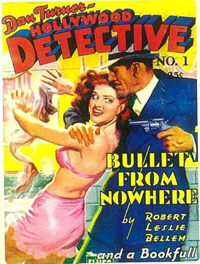
When Trojan began DAN TURNER, HOLLYWOOD DETECTIVE in late 1941, the Schnapp style was clearly evident, and particularly some elements he used on the SUPERMAN logo like the thick sans serif letterforms, the curved shape, the telescoping drop shadow, even the shading on the curves where the telescoping goes from black to open areas. DAN TURNER is a handsome script that Schnapp excelled at, and the other cover lettering looks like his Art Deco-influenced work as well. Love that extremely long vertical strokes on BY! When the DAN TURNER part was dropped in 1943, the resemblance to the SUPERMAN logo was even more pronounced.
In fact, it begs the question, did Donenfeld request that Schnapp imitate his own logo, or was it simply a matter of “it worked before, I’ll try it again”? I guess we’ll never know. In any case, I think this logo is the most compelling evidence I have that Ira Schnapp was working for the Donenfeld pulps.
We’ll look at the rest of those pulps next time. More logo studies can be found on my LOGO LINKS page.
July 31, 2012
SCHNAPP, DONENFELD and the PULPS Part 2
Images © the respective copyright holders.
In 1933 Harry Donenfeld was making plans to expand his sexy pulp magazine empire, and this man, artist Adolphe Barreaux, was drawn into those plans. In a biographical article you can find HERE, writer David Saunders describes what happened:
In July 1933 Adolph Barreaux became involved with Harry Donenfeld and Merle Williams Hersey in an attempted revival of THE POLICE GAZETTE, which was to feature a comic strip by Barreaux about the saucy misadventures of a Broadway chorus girl named “Flossie Flip.”
Although the project never got off the ground, Barreaux soon found steady work drawing story illustrations for Donenfeld’s publications, which included a sensational line of magazines…
As a clever businessman that produced risque materials, Donenfeld cloaked the true ownership of his wide-ranging business in a maze of smoke and mirrors. He was a very successful and business was rapidly expanding. Rather than assign and approve a large number of illustrations from a variety of freelance artists, Donenfeld offered Barreaux the chance to run an art agency that would supply all of the black and white interior story illustrations he needed.
They formed a joint company and the Barreaux Studio was opened at 101 West 46th Street, where Barreaux directed and coordinated the production of the pen & ink art that appeared in Donenfeld’s magazines.
Barreaux was soon producing art and short comic strips for a new line of pulps put out by Donenfeld and his associates under the imprint Culture Publishing. Above is the earliest such strip from 1934. Donenfeld was the first to use comics in his pulps, and they were in the same lurid and sex-filled style as most of the stories. But as you can see, Barreaux was not much of a logo designer, and is described as working only on the interiors. So who was doing the cover logos and lettering? According to comics historian Jerry Bails on his “Who’s Who of American Comic Books” WEBSITE, Ira Schnapp began working for Donenfeld’s pulps in 1934. Bails does not give a source for this, but was a well-respected and knowledgable figure, and I’m ready to take his statement as one backed by some kind of reliable information, perhaps something Ira told an artist friend like, say, Murphy Anderson. Let’s look at the pulps and see if we can detect Ira’s work on them.
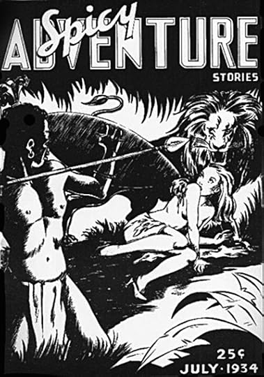
One of the new line was to be SPICY ADVENTURE STORIES, and I’ve lifted this pre-publication ashcan cover from a Dial B for Blog article about Schnapp. (Ashcans were prepared for trademark purposes before the first issue was assembled and printed.)
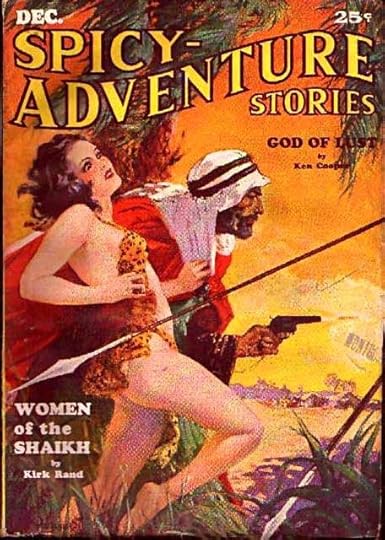
When the actual pulp hit the newsstands, it featured a much different, and much better logo, seen here on the third issue from December, 1934. Clearly someone had dashed off the ashcan logo, and then they hired a real logo designer for the actual magazine. And, to me, it certainly seems like it could be the work of Ira Schnapp. The classic serif letterforms, marred only by some over-large serifs on the T’s, the clever flag-wave shape of ADVENTURE—leaving space for the other two words above left and below right—even the somewhat wider than usual spacing between some of the letters all suggest to me that Harry Donenfeld, or perhaps someone who worked for him like Barreaux, had hired Schnapp to design this logo, and perhaps many more. If Schnapp did work on Donenfeld’s pulp magazines, it would most likely have been as a freelancer, since we know Schnapp maintained his own studio at least until 1941. Did the two meet and work directly together on these logos? We’ll probably never know, but Schnapp is often described in his later years by those who knew him as very friendly and outgoing, a person who loved to talk and tell stories about his career. Donenfeld was a salesman, first of clothes, then of printing services and magazines, so he probably was also an outgoing person. The two men were about the same age, and from a similar background as Jewish immigrants from eastern Europe. It seems likely to me they would have some reasons to become friendly and work directly together, but that’s only my guess.
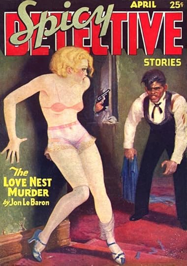
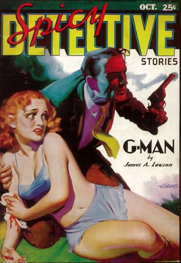
Another in the SPICY line, and perhaps the first published, the April, 1934 issue features a logo somewhat similar in design to the ashcan version of SPICY ADVENTURE above, but with SPICY lettered in a much more accomplished open script with a slight drop-shadow that says “Schnapp” to me. And look at the word DETECTIVE. At first glance, fairly standard block letters with a double outline, but see how parts of the outline stop near the bottom and black telescoping is added? Quite a clever and complex idea that adds interest to the logo. My vote goes to Schnapp on this logo, too. (Incidentally, detectives were such a common and popular theme in the pulps that the publishers seemed to have no problem covering up so much of the word on the earlier cover, but the later version of this logo, as shown, has a thinner version of SPICY.) And on these covers, they’ve traded the usual Cooper Black type (as seen on SPICY ADVENTURE) for hand-lettered titles, something that Schnapp could easily have done for them with his background in show card lettering. I think the upper and lower case lettering with a slightly Art Deco flavor used for JAMES A. LAWSON looks quite similar to a style Schnapp employed on many DC Comics covers later.
You can see a little of it in THE and OF in this original Schnapp lettering from the cover of STRANGE ADVENTURES #159 from my collection, and other examples are easy to find on many DC covers from the 1950s and 1960s.
Harry Donenfeld also published this pulp beginning in April, 1934 originally under the Super Magazines imprint. It was edited by Frank Armer, from whom Donenfeld had acquired several pulps a few years earlier. (Armer continued to do editing work for Donenfeld.) The logo on this second issue is an interesting precursor to one that Ira Schnapp would refine in 1940 for SUPERMAN. The block letters are very much in Schnapp’s style, and the telescoping with top surfaces open for a second color, as well as the triangular shape, are all ideas that Ira Schnapp continued to use later in comics, and I feel pretty confident in suggesting this logo is designed by him, and perhaps the other hand-lettered titles as well.
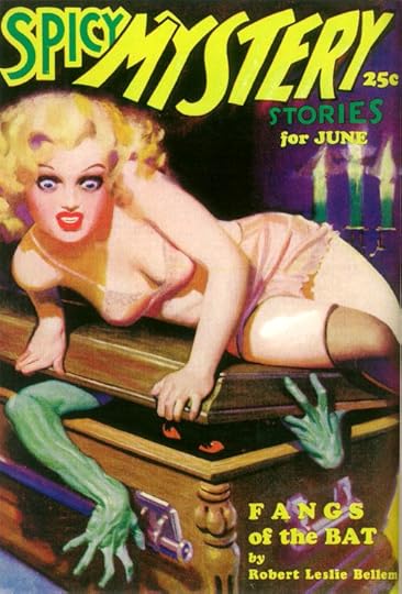
It’s interesting to note that Donenfeld was combining genres in his new line of pulps, adding the sexy stuff to other tried-and-true pulp categories. The next one from Culture Publishing was SPICY MYSTERY beginning in 1935. The 1936 cover above has a logo that looks nothing like Ira Schnapp’s work to me. In fact, I can’t recall anything by him that used the kind of slanted, off-kilter lettering seen in MYSTERY here. The letterforms and stroke weights are inconsistent, not well designed, and the entire logo looks like it’s falling to the right like a string of dominoes. Cooper Black is again used for the rest of the type.
Donenfeld continued to publish some of his earlier sexy pulps, and the October, 1935 issue of this one featured a new logo, moving from an Art Nouveau look to a decidedly Art Deco version that preserved the basic shape and some of the fanciful touches of the previous one. This seems like another Ira Schnapp logo to me. Schnapp was a working letterer and designer throughout the entire Art Deco period, and it continued to be one of his favorite styles when he worked in comics. This excellent logo could certainly be by him. The rest of the cover uses Cooper Black type.
A third genre mash-up from Culture Publishing debuted in 1936. Rather than going for a western poster lettering style, as many western pulps did, this one is firmly in the Art Deco style, though adding wobbly edges to perhaps suggest a western roughness. Another logo that seems very likely to be by Ira Schnapp to me. Who else would go for Art Deco on a western cover? Even Ira didn’t go there when he did western-themed comics covers later. The way the entire logo area is so tightly integrated, and the flag-wave shape of WESTERN that allows the other words to fit around it are similar to what we saw on SPICY ADVENTURE, but more so, using negative space very creatively. The hand-lettered story title is again Art Deco style in contrast to the western theme.
In 1937, Donenfeld and his partners may have been feeling the heat from the authorities regarding the sexual content of his pulps. They produced some new magazines that seem to be an attempt to clean up their image somewhat. Under the Merwil Publishing name this very wholesome-looking and even patriotic effort led the way. A logo made from twisted rope is always a challenge to keep readable, and this one succeeds admirably, with well-crafted and graceful shapes, and a slight drop-shadow to make it more three-dimensional. I think it’s the work of Ira Schnapp, as is all the other lettering on the cover. In a way it’s a tour de force of hand lettering, using several quite different styles, yet making it all work, a trademark of Schnapp. And the large lettering at the bottom seems very much in the Schnapp style, too.
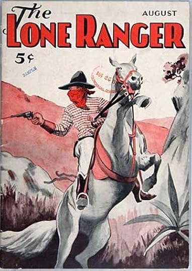
Meanwhile, back in 1936, Donenfeld had produced this rather elaborate ashcan edition of THE LONE RANGER under a new imprint, Spartan Publishing. The Art Deco approach suggests more Ira Schnapp work to me, as do the shapes of some of the letters. The character had begun on a radio show in 1933, and became quite popular, spreading to movies and magazines, and later TV.
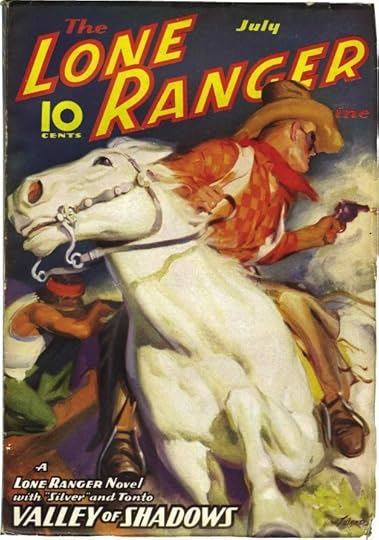
When the pulp hit the stands, it looked quite different, and even the imprint had changed to Trojan Publishing. Donenfeld put out only eight issues of THE LONE RANGER MAGAZINE, each containing a novel-length story by the character’s creator Fran Striker. They were the first appearance of Lone Ranger stories in print form. This was clearly another attempt to appeal to a wider, more mainstream audience. The logo and lettering is again probably by Schnapp, very much in his style. The logo is much bolder in outline, but not as appealing to me as the earlier one. It does get away from Art Deco somewhat, and perhaps the company wanted that. In general, this is really quite an appealing cover. More Trojan magazines would follow close behind, but none were as clean-cut as this one.
I’ll continue with them next time. More logo studies can be found on my LOGO LINKS page.
July 30, 2012
SCHNAPP, DONENFELD and the PULPS Part 1
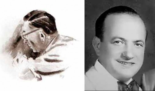
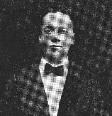
Ira Schnapp, watercolor by Jack Adler, 1960s; Harry Donenfeld at his brother’s wedding, 1927. This and all images © the respective copyright holders.
This series of blog posts has two main goals. First, to outline and show cover examples of the pulp magazines published by Harry Donenfeld and his associates from the late 1920s to 1950. Donenfeld is better known as the publisher (with Jack Liebowitz) of National Periodical Publications beginning around 1938, the home of Superman and Batman, but his earlier and somewhat parallel career as a publisher of sexy pulp magazines is less known.
Second, in my continuing explorations into the work of logo designer and letterer Ira Schnapp, I’m hoping to discover or at least guess at some of the work he did for Donenfeld’s pulps, which were, I believe, his entree into Donenfeld’s comics. He began working for those comics as a freelancer in 1940, first refining Joe Shuster’s Superman logo, then doing other freelance logos, and finally becoming the staff logo, cover lettering and house ad man for what became DC Comics from about 1949 to 1968. His work on the pulps is undocumented, and I’ll be focusing on the logos and cover lettering of the pulps to see what I think might have been Schnapp’s work. I’m heavily indebted to research help from fellow logo designer Alex Jay. In addition to new research, I’ll be using some of what Alex covered in his blog post about Ira Schnapp HERE, and in my post where artist Neal Adams talked about Schnapp HERE.
Let’s start with Ira Schnapp, and what we now know about his early working life. Born in either 1892 or 1895 in Sassow, Austria (now part of the Ukraine), Ira (born Israel, then Irving for a while, finally legally Ira) emigrated to America with his mother and two older brothers in 1900, joining their father and another brother who had come a few years earlier. Schnapp’s father was a grocer at first, later a salesman. Somehow, perhaps through an apprenticeship, young Ira got work designing very large Roman-style inscribed lettering for some of the monumental buildings that were being constructed in Manhattan from about 1908 to 1913. Ira mentioned doing this for three of them: the Walter A. Farley Post Office building, the New York Public Library, and Grand Central Terminal. Contrary to some reports, Ira was not a stone carver, he designed the letters on large sheets of vellum or other translucent paper. The letters were then transferred to the stone blocks and carved by the carvers. Ira showed Neal Adams some examples of those paper layouts. We don’t know if he was working alone, or as part of a team of designers, which seems likely due to his young age and recent arrival in the city, but either way it was an exciting beginning! This period of Ira’s career probably ended when World War One halted that kind of elaborate construction in Manhattan for a while.
Nothing is known for sure about Ira’s career during the war (he probably did not serve in it) or through the 1920s and into the 1930s, but Alex Jay has turned up some basic census information that gives a few clues. In the 1920 census, Ira gave his occupation as “artist in the moving picture industry.” In my article linked above, I talked about some of the work he might have done, including titles and intertitles (the frames with hand-lettered dialogue) for silent films, as well as lobby card and movie poster logos and lettering, but since most films were being made in California even then, I’m not sure how much of that work was available in the New York area. The most likely kind of work would be creating show cards: hand-lettered signs commissioned by individual theaters to promote the films they were showing. Ira talked to Neal Adams about doing work like this at Radio City Music Hall for films like “King Kong” (1933) and “Mighty Joe Young” (1941), and Murphy Anderson has been quoted in a Dial B for Blog article as saying, “There were periods in the thirties when practically every movie house in Times Square had Ira Schnapp lettering on display somewhere!”
Schnapp probably looked for similar work in other areas like advertising and publishing. In the 1930 census he listed his occupation as “commercial artist,” a signal that he’d broadened his clientele. His occupation remained the same in the 1940 census, and on his 1941 draft card (from the same Dial B for Blog article) he listed his employer as “Self,” and his work address as 442 West 42nd Street, New York City, near 10th Avenue. This was not his home (he lived on 110th Street then) but probably a studio, perhaps shared with others, and easy walking distance to many theaters, as well as advertising and publishing companies. During the Great Depression of the 1930s, advertising work became much harder to find, but pulp magazines were having a surprisingly successful boom period, providing cheap thrills for a low cost. It seems natural that Schnapp would find work in that field.
Now to Donenfeld. According to Wikipedia and other sources, Harry Donenfeld was born in Romania in 1893, and emigrated to America in 1898 with his parents and brothers. So, his was a similar story to that of Schnapp. Harry’s three brothers set up a printing business, but Harry seems to have run with a different crowd, was involved in gangs, and became a clothing salesman with his own store for a while. He fell on hard times, and in 1921 joined the family printing business, Martin Press. Through the 1920s the business saw a vast expansion in capital, rumored to be the result of a side career in liquor bootlegging by Harry, who reportedly had underworld contacts, which may have also helped him land some lucrative printing jobs. Harry likewise proved a tough man in the business itself, pushing out his two older brothers and taking control of the company, keeping his brother Irving as head printer. He changed the name to Donny Press in 1923. He may have been involved in printing pulp magazines as early as 1926. In 1929, Harry took on a partner, Jack Liebowitz, who was a good financial man and accountant, complementing Harry’s sales ability.
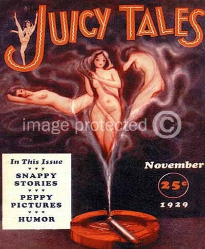
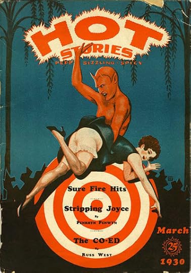
Using the funds they’d built up, Harry and Jack began a new phase of their career, publishing magazines themselves. According to a website called Who’s Whose in DC Comics by Bob Hughes (not sure what his sources are), in 1929 they began publishing “a long string of semi-successful “art” magazines beginning with Juicy Tales (later Joy Stories) and Hot Tales. Merle Williams Hersey was the editor and “front” for the company.” The covers above are the only ones I can find from this period. As you can see, the sexual theme is clear. The logo on JUICY TALES is pretty good, block letters with a nice bounce, and the wavy lines inside add energy and a slightly exotic feel. The logo on HOT TALES is also energetic, but more amateurish and uneven. Both magazines have the remaining type set in Cooper Black, which looks old-fashioned now, but was the latest thing then, released in 1922, and used extensively throughout the next three decades. I was still using it occasionally on things like text pages at DC Comics in the 1970s and 80s.
Donenfeld’s company used several names in this period, including Irwin Publishing, D.M. Publishing and Merwil Publishing, with his printing company also using the name D. M. Press. Alex Jay has found an address for them in 1929: 143 West 20th Street, New York City. From this period on, Donenfeld’s businesses became a confusing cloud of shell companies and imprints perhaps intended to keep creditors, authors, and the authorities guessing. Indeed, his magazines were prosecuted on obscenity charges more than once, and denied mailing permits by the post office for the same reason. Though fairly tame by today’s standards, the selling point of these pulps was clearly the sexual content, which I would classify as soft-core pornography.
Alex Jay has found a newspaper article stating that Donenfeld’s Merwil Publishing moved to 702 Grand Central Bldg., 480 Lexington Ave in 1932. This is the first reference we’ve discovered to that address, at the corner of 46th Street, which would be home to most of Donenfeld’s companies, including what would become DC Comics, for many years.
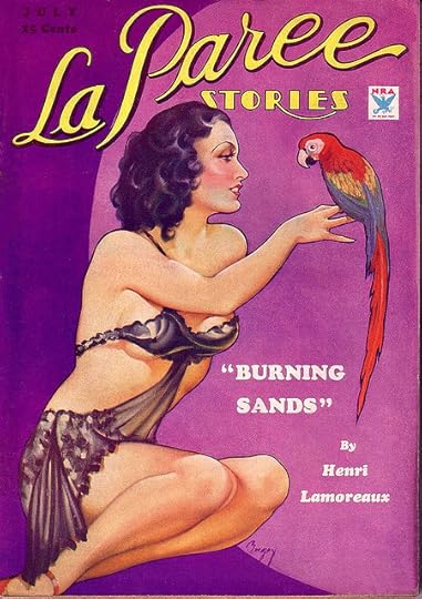
In May of 1932, Donenfeld and Liebowitz acquired a line of sexy pulp magazines from Frank Armer, as repayment of printing debts owed. Armer had started them in the 1920s. He’s another interesting fellow with a long track record in the sexy magazine business, starting with SCREENLAND in 1922. The cover above is from 1934, and the logo was created in 1930, before Donenfeld acquired the title, but to me it looks like it could be the work of Ira Schnapp. Pure speculation on my part, but the graceful script of LA PAREE does remind me of some of the logos and house ad lettering he did for DC in the 1950s, particularly on the romance titles, while the Art Deco style of STORIES is something Schnapp embraced. I’m sure there were other people doing this kind of work, but it’s interesting to consider this as the first possible connection between Schnapp and Donenfeld. And if Schnapp did work for Armer, it’s possible he might have introduced him to Harry Donenfeld, since Armer continued to work as an editor on some of these magazines. Note the use of Cooper Black again for the story title.
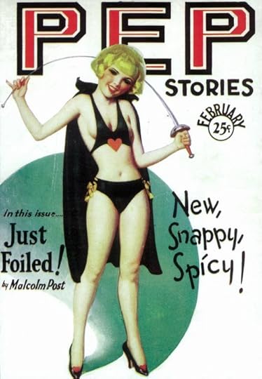
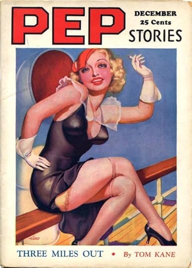
Pep was another former Armer title. Here are 1930 and 1934 issues with a pretty bland and blocky logo that doesn’t suggest Schnapp to me. The cover lettering on the first one is pretty nice, but doesn’t seem like Schnapp’s style either.
This third Armer pulp, showing a 1933 cover, has a 1930 logo that I feel is very far from anything Ira Schnapp would do. Those curves broken into awkward straight segments really don’t look like his work in the least. Cooper Black is used for the remaining type.
I’m not sure, but I think this one is also an Armer acquisition. It began in 1931, and sported a really charming Art Nouveau logo, perfect for the subject. Whoever designed the logo knew his stuff. Schnapp never worked in an Art Nouveau style as far as I know.
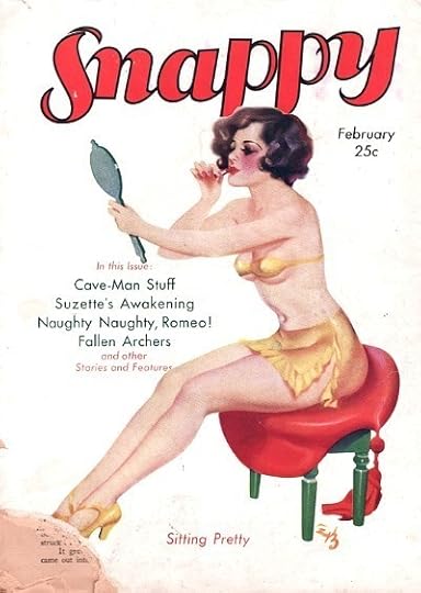
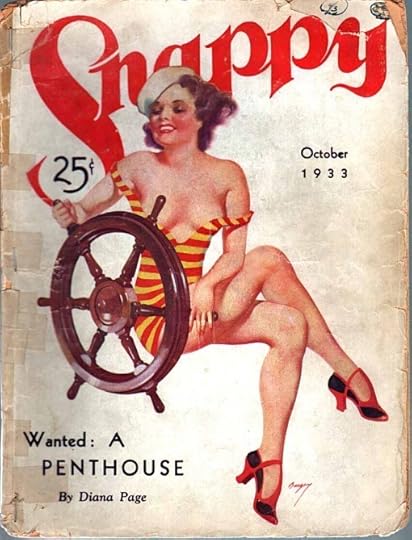
SNAPPY is confusing because there was also a pulp called SNAPPY STORIES that had a long run beginning in 1912 and surviving until 1933 under several owners. One source has it listed as a Donenfeld pulp, but I believe that’s wrong. I think they meant SNAPPY, which might be another pulp acquired from Frank Armer. It was definitely a Donenfeld pulp by 1933, and continued to be published through at least 1938. The logo from 1931 is just okay, but the one from 1933 (and through ’38) is delightful. It has a handsome, fluid style of upper and lower case serif letters, and the way the S lines up with the N is particularly attractive. I would again like to suggest it might possibly be the work of Ira Schnapp based on no evidence other than style, and I could be completely wrong. Donenfeld and Liebowitz continued to publish these magazines, and they were the springboard for their next pulp expansion.
More on that in Part 2. Other logo studies can be found on my LOGO LINKS page.
July 29, 2012
Beginning Tomorrow…

…a different kind of Logo Study: SCHNAPP, DONENFELD and the PULPS. In four parts, Monday to Thursday.
Birds on the Beach

Ellen and I went for a delightful walk on the beach at Stone Harbor Point yesterday evening.

There weren’t many other people there, but we weren’t alone, there were lots of birds. Some are summer residents, some are shorebirds on their return migration from the arctic, having finished their breeding up there. That’s right, migrating south in July. When you go as far as some of these birds, you spend much of your life migrating.

This Red Knot, for instance, an endangered species, which is why he’s wearing leg bands (for researchers to attempt to keep track of him). He has one of the longest migrations, traveling from southern South America to the arctic every year.

These Ruddy Turnstones are still showing a lot of breeding color, but are now on summer vacation until they continue south.

A Semipalmated Plover.

Two Willets, which could be migrants or residents, some nest in this area.

A lovely way to end the day out in the natural world.
July 27, 2012
And Then I Read: THE LOVELY HORRIBLE STUFF
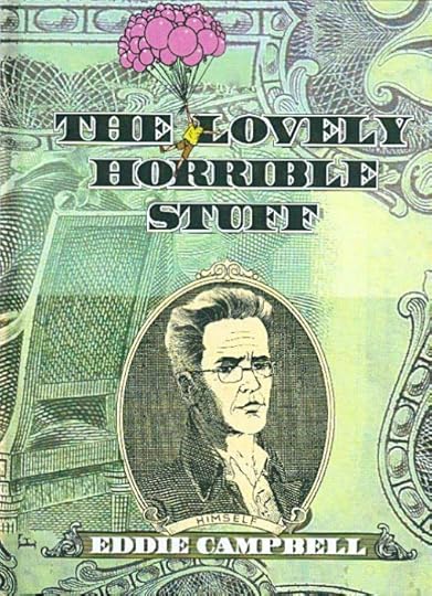
Images © Eddie Campbell.
Eddie Campbell’s latest 96-page hardcover is all about money. It covers a wide range of money topics, from Eddie and his family’s own finances to dealing with parental finance problems to how money affected people like Shakespeare. The second half of the book has Eddie and his wife visiting the remote Pacific island of Yap, which is famous for its form of money: gigantic stone disks that took a great deal of labor to produce on another island and carry home through dangerous waters in small, frail boats. When the Yap islanders finally got their money home, it generally sat in one spot and was simply allowed to change owners when used, in effect the model for modern banking and finance. Eddie investigates this unusual monetary system and all the stories and characters around it, making for amusing reading. The entire book is pretty funny, in typical Campbell fashion, with bits of wry irony and grim reality raising their heads here and there.
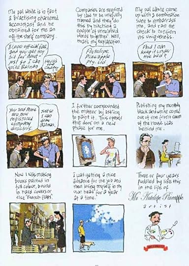
Eddie’s art is kind of loose and messy, but he gets his intent across clearly, and his style seems to fit his personality and subjects quite well. I feel the same way about Eddie’s hand-lettering. A little hard to follow at times, but worth the effort because it suits him so well.
Recommended.
Todd Klein's Blog

- Todd Klein's profile
- 28 followers

