
SCHNAPP, DONENFELD and the PULPS Part 1
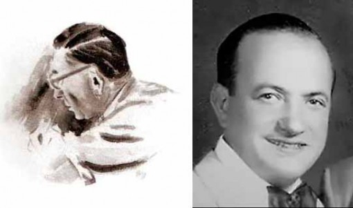
Ira Schnapp, watercolor by Jack Adler, 1960s; Harry Donenfeld at his brother’s wedding, 1927. This and all images © the respective copyright holders.
This series of blog posts has two main goals. First, to outline and show cover examples of the pulp magazines published by Harry Donenfeld and his associates from the late 1920s to 1950. Donenfeld is better known as the publisher (with Jack Liebowitz) of National Periodical Publications beginning around 1938, the home of Superman and Batman, but his earlier and somewhat parallel career as a publisher of sexy pulp magazines is less known.
Second, in my continuing explorations into the work of logo designer and letterer Ira Schnapp, I’m hoping to discover or at least guess at some of the work he did for Donenfeld’s pulps, which were, I believe, his entree into Donenfeld’s comics. He began working for those comics as a freelancer in 1940, first refining Joe Shuster’s Superman logo, then doing other freelance logos, and finally becoming the staff logo, cover lettering and house ad man for what became DC Comics from about 1949 to 1968. His work on the pulps is undocumented, and I’ll be focusing on the logos and cover lettering of the pulps to see what I think might have been Schnapp’s work. I’m heavily indebted to research help from fellow logo designer Alex Jay. In addition to new research, I’ll be using some of what Alex covered in his blog post about Ira Schnapp HERE, and in my post where artist Neal Adams talked about Schnapp HERE.
Let’s start with Ira Schnapp, and what we now know about his early working life. Born in either 1892 or 1895 in Sassow, Austria (now part of the Ukraine), Ira (born Israel, then Irving for a while, finally legally Ira) emigrated to America with his mother and two older brothers in 1900, joining their father and another brother who had come a few years earlier. Schnapp’s father was a grocer at first, later a salesman. Somehow, perhaps through an apprenticeship, young Ira got work designing very large Roman-style inscribed lettering for some of the monumental buildings that were being constructed in Manhattan from about 1908 to 1913. Ira mentioned doing this for three of them: the Walter A. Farley Post Office building, the New York Public Library, and Grand Central Terminal. Contrary to some reports, Ira was not a stone carver, he designed the letters on large sheets of vellum or other translucent paper. The letters were then transferred to the stone blocks and carved by the carvers. Ira showed Neal Adams some examples of those paper layouts. We don’t know if he was working alone, or as part of a team of designers, which seems likely due to his young age and recent arrival in the city, but either way it was an exciting beginning! This period of Ira’s career probably ended when World War One halted that kind of elaborate construction in Manhattan for a while.
Nothing is known for sure about Ira’s career during the war (he probably did not serve in it) or through the 1920s and into the 1930s, but Alex Jay has turned up some basic census information that gives a few clues. In the 1920 census, Ira gave his occupation as “artist in the moving picture industry.” In my article linked above, I talked about some of the work he might have done, including titles and intertitles (the frames with hand-lettered dialogue) for silent films, as well as lobby card and movie poster logos and lettering, but since most films were being made in California even then, I’m not sure how much of that work was available in the New York area. The most likely kind of work would be creating show cards: hand-lettered signs commissioned by individual theaters to promote the films they were showing. Ira talked to Neal Adams about doing work like this at Radio City Music Hall for films like “King Kong” (1933) and “Mighty Joe Young” (1941), and Murphy Anderson has been quoted in a Dial B for Blog article as saying, “There were periods in the thirties when practically every movie house in Times Square had Ira Schnapp lettering on display somewhere!”
Schnapp probably looked for similar work in other areas like advertising and publishing. In the 1930 census he listed his occupation as “commercial artist,” a signal that he’d broadened his clientele. His occupation remained the same in the 1940 census, and on his 1941 draft card (from the same Dial B for Blog article) he listed his employer as “Self,” and his work address as 442 West 42nd Street, New York City, near 10th Avenue. This was not his home (he lived on 110th Street then) but probably a studio, perhaps shared with others, and easy walking distance to many theaters, as well as advertising and publishing companies. During the Great Depression of the 1930s, advertising work became much harder to find, but pulp magazines were having a surprisingly successful boom period, providing cheap thrills for a low cost. It seems natural that Schnapp would find work in that field.
Now to Donenfeld. According to Wikipedia and other sources, Harry Donenfeld was born in Romania in 1893, and emigrated to America in 1898 with his parents and brothers. So, his was a similar story to that of Schnapp. Harry’s three brothers set up a printing business, but Harry seems to have run with a different crowd, was involved in gangs, and became a clothing salesman with his own store for a while. He fell on hard times, and in 1921 joined the family printing business, Martin Press. Through the 1920s the business saw a vast expansion in capital, rumored to be the result of a side career in liquor bootlegging by Harry, who reportedly had underworld contacts, which may have also helped him land some lucrative printing jobs. Harry likewise proved a tough man in the business itself, pushing out his two older brothers and taking control of the company, keeping his brother Irving as head printer. He changed the name to Donny Press in 1923. He may have been involved in printing pulp magazines as early as 1926. In 1929, Harry took on a partner, Jack Liebowitz, who was a good financial man and accountant, complementing Harry’s sales ability.
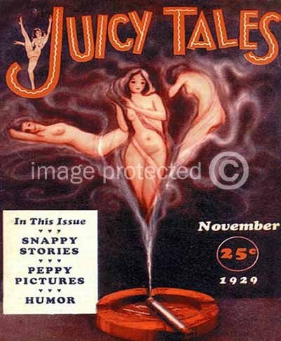
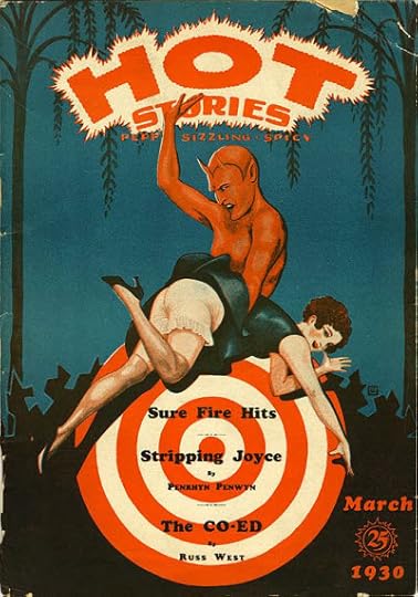
Using the funds they’d built up, Harry and Jack began a new phase of their career, publishing magazines themselves. According to a website called Who’s Whose in DC Comics by Bob Hughes (not sure what his sources are), in 1929 they began publishing “a long string of semi-successful “art” magazines beginning with Juicy Tales (later Joy Stories) and Hot Tales. Merle Williams Hersey was the editor and “front” for the company.” The covers above are the only ones I can find from this period. As you can see, the sexual theme is clear. The logo on JUICY TALES is pretty good, block letters with a nice bounce, and the wavy lines inside add energy and a slightly exotic feel. The logo on HOT TALES is also energetic, but more amateurish and uneven. Both magazines have the remaining type set in Cooper Black, which looks old-fashioned now, but was the latest thing then, released in 1922, and used extensively throughout the next three decades. I was still using it occasionally on things like text pages at DC Comics in the 1970s and 80s.
Donenfeld’s company used several names in this period, including Irwin Publishing, D.M. Publishing and Merwil Publishing, with his printing company also using the name D. M. Press. Alex Jay has found an address for them in 1929: 143 West 20th Street, New York City. From this period on, Donenfeld’s businesses became a confusing cloud of shell companies and imprints perhaps intended to keep creditors, authors, and the authorities guessing. Indeed, his magazines were prosecuted on obscenity charges more than once, and denied mailing permits by the post office for the same reason. Though fairly tame by today’s standards, the selling point of these pulps was clearly the sexual content, which I would classify as soft-core pornography.
Alex Jay has found a newspaper article stating that Donenfeld’s Merwil Publishing moved to 702 Grand Central Bldg., 480 Lexington Ave in 1932. This is the first reference we’ve discovered to that address, at the corner of 46th Street, which would be home to most of Donenfeld’s companies, including what would become DC Comics, for many years.
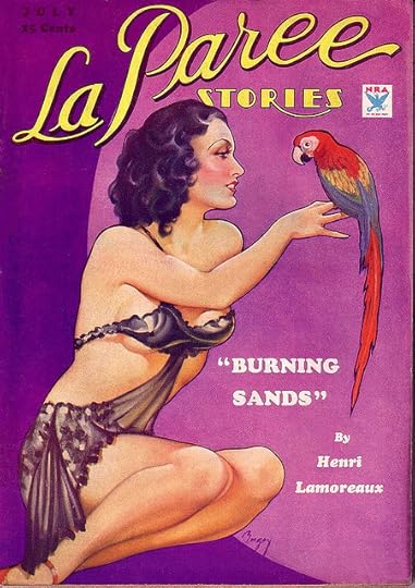
In May of 1932, Donenfeld and Liebowitz acquired a line of sexy pulp magazines from Frank Armer, as repayment of printing debts owed. Armer had started them in the 1920s. He’s another interesting fellow with a long track record in the sexy magazine business, starting with SCREENLAND in 1922. The cover above is from 1934, and the logo was created in 1930, before Donenfeld acquired the title, but to me it looks like it could be the work of Ira Schnapp. Pure speculation on my part, but the graceful script of LA PAREE does remind me of some of the logos and house ad lettering he did for DC in the 1950s, particularly on the romance titles, while the Art Deco style of STORIES is something Schnapp embraced. I’m sure there were other people doing this kind of work, but it’s interesting to consider this as the first possible connection between Schnapp and Donenfeld. And if Schnapp did work for Armer, it’s possible he might have introduced him to Harry Donenfeld, since Armer continued to work as an editor on some of these magazines. Note the use of Cooper Black again for the story title.
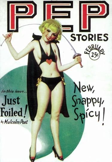
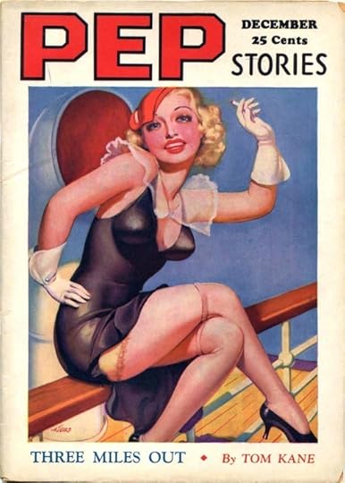
Pep was another former Armer title. Here are 1930 and 1934 issues with a pretty bland and blocky logo that doesn’t suggest Schnapp to me. The cover lettering on the first one is pretty nice, but doesn’t seem like Schnapp’s style either.
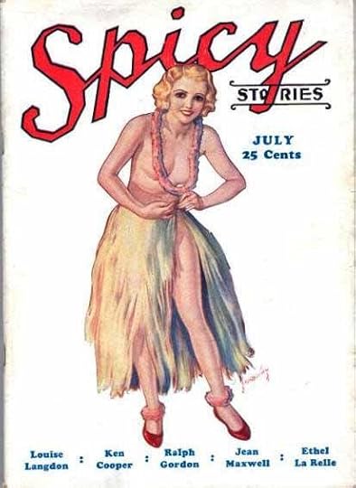
This third Armer pulp, showing a 1933 cover, has a 1930 logo that I feel is very far from anything Ira Schnapp would do. Those curves broken into awkward straight segments really don’t look like his work in the least. Cooper Black is used for the remaining type.
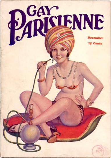
I’m not sure, but I think this one is also an Armer acquisition. It began in 1931, and sported a really charming Art Nouveau logo, perfect for the subject. Whoever designed the logo knew his stuff. Schnapp never worked in an Art Nouveau style as far as I know.
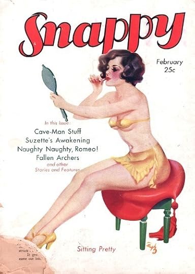
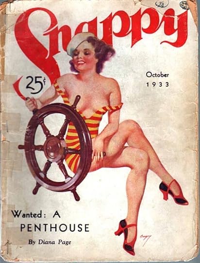
SNAPPY is confusing because there was also a pulp called SNAPPY STORIES that had a long run beginning in 1912 and surviving until 1933 under several owners. One source has it listed as a Donenfeld pulp, but I believe that’s wrong. I think they meant SNAPPY, which might be another pulp acquired from Frank Armer. It was definitely a Donenfeld pulp by 1933, and continued to be published through at least 1938. The logo from 1931 is just okay, but the one from 1933 (and through ’38) is delightful. It has a handsome, fluid style of upper and lower case serif letters, and the way the S lines up with the N is particularly attractive. I would again like to suggest it might possibly be the work of Ira Schnapp based on no evidence other than style, and I could be completely wrong. Donenfeld and Liebowitz continued to publish these magazines, and they were the springboard for their next pulp expansion.
More on that in Part 2. Other logo studies can be found on my LOGO LINKS page.


Todd Klein's Blog

- Todd Klein's profile
- 28 followers

