
Todd Klein's Blog, page 298
September 27, 2012
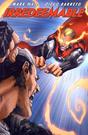
And Then I Read: IRREDEEMABLE Volume 9
Images © Boom Entertainment, Inc. and Mark Waid.
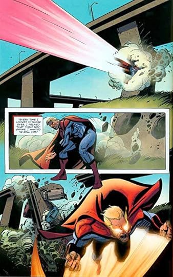
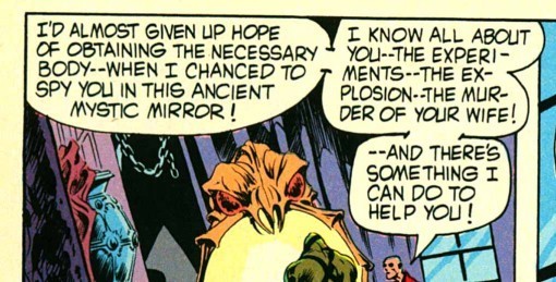
Mark Waid’s character The Plutonian is essentially Superman gone very bad indeed. His character Max Damage is a villain trying to do good. Both their stories take place in the same universe, on the same Earth, so it was inevitable that they’d face each other. That’s what this book is leading to. It’s also about how they became linked in tragic childhood events, why things turned out as they did for each of them. In the present, Plutonian is being lectured by two very powerful beings. Are they his parents? In a parallel track we see the origins of Max Damage as told in flashbacks and letters. The big confrontation promised on the cover never quite happens, though earlier ones do. I’m guessing there’s another volume coming!
The art by Diego Barreto and Marcio Takara is great: solid superheroics, good storytelling, and fine character work. It leans a little more toward the cartoony end of the realistic/animated scale than some of what’s come before, but I think it works quite well.
Recommended.


September 26, 2012
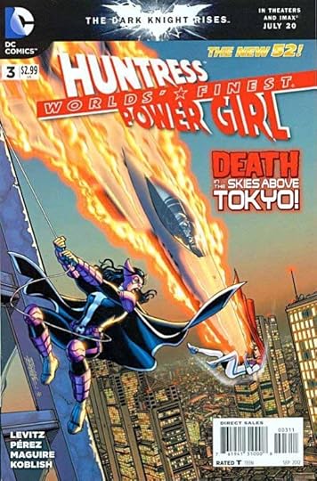
And Then I Read: WORLD’S FINEST 3
Images © DC Comics, Inc.
Writer Paul Levitz has found an interesting and clever way to tell this story. It’s divided into two sections. In the present, Huntress and Power Girl are facing a monster whose power seems to increase with every blow they give him, and who sucks up energy like Gatorade. The monster has trashed a nuclear facility in Japan as the story opens, and it only gets worse from there. In the past, we see the two women recently arrived on this particular Earth (they’re from another one), trying to figure out a new role for themselves, as well as how they got there, and how they might get back where they came from. This flashback story is embedded in the center of the other story, which comes both before and after it. Both stories are fun; the present one has all the action, the past one is gradually exploring the mysteries of the series and the relationship of the two friends.
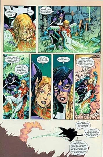
Also very clever is the way the art duties are divided in the book. George Perez pencils the present day section, inked by Scott Koblish (above), and Kevin Maguire does the complete art for the past section. All the art looks great to me, both sections play to the strengths of the artists, and we get regular interior art from two pencillers who probably don’t want or couldn’t keep up with the grind of a full monthly book. I don’t know whose idea that was, but it’s brilliant, and I’ll keep reading as long as this team of writer and artists is here to entertain me.
Recommended.
September 25, 2012
And Then I Read: DARK HORSE PRESENTS 11
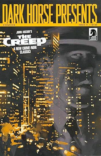
Images © Dark Horse Comics and the appropriate copyright holders.
This issue begins with a new 1940s-style hero called The Black Beetle in a story completely produced by Francesco Francavilla. I liked it, though the reading experience was marred by a style error in the lettering throughout that’s one of my pet peeves: using the upper-case serif “I” everywhere, including in the middle of words, instead of only for the personal pronoun I and contractions like I’ll and I’m. This is such a common mistake these days, I can only wonder how talented folks with great art skills like Francavilla can’t see how awful that looks.
Chapter 3 of “Amala’s Blade by Horton & Dialynas is more great steam-punk pirate goodness, with added ghostly fun.
Chapter 9 of Carla Speed McNeil’s “Finder” looks great, reminding me some of Moebius, but the story has slipped off the tracks for me, I don’t know what’s going on.
Chapter 2 of “Criminal Macabre” by Niles and Mitten has a good film noir vibe, though not a lot happens this time. The art feels a bit too stylized for the subject to me, it’s hard to tell who’s dead and who isn’t, for instance.
Evan Dorkin is back with more “Milk and Cheese,” and while I disliked the last one, I found this chapter pretty funny and entertaining. Maybe because it’s mostly lots of four-panel gag strips, five to a page. There’s humor in the individual gags, and some of them repeat and build on that to good effect.
“The Occulist” begins a new series by Mike Richardson, Tim Seely and Victor Drujiniu. It has an X-Files feel, with a pair of investigators and some creepy stuff going on. Not bad,
Chapter 1 of “The Creep” by John Arcudi and Jonathan Case looks great, and is well-written, with a detective receiving a letter from an old flame about her son’s suicide, and the emotional turmoil it caused. This is again film noir-ish, but very well done, and I’m looking forward to more.
“Pig” is another illustrated short story by Andrew Vachss, a depressing tale of urban violence and teen angst. Not appealing to me.
Chapter 8 of Neal Adams’ “Blood” looks great but gory. I’m afraid I gave up on the story some time ago, but enjoyed looking at the art.
“The White Suits is apparently an excerpt from a longer story by Frank Barbiere and Luke Radl featuring Russian criminal gangs and drugs, with a young woman apparently caught in the middle. Pretty good.
And overall, this issue is recommended.
September 24, 2012
NEW Lettering from Gaspar Saladino!
This image and the next three below © Magnus Aspli, Michael Deshane and Jelena Dordevic (as close as I can type it here).
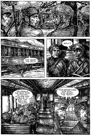
What were you doing in 1951? Myself, I was being born in January of that year in central New Jersey. Not far away, in New York City and Long Island, Gaspar Saladino was beginning his career as a freelance letter for DC Comics (among others). Gaspar continued to produce his skillful, dynamic, and creative hand-lettering for DC until they moved to all-digital lettering around 2002, essentially putting him into retirement. A few weeks ago I learned from fellow letterer (and friend and admirer of Gaspar) Clem Robins that “The Master” had returned to the drawing board to letter some sample pages for an international team of would-be comics creators, something arranged by Clem himself. With everyone’s permission and help, I’m delighted to be able to report on this work, which has allowed Gaspar to extend his comics lettering career to a seventh decade! The sample above is from the first page, and it confirms to me that my favorite letterer, and the man that I (and many others) saw as a role model in lettering has still “got it.”
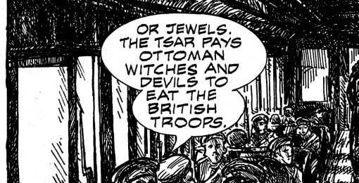
The proposed comics project is titled by the creators, “Empire of Blood,” and co-writer Magnus Aspli describes it as “an epic historical drama grounded in realism, but which also deals with fantastical Slavic folklore elements, anachronistic technology and horror genre aspects.” It begins in “1855 as the Crimean War rages and the Russia Empire is in turmoil, internally as well as on the front lines; two men—one a vurdulak and protector of Tsar Nicholas I, the other a steadfast revolutionary—are sent on a vengeful collision course. A course that will change the fate of nations.”
Magnus Aspli is a native of Norway, his writing partner Michael Deshane lives in Canada, and their artist, Jelena Dordevic (my blog program simply will not recognize some of the actual letterforms in her name), resides in Serbia. Magnus told me, “I started with the idea, I think it was in 2010, then hooked up with Michael online and we began writing it together in the autumn of that year. We worked on the story/scripts for a year before we contacted Jelena through DeviantArt. Luckily she was intrigued and the three of us have been developing it since.” Earlier this year, with some finished art ready, they contacted Clem Robins online, hoping to enlist him as a letterer for their comics proposal.
Clem told me, ” I liked the art a lot, but with all that cross-hatching, I thought it’d look lousy with computer lettering. I called Gaspar and asked him if he’d be willing to try it. I wasn’t sure he would be, but he was delighted. As it happens, the artist was a big fan of (Gaspar’s work on) ARKHAM ASYLUM, and couldn’t believe he would be interested in working on her pictures. Gaspar did the work on vellum overlays and mailed it to Michael in Canada, who scanned the lettering and sent it to Norway, where it was digitally combined with the artwork. For his part, Gaspar liked the story, so far as he read it, and loved the woman’s art.”
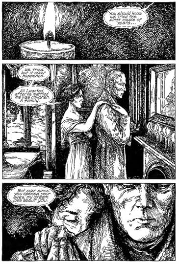
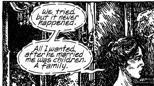
Here’s the complete first page, and you can see what Clem meant about all that cross-hatching, but I have to agree, I think the art is quite good, and doesn’t Gaspar’s handsome upper and lower case lettering work well on it? And the style he’s created for the whispered dialogue is creative and I think unique.
Here’s another page with standard balloon lettering that also looks great to me.
A closer look at one balloon. At this size, the lettering is a little rough in spots, but certainly quite readable and very much in Gaspar’s style, reminding me of what he was doing for DC in the early 2000′s.
I spoke to Gaspar this afternoon for the first time in at least 10 years, probably more. Clem has been encouraging me to give him a call, and this seemed a good time to make the effort, as I wanted to make sure he was okay with me blogging about this project. We had a good talk, and Gaspar sounds just the same as ever. After some catching up, I asked how it was for him doing this lettering, was he rusty? “No, not really,” he replied, telling me that he keeps his hand in practice by writing things every day, but with a regular pen, not lettering pens. He seemed very happy to have this chance to do some hand-lettering again, and when I told him nearly all my lettering work is on the computer now, he said jokingly, “You should get back to hand-lettering, you traitor!” But he understood when I told him that computer lettering is what all the major companies are geared for now, and what they want from me.
Before I conclude this post, I thought it might be interesting to look at some examples of Gaspar’s standard balloon and caption lettering over the years, and they begin below. (Gaspar, if you’re reading this, hope you don’t mind this stroll down memory lane!)
This image and those below © DC Comics, Inc.
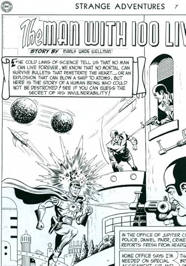
Here’s part of a page from STRANGE ADVENTURES #7, cover dated April, 1951, which I believe is lettered by Gaspar, and quite early in his career. It’s scanned from original art.
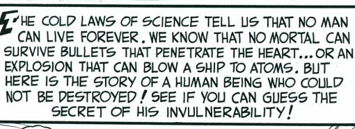
A closer look at the big caption shows elements that identify it for me, including Gaspar’s distinctive S with a long straight central bar. This early work is a little stiff, but quite professional. Editor Julie Schwartz was already making good use of Gaspar’s talent, even then!
In this panel from SWAMP THING #2, cover dated December, 1972, Gaspar’s work had become rounder, and begun to show his use of a pen with a slight wedge tip, making the horizontal strokes a little thicker than the vertical ones. (It was a Speedball FB6 filed down to a wedge shape, I believe.) This example is also more condensed, and it’s worth noting that this lettering is done smaller than the earlier sample. The standard DC art size had shrunk from about 200% of printed size to about 150%.
Here’s part of a page of lettering on vellum over photocopied art from the LOBO PARAMILITARY CHRISTMAS SPECIAL from 1991. Look at that great first caption and its decorative capital S! I could write volumes on all the wonderful display lettering and sound effects in this comic alone.
But I’m focusing on the regular lettering here, and these two examples show Gaspar’s style had shifted again to one that’s more angular and less rounded. The wedge-tipped pen work is also more obvious and pronounced. Some of the S shapes are getting back to the angular look of the first example from 1951. And while I don’t have any examples handy, I think this trend continued toward more angular work until Gaspar’s style reached the place it is today in his latest lettering.
When I spoke to him, I asked Gaspar if he’d like to do more lettering. He said he would, and this confirms what Clem has told me, that he was very happy to have this small project in front of him. Of course, he’d be doing hand-lettering, and I imagine would like something he could take his time with, nothing with a tight deadline. Perhaps other projects that would fit that bill will come his way in the future. I and all my long-time lettering friends would be delighted if they did. We’d like nothing better than to see more work from the man we admire so much, the one we call “The Master.”
September 23, 2012
And Then I Read: TIME CAT
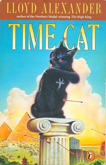
© Estate of Lloyd Alexander, cover illustration © Wayne McLoughlin.
I discovered Lloyd Alexander through his Prydain series of fantasy novels, reading them as they came out in the 1960s. Wonderful work, I feel the best of his long career. At the time the only other fantasy he had published was this one. I read it at the time and thought it okay, but was not impressed. As a fantasy type: a child (or children) who travel through time with the help of a magical animal or object, I’d read better examples by E. Nesbit and Edward Eager to name two.
Rereading it now after nearly 50 years, I think I’m willing to give the author a little more slack and say it’s a good book. Still not a great book, but well worth reading. Gareth, a magical cat with an ankh sign in his black fur takes his master, Jason, on a journey through time to nine eras and places, all of which have something to do with cats. In each place they visit, Gareth and Jason quickly become involved in some sort of trouble, often with important historical events happening around them. Their journey begins in Egypt in 2700 BC, a time and place when cats were worshipped. Garth makes such an impression that courtiers of the Pharaoh steal him from Jason to give as a gift to the Neter-Khet, the young man in charge of all Egypt. As we soon learn, though the boy can command everyone around him to do his bidding, that doesn’t work for cats.
Episodically, the story continues through ancient Britain, Ireland, Japan, Italy, Peru, the Isle of Man, Germany and America in 1775. In each segment, Jason and those he meets learn something about human nature, and especially cat nature. The characters are entertaining, and Alexander’s ability to capture human faults and foibles shines through in many areas of the book. Where I would fault it is the almost complete lack of set-up at the beginning, and in the somewhat too obvious moral lessons being conveyed. But it’s a fun book, and one can almost see the author figuring out how to tell stories that will entertain kids and adults alike. Later books after the Prydain series are also quite good, and generally better written than this one, but if you like Alexander’s work, this is certainly worth a look.
Recommended.
September 22, 2012
More Yard Butterflies

A few more from this past week, including a rare stunner. Not this tiny one, it’s an Eastern Tailed Blue, one of our smallest butterflies. About the size of your index fingernail. More gray than blue, but in flight they do give a pale blue impression.

This Red-banded Hairstreak is also quite small, about thumbnail size. It’s one of the more common Hairstreaks, and one I expect to find feeding on our Sedum, as this one is, head down. The red band is obvious, the hairstreak refers to the little hairlike tails extending from the wings.

This is a Skipper, I don’t know which kind, and I can’t be bothered to try to figure that out. There are about a dozen species of these small butterflies, a little larger than Hairstreaks, that all look about the same, and can only be identified with hard work and patience, mainly by differences in shade and spotting on the wings.

Most Skippers are boring, but when I spotted this one on one of our Butterfly Bushes, my heart skipped a beat. This is a Long-tailed Skipper, much larger than the usual ones, about two inches, with a cool blue feather-like covering on the back and those long tails at the wing ends. I’d only seen one twice before as far as I can recall, and it was a first for our yard.

This is my favorite of the many pictures I took, looking very birdlike.

Here’s an underwing side view showing just how long those tails are. A rare sighting, and a thrilling one for me. Ellen came home a little while later, and was just in time to see it fly off for good, which is too bad, but typical!
September 21, 2012
And Then I Read: THE FAMILY CIRCUS 1960-61
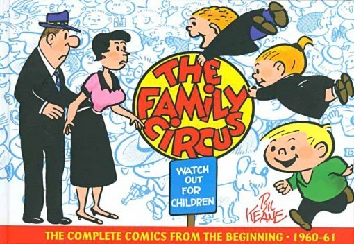
Images © Bil Keane.
This book of newspaper strips is a well-made and well-designed hardcover along the lines of the “Peanuts” series, but a little larger. THE FAMILY CIRCUS is a strip I’ve read off and on since my own childhood; never a favorite, but generally amusing family humor. Light weight, without the adult undertones of “Peanuts,” but in this collection of early strips, often on the mark and funny. The daily strip has always been a single panel in a circle, and most of this book has three of those on a page. The Sunday strips, in color and much larger, began in September of 1961, so there are relatively fewer of those here.
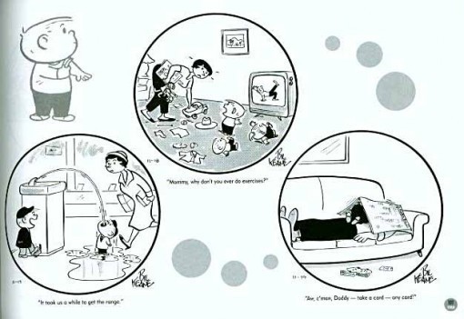
Bil Keane is still with us, and works on the strip with his son. The drawing style has become somewhat refined from these early days, but hasn’t changed hugely. The kids, especially, look pretty much the same. The parents have changed more. The restrictive nature of a single panel gag (occasionally two panels) means you have to come up with ideas that can be conveyed quickly. Some work better than others, but the best of these are right up there with good New Yorker cartoons, I’d say.
This is not a book I would have bought, it was a gift to attendees at the Harvey Awards. I’m glad I got to read it, I think I appreciate the strip and Keane more now than I ever did.
Recommended.
September 20, 2012
And Then I Read: HARLAN ELLISON’S PHOENIX WITHOUT ASHES
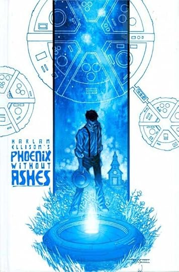
Images © The Kilamanjaro Corporation.
I had to read up on this project to remember its history. It began as a pilot script for a Canadian TV show, but budget cuts changed the story so much that Harlan disavowed it and withdrew his name from the credits. The TV show was “The Starlost” (which I remember seeing a few episodes of), and they kept Harlan’s premise, but changed the episode title to something else, rather than this, his original title. I don’t recall how different the show was from this comic, but Harlan’s script won a Writers’ Guild of America award for Best Screenplay. Apparently Harlan sold it to IDW as a comic series, which is collected here. The writing credit is all his, though science fiction writer Ed Bryant is given a “special thanks” in small print, so perhaps he handled the adaptation, or at least helped with it.
The story begins in a rural farm community that at first seems like something from the 19th century, or perhaps an Amish group, but the presence of machines soon pushes that idea aside. The community is very religious and old-fashioned, dominated by Elder Micah, who has a lot of problems with young Devon, a teenage boy/young man who does not want to follow Micah’s rules and the pronouncements of a sacred computer-like machine, designed to genetically match up young people for marriage. Devon loves Rachel, but Rachel has been promised to Garth. Garth doesn’t love Rachel, but is willing to follow orders and marry her. Rachel loves Devon, but not Garth, though she is much more timid about disobeying the rules of the community.
Things really heat up when Devon overhears the town elders talking about their genetics matching machine, and Elder Micah reveals he is the one programming the actual matches; the machine has been broken for a long time. That sends Devon over the edge of rebellion. He’s captured, but escapes and finds a strange metal hole on the outskirts of town that promises escape. What he finds inside changes everything. His community is one of many separate biospheres traveling together through space as part of a massive colony ship. Something has happened to the crew, though, and as the centuries have passed, the biosphere inhabitants have forgotten that they’re even in space at all.
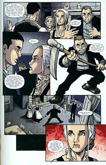
The art by Alan Robinson is excellent. I think he does a great job with both the period setting and costumes, and later the spaceship as Devon discovers it. His characters are effective actors, and his storytelling is fine.
I enjoyed reading this, my only problem with it is that it has no real resolution. It’s meant to be the beginning of a much bigger story, and one we’ll probably never see. Too bad, I would have liked to read more. The idea itself is not unique. Robert Heinlein did something similar in his novel “Orphans of the Sky” (originally two short novels), and there have been others. As the pilot for a TV show, Harlan’s work here is great, but kind of unsatisfying as a standalone story.
Still, recommended.
September 19, 2012
And Then I Read: FRANK READE, Adventures in the Age of Invention
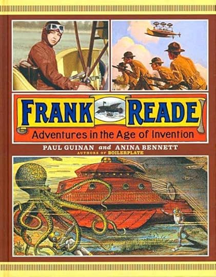
Images © Paul Guinan and Anina Bennett.
This large, handsome coffee-table size hardcover is similar to the authors’ previous book from Abrams, “Boilerplate: History’s Mechanical Marvel.” In some ways it’s a companion and continuation of many of the same themes and ideas. The difference is that, while the robot “Boilerplate” is something Paul and Anina made up completely, the characters of Frank Reade and his family have a long literary tradition as the stars of a series of dime novels (predecessors of pulp magazines) beginning in 1882, and continuing for decades. Most featured Frank Reade Jr., a hot-headed adventurer and teenage inventor, the model for later heroes that are better known today like Tom Swift, and probably inspired by Thomas Edison in part.
What the authors have done in this book is present the life story of the Reade family in text and pictures, with the dime novels providing lots of great illustrations as a starting point, and artist Guinan adding many more apparently period photos and illustrations. This book, like “Boilerplate” attempts to blur the line between history and fiction as much as possible by including many real people and true events in the narrative, sort of like what films such as “Forrest Gump” have done. They’re really good at it. So good that, even knowing the game, I often had a hard time deciding if some photo, illustration, or description was real or made up, or where the convergence was between the two. The book is beautifully designed and very well printed, adding to the enjoyment of each page.
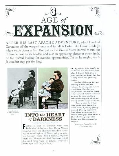
The photos are the most unsettling visuals for me. In “Boilerplate,” I knew the robot wasn’t real, but in this book we have what appear to be either actual historical photos or very convincing modern replicas that seem quite authentic, down to the “hand-tinted” look of the one at right above. It’s a fun game, though playing it does distract from the narrative (written mostly by Anina I think), which is quite well done. The only downside of the project is that the heroes don’t come off very well. Frank Reade Jr. in particular seems to have been rather unlikeable; bloodthirsty, at times cruel and uncaring about his comrades and family, suspicious of any who would befriend him, and always conniving to gain advantage over his rivals. Then there are the excerpts from the dime novels, usually just a page or two, but none of them seem to have been very well written. In all the images and inventions are the most fun thing about the Reade family. Those inventions, as depicted by excellent but unknown artists in the dime novels, are really the stars of the Reade adventures, and are great fun to look at and think about. Guinan has apparently created diagrams, cutaways and models of some that are quite impressive.
I enjoyed this book, and recommend it. If you’ve already tried “Boilerplate,” you’ll certainly want to have this one as well.
September 18, 2012
And Then I Read: FRANKENSTEIN ALIVE, ALIVE! 1
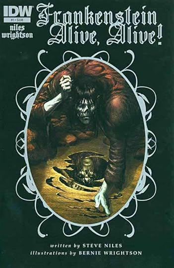
Images © Steve Niles and Bernie Wrightson.
I’ve loved Wrightson’s art since I first discovered it in the early 70s, and his adaptation of Mary Shelley’s “Frankenstein” with lots of full-page illustrations is a wonderful showcase for his art. That alone pretty much sold me on this project, but I also like the writing of Steve Niles, another plus. Despite all that, I wasn’t quite sure what this story would be like. As I opened the book and began to read, the art immediately met with my approval. And the story? It opens at a circus sideshow where the Frankenstein monster is appearing as one of the freaks, and seems to kind of like the life he’s found there. With narration in captions by the monster, we go from that setting into a recounting of some of Mary Shelley’s novel, all from the monster’s perspective. Very well handled, completely respecting the original work as far as I can recall. Victor Frankenstein and his creation continue their struggles and arguments, their love/hate relationship to the monster’s apparent death at the end, though we know, of course, he didn’t die. And that’s what the title of the book says, after all.
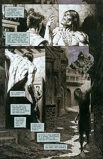
As I said, Bernie’s art is terrific, using a mix of pencil tones, gray washes and inks. At first glance it seems to be black and white with gray tones, but if you look closely, the art has been scanned in color, allowing for a much richer palette of warm and cool grays that add a great deal to the effective atmosphere of the book. For instance, compare the cool gray of the sky with the warm grays of the buildings above. This is the best new work I’ve seen from Wrightson in years, and I can’t wait to see more of it.
Highly recommended!
Todd Klein's Blog

- Todd Klein's profile
- 28 followers

