
Todd Klein's Blog, page 296
October 22, 2012
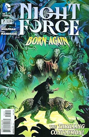
And Then I Read: NIGHT FORCE 7
Images © DC Comics, Inc.
Writer Marv Wolfman wraps up his latest NIGHT FORCE storyline here in a satisfying way. The somewhat complex storyline involving generations of arranged pregnancies directed by strange otherworldly beings kinds of falls away from the main characters who finally get to make some decisions and actions of their own and take charge of their own future. There are some clever games played with time and repeating events, a revealed object of power, and as usual Baron Winter and his leopard partner acting cranky even while doing the right thing.
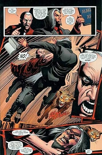
The art by Tom Mandrake has continued to grow more powerful as the series progressed, and in this final issue is full of energy, and even shows the moody influence of the original artist on the series, Gene Colan. Mandrake takes a slightly impressionistic approach here that works well, and his layouts and storytelling are great.
Highly recommended, though of course not the place to start. I suggest getting the collected edition if there is one, and there should be.


October 20, 2012
Fall Color

From our walk today around Lake Nummy in Belleplain State Forest.


October 19, 2012
And Then I Read: SLOW APOCALYPSE by John Varley

© John Varley, cover design by Judith Lagerman.
John Varley is an author whose work I like so much that I will automatically buy any new book he puts out, and I have yet to be disappointed. Most of his work has been science fiction. This one is a disaster thriller with just a touch of SF in the cause: someone in a secret military lab somewhere creates a strain of bacteria that can turn crude oil into something completely unusable and unleashes it on an oil field in Saudi Arabia. It succeeds too well, causing explosions and destroying the entire field. Too well, because, though it was only intended to work underground, the bacteria mutates into a form that can travel by air and begins to spread across the world, wreaking havoc on one oil field after another, and leaving behind nothing that can be used as fuel or anything else.
Dave Marshall is a comedy writer living in Los Angeles, a bit down on his luck, trying to drum up new story ideas from Colonel Warner, an ex-military man who works as a consultant on Hollywood films involving the military. At a meeting between the two, the Colonel reveals the story of the disastrous bacteria now spreading across the world, but being kept a dark secret by all the governments involved. Not long after their meeting, Dave witnesses the Colonel assassinated by government forces, which convinces him the story is true.
Dave’s wife Karen doesn’t believe a word of it, and the two are somewhat estranged anyway, but his daughter Addison becomes convinced, and joins him in planning what to do before their own world changes. They stock up on supplies, and information. They bring some close friends in on what they know, hoping they have time to prepare.
One night the oil field in the Los Angeles basin begins to explode, and suddenly it all seems much more real. But the authorities are still covering up the true problem, and it takes an even worse disaster, a massive earthquake, to completely destroy the infrastructure of the city and get everyone to see how life as they knew it was over. Even Karen is shocked into the truth, and finally rejoins her family in their efforts to survive this disaster. As you can imagine, things are going to get a lot worse.
Great read, wonderful characters, vivid depictions of the upheavals of everything we know. There are some quieter moments in the book, but some, like a fire that threatens their home, are as thrilling as anything you might see in the best action film, and very hard to put down. Varley is a fan of SF author Robert Heinlein, and many of his books can be seen to parallel that writer’s work in some way. This one has some nods to “Farnham’s Freehold” at the beginning, but follows its own logical course, and has a much better story arc than that book. I recommend it highly!
October 18, 2012
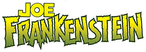
NEW Gaspar Saladino logo for JOE FRANKENSTEIN!
Images © Graham Nolan and Chuck Dixon, all rights reserved.
A few weeks ago I got an email from artist Graham Nolan asking if I’d be available to design a logo for a creator-owned project he and writer Chuck Dixon were developing called JOE FRANKENSTEIN. I haven’t taken many logo assignments the last few years because I’m usually quite busy lettering pages for DC Comics and other companies, and while logo designing can be rewarding, it’s tough to schedule around, since you can’t tell how long it might take. While I haven’t seen either in a while, I know Chuck and Graham a little from their days writing and drawing BATMAN, where they created the villain Bane, among other things.
After learning that they needed the logo soon, I regretfully passed on the assignment, and Graham asked if I could recommend someone else. I did, and that person was also too busy, so Graham came back to me for more ideas. That’s when I thought of Gaspar.
Gaspar Saladino has long been my favorite letterer and logo designer, and recently he returned from retirement to letter a few new pages for a proposal by some newcomers, an assignment arranged by letterer Clem Robins. I wrote about that HERE. I hadn’t spoken to Gaspar in over ten years, but that lettering project, and my blog about it, prompted me to get back in touch, and Gaspar and I have been talking on the phone about once a week since. I knew he’d enjoyed lettering those pages, so I thought he might like to try this logo design too. I asked Graham if he’d be willing to give Gaspar a shot at it, and after some thought and discussion with Chuck, he said he would. I asked Gaspar about it, and he said he’d be happy to do it. “You and Clem should be agents!” he told me, after I assured him this was work I didn’t want for myself.
Next I gathered as much info as I could from the project’s WEBSITE plus what Graham could tell me and put it into an email to Gaspar, and of course gave each of them the other’s phone number so they could talk directly. Graham wanted a mundane “JOE” over a monstrous “FRANKENSTEIN,” something with a “Universal Monsters” vibe, he said. Gaspar set about doing his first pencil sketches for the assignment.
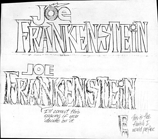
Here are those sketches. I liked them a lot, preferring the top one with its unusual letterforms and a hint of lightning in JOE, while the second one had that organic, rotted look of some of Gaspar’s famous horror logos for DC like SWAMP THING. Neither were quite what Chuck and Graham wanted though, and Graham asked for more sketches.
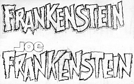
Here’s the second round, and Graham said they loved them both. I do, too! Chuck and Graham felt the top one was the closest to what they were after, but he made a few modifications.
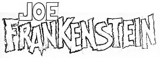
Here’s the final sketch with an all caps JOE drawn in by Graham, and he also reduced the height of the S and eliminated the open drop shadow, which he felt could always be added later on the computer if needed. This was sent to Gaspar, who being a pro, was happy to ink it just as they wanted it. The final inked version is the top image above, looking great to me. I particularly like the way the A seems to be falling apart at the bottom.
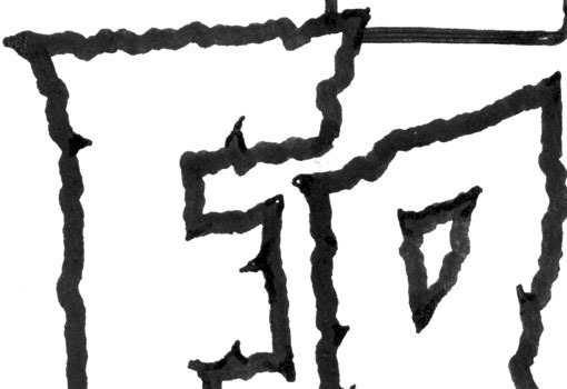
Here’s a detail from Gaspar’s inks at full size. If you look closely you can see some extra pen lines where he made the cracks in the letters a bit deeper and sharper, as well as the outside corners. Despite the fact that he hasn’t worked on a logo in a long time, I’d say The Master still has it!
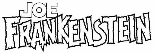
Here’s the logo scan cleaned up a bit and converted to bitmap format on the computer, making all the blacks solid black and all the whites pure white. I note that Gaspar did a little revising on the JOE that Graham sent him, making the O perfectly round, and the J and E more evenly square, which I think is an improvement.
Here it is with color by Graham, looking even better…
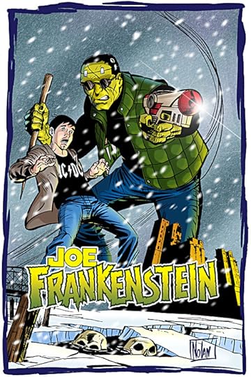
…and best of all on this promotional poster for the project with a white outline around it to separate it from the art. I’m really pleased with the way this venture turned out, and I know Graham and Chuck are as well. “We can now say we have a Gaspar Saladino logo! Very cool,” Graham emailed.
I think so, too. And I urge you to check out and support this project, which looks like a great one to me. In addition to their website, the project is raising funds on IndieGoGo HERE. They have a publisher, IDW, but still need to finance the actual work of creating many pages of story and art, and your support will help with that, while guaranteeing you all kinds of cool premiums, or just a copy of the finished book.
As for Gaspar, I think he enjoyed doing this, and perhaps there will be more new work from him in the future. Stay tuned!
October 17, 2012
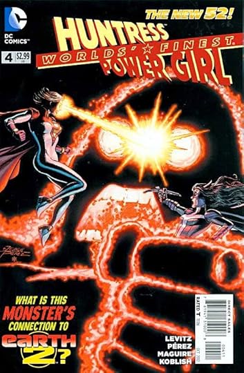
And Then I Read: WORLDS’ FINEST 4
Images © DC Comics, Inc.
Paul Levitz is having some good fun with superheroes in this book. It takes place on an Earth like ours, but not quite. This Power Girl and Huntress are from Earth 2, a different other Earth. (And we can see the snowball of complexity beginning to roll downhill there…) But none of that gets in the way of a good action-filled giant radioactive monster in Japan story that Paul wraps up nicely in this issue, to make way for an Issue 0 next time. And in the flashback sequence, we get to see the two ladies in their civilian garb dealing with more mundane but equally entertaining issues like sleazy guys.
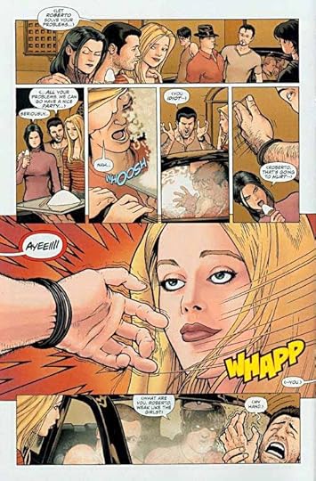
The flashback art is by Kevin Maguire, sample above, doing what he does best: character interactions and humor, while the main story is full of wonderful action courtesy of George Pérez and Scott Koblish. It’s all great, the contrast is refreshing, everyone gets to work at a pace they can handle, what a deal!
Recommended.
October 16, 2012
And Then I Read: GREEN LANTERN NEW GUARDIANS 11
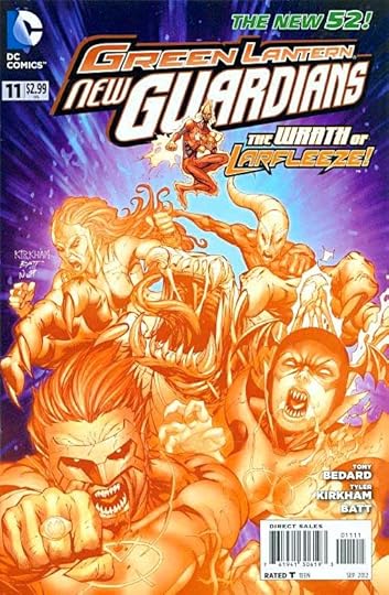
Images © DC Comics, Inc.
Kyle Rayner and his group of multicolored Lanterns has come to the Vegan star system to confront Larfleeze, the chief and only real Orange Lantern, as they believe he’s the source of some of their recent trouble. I usually find Larfleeze amusing, but here he’s more crabby and grabby than ever, and less funny. The godlike Invictus with his gigantic starship the size of a solar system has also arrived and is creating havoc of his own. After some fighting the true source of trouble is revealed, and it’s a surprising one. I’m still enjoying this title, though things are getting a little frenetic. If, as I suspect, all these plots are wrapping up next issue, it should be a doozy.
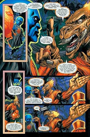
The art by Tyler Kirkham and Batt continues to be quite good, with the action scenes stealing the show, aided by great coloring from Nei Ruffino and fine lettering by Dave Sharpe.
Recommended.
October 14, 2012
And Then I Read: SPACE RACE by Sylvia Waugh
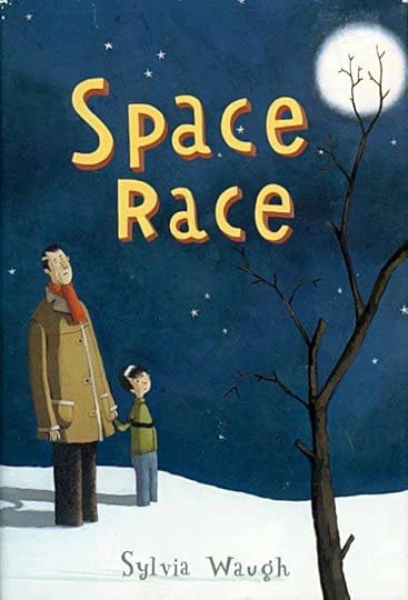
© Sylvia Waugh, illustration © Martin Matje.
Sylvia Waugh has written three well-received books about The Mennyms, a family of life-size dolls that have come to life. I read two of them, and while I find the entire idea creepy, I came to admire her writing. This book is unrelated, but like her other books, it does focus on two outsider characters: young Thomas and his father Patrick. They seem to lead an ordinary life in small-town England, but in fact they are spies of a sort. Though they appear human, they’re actually aliens from a distant planet gathering information about humans. Their mission has a time limit, and it’s almost up, so the two begin to travel toward the place where their space ship is hidden, but on the way a terrible traffic accident occurs, and Patrick completely vanishes. Thomas is taken to a hospital, and kept there for observation, but he refuses to cooperate. Thomas is already conflicted about leaving the only life he knows (he was too young to remember their own planet), and yet if his father doesn’t come back to get him in time, the ship will leave without them. And of course Thomas is also very worried about his father and what might have happened to him.
It’s a charming story with great characters and a good deal of mystery and suspense, while at the same time being science fictional, quite an appealing combination for me. I recommend it highly.
October 13, 2012
And Then I Read: THE WAR HOUND AND THE WORLD’S PAIN by Michael Moorcock

© Michael Moorcock.
Last summer at the San Diego Con, artist J.H. Williams III and I agreed to swap some favorite fiction and authors. Jim’s recommendation for me was the von Beck novels of Michael Moorcock, and I’ve just finished the first one. I’ve read a handful of Moorcock novels over the years, but none in this series, which is only a small part of his much larger “Eternal Champion” oevre spanning many series and books. Of those, I’ve read some of the Elric books and not much else.
Ulrich von Beck is a nobleman and military officer in Europe during the Thirty Years War, and as the story opens in 1631, he’s in the Harz Mountains of Germany with his troops. Dispirited and tired of war, he slips away into the forest hoping to leave the battlefied behind. Soon he comes upon a wonderful but eerily silent and deserted castle where he makes himself at home. When a group of soldiers and a carriage appears on the approach to the castle, he goes out to oppose them, but before the battle can become deadly, the carriage door opens, and a beautiful woman orders her soldiers to stop. Von Beck has already realized something is amiss with the soldiers anyway—they’re living dead, in the manner of zombies.
Back in the castle, the Lady Sabrina claims it’s her own, but that she holds it for her master, Lucifer, lord of Hell. She also tells von Beck that only those whose souls are already damned can enter it, news which he’s not happy to hear, but privately agrees with, after the horrible things he’s done in battle.
As it turns out, Lucifer himself has arranged all this to meet with von Beck and send him on a quest. Lucifer is tired of ruling Hell, and wants to make amends with God. To that end, he would send von Beck on a quest to find the Holy Grail, which Lucifer says can end the world’s pain. Von Beck also learns that, if he’s successful, it will save his own soul, and that of Sabrina, who he’s already fallen in love with.
This story sounds very Mediaeval, and it is, but in Moorcock’s hands, and from von Beck’s narrative viewpoint, we get a more modern feel for the characters, their motivations and ways of thinking, and eventually some effective allegory. On his quest, von Beck picks up a sidekick: Sedenko, a Kazak soldier, and a deadly enemy: Klosterheim, a supposed priest who turns out to be another agent of Hell, and one opposed to the quest.
The journey takes them through both historically accurate Europe at war and mythical lands in Mittelmarch, outside our reality, where magic and sorcery are common. There they meet a philosopher, Philander Groot, who plays an important part in the later parts of the story.
I enjoyed the book a lot. For a while I thought it would be a typical quest story with lots of violent action and strange settings and characters, but after some of this, Moorcock gradually shifts the focus of von Beck’s narrative to issues of good versus evil and morality in a way that is more engaging and thoughtful than the usual quest story. The finale, a huge battle with the forces of Hell on the outskirts of Heaven, is thrilling and satisfying. I look forward to reading the rest of the von Beck books, in the omnibus edition Jim gave me (not the one pictured above).
Recommended.
October 12, 2012
Cape May Birds and a Hawk Up Close

Images © Todd Klein.
The last two Fridays I’ve been birding at Cape May Point on days when the weather was favorable — northwest winds pushing migrating birds toward the coast — and have seen lots of great birds. Dozens of Northern Flickers like the one above, for instance. This is a young bird without the head markings of full adult plumage.
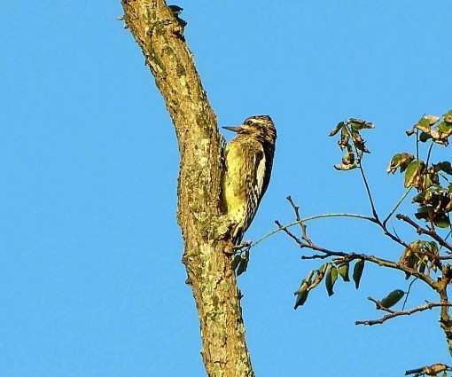
Here’s a Yellow-Bellied Sapsucker, that bird name that Yosemite Sam used to get a laugh with in the cartoons.
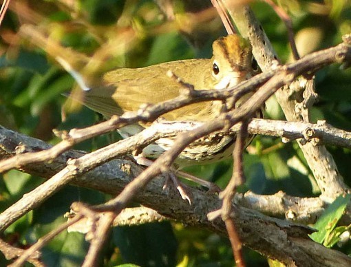
There were still a good variety of warblers last Friday like this ever-elusive Ovenbird, but this Friday most had passed through except for Yellow-Rumped, some of which will stay all winter.
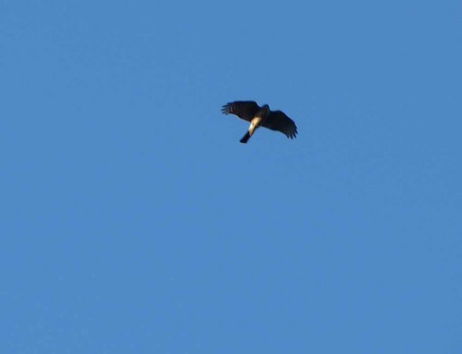
There were quite a few Sharp-Shinned Hawks cruising the fields looking for a meal of small songbird, but they’re tough to get a photo of, this is about the best I can do usually.
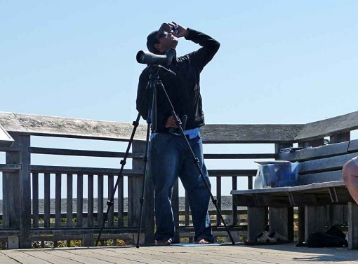
After doing my volunteer time at the Cape May Bird Observatory this morning, I went to the Hawk Watch platform at the state park, where the official hawk counter notes every raptor that passes by, a project partly funded by the New Jersey Audubon Society to help us understand what’s going on with bird populations. Most of the raptors that come this way are young birds born this spring, migrating for the first time. If the winds are right they’re pushed toward the coast, then follow it south, until the come the the pointed end of New Jersey. Then they usually stop to consider whether they want to fly across the Delaware Bay, or go up the bay side of the state to a closer crossing. It makes Cape May a natural migrant trap and an excellent place for fall birdwatching.

There’s another science project going on here with raptors: banding. For decades raptors have been trapped humanely at several locations around Cape May Point and banded by naturalists also hoping to learn more about the lives of migrating birds. You can read about the project HERE. While I was on the platform today, one of the banders appeared with a recently trapped hawk in one of the cans they use to keep the birds quiet while they affix the metal identification bands to their ankles. He announced it was a young Red-Shouldered Hawk, a species we don’t see very many of here, and everyone gathered around to see and photograph the bird as he took it out of the can.
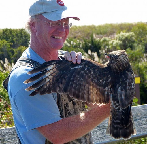
Here’s the bander (I neglected to get his name, unfortunately) showing the hawk’s wing. Notice the light section near the wing tip, this is called a “window,” an area which allows more light through. It can be seen even when the bird is soaring high overhead, just a silhouette, and a good way to identify the species.
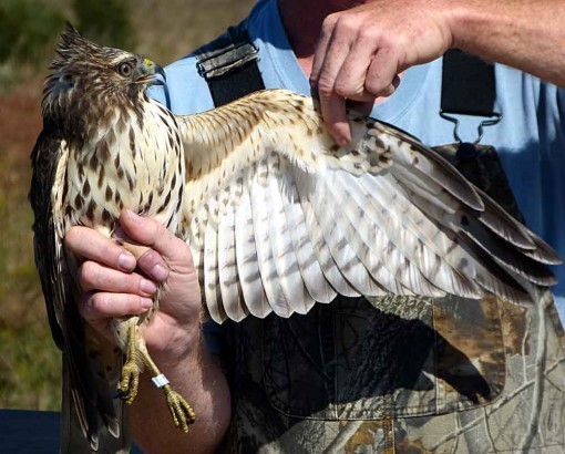
Here’s the underside of the bird and its wing, and you can see the metal band on its leg. It has numbers and I think an email address you can contact if you should find a dead bird with a band. Only about 30 percent of young birds survive a full year in the wild — migration is a dangerous business — and only a fraction of those are banded, but every year a few bands are reported, adding to our knowledge.
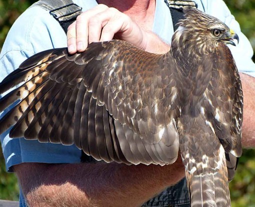
In this light you can see the beginnings of the rufous red beginning to show on the shoulders, the color that gives the bird its name. It will get a lot more of that color as it matures, and some on the front as well. Note you can still see the “window” in the wing tip. This bird was quite calm and cooperative. The bander said Red-Shoulders tend to bite, but this one didn’t try it. He thought it was probably a male because of the relatively small size for the species. In most raptors, the females are larger.
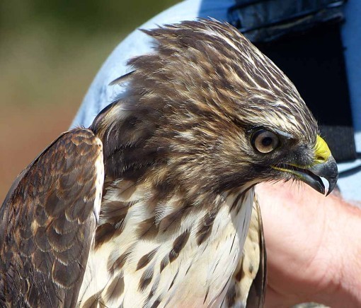
Raptors are not only important to the food chain, they’re handsome and beautiful, as you can see here. It was a thrill to see this one up close. A short time later, he released it, and we watched it soar up, circle the area a few times to gain altitude, and head on its way.
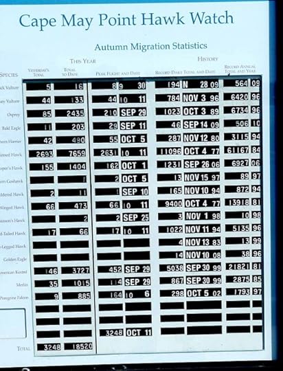
Here’s the official tally board for the Hawk Watch, with yesterday’s numbers in the left column, the largest count so far this fall. The next column is the totals for the year. The raptors with the highest counts are Sharp-Shinned Hawk at 7,659 and American Kestrel with 3,727. Red-Shouldered total is only 11. So you can see why the bander was excited to have caught one and wanted to show it off. Everyone on the platform benefitted!
October 11, 2012
And Then I Read: THE FLASH 11
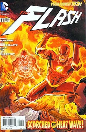
Images © DC Comics, Inc.
Writers Francis Manapul and Brian Buccellato continue to bring the Flash Rogues Gallery back into this title, this time featuring Heat Wave and Captain Cold, at odds with each other as well as Barry Allen. A familiar theme in the Flash mythos, but with a different feel in this version. Barry has decided to let his secret identity persona remain dead to the world, and takes on a new name and job in a sleazy bar in a poor part of Keystone City frequented by some of the criminals that make up that Rogues Gallery. So, he’s on the spot when the two polar opposites start a brawl. Heat Wave is pretty crazy in this version, having already done a lot of damage elsewhere. And at the end of the issue, another old Rogue shows up to join the party.
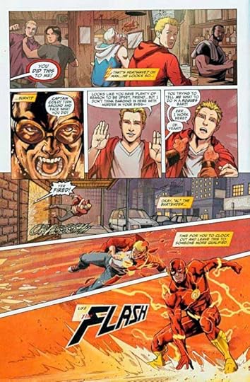
The art on the issue is by penciller Marcus To and Inker Ray McCarthy. It’s not bad, though less appealing to me than Manapul’s own art, but I can understand him needing a break. The way the story sort of sidesteps many of the previous plotlines makes me wonder if this one was done out of continuity to provide that kind break. If so, it works pretty well.
Recommended.
Todd Klein's Blog

- Todd Klein's profile
- 28 followers

