
Todd Klein's Blog, page 238
September 5, 2014
And Then I Read: DETECTIVE COMICS 33
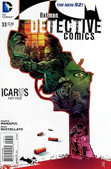
Image © DC Comics, Inc.
I’m not a fan of cop shows, I don’t watch any on TV. Don’t read murder mysteries either. For a story about guns, gangs and drugs in Gotham City to work for me, there has to be great writing and characters first, and this one has it. Tops in my estimation is the handling of Harvey Bullock vs. Batman. The story takes place early in the careers of both, when they’re completely at odds, and it makes for fascinating reading. We also see Batman doing actual detective work, something this title has often lacked, and the art by Francis Manapul manages to make even the most brutal and abhorrent criminal activity somehow lush and appealing to me. Quite a trick. Quite a team, Manapul and Buccellato.
Recommended.


September 4, 2014
Pulled From My Files #25: THE KINDLY ONES

Images © DC Comics, Inc.
Here’s something I didn’t know I had until I uncovered it this week, the original title lettering for The Kindly Ones storyline in SANDMAN, running from issues 57 to 69 of the series.

When I used it, I assembled a reduced photocopy of the hand-lettering onto a frame, as seen here, adding the appropriate chapter number each time. I don’t recall how much of the art by Marc Hempel was sent to me for lettering, but it’s likely some pages were lettered on vellum overlays atop xerox copies of the art. In either case, I would have put the title block together first and pasted it onto either the penciled art or the overlay.

Here’s a larger scan with the words stacked so you can see it more clearly. It was penciled on DC art paper with a smooth or plate finish, probably a cover board, then inked with a technical drawing pen, I think probably a number 2.5 or 0.70mm size. When it was dry, I would have pointed the corners with a size 0 (.035mm) pen. The intent is to contrast the very euphemistic words with a style suggesting something creepy and dangerous, the characters themselves. I think it works well, if I do say so myself.
September 3, 2014
Incoming: FABLES DELUXE EDITION BOOK NINE

Image © Bill Willingham and DC Comics.
I don’t usually do two of these so close together, but I was so happy to see this book I couldn’t resist. First, I was blown away by the wraparound cover by Daniel Dos Santos, which looks even better without any type on the actual cover boards. Second, the paper and printing on these is SO much better than both the original comics and the regular trade paperback collections. Wonderful to finally see our work reproduced this well. Finally, the collection of issues 70-82 puts some amazingly varied stories in one volume, from epic battles and thrilling action to moving tragedy and heartbreak. From clever comedy to chilling horror. From spy thrillers to intimate character work. From honest heroism to the worst villainy. Fables, and especially this collection, has it all. Look for it at a shop near you.
September 2, 2014
Incoming: The LOEG CENTURY Hardcover

Image © Alan Moore & Kevin O’Neill
This was out in time for the San Diego Comic Con, but I’ve just received some copies from the publisher. A long time in the making, it will be nice to put it on the shelf next to volumes 1 and 2 and the Black Dossier. I had lots of challenging fun with the lettering in these books, from crazy psychedelia to twisted madness and beyond. Doing the design work with Kevin is also great fun, and I think the entire package looks quite handsome, but of course I’m biased. Order it online from Top Shelf, or look for it at a shop or bookstore near you.
September 1, 2014
Pulled From My Files 24: SUPREME LETTER COLUMN HEADER
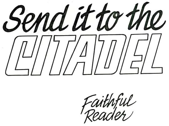
Images © Rob Liefeld.
I did lots of extra design work for the issues of SUPREME I worked on with Alan Moore writing for various artists. One assignment was to create a letter-column header similar to ones seen in most comics until the internet and email cut way back on actual fan letters. I’m not sure how many letters were coming to the editor of SUPREME, possibly the letter column was partly or completely written by Alan, but in any case, the idea was to give it a retro look, as with much of the SUPREME design work. I started by hand-lettering the column title and “Faithful Reader” as a return address, using Speedball dip-pens and a Faber-Castell TG-1 technical pen for the open lettering.
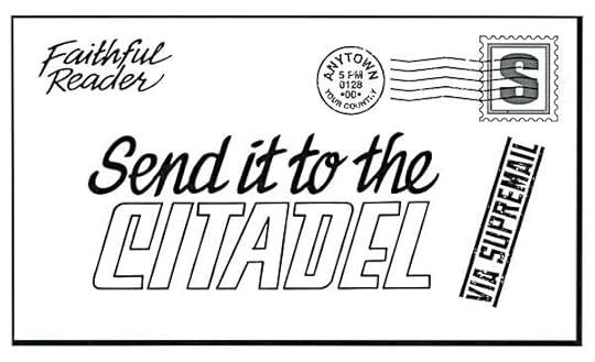
I scanned that and assembled this “letter” on my computer using Adobe Photoshop and Illustrator. “Via Suprememail” is one of my fonts with distressing to make it look rubber-stamped.
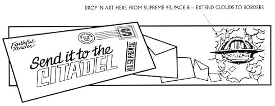
Finally I put the letter into a rectangular design containing a stream of letters flying toward Supreme’s flying headquarters, his “Citadel.” I indicated where to pick up the art for that from a previous issue, and that it would need art extension on the clouds. I don’t have a copy of the printed letter column, but it would have been colored and dropped onto the top of the letters page layout. In the old days on staff at DC, assembling letter columns was one of my production duties, this time I was able to pass that part on to someone else!
August 31, 2014
Rereading: HIS LAST BOW by A. Conan Doyle
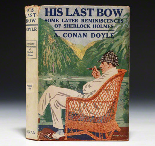
Continuing my revisit to the entire Sherlock Holmes canon on my phone and iPad (first edition cover above). This book is relatively short, containing only seven stories, though the first, “The Adventure of Wisteria Lodge,” was long enough to run in two parts in The Strand magazine. It’s a somewhat familiar idea with a man being lured to a remote estate in the country where a murder takes place, and the innocent visitor is under suspicion as the murderer, so he turns to Holmes to prove his innocence. One other character, local Police Inspector Baynes turns out to be nearly as clever and resourceful as Holmes himself, and the two of them race to the solution. Good reading.
In “The Adventure of the Red Circle,” a landlord comes to Holmes with complaints about a very mysterious lodger who has not been seen in person since moving in, and seems to have odd habits and cryptic communications in note form. Holmes takes the case, discovering that someone is communicating with the lodger through newspaper ads and signals from a nearby house. A sinister plot is uncovered, and some exciting action ensues.
“The Adventure of the Bruce-Partington Plans” is both a cracking good mystery and a spy thriller, in fact perhaps the first such story ever. Stolen government weapons plans, a murdered body at a very unlikely place, Holmes and Watson breaking and entering, even Mycroft Holmes is involved. Great reading.
“The Adventure of the Dying Detective” has Holmes at death’s door, and very reluctant to allow Dr. Watson to treat him. Holmes says he his highly contagious and begs Watson to bring a specialist on rare infections to see him in his rooms. The man is question is clearly a shady character who is quite delighted to have Holmes sick and perhaps dying. He comes to gloat. Fine reading.
“The Disappearance of Lady Frances Carfax” has a somewhat gullible rich English woman disappearing in Europe, suspected of abduction or foul play. Holmes and Watson head to the continent to investigate and are soon on the trail of a suspicious bearded man, but the final solution takes them back to London again. Another enjoyable story.
“The Adventure of the Devil’s Foot” brings Holmes to the moors of Cornwall, where a social evening of card playing has turned bizarre, leaving two men insane and a woman dead. Holmes suspects a rare poison is involved, and even puts his own life at risk with it during the investigation. A nicely creepy mystery.
“His Last Bow,” the final and title story is the only one in the collection I didn’t care for. It’s in third person, and is another spy story, not really a mystery at all. Holmes and Watson appear well into the narrative, Watson mostly off-scene, and while this adventure brings Holmes’ work to the brink of World War One, it does so in a way that seems sad and melancholy, as if the world Holmes knew and relished for decades has faded away, as has Holmes, only coming out of retirement for this last adventure.
In all, the collection is well worth reading and recommended.
August 30, 2014
And Then I Read: THE ROYALS 6

Image © Rob Williams & Simon Coleby.
The final issue of this series did not change my previous opinion of it, which is not a good one. For a story to work for me there has to be at least one character I like, or at minimum empathize with, and I didn’t find any here. The cast is mainly super-powered royalty, British and otherwise, at war with each other and dragging their populations with them. Meanness, treachery, cruelty and bloody violence are their stock in trade. Young Henry, prince of England, had the best chance of being likeable, and I did like him and his sister Rose at first, but their inability to do anything effective to help themselves or the people around them wore me down. Perhaps writer Rob Williams meant his story to be a dig at the idea of royalty, or a cautionary tale about abuse of power. Certainly it’s tragic, but not in a way that I thought profound or moving. Those qualities would have required characters I liked. I’m sure there are readers out there who will have other opinions, every story speaks best to someone. The art and storytelling are competent, if a little too vague in the faces at times, and the book looks good overall. Just not my cup of British tea.
Not recommended.
August 29, 2014
See You in Baltimore?

Next Saturday and Sunday I’ll be at the Baltimore Comic Con. This will be my third or fourth time at the show, but my first time at a table. I don’t yet know what my table number is, but I’ll be there somewhere! I’ll have all my prints for sale, and of course would be happy to sign anything I’ve worked on.
From 4 to 6 PM on Saturday I’ll be at The Last Fables Panel in room 339-342 along with Bill Willingham, Mark Buckingham, Andrew Pepoy, Steve Leialoha and probably plenty of other Fables creators. I’m looking forward to that.
Baltimore is what I would call a medium-sized show, but what makes it especially nice for comics fans is: comics and comics creators are the focus and main attraction. You can see the guest list HERE, and read more about the con HERE and on their Facebook page, which seems to have more up-to-date information than the website at the moment. You can get tickets HERE. Downtown Baltimore and the Harbor area are also great places to spend some time away from the con.
If you go, hope to see you there!
August 27, 2014
And Then I Read: GREEN LANTERN NEW GUARDIANS 33

Image © DC Comics, Inc.
I’m finding the Guardians of the Galaxy as they’re written now more interesting than the previous bunch. These are a group that was locked away by their fellows for billions of years, so they’re not up to speed, and in some ways are treated like dependents by Kyle Rayner and Carol Ferris, who are accompanying them in a tour of the galaxy. This time the Guardians have been captured by Psions, creatures once raised to intelligence by the Guardians who have held a grudge ever since. It’s an interesting encounter, and these Psions seem quite powerful. The writing by Justin Jordan and the art by Brad Walker and company is all good.
Recommended.
August 26, 2014
And Then I Read: JUSTICE LEAGUE 32

Image © DC Comics, Inc.
It’s been a long time since Lex Luthor was the pure evil villain of the stories I read as a child, and the first Superman movie, but writer Geoff Johns is doing an excellent job of playing Luthor as a complex character with an intriguing mix of good and bad intentions and schemes in this book. Meanwhile, we have Johns’ vision of The Doom Patrol after a twisted version of Green Lantern’s ring on the finger of an unwitting victim, creating another moral dilemma, and the Justice League itself finally getting into the fray. All nicely told with terrific art by artists Doug Mahnke and Keith Champagne.
Recommended.
Todd Klein's Blog

- Todd Klein's profile
- 28 followers

