
Todd Klein's Blog, page 240
August 10, 2014
August in the Garden

For years I’ve been trying to capture the intense red of the Cardinal Flowers that bloom in August along the edge of our small pond. Today I took this photo and enhanced the saturation and contrast in Photoshop. It’s still not as bright as the real thing, but closer.

On the front porch the Begonias are doing well, having about doubled in size since I planted them in May.

Also on the front porch, the Geraniums are blooming well, too.

The largest flowers in the front garden are dozens of these Joe Pye Weeds, six feet high and loved by insects and butterflies, though I couldn’t find any to photograph this morning.

My only insect photo is this Silver-Spotted Skipper on our Butterfly Bush. If I had more time and patience, I could get more, I’m sure. Yesterday there were some beauties, and they’ll probably be back.


August 8, 2014
And Then I Read: B.P.R.D. LAKE OF FIRE
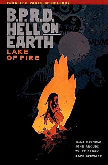
Image © Mike Mignola.
It says something about the staying power of the overall Hellboy franchise that this is the eighth trade paperback collection just in the “Hell On Earth” storyline of B.P.R.D. There are other storylines in the series, and all are spinoffs of HELLBOY itself.
With a title like “Lake of Fire,” you might expect to see fire-starter Liz Sherman, and you’d be right. She’s faced a long crisis of confidence, but seems to have turned the corner on that, and just in time, as it turns out. We also catch up with events at headquarters, and witness a chilling cult conclave at the Salton Sea site of monster activity, both hellish and human monsters, that is. Great stuff, nice art by Tyler Crook, excellent coloring by Dave Stewart, and dandy lettering by Clem Robins.
Recommended.
August 7, 2014
And Then I Read: A BOOK YOU CAN’T FIND ANYWHERE
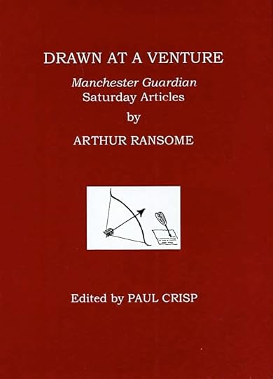
Image © estate of Arthur Ransome.
It’s the latest publication of The Arthur Ransome Society (hereafter TARS), published for subscribers recently. I expect there were some extra copies printed that will eventually be available from the TARS website, but their online sales process is currently unavailable. It’s a book of essays, which automatically makes it of little interest to most readers of this blog, I think. Normally I’d be one of them, but I love the writing of Arthur Ransome. Particularly his series of novels for children beginning with Swallows and Amazons and running to 11 more similar volumes. Those books led me to seek out other work of the author, and eventually to join TARS, whose yearly literary magazine is great reading, and who periodically publish little known works of the author such as this, not to mention having all kinds of activities for members in Britain and elsewhere.
These newspaper articles are weekly essays. Ransome had recently ended a long series of essays mainly about fishing, a personal passion, which have been collected in other books. As a favor to the publisher, he agreed to do this new column where he could write on any subject he liked, which actually turned out to be harder for him, and he gave it up after about two and a half years, but the articles he did write from 1929-31 are great reading. Some touch on politics, but the ones I liked best did not. I preferred the many articles that delved into human nature in one way or another, such as why other people’s games seem so pointless to us if we don’t follow them, how one’s profession affects the way we see the world, why travel is more often fun to plan than to experience, how we often read too fast, the joys of reading aloud, why city visitors to the country see it so differently than residents, and vice versa, the dust that once cloaked the British countryside, why those who exercise and preach about it are so annoying, the pleasure of being up early, and so many more.
I guess this review is more for myself than anyone, but if you have any interest in Arthur Ransome and his writing, I highly recommend TARS.
August 6, 2014
And Then I Read: AQUAMAN 33
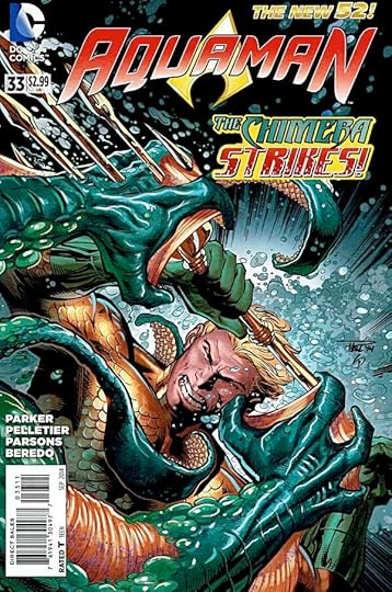
Image © DC Comics, Inc.
Writer Jeff Parker has created a creepy and dangerous monster with a strong wish to kill Aquaman. The Chimera combines some elements of a giant sea creature Aquaman killed some issues back with a human diver also killed by accident in the same confrontation. There are underwater scientists involved in his creation, and both the human and monster parts want revenge on Arthur Curry. Chimera’s ability to switch between human and monster forms is a clever plot device that allows the entity to sneak up on his prey quite effectively. Meanwhile, Aquaman is briefly reunited with Mera, and gets caught up on the problems she’s been facing in Atlantis. The art by Pelletier and Parsons continues to be quite good.
Recommended.
August 5, 2014
And Then I Read: DARK HORSE PRESENTS 32

Image © Mike Mignola and Dark Horse Comics.
Hellboy’s drunk wedding turns out about as you’d expect, and his bride likewise, but it’s an amusing ride that I enjoyed. The art by Mick McMahon is very stylized, but in a somewhat different way than Mignola’s. Still works fine.
“Integer City” is a hard-boiled detective story with horror elements. Okay, I guess, but the genre seems to be overdone in DHP, and this one is not memorable so far.
“The Deleted” is another familiar theme, wastrel teenager wakes up in a dystopian wreck of a place, and is soon enlisted by a cute girl to fight monsters. The art on it is by the ever-colorful Brendan McCarthy, and is the best part of the strip.
I’m enjoying the latest Nexus serial, even though it feels like a runaway train, almost careening off the tracks in places, but then somehow righting itself. This time we see the Merk for the first time in a long time, always fun.
“Monstrous” is an interesting idea, a human trapped in a monstrous body, infiltrating fellow monsters who have killed most of the other humans. Lots of moral quandaries as well as action. Not loving the art, but it’s okay.
“Saint George, Dragonslayer” is a lively and enjoyable twist on the hero of myth, written like a situation comedy/adventure film by Fred Van Lente, and with quite excellent art by Reilly Brown. So far, a keeper.
“The Many Murders of Miss Cranbourne” is back, I think Miss Marple and supernatural elements, though the latter haven’t shown up yet in this episode. Okay, not caring for the art much.
“Alabaster: Boxcar Tales” reaches its 13th and apparently final chapter, at least in this anthology. I’ve read them all, enjoyed the art and the dialogue, but haven’t a clue as to what it’s all about.
A fine issue, recommended.
August 4, 2014
Watching GUARDIANS OF THE GALAXY
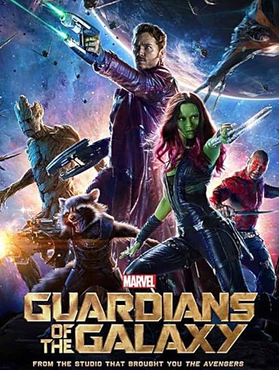
Image © Marvel.
When I was young, and an avid science fiction and fantasy reader, I searched long and hard for anything on the large or small screens that gave me the same kind of fun as what I was reading. That changed with “200l: A Space Odyssey” and even moreso with “Star Wars.” Having seen this summer action adventure fantasy today, I can report that it delivers the fun. It doesn’t break any new ground, but it’s quite entertaining. I have to admit I’ve never read any of the comics it’s based on. I did read the early adventures of the character Star-Lord, but the version here is later and a lot different, as far as I remember. The other “heroes” were all new to me. I did enjoy seeing Thanos, one of Marvel’s best villains, well-handled here, as I’d bet his creator Jim Starlin did. For once the credits were generous, giving Jim and others creator credit, and listing many other comics creators too. Nice to see that. Of course, Stan Lee had his cameo as well.
The plot of the film is not particularly important or memorable. The interactions among the characters, in both serious and funny moments, was well handled and fun to watch. The effects were epic, but not particularly better than other recent action movies. At least there weren’t so many things going on at once most of the time, so I found things easier to follow than in other recent films. Yes, it’s full of action, but there are plenty of quieter moments, a good balance. No one character stood out for me as a favorite, but as a group, the leads were all fine. I was not as taken with Rocket, the CGI raccoon as some may have been, but he and Groot, the plant man, were well-crafted and played. In fact, at times I found them more convincing than Zoe Saldana as Gamora, who I didn’t feel was as believable in the quieter scenes. Chris Pratt as Star-Lord hit all the right notes for me, a good blend of funny and heroic while still being kind of a jerk.
In short, well worth seeing and recommended.
August 3, 2014
A Small Commission

Image © Todd Klein.
I don’t take many commissions, but this one from Walt Parrish was easy to say yes to. Three by three inches, anything I wanted to do. Walt has quite a fine collection of these on his website. I’m honored to be among them.
August 2, 2014
Lettering Placements


Images © DC Comics, Inc., except as noted.
I’ve written about balloon placement in my book, The DC Comics Guide to Coloring and Lettering Comics and also on my website. When I started in comics, lettering was laid out on the art by the penciller, at least at DC Comics. Artists like Curt Swan would pencil in all the dialogue so he and the letterer would both know where everything should go, and that it would fit. The Marvel style of comics creation spearheaded by Stan Lee started to change that. Marvel artists like Jack Kirby and Steve Ditko would lay out an entire story from a plot, and Stan would write the dialogue afterward. This was fine with experienced artists, but later ones using the plot-first system didn’t always have a good handle on how much space to leave for lettering, and the situation has only gotten worse since then. Today many letterers are expected to do their own lettering placements, and often have a tough time of it. Newer comics writers and artists who don’t really understand the medium and how it tells stories both contribute to the problem. The writer will try to do too much in one panel: multiple actions, back and forth dialogue. Artists struggle with that, and also make basic storytelling mistakes like having the first character speaking on the right side of the panel instead of the left, or filling the panel with large close views of character heads, leaving no room for dialogue balloons.
I have to say I’ve often been lucky enough to work with writers and artists who understand comics, and what I need to do my part of the job. Here are a few examples. Above, two panels from DC’s DEAD BOY DETECTIVES. Artist Mark Buckingham does layouts in pencil, and often lightly indicates where lettering should go. Either the editor or assistant editor marks up a copy of the pencils with clear marker indications for placement, usually following Mark’s lead. The storytelling is clear, so when I get the finished art by Ryan Kelley I rarely have trouble fitting the lettering in where requested, though I will move it around if I need to, as in the second panel above.


These two images © Alan Moore and Kevin O’Neill.
Here’s a section from THE LEAGUE OF EXTRAORDINARY GENTLEMEN: CENTURY: 1969. Often artist Kevin O’Neill will mark balloon placements on a photocopy of his finished art, but on this page he didn’t have time to make a copy, so he put a sheet of tracing paper over the art and rough-sketched a layout with balloon placements. This is fairly complex storytelling, and quite a few balloons, but Kevin knows how much space to leave, and I was able to get everything in as requested.


Finally here’s an example of an artist going above and beyond the call of duty! For TOM STRONG’S TERRIFIC TALES #11, artist Bruce Timm did a story featuring Tesla Strong. For lettering placement, he sent me photocopies of his finished art, and taped over it were his own hand-lettered balloons! Bruce made it very easy for me in this case, even with fairly heavy dialogue in the last two panels. And I had fun lettering the story in the style of Ira Schnapp to match the 1950s feel of the piece. By going the extra distance, Bruce Timm has sort of recreated the way comics were laid out by the artists when I first began lettering them, except that I couldn’t letter it with pens and ink, as I did back then. While I don’t think artists today need to go this far, they and the writers both need to think about how and where the lettering will go to help tell their stories.
August 1, 2014
And Then I Read: SWAMP THING 33
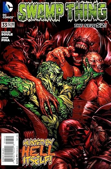
Image © DC Comics, Inc.
This issue is a tale of “no good deed goes unpunished.” Alec Holland thought he would help the former avatars of The Green who had helped him by pulling them back to the real world and into human form. They’ve been complaining about that and plotting against him ever since. Nor are they united in any way except by circumstance, each of the former avatars has his or her own agenda, and here we see the agenda of Lady Weeds coming to the fore, even as that of Wolf are in play. He’s set demons from Hell after Alec, making his troubles even greater. Writer Charles Soule continues to entertain and surprise me, keeping things unpredictable yet right for the characters. The art by Javier Pina is excellent.
Recommended.
July 31, 2014
And Then I Read: AQUAMAN AND THE OTHERS 4

Image © DC Comics, Inc.
Writer Dan Jurgens is spinning an entertaining tale involving ancient Atlantean gold, a very old family determined to get it back, and a group of off-beat heroes, led by Aquaman, bent on defying them. There’s equal measures of supernatural chills, otherworldly magic, high-orbit science and believable heroics on both sides of the struggle. Aquaman is wounded badly, so the team must come together to fill the gap, and they rise to the occasion. The plot has some interesting surprises, too. I’ve enjoyed the art of Lan Medina since his work on the very first story arc of FABLES, and it looks great here inked by Allen Martinez. I find the entire package appealing.
Recommended.
Todd Klein's Blog

- Todd Klein's profile
- 28 followers

